Friday, January 31, 2020

Muuto launches modular lamp and sculptural vase by Earnest Studio

Earnest Studio Muuto

Rotterdam-based Earnest Studio has designed a pair of products for Danish design brand Muuto – a lamp featuring individual lighting units fixed to a metal pole by magnets and a vase with a kinked profile.

The lamp and vase are the first products created for the brand by designer Rachel Griffin's studio.

Earnest Studio Muuto

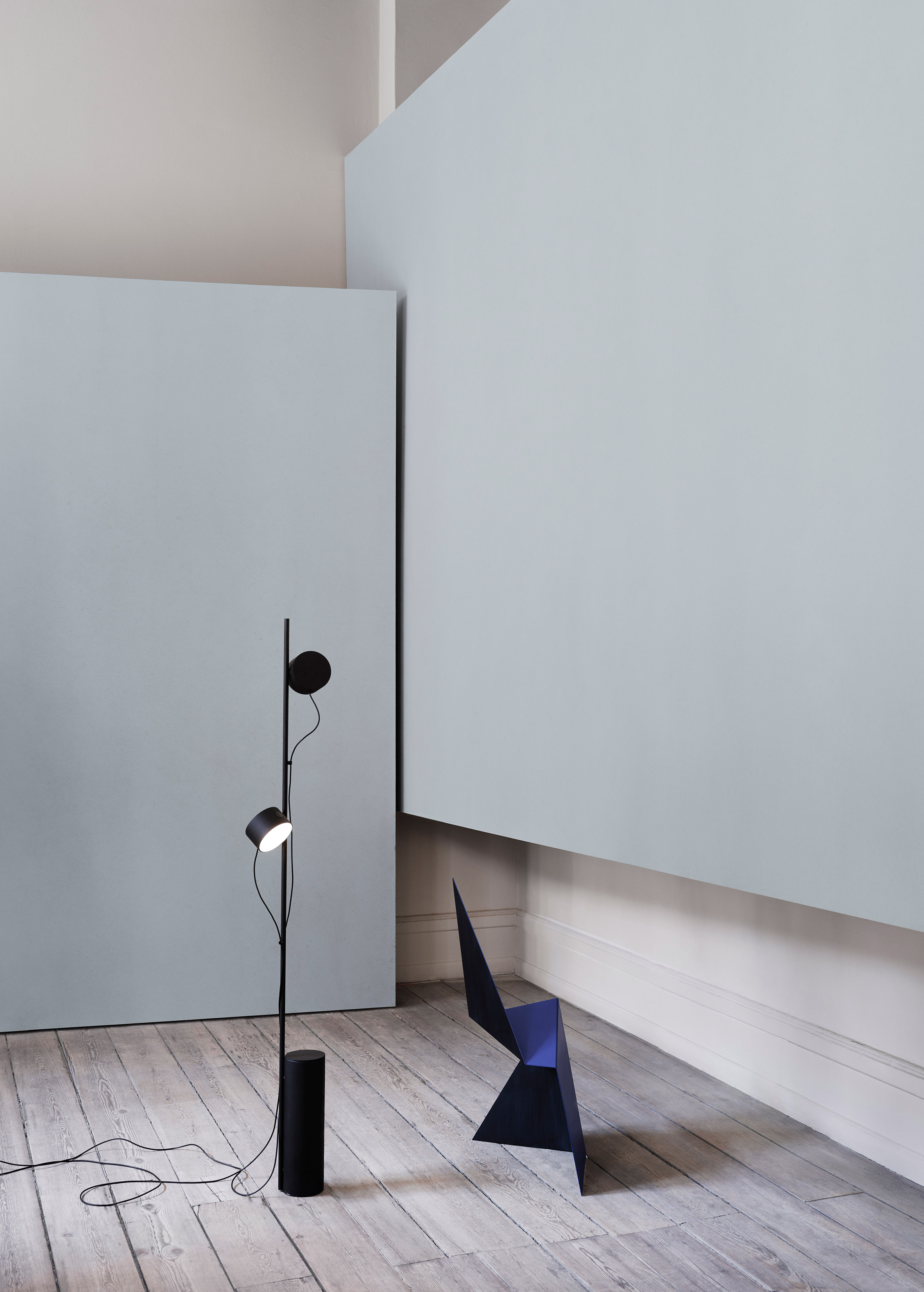
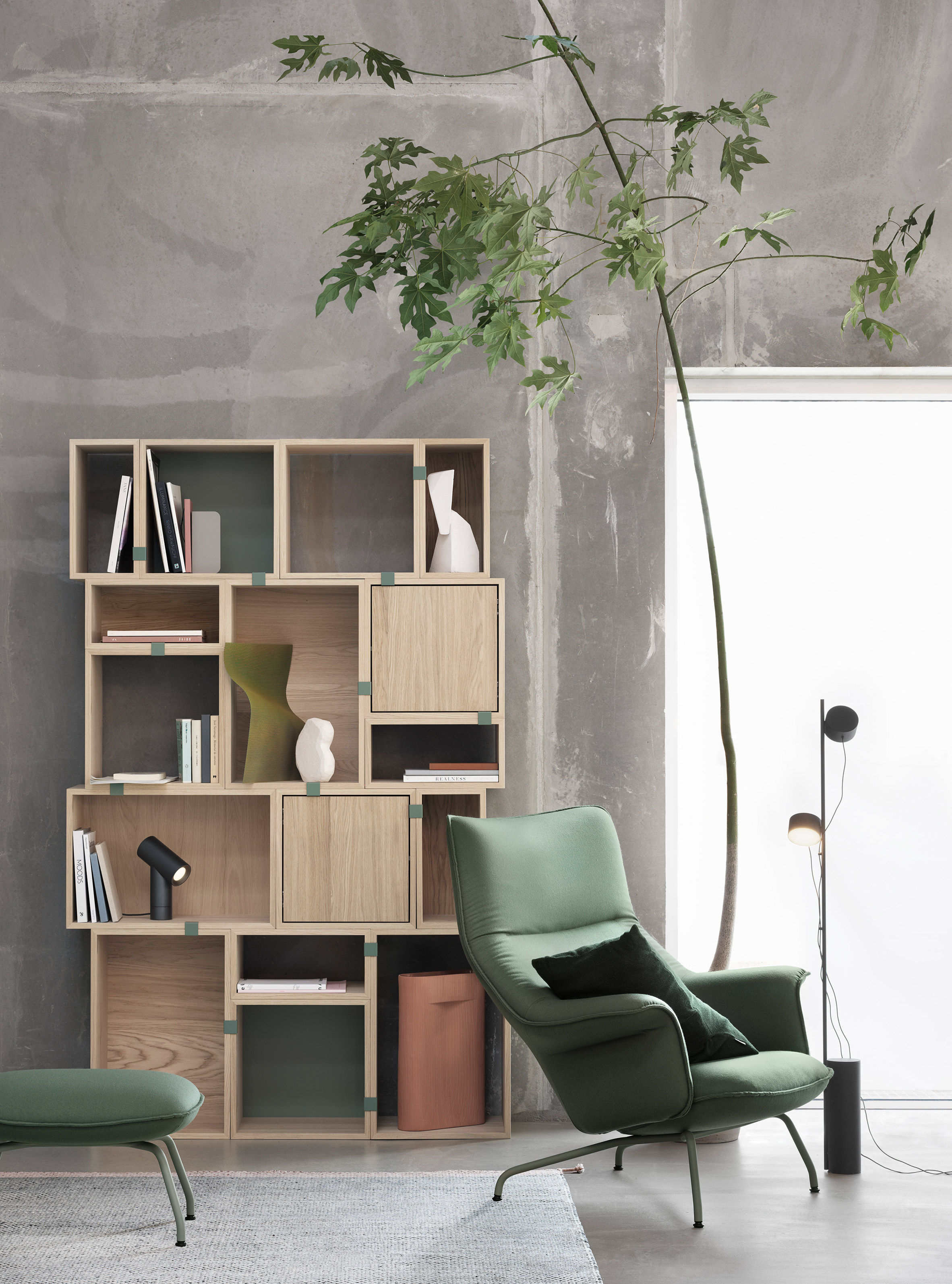
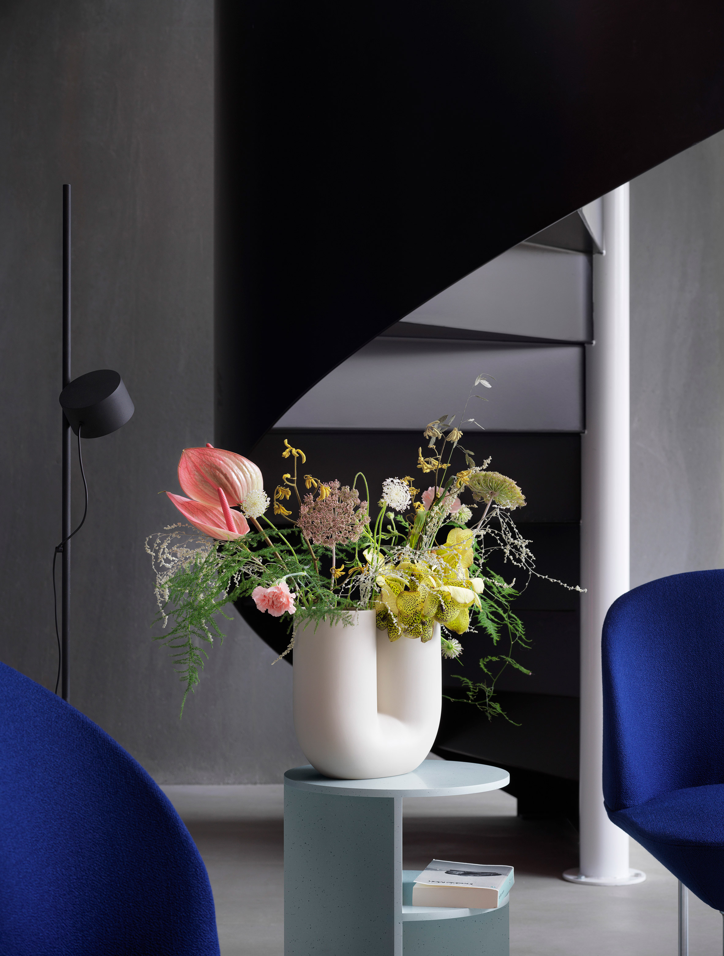
The Post Floor Lamp is a modular lighting-solution comprising a base and two, round lighting units that the user can fix to a central stem in any position.

The lamps can be angled as required and are individually dimmable, so the direction and strength of the light can be tailored to suit the space.

Earnest Studio Muuto

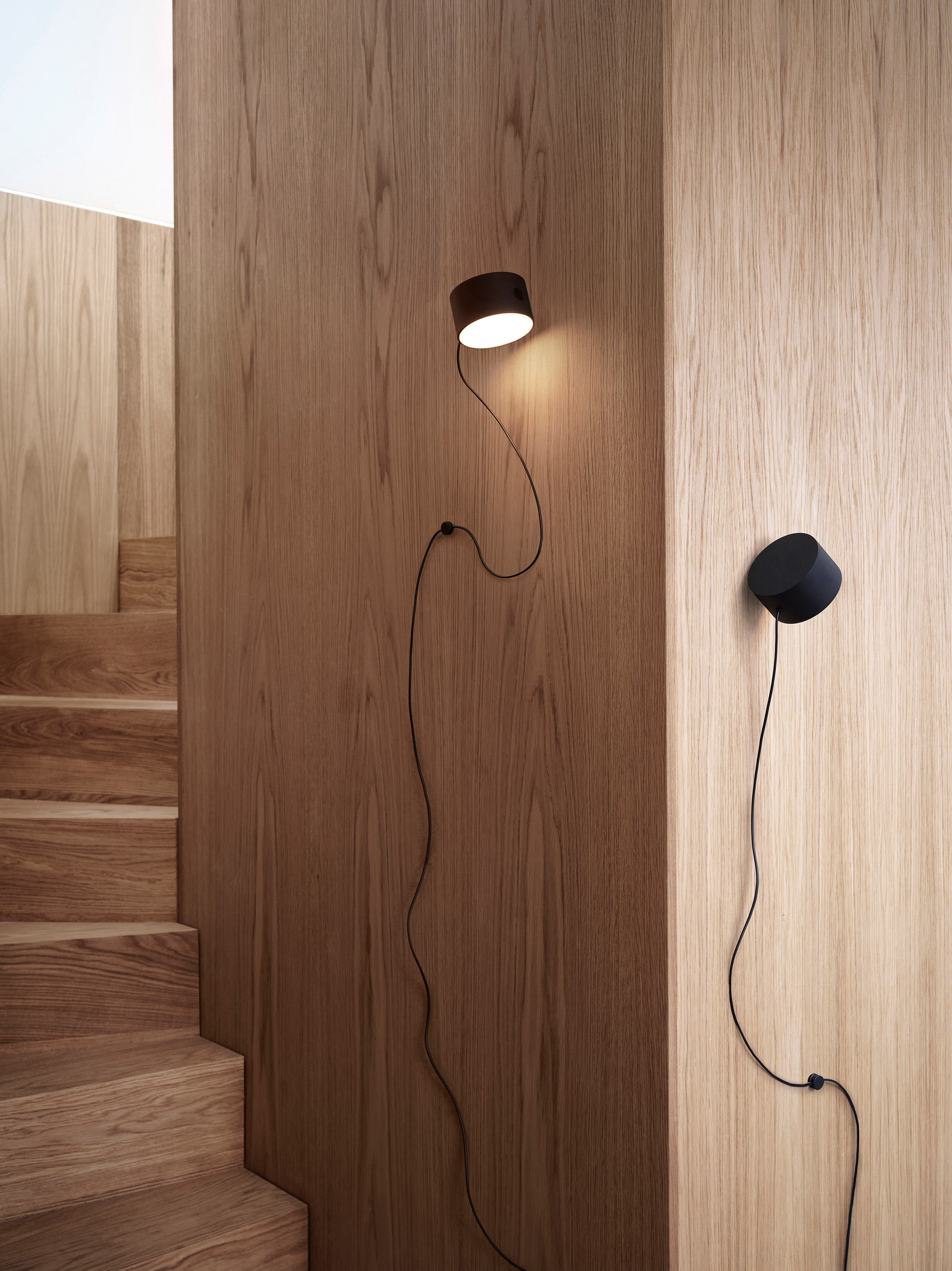
The two lighting units are plugged into a central power hub so they can both be turned on or off at the same time. Each lamp also has its own integrated touch-operated switch for controlling the light.

The cords are fitted with magnetic cable drops for attaching the cable to the central rod. An additional lighting unit can also be added by plugging it into the power hub and positioning it on the rod.

Earnest Studio also developed a wall-mounted version of the product, which applies the same simple and graphic aesthetic to units that can be magnetically attached to a wall-mounted metal bracket.

Earnest Studio Muuto

"The Post Floor and Wall Lamp came from the idea of exploring the flexibility of a magnetic joint, giving the user the freedom to position and dim the lamp's lighting units according to individual needs," Griffin explained.

"Designed with a sculptural expression, simple lines and refined finish, the Post Floor and Wall Lamps represent a new perspective through their graphic character and forward thinking functionality."

Earnest Studio Muuto

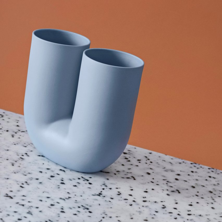
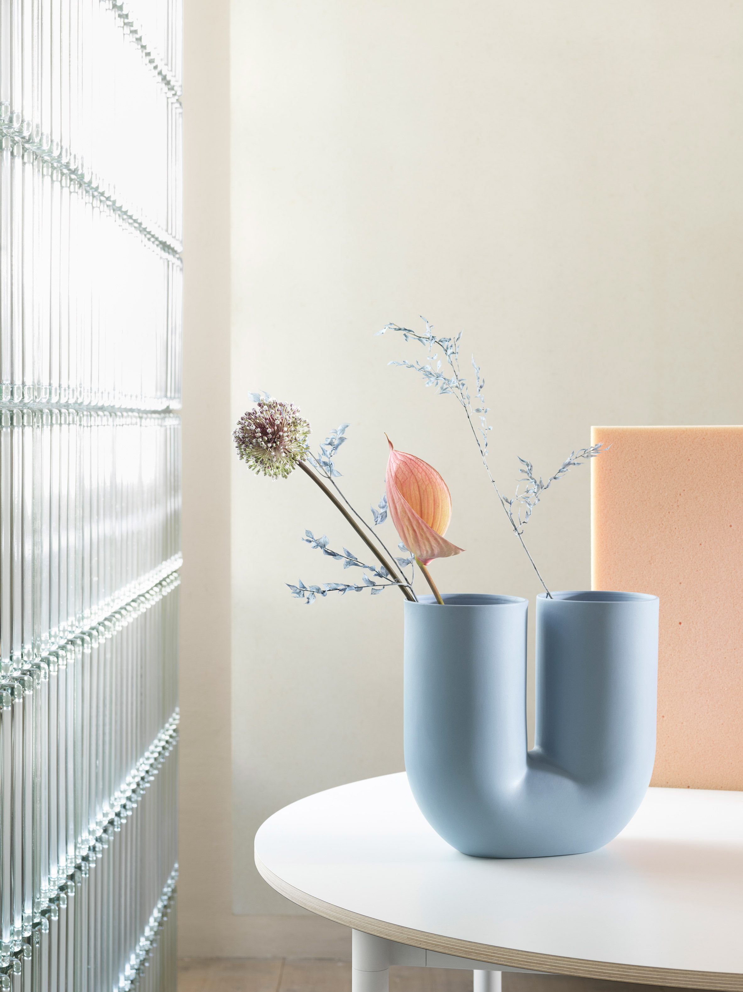
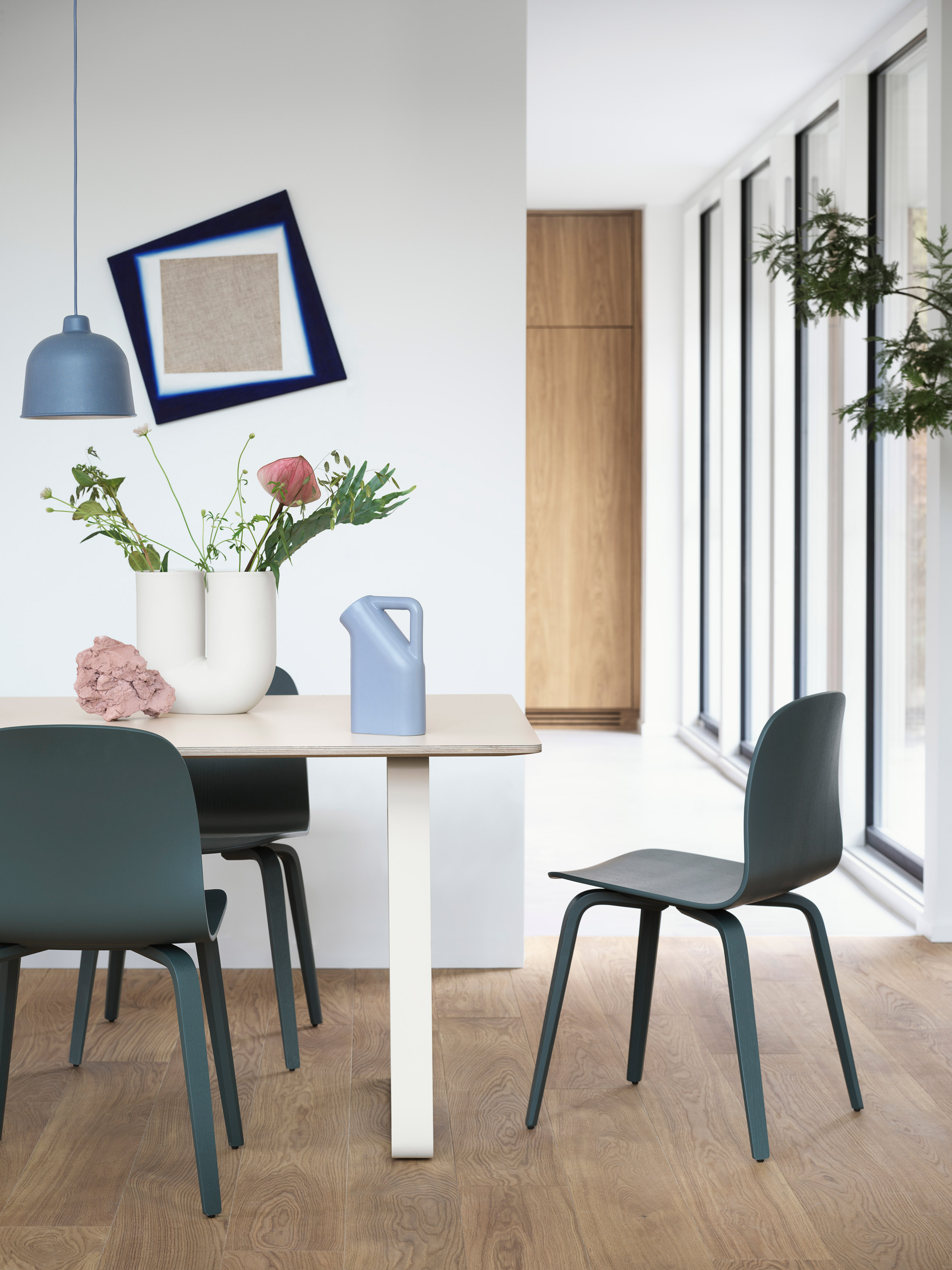
The second product created by Earnest Studio for Muuto is the Kink Vase. Griffin developed a new take on the traditional accessory, using digital design technologies to create its playful shape.

"My starting point for the Kink Vase was an exploration of how new forms could be created through the digital manipulation of simple shapes," said the designer.

"The design combines this appreciation of modern technology with traditional ceramic craft, resulting in a piece that is both contemporary and sculptural," she continued.

"The graphic and playful appearance of the Kink Vase – combined with its double opening, which suggests a new way to arrange flowers – infuses its surroundings with joy."

Earnest Studio Muuto

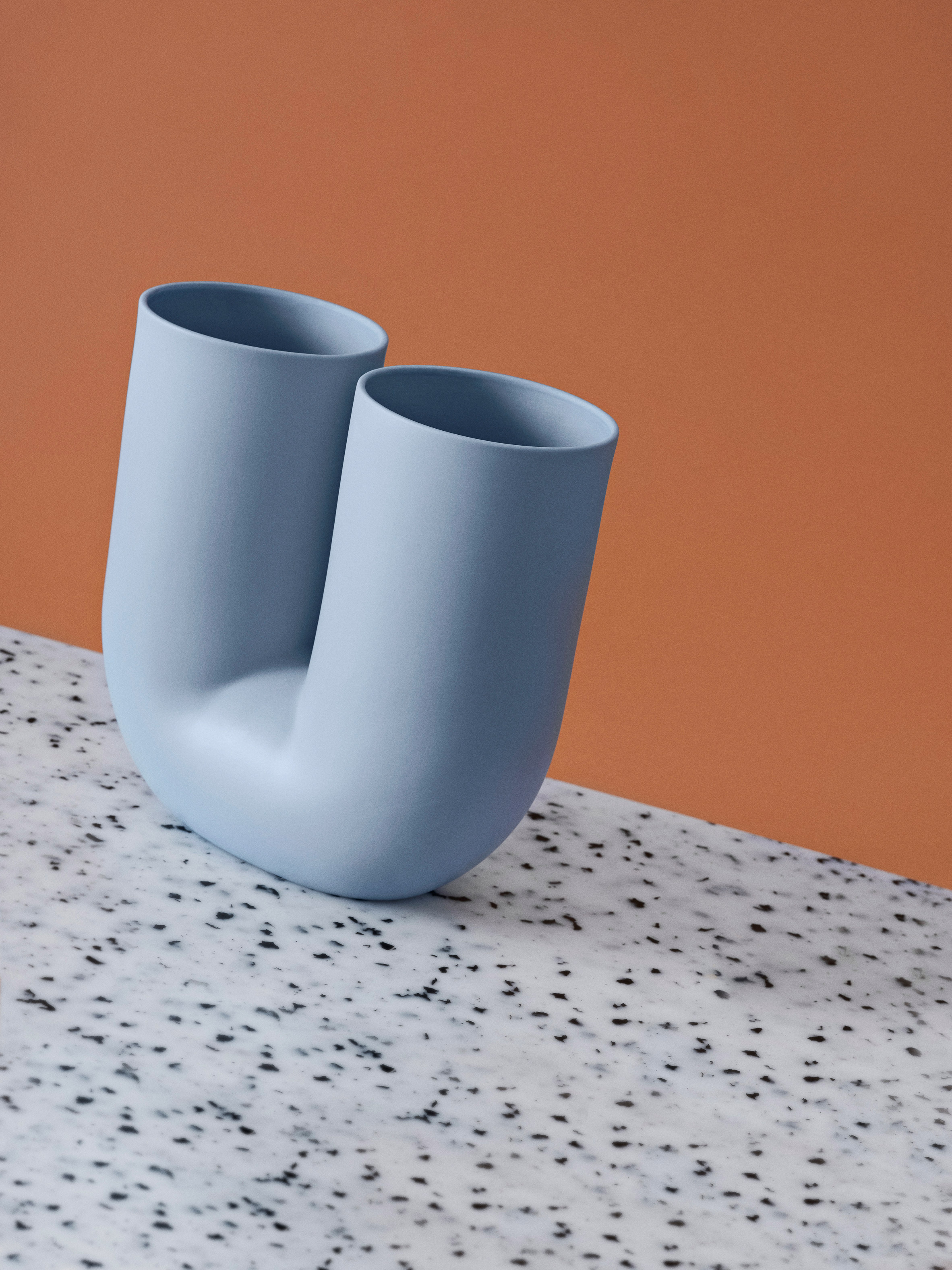
The distorted tubular form was made possible by computer modelling software and is produced in porcelain using a traditional process.

The design's double-ended form gives it a sculptural presence in a room when not in use, and the user can choose to use one or both ends for floral arrangements.

The vase is available in sand and light blue colourways, with a glazed inner surface providing a contrast to the smooth, matte exterior.

Earnest Studio Muuto

The two new products were unveiled by Muuto at the Design Post showroom during the recent IMM Cologne trade fair.

American-born Griffin founded Earnest Studio in 2012 after studying graphic design in the USA and graduating from the Man & Living programme at Design Academy Eindhoven.

The multidisciplinary studio works across a broad range of projects, designing everything from brand identities to furniture and accessories. Griffin previously collaborated with designer Emilie Pallard on a collection of furniture made using standard construction materials.

Earnest Studio Muuto

Muuto works with many international designers to develop products and furniture that represent a contemporary take on Scandinavian design traditions.

The brand's recent products include a collection of cocoon-like pendant lights designed by Benjamin Hubert's studio Layer, and an aluminium lamp by Tom Chung that projects light from both ends.

The post Muuto launches modular lamp and sculptural vase by Earnest Studio appeared first on Dezeen.


from Dezeen https://ift.tt/31pqeBz

Tripadvisor reveals new logo ahead of year-long identity refresh

Mother Design’s New York studio has updated Tripadvisor’s logo as part of a wider identify refresh, which will roll out over the year.

Tripadvisor was established in 2000 as a way to provide travel guidance for other users. Anyone can create an account and review restaurants, hotels and other tourist attractions.

Courtesy of Mother Design

It also has a flight-finding service and offers customers options for holidays, from rentals to packages and car hire.

The site has nearly 460 million unique visitors each month and 830 million reviews and opinions. “The company knows the world of travel has evolved,” the studio says, “so it only makes sense that the platform’s branding follows suit.”


An exercise in “reduction”

The most noticeable change is the simplification of the company’s logo, Ollie the Owl. It was an “exercise both in reduction of complexity and amplification of character”, says Mother Design.

Courtesy of Mother Design

The owl, which used to have two differently coloured eyes and a yellow head, is now rendered in black only. “We retained its inherent personality but refined its geometry for better reproduction at all sizes,” the design studio says.

The “much simpler owl” appears on Tripadvisor’s website as well as the app.


A “real, global, human connection”

Mother Design has also created a series of icons, relating to the travel service’s various functions. A parasol represents ‘rest’, a backpack for ‘hike’ and a double bed for ‘stay’. There are also new icons for hotels, eating and the search function.

Courtesy of Mother Design

Although the logo is now monochrome, the colour palette for the identity remains varied. Some of the shades now include ‘TripGreen’, orchid, salmon, rose, sand, moss, pine and mustard.
A custom typeface, Trip Sans, has been provided by Colophon Foundry which “could carry the weight of the real, global, human connection the brand believes in”, Mother Design says.


Name change

Another change is the company’s name, from TripAdvisor to Tripadvisor. The company says that the “subtle change” reflects how “people recognise our name and pronounce it as a single word” after twenty years of existence.

Courtesy of Mother Design

Tripadvisor says that the logo update is only the “first step” in its “new look”, though it has not yet revealed further details about its new identity.

The post Tripadvisor reveals new logo ahead of year-long identity refresh appeared first on Design Week.


from Design Week https://ift.tt/2uPhvwc

Royal Astronomical Society rebrand inspired by “vision and discovery”

The Royal Astronomical Society has been rebranded in a bid to “better reflect its purpose”.

London-based design studio Johnson Banks led the project, after being approached by Christine Losecaat, programme director for the organisations 200th anniversary celebrations.


Bringing in a digital-friendly logo

At the centre of the rebrand is a new logo. It features stepped spokes arranged in a circle, with the final shape turned to 23.5 degrees to reflect the Earth’s axis tilt. According to Michael Johnson, founder and creative director at Johnson Banks, the mark is open to interpretation – viewers might see a stylised eye or a planet with an orbiting moon, for example.

The logo replaces the society’s legacy symbol, which featured an engraving of a telescope designed by Sir William Herschel, the Royal Astronomical Society’s first ever president appointed some 200 years ago.

The previous mark

This previous mark was dated, Johnson says. “In the digital age, [it] didn’t reproduce well in small sizes or on screens,” he adds.

Moreover, with its previous emphasis on the telescope the logo also didn’t feel inclusive of the society’s other interests like geophysics.

“It’s an organisation that looks up, but also looks down into the planet,” Johnson says, “so we were keen to reflect that properly.”


“Allowing the imagery to take centre stage”

Elsewhere in the identity, a central colour palette of black, white and grey has been adopted. The colours have been chosen to “compliment beautiful images of the sky, planets and geological formations” which appear across the society’s communications.

These colours are further accented by a secondary colour palette inspired by shades found in the sky and on land, which already features on the society’s Monthly Notices and Geophysical Journals.

“In the previous identity, the logo was really the only consistent part of it, and when we looked at all the other communications, there really wasn’t any sense of cohesion,” says Johnson. “It soon became very apparent that the way forward was with the sensational imagery the society had to offer.”

With this at the forefront, Johnson says the team really wanted “a system that most of the time would just work in the background and only take the focus when necessary, allowing the imagery to take centre stage”.


“Doing more with their brand”

The new look aims to clarify the society’s mission, while also attracting “attracting a younger and more diverse membership”.

With the organisation celebrating its bicentenary this year, Johnson hopes the new look will signal to similarly historic societies that “it is possible to sensitively modernise their brands.”

“A lot of the learned societies like the Royal Astronomical Society were founded around the same time,” Johnson says. “And many are now starting to realise they need to do more with their brand.

“Of course, you can’t ignore the current membership, but attracting new members is necessary too and that’s what this new identity is for.”

The post Royal Astronomical Society rebrand inspired by “vision and discovery” appeared first on Design Week.


from Design Week https://ift.tt/2uN053k

Dog Owners Are Buying Face Masks To Protect Dogs From Coronavirus

According to the live map that tracks the spread of coronavirus (2019-nCoV), there are nearly 10,000 people currently infected with the virus. There have also been over 200 deaths after people contracted the virus which causes such symptoms as fever, cough and shortness of breath and conditions varying from people being mildly sick to people being severely ill and dying.

Since the initial cases had links to a large seafood and animal market in Wuhan, the virus is thought to originate in animals, but such information has not been officially confirmed. According to Wikipedia, “Comparisons of genetic sequences between this virus and other virus samples have shown similarities to SARS-CoV (79.5%) and bat coronaviruses (96%),” because of this, it’s highly likely that bats were the origin of the current virus devastating China.

As coronavirus is rapidly spreading it is reported that Chinese dog owners rush to buy face masks for their dogs

Image credits: Zhou Tianxiao

Despite the fact that The World Health Organisation (WHO) reported that there is no evidence suggesting house animals can be infected with the new strain of coronavirus, Chinese people have still gone one step ahead to protect their pets from a potential threat. Sales of pet masks have reportedly skyrocketed since the initial outbreak of the coronavirus and don’t seem to be stopping anytime soon.

Image credits: Zhou Tianxiao

Image credits: Zhou Tianxiao

Zhou Tianxiao, a 33-year-old online retailer from Beijing, reported that he’s selling ten times the amount of dog masks than he usually did before the spread of the Wuhan coronavirus. The man initially sold masks designed specifically for dogs to help protect the pooches from the air pollution, a business he started back in 2018 on e-commerce site Taobao.

Image credits: Zhou Tianxiao

Image credits: Zhou Tianxiao

“[The dog masks] might not be as professional as the medical masks made for humans, but they are functional,” Zhou told MailOnline. The retailer sells the dog masks at the price of 49 yuan ($7) for the pack of three.

Image credits: Zhou Tianxiao

Image credits: Zhou Tianxiao

Zhou Tianxiao also said that the main purpose of the masks is “o block out smog, stop dogs from eating or licking food on the floor and prevent them from being exposed to the virus”.

Image credits: Zhou Tianxiao

Image credits: Zhou Tianxiao

Image credits: Zhou Tianxiao

Image credits: mindy622


from Bored Panda https://ift.tt/2RZGF2Q

Why Headspace is going local

Headspace's Healthy, Happy America initiative will see the brand partner with local organisations to put on mindfulness events in cities across the US. We talk to Chief Creative Officer Caroline Pay about the project, and Headspace's plans for the future

The post Why Headspace is going local appeared first on Creative Review.


from Creative Review https://ift.tt/37LyIoS

Vets Save Man’s Dog From Cancer, He Thanks Them With A $6M Super Bowl Ad

Vets are real everyday heroes. Every single day, they help heal our pets, but they don’t get enough praise. Fortunately, once in a while, somebody comes along who spares no expense to show their utmost appreciation for veterinarians.

David MacNeil thanked the vets who saved his 7-year-old Golden Retriever, Scout, from cancer with a 6 million dollar Super Bowl ad. And the best part? He encouraged people to donate to the vets who saved his dog and all the funds raised from that commercial will support research at the heroes’ veterinary school and help them buy new equipment. That way, they’ll be able to diagnose and treat cancer even better: not just in animals but in humans, too.

“Scout’s illness devastated us. We wanted this year’s Super Bowl effort to not only raise awareness but also financial support for the incredible research and innovative treatments happening at the University of Wisconsin School of Veterinary Medicine, where Scout is still a patient,” Macneil said in a statement.

“We wanted to use the biggest stage possible to highlight Scout’s story and these incredible breakthroughs, which are not just limited to helping dogs and pets. This research will help advance cancer treatments for humans as well, so there’s the potential to save millions of lives of all species.”

Vets saved 7-year-old Scout from cancer and his owner thanked them with a 6 million dollar ad

Image credits: uwmadison

You can watch the Super Bowl ad right here

Meanwhile, the dean of the School of Veterinary Medicine at the University of Wisconsin in Madison, Mark Markel, said that this is an opportunity for “veterinary medicine worldwide.”

“So much of what’s known globally today about how best to diagnose and treat devastating diseases such as cancer originated in veterinary medicine. We’re thrilled to share with Super Bowl viewers how our profession benefits beloved animals like Scout and helps people, too,” he shared his thoughts in a statement.

Scout is his owner David MacNeil’s best friend

Image credits: wtscout

Scout had a 1% chance to survive, but his owner wouldn’t give up on him

Image credits: wtscout

Image credits: wtscout

Here’s a video about how the vets treated Scout

Scout collapsed in the summer of 2019, was diagnosed with cancer and was given only one month to live. However, the founder and CEO of car accessories company WeatherTech, MacNeil, couldn’t accept this fate for his best buddy.

He decided not to put down his Golden Retriever despite him having only a 1 percent chance to survive: “I’m like, ‘I’m not putting that dog down. There’s just absolutely no way.”

Instead, he took Scout to the UW School of Veterinary Medicine where vets treated him with chemotherapy and radiation. Now, Scout’s tumor is nearly entirely gone.

The vets are doing everything they can to help Scout recover

Image credits: weathertech

Scout is a very good boy

Image credits: wtscout

Image credits: uwmadison

Image credits: wtscout

Image credits: wtscout

MacNeil’s Super Bowl ad is a 30-second commercial called ‘Lucky Dog’ and encouraged people to donate money to support tireless vets like the ones who saved Scout. “I hope it has a positive impact on cancer for animals and people, all over the world,” he said about the commercial.

There are three main options when it comes to treating pets with cancer: surgery, chemotherapy, and radiation therapy (aka radiotherapy). These can also be used in combination with other treatments to try and save an animal’s life.

The type of treatment advised is linked to the type of cancer, its growth rate, as well as how far it has spread. Surgery, i.e. cutting out the tumor, is considered to be the oldest, most effective, and most frequently used type of treatment. Nowadays, it’s usually done alongside chemotherapy and radiotherapy. All in the hopes of saving the animal, so he can be just like Scout the Golden Retriever.

Here’s how people reacted to the story


from Bored Panda https://ift.tt/38V70pF

Design shows in China including Design Shanghai and Festival of Design postponed due to coronavirus outbreak

Design Shanghai fair postponed due to coronavirus outbreak

Organisers of the Design Shanghai trade fair and the Festival of Design architecture conference have cancelled their March 2020 events as the coronavirus outbreak disrupts travel and business in China.

Design Shanghai, the biggest contemporary design show in China, said it was moving the fair to May "to ensure the welfare and safety of visitors to our show".

Shanghai architect Neri&Hu has scrapped plans for its Festival of Design conference after "carefully evaluating the situation and potential risks." The event will return in March 2021.

The two high-profile events are among an increasing number of industry events affected by the virus, which has so far claimed 213 lives in China.

Shows in Shanghai, Shenzhen and Guangzhou affected

Shenzhen International Furniture Fair, which was due to take place from 18 to 21 March, announced it has postponed its dates to June.

The Department of Commerce of Guangdong Province and Guangzhou Municipal Commerce Bureau announced the suspension of all large trade events "to ensure health and safety of all participants".

The 45th China International Furniture Fair, which was due to take place in Guangzhou from 18 to 21 March, is among events affected.

Meanwhile, dealers have been calling for the Art Basel Hong Kong show to postpone its upcoming edition, due to take place in Hong Kong from 19 to 21 March. The fair has yet to announce a decision.

Design Shanghai postponed for "safety of visitors"

Design Shanghai was scheduled to take place from 12 to 15 March at the Shanghai World Expo Exhibition and Convention Centre.

It will now take place in the same location from 26 to 29 May, assuming that the virus has been contained by then.

"After careful consideration and advice, we have made the difficult decision to postpone Design Shanghai to ensure the welfare and safety of visitors to our show, our exhibitors and our team," said Design Shanghai director Zhuo Tan.

"We are grateful to have confirmed new dates in the same venue with the same layout so as not to compromise the quality and success of the fair," she continued.

"We appreciate the show of support that we have received from the design community and our partners during this time."

Design Shanghai fair postponed due to coronavirus outbreak

The organisers of Design Shanghai made the decision in consultation with the Chinese government and local authorities, as well as the fair partners, venue and local team. Exhibitors were notified on 30 January.

Launched in 2014 by Media 10, Design Shanghai has become one of the region's most highly acclaimed shows for the design market. The fair was sold to Clarion Events in June 2019.

Festival of Design cancelled due to "potential risks"

Neri&Hu told Dezeen they had decided "with great disappointment" to cancel the 2020 edition of Festival of Design.

The third edition of the annual conference, which invites architects from around the world to deliver lectures, was due to be held in Shanghai at the same time as Design Shanghai.

"It is with great disappointment that we have to inform all related parties on this unexpected decision, but it seems to be the best course of action at this time, setting the health and safety of our guests and attendees as our top priority," said Neri&Hu's Rossana Hu and Lyndon Neri.

"We shall resume the Festival of Design in Spring 2021, but for now, we pray for those whose health is affected by the virus outbreak and hope that the design community will be effective in offering our own contribution to the on-going relief efforts," they added.

Coronavirus a global emergency

The first case of flu-like coronavirus infection was detected in Wuhan, the capital of Hubei province, on 31 December. Efforts to contain the virus have failed, with almost 10,000 cases reported in China so far and infections reported around the world.

The World Health Organization yesterday declared the outbreak a global emergency.

The Chinese government has been rapidly building a 1,000-bed hospital in Wuhan in a bid to contain and treat patients suspected of contracting the coronavirus.

The 25,000-square-metre Huoshenshan facility in Wuhan is expected to be in operation by 3 February, while a second 1,600-bed hospital called Leishenshan is set to be ready by 5 February.

The post Design shows in China including Design Shanghai and Festival of Design postponed due to coronavirus outbreak appeared first on Dezeen.


from Dezeen https://ift.tt/36KgL8X

Zaha Hadid Architects releases visuals of amorphous OPPO Shenzhen headquarters

OPPO Headquarters by Zaha Hadid Architects

Zaha Hadid Architects has revealed its proposal for four interconnected towers in Shenzhen, China, which will contain the open-plan headquarters for OPPO.

Set to break ground later this year, the amorphous OPPO headquarters is designed by Zaha Hadid Architects to accommodate the continual growth of the company dubbed as China's leading smartphone manufacturer.

The headquarters will measure 185,000-square-metres, and in a bid to echo the company's "commitment to connectivity", it will contain a number of large atriums surrounded by light-filled open-plan offices.

OPPO Headquarters by Zaha Hadid Architects

"OPPO launched their first phone in 2008, growing to become China's leading smartphone manufacturer and the fifth largest worldwide with over 40,000 employees in more than 40 countries," explained the studio.

"Accommodating this growth, OPPO's new headquarters will continue their commitment to connectivity through design."

OPPO Headquarters by Zaha Hadid Architects

Zaha Hadid Architects' proposal for the OPPO headquarters was the winning design in a international competition – seeing off competition from the likes of BIG, SOM and Rogers Stirk Harbour + Partners.

The building is slated for completion in 2025. The highest of its four towers will contain 42 storeys, reaching 200 metres in height.

OPPO Headquarters by Zaha Hadid Architects

The studio has dedicated two of the towers solely to open-plan office space. These towers will be linked by a 20-storey lobby and punctured by a number of large atriums.

Meanwhile, the remaining two towers will serve as external service structures and contain all the building's main circulatory routes.

OPPO Headquarters by Zaha Hadid Architects

This configuration is designed by Zaha Hadid Architects to create open, uninterrupted floor space throughout the offices, and encourage collaboration between different departments as a result.

"Locating the towers' service cores externally frees the centre of each floor from obstructions; providing uninterrupted views throughout the building that will enhance interaction between employees," said the studio.

"The abundance of natural light, varied working environments and diversity of routes for staff and visitors to move through the building are all conducive to creative engagement and spontaneity."

OPPO Headquarters by Zaha Hadid Architects

Though different in size, the towers will be unified by their sinuous glass forms that taper inwards towards ground level.

This reduction in floor area is designed to cater for a large landscaped plaza planned at street level, which is hoped will provide "new civic space for the city". Here there will also be an art gallery, shops, restaurants and a direct link to Shenzhen's subway.

OPPO Headquarters by Zaha Hadid Architects

Once complete, the OPPO headquarters will also contain publicly accessible dining, leisure and entertainment facilities on the 10th floor, and a public viewpoint at roof level.

OPPO Headquarters by Zaha Hadid Architects

Zaha Hadid Architects is an international architecture studio founded in 1980 by the late Pritzker Prize-winning architect Zaha Hadid. Today, it is headed up by Patrik Schumacher who recently defended architecture's long-hours culture at Dezeen Day.

Elsewhere in China, the studio is developing Unicorn Island to support the growth of China's technology and research sectors, and has recently completed a giant starfish-shaped airport and 45-storey Leeza Soho skyscraper.


Project credits:

Architect: Zaha Hadid Architects
Design: Patrik Schumacher and Christos Passas
Zaha Hadid Architects project directors: Charles Walker (Commercial Director), Christos Passas (Design Director), Satoshi Ohashi (ZHA China Director)
Zaha Hadid Architects project associates: Hussam Chakouf (Competition Lead), Juan Liu, Yang Jingwen
Zaha Hadid Architects project designers: Melhem Sfeir (Competition Lead), Duo Chen, Katerina Smirnova
Zaha Hadid Architects project team: Massimo Napoleoni (Facade Specialist), Aleksander Bursac, Mihai Dragos-Porta, Vera Kichanova, Ying Xia, Che-Hung Chien, Meng Zhao, Qi Cao, Alex Turner (Graphic Designer)
Zaha Hadid Architects workspace analysts: Uli Bloom, Philip Siedler, Lorena Espaillat Bencosme
Zaha Hadid Architects project support: Tatiana Chembereva, Camille Kelly

The post Zaha Hadid Architects releases visuals of amorphous OPPO Shenzhen headquarters appeared first on Dezeen.


from Dezeen https://ift.tt/2UcFhg9

Paola Paronetto combines paper and clay to create delicate vessels

Pistilli paper clay ceramics by Paola Paronetto

Italian ceramicist Paola Paronetto has unveiled two new vase designs, created using her distinctive "paper clay" technique.

Based in the Alpine village of Pordenone, where she grew up, Paronetto has developed a unique method for creating ceramics with seemingly fragile shapes and proportions.

Pistilli paper clay ceramics by Paola Paronetto

Her technique involves adding a certain amount of paper pulp to the ceramic mixture, which offers extra stability.

It also makes it possible to add vertical folds that will remain after the clay has been fired.

Bosco paper clay ceramics by Paola Paronetto

Paronetto has used the process to create two new designs, which she unveiled at the Maison&Objet homeware fair in Paris earlier this month.

Named Bosco and Pistilli, both are designed to replicate forms in nature.

Bosco paper clay ceramics by Paola Paronetto

Bosco is a set of slender vessels, with arms that extend out like the branches of a tree. The word "bosco" means wood in Italian.

This is one of the most difficult pieces to produce in Paronetto's whole collection – the mixture has to be exactly right in order for the branches to stay in place throughout the production process.

Pistilli paper clay ceramics by Paola Paronetto

Pistilli is a series of tired vessels, available in a variety of different shapes and sizes. The name is a reference to the female reproductive part of a flower, the pistol.

Pistilli paper clay ceramics by Paola Paronetto

"Both families of objects are composed of tubular shapes to assume facets that are both evocative and abstract, almost playful," reads a statement released by Paronetto.

"As suggested by their names, the objects of the Bosco and Pistilli series acquire their maximum expressiveness in groups, playing with different heights and/or colours, just as in nature."

Paper clay lamps by Paola Paronetto

Paronetto has spent a decade developing her paper clay technique. Each piece is unique, handmade by the ceramicist using her traditional potter's wheel.

Her best-known work is the ongoing Cartocci series, which includes vessels in the shapes of bottles and cacti, as well as bowls that resemble mushrooms.

The ceramicist recently also used the technique to create a series of ceramic pendant lamps.

The post Paola Paronetto combines paper and clay to create delicate vessels appeared first on Dezeen.


from Dezeen https://ift.tt/2S5OrbF

In-house teams: How Reuters Graphics visualises “catastrophic” world events

“Just because a story is big doesn’t mean that it’s visual, or that it merits a response from us,” Simon Scarr tells Design Week. “We try to work on stories that really need our work — where the visual aspects are essential to the understanding.”

Scarr is the deputy editor of the Reuters Graphics, the news agency’s in-house graphics team that creates and distributes graphics to its clients all over the world. Recent visuals have covered the outbreak of the Coronavirus in China, Hong Kong protests and the Iran-U.S missile crisis. In January, the team made a scroll-down page displaying hundreds of orange squares, aiming to convey the scale of Australia’s bushfires, which have so far razed 103,000 sq km of land (an area the size of South Korea).

We speak to Scarr about how the team tailors content to clients, keeps up with the news cycle and stays inventive.


What do they do?

The team publishes graphics to Reuters.com and distributes content to clients internationally. Reuters is a news agency, which media and corporate companies from all over the world subscribe to. This means that the focus must have “global or at least regional appeal”. “As much as a mayor’s race in Spokane may be of huge interest for that community, it won’t play on the global scale,” Scarr says.

It means they must always consider the “end user of the work”, which is not necessarily a reader. A client might be a newspaper, but it could also be a company with an online product. That means that the team must produce a file that is easy to edit, for individual client’s use. “We have to go one step beyond thinking how something will look in the window of a web browser,” Scarr explains. It has to be done “in a way that’s easy to understand if someone if picking these files apart and editing them”.

Illustrations for the Hong Kong protests. Courtesy of Reuters

Another consideration is language. Because of the agency’s international focus, not all clients use the English language, so the graphics and presentations have to be built in a way that is easy to translate. And although digital is a focus, many clients still have a printed product. A print client might want a static map or a series of static charts, Scarr says. “We would never send out a large interactive file and expect a print client to pick that apart,” he adds. “Everything has the customer in mind.”

Most importantly, it’s the “visual merit” of a story that matters. Scarr says a question that’s often asked among the team is: “Will the visuals add value, or can the reader understand this story just as well without them?”


How does the team work?

Scarr is based in Singapore, but the graphics team has desks in New York, London, and Bangalore. There are around 20 members in the entire team. Each desk tends to focus mostly on their region (divided by AMERS, EMEA, and APAC), but there is some collaboration on stories with “global elements” and pre-planned major events, like a recently published feature on Davos (with floating Bill Gates’ faces to show the number of years the Microsoft founder has attended the annual Swiss conference). The 2020 Tokyo Olympics coverage will be a joint effort between all bureaus.

“Cross-region collaboration can also be driven by pairing up particular skillsets, data-heads, cartographers, illustrates and codes to work together,” Scarr says. “We think of ourselves as one large team and have communication channels that make it easy for us to share work, discuss ideas and solicit feedback, regardless of where we are in the world.”

That also means working with the entire newsroom. Most of the team are reporters by trade, Scarr says — although he is an exception, having gained a diploma in Newspaper Design and Information Graphics. But having access to the Reuters newsroom — with reports on the ground and investigative journalism — means that the team can work with an enviable variety of datasets.

The visual showing the edited police procedures manual. Courtesy of Reuters

A recent visual for the Hong Kong protests showed changes the police made to their guidelines on the use of force in the run up to October’s violence. Discovered by a reporter at the Hong Kong bureau — “a story by itself”, Scarr says — the information then became part of a “bigger immersive project”. The team highlighted in yellow all the additions the police made (such as suggestions of pepper spray, tear gas and water cannons as law enforcement) and strike-throughs for removed phrases. For example, the framework of actions against police by assailants that were considered aggressive changed from, “Physical assault not intended to cause serious bodily injury” to “Physical assault to cause or likely to cause bodily injury to others”, significantly loosening police restrictions.

Illustration of the weapons used during the Hong Kong protests. Courtesy of Reuters

What’s the process like?

Scarr says while the team is “open to experimentation” in terms of new technology, there’s a regular suite of programmes it uses. Adobe Illustrator is prime among them, as well as QIS or ArcGIS for mapping and plotting map layers and Cinema 4D for 3-D work. D3.js is used for a lot of the data visualisation.

When it comes to coming up with ideas for the visuals, the process is less linear. “Truthfully, we often don’t know the best way to visualise something until we start trying to do it,” Scarr says. “For most of the pieces we do, there is a sad trail of trial and error.”

But just as great ideas can end up as mediocre visuals, often the simplest data makes the most impactful graphic. One particularly memorable motion graphic came from a simple fact: In 2019, almost 1 million plastic bottles were purchased every minute. It shows a human figure being ‘drowned’ in plastic bottles, with a timer that counts how many plastic bottles have been sold since the page was opened.

As you scroll down, more graphics show the quantity by hour (at which point Rio de Janeiro’s Christ the Redeemer would have been covered) and by day — when 1.3bn bottles would pile up to half the size of the Eiffel Tower. In ten years, 4 trillion bottles have been sold, enough to cover the city of Manhattan.

Visualisation showing the amount of plastic humans inadvertently consumer. Courtesy of Reuters

The team is aware that projects are likely to be shared on social media, and so should look good. Illustrations for the Hong Kong weapons piece were done in-house in Singapore by Marco Hernandez, lending a hand-drawn illustrative style that contrasts with the more-realistically rendered models of bullets and weapons.


What are the challenges?

A good news sense is crucial. The biggest story in the world might not be on the pages the day after, and Scarr says it would not be worth it to commit time to visualise these. It’s also possible to follow stories as they break. The recent coverage of Coronavirus — the respiratory illness that has spread from Wuhan, China — is a good example of this. First there was a global map charting the outbreak of cases, then a chart with pending cases against deaths and recoveries and another map of mainland China with localised cases. “As that story continues to grow,” Scarr says, “you spot more angles to look at and more interesting ideas.”

Visualising the scale of plastic bottle use. Courtesy of Reuters

It also requires being selective, sometimes disapprovingly so. “There are unlimited possibilities for visual story-telling and with unlimited resource we would probably try to do them all,” he says. “But the fact of the matter is, we are a moderately sized team trying to cover the entire world, so we can only really engage on a tiny fraction of the projects we would like to.”


What’s next?

Scarr is sure that things might change with the advent of virtual and augmented reality — “there’s a progression in how people are absorbing content,” he says. But the team has to think about how widespread that technology is. “We’re not aggressively working on projects using that technology right now, but we do discuss new ways of tackling projects, especially with sports.” Right now, it’s simplicity that’s key: People are used to scrolling down through stories, so the interactive graphics often work with this motion.

The Star Wars graphic, which shows how man lightsaber strikes characters made against each other during the films. Courtesy of Reuters

Sometimes the graphics team dabble outside of serious news into lighter stories. Like an infographic on Star Wars, published on the release of the 2019’s The Rise Of Skywalker, showing the number of lightsaber strikes made by each characters in the science fiction saga. The statistics were visualised in signature blue, red and greens of the weapons. (Mark Hamill, the actor who played Luke Skywalker liked the story on Twitter.) The team has also published graphics for the Oscars, using different shades of gold to represent nominations earned by films.

Scarr hints that there are more of these projects to come — including a recurring idea about the proliferation of mangoes — and not simply because they are popular online. “It’s a welcome change of pace after covering the negativity or catastrophic events that often drive the news agenda,” he says.

The post In-house teams: How Reuters Graphics visualises “catastrophic” world events appeared first on Design Week.


from Design Week https://ift.tt/2vyFpw5

Architecture and design events in February 2020 from Dezeen Events Guide

Dezeen Events Guide February

Modernism Week in Palm Springs, Stockholm Design Week and the Collect crafts fair and Surface Design Show in London are among the architecture and design events taking place this month and listed on Dezeen Events Guide.

Other events taking place in February include Madrid Design Festival, Nomad St Moritz and Object Rotterdam.

Stockholm Design Week

Stockholm Design Week is Dezeen's first major excursion of the year, as we have several events taking place in the city. Check the Stockholm section of Dezeen Events Guide for details!

The week takes place from 3-9 February in the Swedish capital, with more than 200 events across the city, including the Stockholm Furniture & Light Fair, which is the biggest design fair in Scandinavia.

The Guest of Honour at this year's fair is Indian-British design duo Doshi Levien, who will present an exhibition explaining their working process in the entrance hall of Stockholmsmässan, where the fair takes place.

The fair's talks programme will include a lecture by Doshi Levien's Nipa Doshi and Jonathan Levien moderated by Dezeen founder and editor-in-chief Marcus Fairs. It takes place at 2pm in The Design Bar at the fair.

Modernism Week

Modernism Week takes place in Palm Springs, California this month. The 15th year of the festival will include walking, biking and bus tours of many of the mid-century houses in the area, as well as films and lectures.

Talks include an exploration of the female architects involved in designing Palm Springs, and TWA Hotel: Rebirth of a Modern Icon about the restoration of Eero Saarinen's 1962 TWA Flight Center at JFK airport.

Collect craft fair

The Collect: International Art Fair for Modern Craft and Design functions more like an art fair, with galleries taking stands to show exhibitions by specific designers and makers.

Collect moves to London's Somerset House this year, with over a quarter of participating galleries showing for the first time.

Galerie Scene Ouverte from Paris will show furniture and objects in small editions, in the manner of a New York apartment, and three South Korean galleries will show new work.

See more events in London on Dezeen Events Guide.

About Dezeen Events Guide

Dezeen Events Guide is a new guide to the leading architecture and design events taking place around the world each year.

With over 100 events in 30 countries already listed for 2020, including conferences, trade fairs, major exhibitions and design weeks, the guide is updated weekly.

Inclusion in the guide is free for basic listings, with events selected at Dezeen's discretion. Organisers can get enhanced or premium listings for their events, including images, additional text and links, by paying a modest fee.

In addition, events can ensure inclusion by partnering with Dezeen. For more details on inclusion in Dezeen Events Guide and media partnerships with Dezeen, email eventsguide@dezeen.com.

The illustration, featuring Ragnar Ă–stberg's 1923 Stockholm City Hall, is by Rima Sabina Aouf.

The post Architecture and design events in February 2020 from Dezeen Events Guide appeared first on Dezeen.


from Dezeen https://ift.tt/2GI3yCJ

IOC designs Solari workstation in collaboration with Gensler

Dezeen Showroom: trestle legs and a customisable, J-shaped privacy screen distinguish the Solari desk system, developed by Italian office...