Showing posts with label Creative Review. Show all posts

Friday, November 13, 2020

John Lewis and Waitrose’s Christmas ad shows a little kindness goes a long way

While we’ve become all too familiar with the hallowed John Lewis Christmas ad’s mission to tug at our heartstrings, for all the obvious reasons no one has quite known what to expect from the retailer’s festive campaign this year.

Following on from its first joint campaign with Waitrose last year, which told the story of an excitable dragon called Edgar, the retailers have teamed up again on Give a Little Love, a festive fundraising campaign inspired by the kindness of the British public during the pandemic.

Created by adam&eveDDB and directed by CR favourite Oscar Hudson, the two-minute campaign film celebrates the many different forms of moving art – from animation and claymation to CGI and cinematography.

Designed as an act of solidarity with the creative industries during a particularly turbulent year, the film is made up of nine vignettes by eight different artists, including puppet maker and animator duo Andy Gent and Anthony Farquhar Smith, stop-motion wizard Chris Hopewell, and animator Anna Mantzaris.

French directors collective MegaComputeur, animator Sylvain Chomet, Latvian illustrator Anete Melece and animation studio Shotopop have also contributed to the spot, and all of its scenes are connected to create a long chain of giving as each film passes the campaign’s heart emblem on to the next part.

In a move away from the traditional John Lewis schmaltzy cover track, a new song has been commissioned by BBC Music’s Sound of 2020 winner Celeste, titled A Little Love.

The film’s message ties in with the wider work being carried out by John Lewis and Waitrose amid the pandemic, as they attempt to raise £4 million for charities FareShare, which helps those facing food poverty, and Home-Start, which works with parents who need support.

John Lewis and Waitrose Partners will also donate £1 million to charities who support families in their local communities, and customer donations up to the value of £2 million will be matched by a further donation from the John Lewis Partnership.

To promote the retailers’ campaign work this year, an additional 30-second charity ad has also been created by adam&eveDDB and directed by Oscar Hudson. The spot features the work of four post-graduate students from Kingston University: Amelia Fowler, Marta Pinto, Leksey Lee and Bella McEvoy.

It’s a fitting approach in a year that takes things back to the core message of the much-loved moment in the festive calendar, and is really what Christmas should always be about: kindness.

Credits:
Agency: adam&eveDDB
CCO: Richard Brim
Director: Oscar Hudson
Music: Celeste

The post John Lewis and Waitrose’s Christmas ad shows a little kindness goes a long way appeared first on Creative Review.


from Creative Review https://ift.tt/2H2OIuA

Thursday, November 12, 2020

Anime Architecture celebrates iconic fictional cityscapes

Anime Architecture brings together some of the most elaborate and futuristic locations of the genre, emphasising the level of work and detail that went into creating these fictional pieces of architecture.

The images were all created between 1988 and 2010, during which, as the book’s author Stefan Riekeles notes, the anime industry went through significant changes as the result of new digital technologies.

“Over these 22 years, paper-based background artwork reached its peak in terms of both realism and dedication to detail. Nowadays, computer animation is used in all areas of production, but the most important tools for the creators of the works featured here still include the layout table, paper, pencil and paintbrush – these artists established their careers and reputations at a time when anime was almost exclusively hand-drawn on paper.”

Top image: Metropolis, scene 12, cut no. 7 et al. Final production background Shuichi Kusamori © 2001 Tezuka Productions/Metropolis Committee. Licensed from Bandai Namcoarts Inc. All Rights Reserved; Above: Patlabor: The Movie, cut no. 182. Final production background: Hiromasa Ogura © 1989 Headgear
Akira, cut no. 207. Final production background: Toshiharu Mizutani. Based on the graphic novel Akira by Katsuhiro Otomo. First published by Young Magazine, Kodansha Ltd. © 1988 Mash • Room/Akira Committee. All rights reserved
Akira, cut no. 1. Still images. Based on the graphic novel Akira by Katsuhiro Otomo. First published by Young Magazine, Kodansha Ltd. © 1988 Mash • Room/Akira Committee. All rights reserved

The book – which has been more than ten years in the making – delves into the process behind these images, from the concept design, through colour palettes and into the final layout phase. It also explores some of the genre’s influential moments – for example Akira’s Neo Tokyo setting, and the Patlabor films’ more realistic depiction of the Japanese capital.

There’s no shortage of beautiful imagery to accompany it either, and seeing such elaborate drawings on their own, away from the action of the film, only emphasises how much detail their creators painstakingly included. Whether they show science fiction cities, or edited versions of real-life locations, the book is a welcome bit of architectural escapism.

Ghost in the Shell, cut no. 68.  Final production background, detail: Hiromasa Ogura. © 1995 Shirow Masamune/Kodansha • Bandai Visual • Manga Entertainment. All rights reserved
Patlabor 2: The Movie, cut no. 572. Final production background: Hiromasa Ogura. © 1993 Headgear

Anime Architecture is published by Thames & Hudson, priced £35; thamesandhudson.com

The post Anime Architecture celebrates iconic fictional cityscapes appeared first on Creative Review.


from Creative Review https://ift.tt/2UoiTiY

Introducing director duo The Coyle-Larner Brothers

Ben Coyle-Larner – better known by his musical moniker Loyle Carner – is branching out from rapping to directing with his brother Ryan. Here, the duo discuss their mission to tell stories with humanity at their heart and why working with family cuts out the bullshit

The post Introducing director duo The Coyle-Larner Brothers appeared first on Creative Review.


from Creative Review https://ift.tt/2H0iqAk

How I Got Here: Forest Young

Wolff Olins’ first global chief creative officer discusses his circuitous path to creativity, and why he believes failure is the secret ingredient for success

The post How I Got Here: Forest Young appeared first on Creative Review.


from Creative Review https://ift.tt/32CfKQK

Five creative ideas that reimagined Christmas for top brands

Reimagining Christmas is a new initiative from Pinterest and The Dots, giving hard-hit freelancers and furloughed creatives a paid opportunity to put a fresh twist on one of the annual advertising milestones – the Christmas ad – and give us all some much-needed festive positivity in the age of COVID.

Reinventing what festive campaigns can be like through the lens of top brands including MADE.com, Birds Eye, British Airways and Sony Music, the final five concepts have been revealed. These were chosen by a panel of senior creatives from top agencies including Leo Burnett, Grey London, AMV BBDO, adam&eveDDB and theSOwhiteproject.

Read on to discover the stories behind them…

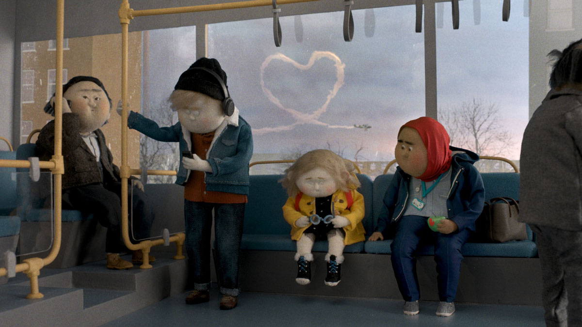
Hide and Seek: Annlin Chao, for MADE.com

“2020 is definitely a strange year,” reflects Taipei-born RCA graduate Annlin Chao, who has worked as an independent film and animation director since 2017 with clients including Channel 4, Twinings and the National Palace Museum Taiwan.

While many live-action productions have been put on hold, however, she points out that animation can still thrive in remote-working conditions. Having that second string to her bow has proved invaluable in a tough climate.

Chao drew on her own childhood for her Reimagining Christmas concept. “I believed deeply in the mysterious bearded man who flew through the sky to bring us gifts and happiness,” she recalls. “But the magic was gone when one year I accidentally found my presents at the bottom of my parents’ wardrobe.”

Annlin’s heartwarming concept brought a fresh and unexpected perspective to our brand. It captured the excitement of being at home in the run-up to Christmas

While she felt only disappointment at the time, looking back Chao reflects fondly how much effort her parents put in each year, and how it was their love that provided the magic. She chose the brand that best fitted that sentiment: “MADE.com delivers inspiring designs that are also warm and gorgeous,” she explains. “It’s the spirit of Christmas, as I wanted to tell it.”

Pinterest’s video ad format offered the perfect opportunity to tell a compelling story, and Chao developed a series of storyboards based on ‘hide and seek’ stories. Parents try to keep their children’s gifts a secret, with MADE.com furniture serving as ideal hiding places.

“Annlin’s heartwarming concept brought a fresh and unexpected perspective to our brand,” says Ray Murphy, Head of Content at MADE.com. “It captured the excitement of being at home in the run-up to Christmas, and the lengths parents go to in order to surprise their children.”

“Christmas is about love and reunion, which we eagerly need in 2020,” Chao concludes. “I don’t think I can go back to Taiwan this year, and I miss my family more than ever. I’ve tried to capture some of that love in my campaign.”

pinterest.co.uk/annlin_mation; pinterest.co.uk/annlin_art; pinterest.co.uk/annlinchao

The One That Got Away: Anna Wanczyk & Eleanor Calsy-Harrison, for Birds Eye

Both recently freelance, Anna Wanczyk and Eleanor Calsy-Harrison first met at London-based design studio Magpie, where Wanczyk was head of design.

Calsy-Harrison took voluntary redundancy in the summer, which she found “both liberating and terrifying” without a safety net. Having made the leap less than a year earlier, Wanczyk didn’t qualify for any government support – so a steady stream of work was essential.

Although they hadn’t worked together since Magpie, the duo teamed up after spotting Reimagining Christmas on The Dots. “It was great to immerse ourselves in something positive for a couple of days,” says Wanczyk.

It’s far from certain what Christmas will look like as cases continue to surge, so for their Birds Eye concept the duo sought an idea that could work in any scenario. “There’s always going to be that pesky pea that manages to escape your plate, and that need to get away is something we can definitely relate to,” she smiles.

After researching festive content on Pinterest, including popular Christmas searches, they developed a bold, cut-out style that could stand apart from it all. “It’s not got the usual Christmas feel,” admits Calsy-Harrison. “But it’s not your usual Christmas.”

In the face of likely restrictions preventing large family groups coming together for Christmas dinner, the campaign captures the playful spirit of the season through Pinterest’s standard video ads and static Pins, although there are rich opportunities for the idea to expand across maximum-width video and carousel formats too.

“When browsing Pinterest for Christmas inspiration, you’ll find ‘Peter the Pea’ in all sorts of festive scenarios: nestled in a box of baubles, peeking from the mistletoe or rolling out from grandad’s new slippers,” concludes Wanczyk.

pinterest.co.uk/annawanczyk; pinterest.co.uk/ecalsyharrison; the-dots.com/users/anna-eleanor-848400

#NeverTooOldForChristmas: Alanna Proctor, for Sony Music

Alanna Proctor has been passionate about photography from a young age. While studying Fine Art she fell in love with the 35mm format, influenced by photographers Ryan McGinley, William Eggleston and Olivia Bee. “I was enchanted by how they captured their life in such a pure way, whilst portraying this beautiful dream state,” she says.

When Proctor saw Sony Music was participating in Reimagining Christmas, she leapt at the chance to combine 35mm photography with her other deep-rooted passion: music. “Both can capture moments and memories, and I wanted to explore tying them together with Christmas,” she says.

Inspired by her grandfather – who has spent most of the pandemic alone, reminiscing over his favourite songs and memories – Proctor found her solution: a series of 35mm photos documenting a family at Christmas, listening to music in their own way, sparking emotions about the past, present and future.

“My campaign feels like a family photo album,evoking those warm, cosy, and feel-good feelings that we experience when spending afternoons with family, around the Christmas tree,” she continues. Using Pinterest’s carousel format, people can flick through the images and be inspired to head over to the playlist and start making their own memories.

Paper Planes: Laura Fluture & Carina Toma, for British Airways

Laura Fluture started as a planner, then a copywriter, and finally group creative director at Romanian agency Kubis. She teamed up with art director Carina Tomina to tackle a Reimagining Christmas brief for British Airways.

Bringing an airline front of mind at a time when overseas travel has been pared back to the minimum proved a challenge. “The trick is to make people think of planes even if they’re not travelling,” adds Fluture.

“Before writing down the idea, we brainstormed on what our headline would sound like,” she recalls. “We found the perfect one: ‘Planes fly. So do wishes. Make sure they have a destination.’ From there, everything made sense.”

“The perfect Christmas present says how you feel about someone,” continues Tomina. “And the most common present is the Christmas card, which can literally say a lot.”

The solution: Paper Planes by British Airways, a way of encouraging people to reinvent their Christmas cards as paper planes, with their loved ones as their destinations. Contextual placement of video and carousel ads on Pinterest brought the concept to life.

“Pinterest is a platform about planning your future. Our idea is about planning something that you can do with your own hands for the following Christmas,” explains Fluture.

“The idea was so simple that it was easy to adapt once we learnt all the Pinterest formats: step-by-step instructions on how to reinvent a card as a paper plane, based on your ‘destination’: mom, dad, bro, sis, lover, BFF and so on,” she adds. “After all these steps, why not recommend a British Airways destination that suits them both?”

ro.pinterest.com/carinatoma1044/; the-dots.com/users/laura-fluture-322568; the-dots.com/users/carina-toma-toma-832287

It’s All About the Little Things: Andy Poyiadgi, for Birds Eye

As a freelance film and video director who relies on live-action shoots for work, 2020 has been tough for Andy Poyiadgi. “The biggest challenge has been exploring new career possibilities: it’s terrifying, but also a bit exciting.”

When Poyiadgi read a “rousing post” about Reimagining Christmas by The Dots founder Pip Jamieson, it felt like an ideal opportunity.

“I chose Birds Eye Peas because I love peas, and I also think they embody the spirit of what’s important this Christmas: the little things,” he explains. “I loved the freedom of the brief, the chance to craft something, and perhaps to move in a new direction. Oh, and the excuse to eat more peas.”

The humble pea took centre-stage in the campaign. “My initial idea was to portray this Christmas as a downsized affair,” Poyiadgi reveals. “I pitched the idea of heart-warming festive moments featuring peas instead of people.”

His next challenge was creating appropriately festive scenes on such a small scale. “Initially I intended to make tiny sets and furniture. In the end, I opted for real peas (photographed on my dining table) and hand-drawn illustration,” he explains.

Finding the right tone for the captions proved tricky, but Poyiadgi is happy with the final outcome. “I wanted them to have a bit of wit, a bit of warmth, and to hopefully resonate with the audience,” he says. “Pinterest is a place to find inspiration, so hopefully this campaign will inspire not just some heart-warming pea recipes, but also the way we approach this Christmas.”

pinterest.co.uk/andypoyiadgi

For more visual inspiration on creating compelling brand stories for Pinterest, check out the Creative Strategy board which celebrates iconic brand campaigns on the platform. Explore all the tools at your disposal for creating on Pinterest with the Creative Agency guide

The post Five creative ideas that reimagined Christmas for top brands appeared first on Creative Review.


from Creative Review https://ift.tt/2K0AH1A

Pentagram gives banking a fresh face in Virgin Money rebrand

There has been a movement among traditional financial institutions to adopt a more human persona in recent years – largely thanks to younger, cooler challenger banks like Monzo and Starling snapping at their heels.

Recent examples of this shift in tone include Natwest’s launch of millennial-friendly digital banking service Bó, and First Direct’s new brand positioning that focuses on financial wellness.

It is in this context that Virgin Money unveils its new brand identity, which comes off the back of its merger with CYBG plc, formed of Clydesdale Bank, Yorkshire Bank and B products and services.

Virgin Money approached Pentagram’s Luke Powell, Jody Hudson-Powell and Domenic Lippa to create a fresh look to go with its new proposition, as a brand that shares Virgin’s core values but happens to be in banking, as opposed to a financial brand that happens to be part of Virgin.

The new identity looks to move the brand firmly away from the often faceless, corporate look favoured by many financial services companies, and reflect a customer-focused approach to banking.

The design team created a bespoke mono-linear wordmark, with the wider Virgin Money headline font family being built from this geometric logo.

The Virgin Money ʹMʹ and its distinctive loop is a key feature of the wordmark, and a stacked version of the logo is used for applications where users are already familiar with the brand, such as in stores, on bank cards or existing customer communications.

A bespoke typeface was created by Luke Prowse and comprises two distinct cuts, Virgin Money Sans and Virgin Money Loop, to allow the brand to adjust its visual tone of voice.

“The overall construction is a balance of geometric curves, nuanced humanist forms, and hard edges and angles, creating a visual form that references Virgin Money’s functional and pragmatic side while embodying its people-centred approach,” says Pentagram.

The instantly recognisable Virgin red is used as the brand’s primary colour, alongside a secondary colour palette of bright blue, purple and white.

Pentagram also created a distinct and and more sophisticated visual language for its business banking sub-brand, Virgin Money Business. It features a reduced usage of the looped typeface, a lighter version of the Virgin Money pattern and a more streamlined colour palette of charcoal and bright lime.

pentagram.com

The post Pentagram gives banking a fresh face in Virgin Money rebrand appeared first on Creative Review.


from Creative Review https://ift.tt/2Is8GPC

magCulture Live goes virtual for 2020

In what’s been a difficult year for the magazine industry, print fans can rejoice at the news that magCulture’s annual conference is still going ahead – albeit in virtual form this time around.

Following on from magCulture Live Online, which replaced its New York conference earlier this year and featured the New York Times Magazine’s Gail Bichler and Jaap Biemans of Coverjunkie, the eighth London edition of magCulture Live sees the event shift online for two days of magazine goodness.

The days are divided up by theme, the first of which focuses on activism. It will include talks by critic Steven Heller on the historic power of magazines as platforms for change; Maya Moumne of Beirut-based Journal Safar, who will discuss the publishing scene in the Middle East; and London art director Sachini Imbuldeniya, who recently founded diversity-focused illustration and photography agency Studio Pi.

Day two is all about analogue, and will see talks by graphic designer and art director Kurt Koerpel about the reinvention of Interview Magazine and how his work on small run zines has influenced that, and OOMK’s Rose Nordin on how the publication’s Rabbits Road Press project has empowered people outside the creative industries to have a voice. Meanwhile, Jack Self of Real Review will be discussing the meaning of Nishant Choksi’s vivid face illustrations, which have appeared on the front cover of each issue.

The line up also includes two keynote speakers, the first day featuring Empire editor-in-chief Terri White, who will explain how her magazine has kept the flag flying for films despite the paralysing effect of the pandemic on the movie industry.

On the second day, Atlantic creative director Oliver Munday will be discussing the process behind the recent redesign of the magazine, and how it has helped reinvent one of America’s premiere news titles during a particularly turbulent year.

MagCulture Live is on from November 18-19. Tickets cost £60 per day or £90 for both days, or £45 and £60 for students, and are available here; magculture.com

The post magCulture Live goes virtual for 2020 appeared first on Creative Review.


from Creative Review https://ift.tt/3lq8WNw

Feast your eyes on the complete works of Dieter Rams

Dieter Rams: The Complete Works takes readers right back to the beginning of the designer’s career and his earliest surviving work – a sketch of a Z-shaped chair drawn by Rams in 1947 (a scale model of which was only made in 1952). From there the book traces the development of the designer’s career, from portable radios and pieces of furniture through to the iconic Braun and Vitsoe pieces he’s known and loved for.

Each design is accompanied by a short description, which delves into the back story of the piece as well as the materials used. The chronological arrangement allows readers to see the gradual emergence of Rams’ distinctive minimal approach – which has been a major influence for designers and creatives of all kinds, not least Apple’s Jonathan Ive.

Rams has written an introduction to the book, which delves a bit deeper into his own design philosophy. “Design is not just about the formal design of our Dingwelt, our ‘world of things’, it determines the life of every individual and how we all live with one another,” he writes.

Top image: HLD 6, 1971, Hair dryer, Jürgen Greubel, Dieter Rams, Braun; Above: Dieter Rams: The Complete Works, Klaus Kemp, Phaidon; T 3, 1958, Pocket radio, Dieter Rams, HfG Ulm, Braun
Mono radio-phono combination, Dieter Rams, Hans Gugelot, Gerd A Müller, Werkstatt Wagenfeld: Ralph Michel, Helmut Warneke, Heinz G Pfaender, Braun;
HLD 4, 1970, Travel hair dryer, Dieter Rams, Braun

The essay questions the potentially damaging influence of design, and the responsibility designers have. Rams recommends designers ask themselves difficult questions about whether the product they’re creating is necessary, and whether it improves lives or merely boosts status.

He writes: “Is it repairable? Is it durable? Easy to use and flexible in its use? Can I master it easily or does the new product dominate me? That last question is one I find particularly relevant today. The primary insight I have gained in my 60 years as a designer, and through my experiences with both companies and end users, is a simple one: ‘Less, but better.’”

There’s plenty more pearls of wisdom in his introduction, which feels very much a timely response to current conversations around waste and sustainability. And for those that want to delve further into Rams’ career, there’s also an essay by art historian Klaus Klemp that explores the designer’s influence.

Dieter Rams: The Complete Works, Klaus Kemp, Phaidon; 606 Universal Shelving System, (RZ 60), 1960, Shelving programme, Dieter Rams, Vitsoe+Zapf / sdr+ / De Padova / Vitsoe
All product photography: Andreas Kugel, © copyright Dieter Rams Archive

Dieter Rams: The Complete Works is published by Phaidon, priced £39.95; phaidon.com

The post Feast your eyes on the complete works of Dieter Rams appeared first on Creative Review.


from Creative Review https://ift.tt/2JX3zYp

Wednesday, November 11, 2020

Coca-Cola’s Christmas ad is an epic struggle against the elements

Certain themes are emerging in this year’s set of Christmas ads, with many brands opting to highlight the importance of family and togetherness in what has been a truly challenging year.

In this new Coca-Cola ad, created by Wieden + Kennedy London and directed by Taika Waititi, we see this notion taken to extremes as a father is shown battling, with Bear Grylls-style levels of endurance, to deliver his beloved daughter’s letter to Santa.

And boy does he battle, crossing oceans (complete with a giant whale), climbing mountains and enduring icy temperatures to complete his quest. Things get so extreme that I half expected the audience to be required to interact with his mission in the style of You Vs Wild and force him to eat reindeer poo to survive.

But more seriously, the sweet pay off at the end of the ad – where the iconic Coca-Cola Christmas truck makes an appearance but family steals the show – manages to shift it from the beautifully-shot-but-ridiculous into something genuinely heartwarming. And an epic battle against nature to get home for Christmas also seems a fairly apt metaphor for how things are playing out so far in 2020.

Credits:
Agency: Wieden + Kennedy London
Director: Taika Waititi

The post Coca-Cola’s Christmas ad is an epic struggle against the elements appeared first on Creative Review.


from Creative Review https://ift.tt/3nfvAZv

Burberry’s choreographed ad sidelines the Christmas schmaltz

Hot on the heels of partnering with footballer and activist Marcus Rashford to fund youth centres in the UK, Burberry has launched its new festive campaign, which features a choreographed fashion film celebrating the brand’s heritage and what it means today. The ad was produced by RiffRaff Films and was created in collaboration with directing quartet Megaforce and choreographed by dance collective, (La)Horde.

Unlike many ads this time of year, the film eschews the wholesome schmaltz and cheesiness for something a little more contemporary by capturing dancers Kevin Bago, Robinson Cassarino, Chantel Food and Zhané Samuels elegantly sidestepping giant icy blocks in synchronised fashion down London’s Petticoat Lane. 

Dressed head to toe in the heritage label’s latest collection, the spot is a nod to the 1950s classic film, Singin’ in the Rain. “We found the idea for this film digging through Burberry’s history. The founder, Thomas Burberry, created innovative weatherproof clothing that was used by polar explorers, which gave us this idea of a story that saw its characters braving the elements with ease,” explains Megaforce.

“That iconic scene from the film Singin’ in the Rain came to our minds so we wanted to draw inspiration from it and make a version that speaks for our times. This year has been tough for us all, so we wanted to push the metaphor and transformed the rain to ice blocks. We also changed the narrative from a single character to a group of friends because going through adversity is a thing that we’d better do together.” 

Matthew Fone, founder of RiffRaff films adds: “The most pleasing thing for me about this collaboration is how Megaforce took the brief of capturing what Burberry stands for today alongside its prominent heritage; and made a festive film that encapsulates the notion of both, in a simple metaphor of adversity in their own, inimitable way, no baubles.” 

Instead of baubles are falling blocks of ice, which were created by visual effects company MPC, and help add to the playfulness of the ad. “The film showcases our ambition to challenge the ordinary and push the boundaries of remote post-production,” says Alex Lovejoy, creative director at MPC.

“A key element was building the falling ice blocks – to do this successfully it was essential to capture data on set, so we took detailed photogrammetry of the streets and referenced real ice blocks shattering. This was used as the base for our CG so that it could be synchronised exactly with the live action. We are all incredibly proud of the final film, which was a lot of fun to create.”

The spot is accompanied by a campaign shot by Rafael Pavarotti, featuring Manchester United player Marcus Rashford, as part of his new partnership with Burberry to combat child hunger and poverty. The brand has also committed working with a range of local and global charities as a part of this campaign including London Youth, Manchester’s Norbrook Youth Club and Woodhouse Park Lifestyle centre, the Wide Rainbow Partnership, and the International Youth Foundation.

Credits:
Agency + Production: RiffRaff Films
CCO: Ricardo Tisci, Burberry
Directors: Megaforce
DOP: Katelin Arizmendi
Post Production: MPC
Choreography: (La)Horde
Sound: Sam Ashwell, 750mph
Music: Twenty Below Music

The post Burberry’s choreographed ad sidelines the Christmas schmaltz appeared first on Creative Review.


from Creative Review https://ift.tt/2UiujVj

Queen Rules brings analogue craft to game graphics

The game challenges players to work their way through 156 levels of number puzzles, all watched over by the floating heads of various clay figures. One user has described Queen Rules as “sort of like Sudoku – on shrooms”.

The characters are all created by Larissa Honsek, a Berlin-based artist who’s been working with clay for the last nine years. She made all of them by hand, sculpting elaborate crowns, jewelry and hairdos for Queen Rules’ cast of royal characters.

It’s Honsek’s first game project, with the artist spending around eight months on the project. She says that characters usually took a day or two to design, build and finish in post-production, while the game’s more complex clay worlds took a couple of weeks to complete.

Red Lab has experimented with non-digital graphics before, previously developing a game made entirely using paper. “I was always fascinated by the blend of digital and the real world,” co-founder and partner Stefanie Palomino told CR. After searching for “the most astonishing and unseen characters”, the studio stumbled on Honsek’s work, feeling that it would create a more emotional attachment with people.

“The game market is over-flooded with the same aesthetics and gameplay (everybody copies everybody) and we really wanted to go for something different,” explains Palomino. “Choosing the colour palette was also very important for us, we wanted to run away from flashy and high contrast tones.”

Queen Rules is available via the app store, priced £1.99; queenrulesgame.com; instagram.com/larissahonsek

The post Queen Rules brings analogue craft to game graphics appeared first on Creative Review.


from Creative Review https://ift.tt/3eR0kNM

IOC designs Solari workstation in collaboration with Gensler

Dezeen Showroom: trestle legs and a customisable, J-shaped privacy screen distinguish the Solari desk system, developed by Italian office...