Thursday, April 30, 2020

Lia Kantrowitz’s airbrush-style editorial illustrations embrace the surreal

New York-based illustrator and designer Lia Kantrowitz describes her editorial work as loud and cartoonish all in an airbrush style. Her client list is impressive and includes the likes of The New York Times, Bloomberg Businessweek, Working Not Working and many others. 

Day-to-day, Kantrowitz works at Vice as a senior editorial designer where she illustrates header images for articles, as well as playing a key role in art directing and commissioning for the website. “It’s nice to have a hand in diversifying the site and expanding the community of artists we work with,” she says.
   

When she’s working on freelance projects in her spare time, Kantrowitz has gravitated towards editorial commissions as they keep her on her toes a bit more. “I like that they keep me informed with subjects I might not have otherwise read about, and challenges me to be more conceptual,” she explains. “I feel like that has to be a good exercise for your brain. I love working on briefs that revolve around mental health, relationships, and drug research.” 

Kantrowitz keeps her creative process relatively simple when working on a new project. “Image research, reading, and music all help start the process for me,” says the creative. “Then I usually collage together a composition and draw from there. Pulling inspiration from old cartoons, ads and books, Kantrowitz’s images are pumped full of bold, garish characters and brilliantly lurid colours.

From inflatable tube men to computer-faced colleagues, there’s a touch of the surreal to Kantrowitz’s work which adds an element of surprise to her illustrations. “I like drawing things based on what’s going on with me at the moment and what I’m listening to, I reference lyrics a lot,” she says. “If I can throw in a looney tune or muppet, I’ll be extra happy.”

Kantrowitz does experience creative blocks, however. “Pushing through a creative block feels like banging my head against a wall,” she says. “Sometimes it lasts for a few hours, sometimes for a few days. I can’t really gauge what causes it, or how long I’m going to be in it.”

While she’s not worked on a huge amount of freelance projects since the world has adjusted to lockdown life, Kantrowitz has tried to maintain a positive outlook by keeping herself distracted with different projects and staying in touch with the people closest to her.

“Trying new recipes, video games and movies has given me some peace of mind,” she says. “Life hasn’t stopped, it’s just very different at the moment, so it’s important to make sure you’re taking care of yourself with what means you have.”

liakantrowitz.com

The post Lia Kantrowitz’s airbrush-style editorial illustrations embrace the surreal appeared first on Creative Review.


from Creative Review https://ift.tt/2KNZEdF

The Lowdown: how brands can use social during lockdowns

Rachael Steven (left) and Mobbie Nazir

The coronavirus crisis has prompted some creative, inspiring and heartfelt uses of social media – from the Clap for Carers campaign and Joe Wicks’ wildly successful morning workouts, to virtual nightclubs, live streamed-DJ sets and viral fashion challenges. With audiences spending more time on devices, there’s a huge opportunity for brands looking to provide support and entertainment – but there’s also a need to approach social content with caution and care.

In a live conversation for The Lowdown – a new content platform from Xeim brands including Marketing Week, Creative Review, Design Week and Econsultancy – we spoke with Mobbie Nazir, chief strategy officer at global creative agency We Are Social, about how brands can use social platforms to engage with audiences in a positive way while they’re stuck at home.

Listen below for advice on how brands can respond to changing demands and create standout content that is useful and relevant. We also discuss whether lockdowns will lead to a longer-term change in how brands and audiences view social platforms, and the new trends and formats that have emerged in the midst of social distancing.

This conversation is part of The Lowdown, a series of regular broadcasts from Xeim on how marketers, agencies and brands can help address the challenges brought by the Covid-19 pandemic. More info here

The post The Lowdown: how brands can use social during lockdowns appeared first on Creative Review.


from Creative Review https://ift.tt/2KLmmmG

Exploring the enduring influence of heraldry in design

First developed in the 12th century, heraldry was a practice originally reserved for medieval knights, and served a simple but practical purpose: to show who you were. At the time, a banner had to be simple enough for someone to read while on a galloping horse, for the outcome of misreading such symbology could (and often did) cost lives on the battlefield.

As a means of illustrating a knight’s achievements, the coat of arms quickly evolved into a status symbol that provided an insight into everything from family history and property to profession and occupation. Different crest designs also developed symbolic meanings: flowers had connotations around hope and joy, fruit signified bounty and peace and, depending on which animal you chose, you could emphasise character traits such as wisdom and loyalty.

Heraldry’s legacy hasn’t disappeared, however. The ancient practice’s influence lives on in a suprising number of today’s coat of arms equivalent: the logo. First published in 2015, Modern Heraldry: Volume One looked at the significance of heraldry in the wider context of nostalgic design and a return to analogue crafts such as letterpress. Here, we speak to Counter-Print co-founder Jon Dowling about releasing volume two of the book, and why it’s cool to care about heraldry.

Creative Review: Why did you decide to revisit the Modern Heraldry project?
Jon Dowling: It’s been five years since we first published Modern Heraldry: Volume One. It was an incredibly popular book upon its release and sold out very quickly. It had been on our minds for sometime that we needed to reprint it but I think enough time had passed for us to think we should, in fact, create a second edition.

It was a few years on from the first volume but the popularity of heraldry, it seemed, had not diminished. You still see it everywhere – from banks, train lines, schools and churches to universities, football clubs and societies – heraldry is still such a potent modern symbol.

CR: What sort of designs are included in part two?
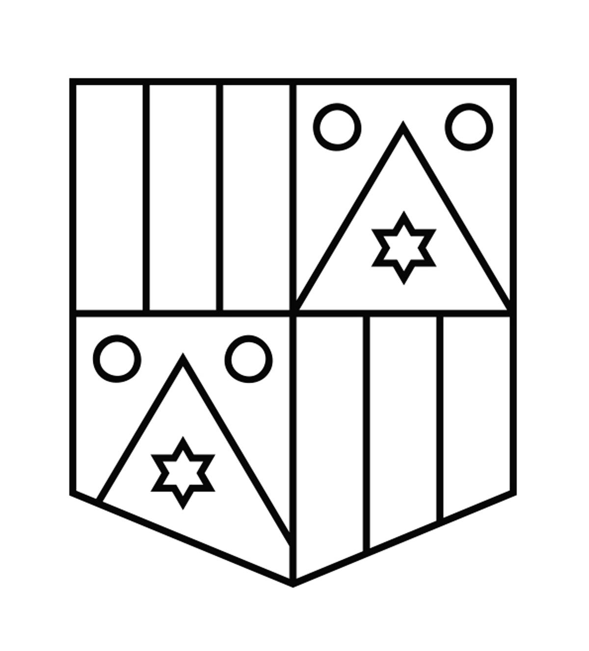
JD: For both books we grouped the trademarks under categories chosen for their heraldic connotations such as: shields, crests, stamps, seals, laurels, flags and crowns. There were many imaginative variations and combinations in every crest design that identified the particular carrier or owner of that crest. Each symbol was chosen for its meaning, and we can see a continuation of this with the marks contained within Modern Heraldry.

Today, each element of a herald mark can be subjective or literal. For example, sometimes the audience is asked to make visual leaps when elements are chosen to represent the geographical origins of a product or to read the marks literally when books are chosen for publishers, pens for copywriters and so on. We enjoyed exploring the marks, and thinking about the links between the original purpose of heraldry and the meaning invested in contemporary logos.

CR: Can you talk us through a few examples?
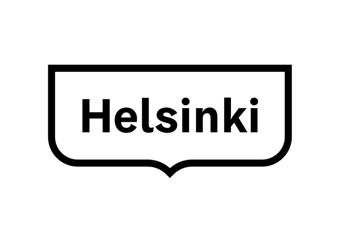
JD: Sometimes the contemporary heraldic designs still derive from the founder’s family crest. The book shows a number of modern renderings of centuries-old crests, as we see with FL@33’s crest for the Waldruche de Montremy family. Other times, as with Werklig’s work for the city of Helsinki, we see a design company repurposing elements of the area’s traditional crest to create something new. In both cases, this work is carried out to respect the past and create something modern.

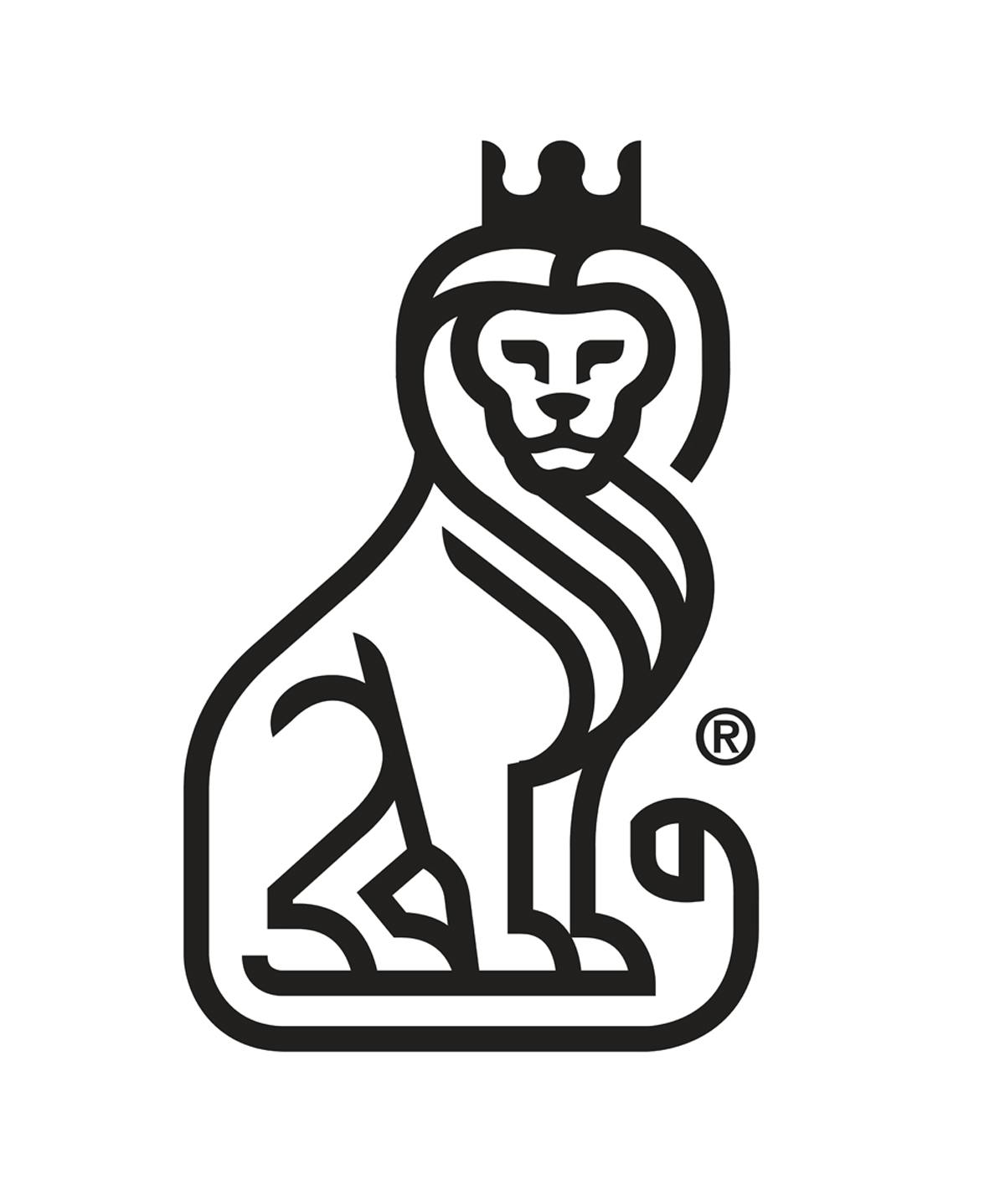
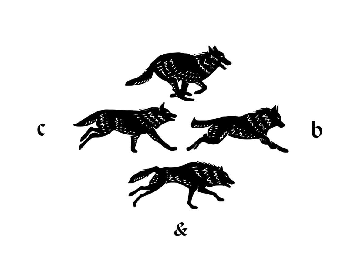
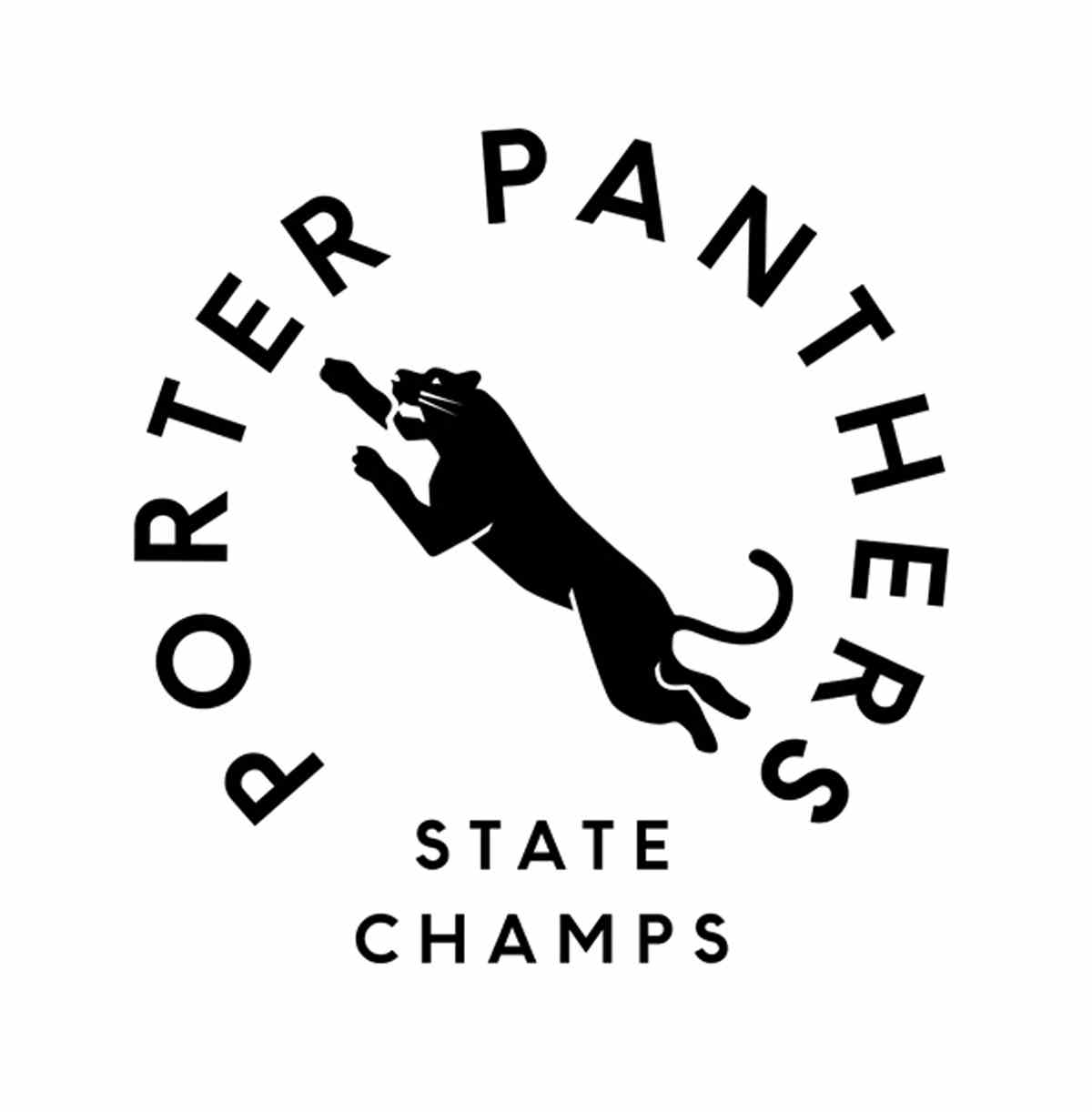
However, more often the examples in the book use heraldry in an attempt to convey a sense of respectability for a commercial venture. The treatment is often seen as a byword for dignity and dependability, with animals frequently used, such as lions to denote strength, pride and trust – as with Mateusz TurbiƄski’s mark for KMCC Accounting. Animals are also used in positions of combat for sports teams, such as Brandon Nickerson’s Porter Panthers volleyball mark. Wolves seem to be chosen for connotations of team work (as seen in Communal’s Cluster & Bosk logo for a film production company), owls for wisdom, foxes for cunning, while others represent traits such as wisdom, resourcefulness and loyalty.

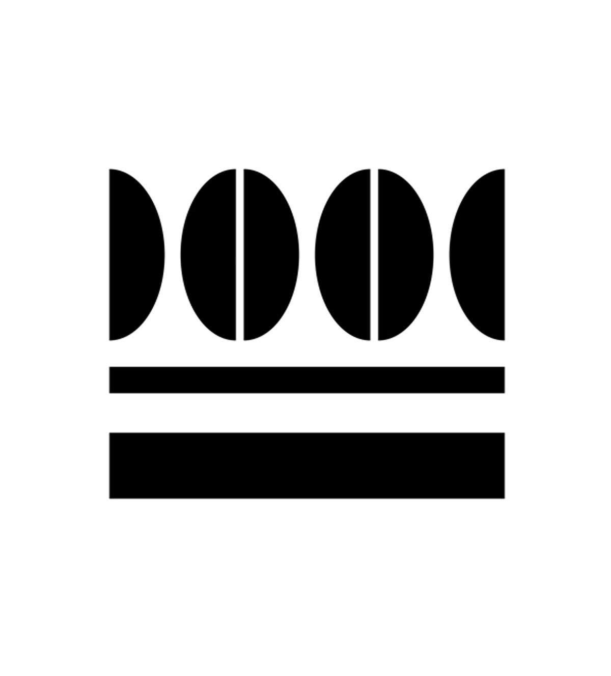
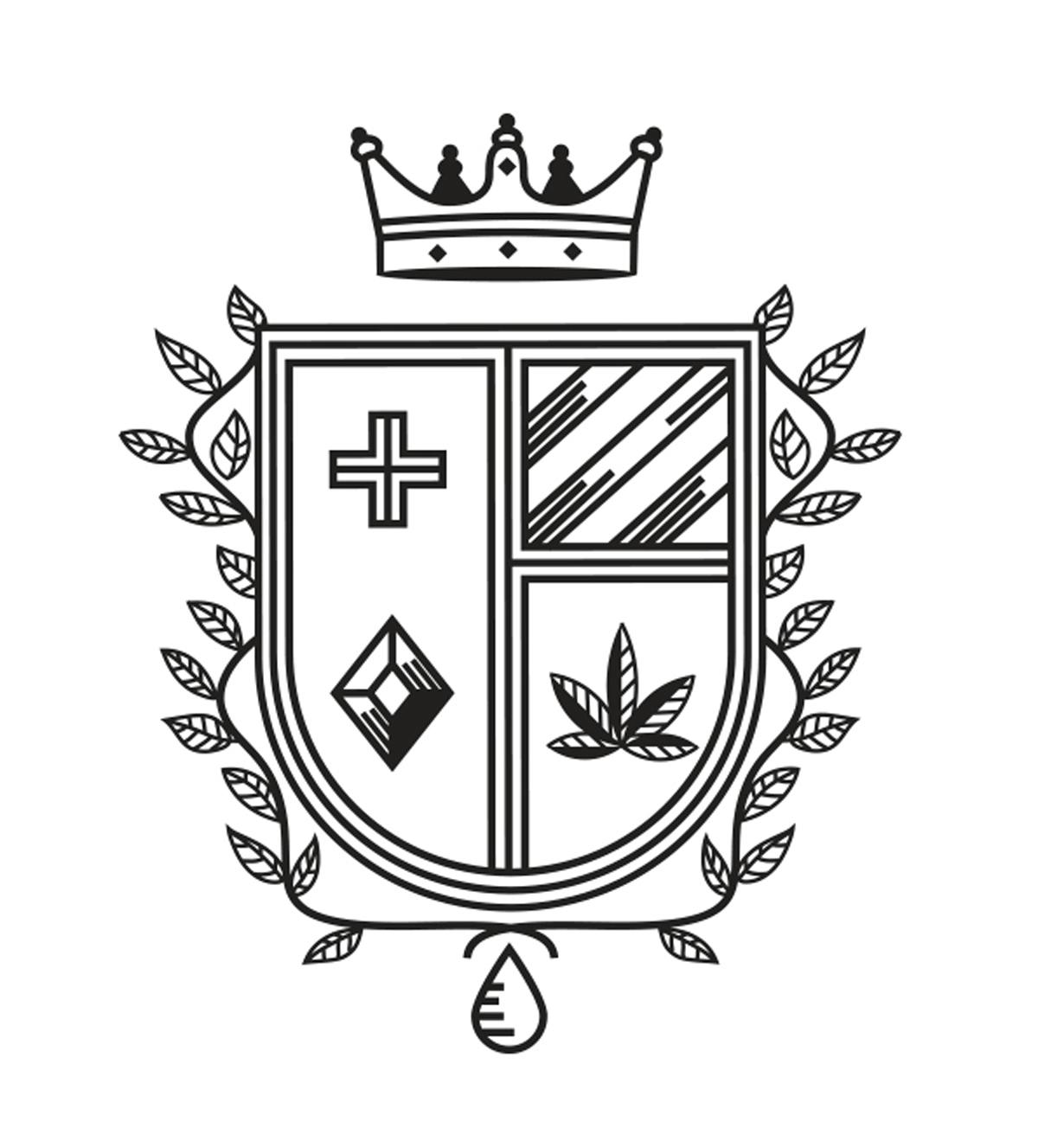
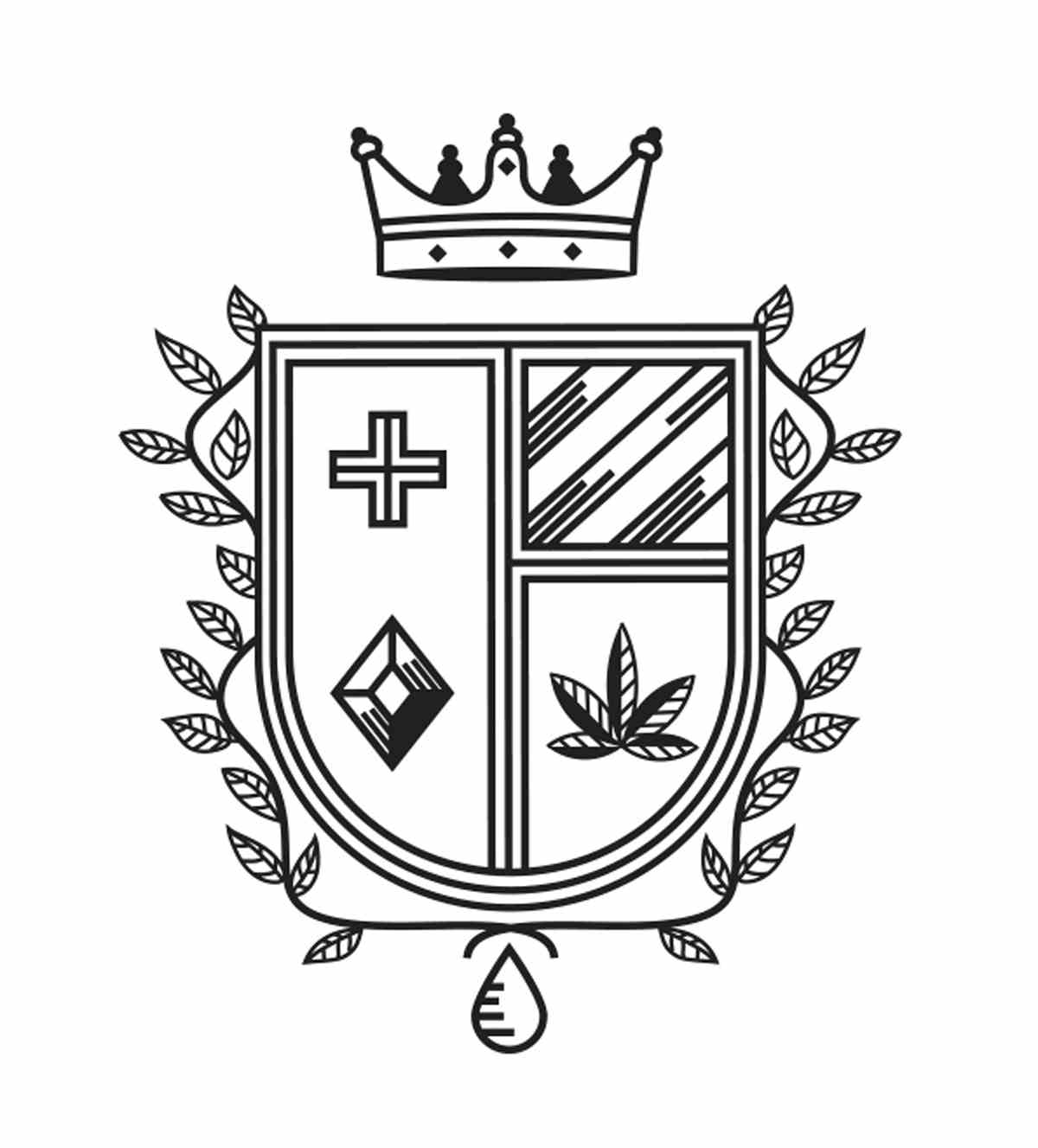
Crowns are often used to convey quality. This can be seen with Apus’ mark for Biji Coffee, which is injected with secondary meaning. It is both reminiscent of a crown, a nod to quality produce but, on second glance, also contains coffee beans – suggesting the produce the company is famous for. Heraldry is even sometimes used as a subversive tactic when establishing a modern identity, as we see with Saturna Studio’s crest designed for Passport, a company that sells cannabis products.

CR: Why do you think heraldry still has such a big presence in design and branding today?
JD: Audiences perhaps respond well to nostalgia, with many designers keen to capture the visual romance and history of a brand, or convey craftsmanship. Despite our modern obsession with technology, there has been a leaning towards craftsmanship and quality in what we choose to consume, in opposition to mass production and globalisation, and the style of the logos collected in this book reflect this trend.

This could be termed as a kind of ‘neo-nostalgia’, which many brands and designers turn to, creating modern marks that share historic, often heraldic, visual cues in order to convey a sense of respectability, dignity and dependability. This traditional aesthetic arguably resonates so strongly among brands and designers because it reflects the history behind brand-making. This can be seen both stylistically – before computers it was all handmade – and in its construction, with the laurel, shield, seal and crest chosen to display information.

CR: What do you think today’s creatives can learn from the design principles of heraldry?
JD: Today’s designers are, thanks to the web, lucky enough to be equipped with an encyclopaedic grasp of design history, and are able to use historical reference as inspiration. They are designing marks that intentionally counteract the highly-polished, digital-based logos associated with mass consumerism; turning instead to craft-based mediums such as hand-lettering, stamps, traditional symbolism and historic embellishment.

The combination of the old and the new, craftsmanship and technology, often creates a fertile breeding ground for innovative logo solutions and marks that are invested with layered meaning, as well as beautiful aesthetics. As ever, there is a much inspiration to be gained from looking to the past, exploring heraldry and the links we make between symbology and meaning.

Modern Heraldry: Volume Two is available to buy from counter-print.co.uk

The post Exploring the enduring influence of heraldry in design appeared first on Creative Review.


from Creative Review https://ift.tt/35rPQ2v

Woman Illustrates Funny Situations People Can Relate To In Her 37 Comics

The artist known as Sabincomics on Instagram creates colorful, funny, and relatable comics about everyday life. Most of you will probably relate to them on some level. She has about 14k followers and posts weekly. She also has a YouTube channel filled with drawing tutorials and explanations on how she creates her illustrations.

The artist touches all sorts of topics, like social situations, the struggles of being a girl, and, of course, the pandemic. "My comics are mostly inspired by my life and my daily routine!" the artist told Bored Panda.

More info: Instagram | youtube.com

#1

Image credits: sabincomics

We asked the artist what inspires her work, how long has she been drawing them: "My comics are mostly inspired by my life and daily routine. I started to draw since I remember myself and I always had a preference to create my own cartoon characters and drawing comics and later animations."

#2

Image credits: sabincomics

#3

Image credits: sabincomics

When describing her style she said: "I would say that it's in between modern and realistic cartoon styles, but I like to try all the different art and cartoon styles." She mentioned that creativity is a big part of her life and she creates 2 comics per week. She wishes that she had more time in a day so she could draw everything she wanted.

#4

Image credits: sabincomics

#5

Image credits: sabincomics

Since her comics are inspired by real life, she doesn't find it difficult to find inspiration for her work, because everyday brings new adventures she can illustrate in her comics. When asked if she had any tips for people just starting out, she had this to say: "Just start to create whatever you have in mind. Everything starts with an idea, so grab a paper and a pencil and start giving life to your ideas!"

#6

Image credits: sabincomics

#7

Image credits: sabincomics

"I study at Fine Arts University and my dream job is to create comics, animations, and art, or cooperate somehow with a big Animation Studio. Also I have a little secret to tell you... I have one more channel on Youtube called TIM (toys in motion). If you like check it out, I believe it will make you laugh." - said Sabin when asked about her job and hobbies.

#8

Image credits: sabincomics

#9

Image credits: sabincomics

Sabin shared with us the struggles she faces as an artist: "First of all, I have a struggle with the most strict judge...myself. And second, unfortunately, I don't have easy access to all materials I need and I want. I believe this last one is a struggle that every creator faces."

#10

Image credits: sabincomics

#11

Image credits: sabincomics

"Every day is a new challenge! This should not scare us, but give us joy because we will create something new. And please come to my page and channel, I need you all because you give me the strength to give you the best I have!"

Hopefully, these bright and cheery illustrations will brighten your mood and give you a break from your dull routine. Do you relate to any of the comics? What situations in your daily life would you like to illustrate? Tell us in the comments!

#12

Image credits: sabincomics

#13

Image credits: sabincomics

#14

Image credits: sabincomics

#15

Image credits: sabincomics

#16

Image credits: sabincomics

#17

Image credits: sabincomics

#18

Image credits: sabincomics

#19

Image credits: sabincomics

#20

Image credits: sabincomics

#21

Image credits: sabincomics

#22

Image credits: sabincomics

#23

Image credits: sabincomics

#24

Image credits: sabincomics

#25

Image credits: sabincomics

#26

Image credits: sabincomics

#27

Image credits: sabincomics

#28

Image credits: sabincomics

#29

Image credits: sabincomics

#30

Image credits: sabincomics

#31

Image credits: sabincomics

#32

Image credits: sabincomics

#33

Image credits: sabincomics

#34

Image credits: sabincomics

#35

Image credits: sabincomics

#36

Image credits: sabincomics

#37

Image credits: sabincomics


from Bored Panda https://ift.tt/2SpEqaf

Container Atlas editor picks top five shipping-container architecture projects

Container Atlas editor's picks

Container Atlas brings together examples of shipping-container architecture from around the world. Here, one of the book's editors picks his top five projects from the book's latest edition.

Han Slawik is the co-editor of Container Atlas – A Practical Guide to Container Architecture, along with Julia Bergmann, Matthias Buchmeier, Sonja Tinney, and by Lukas Feireiss and Robert Klanten for Gestalten.

A decade on since the first Container Atlas was published, the new and extended edition features 20 more handpicked examples of shipping-container architecture.

Along with floor plans, sketches and photos illustrate the whole range of buildings that have been created from shipping containers, from community centres to luxury homes, restaurants to retail spaces. The book also presents a comprehensive history of the origins and evolution of container architecture.

An engineer, architect and professor, Slawik has been an expert in shipping container architecture for decades.

Read on for Slawik's editor's picks:


Container Atlas editor's picks
Photo by Kyungsub Shin, from page 166 of Container Atlas, Gestalten 2020

Common Ground, Seoul, by Urbantainer and Office 53427

"This modern indoor market hall with an open market street is situated in a central location but inside a heterogeneous urban environment.

"The cubic capacity made of fitted freight containers was created quite fast and in a cost effective way. If required it can easily be dismantled.

"To me, this unit can seem slightly rigid. However, functionally and spatially it is consistent in container architecture. The ensemble is extremely popular with visitors because the inside and outside can be enjoyed alike, and the building fosters communication.

"These buildings also reflect the image of freight containers: internationality, standardisation, multi-functionality, and the transport of goods."


Container Atlas editor's picks
Photo by Tinney Kleusberg, from page 69 of Container Atlas, Gestalten 2020

Campus, the Netherlands, by Han Slawik for Architech

"This is my favourite project from the new edition of the Container Atlas, because it is the first container building made of steel.

"For the international architecture competition on 'temporary living' in 1986, Architech realised the first steel container buildings that were made of ISO freight containers. These unified the three important adjectives of container architecture of being mountable, demountable and remountable.

"The pitch is seen as the pioneering project of container architecture in Europe. During the pitching phase, the architecture studio experimented with construction and space. These first container buildings made of steel also served as the laboratory during the planning and construction phases.

"At the time, my studio Architech was still a rather small creative studio that was acting in an experimental manner. "


Container Atlas editor's picks
Photo by Johannes Grimme, from page 242 of Container Atlas, Gestalten 2020

Containerwerkstatt, Germany, by Grimme Architektur & MöbelwerkstÀtten

"This project is made of reused 12-metre-long containers.

"For this office building that can also house workshops, a simple interior fitting system was employed stating a container specific aura – puristic, minimised, reduced and therefore very cost-effective.

"Bridge fittings in the corners of the containers allow for quick and easy changes of the container configuration."


Joshua Tree Residence by Whitaker Studio
Image courtesy of James Whitaker

Joshua Tree Residence, unbuilt, by James Whitaker

"The Joshua Tree Residence  is one of the most exciting projects currently seen in container architecture in my point of view.

"The elaborate supporting structure is varying widely from the normal load of freight containers. The inside allows for different views in all directions and promises an extraordinary spatial experience – inside and outside. The contrast between nature and the building at this container project strengthens this effect.

"I hope that this project is going to be realised!"


Container Atlas editor's picks
Photo by Dave Southwood, from page 222 of Container Atlas, Gestalten 2020

Drivelines, South Africa, by LOT-EK

"These two connected super blocks in the city centre consist of recycled freight containers. They house compact unconventional apartments and some shops.

"The space in-between those invites for meetings and further development opportunities. From some angles, the facade could seem to serve merely decorative purposes. However, the facade can be very clearly seen, also from a distance."

The post Container Atlas editor picks top five shipping-container architecture projects appeared first on Dezeen.


from Dezeen https://ift.tt/2VQZnwK

"Our brick has pride of place in our meeting room so we can show it off"

If you won a Dezeen Award this year, how would you display your brick-style trophy? We got back in touch with some of the 2019 winners to share their "shelfies".

The trophies for Dezeen Awards have been designed by Dutch design studio Atelier NL since its first year. They are made by hand from London clay – the material used to make the traditional yellow bricks that are a defining characteristic of buildings across the UK capital.

This year, 45 more trophies will go to winners across categories spanning architecture, interiors and design, as well as to the three projects of the year selected from the pool of existing winners.

Enter Dezeen Awards before 2 June and start thinking about where you'd put your trophy if you win!


"Our brick has pride of place in our meeting room so we can show it off"

Shanghai, Hong Kong and Auckland-based architecture and interior design studio Linehouse, winner of emerging interior designer of the year, keeps its trophy in the meeting room, where guests can admire it.

"We have a few other awards on the shelves next to it but the brick stands out because the design and materials are so tactile and thoughtful", said co-founder Alex Mok, who is also a Dezeen Awards judge this year.


"It sometimes becomes a temporary one-minute-sculpture"

German studio J Mayer H, winners of the residential rebirth category with their project Casa Morgana, moves its trophy around the studio to remind everyone of Dezeen Awards.

"The trophy moves around the office, from here to there, and becomes a temporary one-minute-sculpture in combination with other objects", said Beate Quaschning.

"The composition is random and done by different people. The trophy travels to different departments and reminds the whole team of the Dezeen Awards."


"It reminds us of our dedication and commitment to design"

Vladimir Radutny Architects keep its trophy in the conference room, where it stands alongside other awards that the Chicago-based studio won in the past.

"The trophy sits on the shelves of our office conference room, as part of the display of work, process models and images of completed projects", explains founder Vladimir Radutny. "It's part of the collection of our achievements for the past 11 years."


"It is a position that will be noticed by visitors"

Japanese architect Katsutoshi Sasaki designed a 102-square-metre house for his family in Toyota, Aichi Prefecture, which won in the urban house category last year.

Sasaki and his family keep the trophy in the open loft space in their home, where it can be seen by visitors. He said that he felt "on top of the world" when he received the award.


"We keep it where everyone can enjoy it"

Amsterdam-based Studio Drift, which won designer of the year 2019 and lighting design of the year 2019, keeps its trophies in the studio's shared library space, where everyone can see and enjoy them.

"Our founders Ralph and Lonneke think that everyone won the awards, so they wanted to make sure that it is felt throughout the team", said Sarah Schulten of Studio Drift. "We also had the  certificates framed and they are hanging in Ralph's and Lonneke's Office."


"The trophy stands next to a Japanese lucky charm"

Japanese design studio Takt Project won emerging designer of the year at Dezeen Awards 2019. Founder Satoshi Yoshiizumi said that the trophy is kept in their Tokyo office.

"As you can see from the photo, the trophy is on the shelf together with our work and a rake, which is a Japanese lucky charm", said Yoshiizumi.

In Japan, decorated miniature rakes made of bamboo represent success, wealth and good luck.


"Located in the heart of our workplace"

London-based architecture and interior design studio Sevil Peach was crowned interior designer of the year 2019.

"The trophy is on the kitchen shelf which is part of the Studio", explains co-founder Sevil Peach."It is in the heart of our workplace visible to all, along with few much loved objects".


"All our guests ask about it"

Brazilian firm Laurent Troost designed a two-storey house within a campinarana, a forest characterised by small trees, and won rural house of the year 2019.

"The trophy is displayed on the main living room shelf among some other trophies, decoration items and architectural and art related books", said Troost.

"It is on display on that shelf because we are so proud if this important achievement and because of its special design, all of our guest do ask about it."

Laurent Troost is also a Dezeen Awards judge this year and will be assessing entries in the architecture project categories.


"Located in a prominent part of our studio"

Lorcan O'Herlihy Architects (LOHA) won in the housing project of the year category with their social housing building MLK1101 in Los Angeles, USA.

They keep their trophy where new clients and guests are sure to notice it.

"The award is located in a prominent part of our studio where we host new clients and visitors", said member of the studio Sinead Finnerty-Pyne.

"The display area features a selection of our recent publications and awards. We like the way that the raw brick material of the Dezeen Award compliments the off-the-shelf aesthetic of our plywood cabinets."


"The trophy blends in with the environment"

China-based architecture studio Atelier Liu Yuyang won hospitality building of the year with its XY Yunlu Hotel.

"We keep the trophy in our principal architect Liu Yuyang's office, together with other trophies and certificates. All of them are placed on a table beside the window, with a view on big trees and flowers. This clay made brick trophy blends in with the environment", explains Qiushi Kong on behalf of the studio.

"Although we don't have big shelves or fancy tables to display these awards, it is still a corner of glory, which represents the world's recognition and affirmation of our design work."

Enter Dezeen Awards 2020

You can enter Dezeen Awards 2020 until Tuesday 2 June, so you still have plenty of time to complete your entry!

If you run into issues or have questions drop us a line at awards@dezeen.com or visit our how to enter page for more information.

The post "Our brick has pride of place in our meeting room so we can show it off" appeared first on Dezeen.


from Dezeen https://ift.tt/3f3MYxh

British Sea Turns Tropical After Lockdown Decreases Pollution

While the novel coronavirus is ravaging across the globe and people are locking themselves up at home to avoid getting infected, the world seems to do just fine without us. We have seen the news from all over the world about animals invading cities and claiming it for themselves as people empty the streets, witnessed water in Venice go crystal clear, and welcome some of the wildlife back to its canals and many more examples of nature thriving.

This time, it’s Brits throwing some good news at us. Even though they are usually not the ones to brag about sunny weather and tropical coastline, it seems the lockdown has done some good to their coastline near Portsmouth.

Incredible drone photos show tropical-looking British coastline

Image credits: Solent News/Solent Sky

Even though most people never expect tropical-looking pictures of the seaside to be coming from the Brits, they did manage to surprise us this time. Mike Woods took these incredible looking pictures by flying a drone over Portsmouth. He was amazed to see usually murky waters azure blue and crystal clear.

The photos of azure blue waters were taking by flying a drown over Portsmouth

Image credits: Solent News/Solent Sky

Some people believe the sea around Portsmouth has cleared out to decreased pollution levels during the coronavirus lockdown. It’s not necessarily the case but the locals are happy about this change despite the possibility of it being temporary.

Usually murky waters most likely cleared out because of a decrease in pollution

Image credits: Solent News/Solent Sky

It could be pretty accurate since the color of the sea depends largely on how many particles are in the water, so the more it is affected by car pollution, boat traffic and other human activity, the more particles get into the water and changes its hue, making it appear darker and murkier.

Pollution levels dropped significantly in the UK due to the coronavirus lockdown

Image credits: Solent News/Solent Sky

Mike Woods, who took these aerial shots of azure blue seas near Portsmouth said: “There has been a lot of talk about the color of the water in the area recently and I think the perception is, nature is thriving.”

“It’s phenomenal. We’ve never, ever seen the water look this clear before, it’s lovely,” said Mike Woods who took these photos

Image credits: Solent News/Solent Sky

“It’s beautiful to see it and it looks like you are in a different country down there, it really does. It’s phenomenal,” he added. We’ve never, ever seen the water look this clear before, it’s lovely.”

However, the water could just appear cleaner with fewer people and boat traffic to disturb its stillness

Image credits: Solent News/Solent Sky

Looking at the prospects of maintaining the British coastline as tropical as it looks now, it would seem people should just leave it alone for good, not only during the lockdown as scientists explain that murky waters are caused by the concentration of particles in them.

These Google Earth images showcase how the British coastline looked before the lockdown

Image credits: Google Earth

Despite the good news about the tropical-looking British coastline, waters of Venice clearing out, and even ozone layer fixing itself, assuming that all the environmental problems of the world will fix themselves in a couple of weeks of human inactivity and will stay fixed is a little bit over-optimistic. It doesn’t mean we shouldn’t enjoy it while we can though!

The murkiness was most likely caused by car pollution, water traffic and human activity

Image credits: Google Earth

That’s what people responded to the photos


from Bored Panda https://ift.tt/2WggIhG

IOC designs Solari workstation in collaboration with Gensler

Dezeen Showroom: trestle legs and a customisable, J-shaped privacy screen distinguish the Solari desk system, developed by Italian office...