Pentagram has designed the identity for Virgin Money, a new bank from Virgin that seeks to “challenge the UK’s existing banking landscape”.
The project is a collaboration from Pentagram partners Luke Powell, Jody Hudson-Powell and Domenic Lippa. The identity also rolls out across rebranded physical locations.
According to the studio, Virgin Money wanted to position itself as a brand that “shares Virgin’s core values but happens to be in banking” as opposed to a “financial brand that happens to be part of Virgin”.
The new identity is a result of Virgin Money’s merger with CYBG plc (comprising Clydesdale Bank, Yorkshire Bank and B products and services), a multi-year acquisition that was finalised in October 2019.
Resisting the “faceless” bank identity
The identity also seeks to “make individuals and businesses feel happier about their money” while standing out from the many “faceless” banks and financial start-ups in the UK, Pentagram says.
The studio has created a mono-linear wordmark, with a distinctive loop in the M. The mark is a balance of “curves and hard angles”, the design team says, while its “subtle humanist details” aim to reflect the brand’s forward-thinking values and its people-centred approach.
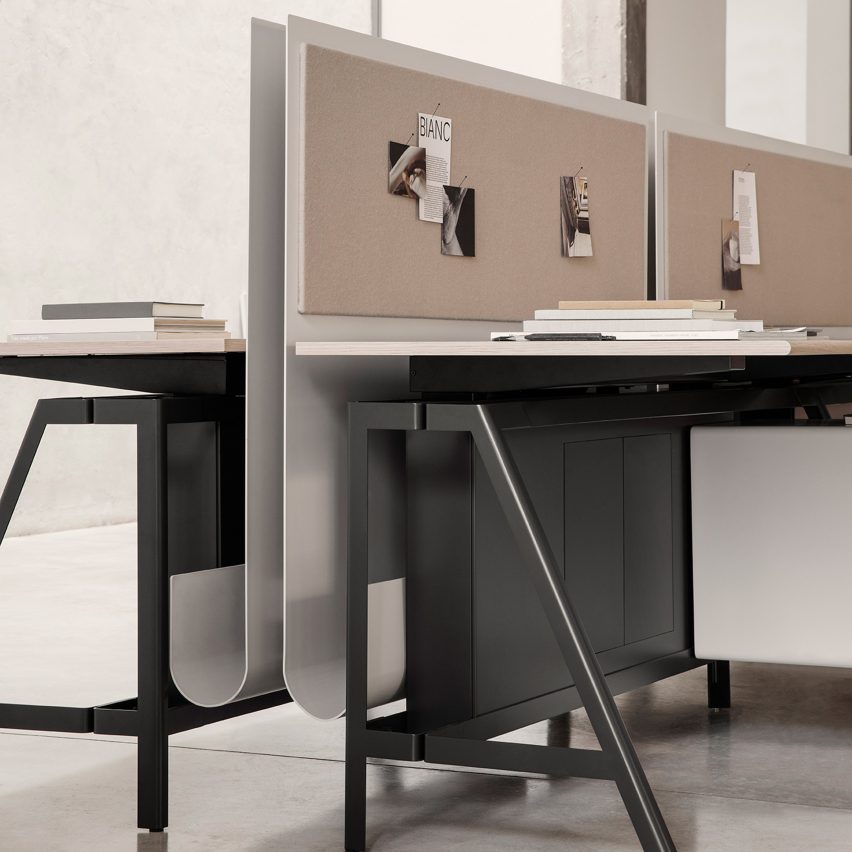
A stacked version of the logo can be used where space is limited, like on physical signage outside shops or on printed materials. It also appears on the bank cards which have been designed vertically.
Inspired by the wordmark, a bespoke typeface has been created: Virgin Money Sans. It has five weights – thin, light, regular, medium and bold – and has been crafted with “optimum legibility across a wide range of sizes and applications”, Pentagram says.
The studio adds: “The overall construction is a balance of geometric curves, nuanced humanist forms, and hard edges and angles.”
A second typeface has also been developed for the identity. Virgin Money Loop is a nod to the recurring brand loop and seeks to create a “sense of movement” for the identity, Pentagram says.
It also can give the “impression that the letter is created from a single line”, which the studio says is useful for when a word or phrase needs a “level of visual personality”. This can be customised further by adjusting the number of looped characters and ligatures.
A set of linear patterns based off the wordmark’s M are used throughout the identity. They can be used as a repeated visual element or overlaid on photography.
The “instantly recognisable” Virgin red has been used for the identity, while a secondary colour palette has been used to adapt to wider communications, which includes pink and blue tones.
As well as consumers, the brand also caters to business banking services and an adjusted version of the identity can be used for this. There is a reduced use of the Virgin Money Loop typeface, a lighter version of the looping pattern, and an alternative palette of charcoal and lime.
“An energetic and modern feel”
Virgin Money has also updated its app and website offerings and for this Pentagram has designed a new set of icons.
With their loops and geometric curves, these icons align with the other brand assets, according to the studio.
Virgin Money is also rolling out the identity to its new stores, which have been designed by IAM architects. Pentagram says that the “vibrant colour palette and large scale patterns give the spaces an energetic and modern feel”.
The Virgin Money Loop typeface has been used throughout to reinforce a “playful and informal” atmosphere in the locations.
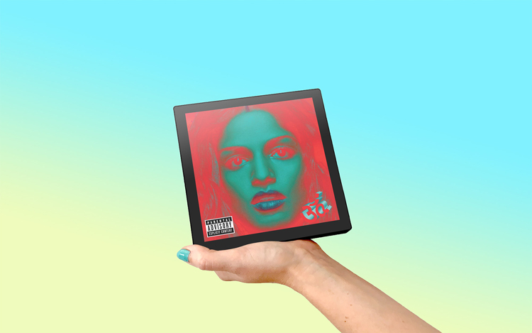
Musician and designer Tom Vek has unveiled plans for Sleevenote, a portable music player which hopes to lead “the digital album artwork revolution”.
Unlike most traditional music players, Sleevenote is square – designed to mimic a physical album. At 16cm wide, it is slightly bigger than a CD and just smaller than a 7” record sleeve.
It has a retina-standard touch screen which lets people view album artwork full-size as they listen, and there are playback buttons along the top. The device has Wi-Fi and Bluetooth so that it can connect to speakers, though you can also listen through headphones.
The product is being launched on fundraising platform Indiegogo with a target goal of just under £500,000. The project hopes to find 1,000 backers to put the concept into production (meaning that each device has a cost of around £500), with an estimated shipping date of October 2021.
Artwork gives albums “character”
Working as both a graphic designer and recording artist, Vek has designed the artwork for all of his albums. On the Sleevenote device and accompanying app, he has collaborated with Bryl co-founder and interactive designer Chris Hipgrave.
Artwork is so important to albums as it gives them their “character”, Vek tells Design Week. For example, the track listing found on the back of albums is like a “navigation for the record”. It helps listeners know where they are and tells the story of the album, according to the designer.
While Apple’s iPod helped to drive music into the digital age, its dimensions did not show off visuals in the best way, Vek says. Sleevenote meanwhile is designed to put the focus onto the album art.
The product also has a thickness to it which means it feels like a “hardback book”, the designer says. It can stand up on its own while concept images show it as part of a coffee table set-up.
This part of the design was about making the device a part of a social setting, Vek explains. He hopes that Sleevenote can recreate the act of flipping through someone’s record collection – a more enjoyable and less daunting proposition than choosing from an endless collection of music, he adds.
“It feels like the rug has been pulled out of designers’ feet”
As well as the design of portable music devices, details of album art can become lost in the digital age, according to Vek. He mentions how albums could previously have had “hidden tracks” but when they appear on iTunes, their title appears as “Hidden Track”.
“It feels like the rug has been pulled out of designers’ feet for the digital side of things,” he says. “Generally, there’s an apathy to digital products because control gets lost.”
Sleevenote would provide designers with a “blank canvas” to work with, Vek says, as the digital interface is a more accurate recreation of the physical artwork. In this way, it would do away with the “homogenous and uniform user experience (UX)” of streaming platforms, he adds.
How does the app work?
The Sleevenote device uses the app of the same name, which is available now for free and can be used on any iOS device. “It’s all about browsing exclusively via album art,” Vek says.
A pinching movement lets you zoom in on covers, while swiping right lets you interact with the tracklists. The emphasis is also on entire albums – there is no feature to make playlists at the moment.
While you can scroll through the album artwork of your current musical library, Sleevenote’s catalogue of interactive back covers and booklet art is currently at around 1,000. The app also has a function which allows fans and designers to upload their own album art for releases.
The app is also only compatible with Apple Music and music that people have uploaded themselves. Vek says that a partnership Spotify is in “active development” while he’s also interested in collaborating with Tidal.
The designer says he is also keen to work with Bandcamp, a platform which lets artists upload and price their own music for sale.
Stefan Sagmeister is trying to think long-term at the moment. The 24-hour news cycle – aided by platforms like Twitter – means it’s easy to only see “democracy in peril, ubiquitous conflicts and an overall outlook of doom”, he tells Design Week.
“As you know, short term media like Twitter and hourly news create an impression of a world out of control,” the designer says. But the opposite is true, according to Sagmeister, pointing to a global rise in literacy rates, fall in hunger and increased life expectancies.
It’s the thinking behind the graphic designer’s latest project – a series of reflective espresso and cappuccino cups and saucers for coffee brand Illy’s Art Collection. The cups have a mirrored titanium surface, which reflects the minimalist geometric graphics of the saucers. He hopes that “viewers might see them as reminders that the latest tweets are just blips in an overall rather good environment”.
As far as the current pandemic goes, Sagmeister is finding some comfort in the past. “If you look at pandemics from a point of view of 100 years, you will see that the Spanish flu killed 45m people, AIDS/HIV about 30m,” he says. “This of course does not mitigate the unbelievable one million humans that have lost their lives during Covid-19, but it does put the often-quoted view that we live in ‘unprecedented times’ into perspective.”
Sagmeister’s designs for Illy
Sagmeister’s current routine is well-suited to lockdown. He gets up at 6:30 and works out on his roof – using a virtual reality (VR) exercise app designed for the Oculus Quest system. “After being incredibly sweaty and a subsequent shower I’m normally in the studio by 8:30am, the commute being a spiral staircase up from my apartment,” he explains.
In his home studio on Manhattan’s 14th Street, Sagmeister has a “wide view over the New York skyline and a far view of itself”. He says he’s surprised at how much he missed those wide-open views when working in studios on 23rd Street and Broadway which provided only views of the streets.
Though New York is now home, Sagmeister was born in Austria and studied graphic design in his home country before leaving for America. After working for graphic designer Tibor Kalman’s M&Co, he set up his Sagmeister Inc. in 1993, where his diverse client list ranged from bands (The Rolling Stones, The Flaming Lips) to television networks (HBO) and cultural institutions (The Jewish Museum, The Guggenheim).
In 2012, he renamed the studio Sagmeister & Walsh after Jessica Walsh became a partner. Last year, it was announced that Walsh would form commercial studio &Walsh while Sagmeister Inc. would focus on self-generated design projects. At the time, Sagmeister stopped accepting all promotional, branding and advertising-related design work to concentrate on projects he finds more “meaningful”.
The Illy coffee cups fulfill this purpose, Sagmeister says, as they will hopefully “serve as a reminder that the latest negative tweet we see does not mean that we are living on the brink”.
By not accepting any traditional advertising work, he was also able to collaborate with designers remotely early on in the year. “So I was fully set up when the lockdown arrived in March,” he says. “This was not prompted by smart foresight but caused by pure luck.”
Sagmeister is known for taking a sabbatical around every seven years and not accepting any work in that period. It’s an appealing concept, though it won’t be affordable for many designers. And at a time like this, it seems all but impossible. Again, his long-term view might provide some perspective here. “I’ve kept a business diary for three decades and can clearly see that our studio made me happier in times when we produced good work compared to times when we were very profitable,” he says.
How does he think that working practices might change for designers more generally? “Tasks requiring complex equipment will still be completed in a physical space, while many other processes can be handled from a home office anywhere,” he continues. But over time, he believes that a “certain fatigue” will set in from working alone. “People will have a desire to work 2-3 days a week surrounded by their colleagues,” he expects.
As well as affecting daily routines, lockdown has put a stop to international travel. The designer, who has often found travel an inspiration to his work, says that he’s found solace in train rides to Philadelphia and Washington. “There’s always a fantastic possibility to let the mind wander while the landscape is flying by,” he says. “And it’s a fantastic space to come up with ideas.”
Sagmeister is known for his combination of art and design, most recently seen in his multimedia exhibition Beauty, accompanied by a visiual book. But he’s also branched into social media, finding an active design community on Instagram. Perhaps it’s not surprising that a designer known for headline-grabbing antics (designers at Sagmeister & Walsh posed naked for staff photos) would lend himself well to the visual platform.
To over 450,000 followers, Sagmeister writes reviews of design projects from around the world. Anyone is free to send in a submission to his email account. Unlike more traditional design criticism, Sagmeister’s writing is short – “the visual medium simply demands it” – and most comprise only two or three sentences.
He offers “constructive reviews” to the young designers sending in their work. Many other creatives also add their opinion in the comment section, again mostly with constructive feedback. “So far, cynicism, snark and aggression which are so prevalent on other social media platforms have been kept widely at bay,” he adds.
He picks projects according to the following criteria: “Am I able to give advice that improves the project? Is the project so delightful that it needs to be celebrated?”
Sometimes they diverge from design projects. At the end of October, Sagmeister posted about Alex Gibney’s investigative documentary Totally Under Control which took a critical look at the US government’s response to Covid. Sagmeister’s post included a photo of Donald Trump removing a facemask.“Sometimes I do pick a project I consider not successful, but only if it allows me to make an important point,” he adds.
In the week before the US election, Sagmeister admitted to having no “smart predictions” when it came to the result. “The elections scare even an optimist like me shitless,” he says. “Outside of that, I will continue to look at the world from the long-term perspective and will try to create work true to that.”
London studio Templo has created the identity for the UK Anti-Corruption Coalition (UKACC), which aims to reflect the organisation’s push for “openness, transparency and fairness”.
UKACC is an independent group which seeks to hold the powerful to account, including political leaders, corporations and parties with vested interests.
As its name suggests, the coalition brings together a variety of anti-corruption organisations in the UK and also internationally. Some of the NGOs it works with include Oxfam, Transparency International and Global Witness.
According to Templo, the biggest challenge for the identity was “communicating why corruption matters”. “The relevance of corruption and its negative impact is not immediately apparent in the same way as other causes,” the studio adds.
“Dialling up the action”
In light of the sometimes-abstract notion of corruption, Templo created an identity which “dials up the action, evidence-based focus of UKACC”, the studio says.
The logo features a cityscape reminiscent of the London skyline, with abstracted forms of recognisable buildings such as the Big Ben clock tower.
Templo founder Pali Palavathanan tells Design Week that it was necessary to show how pressure can be applied not only to financial systems but also political ones. “Hence why we introduced a simplified representation of the Big Ben clock tower,” he says.
The symbol also couldn’t be too “antagonistic” because UKACC works with government bodies in the hopes of achieving reform and accountability, the designer adds.
“Energy and edge”
A modern inktrap typeface has been used for the lock-up as a way to balance the visuals and provide “energy and edge”, Templo says.
Inktrap typefaces were traditionally designed for small-size printing. The letterforms do not have corners or details for so that when the ink spreads, the type stays crisp.
The typeface Whyte Inktrap has been chosen for the identity. “Using this typeface adds an additional level of transparency and legibility, which ties into the overall concept,” Palavanathan says.
A red, white and blue colour palette has been used for the identity which is a nod to the colours of the Union Jack and seeks to give the identity a “British feel”, the studio says.
“Corrupted, distorted and compromised”
Templo has also created a series of “glitched” images which aim to convey the effects of corruption, including photos of London skyscrapers and the Houses of Parliament. “The images themselves are corrupted, distorted and compromised,” the studio says.
More images, including a Big Brother-type eye and a Union Jack, have been recreated out of financial data such as currency symbols.
These assets (which can be used for digital and physical platforms) will be expanded upon as the brand evolves and grows, according to Palavanathan.
The identity will roll out on UKACC’s new website, social media platforms and on tools such as briefing and policy documents.
A diabetes-monitoring earring and air purifier inspired by the London Underground are among the shortlisted projects at this year’s Global Grad Show.
Hosted by Dubai Art Group, the year-round showcase brings together 100 new graduate projects which aim to have social impact in sectors such as personal health and the environment.
Airtomo air purification device
270 universities from around the world submitted a total of 1,600 projects for the second year of the competition. 2020 also marks a record 24 shortlisted projects from UK and Irish universities.
Two of the shortlisted projects will secure seed funding to help bring them to market. The line-up is now live and can be viewed as part of a virtual event on the Global Grad Show website.
Air purifiers and chlorophyll film
Concerns about the environment loom large for this year’s line-up, from reducing the effects of air pollution to designing more sustainable materials.
Kevin Chiam from the Royal College of Art (RCA) has submitted a wearable air purification device. Airtomo is inspired by the high levels of pollution in urban public transportation settings, such as the London Underground. The product can release atomised water to clean 167 litres of air every minute, according to Chiam.
The water vapour binds particles to form larger aggregates which fall to the ground and remove them from the air. It is aimed to be worn – you can attach it to your shoes or backpack strap. It can also be integrated into the built environment by being placed on a wall, for example.
Chlorophyll films from Shiyi Liang
A crop of material innovation also aims to prompt more sustainable production cycles. The Ventnor Brickworks from Imperial College produce construction bricks made of kelp while RCA’s Shiyi Liang has developed a chlorophyll film that could be used in small hold farming methods.
The international aspect of the competition means that projects often incorporate local solutions and target area-specific challenges. For example, Li Ping from the National University of Singapore has developed a packaging product that uses durian fruit (native to Borneo and Sumatra) as an alternative to materials like Styrofoam.
Meanwhile, at Uganda’s Mackerere University, Sande Jackson Mugenyi has created low-cost shoes made from recycled plastic bottles for school-girls walking long distances.
Wearable technology leads health category
Milli from Zachary Rigby
Health and wellbeing is another popular focus. Milli by Loughborough University’s Zachary Rigby hopes to reassure people who are deaf or hard of hearing when they sleep. Many people with these conditions live in places that are not equipped to wake them in the event of an emergency, according to the designer.
“This can be life-threatening,” Rigby says. Milli comprises a “smart bedside clock” which can be connected to an alarm and a vibrating under-pillow device. Through haptic technology, the product can wake deaf people not only during an emergency but also as part of a daily routine.
Sense gluclose earring from Tyra Kozlow
The Sense glucose earring from the University of Huddersfield’s Tyra Kozlow is a non-invasive blood glucose monitor which aims to help people manage type 1 diabetes. It connects with an app to alert people with diabetes about their current levels of blood sugar and sends them notifications.
Wearable technology and health is also the focus for Callum Leitch from the University of Glasgow with his project Monitum. When a seizure is detected through a sensor, the device vibrates behind the ear to alert the person to get themselves to safety.
Pause Pillow from Wonmo Yoo and Hyun Yeol Shin
Our growing reliance on smart phones, and how it affects us mentally, has inspired two international projects. From South Korea’s Samsung Art and Design Institute comes the Pause Pillow. The interactive pillow – designed by Wonmo Yoo and Hyun Yeol Shin – contains a pressure sensor which limits a phone’s network when people rest their heads on it.
Facel from the Higher School of Economics in Russia is a headset that aims to reduce stress and improve efficiency by monitoring parameters such as eye fatigue and concentration levels.
Covid initiative
This year, there was also a Covid initiative as part of the competition call-out. Four projects – including a device to make bleach at home and an app for Covid volunteering – are currently under consideration.
One has already advanced pilot stage. Imperial College’s Foresight is an AI system which processes clinical information about patients in intensive care units. Led by Sam Tukra, it was designed to be easily adapted to medical settings and use data that is usually commonly collected.
A temperature-based reflective paint and a portable cooking solution
The winning projects from last year are a reflective paint from SpectrumLab which changes colour based on temperature in the hopes of improving buildings’ energy efficiency and portable stove Safe Cooking which aims to provide an affordable solution for people whose current cooking methods are unsafe.
Studio Blackburn has designed the identity for the Sunderland Future Living Expo to represent “the city’s determination to look to the future”.
The Sunderland Future Living Expo will take place in 2023. The event aims to explore how the world will be living in the future, with a focus on greener and smarter housing area development.
It will take place on the site of the Riverside Sunderland neighbourhood, a district currently under development by the city council. In the run up to the 2023, a series of themed events will take place.
Naming the Sunderland Future Living Expo
Studio Blackburn founder Paul Blackburn has worked with Sunderland City Council on various projects over the past 10 years. The aim of this latest project was to ensure the expo felt relevant to the issues being faced by the UK at the moment, he tells Design Week.
The studio was first tasked with naming the event. Blackburn says the Sunderland Future Living Expo title was settled upon because the team felt it important to include the city at the centre of it.
“The other words, Future Living Expo, are all very positive, and we wanted to situate Sunderland with them,” he says.
“Sunderland’s confident sense of self”
As a mining and shipbuilding city, Sunderland is dealing with various post-industrial challenges. Blackburn says the aim was to create a brand that represented its future.
“This is an event that people around the world will be looking to, and we wanted the identity to mirror Sunderland’s confident sense of self,” he says, explaining why a confident but approachable tone has been used.
For this reason, Blackburn says the studio chose not to focus on the past at all in the branding. Sunderland’s involvement in shipbuilding and mining, and its continued presence in the field of automotive innovation means it has always been technologically advanced, he says.
“The heritage of the city has always been at the forefront of technological advancements and now is no different, so we wanted it to feel contemporary.”
“Blocky” letters
At the centre of the project is the expo logo, which comprises four “blocky” letterforms. The choice of logo was inspired by the blocks that make up neighbourhoods and cities, Blackburn says.
These letters have been designed to function also as a framing device. Blackburn says “as little as possible” has been removed from each letterform to allow the studio and event organisers to use the logo to “house pictures for different applications”.
“It will act as a kind of window into the future,” he says.
Alongside the logo and graphic identity, the studio has also developed the photography, animation, film, wayfinding and website for the event. The website, which launched last week, will be home to all the information and some events which will take place in the build up to 2023.
An educational app has been launched which aims to teach young people about black narratives by creating Augmented Reality (AR) statues of black figures and plaques honouring them.
History Bites has been initiated by UK charity Black Learning Achievement and Mental Health (BLAM) as a way to “teach young people about the individuals who fought for the freedom of black people”, the charity says.
Early in lockdown, BLAM UK launched a free online learning platform for people aged 6-16. London-based studio Landmark then reached out to develop a web-based app that uses AR to enhance the experience.
BLAM UK founder Ife Thompson tells Design Week that the app is an attempt to make “black narratives more attainable to all”. You can access the app here.
From the Bristol bus boycott to NASA
The app is web-based, available through scanning a QR code on your phone. There are currently six lesson areas, including the Bristol bus boycott and the contribution of black people to NASA’s space technology.
Each section has its own educational content (all created by BLAM) which includes lessons, podcasts and essays.
After the lesson, there is quiz with multiple choice questions. If you pass the quiz, you earn a badge and unlock one of the AR statues or plaques.
Using your phone’s camera, you can then place it into your surroundings, save the image and upload it to your ‘scrapbook’. It also logs it onto an interactive app so that you can see where other users have earned badges and unlocked statues.
“The omission of black people within this curriculum is harmful”
One of the app’s AR statues
History Bites was born from the desire to address gaps in an “overly Eurocentric” curriculum, the charity says. It adds: “The omission of black people within this curriculum is harmful, as black children nowadays do not have a full understanding of their history, culture and impact on the world.”
It hopes that the app promotes a “positive identity development”. Different learning styles have been incorporated including visual, auditory and kinaesthetic, according to Ife Thompson. She says that BLAM’s previous work on youth projects helped the team work out the most stimulating experience.
“We do not have enough statues of black people in the UK”
In-app screenshot
Conversation about statues in the UK reached a fever-pitch this summer after the toppling of slave-trader Edward Colston in Bristol. It prompted conversations about many British statues that have links to the slave trade and colonialism.
“We do not have enough statues of black people in the UK,” Thompson tells Design Week. “We wanted to teach young people under-celebrated black heroes and sheroes and narratives who remain whitewashed from our history.”
“We also wanted to showcase real-life black statues of those who fought for the human rights and dignity of black people to be restored and forever championed,” she adds.
Some of the AR figures are based on real-life statues while others are plaques (reminscent of the blue plaques seen across the UK).
“We wanted to bring this homage closer to the UK”
The interactive map
History Bite’s stories aim to diversify teaching through a long sweep of history. One of the lessons focuses on Mansa Musa, a West African Islamic political figure who ruled over Mali in the Middle Ages.
More contemporary events are also covered, such as the Bristol bus boycott. The 1963 case against the Bristol Omnibus Company resulted in the overturning of the company’s discriminatory employment policy: previously black and Asian people were not permitted to work for the transport company.
Other figures include former president of Ghana Kwame Nkrumah who led West Africa’s Gold Coast to independence from Britain in the 1950s.
“Many of the people have statues of them in their respective countries,” Thompson says. “We wanted to bring this homage closer to the UK.”
Who? NHSX is the National Health Service’s technology arm, which seeks to implement digital and data-driven solutions in healthcare.
What? This is the second round of funding being made available for its AI in Health Care Award. This latest round is particularly interested in products that are at phases three or four, meaning they are ready to support the first real-world tests in health and social care settings, or which need to generate early clinical safety and efficacy data. A range of areas in healthcare are projected to benefit from AI – from imaging and screening, to triage services and operational automation.
How much? In this second round of funding, awards are uncapped and given per product typically for 12-36 months. The total amount set aside for the three years in £140 million.
UKRI, Museums Association – Digital Innovation and Engagement Fund
Who? UK Research and Innovation (UKRI) is a public body of the government that directs R&D funding, while the Museums Association is a professional membership organisation working in the heritage and cultural sectors.
What? The two organisations are teaming up with creative design consultancy The Liminal Space to launch a new fund to support museums in starting, scaling up or evaluating innovations made in response to the coronavirus pandemic. The idea is to shape “a new cultural future”, according to UKRI had of public engagement Tom Saunders, and a special focus is being placed on engaging under-represented people and communities. A series of workshops will also be offered to complement funding.
How much? Grants of up to £50,000 will be awarded.
Who? The British Council is an organisation that specialises in international cultural opportunities.
What? The council is offering up grants for creatives looking to undertake internationally collaborative projects. The focus is on digital grants, and is an attempt to restart projects that were put on pause because of the pandemic, and begin new ones. Virtual conferences, exhibitions, online cultural archives and digital games have all been named as example ideas by the council, which is hoping that the scheme will help usher in a new wave of “sustainable” collaboration that doesn’t rely on air travel.
How much? Two levels of funding are up for grabs: 12 grants worth between £10,000 and £20,000, and 15 grants worth between £40,000 and £50,000.
Department for Transport – Accessibility-Technology Research and Innovation Grants
Who? The DfT is the government department responsible for overseeing the UK’s transport network.
What? As part of the DfT’s Inclusive Transport Strategy, the department is looking to transport solutions which remove barriers currently faced by people with additional needs. The grant programme is looking to fund at least three companies’ projects, which could significantly improve “access to services and confidence in travelling”. This could include projects that make it easier to access information, automate processes, or better support travellers and co-design in these fields is strongly encouraged. Projects looking for funding will need to have already been lab tested, ready for further development.
How much? Funding of up to £120,000 will be available for at least three companies.
Who? The Paul Hamlyn Foundation is an independent grant-making organisation which seeks to support people overcoming disadvantage, with a history of funding arts projects.
What? The Arts-based Learning Fund was developed to support pupils in formal education settings engage with the arts. It’s open to organisations that wish to engage with students in their particular field of creativity. The end result of this work could look like specific programmes to support a school’s needs or that is co-created with cultural organisations, for example. Funding is designed to be flexible, owing to the coronavirus pandemic and awards to organisations outside of London will be prioritised.
How much? Grants as high as £400,000 can be made, but most will be around £150,000 to £250,000 over two or three years.
Who? UK Research and Innovation (UKRI) is a public body of the government that directs R&D funding.
What? The Smart Sustainable Packaging Challenge aims to establish the UK as a leading innovator in the consumer packaging field. Prospective applicants to the challenge must deliver on the UK Plastics Pact, which seeks: a more circular packaging value chain, improved communication techniques to increase recycling rates and more consistent data on supply chains. Projects can either be a redesign of existing goods or an entirely new product. Suggested themes include reusable packaging, packaging tracking and plastic alternatives.
How much? The competition will award grants between £50,000 and £150,000 per project.
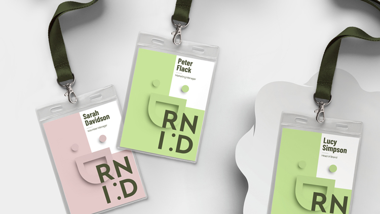
The Royal National Institute for Deaf People (RNID) has rebranded with a new visual identity from London-based design studio Someone, which incorporates a smile device.
The studio worked with the charity’s in-house design team and brand consultant Dan Dufour on the project which comprises a new logo, wordmark, bespoke illustrations and photography.
The charity was established in 1911 in London by deaf banker Leo Bonn. It aims to create a more inclusive society for those who are deaf or have hearing loss, as well as testing out new treatments for people with these conditions.
According to the charity, 1 in 5 adults in the UK have a form of hearing loss while 1 in 8 have tinnitus.
Returning to a “much-loved” and “better recognised” name
The new visual identity accompanies a name change for the charity. This renaming process was underway when the studio joined the project, Someone founder Simon Manchipp tells Design Week.
In 2011, the charity changed its name to Action on Hearing Loss in a rebrand led by design studio Hat-Trick in collaboration with copywriter Nick Asbury.
The charity announced that it would be changing back to its previous name as research showed that it was “much-loved, preferred and better recognised”.
RNID head of brand Cheryl Hughes says that the new identity “is focused on positivity” with details that “celebrate diversity”. “We might be over a century old, but it doesn’t mean we’re stuffy and formal,” she adds.
Making life “fully inclusive for deaf people”
Manchipp says that the studio carried out research with 6,000 people to find a new strategy. The result of this was a redefined purpose: “Together, we will make life fully inclusive for deaf people and those with hearing loss or tinnitus”.
The designer says that the charity is involved with “many kinds of experience” and the brand needed to be “clearly open to all of them”.
One of the most prominent parts of the identity is a new logo which takes the form of a smiley face (made up of a colon and capital D from the RNID wordmark).
This “radically reconsidered” design “brings charm to the category with a smile at its heart”, the studio says.
“Progressive and unusual”
The “modern sans serif” typeface Barlow, designed by Jeremy Tribby, has been chosen for its “kinder, warmer, more inclusive feel”, Manchipp says.
The “flexible” family of fonts has 54 styles with three widths and nine weights, making it “suitable for large and small digital and print use”, he adds.
A “progressive and unusual” colour scheme comprising green and pink tones has been chosen which “avoids the hard punches of primary palettes”, the design studio says.
A “unique illustrative style” has also been adopted which helps to “differentiate and aid storytelling”, according to Someone. These include speech bubble icons that are used throughout physical and digital material.
“Culture and language is constantly evolving”
According to the studio, RNID is going to publish its new tone of voice guidelines online as a way to “encourage deaf people to help shape the language the charity uses”. The refreshed tone aims to be more “conversational” and “less formal”.
RNID digital director Michael Wilkinson says: “Culture and language is constantly evolving and we want to make sure we reflect that in the way we speak as a brand.
“That’s why we’re going to be publishing our tone of voice publicly and inviting people to help shape its future direction.”
The identity launched this week and will be rolled out fully throughout the upcoming year.
The Coronavirus Job Retention Scheme (CJRS) – also known as the furlough scheme – will continue into December, the government has announced.
Prior to this weekend, the scheme was slated to end. In its place, the government planned to institute the Job Support Scheme (JSS).
But in line with a rise in coronavirus cases and deaths, further lockdown measures have been announced for England. As a result the JSS will not be rolled out, with the chancellor instead sticking with the furlough scheme.
Back to the original furlough scheme
The furlough scheme has been in place in various capacities since April.
As it geared to close at the end of October, the support package was offering employers 60% of furloughed employees’ wages. This then needed to be topped up 20% by firms, thereby giving workers 80% of their average pay packet up to £2,500. Employers were also asked to make National Insurance and pension contributions.
Under new lockdown measures, the scheme will be reverting back to how it was first introduced. The government will pay the total amount of 80% of an employee’s wage, up to the £2,500 cap.
Firms will only be asked to contribute National Insurance and pension costs, which accounts for 5% of total employment costs on average. All in, the government says this extended furlough scheme is “more generous” than it was in October.
Last month, a Design Week poll revealed 56% of readers were still on furlough, with no idea when they would be brought back. While the news suggests the government has given another month-long buffer for employers, the extension of furlough at the eleventh hour means many of these jobs may have already been lost.
What about self-employed workers?
So far, there is no word on if and how the support on offer to self-employed workers will change. Reacting to the news over the weekend, Creative Industries Federation CEO Caroline Norbury said it was vital that parity was sought between employees and the self-employed.
“A third of the creative workforce is freelance, and many will see all of their work cancelled as a result of these new measures,” she said in a statement. “They cannot be expected to live on 40% of their income or less, whilst colleagues on payroll receive 80%.”
Norbury also said that the suspension of the Universal Credit minimum income floor should be extended beyond November too, since “more and more creative practitioners turn to that means of support as a vital lifeline”.
Business grants
Alongside changes to the furlough scheme, the government has announced a series of business grants which will be available to firms forced to close in England.
Grants will be handed out bases on the rateable value of a property – those working in a premise worth £15,000 or under will receive £1,334 per month; between £15,000 and £51,000 will receive £2,000 per month; and more than £51,000 will receive £3,000 per month.
Additionally, the government says £1.1 billion is being given to local authorities, which will allow for one-off payments to help support businesses more broadly.
The US 2020 election comes to a close next week on Tuesday 3 November, following a year marked out by a pandemic and international race protests.
Even without those tumultuous events, the 2020 race between incumbent president Donald Trump and the Democratic nominee Joe Biden would have been a much-watched contest.
Shocking the polls, Trump pulled off a victory in the 2016 election against former secretary of state Hillary Clinton, which set the tone for a controversy-fuelled four years.
We take a look at both Republican and Democratic campaigns and how they’ve been designed, from branding to graphics and digital strategy.
The logos
Trump and his vice-president Mike Pence’s logo has been designed in-house. It is similar to the 2016 logo, which itself was a quick do-over of a scrapped first logo (which many commenters mocked for its suggestive undertones). Biden and vice presidential nominee Kamala Harris’ design has also been done in-house, though it builds off a design from San Francisco-based marketing agency Mekanism.
Hyperakt creative director Deroy Peraza tells Design Week that while both logos are “safe and expected”, the Biden Harris one is “stronger” because of its use of foundry Hoefler&Co’s Decimal typeface. (Brooklyn, New York-based Hyperakt was responsible for creating the branding for 2020 democrat nominee Pete Buttigieg, the first openly-gay person to launch a presidential campaign.)
According to Hoefler&Co, Decimal was inspired by the typefaces on watch faces. It is “modern, sturdy and designed for optimal legibility at both large and small sizes”, Peraza adds. There’s also a “clear hierarchy, flush alignment and lack of additional decorative elements” which makes the logo “usable in different contexts”, the foundry says.
In contrast, Trump and Pence’s mark “feels like a generic rubber stamp logo made from clip art elements,” Peraza says. He calls the spacing, alignment and font “wonky” and “pretty random” while adding that there’s a “ton going on with the tagline, border, stars and year”.
However, Design Bridge New York designer Marisa Hagerty and brand strategist Lisa Franck suggest that Trump’s branding might appeal to his audiences. His voters “resonate with his rough-around-the edges, unpretentious and bold approach to branding because that’s exactly how he takes to leadership”.
“They don’t want a president who follows the rules – of design or politics,” the designers say.
Designed with “opposition in mind”
Biden’s logo in use on merchandise
New York-based studio Vault 49 co-founder John Glasgow suggests that the logos were unexpected as they appear to be designed with “the opposition in mind”.
Trump’s use of a coloured san-serif on a white background is “simple”, he says, while the star details and “no-nonsense” lock-up are characteristics Glasgow associates with Biden. In contrast, Biden’s logo is “loud” and “in your face”. “The emphasis on the ‘E’ gives me large energy company vibes, more than stripes from the US flag,” Glasgow adds.
Trump’s inclusion of the slogan in the lock-up could be an advantage for his strategy, according to Glasgow. “Like Barack Obama’s Hope, it’s given Trump’s base something strong to hang their commitment on. In contrast, not having one may show a lack of an anchor for Biden.”
Biden does have several slogans in use on his campaign including “Build Back Better”, “Restore the Soul of America” and “Our best days still lie ahead”.
Obama’s 2008 logo
Design Bridge’s Hagerty and Franck say that a Biden victory might prompt a “similar visual trend among the next crop of Democratic candidates” though this trend can be tracked back to Obama’s 2008 logo.
Biden’s “E” is a reference to the stripes of the American flag but it is also a “nod back” to Obama’s logo, the designers say. There is an improvement here, according to the Hagerty and Franck. “The Biden ‘E’ is better integrated into the logotype.”
“It’s a shame that design isn’t valued by Biden’s team”
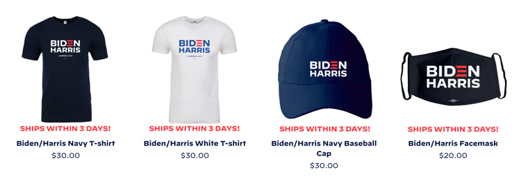
Examples of Biden’s merchandise
Both candidates have a wide range of merchandise available to buy online, which range from tote bags to dog collars (though only Biden has a facemask available). In general, Biden’s merchandise takes a light approach to branding, often attempting a humourous touch. Among the designs is tank top that features a widely-circulated vintage photo of Biden, for example.
Colorado-based O Street designer Josh Peter says that the merchandise is “safe, tasteful, and mostly in danger of being forgettable.” He adds: “It’s a cliché to drop ‘they’re someone you’d like to get a beer with’ as a reason to vote for a politician, but for Joe, you really do want to get a beer with him.”
A tank top featuring young Biden
Hyperakt’s Deroy Peraza meanwhile says that the prevailing feature of Biden’s merchandise is a “very intentional throwback to happier, more hopeful Obama days”.
“In fact, the combination of all caps sans-serif font Decimal and the lower case italic serif Mercury are almost identical to the system Obama used,” Peraza says. “Biden’s campaign wants to convey that electing him is a way to return by proxy to where the Democratic Party left off.”
Shepard Fairey’s Hope poster for Obama
John Glasgow echoes Peter’s beer-drinking sentiment, noting the “humorous tone of voice”. But it also feels like design is an “afterthought”, he says. “I would expect this level of creativity and execution from my daughter’s 6th grade class rather than the leading Democratic nomination, fighting to become president.”
He points to the Obama campaign’s “unforgettable, iconic portrait” by street artist Shepard Fairey as an example of a “bold” branding system that worked.
“The iconic illustration stood out on merchandise and it would’ve felt at home if it was sat next to a mural of Notorious BIG in Brooklyn,” Glasgow says.
The fly swatter available in Biden’s store
New designs have been added throughout the campaign. During a vice-presidential debate, a fly landed on Mike Pence’s head which caused headlines. Within two hours, the Biden campaign had put up a flay swatter for sale with the slogan: “Truth over Flies.”
“This was a good move that looked responsive and alert for a campaign that’s otherwise been dormant,” Josh Peter says. “More effective than the candidate themselves firing off 300 tweets an hour, though? Time will tell.”
Peraza agrees: “It’s a gimmick, but we live in a world of memes – gimmicks in 2020 speak.” This “playful reaction” is “relatable” and shows that the candidate is “in touch with popular culture”, he says.
“One of the singular most successful devices in presidential branding history”
Trump’s promise to “Make America Great Again” was a ubiquitous slogan in the previous election, along with its acronym MAGA. For this election, Trump has stuck to the slogan, which appears widely in his branding system. (Another slogan has also been added: “Keep America Great”.)
O Street’s Josh Peter says that MAGA showed how “good marketing beat good design” in 2016.
He says: “You can take issue with what you think Donald Trump means by ‘Make America Great Again’, but it’s a potent and memorable message. We all laughed when he stitched it into a trucker hat set in Times New Roman – it felt like something your grandpa would force everyone to wear for a photo at the family reunion – but Donald had the last laugh.”
Voters in swing states chose the MAGA hats over Hillary Clinton’s “slick” campaign which “oozed corporate money”, Peter says.
This cycle, Trump’s team have “just bumped up the text size on the hats”, he says. “You can imagine the meeting when they asked Trump what the totality of the campaign’s design should be, he said: ‘Make it bigger’.”
Peter does think that there could be a vintage appeal to these designs one day. “When Trump’s political career is long over and these hats aren’t charged with emotional energy, I think they’ll be a hip streetwear item,” he says. “You heard it here first.”
Deroy Peraza says that Trump’s branding “is amateurish and poorly executed” but adds: “I’m clearly not who this is trying to appeal to.”
Designers seem to agree that while the design might not be good by traditional measurements, it is effective. “There’s a homemade on Microsoft Word quality to it that makes it feel like Trump made it himself between tweets – although it was at least spellchecked”, Peraza adds.
The designer also says that the MAGA tagline – inspired by Republican president Ronald Reagan’s succesful 1980 slogan “Let’s make America great again” – has been the “perfect encapsulation of the nationalist, white-Christian version of an idealized history that completely ignores the plight of black people, women, native Americas and people of colour in general”.
“It’s evident by the sea of red MAGA hats at Trump rallies that, good design or not, this has been been a very successful branding device for the campaign – perhaps one of the singular most successful ones in presidential branding history.”
Design Bridge’s Hagerty and Franck also highlight a “startling trend” in branding in the more local election campaigns.
Instagram account @politicsndesign shows visual trends among Republicans running for Congress. The image above shows a widely-used template among politicians – a rectangular frame with the star detail at the top, mimicking Trump’s presidential logo.
The design trend sends a “subtle” message to voters, according to the Hagerty and Franck. “They are communicating to voters, ‘Vote for me if you approve of everything the Trump administration is doing’,” Hagerty and Franck say.
“Now that Republicans are the part of Trump, more candidates are adopting this look.”
“Russia’s very successful disinformation campaign during 2016 worked”
The role of social media, already contentious thanks to the Cambridge Analytica scandal, has become a lightning rod during this election. Platforms like Facebook have removed advertisements from the Trump campaign over inaccurate claims about Covid-19 and immigration, for example.
“Clearly what has been learned by the right during this campaign cycle is that Russia’s very successful disinformation campaign during 2016 worked,” Deroy Peraza says. “So we’re seeing a lot of domestic versions of this happening this cycle.”
Citing the recent Netflix documentary The Social Dilemma, John Glasgow says: “Our addiction to social media means it’s the best way to manipulate our opinion on what matters, what face mask I should buy, and even who I should elect as the next president.”
There is opportunity to use these platforms in a “positive” way though. Glasgow points to New York Democratic representative Alexandria Ocasio-Cortez’ strategy of using Instagram to talk to the public. The popular politician often answers questions in her Stories, for example.
“She does a great job fielding questions form users, talking directly to the camera in a very personal way that makes you feel like you know her and what she stands for,” he says. “It’s more effective than her ads.”