The US 2020 election comes to a close next week on Tuesday 3 November, following a year marked out by a pandemic and international race protests.
Even without those tumultuous events, the 2020 race between incumbent president Donald Trump and the Democratic nominee Joe Biden would have been a much-watched contest.
Shocking the polls, Trump pulled off a victory in the 2016 election against former secretary of state Hillary Clinton, which set the tone for a controversy-fuelled four years.
He has appointed two judges to the Supreme Court under unusual circumstances, faced an impeachment and never shied away from controversial statements.
These eventful years have led to a high interest in this election: figures show that early voter turnout has reached almost 60m. And in a country as vast and politically diverse as America, campaigning plays a key part in winning undecided voters.
We take a look at both Republican and Democratic campaigns and how they’ve been designed, from branding to graphics and digital strategy.
The logos

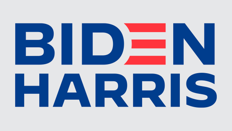
Trump and his vice-president Mike Pence’s logo has been designed in-house. It is similar to the 2016 logo, which itself was a quick do-over of a scrapped first logo (which many commenters mocked for its suggestive undertones). Biden and vice presidential nominee Kamala Harris’ design has also been done in-house, though it builds off a design from San Francisco-based marketing agency Mekanism.
Hyperakt creative director Deroy Peraza tells Design Week that while both logos are “safe and expected”, the Biden Harris one is “stronger” because of its use of foundry Hoefler&Co’s Decimal typeface. (Brooklyn, New York-based Hyperakt was responsible for creating the branding for 2020 democrat nominee Pete Buttigieg, the first openly-gay person to launch a presidential campaign.)

According to Hoefler&Co, Decimal was inspired by the typefaces on watch faces. It is “modern, sturdy and designed for optimal legibility at both large and small sizes”, Peraza adds. There’s also a “clear hierarchy, flush alignment and lack of additional decorative elements” which makes the logo “usable in different contexts”, the foundry says.
In contrast, Trump and Pence’s mark “feels like a generic rubber stamp logo made from clip art elements,” Peraza says. He calls the spacing, alignment and font “wonky” and “pretty random” while adding that there’s a “ton going on with the tagline, border, stars and year”.
However, Design Bridge New York designer Marisa Hagerty and brand strategist Lisa Franck suggest that Trump’s branding might appeal to his audiences. His voters “resonate with his rough-around-the edges, unpretentious and bold approach to branding because that’s exactly how he takes to leadership”.
“They don’t want a president who follows the rules – of design or politics,” the designers say.
Designed with “opposition in mind”

New York-based studio Vault 49 co-founder John Glasgow suggests that the logos were unexpected as they appear to be designed with “the opposition in mind”.
Trump’s use of a coloured san-serif on a white background is “simple”, he says, while the star details and “no-nonsense” lock-up are characteristics Glasgow associates with Biden. In contrast, Biden’s logo is “loud” and “in your face”. “The emphasis on the ‘E’ gives me large energy company vibes, more than stripes from the US flag,” Glasgow adds.
Trump’s inclusion of the slogan in the lock-up could be an advantage for his strategy, according to Glasgow. “Like Barack Obama’s Hope, it’s given Trump’s base something strong to hang their commitment on. In contrast, not having one may show a lack of an anchor for Biden.”
Biden does have several slogans in use on his campaign including “Build Back Better”, “Restore the Soul of America” and “Our best days still lie ahead”.

Design Bridge’s Hagerty and Franck say that a Biden victory might prompt a “similar visual trend among the next crop of Democratic candidates” though this trend can be tracked back to Obama’s 2008 logo.
Biden’s “E” is a reference to the stripes of the American flag but it is also a “nod back” to Obama’s logo, the designers say. There is an improvement here, according to the Hagerty and Franck. “The Biden ‘E’ is better integrated into the logotype.”
“It’s a shame that design isn’t valued by Biden’s team”

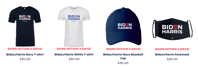
Both candidates have a wide range of merchandise available to buy online, which range from tote bags to dog collars (though only Biden has a facemask available). In general, Biden’s merchandise takes a light approach to branding, often attempting a humourous touch. Among the designs is tank top that features a widely-circulated vintage photo of Biden, for example.
Colorado-based O Street designer Josh Peter says that the merchandise is “safe, tasteful, and mostly in danger of being forgettable.” He adds: “It’s a cliché to drop ‘they’re someone you’d like to get a beer with’ as a reason to vote for a politician, but for Joe, you really do want to get a beer with him.”

Hyperakt’s Deroy Peraza meanwhile says that the prevailing feature of Biden’s merchandise is a “very intentional throwback to happier, more hopeful Obama days”.
“In fact, the combination of all caps sans-serif font Decimal and the lower case italic serif Mercury are almost identical to the system Obama used,” Peraza says. “Biden’s campaign wants to convey that electing him is a way to return by proxy to where the Democratic Party left off.”

John Glasgow echoes Peter’s beer-drinking sentiment, noting the “humorous tone of voice”. But it also feels like design is an “afterthought”, he says. “I would expect this level of creativity and execution from my daughter’s 6th grade class rather than the leading Democratic nomination, fighting to become president.”
He points to the Obama campaign’s “unforgettable, iconic portrait” by street artist Shepard Fairey as an example of a “bold” branding system that worked.
“The iconic illustration stood out on merchandise and it would’ve felt at home if it was sat next to a mural of Notorious BIG in Brooklyn,” Glasgow says.

New designs have been added throughout the campaign. During a vice-presidential debate, a fly landed on Mike Pence’s head which caused headlines. Within two hours, the Biden campaign had put up a flay swatter for sale with the slogan: “Truth over Flies.”
“This was a good move that looked responsive and alert for a campaign that’s otherwise been dormant,” Josh Peter says. “More effective than the candidate themselves firing off 300 tweets an hour, though? Time will tell.”
Peraza agrees: “It’s a gimmick, but we live in a world of memes – gimmicks in 2020 speak.” This “playful reaction” is “relatable” and shows that the candidate is “in touch with popular culture”, he says.
“One of the singular most successful devices in presidential branding history”

Trump’s promise to “Make America Great Again” was a ubiquitous slogan in the previous election, along with its acronym MAGA. For this election, Trump has stuck to the slogan, which appears widely in his branding system. (Another slogan has also been added: “Keep America Great”.)
O Street’s Josh Peter says that MAGA showed how “good marketing beat good design” in 2016.
He says: “You can take issue with what you think Donald Trump means by ‘Make America Great Again’, but it’s a potent and memorable message. We all laughed when he stitched it into a trucker hat set in Times New Roman – it felt like something your grandpa would force everyone to wear for a photo at the family reunion – but Donald had the last laugh.”
Voters in swing states chose the MAGA hats over Hillary Clinton’s “slick” campaign which “oozed corporate money”, Peter says.

This cycle, Trump’s team have “just bumped up the text size on the hats”, he says. “You can imagine the meeting when they asked Trump what the totality of the campaign’s design should be, he said: ‘Make it bigger’.”
Peter does think that there could be a vintage appeal to these designs one day. “When Trump’s political career is long over and these hats aren’t charged with emotional energy, I think they’ll be a hip streetwear item,” he says. “You heard it here first.”

Deroy Peraza says that Trump’s branding “is amateurish and poorly executed” but adds: “I’m clearly not who this is trying to appeal to.”
Designers seem to agree that while the design might not be good by traditional measurements, it is effective. “There’s a homemade on Microsoft Word quality to it that makes it feel like Trump made it himself between tweets – although it was at least spellchecked”, Peraza adds.
The designer also says that the MAGA tagline – inspired by Republican president Ronald Reagan’s succesful 1980 slogan “Let’s make America great again” – has been the “perfect encapsulation of the nationalist, white-Christian version of an idealized history that completely ignores the plight of black people, women, native Americas and people of colour in general”.
“It’s evident by the sea of red MAGA hats at Trump rallies that, good design or not, this has been been a very successful branding device for the campaign – perhaps one of the singular most successful ones in presidential branding history.”
“Scary” design trend
View this post on Instagram
Design Bridge’s Hagerty and Franck also highlight a “startling trend” in branding in the more local election campaigns.
Instagram account @politicsndesign shows visual trends among Republicans running for Congress. The image above shows a widely-used template among politicians – a rectangular frame with the star detail at the top, mimicking Trump’s presidential logo.
The design trend sends a “subtle” message to voters, according to the Hagerty and Franck. “They are communicating to voters, ‘Vote for me if you approve of everything the Trump administration is doing’,” Hagerty and Franck say.
“Now that Republicans are the part of Trump, more candidates are adopting this look.”
“Russia’s very successful disinformation campaign during 2016 worked”
The role of social media, already contentious thanks to the Cambridge Analytica scandal, has become a lightning rod during this election. Platforms like Facebook have removed advertisements from the Trump campaign over inaccurate claims about Covid-19 and immigration, for example.
“Clearly what has been learned by the right during this campaign cycle is that Russia’s very successful disinformation campaign during 2016 worked,” Deroy Peraza says. “So we’re seeing a lot of domestic versions of this happening this cycle.”
He cites a report by the New York Times, which claimed that over 20% of social media posts about mail-in voting have contained disinformation. Peraza says that the “smokescreen has gotten thicker and thicker, seeding more distrust in our institutions”.
“Just because lying proves effective doesn’t mean it’s in our society’s best interest,” he adds.
View this post on Instagram
Citing the recent Netflix documentary The Social Dilemma, John Glasgow says: “Our addiction to social media means it’s the best way to manipulate our opinion on what matters, what face mask I should buy, and even who I should elect as the next president.”
There is opportunity to use these platforms in a “positive” way though. Glasgow points to New York Democratic representative Alexandria Ocasio-Cortez’ strategy of using Instagram to talk to the public. The popular politician often answers questions in her Stories, for example.
“She does a great job fielding questions form users, talking directly to the camera in a very personal way that makes you feel like you know her and what she stands for,” he says. “It’s more effective than her ads.”
The post US 2020 election by design – the winners and losers appeared first on Design Week.
from Design Week https://ift.tt/34D8BkO

No comments:
Post a Comment