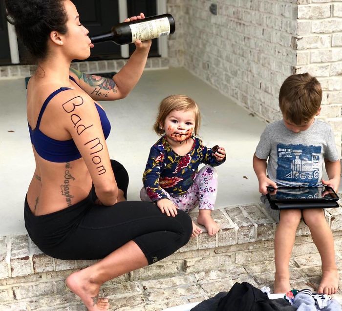
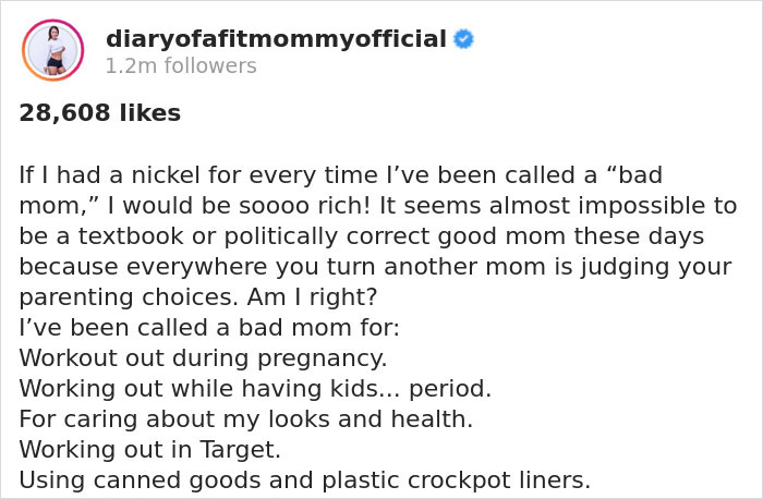
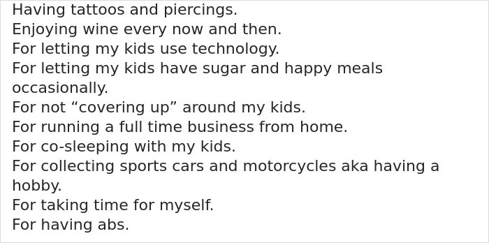
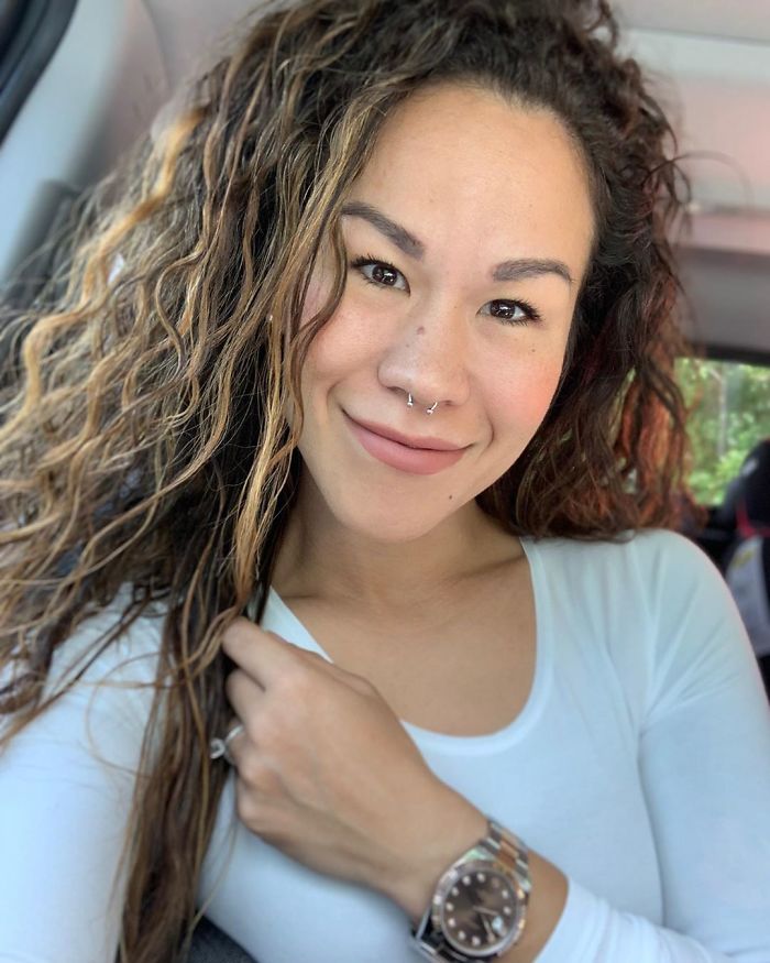
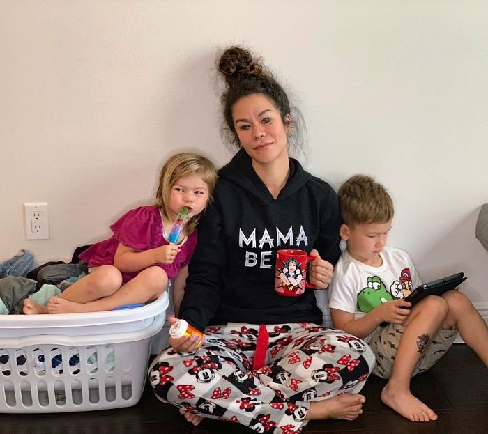
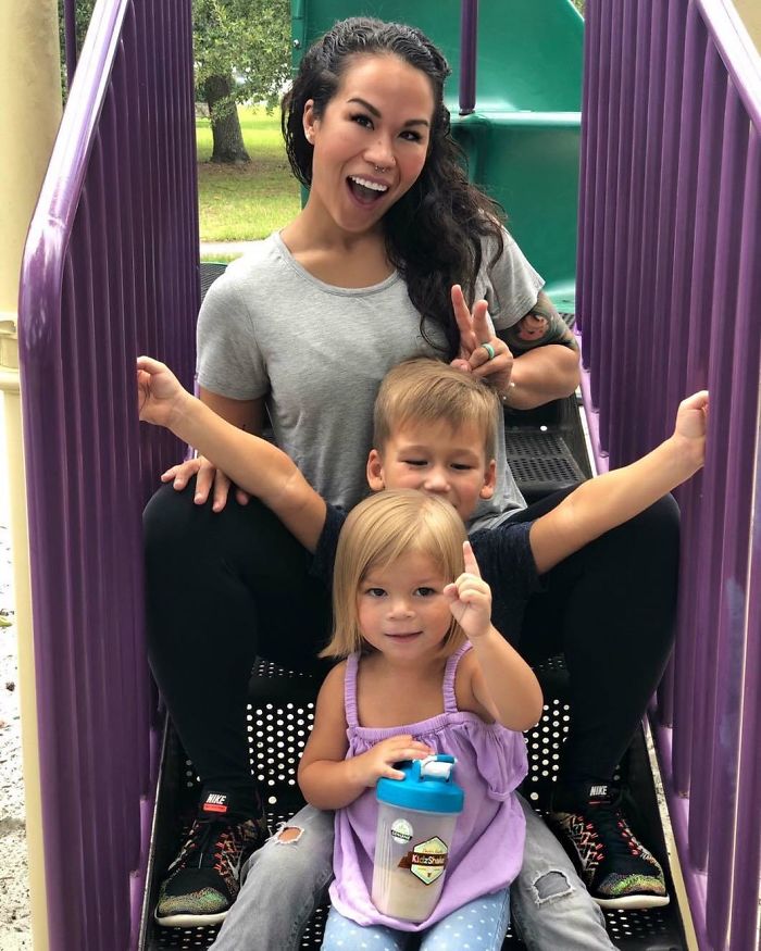
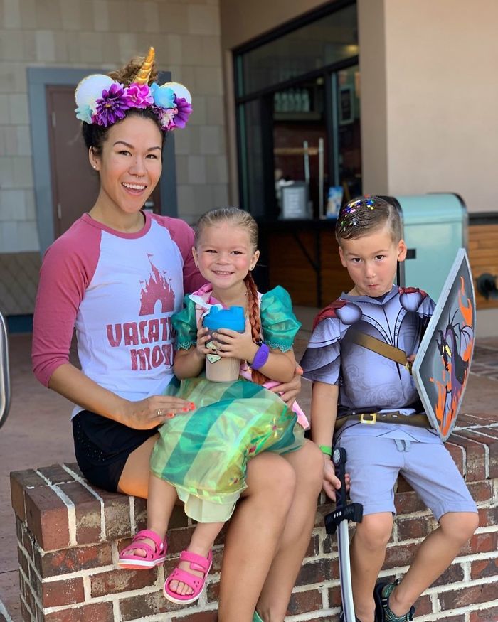
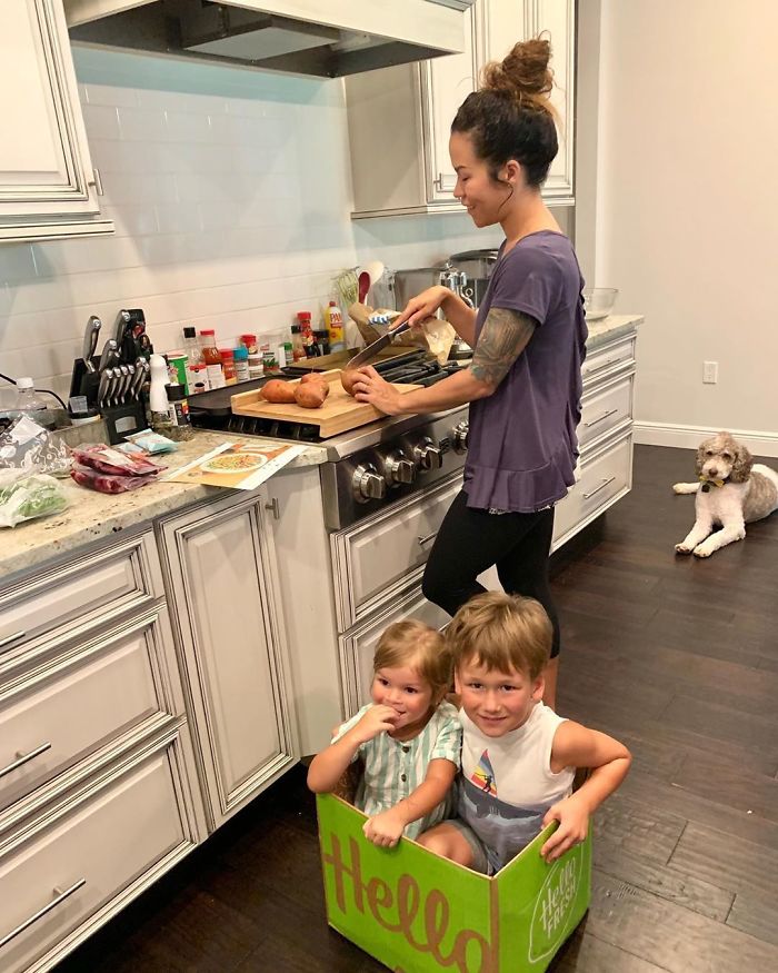
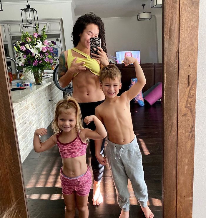
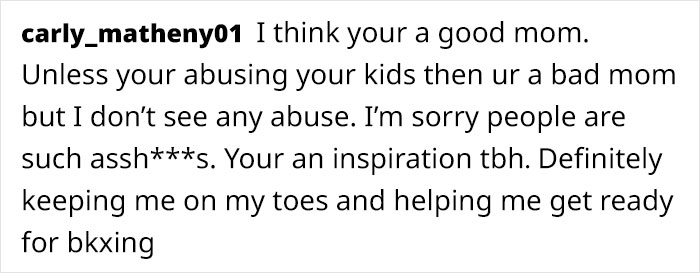
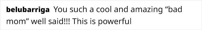
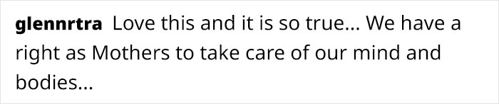
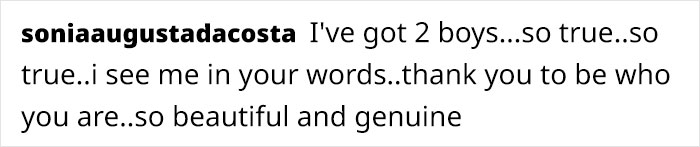
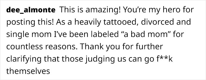
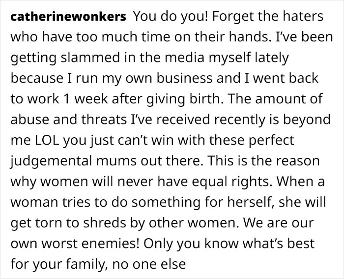
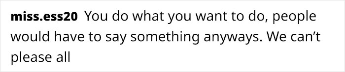
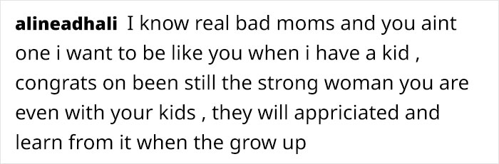
When Sia Cooper became pregnant with her first child, she decided to return to blogging and share her journey and progress with the world. She even quit nursing to become a stay at home mother and dedicate more time to creating content. However, not all mothers and fathers agreed with her parenting choices. Some even went so far as to call Sia a “bad mom.”
In response to them, Sia penned an honest open letter, explaining why she embraced that label. Her post has resonated with over 28,000 people, many of which applauded both Sia’s honesty and her philosophy of raising kids.
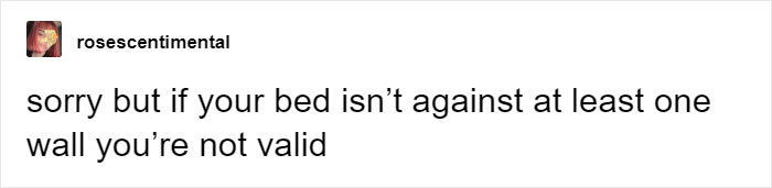
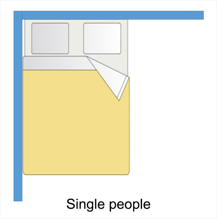
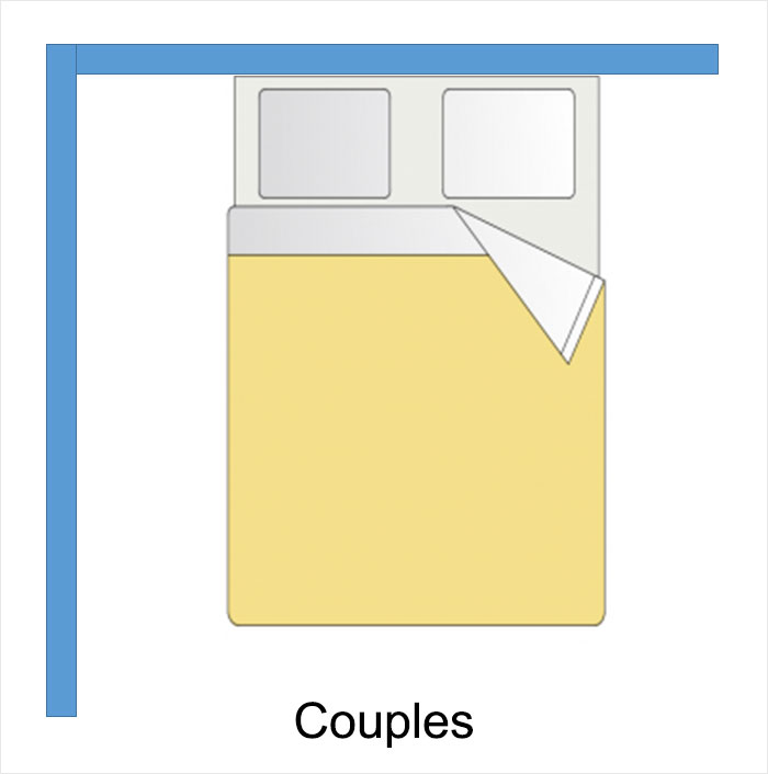
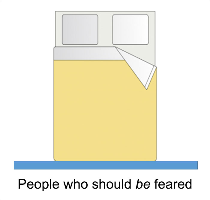
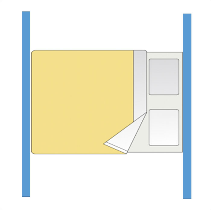
It’s said that you know you’ve become an adult when you put your bed against the middle of the wall rather than the corner. You can see why one would make this association: people living with a partner arrange their bed so that each person can get out of their respective side of the bed without disturbing the other. Someone responsible enough to wash their sheets frequently wants this chore to be as convenient as possible. Moving into a room large enough that it’s no longer necessary to shove the bed into a corner for space might represent a turning point in life.
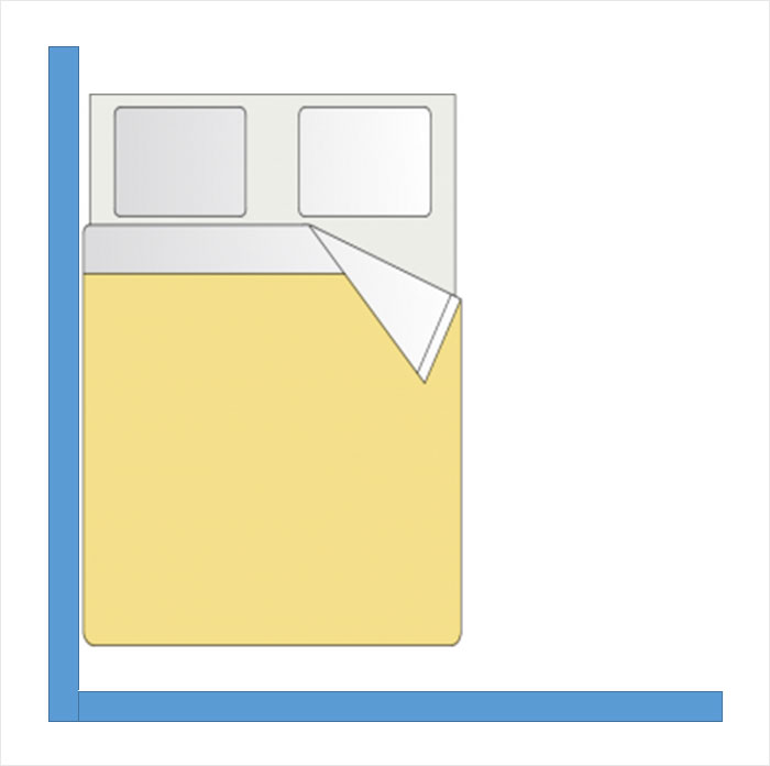
Even so, plenty of single adults are up to the challenge of crawling across their beds to change the sheets and like sleeping in corners just fine. Some of us can’t imagine giving it up for anything, actually. If you have a hard time imagining sleeping peacefully in this spacious minimalist bedroom, you’re not the only one. Why is this?
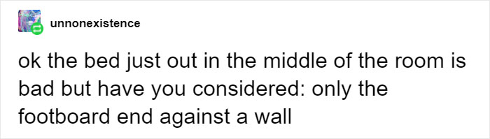
Tumblr users started this odd debate about bed placement
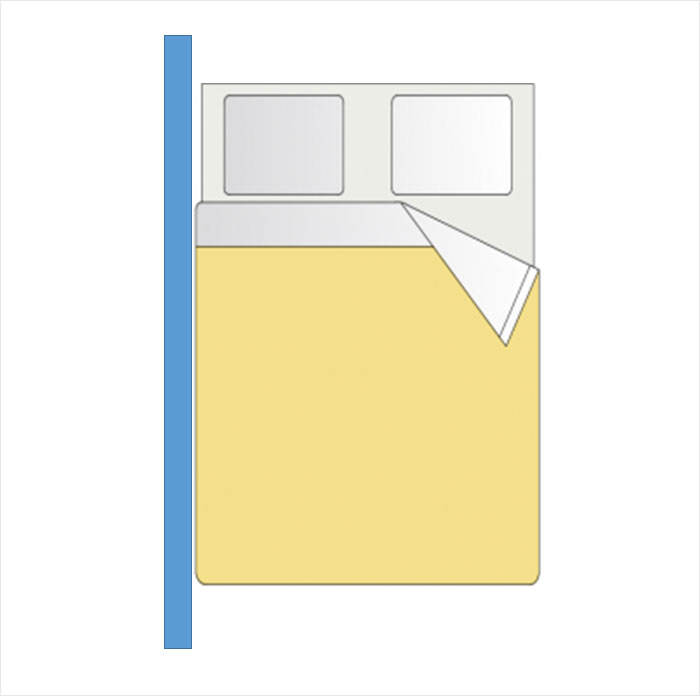
Feng shui, the ancient Chinese practice of aligning one’s self and living space advantageously with the energy present in the environment, calls a position in any given room furthest from and looking towards the door the “command position.” Do you subconsciously gravitate to the command position when you enter a room? Wouldn’t you rather sleep in it? The guidelines of feng shui agree.
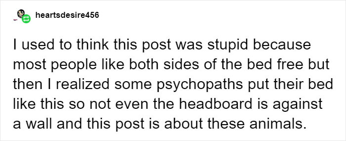
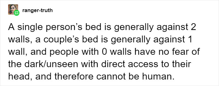
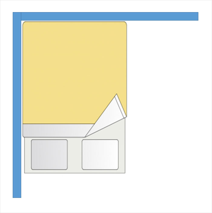
It feels less like an arbitrary rule and more like primal instinct. We may live in generally safe, locked houses or apartments, but like wild animals, we still choose a sleeping position that prevents an attack from behind while giving us an unobscured view in the event that we’re suddenly awakened by a threat.
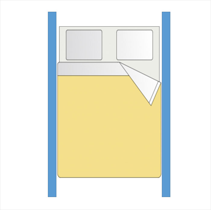
This is probably where we get our intrinsic discomfort with the idea of sleeping with our back “exposed”, our front “trapped”, or both. And someone who lacks that instinct must be fearless indeed. These weird diagrams imagine positions that awaken that unease (and show that some people still can’t behave when they see four panels and some lines.)
Akiko Stehrenberger’s poster art for Portrait of a Lady on Fire
LA-based illustrator and creative director Akiko Stehrenberger has been behind some of Hollywood’s more inventive film posters of the last 15 years, applying her chameleonic art style to movies directed by Spike Jonze, David Lynch, Sofia Coppola and the Coen Brothers. Her style mixes illustration with a certain conceptual ambiguity. “I think if illustration is used, it needs to serve a purpose or else it becomes a paint-by-number,” she tells us. “I pride myself on my concepts as well as my illustrations, even if the concept is not immediately evident.”
This year, she’s produced artworks for many movies, including Shia Laboeuf biopic Honey Boy, but her favourite projects have come from her most instinctive ideas. “I’m also happy when I can create a poster that makes the viewer look an extra second longer,” she says. This is a strategy she mastered in her official poster for highly-anticipated period drama Portrait of a Lady on Fire, which would sit comfortably in a Rorschach test. At first glance, a thickly painted flame rips through the centre in a literal take on the film title; further inspection reveals a subtle allusion to the complicated romance at the heart of the film.
“This was the second time [distribution company Neon] let me do an optical illusion poster illustrated in a minimalist approach,” she says. “I’m always so thrilled when a client lets me do my thing without fear of adding more for marketing purposes. It immediately received amazing responses after it was made public last week, which again is just an added bonus.”
One of two posters created by Akiko Stehrenberger for The Last Black Man in San Francisco
Another of Stehrenberger’s favourite projects from 2019 is The Last Black Man in San Francisco, a tale of gentrification that proved a hit at Sundance. She created two Clio award-winning posters for this film, having convinced A24 to create a second, more conceptual design (the first one is here). “I felt very strongly about this idea because not only was it so simple [and] gave us San Francisco without showing the Golden Gate bridge, it literally and metaphorically showed [lead character] Jimmie’s uphill battle in the story and touched on the surreal moments of the film.”
Far from the more predictable and often cluttered posters usually churned out of Hollywood, Stehrenberger’s film art encourages lingering thought. “I would like to think directors and studios come to me because of my less obvious approaches,” she says. “I have a hard time making things without an idea behind them.” Her illustrations are the kind that beg to be framed, but for now, her work is going to be housed in a book published by Hat & Beard Press, which will take a closer look at her compelling portfolio from the last 15 years, and the varied creative process behind it.
“The book wasn’t my idea,” Stehrenberger tells us. “I was casually speaking to a director I had previously done posters for, telling him I was burnt out from doing movie posters for 15 years. I told him my pipe dream was to walk away from it completely, to go sculpt in the woods or something. He told me if I did that, that I’d need to have a book of my posters.” After chatting with another director a few months down the line, she was approached by Hat & Beard Press about a book, and the idea became a reality.
“It’s pushing me well beyond my comfort zone. The idea of its permanence scared me and it gave me many anxiety attacks, but I knew I had to step out of my comfort zone,” Stehrenberger says. “I was behind the scenes and nameless for so long and was perfectly happy being there. Most of my friends didn’t even know what I did for a living, or at least to what measure, because I try talking about work as little as possible. However, at the heart of all my panic and insecurities, I had to remind myself that this book is a good thing and how great it will be for my young son when he grows up to see what his mom did for a living.”
The book comes at a time when Stehrenberger is expanding her focus to art more generally – though fans will be reassured that she’s not leaving film poster art behind entirely. “It’s been incredibly kind to me and I feel so honoured for all that it does for me. The downside is that it doesn’t allow for much time to make anything else,” she admits. “I feel so lucky to be in a position of having too much work but also don’t want to neglect other types of projects. I don’t have my sights set on becoming the next big fine artist or anything, I just want to find a better balance so I don’t neglect my other creative outlets.” With any luck, you’ll find her sculpting in the woods.
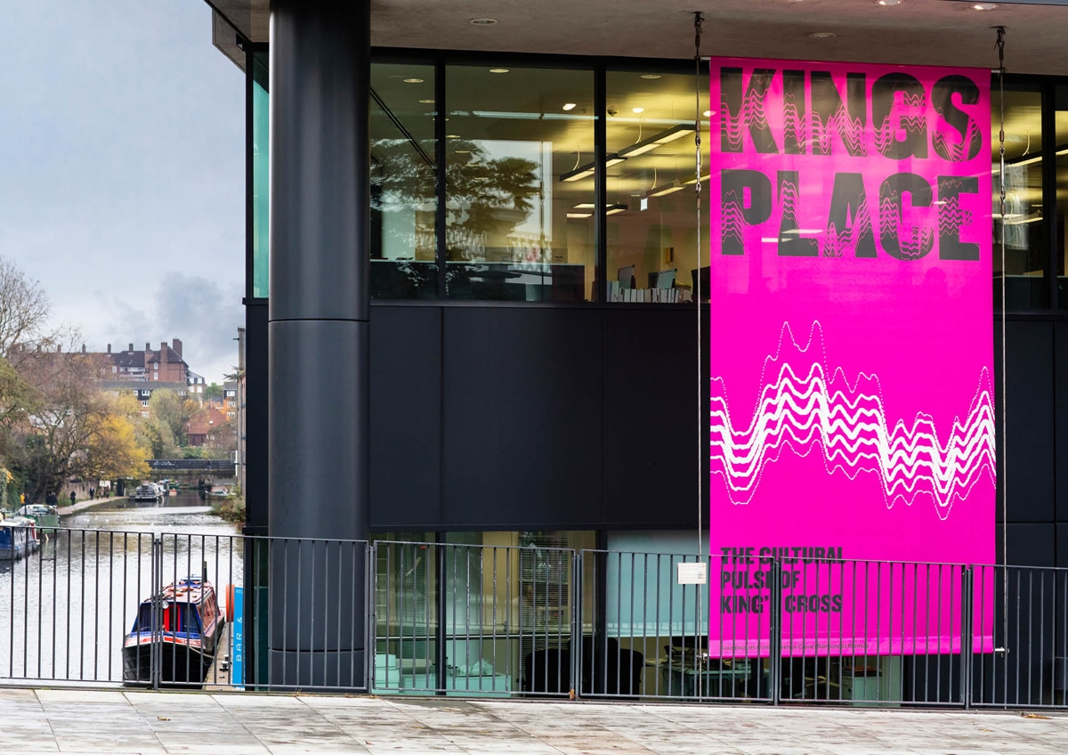
Based in London’s Kings Cross, the space bills itself as the ‘cultural pulse’ of the area, hosting comedy, festivals, music performances and talks. To create its new identity, Studio Sutherl& delved into the “energy and variety” of its events. Working together with software engineer and digital artist Joe Pochciol, the studio built SoundWaveMachine – software that can analyse audio files and then generate new logos based on them.
“We can vary the amplitude, gain and modulation,” explains studio founder Jim Sutherland. “We can also use the waves themselves graphically, for building manifestations and in print.”
The software works on any machine, meaning the client can also generate sound-based logos and headlines themselves. Part of the aim of this approach was to bring together Kings Place’s sub brands, and the sound waves give each of these a common visual identity that still allows for some individuality.
Now, the branding for each event follows the same typeface – Champion Middleweight – but adopts its own unique pattern, based on music or sound from the performance.
Studio Sutherl& also created individual logotypes for each member of staff, based on their favourite tracks, which are featured on business cards and email signatures.


 Congrats to Shia LaBeouf for winning Breakthrough Screenwriter at the Hollywood Film Awards! ???????????????? . . . . . #akikostehrenberger #akikomatic #official #illustration #art #keyart #movieposter #honeyboy #honeyboymovie #almaharel #amazonstudios #shialabeouf #lucashedges #noahjupe #fkatwigs #childactor #puppet #marionette #pinocchio #hfa #breakthrough #hollywood #screenwriter #freethework