The work of Mexican architect Tatiana Bilbao is on show at the Louisiana Museum in Denmark, in an exhibition that includes an imaginary city, a cabinet of curiosities and four full-size architectural mockups.
The Architect's Studio: Tatiana Bilbao Estudio is the first major international retrospective for Bilbao, 47, whose broad-ranging portfolio includes social-housing prototypes, a botanical garden, a pilgrimage route and an aquarium.
The show features an assortment of models, both large and small, along with hand-drawn sketches, collaged images and material samples.
The curation, by Kjeld Kjeldsen and Mette Marie Kallehauge, aims to show how Bilbao focuses on site-specificity and collaboration in her design process, and is uninterested in developing a signature style.
"She is preoccupied with the specific place and human beings," reads their exhibition text. "She operates with closeness and the personal encounter, an approach which can nevertheless end in a major project in a megapolis in Mexico."
A single image is displayed at the exhibition entrance. It is a collage that Bilbao created for a residential project, featuring a drawing done by hand overlaid on top of various images of gardens and landscapes.
Kjeldsen sees collage as a particularly important aspect of the architect's process. Not only is it collaborative, able to be worked on by several people, it is also open-ended – unlike a computer visualisation, it leaves some details open to interpretation.
"In the exhibition, you don't see any sketches by computer," Kjeldsen told Dezeen. "She wants to keep an analogue way of doing things. It's the way she communicates with people."
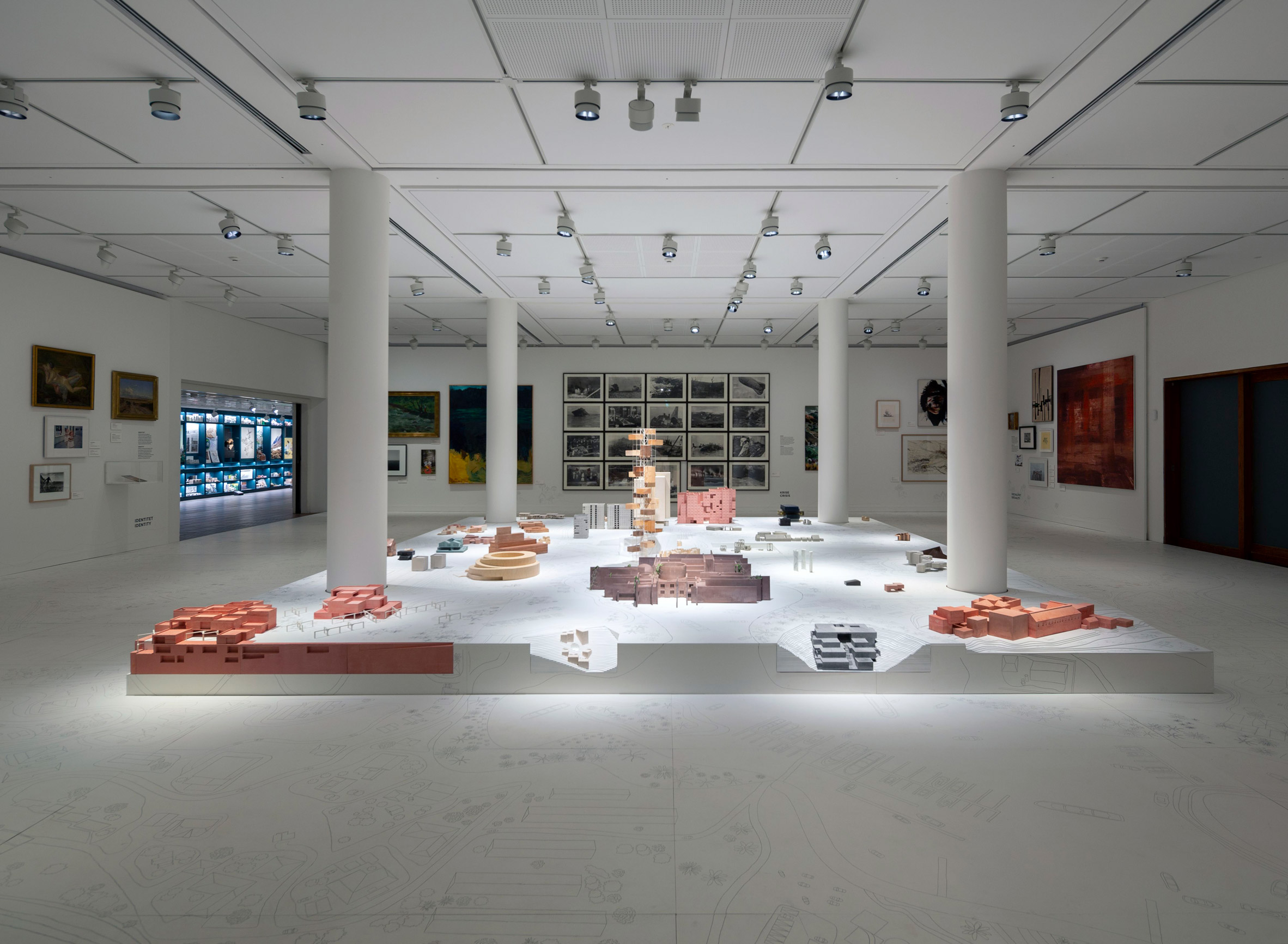
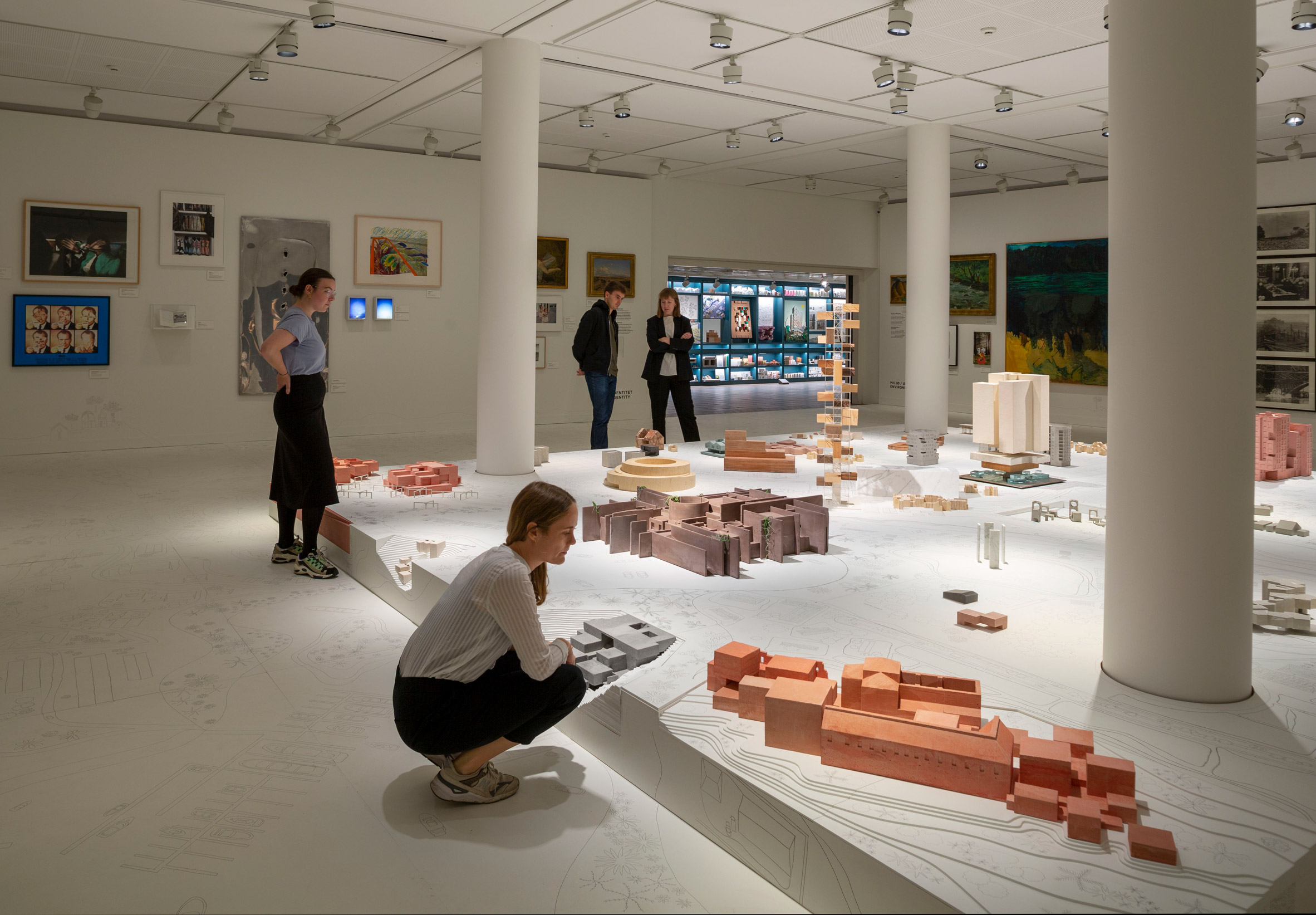
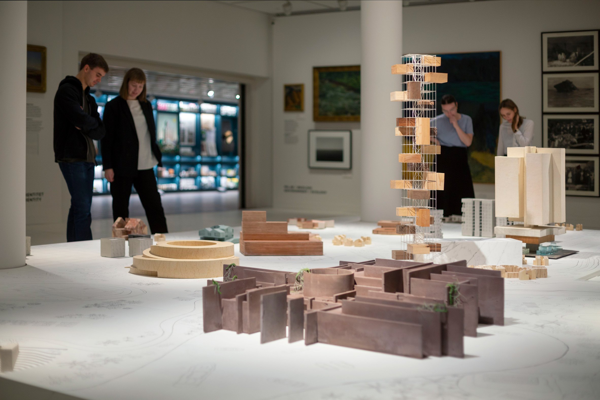
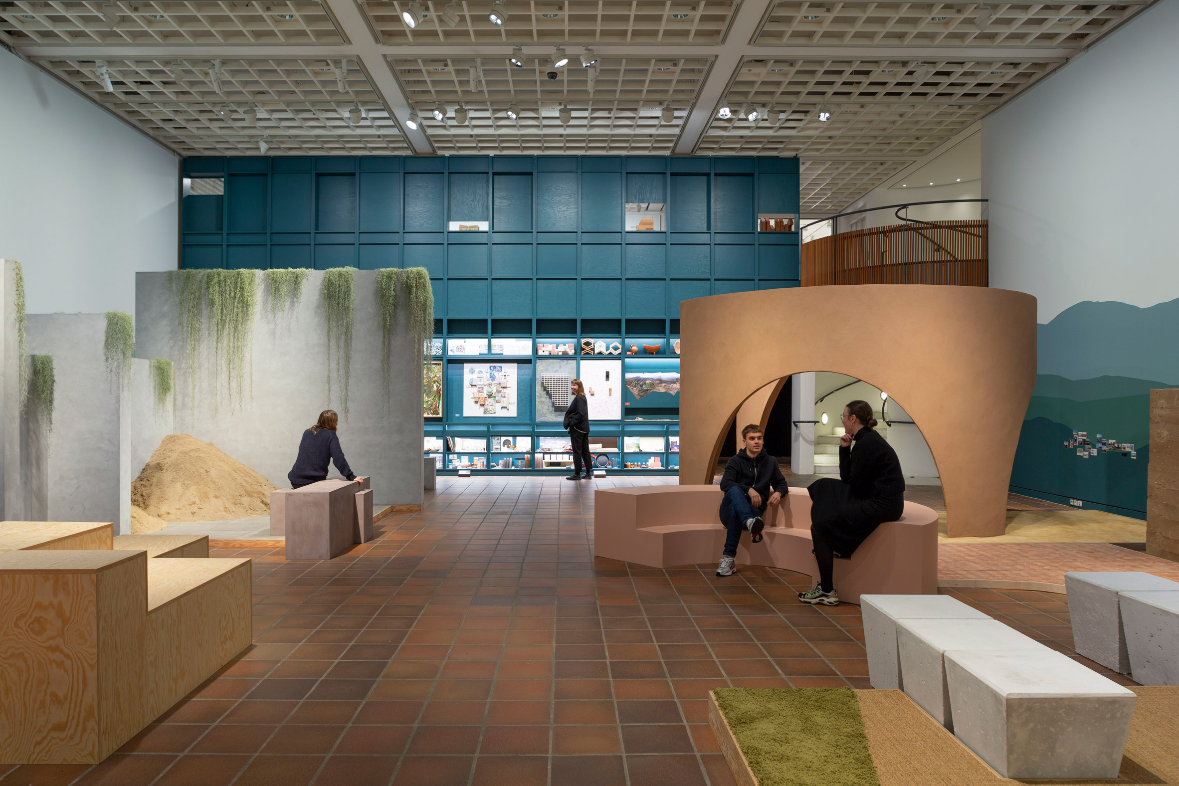
The show is divided into three sections. The first room, titled Landscapes, features a large plinth covered in models of projects both completed and in process.
These models are all the same scale, but made from various different materials, from pigmented concretes to woods. Highlights include the Mazatlan Aquarium and the Irapuato Music Hall and Sports Centre.
Beneath them, a hand-drawn map covers the surface of the plinth and extends out to cover the entire floor of the room. It connects all the projects, as if they were all built in the same city.
On the surrounding walls are artworks from both the Louisiana's collection and the Museo Nacional de Arte in Mexico City, intended to set up the idea of a cultural exchange between the two different contexts.
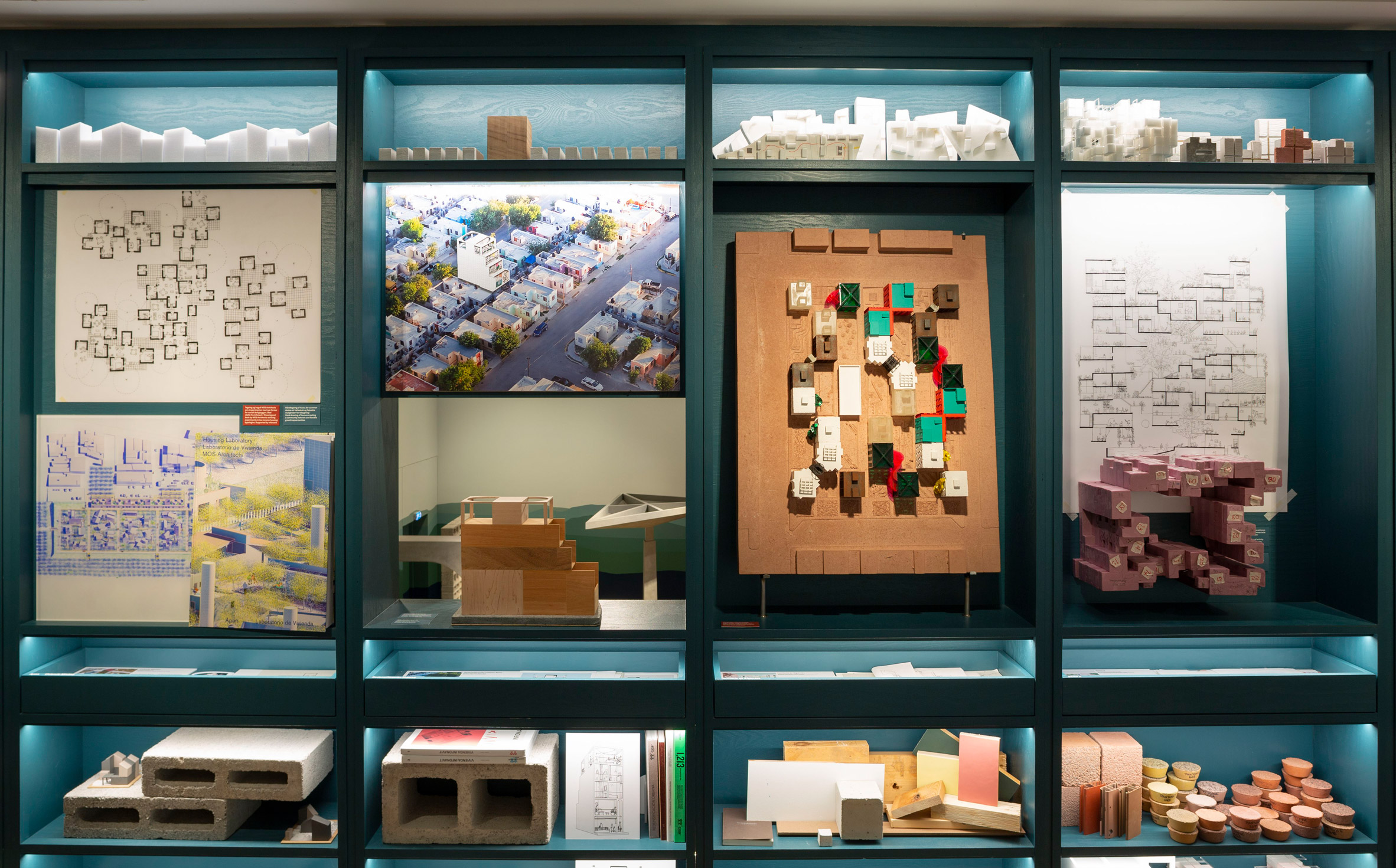
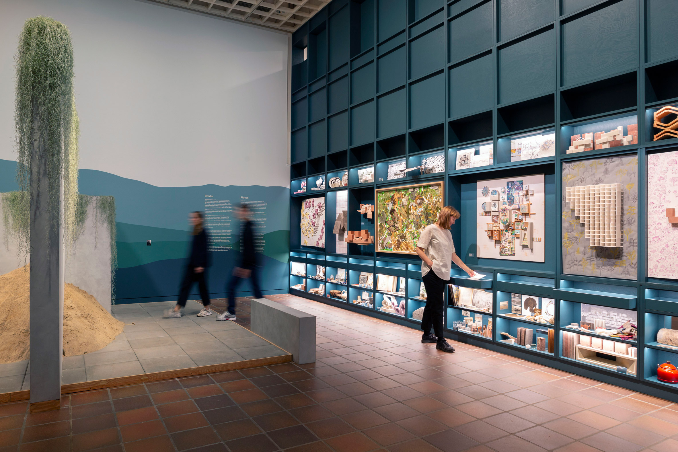
The second area, titled Curiosities, consists of a bright-blue wall of shelving that displays the ideas and objects that have shaped Bilbao's designs.
It includes plenty of collages, along with drawers full of archive materials that visitors can explore.
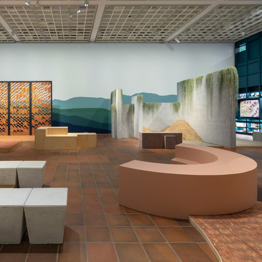
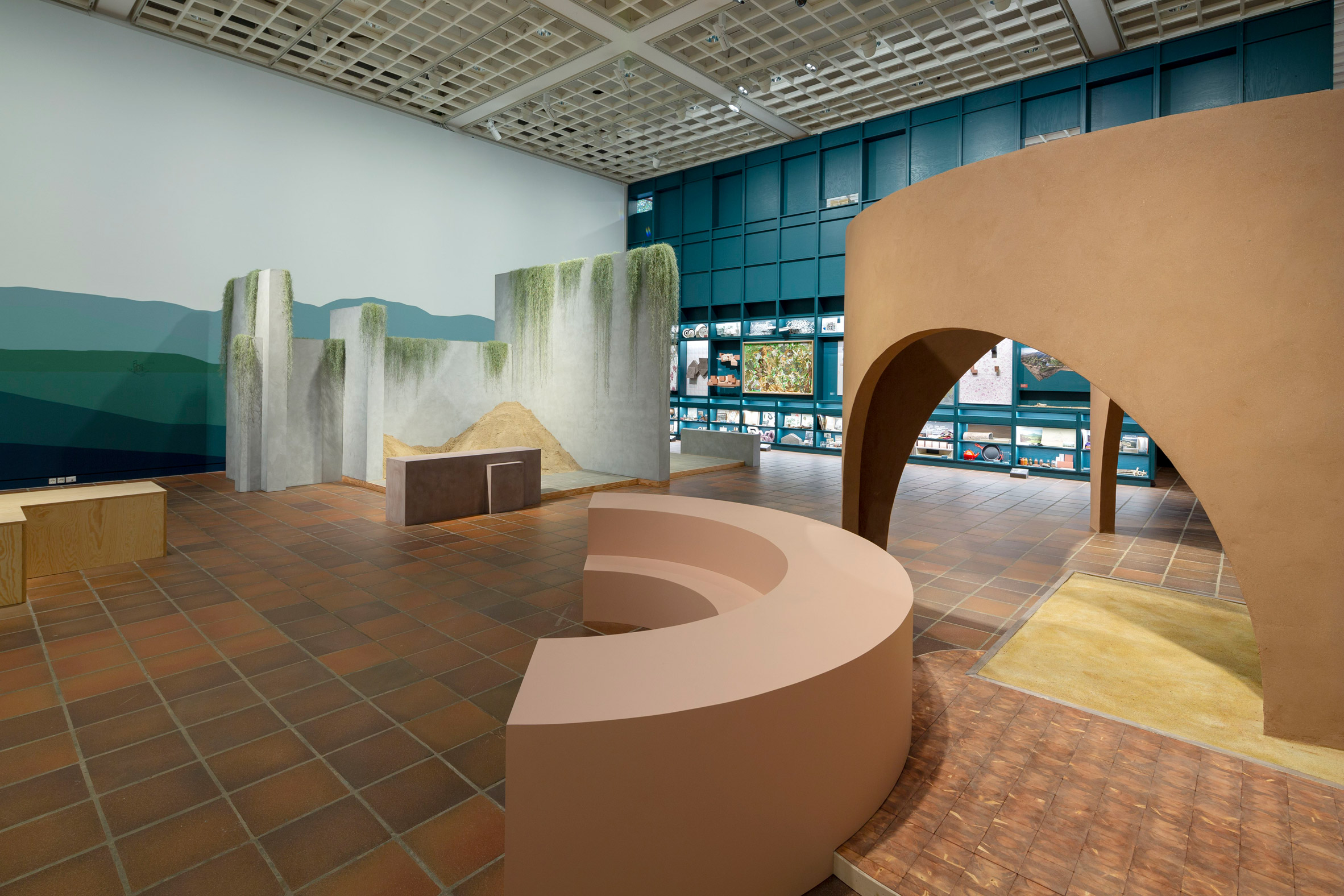
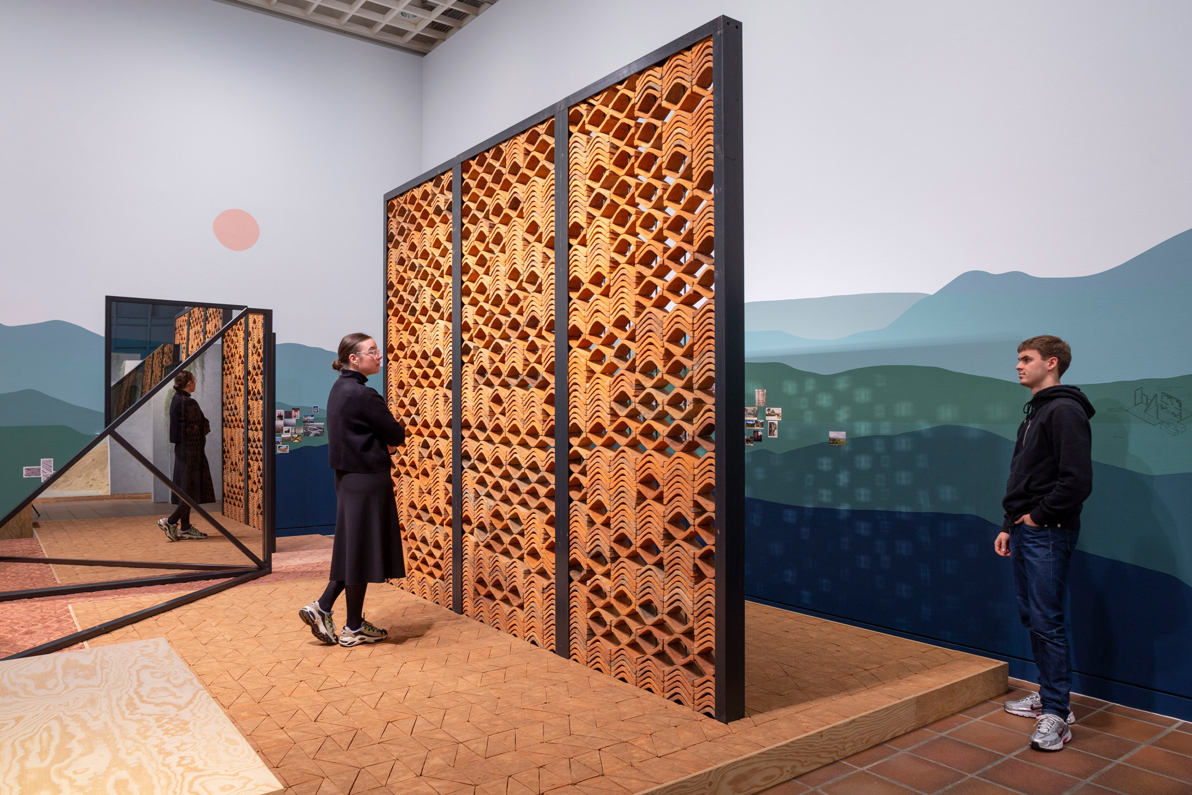
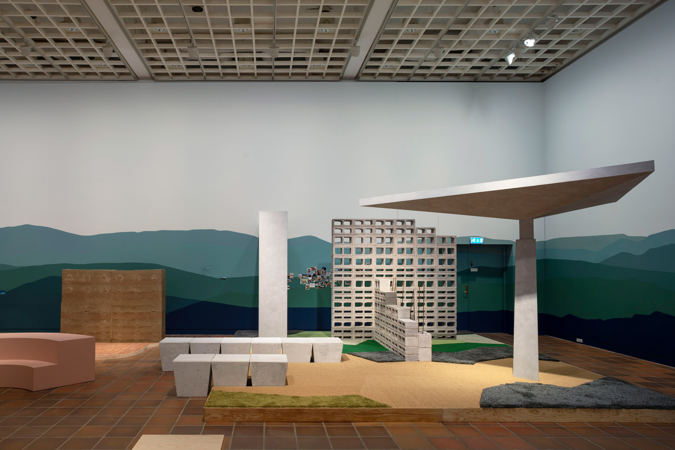
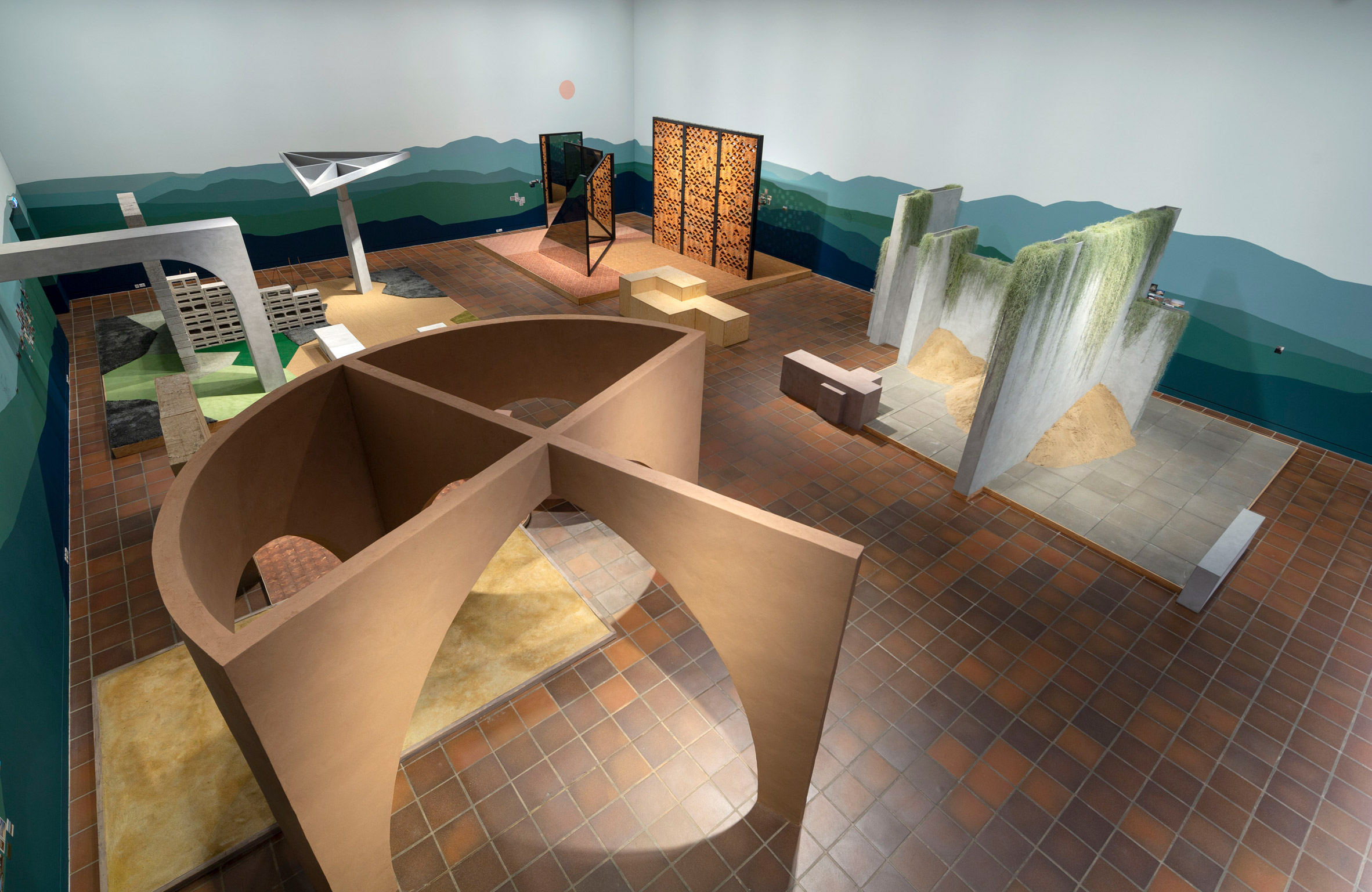
In the main exhibition space, the curators worked with Bilbao's studio to produce full-size fragments of four different buildings.
Called Places, this section shows how the architect works with both natural and mass-produced elements and materials.
Mirrors are positioned alongside walls made up of ceramic tiles to represent Casa del Bosque, a holiday house in Monterrey. Meanwhile the Culiacan Botanical Garden is represented by a mix of concrete elements and carpets.
The Mazatlan Aquarium also reappears in this section, alongside the new, rammed-earth house Staterra.
This is the third exhibition that the Louisiana has hosted as part of The Architect's Studio series, following retrospectives of Wang Shu and Alejandro Aravena. Bilbao will be followed by another female architect, Anupama Kundoo.
"Of course, the whole exhibition series is to do with different cultures," said Kjeldsen, who came up with the idea for the series.
The curator hopes that visitors to the show will see Bilbao as a kind of Robin Hood character, in the way that she uses the proceeds from some of her high-end commissions to fund her more socially driven projects.
"In a way, she's kind of robbing the rich to feed the poor!" he joked.
If you like watching the news on TV or reading them online, you probably noticed the amount of bad news outweighs the good ones by a significant margin. And while we’re not saying that the bad news shouldn’t be reported, sometimes it’s hard to find that glimpse of positivity that would restore your faith in humanity. Lucky for us, however, we’ve got Tom Hanks.
To promote the upcoming movie A Beautiful Day in the Neighborhood where Hanks plays Mr. Rogers, Twitter Movies released a video of the actor narrating and commenting on some of the nicest tweets on Twitter. So if you were looking for a boost of positivity – this is it.
Tom Hanks narrated and commented some of the nicest tweets on Twitter
We hope this video inspires you to pass along the good cheer you get from watching it! After all, if you do a good deed for someone else today, you can imagine what Tom Hanks would have to say about it.
Data is one of the most lucrative resources on the planet, but concern has mounted over protecting digital privacy and the damaging effects of online surveillance this year.
CounterBug is a playful take on the theme that confuses data harvesting algorithms by giving virtual assistants conflicting information about the user, speaking about socially desirable topics and "shouting" over trigger words. Ewa Nowak's solution – brass face-jewellery that confuses facial recognition cameras – is the most aesthetically pleasing, and can be worn in London's King's Cross area, which we learnt this year is using facial recognition to monitor visitors.
This year a number of companies revealed phones with folding screens. Samsung revealed the Galaxy Fold in February this year, with a design that opens like a book to reveal the folding screen inside.
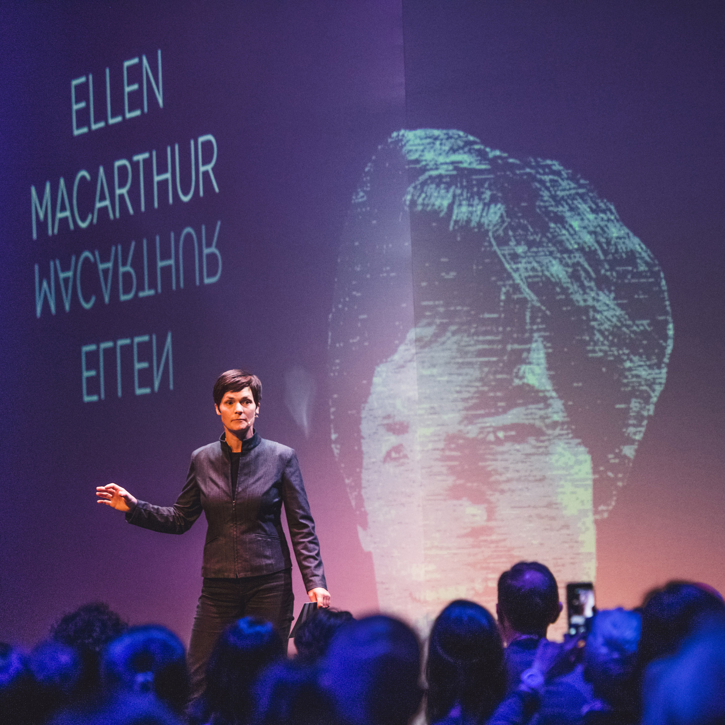
Difficult to define, but hugely important for the future of design, the circular economy was a big topic this year. Round-the-world sailor and circular-economy champion Ellen MacArthur said switching to a circular economy was "absolutely vital" and is looking to persuade 20 million designers to follow her. Adidas's innovation team added that it was "good for business", while designer Richard Hutten believes that companies that don't embrace a non-linear business model will go bust.
Examples of these ideas being put into practice included garments by made by Swedish company Re:newcell made from Circulose, a new material that uses recycled cotton clothes, and Carlo Ratti's orange juice bar that 3D prints a cup to drink from using the fruit's peel.
Electric cars featured heavily at both the Shanghai and Geneva motor shows, and next year's Olympics will see athletes move around in the autonomous, electric e-Palette vehicle by Toyota. More surprisingly, Harley Davidson, the motorbike company associated with Hells Angels and petrol-heads moved into the electric market with two bikes suitable for urban commuters.
It was designer Yinka Ilori's year. The British-Nigerian designer created The Colour Palace pavilion, which stood outside the John Soane-designed Dulwich Picture Gallery in south London. The multi-coloured structure was raised above the ground on four bright-red, stocky legs, and made the designer's mark as the ultimate maximalist.
Designers have been addressing the issue of waste at fairs and exhibitions in two ways: by making installations from recycled materials and by reusing the same materials from the year before.
Apparently fashion is out of fashion, as those who used to make clothes are turning their hands to designing furniture and homeware instead. Belgian fashion designer Ann Demeulemeester launched her first collection of tableware, cutlery and glasses in Paris in September. Meanwhile Rick Owens created a suitably gothic, monochrome collection of seats for Carpenters Workshop Gallery, inspired by brutalism.
Probably the biggest new logo release of 2019 was for the Paris 2024 Olympics. Always a major event and talking point, the latest Olympics logo proved no different, with opinions coming in thick and fast across social media. CR discovered an interesting back story that lay behind the logo, which is rooted in sustainability.
“I don’t think any brand today can credibly claim to be 100% eco-friendly, but we are making the utmost effort to be sustainable throughout the Games,” Julie Matikhine, Paris 2024 Brand Director told writer Jean Grogan for CR. “The last time Paris hosted the Olympic Games was 1924, so this is a once-in-a-lifetime opportunity for all of us. We really want to mark this moment in history.”
Matikhine and her team chose the small Parisian agency Royalties Eco-Branding to create the identity after holding an open competition for ideas from freelancers, small independent and large agencies alike. As its name suggests, Royalties Eco-Branding is focused on creating a system of design that is environmentally friendly, which effects everything from the fonts to the use of digital dark mode.
The logo featured references to Art Deco as well as the central figure of Marianne, the official symbol of the French Republic, and the Olympic flame. “Paris is the City of Light. Our society is undergoing dramatic transformation throughout the globe. Marianne is the symbolic representation of revolutionising society. In 1900, female athletes were allowed to compete in the Olympic Games for the first time. In 2024, we hope to have as many female competitors as male,” says Matikhine.
Of the criticism the logo provoked, Royalties Eco-Branding CEO Sylvain Boyer admitted it was tough going. “I’m not on Instagram or Twitter – luckily,” he says. “I only read the opinion of design forums I respect. We’ve been working intensely on this identity for several months with the Paris 2024 committee. The reaction has been as if it was designed on Monday morning and released to the public in the afternoon. Michael Bierut has approved it. I’m perfectly happy with that.”
A CHANGING WORLD OF ENTERTAINMENT AND MEDIA
This year saw a number of major brands from across the worlds of entertainment and media take on a big rebrand, reflecting the rapid ways in which these industries are changing in the face of new forms of competition and a maturing audience base.
Yahoo launched a grown up new identity, possibly in a last-ditch bid to remain relevant. According to its designer, Pentagram’s Michael Bierut, its intention was to mark wider changes at the brand. “Nothing is more futile than trying to solve a business problem with a new logo,” Bierut says. “The Yahoo team wanted a new identity for all the right reasons: to mark a radical makeover of their products and across-the-board improvements to their user experience standards. These have begun rolling out already, and will continue as the brand reinvents itself.”
New Yahoo branding in action
Facebook also launched a new company brand, a little confusingly with the aim of differentiating Facebook the company from Facebook the app. Its intention was to bring more transparency and clarity, but the jury remains out about whether that can be achieved by a rebrand.
Writing on the role of branding for social media channels for CR, Koto’s James Greenfield observed that wider communication, rather than just a new logo, was required. “Beyond some of the ethical, product decisions he’s made, Zuckerberg has failed to ever really communicate to the outside world,” he wrote. “Most social media brands don’t undertake traditional marketing and so spend little money on brand building. But buying media space to tell your brand’s story will help many companies build a positive global image and support them in times of hardship.”
Facebook’s new company branding
The impact of the streaming giants on more traditional film and TV companies continues, and – after rebrands from Channel 4 and BBC2 last year – we saw more channels refresh their look in order to remain relevant.
Of the draw to this clunky digital look, designer Cameron Askin told CR: “I think to many people the internet is becoming a bit of a broken dream, as evidenced by recent news regarding misuse of data, digital monopolies, fake news etc. I think some people like to look back on the good old days of the internet as a means of escape. I also think that enough time has passed now that when we are looking back on some of those early web pages they feel so foreign and fascinating on so many levels, including aesthetics.”
We also saw an influx of cutesy brand design with brands from language-learning app Duolingo to healthcare apps adopting sweet characters and a playful tone of voice.
According to Michael Johnson, founder of Johnson Banks, the company behind Duolingo’s new look, this is in part a reaction to the uniformity of tech design. “Post-iOS 9, when Jonny Ive took all the skeuomorphic design off the buttons and made everything flat, the world has scrambled to be flat and featureless,” he says. “And that has had an impact on quite a lot of things, including people wanting character and fluffiness.”
Duolingo’s branding and typeface by Johnson Banks
NEW HORIZONS
Some of the most interesting developments in branding in 2019 came from unexpected sectors, as we saw modern branding grace areas that have largely ignored it in the past.
The brand has overhauled everything from the funeral parlour to coffins with a fresh, modern take, and was prompted by Peyton’s frustrating experiences arranging his father’s funeral. “The whole concept is about creating an end-to-end service,” he told CR. “Many funeral directors are just in the business of burying people – it’s quite a narrow job description they have – whereas we’ve tried to bring much more to it.”
Peyton hopes people will also be prompted to begin planning their own funerals with Exit Here. “One of the distressing things about my father’s death – he died of a heart attack – was that we kept on thinking, ‘is this what we would have wanted?’,” he says. “Funerals aren’t just about you, they’re about the people you leave behind, and I think once everyone gets their head around that, they’ll want to plan it and make it as decent an experience [for friends and family] as they can.”
Simon Manchipp, founder of SomeOne, believes this is the beginning of wider changes in branding for law firms. “Law and lawyers are lagging well behind the rest of the world when it comes to branding, marketing and things like that,” he told CR. “They’ve always relied on really big brains attracting other big brains, but I think they’ve woken up and started to understand that brand is not just a logo, typeface and colour. It’s reputation, and the visual identity helps manage that reputation.”
Law firm Simmonds & Simmonds branding
Finally, we saw one company that is truly future-facing release its wider look this year. Virgin Galactic believes that we are on the cusp of commercial space travel and 2019 saw the release of how this might look, in branding terms. Talking to CR, creative director Tom Westray explained what had inspired the company’s elegant style, which draws on sci-fi while attempting to remain part of the Virgin brand family (even if there’s no red in sight).
“Ultimately the Virgin brand is enthusiastic, exuberant and fun,” he says. “But we’re doing some really serious stuff at the moment – Virgin Group is doing Virgin Galactic, Virgin Orbit, Virgin Hyperloop and we’ve been in the aviation industry for many years. So it’s serious stuff and should be treated so, and trying to get that little twist of Virgin culture is a challenge. When you think about tone of voice, for example, if you look at government agency aerospace company culture, and pair that with your typical old school Virgin culture … they seem to be at completely opposite ends of the spectrum. Getting them to meet somewhere in the middle and work in harmony has definitely been a huge challenge.”
And if you think all this stuff is still decades away, Westray insists it’s not. “We make a lot of comparisons to the early days of aviation,” he says. “If you look at how commercial aviation accelerated from something which was for the rich and famous, to something for everybody, that cycle was 30 years. If even that. If you think of someone in their 20s now, by the age of 50 going into space might seem kind of mundane…. I think people will be absolutely staggered by what the commercial space industry looks like 10 years from now.”
Second Home Hollywood, the first US location from the British co-working company, is revealed in this captioned video produced by Dezeen for Second Home.
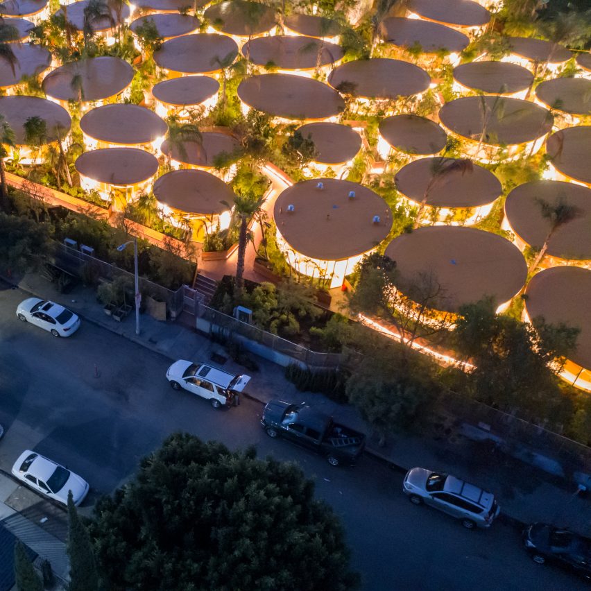
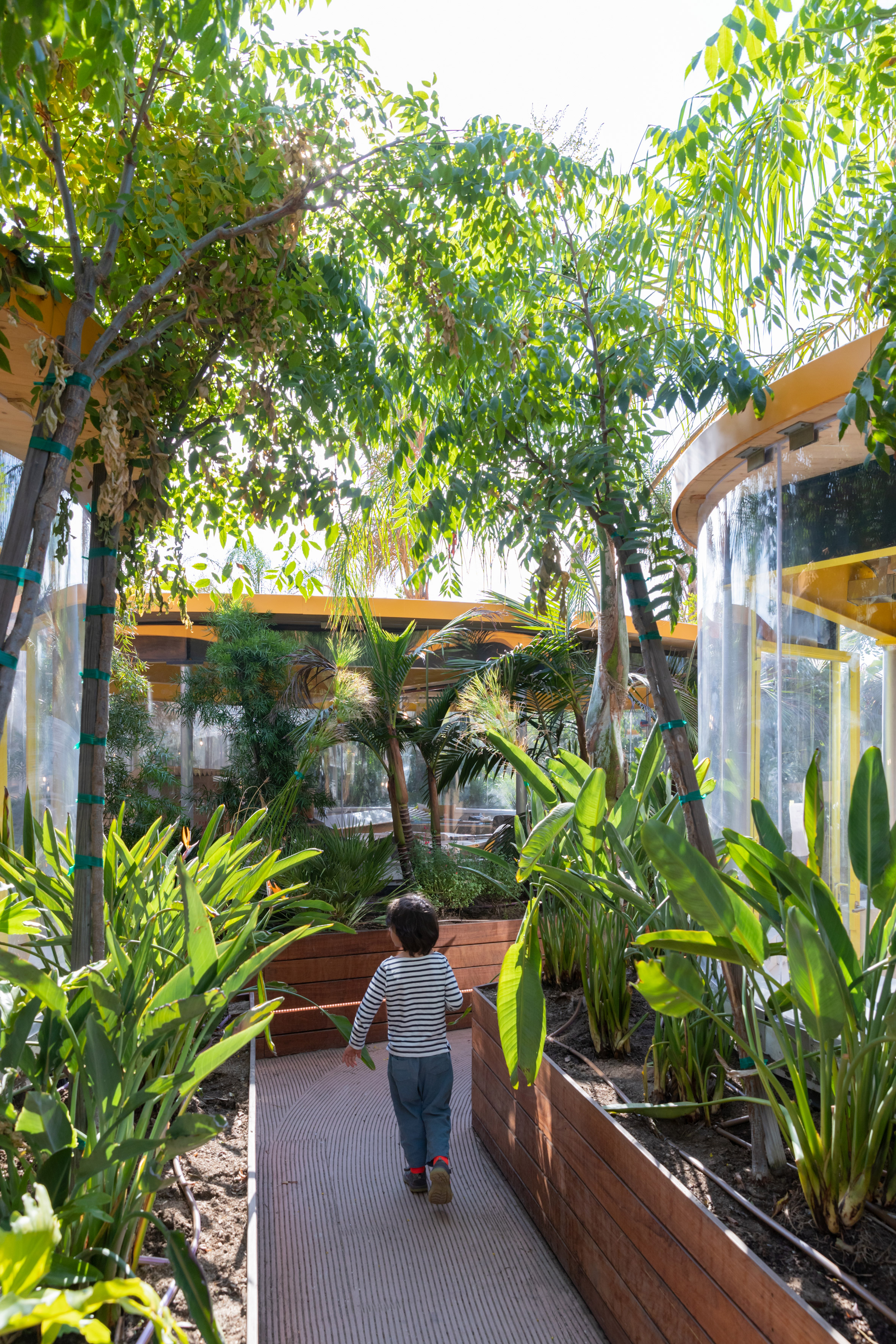
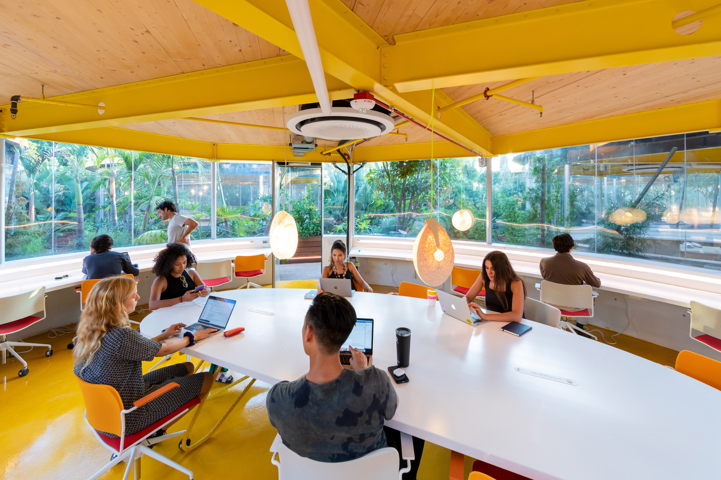
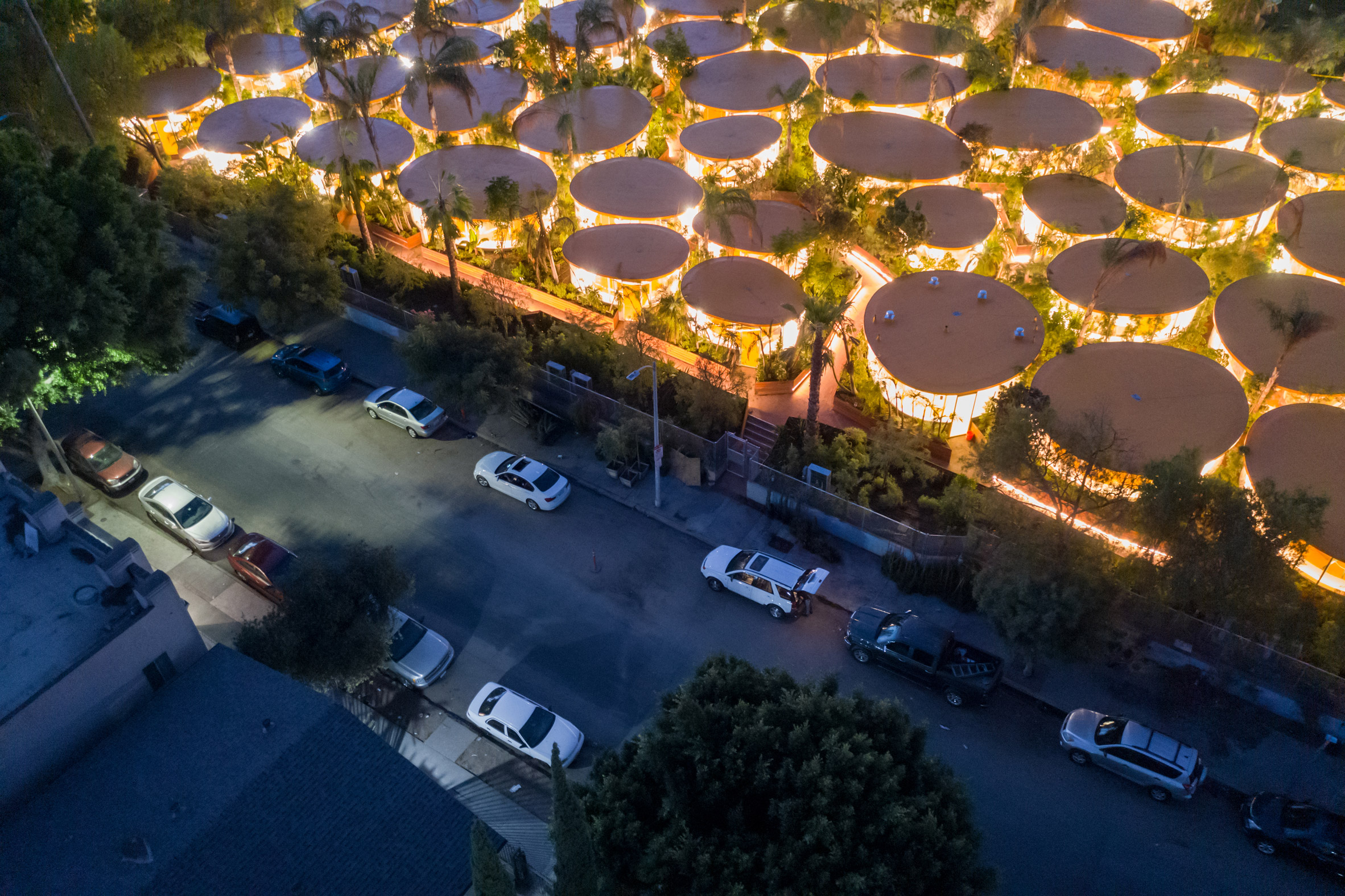
Spanish architecture practice SelgasCano transformed a former Hollywood parking-lot into a sprawling co-working complex that will house 250 companies. It has previously worked with Second Home to create other spaces in London and Lisbon.
In Los Angeles, the architects filled the site with sixty oval-shaped office pods of varying sizes, which are topped with bright-yellow rooftops that resemble a cluster of lily pads when seen from above.
Second Home Hollywood is a co-working complex designed by SelgasCano
The site has been populated with more than 6,500 plants and trees from 112 species native to Los Angeles, in order to create a tranquil working environment for members.
The site also incorporates the former Anne Banning Community House, a historic 1960s building which SelgasCano renovated to accommodate 30 additional office spaces for Second Home members.
The architects transformed a former parking-lot into a campus for 250 companies
The ground floor of the building features a number of spaces that are open to the public, including a branch of Second Home's bookshop called Libreria, a restaurant, outdoor terraces and meeting rooms, which local charities and nearby residents can use for free.
Second Home collaborated with the Natural History Museums of Los Angeles County (NHMLAC) to move the colourful structure to the site, where it was used to host a programme of free public talks, film screenings, and other events.
The pavilion comprises a series of metal arches wrapped in plastic that form a variety of enclosed spaces flooded with coloured light.
The architects filled the site with sixty oval-shaped office pods with yellow rooftops
Second Home was founded in 2014 by co-working entrepreneur Sam Aldenton and Rohan Silva, a former special adviser to then prime minister of the UK, David Cameron.
This video was shot by Dezeen for Second Home in Los Angeles. Photography is by Iwan Baan.