Thursday, January 2, 2020

Someone Points Out That Humans Aged Faster In The Past And The Pictures Don’t Lie

Imagine a situation: you’re looking at an old photo of your great grandparents standing in front of their new home while holding a newborn in their hands. You flip the picture over and there’s a scribble on the back “Mom and Pop, age 22”. You can’t believe your eyes – they look at least forty in that photo! It may sound crazy but it looks like people actually did age faster in the past than they do now.

Baseball player Brandon McCarthy recently asked Twitter users if people aged faster in the past and got some photo evidence confirming this theory. Check it out below!

More info: Twitter

Image credits: BMcCarthy32

Image credits: rockiepie258

Image credits: DickBuffman213

Now, we’re not sure if it’s just a coincidence or not but the pictures don’t lie. Some people speculated that it might be because of the choice of clothes and hairstyles while others pointed out that it might have been caused by rampant smoking (just remember – you could smoke in hospitals and even on airplanes!). Of course, there were also historical factors like the World Wars and the Great Depression that could have influenced the accelerated aging.

Image credits: AndyLChapmanLA

Image credits: jadande

Image credits: KeahiKaiwi

Image credits: rMeredithc

Image credits: jarreddjohnson

Image credits: dbrydodg

Image credits: WillNotBDanide

Image credits: pklinkne

Image credits: CerowB

Image credits: nthomasrios

Image credits: stefanielaine

Image credits: _JVera

Image credits: eckhaus

Image credits: Solvang84

Image credits: CogitoErgoJokes

Image credits: KevinKlussier

Image credits: ThatShaneBua

Image credits: zamartin

Image credits: DTMattSmith

Image credits: BaseballReba

And like in any good Twitter thread, there was no shortage of jokes

Image credits: JohnOttavio

Image credits: airwin_nl

Image credits: MadHominem

Image credits: MRipley13

Image credits: Grova

Image credits: Reynaldo_8

The post Someone Points Out That Humans Aged Faster In The Past And The Pictures Don’t Lie appeared first on DeMilked.


from DeMilked https://ift.tt/2uc4yw6

Lucy McRae offers an escape from the digital with Future Survival Kit

Future Survival Kit by Lucy McRae

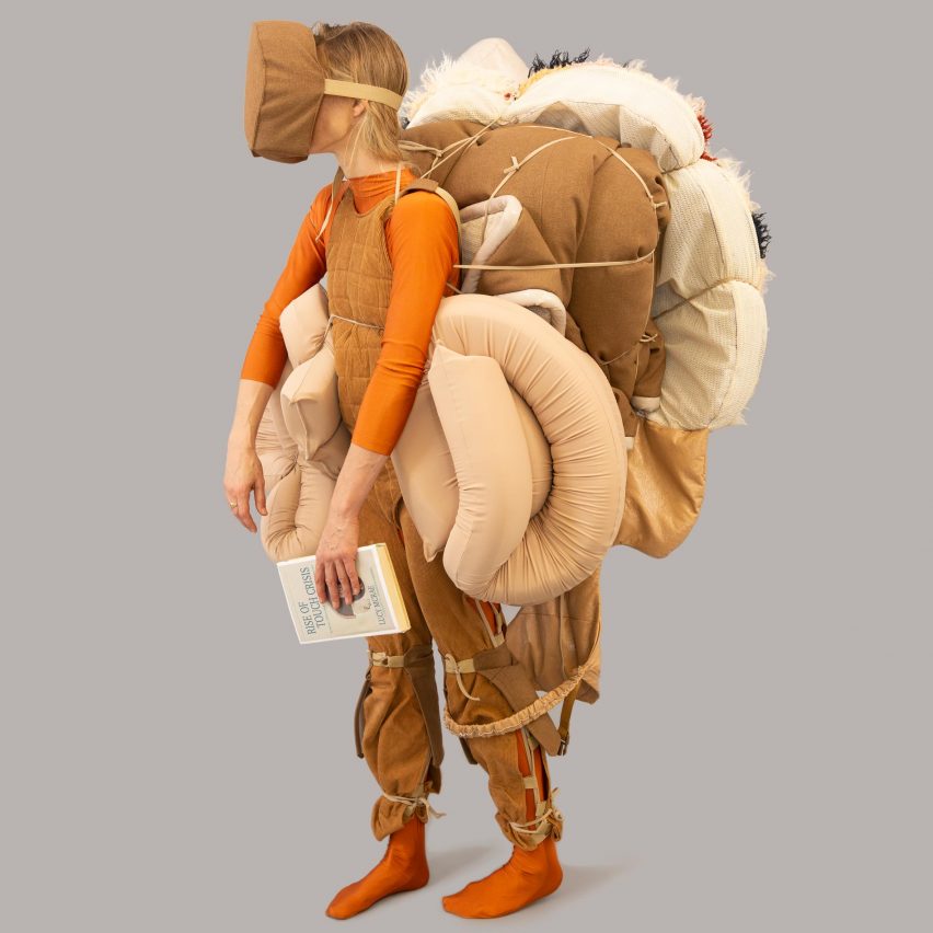
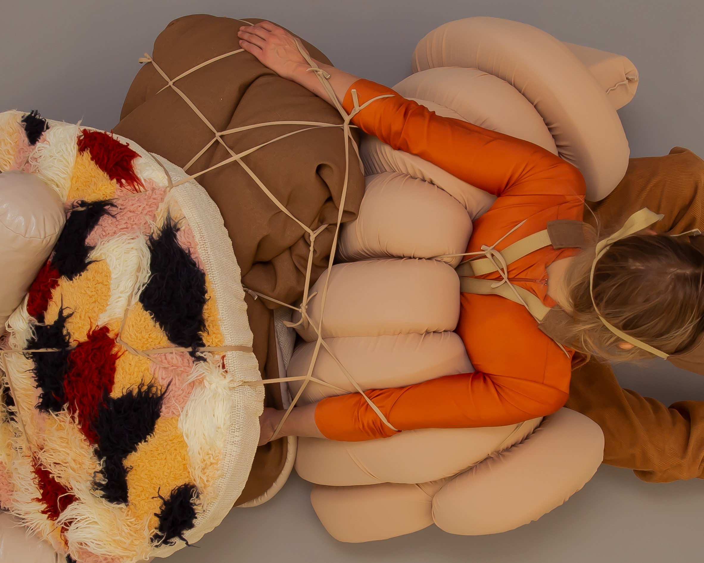
Los Angeles-based artist Lucy McRae has created a survival kit for a post-apocalyptic future, designed to be carried on the body as if you were a sherpa.

McRae, who calls herself a body architect, imagines that people might one day react against "the age of the algorithm", by rejecting digital devices and social media platforms.

Future Survival Kit by Lucy McRae

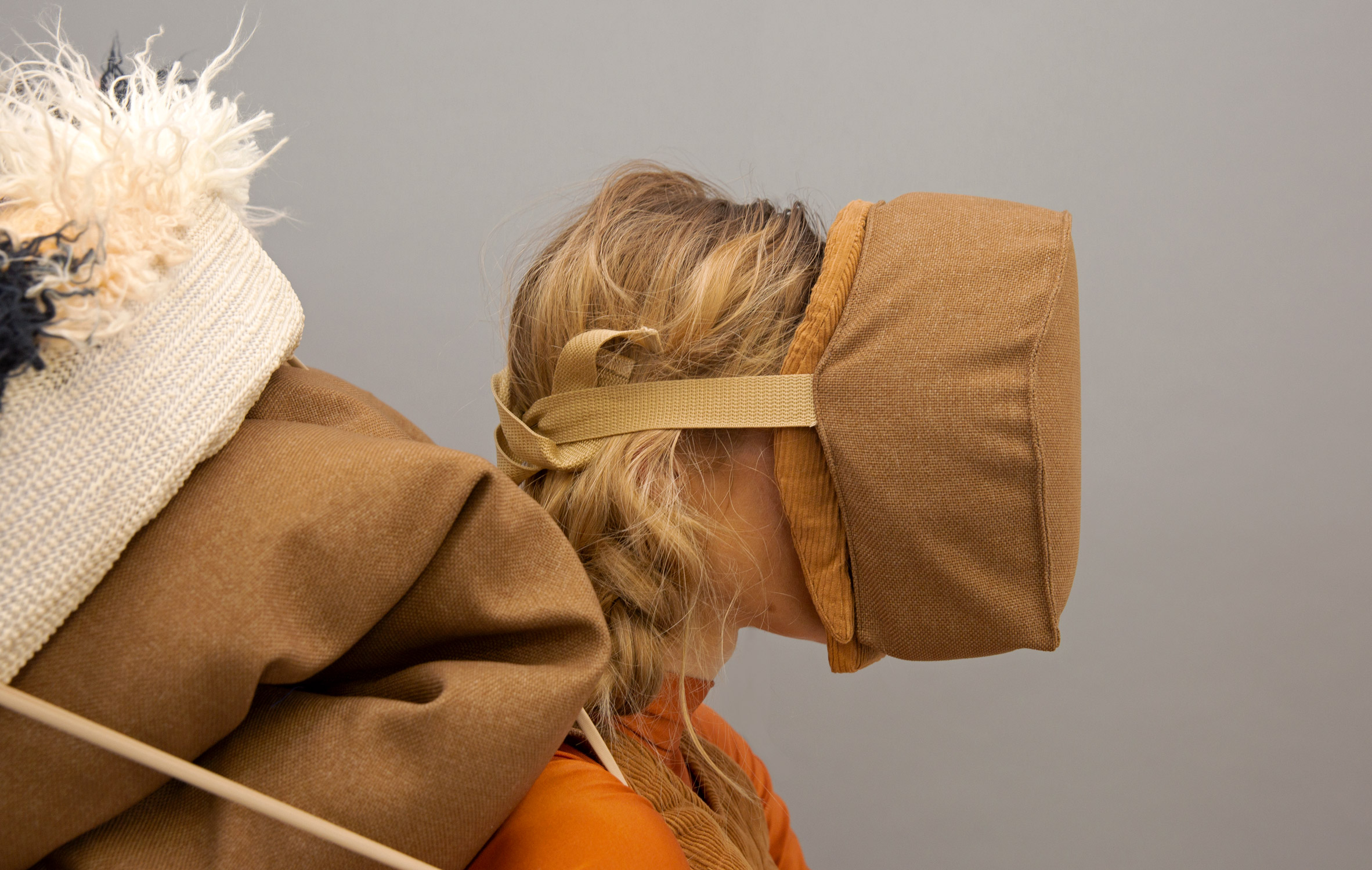
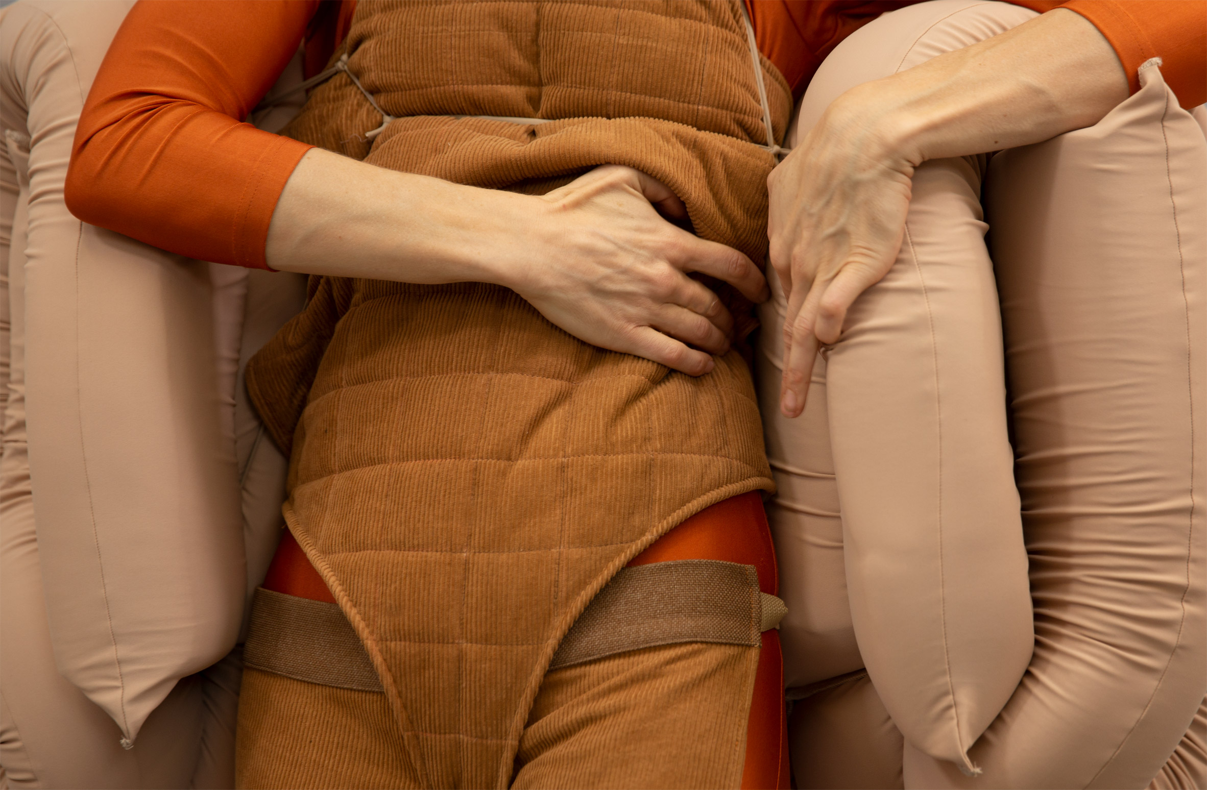
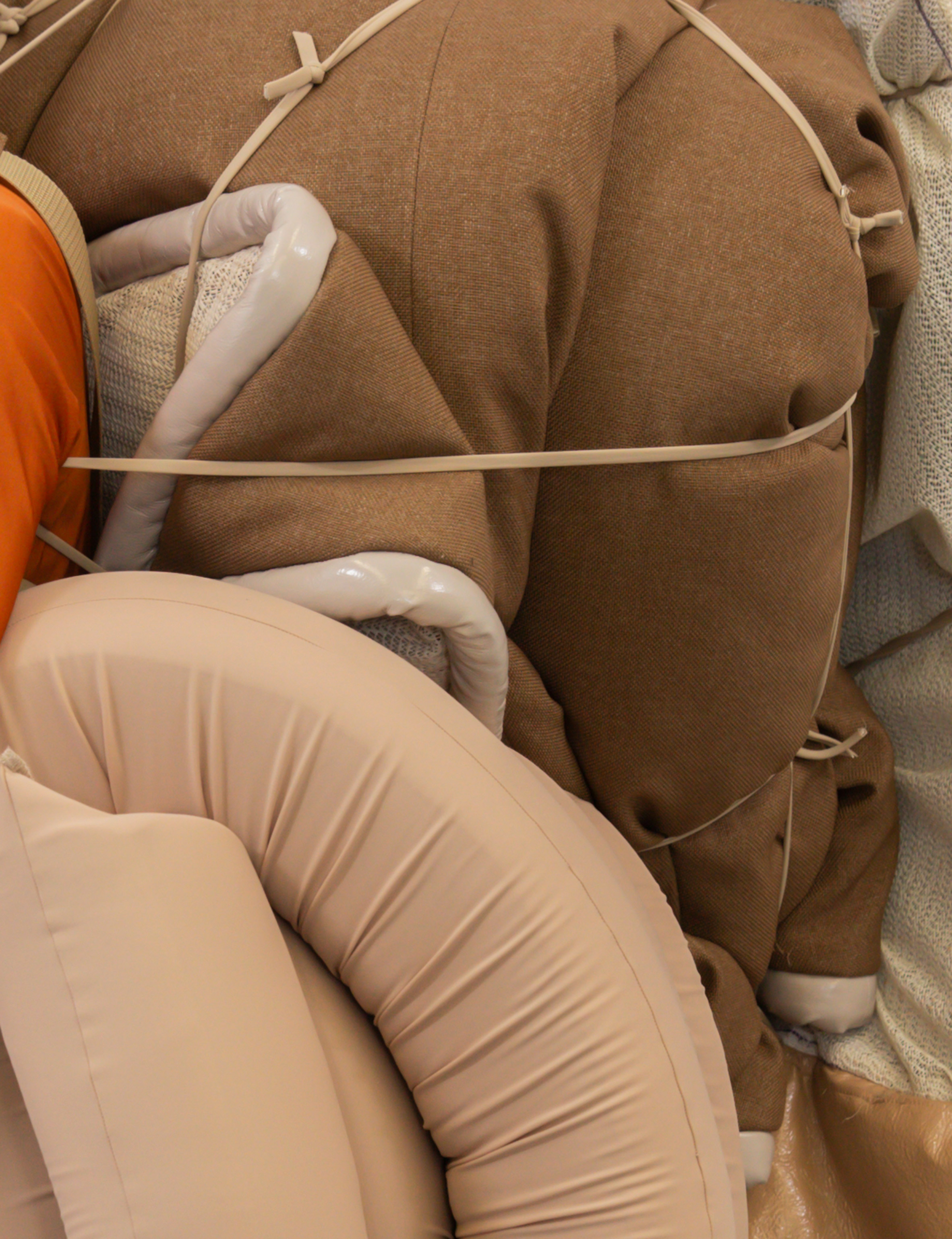
She suggests that a survival kit for this new future could contain tools that help us slowly adjust to this new reality. They include a mask that, like a phone, closes you off from the real world, plus cushions and mats that offer comfort.

"Rarely do we create something significant without being confronted with the brink of disaster," McRae told Dezeen.

"AI, the environment, automation – these themes are destabilising our cosy lives. I'm not suggesting we exit and permanently retreat, I'm just trying to question how we navigate our future."

Future Survival Kit by Lucy McRae

McRae felt the sherpa offered the perfect model for her narrative. These nomadic people, native to the mountainous regions of Nepal and the Himalayas, are known for helping to shepherd people across treacherous terrain.

The artist imagines that, in a post-apocalyptic hunt for independence, anyone could become a sherpa.

"The sherpa gets everyone up the slope, everyday, with no real credit. The average citizen is doing the same, carrying the world on their back day-in day-out, running against the wind, at a time defined by uncertainty and risk," explained McRae.

Future Survival Kit by Lucy McRae

"Researchers have found that a sherpa's mitochondria is more efficient at using oxygen to produce energy, thus are better in higher altitudes," she continued.

"This genetic difference is, for me, a clue that the more uphill challenges we confront, the better our psyche becomes at facing them, in the process inventing new techniques for safety and self awareness in times of turbulence."

Future Survival Kit by Lucy McRae

McRae's work revolves around using the body as a means to speculate on the future, as she explained in a recent interview with Dezeen. She said her aim is to give science fiction "an overdue sex change".

A few of her recent projects have explored what McRae calls the touch crisis – the idea that, with the rise of technology, digital devices might start to vie for human affection, and physical contact with other humans might suffer as a result.

These include her Compression Carpet, an analogue machine that gives someone a hug.

Future Survival Kit by Lucy McRae

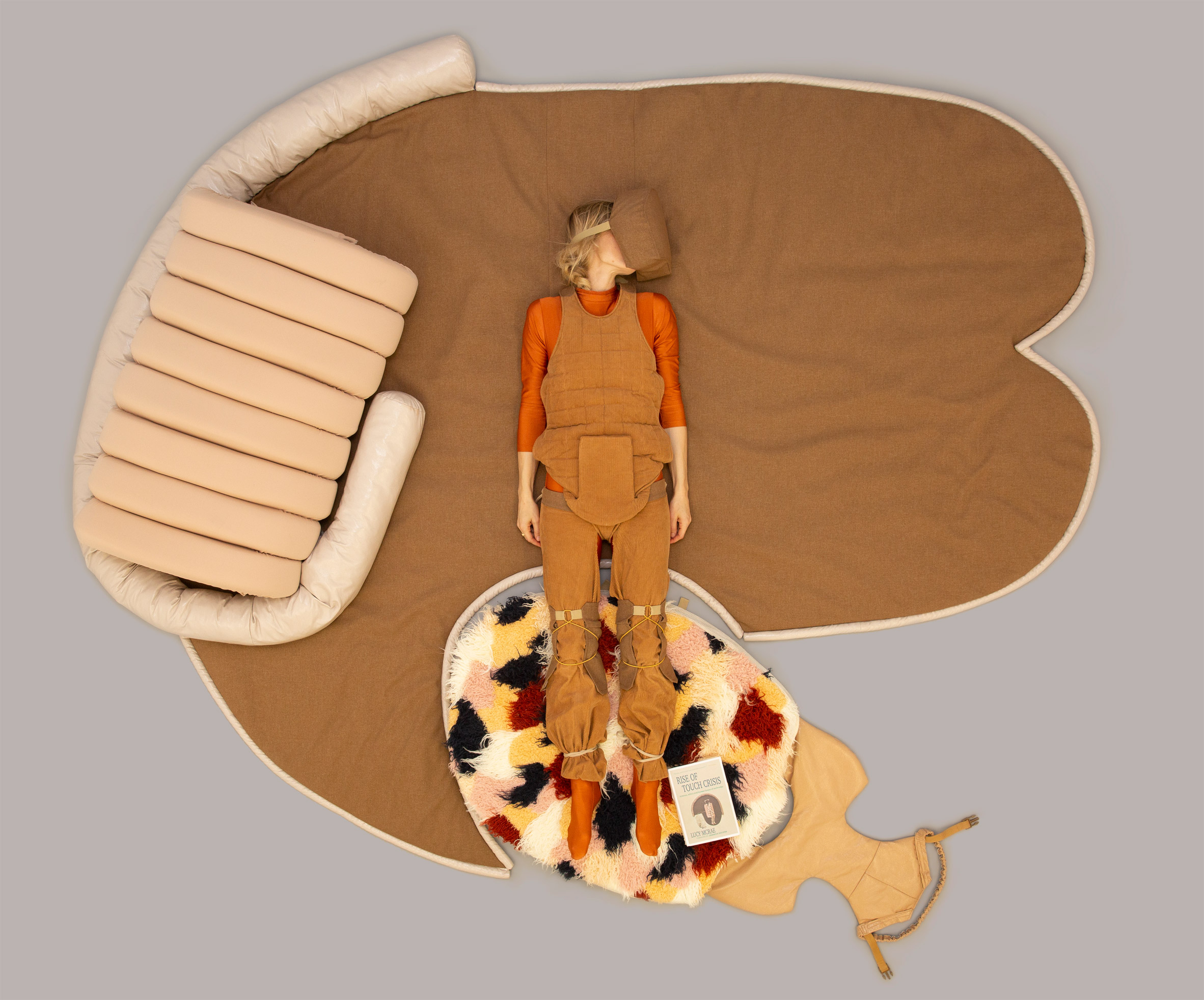
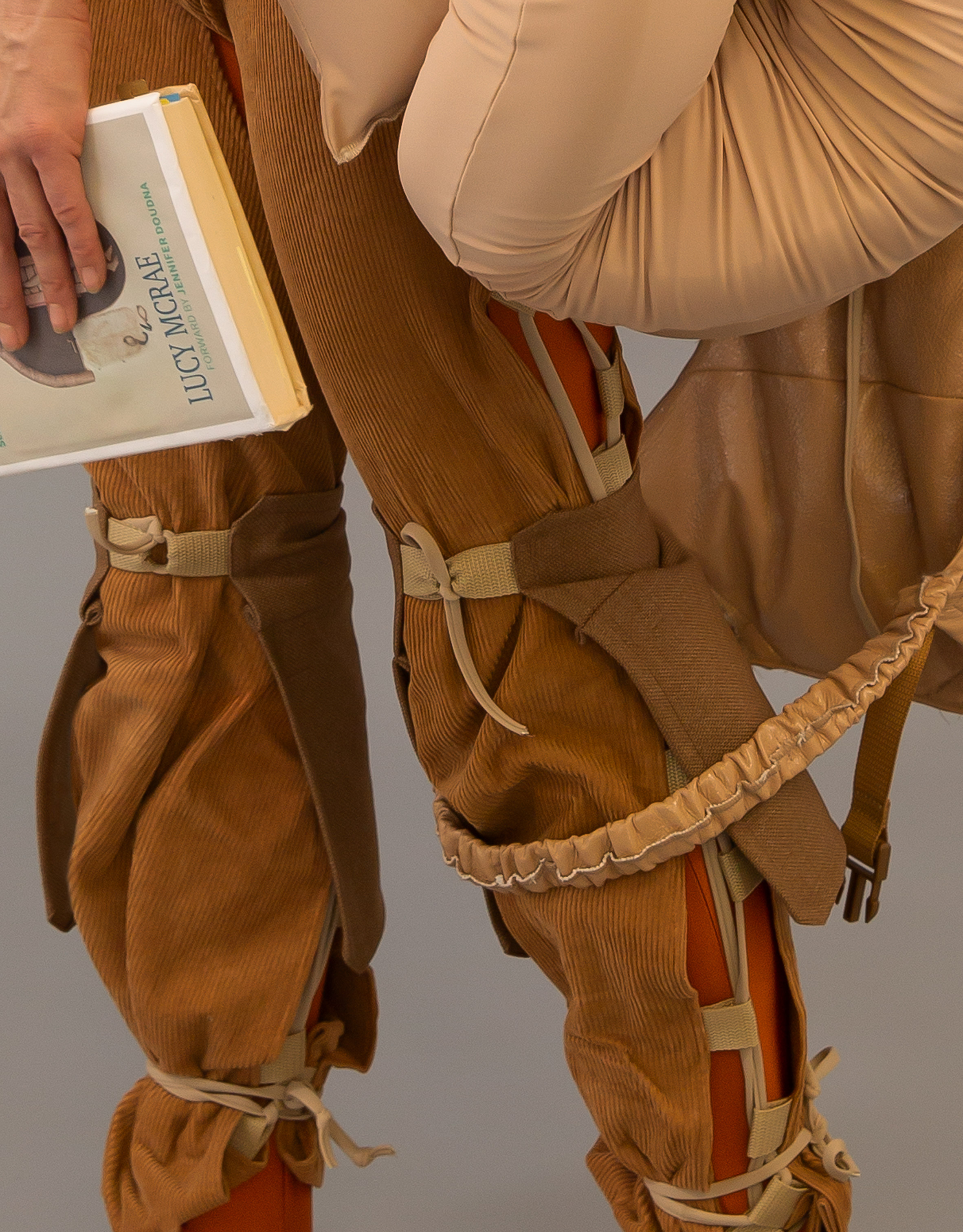
McRae references the same idea in the Future Survival Kit. Images show her body wrapped up in the entire survival kit, but in her hand is a book titled Rise of The Touch Crisis.

"This speculative book would be part illustration, part encyclopaedia, part science manual and part recipe book, written from the point of view of a female scientist turned comfort sherpa," said McRae.

"It would include DIY hacks for emotional survival when isolated in the bush, and how to build trust and captain uncertainty."

Images also show that, when unfolded, McRae's survival kit takes on the form of a giant snail.

Future Survival Kit by Lucy McRae

Future Survival Kit is debuting in State of Extremes, an exhibition at Design Museum Holon in Tel Aviv, curated by Aric Chen. On show until 9 May 2020, the exhibition explores a world undergoing rapid and extreme change.

According to McRae, uncertainty abut the future is an important tool for social progression.

"Anyone who feels comfortable right now, is limiting their opportunity for growth; because we know that growth happens at the edge of uncertainty," she said.

"In my opinion, our only way forward is to swim upstream everyday, just like the sherpa, ascending mountains, aware of the risk but doing it anyway."

Photography is by Ariel Fisher.

The post Lucy McRae offers an escape from the digital with Future Survival Kit appeared first on Dezeen.


from Dezeen https://ift.tt/2ZJesAO

Oval-shaped meeting room is centrepiece of granite office in Chandigarh

Office 543 by Charged Voids

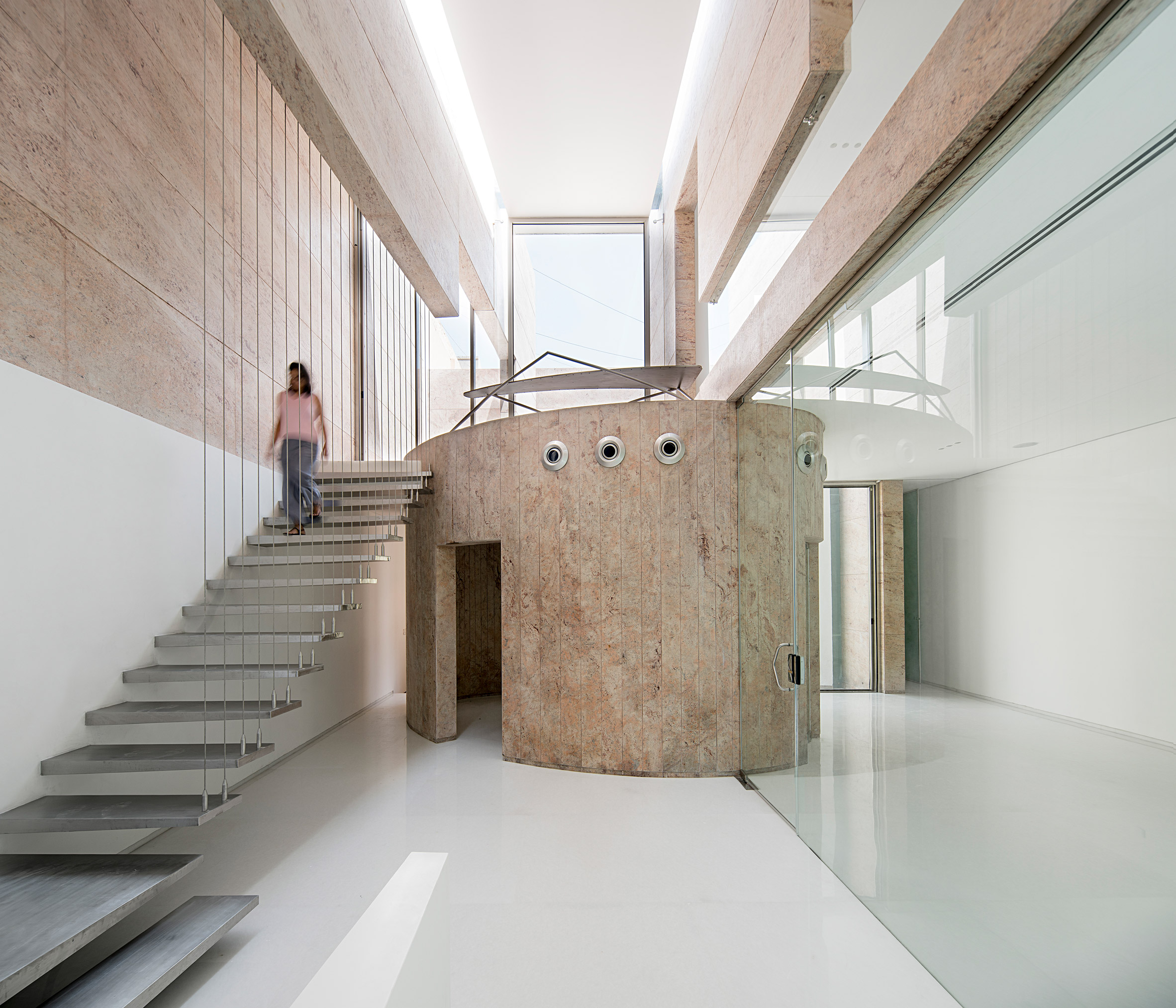
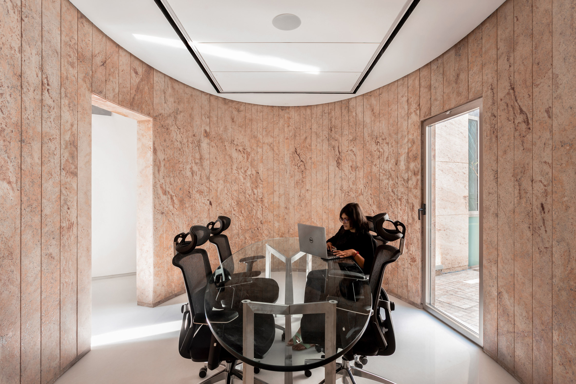
Indian architecture studio Charged Voids has designed Office 543 around an elliptic meeting room with granite walls, which is a private space among the glass-walled offices.

Designed for construction company Khullar Builders, the office is located in the Mohali district of Indian city Chandigarh, which was planned by modernist architect Le Corbusier.

Office 543 by Charged Voids

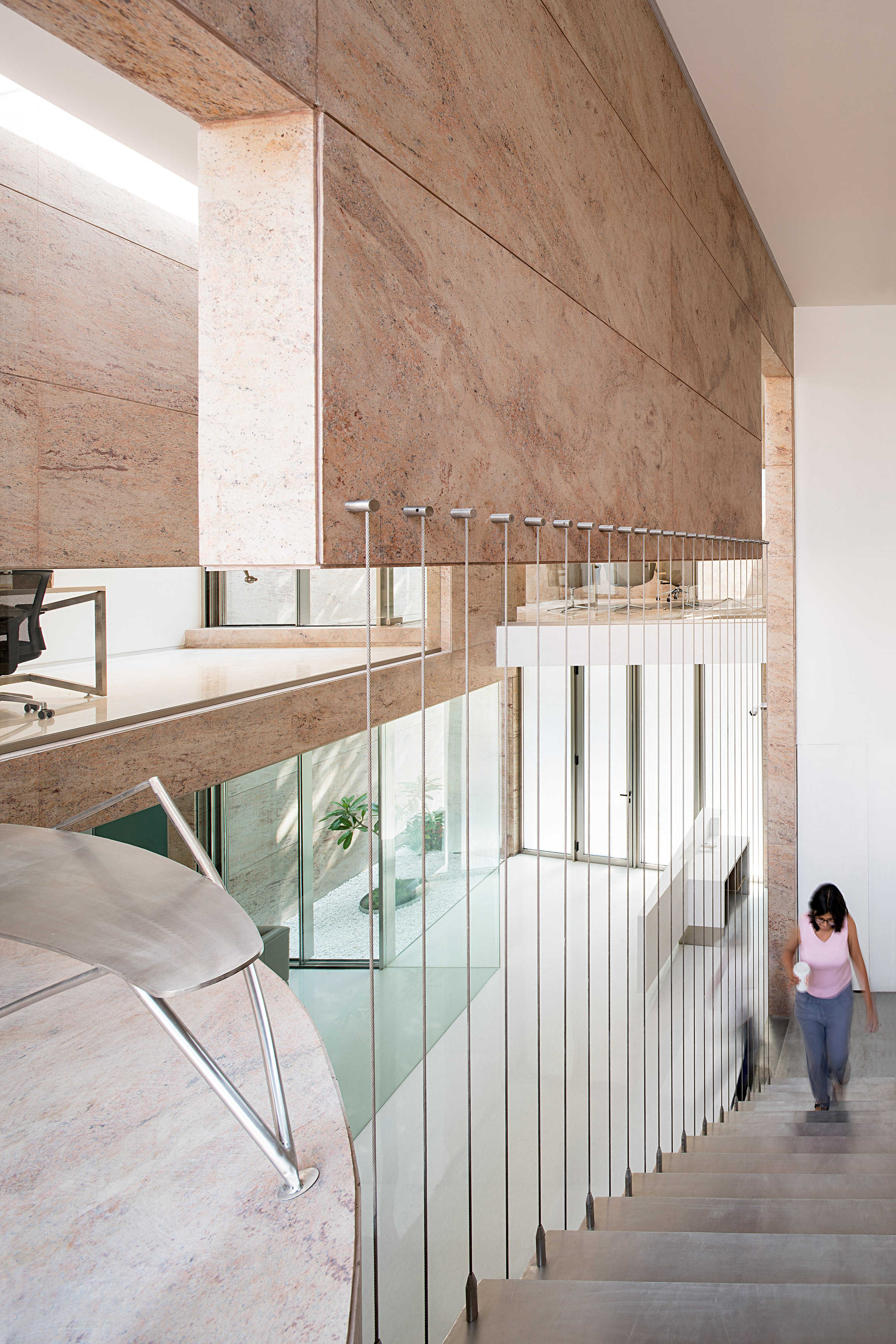
The two-storey building was conceived by the local studio as a series of small spaces that branch off a central double-height atrium. Within this space Charged Voids designed an oval meeting room that contrasts with the otherwise linear  office spaces.

Directly connected to the main office and the central atrium, it is clad with the same Sivakasi gold granite as the building's exterior.

Office 543 by Charged Voids

Alongside the meeting room and main office space, the ground floor contains a reception area and two courtyards, which were planted with small trees.

Openings between the rooms are designed to connect the office's narrow spaces with these courtyards and bring daylight into the workspaces.

Office 543 by Charged Voids

"The interjection of courtyards and skylights is a strategy that allows us to experience the fragments of nature like the wind, light and greenery," said the studio.

"The courtyards are used as a buffer between the exterior and the interior, and break the powerful geometry of the elements of design."

Office 543 by Charged Voids

A floating metal staircase within the atrium gives access to the first-floor, which contains a terrace above the rear courtyard, additional workspaces and an office. A small sitting area is located on top of the oval meeting room.

Further offices are located on the third floor. Designed for another department within the company, these workspaces are accessed via a separate staircase on the right hand side of the facade.

Office 543 by Charged Voids

The studio's design aimed to address the limited space available on 140-square-metre site.

"The idea was to utilise the small site by building the bare essential number of elements with each element achieving its maximum efficacy," explained Charged Voids.

The studio used a restrictive material palette of white marble and Sivakasi gold granite which gives the office its warm-coloured facade. The majority of the interior walls in the office areas are painted white.

Office 543 by Charged Voids

Chandigarh was one of India's first planned cities and was masterplanned by Le Corbusier, who designed landmarks including the Neelam Theatre and Capitol Complex.

Photography is by Javier Callejas.


Project credits:

Architect: Charged Voids
Builder: Khullar Builders
Structure consultant: Pankaj Chopra

The post Oval-shaped meeting room is centrepiece of granite office in Chandigarh appeared first on Dezeen.


from Dezeen https://ift.tt/2svRzVG

VW waves goodbye to the Beetle with a sentimental new ad

The spot, titled The Last Mile, is created by ad agency Johannes Leonardo and set to a version of Let It Be by The Beatles sung by a children’s choir. It is bathed in nostalgia for the Beetle, with references to its place in pop culture history included throughout.

Andy Warhol shows up, as does Kevin Bacon, in his role as a Beetle-driving Ren in Footloose. And the brand’s iconic 60s posters Think Small and Lemon also receive their own homage in the ad.

It might seem odd for a brand to put so much emphasis on a product that is no longer available to buy, but the release of the ad forms part of an ongoing marketing push by VW to move on from the global diesel emissions scandal that severely damaged its reputation in 2015.

The new ad follows a previous campaign that aims to highlight its move into electric vehicles. As with The Last Mile, those ads also leverage the brand’s glorious past.

Electric vehicles are not mentioned explicitly in the Beetle spot though there is a lengthy scene that references environmentalism via wind power and the closing tagline – ‘Where one road ends, another begins’ – is an attempt to look to the future. The hope is clearly that the big love for Volkswagen that the world once had can be used to redeem its standing with consumers and allow both the brand – as well as its products – to move on from its difficult last few years.

johannesleonardo.com

The post VW waves goodbye to the Beetle with a sentimental new ad appeared first on Creative Review.


from Creative Review https://ift.tt/2MPTxXA

Why I’m always happy to see great work from other agencies

Striking an optimistic note at the start of the new decade, Laurent Simon, chief creative officer at ad agency VMLY&R explains why, in a deeply competitive industry, he loves to see great work being made by his rivals

The post Why I’m always happy to see great work from other agencies appeared first on Creative Review.


from Creative Review https://ift.tt/39xyJhg

Design in 2020 — what will graphic design look like?

Pentagram’s Astrid Stavro

What do you think 2020 will hold for graphic design?

The past year has seen a trend emerge, which I think will be amplified in 2020. Whereas traditionally the majority kept their politics close to their chest, graphic designers are now making their voices heard, and using what they do to try and effect change. Not since the 60s has there been so much focus by designers on the issues that affect us all, from politics and social issues to the environment. What’s driven this? Perhaps it’s a need for a new generation of designers — as well as creating exquisitely kerned type — to feel that what they do will make a difference. And perhaps social media has played a part, making it easy to share your opinions, connect with like minded people and mobilise groups.

This new-found political and social consciousness among designers has also affected the brands many of them work for. In 2019 it’s no longer enough to just be a brand — in their relentless thirst for authenticity, brands need to be seen to be ‘giving back’ by supporting social or environmental issues. It reminds me of the heady days of Oliviero Toscani’s hard-hitting ad campaigns for Benetton and Tibor Kalman’s groundbreaking Colors magazine in the Eighties. While this new-found social conscience is to be applauded, it shouldn’t be used as just another way to convince us to buy more stuff, or to mask the fact that many companies are woefully behind on their (self-regulated) sustainability targets.

extinction-rebellion
Extinction Rebellion

One extremely political brand that’s successfully resisting exploitation is Extinction Rebellion. To stop anyone profiteering from its logo (which is owned by street artist ESP), it doesn’t allow any merchandise but instead invites supporters to bring their own clothes to events and have the logo block printed onto them. It’s a global symbol which has burned itself into the nation’s psyche, but won’t be picking up a D&AD pencil anytime soon.

What is your favourite graphic design project from 2019 and why?

There are too many to choose from, but ones that deserve a mention are the tireless work carried out by Led by Donkeys, and the recent Politics v. Policies free newspaper created for the general election by Rory Stiff and Casey Highfield Smith. My favourite project is an example from a big brand, but one which feels like more of a commitment than a piece of simple greenwashing.

For the second time, Lacoste has created Save our Species, a collection with the Union for Conservation of Nature (IUCN) which sees the brand’s iconic crocodile replaced by ten different endangered species. It’s a lovely idea that’s simple, sweet and effective. And although the shirts themselves are expensive and very limited edition, the publicity surrounding the original campaign caused a significant spike in donations to the charity (even if it did win its creator Havas a few gongs along the way).

Lacoste’s Save our Species collection

The post Design in 2020 — what will graphic design look like? appeared first on Design Week.


from Design Week https://ift.tt/39tGPaJ

New BBC V&A series: “The objects are the stars of the show”

There are over 2.3 million objects at the V&A museum, and each has its own story to tell. But despite growing footfall and record numbers of visitors to exhibitions, most of those objects will never be known to the general public. Now a BBC series is revealing a select few of these objects’ histories, which cross fields of art and design, all of which find a home at the central London museum.

Secrets of the Museum is a six-part series, which follows the V&A’s specialists teams — from conservators to curators — as they follow the stories of remarkable objects, from the old (Queen Victoria’s coronet) to the new (the Extinction Rebellion logo). The series is a collaboration between BBC Arts and Blast! Films for BBC Two.

Alistair Pegg, director of programmes at Blast! Films, tells Design Week that the studio didn’t want to make a “conventional” documentary — where you’d have “an interview with the chief executive, a bit in the canteen and a bit with the curators” — but a series “that focuses purely on a small number of objects”.

“In a way, the objects are the stars,” Pegg adds. “They’re the focus and attention.”


Choosing the “stars”

The first episode shows preparation for the 2019’s Christian Dior exhibition, which almost 600,000 people visited. Fashion shows are big for the V&A: another episode looks at the current Mary Quant exhibition. But the museum has always had a broad scope in terms of design; one episode looks at the recent Cars exhibition through the lens of a converted low-rider vehicle, which was transported from Los Angeles to London for the display.

In choosing these “stars”, Pegg says the team were looking for objects that “were having something done to them”. That could mean that they’re being transported (the LA low rider turns out to be too big for the museum’s lifts) or cleaned or transferred; all of which require a “huge amount of work that visitors never see”.

“Visitors don’t realise the process that led up to that point,” Pegg says. “We wanted to take people behind the scenes into a workshop, into the store rooms, and find out what the narratives were.”


“Prism of the object”

Those narratives are the heart of the series, showing the history of design culture and what the objects represent in society. These themes are explored through the “prism of the object”, Pegg says. The low-rider, for example, is part of a car modification culture which is prevalent in Latino communities in the US.

And as V&A’s objects span over 5,000 years of history; the range of objects on display is accordingly vast. One is a Mary Quant mini-skirt bought in a Sheffield Topshop in 1964. At the end of the episode, with the dress in prime position at the designer’s fashion show, the skirt’s owner reflects that it isn’t just a miniskirt, but a representation of something bigger — freedom via the burgeoning feminist movement.

“It’s not just a piece of 1960s pop culture but something that feels resonant” Pegg says. “Through that dress, you can get into a lot of bigger dances.”

While all the object have “interesting stories to tell”, Pegg’s favourite might be a toy elephant. The elephant in question is Pumpie. At almost 100 years old, the handmade children’s toy now requires restoration after severe moth damage. Through him, the Victorian toy making industry can be charted, all the way from its production India to its owners, the Cattey family in west London.

Mystery is at the root of many of the objects — which have “a question mark over them” — such as the face of an unknown beautiful 18th century aristocrat on a gold and enamel snuffbox.


An unfinished museum

“The museum isn’t just finished,” Pegg says. “It’s always acquiring new objects. That is explored through the museum’s Rapid Response collection, which collect designs from today. The series follows the collection’s curator Corinna Gardner as she acquires the Extinction Rebellion visual identity including the flag and hourglass logo for the gallery.

It’s a “fascinating” part of the museum’s work — to identify the pieces of design that will stand the test of time and represent part of today’s culture. “And not just things that are trendy,” Pegg says. Gardner goes to meet Margaret Calvert, the British graphic designer who is responsible for many of the UK’s road signs. Calvert is donating a road sign to the museum and explores her design process.


Wizards of the workshop

Although there is a focus on the objects and their stories, the series also celebrates the museum staff, including the less well-known jobs. That includes Lilia Prier Tisdall, a costume mounting specialist at the museum, who is responsible for making the clothes on display look their best. For the Dior exhibition, that means considering the stars they were designed for — whether that’s Rihanna or Natalie Portman. Pegg says: “You wouldn’t know there was a wizard of the workshop” making a dress hang exactly right.”

This aspect of the series is an antidote for our attention-starved times, according to Pegg. “We’re all living in an age where we’re feeling distracted and time-poor,” he says. “To be able to watch people focus intensely on a toy elephant or a Dior dress looking perfect is very rewarding”

“It’s consoling that people are given the space and time to work on objects in this way,” Pegg adds.


A “richer understanding” of the V&A

As well as providing context about art and design at the celebrated museum, Pegg hopes the series will help audiences appreciate its work anew. “I feel that people will have a richer understanding of what the V&A does on our behalf,” he says. “It’s a national collection for our benefit, to preserve the depth of art and design on our behalf. There’s something quite touching about that — there’s all this work going on for us.”

And as Pegg says, the series comes at a time when museums and galleries have never been so popular. “It reveals what’s behind the closed doors — there’s an industriousness that visitors don’t see. That’s the pleasure of this series.”

The first episode of V&A: Secrets of the Museum is broadcast Thursday 6 January on BBC2.

The post New BBC V&A series: “The objects are the stars of the show” appeared first on Design Week.


from Design Week https://ift.tt/2SLkwax

IOC designs Solari workstation in collaboration with Gensler

Dezeen Showroom: trestle legs and a customisable, J-shaped privacy screen distinguish the Solari desk system, developed by Italian office...