Monday, January 6, 2020

58 Pics Of 3D Street Art That Interacts With Its Surroundings, Created By Caiffa Cosimo

Street art has had a bad reputation, some people even think it's a crime, but there are some amazing artists out there who transform empty walls and spaces into works of art. That’s exactly what Milano-based street Artist Cosimo Cheone Caiffa does, but with a twist. He creates amazing 3D interactive pieces that look stunning.

The artist makes boring spaces pop out with his 3D technique. If you take a picture with the street art at the right angle, you can even become part of the piece. "The idea was born from the desire to get out of the box, and in all my designs I try to send messages of unease, the joy of life and what surrounds me," said the artist to Bored Panda.

More info: Instagram

#1

Image credits: cosimocheone

#2

Image credits: cosimocheone

There are many ways to express yourself and many forms of art. One of them is street art. It's visual art created in public locations, there are other terms for this art form, like "post-graffiti", "independent public art". In many cases, a graffiti artist performs their art illegally, but now there are special locations where they can come and draw without fear. Some artists even get permission to create their artwork.

#3

Image credits: cosimocheone

#4

Image credits: cosimocheone

Common types of street art are spray paint graffiti, stencil graffiti, wheat-pasted poster art, sticker art, street installations, and sculptures. All the artwork that you see in public spaces and locations can be considered street art. Artist Cosimo Cheone Caiffa creates 3D graffiti that interacts with its surroundings, creates an illusion from a certain perspective.

#5

Image credits: cosimocheone

#6

Image credits: cosimocheone

Cosimo Cheone Caiffa was born in Gallipoli, Leece May 26, 1979, and he always showed interest in art. His family and friends were all somehow connected to art, so he grew up surrounded by it. He first learned to paint on a canvas, then found out about graffiti and it immediately captured his interest. He worked and trained hard and now his 3D street art is stunning.

#7

Image credits: cosimocheone

#8

Image credits: cosimocheone

The way Cosimo works is fascinating. He plays with perspective very well. From one angle, his artwork will look weird and deformed, but from another, it will look completely normal. Using this technique, he makes his art jump out and makes it seem like its part of the environment. It's not easy to do this kind of work, you have to have an eye for it, know art theory very well and use your surroundings efficiently.

#9

Image credits: cosimocheone

#10

Image credits: cosimocheone

Cosimo Cheone Caiffas' work is very popular. He has over 21k followers on Instagram with over 300 posts. He does ads for companies and commissions for people. He posts his progress on the pieces he's working on and posts many other things like illusion drawings and paintings. His artwork is truly unique and has a different style and technique. Hopefully, you will enjoy his work!

#11

Image credits: cosimocheone

#12

Image credits: cosimocheone

#13

Image credits: cosimocheone

#14

Image credits: cosimocheone

#15

Image credits: cosimocheone

#16

Image credits: cosimocheone

#17

Image credits: cosimocheone

#18

Image credits: cosimocheone

#19

Image credits: cosimocheone

#20

Image credits: cosimocheone

#21

Image credits: cosimocheone

#22

Image credits: cosimocheone

#23

Image credits: cosimocheone

#24

Image credits: cosimocheone

#25

Image credits: cosimocheone

#26

Image credits: cosimocheone

#27

Image credits: cosimocheone

#28

Image credits: cosimocheone

#29

Image credits: cosimocheone

#30

Image credits: cosimocheone

#31

Image credits: cosimocheone

#32

Image credits: cosimocheone

#33

Image credits: cosimocheone

#34

Image credits: cosimocheone

#35

Image credits: cosimocheone

#36

Image credits: cosimocheone

#37

Image credits: cosimocheone

#38

Image credits: cosimocheone

#39

Image credits: cosimocheone

#40

Image credits: cosimocheone

#41

Image credits: cosimocheone

#42

Image credits: cosimocheone

#43

Image credits: cosimocheone

#44

Image credits: cosimocheone

#45

Image credits: cosimocheone

#46

Image credits: cosimocheone

#47

Image credits: cosimocheone

#48

Image credits: cosimocheone

#49

Image credits: cosimocheone

#50

Image credits: cosimocheone

#51

Image credits: cosimocheone

#52

Image credits: cosimocheone

#53

Image credits: cosimocheone

#54

Image credits: cosimocheone

#55

Image credits: cosimocheone

#56

Image credits: cosimocheone

#57

Image credits: cosimocheone

#58

Image credits: cosimocheone


from Bored Panda https://ift.tt/37Jc0NN

This Is How An MRI Of A Pug Looks And People Find It Terrifying

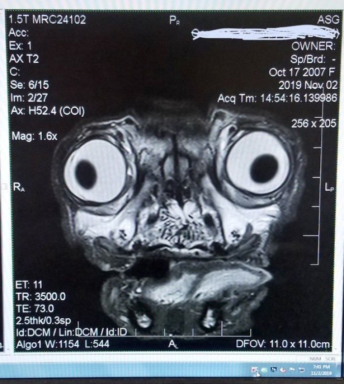
Everyone loves dogs, that’s a universal rule. Even cat people have a soft spot for a cute puppy picture. And if someone says they don’t like dogs then let’s just assume they are lying. And what’s not to like about dogs? They come in all shapes and sizes, from miniature to giant, from fluffy to slim and athletic. Some people regard the small four-legged friends as some of the cutest companions in the world and pugs are no exception. For most of the people pugs are the ultimate cute dog, with two big eyes, button nose and a dorky expression or their little faces. However, Andy Richter recently posted an MRI scan picture of one such pooch on Twitter and everyone got to see a completely different side of this dog breed.

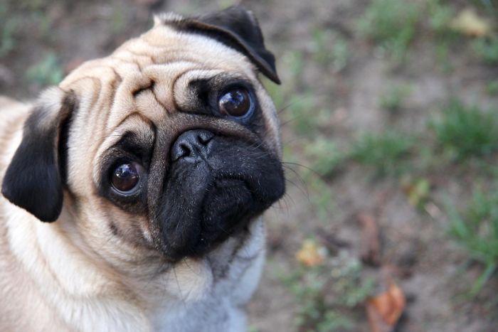
Pugs are regarded as one of the most adorable pets out there

Image credits: existentist

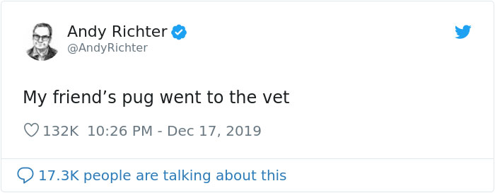
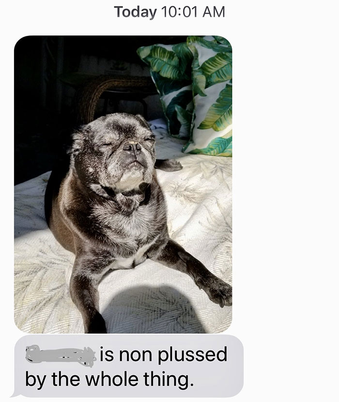
Andy shared a vet’s photo he got from a friend who owns a lovely pug. Despite the terrifying-looking imagery of the MRI scan, the owner of the dog reported that it is 100% fine and healthy. Hooray!

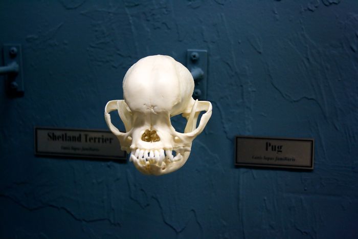
However, one Twitter user might’ve ruined that reputation forever as he shared an MRI scan of a pug

Image credits: AndyRichter

Image credits: AndyRichter

Image credits: AndyRichter

Image credits: AndyRichter

Even though many people find pugs cute and their features desirable in a pet, there’s been a growing concern for the breed’s health issues caused by breeding. One Tumblr user put together an extensive post explaining why we should stop breeding pugs.

Image credits: DodosD

Throughout history, the pugs have been bred to have the facial and body features we are familiar with today. However, the breed didn’t start there. Back in the day pugs had longer snouts and lacked other deformities resulting from years of selective breeding. Some contemporary breeders, who found the pugs’ temperament suiting but the plethora of health issues alarming, decided to breed out the deformities and go back to a fresh healthy start. That’s how “retro pugs” or “retro mops” were created, a much healthier and happier alternative to pugs that allows the pooches have a better life. Of course, that doesn’t mean we should dislike the existing pugs. We should just stop admiring them for qualities that make their little lives much harder.

Image credits: Chris Dodds

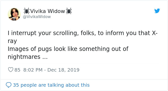
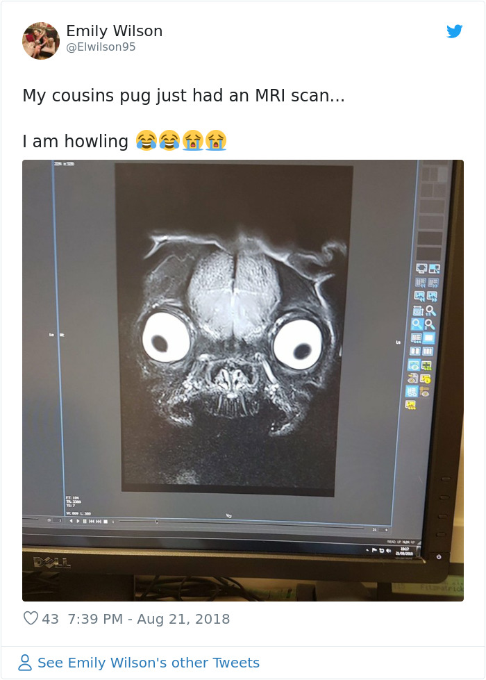
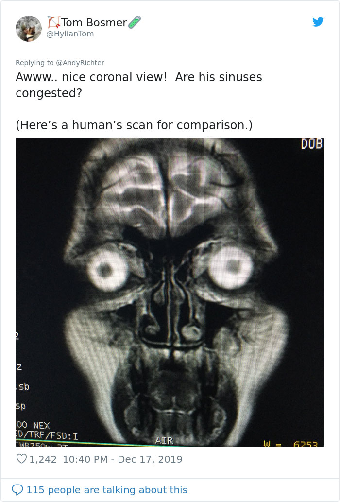
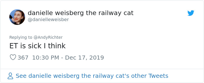
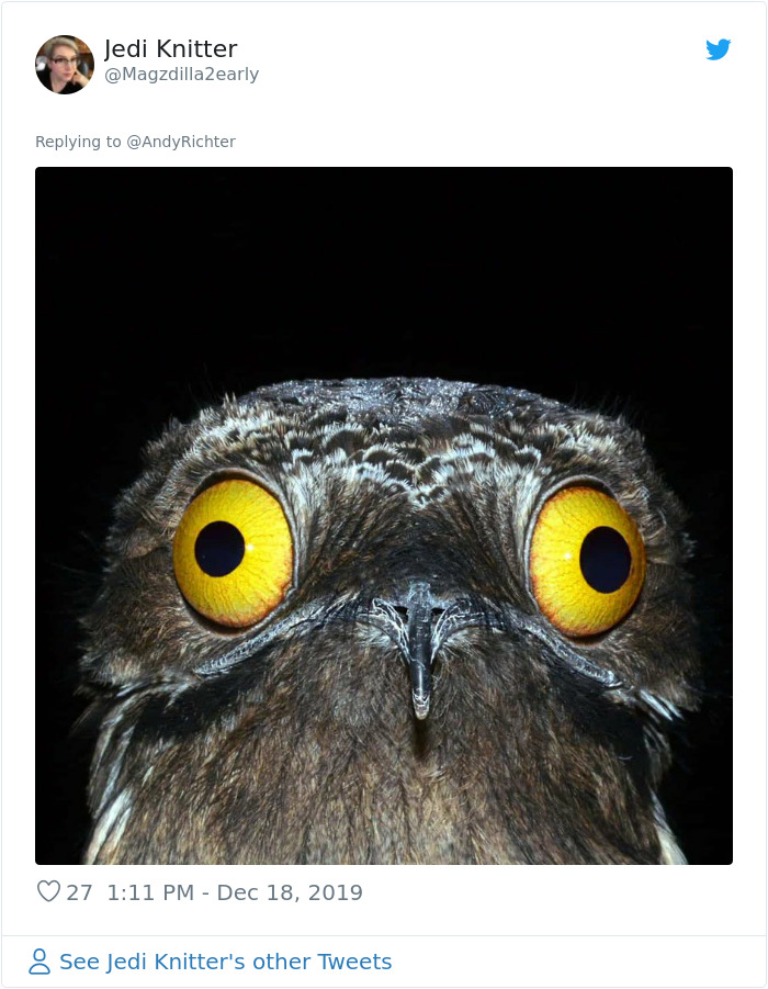
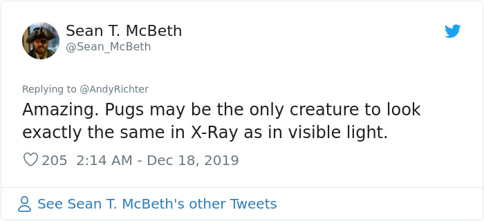
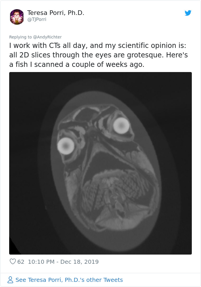
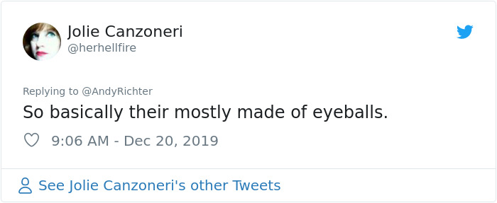
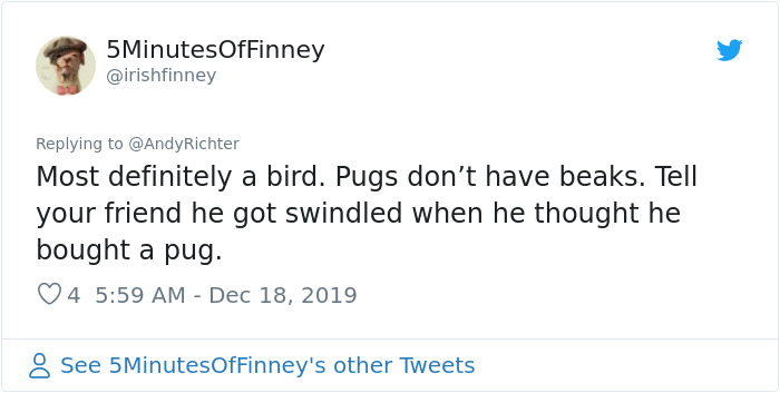
Here’s how people responded to the MRI picture

Image credits: VivikaWidow

Image credits: Elwilson95

Image credits: HylianTom

Image credits: danielleweisber

Image credits: Magzdilla2early

Image credits: Sean_McBeth

Image credits: droctopu5

Image credits: Jfayepaints

Image credits: TJPorri

Image credits: herhellfire

Image credits: Venator5507

Image credits: irishfinney


from Bored Panda https://ift.tt/2rUOSfM

Great Work: WWF’s Black Friday Twist

It’s just six years since Black Friday launched in the UK, but the retail event is now firmly a part of British culture, with everyone from tech companies to department stores cutting their prices in the last week of November.

Along with hefty discounts, Black Friday usually brings a deluge of promotional emails and social media ads from brands promising massive savings for a limited time.

This year, WWF UK decided to join in on the action, creating Facebook ads to promote a flash sale of ‘limited stock’. At first glance, this stock looks like the kind of items you’d expect to see discounted on Black Friday – a gaming console, a handbag and some blusher – but videos soon zoom out to reveal an image of a panda and a message urging consumers to adopt the animal (which remains under threat despite being recently taken off the IUCN’s endangered list).

The campaign was created after WWF approached Facebook with an idea to do something “disruptive” to mark Black Friday. It was inspired by the insight that UK shoppers spent over £2.5 billion during Black Friday week in 2018, which equates to around a quarter of all the money donated to UK charities in the same year.

With this in mind, Facebook and WWF worked closely with Facebook Creative Shop to devise a campaign that encouraged people to give to a good cause, while reminding consumers that animals – just like sale items – are in limited supply.

“WWF UK wanted a slice of the Black Friday action, but with a little twist on the concept,” explains Ciara Harrison, a Creative Strategist at Facebook.

“Taking the top three Black Friday categories – tech, fashion, beauty – we co-created adverts that look like typical ‘sale’ items with sale buzzwords, but you soon realise that the item with limited stock is a vulnerable animal,” explains Harrison.

Content was created in just two days using stock images and was optimised for mobile in line with Facebook’s best practice guidelines. Alongside static and video ads, Facebook worked with WWF to build a Messenger bot experience, where people could take a quiz to determine their spirit animal from a list of at-risk species. The experience ended with a message urging consumers to adopt that animal through WWF.

Created in a short time and on a small budget, the campaign was hugely effective, driving over 58,000 visits to WWF UK’s website and over 2,000 new adoptions. The charity also used the Black Friday creative to promote a Facebook fundraiser, which generated over £3,000 in donations.

By tapping into people’s desire to find a bargain and subverting typical sales ads, WWF was able to cut through the Black Friday noise and raise awareness of its environmental and animal protection work at a time when most people are more likely to be buying Christmas gifts than donating to charity. The campaign followed the launch of WWF UK’s Christmas campaign, created by Uncommon London, which encouraged consumers to ‘adopt a better future’ and protect vulnerable species including pandas, penguins, polar bears and leopards.

Great Work is part of Inspire, a partnership between Creative Review, Facebook and Instagram to showcase outstanding creative work across both platforms. 

Facebook and Instagram’s Creative Hub was launched to help the creative communities understand mobile marketing. The online tool allows creatives to experiment with content formats and produce mock-ups to share with clients and stakeholders. It also showcases successful campaigns created for mobile. Try out the mock up tool at facebook.com/ads/creativehub and see the inspiration gallery at facebook.com/ads/creativehub/gallery

The post Great Work: WWF’s Black Friday Twist appeared first on Creative Review.


from Creative Review https://ift.tt/2SWgpsv

Dezeen Awards 2020 will open for entries on 4 February

Dezeen Awards 2020

Dezeen Awards 2020 will open for entries on 4 February, with the discounted early-entry period running until 31 March. Read on for all the key dates for this year's architecture, interiors and design awards programme.

Now entering its third year, Dezeen Awards identifies the world's best architecture, interiors and design projects, as well as the studios and the individual architects and designers producing the most outstanding work.

Launched in 2018, Dezeen Awards has grown rapidly into one of the most prestigious and popular awards programmes in the industry. Last year it attracted more than 4,500 entries from 87 countries.

Winners from Dezeen Awards 2018 described how the honours have transformed their fortunes.

"We have been getting more and more international project requests lately," said Dutch studio i29, which won interior designer of the year. "To win a Dezeen Award has been a very important moment in our career."

Winning a Dezeen Award "has opened new doors to another level of business," said Atelier NL, which won both designer of the year and homeware design of the year. "We feel like our work is taken more seriously now," the studio added, saying it had won new work thanks to the accolades.

Here are the key dates to keep in mind so you can prepare your entries for 2020:

4 February 2020

Dezeen Awards 2020 opens for entries. There'll be some new categories this year, which we'll be announcing soon.

31 March 2020

Early entry deadline. If you want to save money, submit your entry before 31 March. Early entry prices are £80 for individuals and companies with 10 employees or fewer and £160 for companies with more than 10 employees.

2 June 2020

Final entry deadline. This is your last chance to enter at the standard entry price of £100 for companies with 10 employees or fewer or £200 for companies that employ more than 10 people.

9 June 2020

Late entry deadline. If you can't get your entry in on time, there is still hope! We've introduced a late-entry period. You can find out more on our prices and dates page.

July 2020

This is when we'll publish the architecture, interiors and design longlists.

September 2020

This is when you'll find out if your project or product made it onto the shortlist.

See last year's shortlists ›

October 2020

Project winners are announced online.

See last year's winners ›

November 2020

Time to celebrate the best architecture, interiors and design projects and products of the year at the Dezeen Awards party. More info will be shared closer to the time.

Questions?

If you have any questions about Dezeen Awards 2020 you can contact the team by emailing awards@dezeen.com or sign up to the Dezeen Awards newsletter.

The post Dezeen Awards 2020 will open for entries on 4 February appeared first on Dezeen.


from Dezeen https://ift.tt/35tTSpB

23 Shocking Things Flight Attendants Found In The Hotels They Were Staying At

The life of flight attendants is tough – not only do they have to deal with rude travelers and suffer from constant jet lag, but apparently they also get to stay in some dodgy hotels. Imagine coming back to your hotel room after a full day of cleaning spilled drinks and shoving luggage into overhead shelves only to find some funky hair or mold in the shower – gross!

Flight attendants are sharing the most bizarre things they’ve encountered in the hotels they were staying at and some of them are truly shocking. Mystery puddles, giant spiders and lots and lots of mold – check out all of the weirdness spotted in hotel rooms in the gallery below!

More info: hotelnightmares.com

#1 Ceiling Mold

From a flight attendant at a Radisson: “I was walking to go warm my food up in communal lobby microwave because we get no micros in rooms. I felt something drip onto the hand I was holding my food in. I looked up and saw this.”

#2 Mumb…yiii!!!

From a jet-lagged airline employee staying at the Renaissance Hotel in Mumbai, India: “I don’t think this toilet has been properly cleaned since the ’80s. Or perhaps it has and the guest before me just drank the tap water. Either way… GROSS!”

#3 A Fungus Among Us

From a flight attendant on layover in Orlando who believes there was an actual danged ‘shroom growing in the shower at her hotel.

#4 Ncis: Clarion

Blood on a bed. Is it fair that flight attendants who deal with this crap on the job should have to find it when they’re on a romantic getaway with their sweetie?

#5 That Came Out Of The Shower

From a flight attendant on layover. After she showered she noticed all of the dirt particles that had accumulated on the floor of the tub. She swears it wasn’t on her when she got in, it wasn’t there WHEN she got in, so that pretty much leaves one way.

#6 Hotel Airplane Lav Snot

From a major stockholder in Purell, who says, regarding this blob of bloody snot on the vanity of the first-class lav: “I didn’t pay enough to clean up this”.

#7 Anti-Peeping Proofing

From a flight attendant at The Focus at SFO. Checked in and found paper wadded-up, plugging the door peephole.

#8 Astroglide

From a flight attendant: “My toe just got stuck in some unidentifiable goo on the floor in my room. I refuse to get down and smell it for the sake of the research department.”

#9 Hotel El Paso Phone Funk

From a flight attendant on layover: “True story. Last night/this morn there was a loud party somewhere on our floor. When I finally got tired of being woken up time and again I called the front desk about 3 am to complain. This phone had an ODOR to it, a HORRIBLE odor like someone had wiped their butt with it. While I was complaining to the desk clerk about the noise, I had to hold receiver AWAY from my ear, the funk was that bad. Afterward, I then had to go and wash my ear and face off because I could still smell the reek.”

#10 Moldy Hair Dryers

From a flight attendant on layover in New York City, the Captain from the crew found a giant cockroach on the ceiling of his room.

#11 A Little Birds Nest Of Hair

A diminutive flight attendant who found this cache of hair in her hotel shower at a Courtyard by Marriott in Richmond.

#12 Hotel Nashville Smoke Detector

Who would steal a smoke detector? As seen in Nashville.

#13 Someone Really Wanted To Get In

Someone REALLY wanted to get in to this room at the Galt House in Louisville.

#14 Hotel Phone Filth

At the Hyatt/Jacksonville. The previous users of the phone chewed tobacco, had flaking scabs, Ebola or all of the above.

#15 Layover Filth

From an airport hotel in Orlando. Nice. Probably not a tub you’d want to take a bath in.

#16 Hotel Blurred Pee Pee

Discovered by a flight attendant on layover in LA. She reported it to the carrier so she wouldn’t get blamed.

#17 Sink Driibleage

Another look at some under-the-sink grossness at a Comfort Inn in DC from a flight attendant being a tourist.

#18 Not So Grate

What the hell? At an airport hotel in Syracuse.

#19 When Electroluxe Meets Flobee

On an international jaunt, “I would like to proclaim my absolute hatred for these types of hairdryers. Not only does it look like a vacuum cleaner or a Flowbee, but it takes me 25 minutes to dry my hair with this POS.”

#20 There Probably Wasn’t Much Of A View Anyway

From a flight attendant on layover in Corpus Christi. She blames the opaque window crud on: “salt air and the petrochemical plants on every street corner.”

#21 Hotel Door Jam

The airlines have protocols and procedures to protect their flight crews on layovers and savvy employees learn the do’s and don’ts of life on the road. But sometimes the lodging doesn’t accommodate. From a flight attendant on her night between flights.

#22 Multi-Tasking With Your Bidet

At the Intercontinental Hotel in Amman Jordan courtesy of one of the legions of harried, under-paid, over-abused sky waitrons.

#23 Hotel Spider

A flight attendant at a hotel in Milwaukee found this little bugger lowering itself down to join her in bed. Shrieks and hairspray sent it RAPIDLY back up to safety on the ceiling.

The post 23 Shocking Things Flight Attendants Found In The Hotels They Were Staying At appeared first on DeMilked.


from DeMilked https://ift.tt/2Fr3tmg

Skillshare launches new identity

The rebrand comes as Skillshare is poised to enter its second decade of operation, having grown a community of over eight million users.

The platform runs online courses across all areas of the creative industries, from advertising to fashion, photography to writing. It boasts some formidable contributors from the industry, including Jessica Walsh, Paula Scher, Seth Fried, and Seb Lester.

The new visual sees Skillshare ditch its previous joined-hands symbol for a new wordmark and tagline – Explore your creativity – as well as the distinctive use of squiggly lines (intended to express the winding creative journey) in its new brand colour, Wander Green.

“After a decade spent building a learning community for creative enthusiasts, we felt like our brand needed to evolve along with that growing Skillshare creative community,” says the brand’s creative director Jeremy Perez-Cru of the new design. “Skillshare needed a better way to serve these creatives, communicate with them, and help power their creative potential.”

Former Skillshare logo

While the Perez-Cru hopes the new identity will help Skillshare “grow beyond being just a platform and to better embody the spirit of our community”, it is also rooted in practicality, in particular a need for the mark to be legible in all digital spaces, and allow the company to be more consistent.

It was devised through a process of design sprints with both external and internal teams. “With the help of [brand strategist’s] Concept Bureau, Skillshare had already completed the research and insights needed to signal the desire for a brand evolution,” explains Perez-Cru.

“I’ve personally been specialising in various types of design and innovation sprints for the past few years and find the process incredibly effective. By including all decision makers, we’re able to shortcut the debate cycle and get to solutions more quickly. Clearing calendars and having a focused, heads-down approach frees us from the day-to-day distraction of a traditional workday. With those two barriers removed, all of our energy and time can be devoted towards solving a focused set of problems while simultaneously gathering user feedback.

“We sprinted the second week of September and by the second week of December we had a new visual and verbal identity (logo, colour, type, motion graphics, photography, video suite, voice and tone), integrated marketing campaign (television spot, out-of-home, dozens of performance/social marketing assets, partnership kits), and refreshed products (Desktop, iOS and Android apps). It was a highly collaborative relationship between brand, marketing, tech, executive, content and external design teams.”

At a time when digital rebrands are often accused of being bland, the team were conscious of the need to create an identity that would stand out. “It’s increasingly difficult to create solutions for the many needs of corporate identity – scalability, legibility, flexibility – while maintaining originality,” says Perez-Cru. “There is a reason that geometric sans serif logos are so widely adopted.

“We went through a lot of identity system iterations during our sprint and kept coming back to the need to make it unique and to reflect the spirit of strange, beautiful, and surprising creative acts. We took it really far in some of those and in the end found a happy medium that best reflected our needs. Specific to the logo, we’ve played with upper and lowercase letterforms and believe the resulting, odd family of character pairings helps us be more of who we are.”

skillshare.com

The post Skillshare launches new identity appeared first on Creative Review.


from Creative Review https://ift.tt/2QQPviX

IOC designs Solari workstation in collaboration with Gensler

Dezeen Showroom: trestle legs and a customisable, J-shaped privacy screen distinguish the Solari desk system, developed by Italian office...