Saturday, February 1, 2020

Watch drone footage of the Super Bowl 2020 stadium

This exclusive drone footage shows the multi-purpose Hard Rock stadium in Florida, US, which is hosting the 54th Super Bowl game.

The venue, which serves as a home for the Miami Dolphins, was designed by Populous‎ and HOK and features a shade canopy made from 15,400 tonnes (17,000 tons) of steel measuring roughly 58,000-square-metres (626,000-square-feet).

It will host the 2020 Super Bowl this Sunday 2 February, which will see the San Francisco 49-ers take on the Kansas City Chiefs starting from 6.30pm EST.

Movie is courtesy of Miami Dolphins.

The post Watch drone footage of the Super Bowl 2020 stadium appeared first on Dezeen.


from Dezeen https://ift.tt/31g9iNt

Angular outdoor terraces and feature staircase define house in Norway

Villa_S+E by Claesson Koivisto Rune Architects

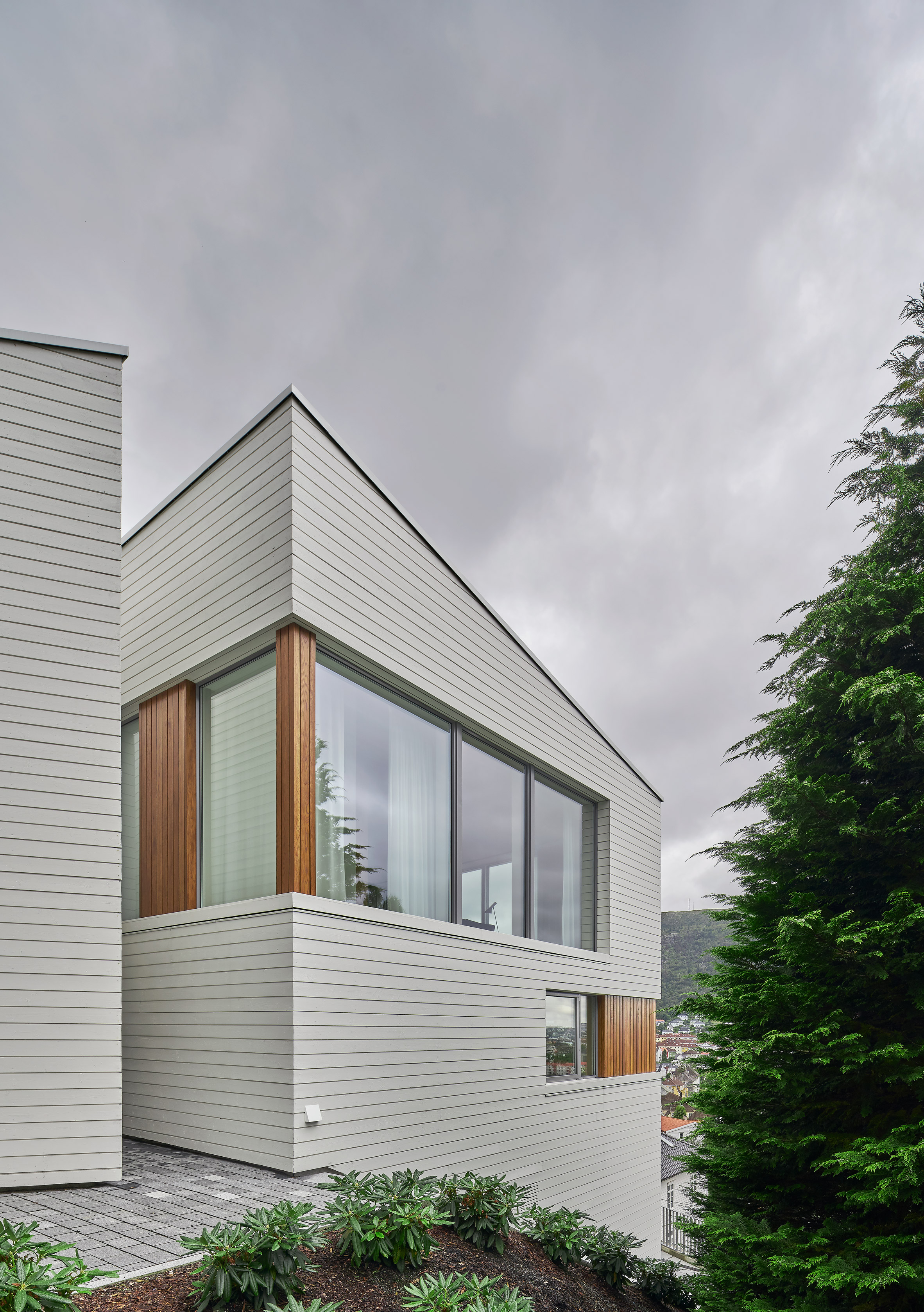
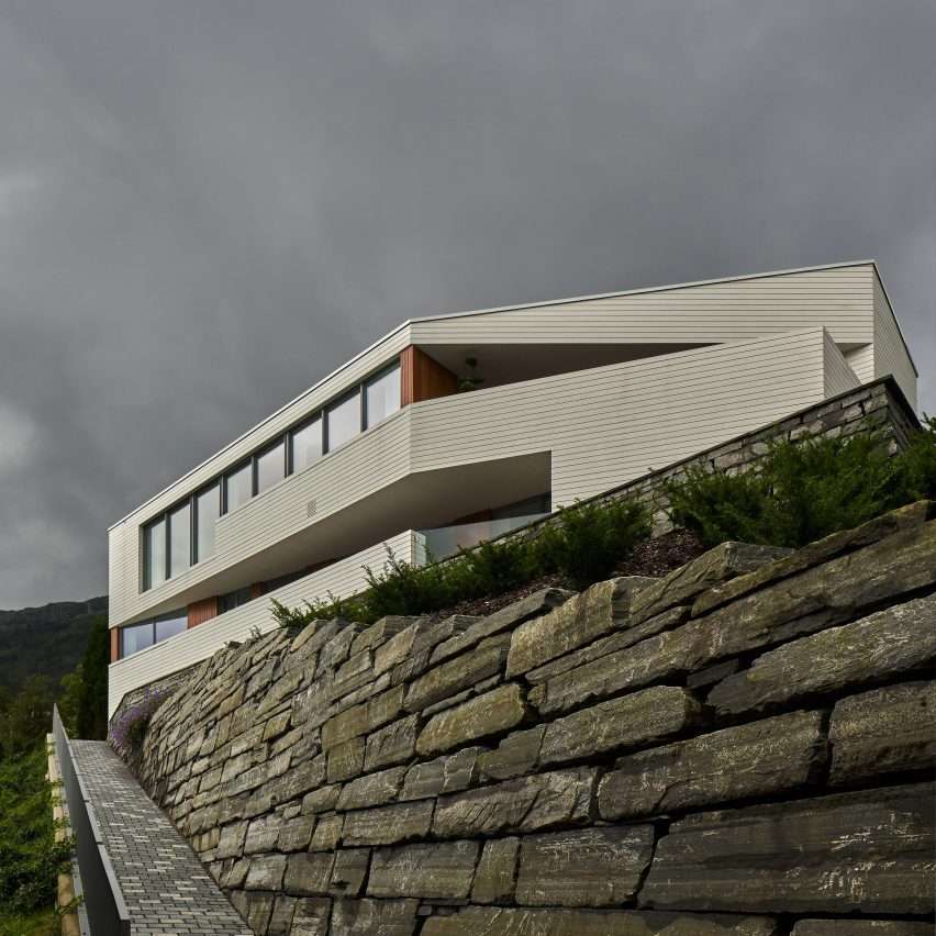
Swedish design practice Claesson Koivisto Rune has collaborated with the architect Todd Saunders on a white house on a steep, stone-walled plot overlooking the city of Bergen .

Called Villa S+E, the house has a separate apartment at ground-floor level accessed from the bottom of the hill.

Villa_S+E by Claesson Koivisto Rune Architects

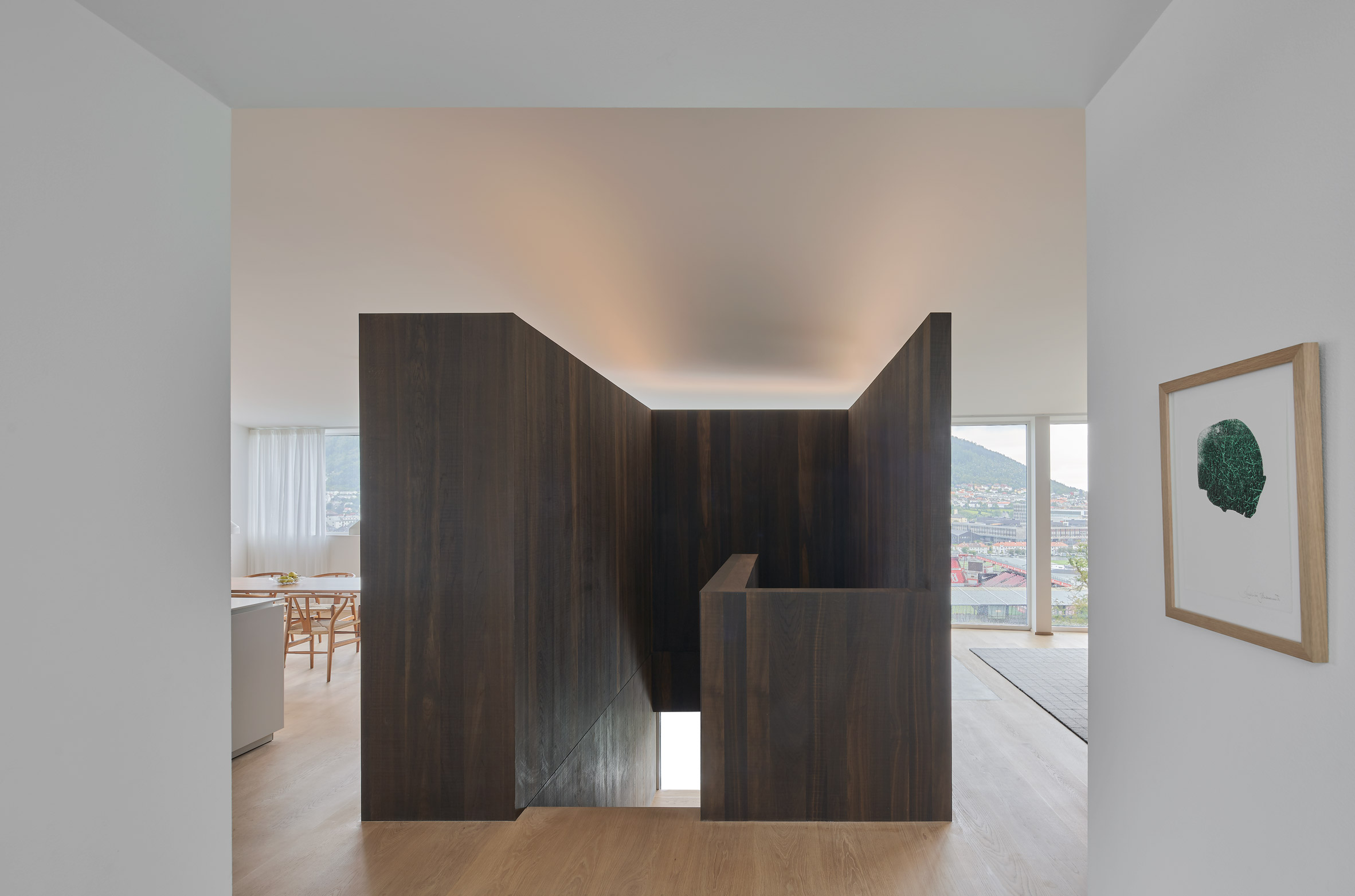
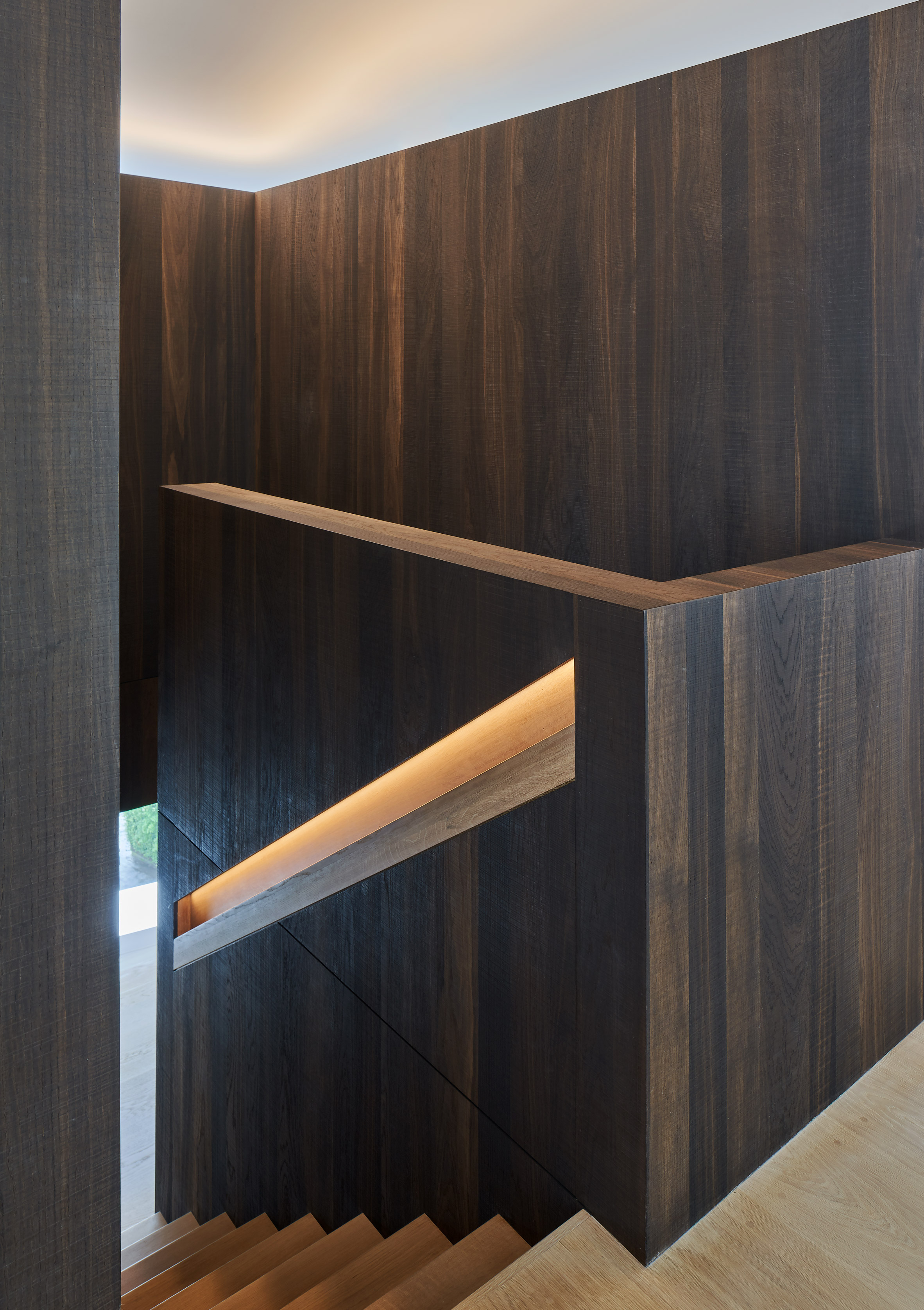
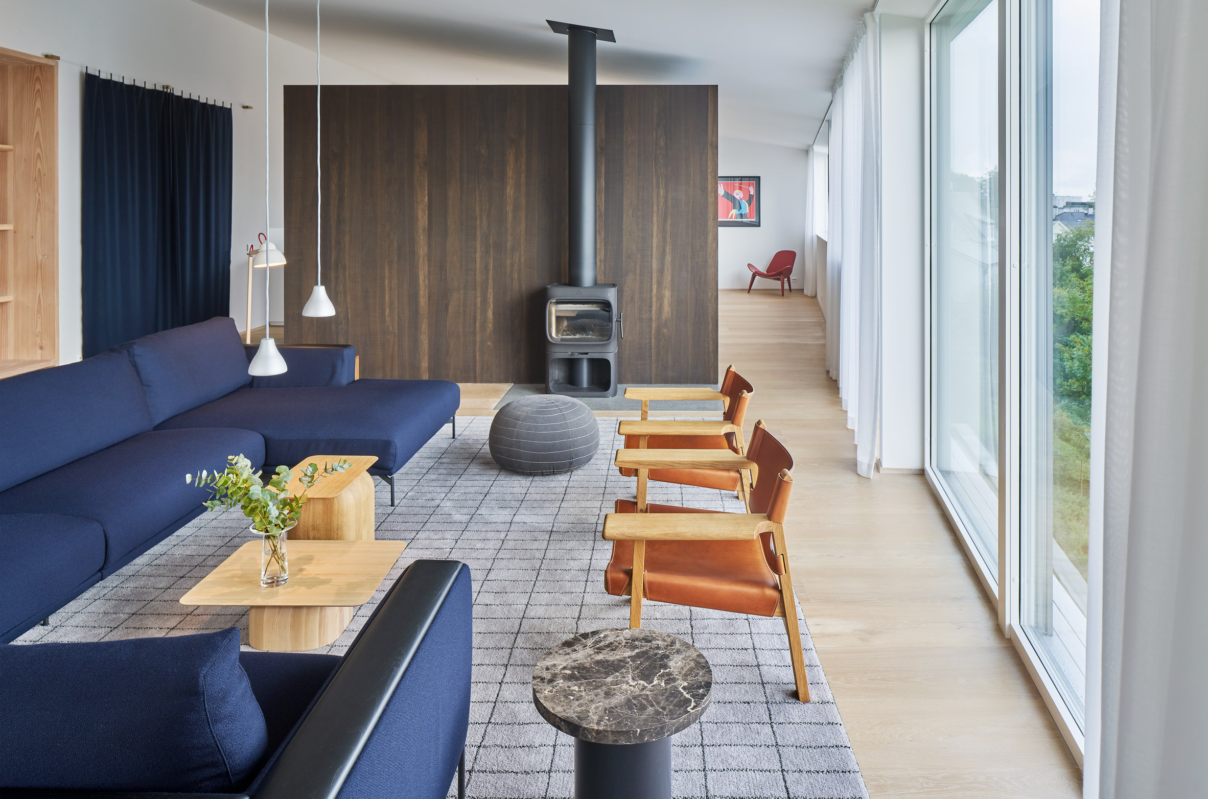
The two-storey home that's accessed from above features open-plan living spaces arranged around a dark oak staircase.

Saunders Architecture had reached planning phase with the house when Claesson Koivisto Rune were brought on the project as interior architects.

Villa_S+E by Claesson Koivisto Rune Architects

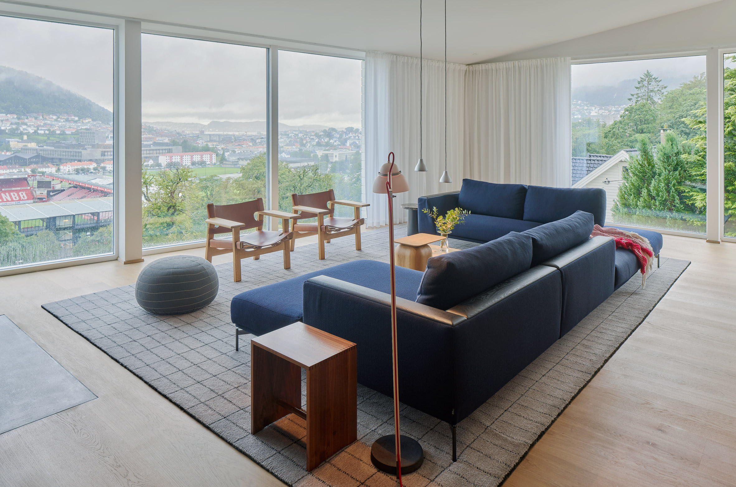
The house has  open, bright living spaces that have panoramic views of the city through a wall of windows.

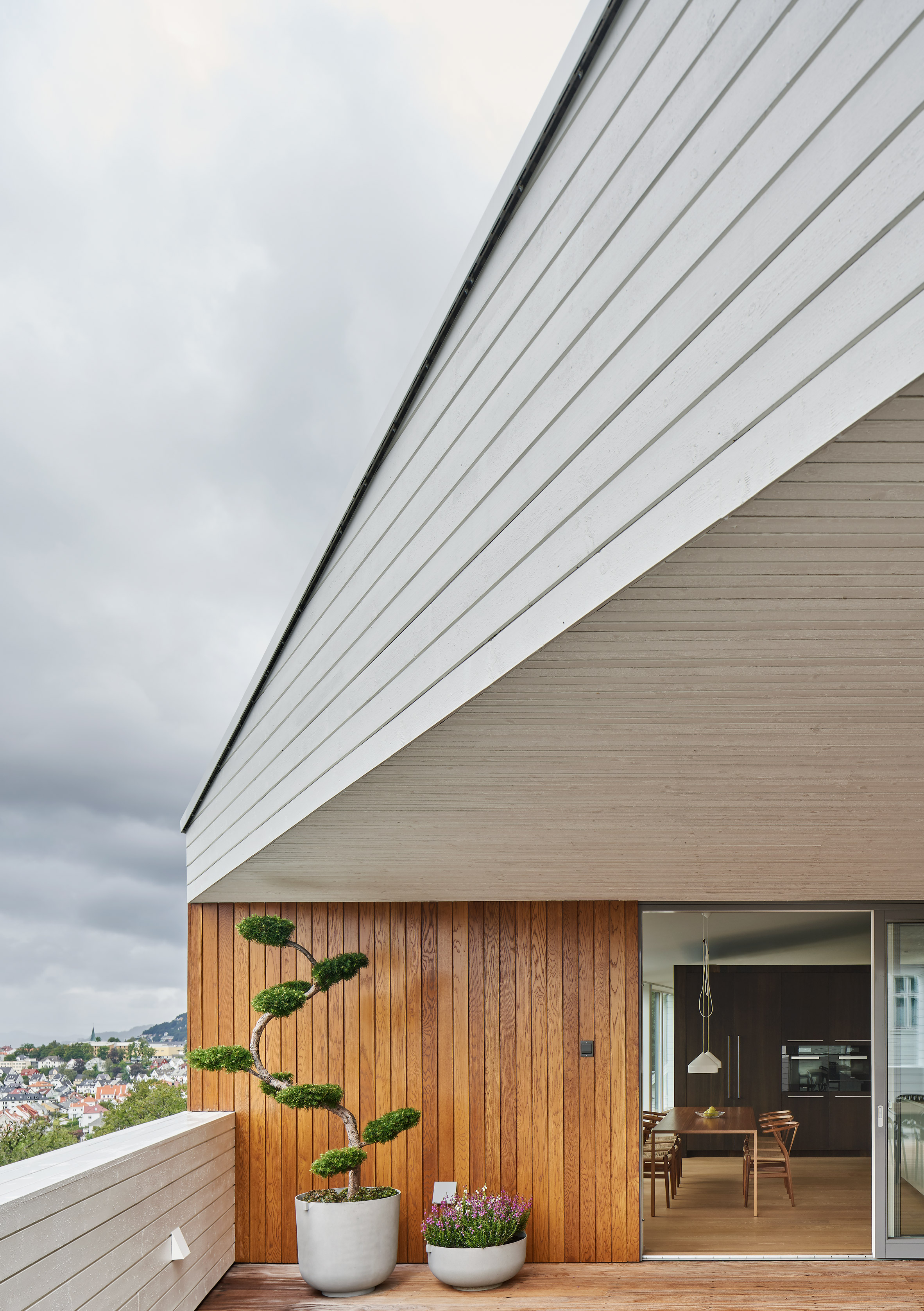
Its rooms open onto slim, triangular-shaped terraces created by the plan's angular form.

Villa_S+E by Claesson Koivisto Rune Architects

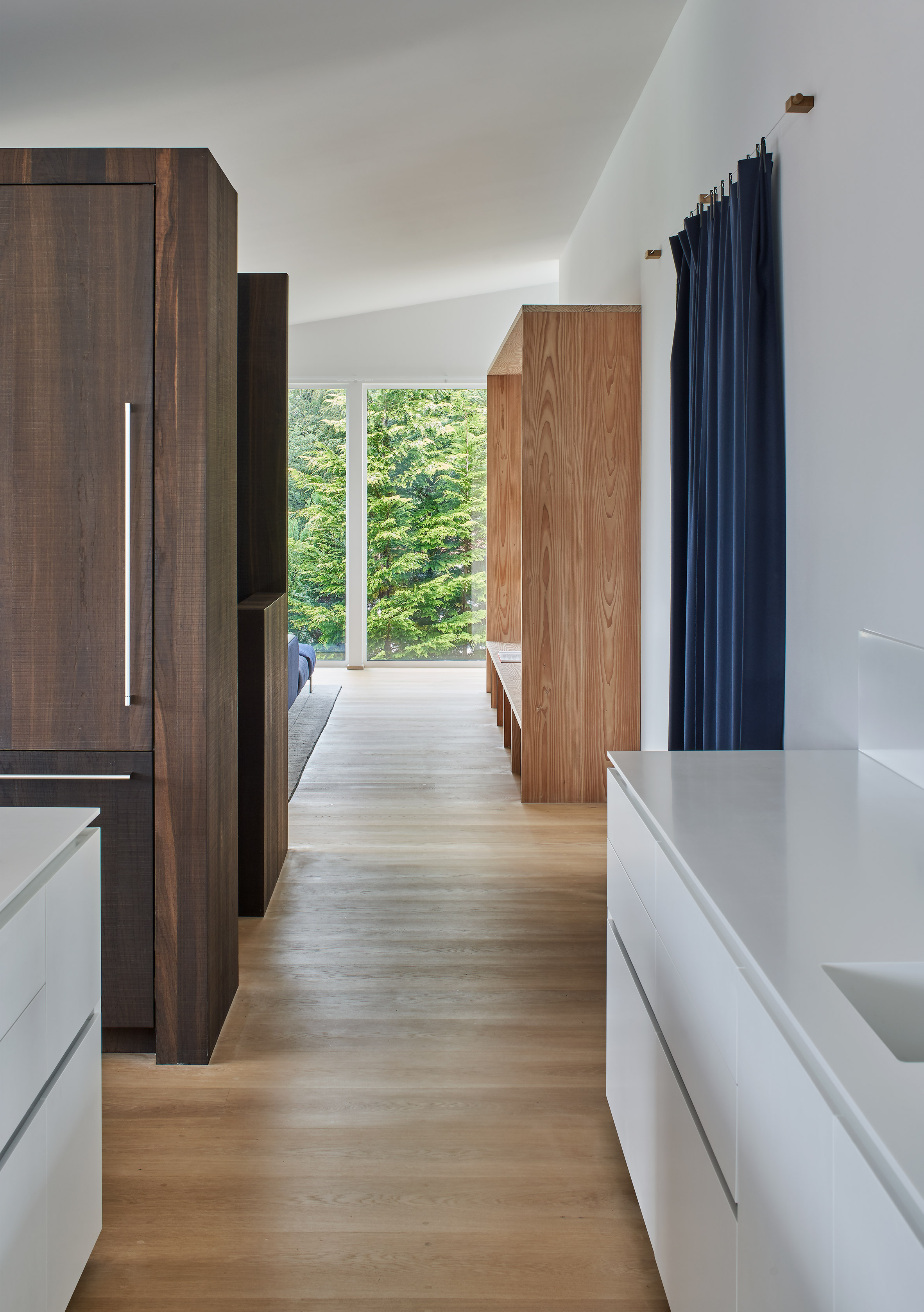
One of Claesson Koivisto Rune's addition to the design was the feature staircase housed in a dark oak box that acts as a focal point.

"Besides its obvious function as vertical communication between the two main floors, this free-standing volume defines the room functions of the communal entrance floor," explained the practice.

"On one side of the block is the kitchen and dining space. On the other side is the living room. Yet, the entire floor is spatially one room."

Villa_S+E by Claesson Koivisto Rune Architects

In the living room, another organising element was added in the form of a Douglas pine bookcase, helping to animate the otherwise blank wall of a bathroom behind.

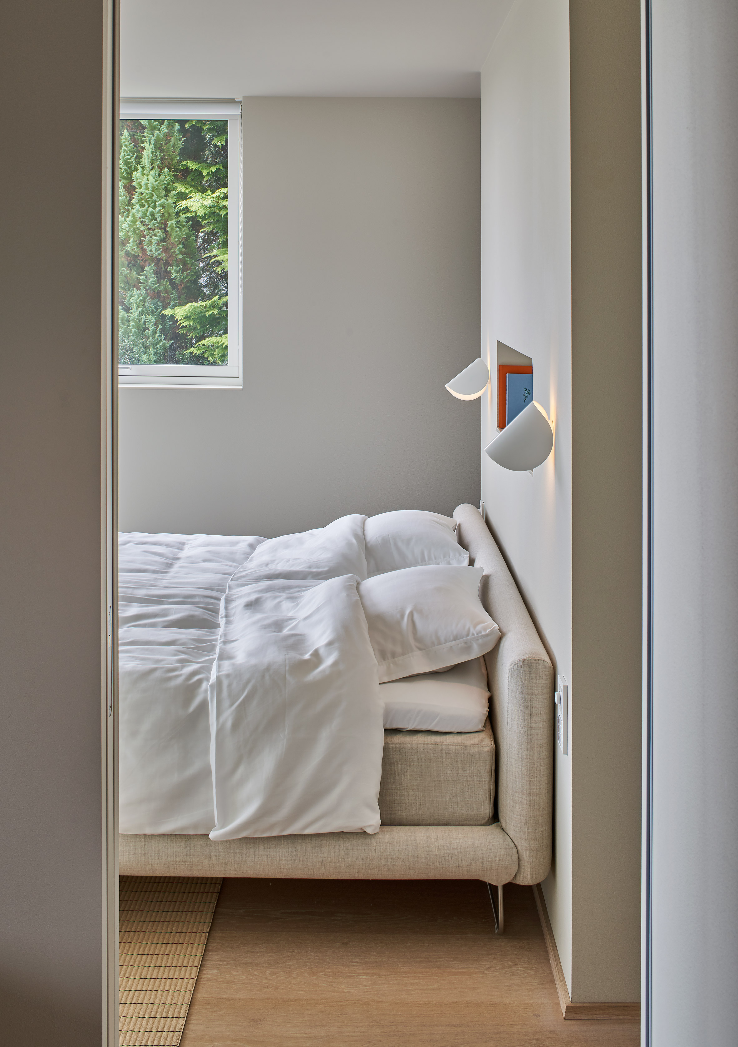
The lower level of the home containing the bedrooms is more compartmentalised.

Villa_S+E by Claesson Koivisto Rune Architects

A corridor divided bathroom and storage spaces at the back of the home. Bedrooms are towards the front, orientated to take advantage of the views over the city.

Villa_S+E by Claesson Koivisto Rune Architects

On both levels, a covered terrace with seating area has been cut out of the home's form, accessible via glazed sliding doors.

A mixture of contemporary Scandinavian furniture and pieces designed by Claesson Koivisto Rune decorates the home.

Villa_S+E by Claesson Koivisto Rune Architects

White walls and pale wooden floors create bright spaces. The exterior is clad in white, horizontally laid wooden planks, with the covered terrace areas lined in a contrasting stained wood.

Villa S+E's private apartment on the ground floor is accessed via a separate stone-paved walkway that leads up the hillside.

Villa_S+E by Claesson Koivisto Rune Architects

The home shares some similarities with Todd Saunders' design for his own home in Bergen called Villa S, a blackened timber form raised on stilts and featuring angular terraces.

Founded in 1995, Claesson Koivisto Rune began as an architectural firm before expanding to have an equal emphasis on design at all scales, recently collaborating with Japanese carpenter Yuji Takahashi to create a collection of hand-carved furniture.

Photography is by Åke E:son Lindman.

The post Angular outdoor terraces and feature staircase define house in Norway appeared first on Dezeen.


from Dezeen https://ift.tt/2vGFApn

Seven of the best new rugs around

Rugs: Woven by Gregory Parkinson for Christopher Farr

From minimalism to maximalism, rugs to suit every taste are being presented at the first furniture fairs of 2020. Dezeen editor-at-large Amy Frearson picks out seven of the most eye-catching examples.

Rugs: Woven by Gregory Parkinson for Christopher Farr

Woven by Gregory Parkinson for Christopher Farr

Different colour mixes and textures combine in this series by Los Angeles-based designer Gregory Parkinson, which launched at Galerie Berthet Aittouarès as part of homeware event Paris Déco Off.

The rugs are produced by British brand Christopher Farr at its weaving mill in Mirzapur, India. Space dying gives them a multi-tonal quality, while tactility is created through warp and weft threads of wool and hemp.

Rugs: Jazz Age Collection by La Manufacture Cogolin

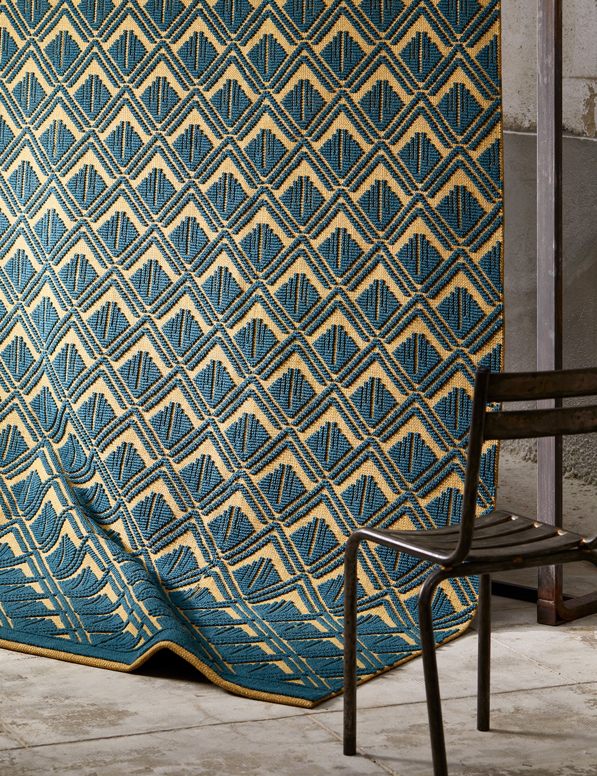
Jazz Age Collection by La Manufacture Cogolin

Art-deco style is celebrated in this series of six rugs, unveiled by Parisian brand La Manufacture Cogolin at its showroom.

Designed by managing director Sarah Henry, each rug showcases a pattern that might have been found in architecture or textiles in the 1920s. Woven on Jacquard looms, the rugs combine gold and silver Lurex with their wool, cotton and jute fibres.

Rugs: Silhouette by Jaime Hayon for Nanimarquina

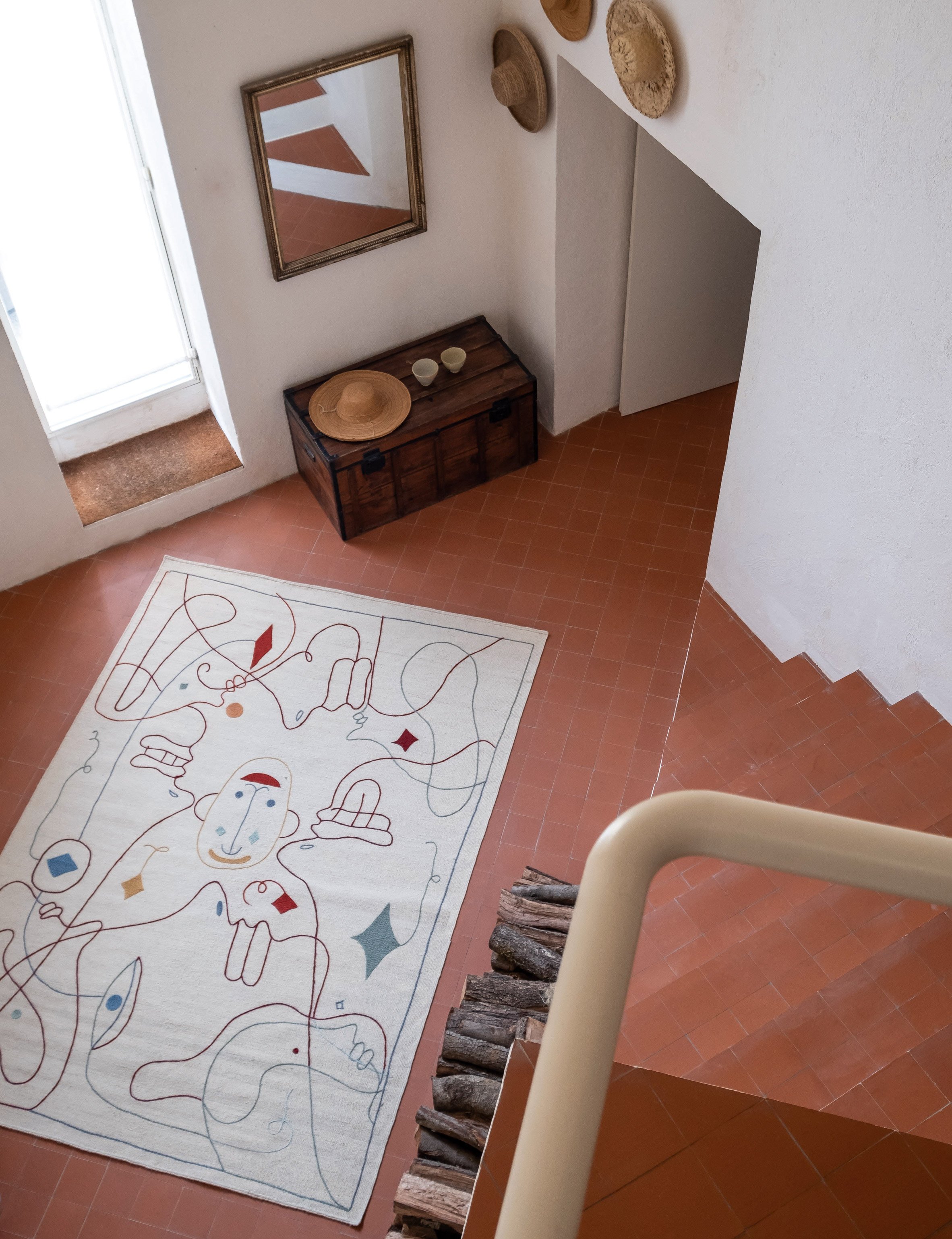
Silhouette by Jaime Hayon for Nanimarquina

The playful, figurative sketches of Spanish designer Jaime Hayon feature on this rug for textile manufacturer Nanimarquina.

Handmade in Pakistan, the design combines chain-stitch embroidery with a kilim weaving technique, so as to give texture and volume to the lines of the illustration. It is available in both indoor and outdoor versions.
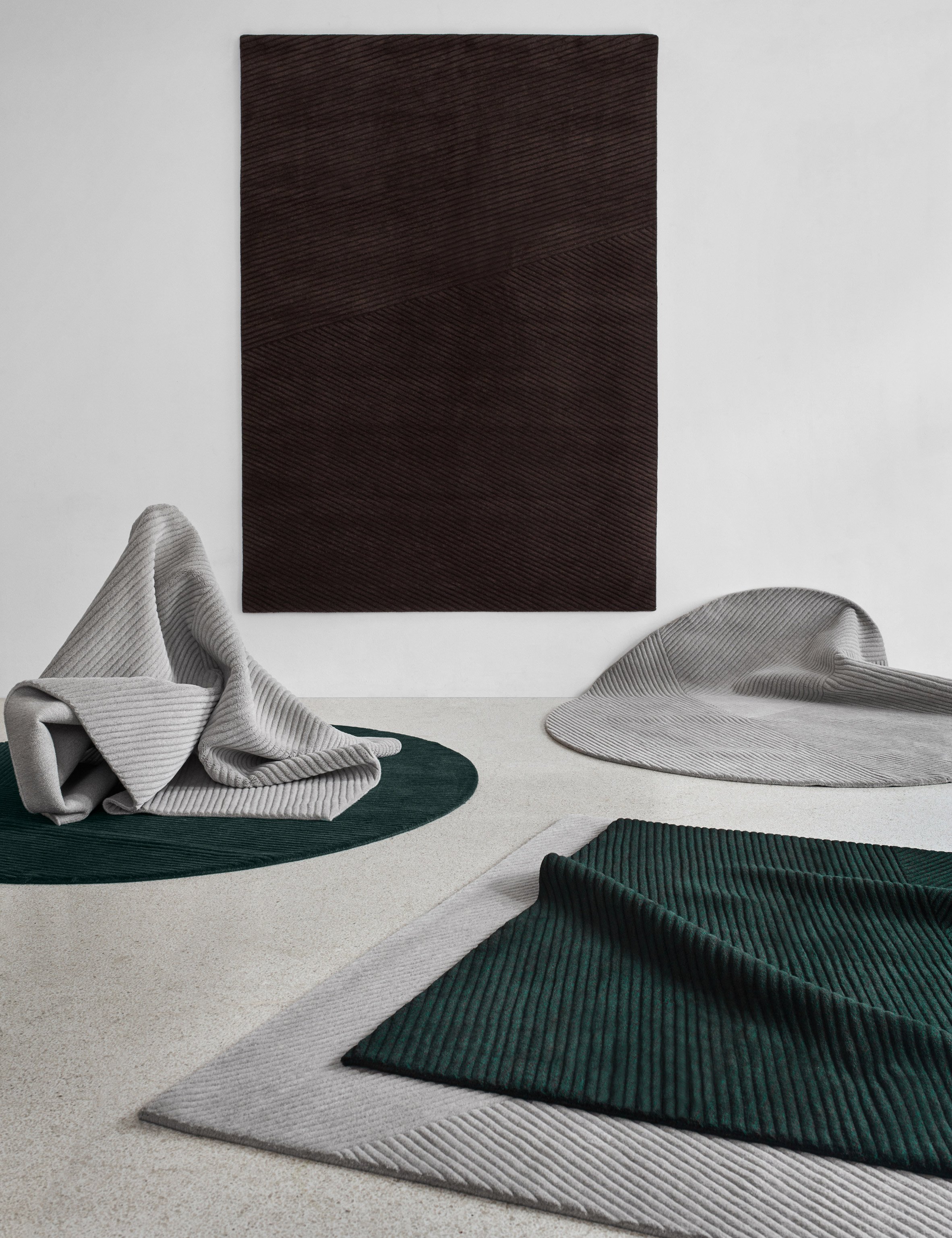

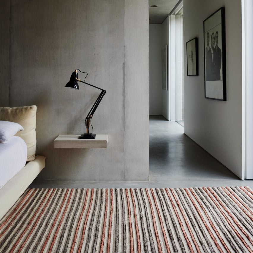
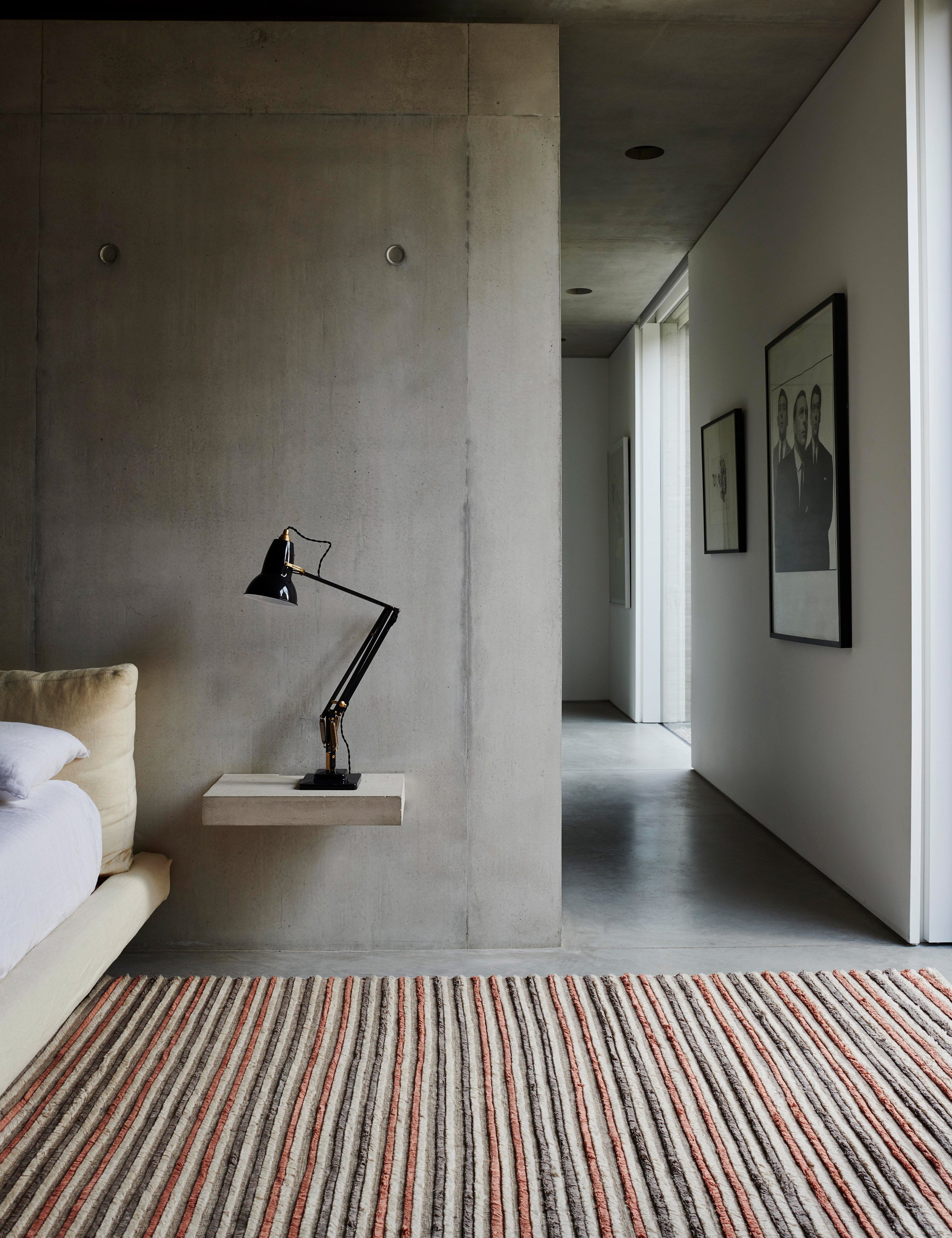
Rugs: Row by Studio Terhedebrügge for Northern

Row by Studio Terhedebrügge for Northern

With textural stripes running parallel in various directions, these simple rugs by German designer siblings Antonia and Silvia Terhedebrügge are evocative of ploughed fields.

The hand-loomed rugs come in simple tones of grey, green and brown, but each colourway is made up of wool threads in varying shades. Northern launched the designs at IMM Cologne and will also present them during Stockholm Design Week.
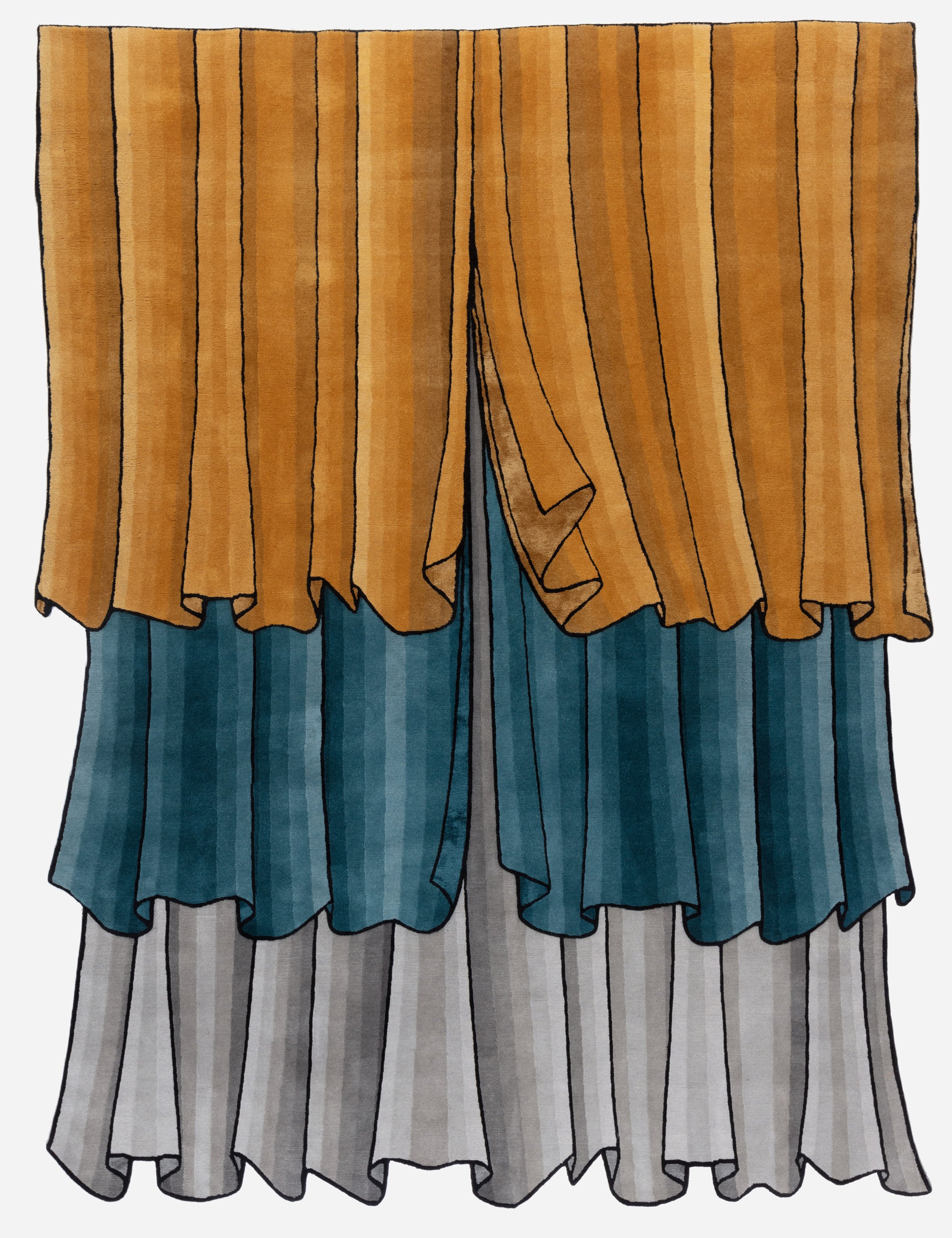

Rugs: Plissé by Cristina Celestino for CC Tapis

Plissé by Cristina Celestino for CC-Tapis

The latest design from Italian rug brand CC-Tapis is designed to evoke the world of theatre. Created by Italian designer Cristina Celestino, it imagines curtains made from three layers of fabric.

An unusual dyeing technique allows different shades of each colour to be cerated, which gives the rug an three-dimensional aesthetic. Shaved by hand, the pile also varies in different sections to emphasise the effect.
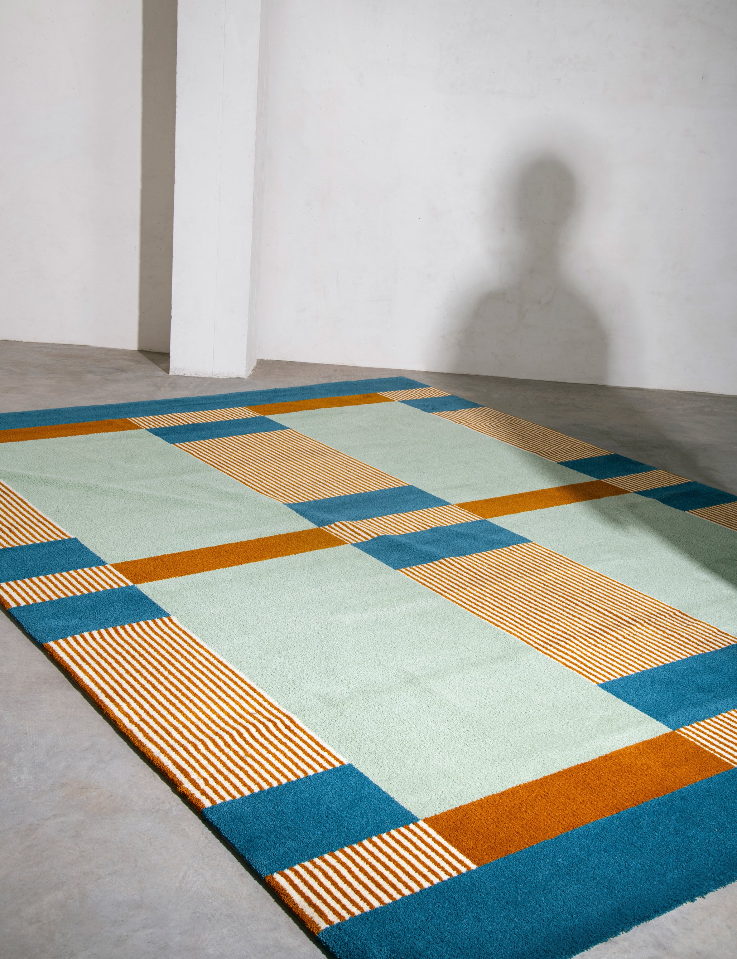

Rugs: Playtime by Emma Boomkamp for La Manufacture

Playtime by Emma Boomkamp for La Manufacture

Childhood games are transformed into patterns for this series of three rugs, created by Dutch designer Emma Boomkamp.

Made from hand-knotted and tufted wool, the designs include Mikado, Rock Paper Scissors and Abacus. They launched in Paris as part of the inaugural collection from new brand La Manufacture.
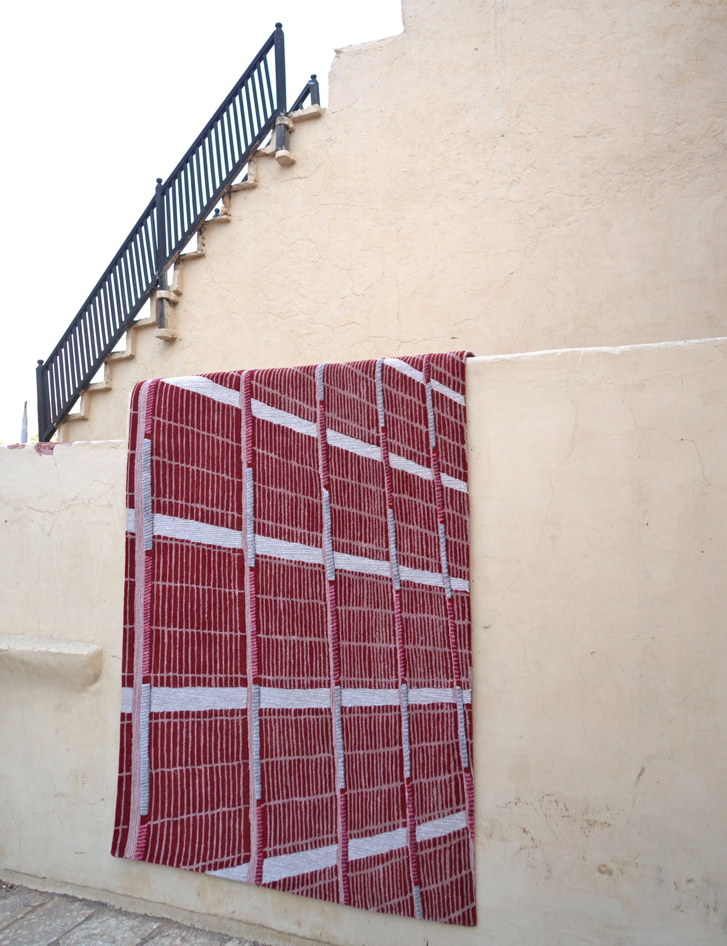

Jaipur Wunderkammer by Matteo Cibic for Jaipur Rugs

Jaipur Wunderkammer by Matteo Cibic for Jaipur Rugs

Italian designer Matteo Cibic explores the shapes and colours of art and architecture in Indian city Jaipur, in this eclectic collection of handmade rugs. There are 16 different designs, depicting everything from mountains to monkeys.

Jaipur Rugs first launched the collection in Milan last year, but also presented it at Maison&Objet 2020 in Paris.

The post Seven of the best new rugs around appeared first on Dezeen.


from Dezeen https://ift.tt/3aYbhdU
This week, China took action against the coronavirus outbreak

Design Shanghai 2020

This week on Dezeen, China began rapidly constructing quarantine hospitals and postponed several design shows in light of the Wuhan coronavirus outbreak.

Following the ongoing spread of the coronavirus that was first detected in Wuhan in December, the Chinese government is building two prefabricated hospitals in the city to treat people with the contagious flu-like infection.

The smaller of the two emergency facilities called Huoshenshan is due to open on 3 February, just 10 days after construction began. Progress is being documented in live footage by state broadcaster CGTN.

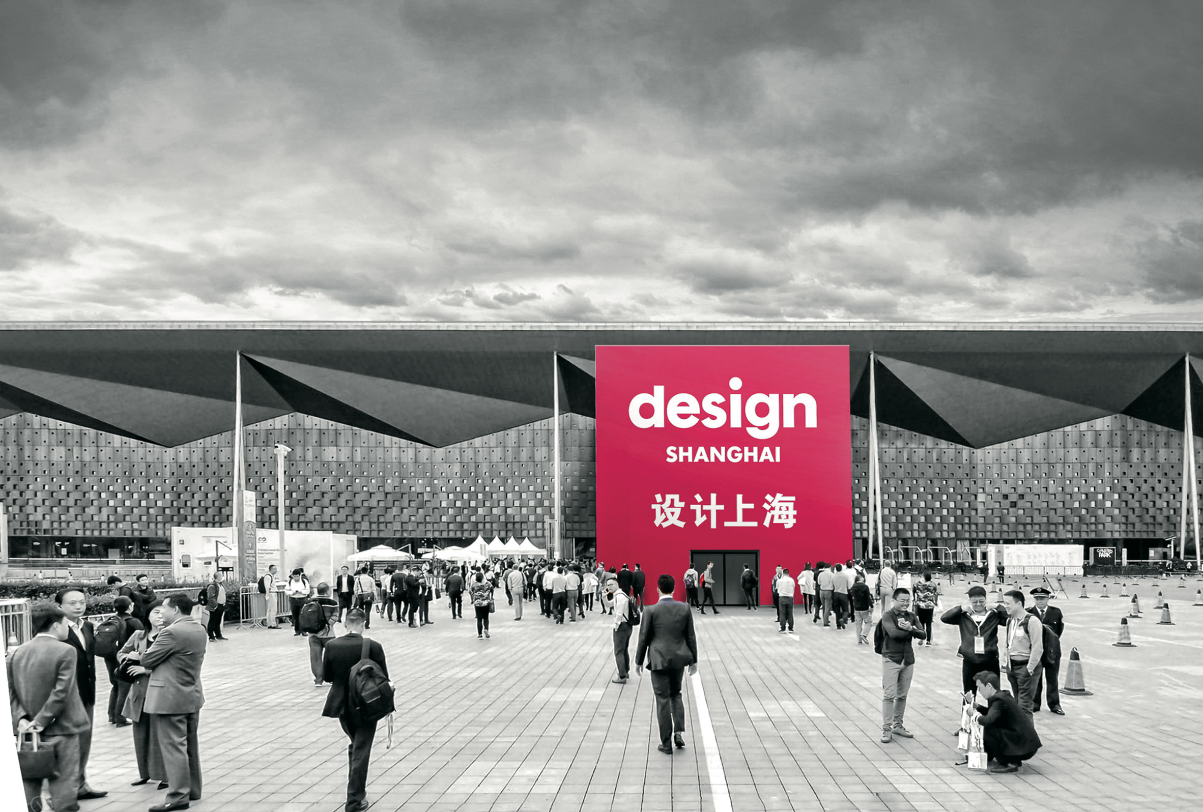
Design Shanghai fair postponed due to coronavirus outbreak
Design shows in China including Design Shanghai and Festival of Design postponed due to coronavirus outbreak

The virus' outbreak, which is now recognised by the World Health Organisation as a global emergency, has also seen the cancellation of several design events across China.

Organisers of the country's biggest contemporary design show, Design Shanghai, said they were postponing the fair until May "to ensure the welfare and safety of visitors".

Shanghai architect Neri&Hu also scrapped its plans for its Festival of Design conference after "carefully evaluating the situation and potential risks".

Frank Lloyd Wright's School of Architecture at Taliesin to close after 88 years

Architecture news this week included the announcement that Frank Lloyd Wright's School of Architecture at Taliesin will be closing after 88 years. Architect Ben Aranda said the decision was "an assault on Wright's legacy".

Elsewhere, construction was postponed indefinitely on CetraRuddy's supertall tower in Downtown Manhattan, while demolition resumed on Paul Rudolph's brutalist Shoreline Apartments in Buffalo.

OPPO Headquarters by Zaha Hadid Architects
Zaha Hadid Architects releases visuals of amorphous OPPO Shenzhen headquarters

New building proposals revealed this week included Tadao Ando's He Art Museum in Shunde and the Shenzhen headquarters for OPPO by Zaha Hadid Architects.

Set to begin construction later this year, the OPPO headquarters will take the form of four different-sized towers unified by a sinuous glass facade.

Trump unveils divisive logo for new Space Force military branch

In the design world, Apple sparked attention after filing a patent for a desktop computer that integrates both its screen and keyboard into a single pane of bent glass.

Designers took to Twitter to share their thoughts on a logo for a new Space Force military branch, which US president Donald Trump revealed on the social media platform.

Yasmeen Lari wins Jane Drew Prize
Pakistani architect Yasmeen Lari wins the Jane Drew Prize 2020

Pakistan's first female architect Yasmeen Lari was in the spotlight as she was named as the recipient of this year's Jane Drew Prize – an annual award that exists to raise the profile of women in architecture.

Architects and designers also celebrated the life and legacy of Italian architect and Superstudio co-founder, Adolfo Natalini, who passed away at the age of 78.

House in Kadogawa by Atelier Kento Eto
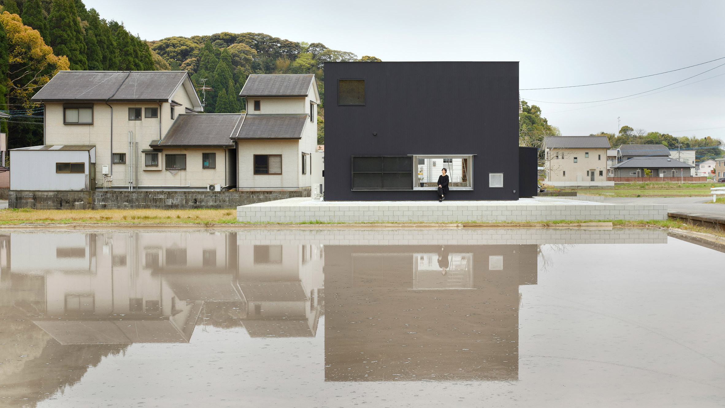
Atelier Kento Eto designs minimal black house hiding lofty interiors

Projects enjoyed by Dezeen readers this week included Atelier Kento Eto's minimal black house in Japan, a Hong Kong apartment that embraces the values of wabi-sabi and two detached yet matching houses on a corner lot in Toronto.

The post This week, China took action against the coronavirus outbreak appeared first on Dezeen.


from Dezeen https://ift.tt/2RNGXv5

Friday, January 31, 2020

Muuto launches modular lamp and sculptural vase by Earnest Studio

Earnest Studio Muuto

Rotterdam-based Earnest Studio has designed a pair of products for Danish design brand Muuto – a lamp featuring individual lighting units fixed to a metal pole by magnets and a vase with a kinked profile.

The lamp and vase are the first products created for the brand by designer Rachel Griffin's studio.

Earnest Studio Muuto

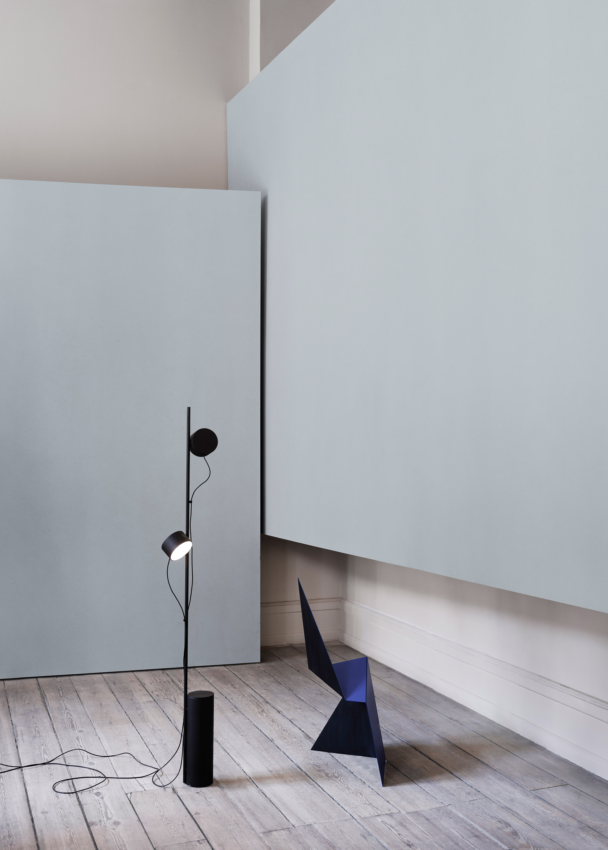
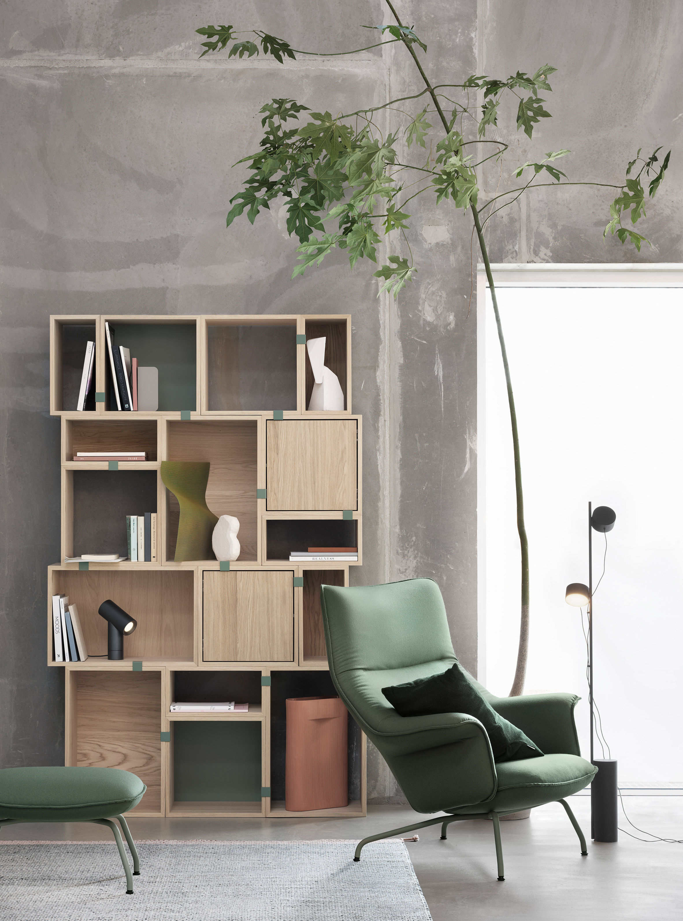
The Post Floor Lamp is a modular lighting-solution comprising a base and two, round lighting units that the user can fix to a central stem in any position.

The lamps can be angled as required and are individually dimmable, so the direction and strength of the light can be tailored to suit the space.

Earnest Studio Muuto

The two lighting units are plugged into a central power hub so they can both be turned on or off at the same time. Each lamp also has its own integrated touch-operated switch for controlling the light.

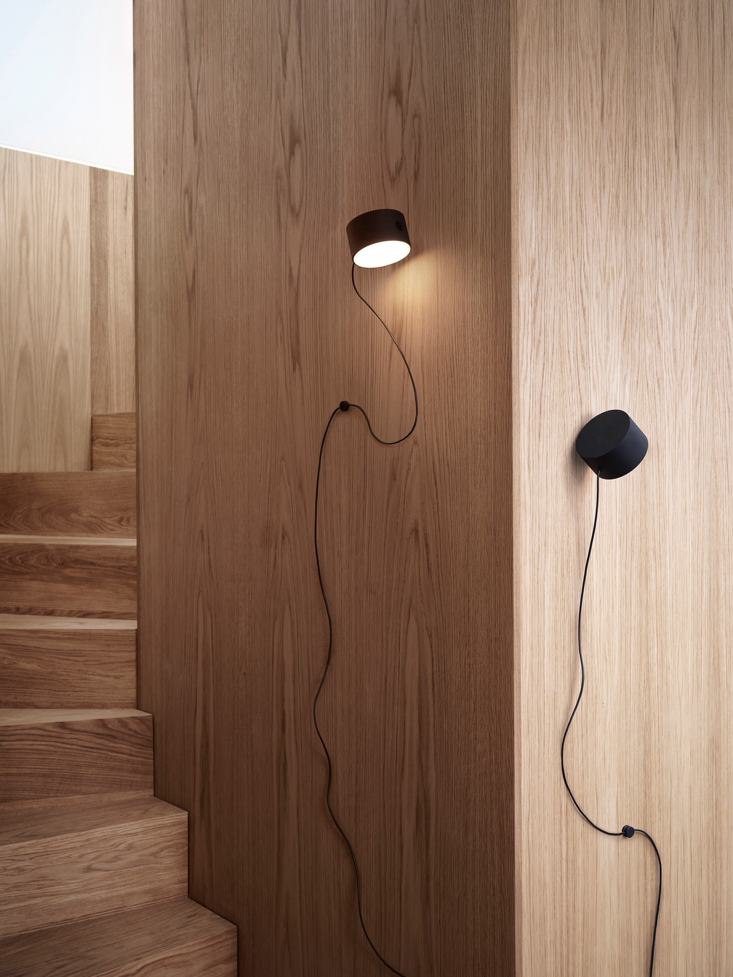
The cords are fitted with magnetic cable drops for attaching the cable to the central rod. An additional lighting unit can also be added by plugging it into the power hub and positioning it on the rod.

Earnest Studio also developed a wall-mounted version of the product, which applies the same simple and graphic aesthetic to units that can be magnetically attached to a wall-mounted metal bracket.

Earnest Studio Muuto

"The Post Floor and Wall Lamp came from the idea of exploring the flexibility of a magnetic joint, giving the user the freedom to position and dim the lamp's lighting units according to individual needs," Griffin explained.

"Designed with a sculptural expression, simple lines and refined finish, the Post Floor and Wall Lamps represent a new perspective through their graphic character and forward thinking functionality."

Earnest Studio Muuto

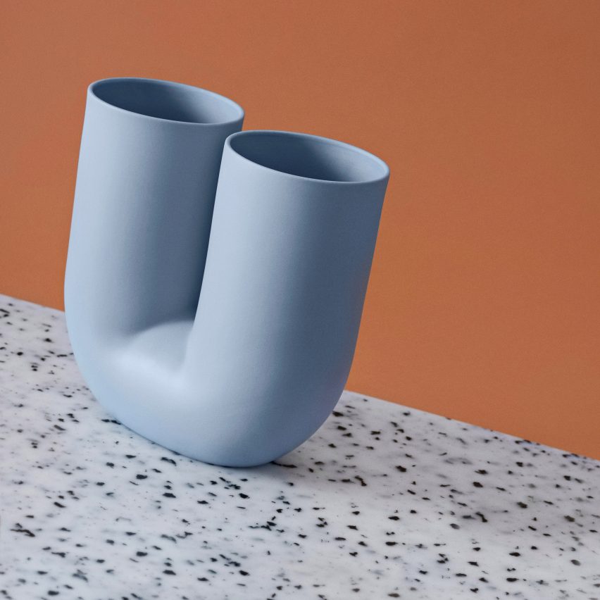
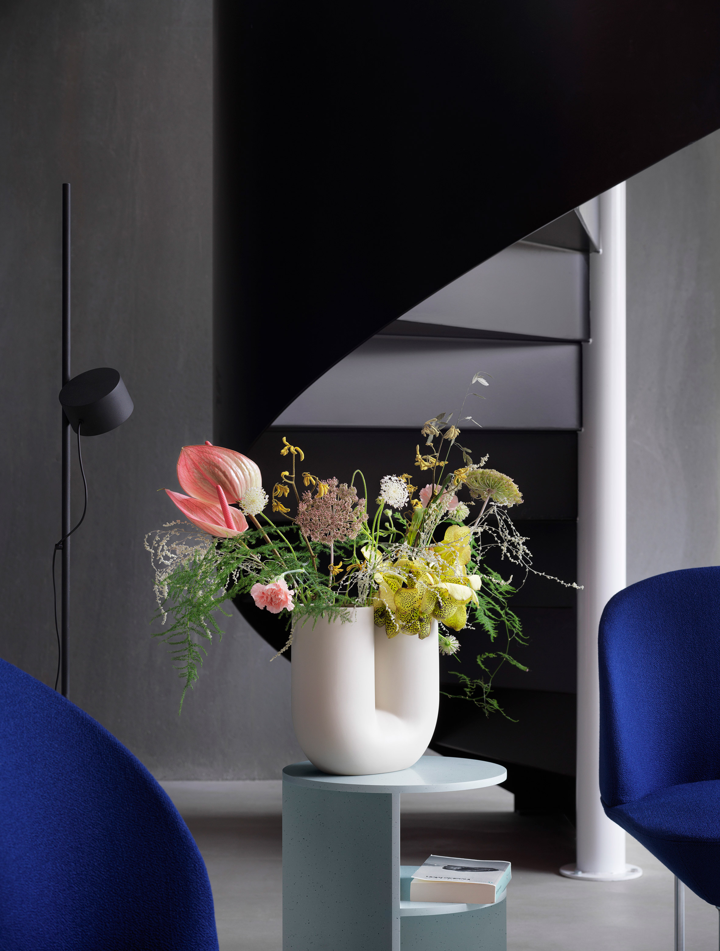
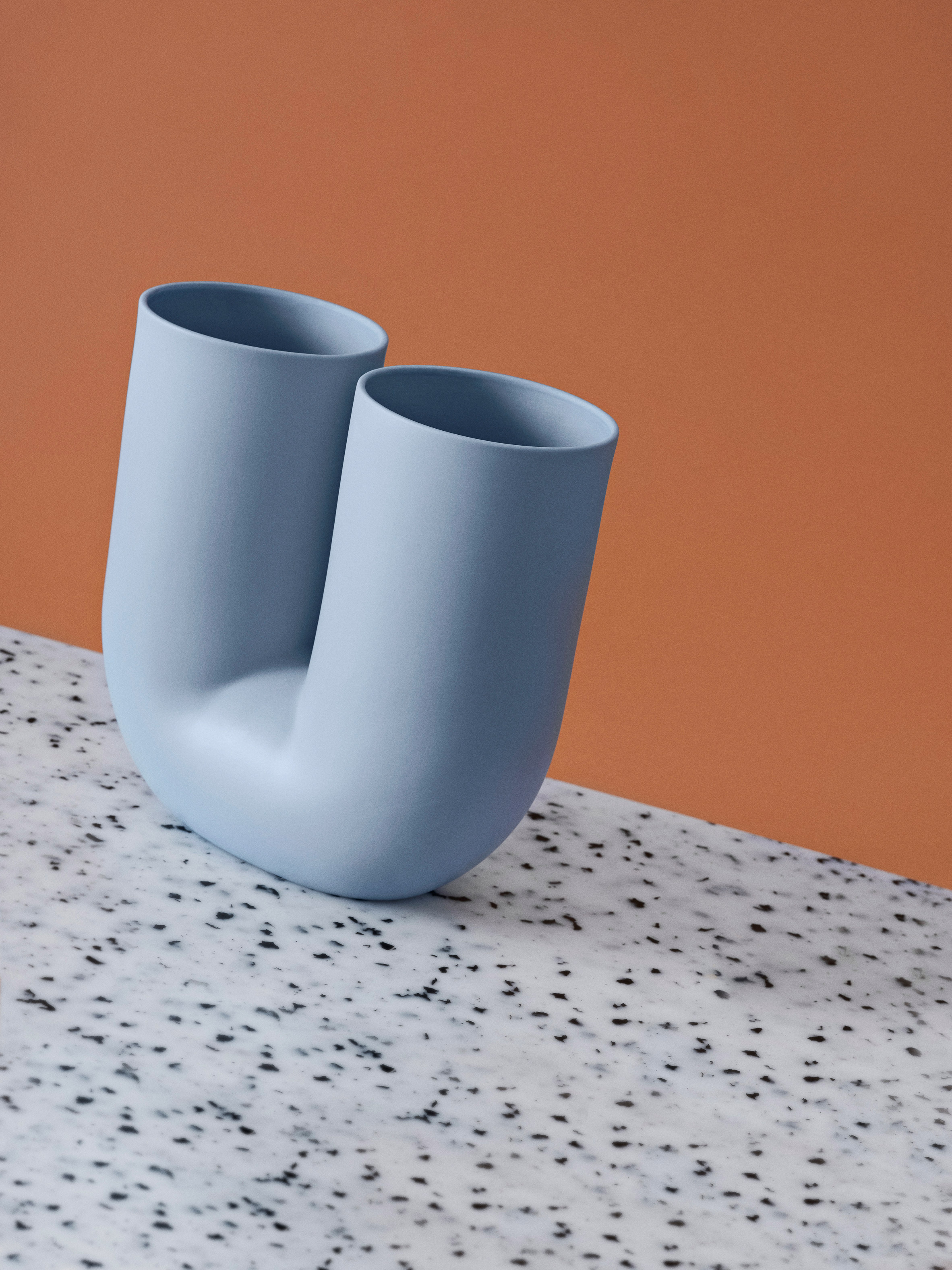
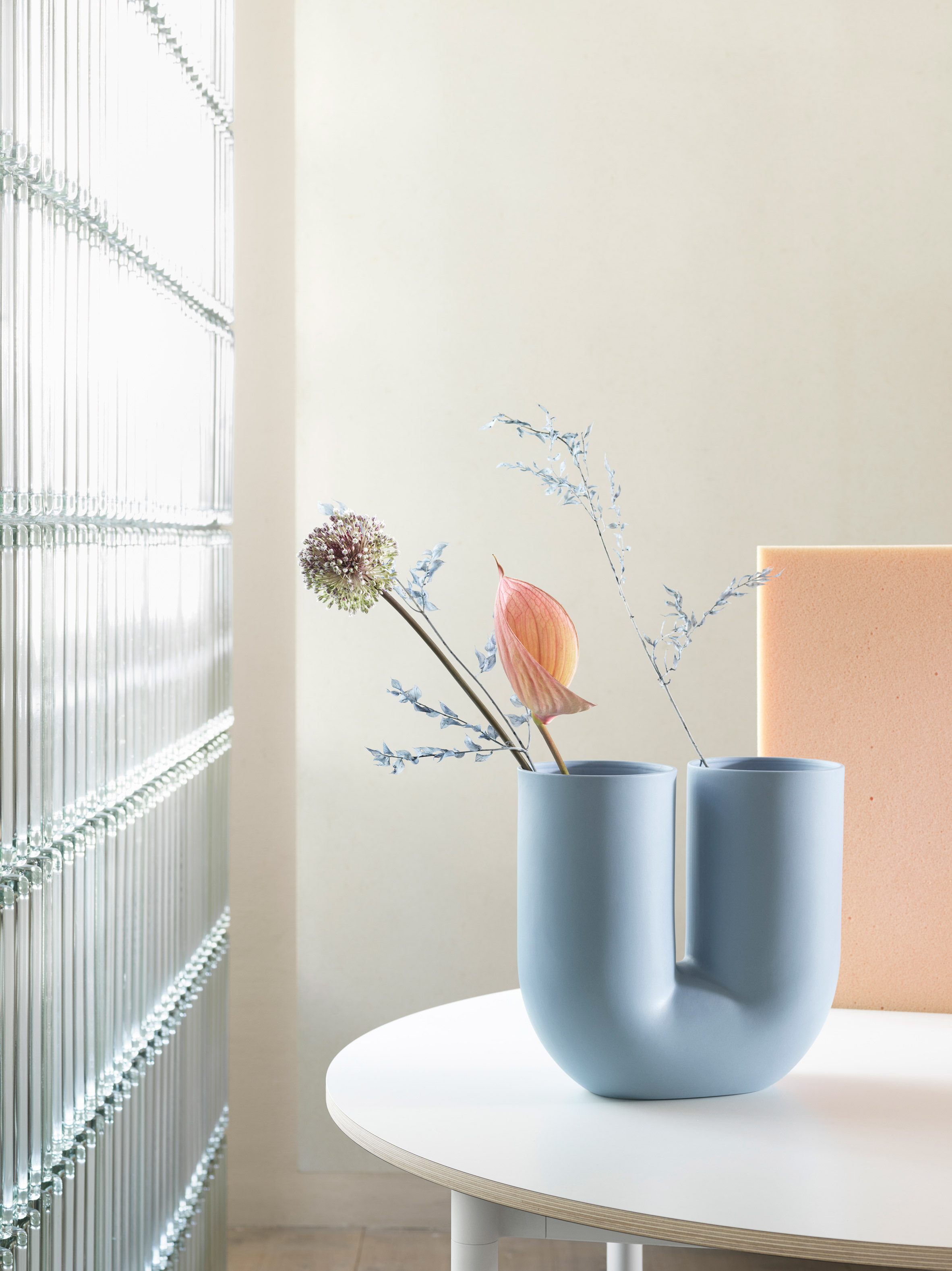
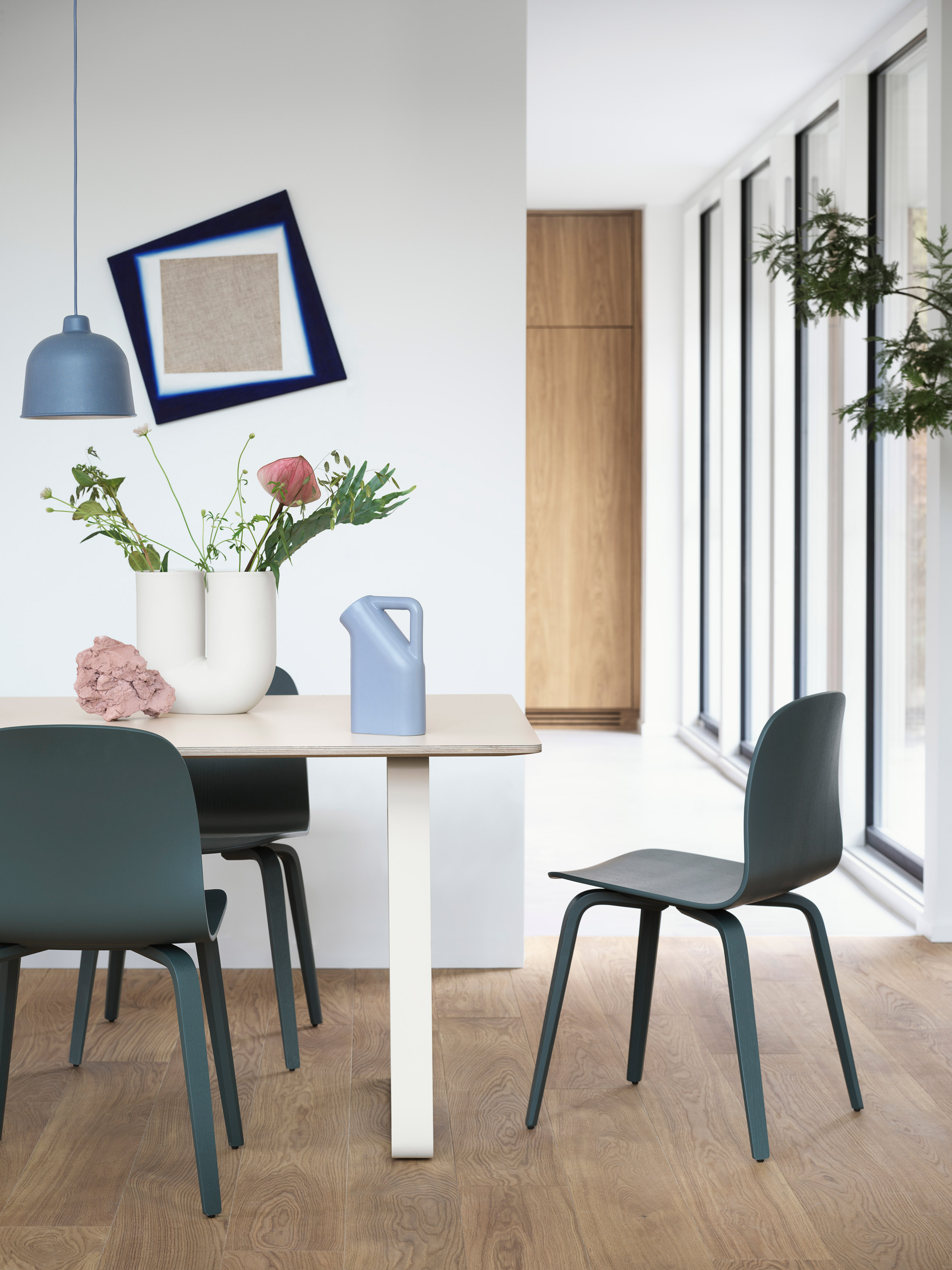
The second product created by Earnest Studio for Muuto is the Kink Vase. Griffin developed a new take on the traditional accessory, using digital design technologies to create its playful shape.

"My starting point for the Kink Vase was an exploration of how new forms could be created through the digital manipulation of simple shapes," said the designer.

"The design combines this appreciation of modern technology with traditional ceramic craft, resulting in a piece that is both contemporary and sculptural," she continued.

"The graphic and playful appearance of the Kink Vase – combined with its double opening, which suggests a new way to arrange flowers – infuses its surroundings with joy."

Earnest Studio Muuto

The distorted tubular form was made possible by computer modelling software and is produced in porcelain using a traditional process.

The design's double-ended form gives it a sculptural presence in a room when not in use, and the user can choose to use one or both ends for floral arrangements.

The vase is available in sand and light blue colourways, with a glazed inner surface providing a contrast to the smooth, matte exterior.

Earnest Studio Muuto

The two new products were unveiled by Muuto at the Design Post showroom during the recent IMM Cologne trade fair.

American-born Griffin founded Earnest Studio in 2012 after studying graphic design in the USA and graduating from the Man & Living programme at Design Academy Eindhoven.

The multidisciplinary studio works across a broad range of projects, designing everything from brand identities to furniture and accessories. Griffin previously collaborated with designer Emilie Pallard on a collection of furniture made using standard construction materials.

Earnest Studio Muuto

Muuto works with many international designers to develop products and furniture that represent a contemporary take on Scandinavian design traditions.

The brand's recent products include a collection of cocoon-like pendant lights designed by Benjamin Hubert's studio Layer, and an aluminium lamp by Tom Chung that projects light from both ends.

The post Muuto launches modular lamp and sculptural vase by Earnest Studio appeared first on Dezeen.


from Dezeen https://ift.tt/31pqeBz

Tripadvisor reveals new logo ahead of year-long identity refresh

Mother Design’s New York studio has updated Tripadvisor’s logo as part of a wider identify refresh, which will roll out over the year.

Tripadvisor was established in 2000 as a way to provide travel guidance for other users. Anyone can create an account and review restaurants, hotels and other tourist attractions.

Courtesy of Mother Design

It also has a flight-finding service and offers customers options for holidays, from rentals to packages and car hire.

The site has nearly 460 million unique visitors each month and 830 million reviews and opinions. “The company knows the world of travel has evolved,” the studio says, “so it only makes sense that the platform’s branding follows suit.”


An exercise in “reduction”

The most noticeable change is the simplification of the company’s logo, Ollie the Owl. It was an “exercise both in reduction of complexity and amplification of character”, says Mother Design.

Courtesy of Mother Design

The owl, which used to have two differently coloured eyes and a yellow head, is now rendered in black only. “We retained its inherent personality but refined its geometry for better reproduction at all sizes,” the design studio says.

The “much simpler owl” appears on Tripadvisor’s website as well as the app.


A “real, global, human connection”

Mother Design has also created a series of icons, relating to the travel service’s various functions. A parasol represents ‘rest’, a backpack for ‘hike’ and a double bed for ‘stay’. There are also new icons for hotels, eating and the search function.

Courtesy of Mother Design

Although the logo is now monochrome, the colour palette for the identity remains varied. Some of the shades now include ‘TripGreen’, orchid, salmon, rose, sand, moss, pine and mustard.
A custom typeface, Trip Sans, has been provided by Colophon Foundry which “could carry the weight of the real, global, human connection the brand believes in”, Mother Design says.


Name change

Another change is the company’s name, from TripAdvisor to Tripadvisor. The company says that the “subtle change” reflects how “people recognise our name and pronounce it as a single word” after twenty years of existence.

Courtesy of Mother Design

Tripadvisor says that the logo update is only the “first step” in its “new look”, though it has not yet revealed further details about its new identity.

The post Tripadvisor reveals new logo ahead of year-long identity refresh appeared first on Design Week.


from Design Week https://ift.tt/2uPhvwc

Royal Astronomical Society rebrand inspired by “vision and discovery”

The Royal Astronomical Society has been rebranded in a bid to “better reflect its purpose”.

London-based design studio Johnson Banks led the project, after being approached by Christine Losecaat, programme director for the organisations 200th anniversary celebrations.


Bringing in a digital-friendly logo

At the centre of the rebrand is a new logo. It features stepped spokes arranged in a circle, with the final shape turned to 23.5 degrees to reflect the Earth’s axis tilt. According to Michael Johnson, founder and creative director at Johnson Banks, the mark is open to interpretation – viewers might see a stylised eye or a planet with an orbiting moon, for example.

The logo replaces the society’s legacy symbol, which featured an engraving of a telescope designed by Sir William Herschel, the Royal Astronomical Society’s first ever president appointed some 200 years ago.

The previous mark

This previous mark was dated, Johnson says. “In the digital age, [it] didn’t reproduce well in small sizes or on screens,” he adds.

Moreover, with its previous emphasis on the telescope the logo also didn’t feel inclusive of the society’s other interests like geophysics.

“It’s an organisation that looks up, but also looks down into the planet,” Johnson says, “so we were keen to reflect that properly.”


“Allowing the imagery to take centre stage”

Elsewhere in the identity, a central colour palette of black, white and grey has been adopted. The colours have been chosen to “compliment beautiful images of the sky, planets and geological formations” which appear across the society’s communications.

These colours are further accented by a secondary colour palette inspired by shades found in the sky and on land, which already features on the society’s Monthly Notices and Geophysical Journals.

“In the previous identity, the logo was really the only consistent part of it, and when we looked at all the other communications, there really wasn’t any sense of cohesion,” says Johnson. “It soon became very apparent that the way forward was with the sensational imagery the society had to offer.”

With this at the forefront, Johnson says the team really wanted “a system that most of the time would just work in the background and only take the focus when necessary, allowing the imagery to take centre stage”.


“Doing more with their brand”

The new look aims to clarify the society’s mission, while also attracting “attracting a younger and more diverse membership”.

With the organisation celebrating its bicentenary this year, Johnson hopes the new look will signal to similarly historic societies that “it is possible to sensitively modernise their brands.”

“A lot of the learned societies like the Royal Astronomical Society were founded around the same time,” Johnson says. “And many are now starting to realise they need to do more with their brand.

“Of course, you can’t ignore the current membership, but attracting new members is necessary too and that’s what this new identity is for.”

The post Royal Astronomical Society rebrand inspired by “vision and discovery” appeared first on Design Week.


from Design Week https://ift.tt/2uN053k

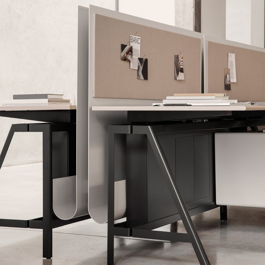
IOC designs Solari workstation in collaboration with Gensler

Dezeen Showroom: trestle legs and a customisable, J-shaped privacy screen distinguish the Solari desk system, developed by Italian office...