Monday, June 1, 2020

Entries for Dezeen Awards 2020 close tomorrow

There is only 1 day left to enter Dezeen Awards 2020. Entries close tomorrow at 23:59 UK time.

To help you finalise your submission today, we've put together a checklist so you can make sure your entry is complete and ready to submit:

Are you eligible? Dezeen Awards is open to registered companies and individual designers over the age of 18. Your project must have been completed between 3 June 2018 and 2 June 2020 to be eligible.

Create an account. You will need to create a Dezeen Awards account to enter, if you do not already have one.

Select your category. There are 36 project categories and six studio categories that you can enter. You can enter the same project into multiple categories.

Describe your project. You will need to provide a short and long project description, telling us and the judges a bit about your project or product. Explain why you should win a Dezeen Award. Tell us how your project fulfils the three criteria: beautiful, innovative and beneficial.

Upload images. You can upload up to eleven images to support your entry. Please include a variety of images including photographs, plans and drawings. Do not include renderings or digital visualisations. Images need to be 10MB or less. Your hero image needs to be cropped to a square format.

Credit and caption your images. Make sure that all of your images are correctly credited where appropriate and captioned to describe what they depict.

Video links (optional). Include a URL link to a video of your project if relevant. Additional credits. Make sure to credit everyone involved in the project.

Get permission from the architect or designer. If you are entering on behalf of the architect or designer, you will need to confirm that you have their permission to do so and provide us with their details.

Payment. Your entry will be submitted once payment has been processed. You must make payment online using a debit or credit card.

Questions. If you have any questions or need help, please email awards@dezeen.com.

The post Entries for Dezeen Awards 2020 close tomorrow appeared first on Dezeen.


from Dezeen https://ift.tt/3eGkk4q

ArkDes, Ilse Crawford, Alcova and Farshid Moussavi feature at VDF this week

Week eight schedule VDF

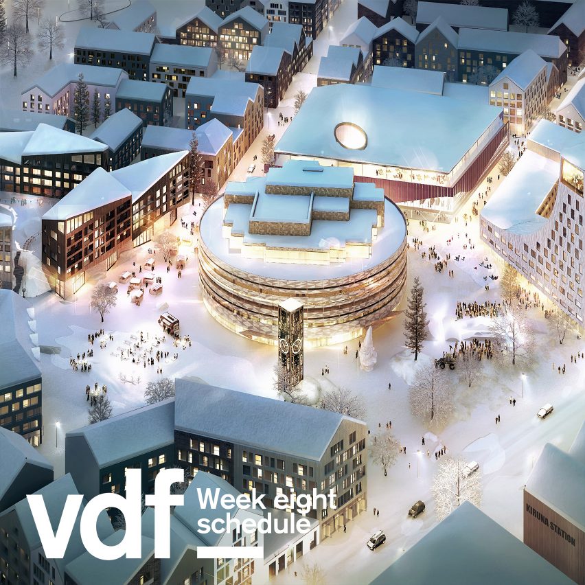
Week eight of the Virtual Design Festival starts this Monday with a collaboration with ArkDes, Sweden's national centre for architecture and design, taking visitors on a virtual 360-degree tour of the opening of its new exhibition, and much more.

We also talk about upcoming industry trends with Lixil chief design officer Paul Flowers and show new touchless and 3D-printed collections as part of our collaboration with Grohe, the VDF headline sponsor.

Designer Ilse Crawford and industrial designer Benjamin Wilson will take part in two live discussions with Dezeen editor-in-chief Marcus Fairs, presented by Braun, and Theodora Alfredsdottir and Patternity join us for our Screentime design series sponsored by Philips TV and Sound.

On Thursday, we showcase the work of 10 designers in collaboration with Milanese design platform Alcova, while the Friday brings a takeover from Austrian Fashion, which presents the work of 15 contemporary fashion and accessories designers.

Iranian-born British architect Farshid Moussavi is this week's guest on our Screentime architecture series, sponsored by Enscape.

We are now more than halfway through VDF. To catch up on what you've missed so far, check out Fairs' selection of highlights from the first half of the festival. For what's to come, see the full VDF schedule. All times are UK times and are liable to change.


Monday 1 June

VDF x ArkDes

For this daylong takeover, Virtual Design festival will showcase a 360-degree virtual vernissage from ArkDes, Sweden's national centre for architecture and design, as well as a live interview with ArkDes director Kieran Long, an interview with artist Linda Tegg, and more.

11.00am Virtual 360-degree vernissage of Kiruna Forever 

A virtual visit that lets you explore the latest exhibition at ArkDes, with over a hundred works by architects, city planners and artists, before it opens on June 2.

12.00pm Kiruna Forever 

Take a closer look at the project behind Kiruna Forever – how do you move an entire city?

1:00pm Interview: Linda Tegg

An interview with Australian artist Linda Tegg, whose Infield project has changed the entrance of ArkDes from asphalt car park to a meadowland.

3.00pm Virtual vernissage: WEIRD SENSATION FEELS GOOD

Take the opportunity to see ArkDes' new exhibition about ASMR, featuring global ASMR artists as well as commercial pieces and works from TV artist Bob Ross, from your own home.

4.00pm Interview with Kieran Long

ArkDes' director Kieran Long in conversation with Dezeen editor-in-chief Marcus Fairs, live from Stockholm.

www.arkdes.se

2:00pm Screentime: Theodora Alfredsdottir

Icelandic product designer Theodora Alfredsdottir joins Marcus Fairs for a presentation and conversation about her work in this Screentime design episode sponsored by Philips TV and Sound.

www.theodoraalfredsdottir.com


Tuesday 2 June

VDF x Grohe

Today's Virtual Design Festival is a collaboration with our headline sponsor, bathroom and kitchen manufacturer Grohe. Dezeen editor-in-chief Marcus Fairs will discuss upcoming industry trends with Paul Flowers, the chief design officer of Lixil, and Grohe will present its touchless and 3D-printed collections and their relevance to health and wellbeing.

www.grohe.co.uk


Wednesday 3 June

VDF x Braun

German brand Braun presents two talks on the theme "Times of change and good design" as part of today's VDF line-up.

The first talk features industrial designer Benjamin Wilson and philosopher, writer and curator Dr. Peter Kapos, followed by a second talk with designer Ilse Crawford. Both talks will be moderated by Marcus Fairs.

www.uk.braun.com


Thursday 4 June

VDF x Alcova

VDF teams up with Milanese design platform Alcova on Thursday 4 June to present the work of 10 designers, studios and brands from its stable.

2:00pm Screentime: Patternity

Anna Murray of London design studio and creative organisation Patternity, which aims to share the positive power of patterns with the world, is today's interviewee for our Screentime design series sponsored by Philips TV and Sound.

www.patternity.org


Friday 5 June

VDF x Austrian Fashion

Today's collaboration with Austrianfashion.net, the platform for Austrian contemporary fashion design, will showcase the work of 15 designers working in fields ranging from jewellery to footwear and fashion.

www.austrianfashion.net

3:00pm Screentime: Farshid Moussavi

Iranian-born British architect Farshid Moussavi will discuss her work, which includes cultural centres, retail spaces, apartment blocks, museums and more, with Marcus Fairs as part of our Screentime series sponsored by Enscape.

www.farshidmoussavi.com


Virtual Design Festival, the world's first digital design festival, runs from 15 April to 30 June 2020 and is sponsored by bathroom and kitchen manufacturer Grohe.

The post ArkDes, Ilse Crawford, Alcova and Farshid Moussavi feature at VDF this week appeared first on Dezeen.


from Dezeen https://ift.tt/2XiIeNg
Coutts is one big family in its heritage-led rebrand

It’s the first rebrand in ten years for the private bank, and happens in a much-changed financial landscape. Fintech companies such as Monzo have ditched the sober branding usually associated with money, and embraced a more playful look and tone of voice, which has seen more traditional banks scrambling to catch up.

So it’s interesting to see Coutts take a different tack. Instead of adopting a similarly conversational tone of voice, FutureBrand has focused on the bank’s 325-year history. The studio went back to the principles of Thomas Coutts, who apparently founded the company with ideas of maintaining a close relationship with, and an understanding of, its clients.

FutureBrand has taken a similarly personal approach to Coutts’ rebrand, focusing on individual stories of people, portraits of the ‘extended family’, and a warmer, more welcoming tone of voice that positions the bank as a kind of home.

FutureBrand hasn’t explained exactly why now was the time for Coutts to change up its branding, but the subtext is perhaps the encroaching influence of younger, more digital-led companies. The studio does report that the updated identity has helped boost perceptions of the bank as more ‘caring’, ‘modern’ and ‘innovative’.

All that said, Coutts is clearly appealing to a particular niche, so perhaps the strategy here is to emphasise the personal nature of that relationship rather than compete with others. Either way, FutureBrand has made an elegant job of it – creating an identity that feels more contemporary, but maintains the hundreds of years of heritage Coutts has built up.

futurebrand.com

The post Coutts is one big family in its heritage-led rebrand appeared first on Creative Review.


from Creative Review https://ift.tt/2yVgogS

The chatbots are coming

CR investigates what it takes to create a good chatbot, and why they could become an essential part of brand comms in our current culture of immediacy

The post The chatbots are coming appeared first on Creative Review.


from Creative Review https://ift.tt/3ckT61E

Standards Manual is releasing a book on NASA’s worm logo

The Worm Standards Manual

The defining rivalry in the context of space travel is most widely considered to be the space race between the USA and the Soviet Union. Yet NASA has been home to intense rivalries of its own. The worm or the meatball: choose your fighter.

NASA’s longest running insignia is a celestial, round graphic – hence the ‘meatball’ nickname – imbued with patriotic colours. It was first introduced in 1959 and was used until 1975, when it was replaced by the worm: a sleek, curved red logotype. Designed in 1974 by Richard Danne and Bruce Blackburn of New York design studio Danne & Blackburn, the new emblem was the product of the Federal Design Improvement Program, and marked an era of modernity for the space agency.

The Worm Standards Manual

The worm design was retired in 1992 and replaced by its predecessor, and was only to be reproduced on merchandise. Yet the worm icon remained one of the most timeless and instantly recognisable in collective memory – it made our top 20 list of the greatest logos of all time, and Pentagram’s Michael Bierut declared that it “was and is absolutely appropriate” versus the “amateurish mess” that is the meatball.

In honour of the worm’s cherished legacy, Standards Manual is releasing a book featuring over 300 images featuring the logo drawn from the NASA archives, along with an essay by Danne.

The final chapter of the book will be completed following the Falcon 9 mission – a joint initiative between NASA and Elon Musk’s SpaceX – to the International Space Station, which successfully launched on May 30.

The mission marks the return of the worm as it is used officially on a rocket for the first time in nearly two decades – an end to a hiatus that will likely be welcomed by designers and space fans alike.

The Worm Standards ManualThe Worm cover

The Worm, published by Standards Manual, is available to pre-order from Counter-Print in the UK; standardsmanual.com; counter-print.co.uk

The post Standards Manual is releasing a book on NASA’s worm logo appeared first on Creative Review.


from Creative Review https://ift.tt/2TZo60D

Janik Söllner’s dynamic editorial illustrations jump off the page

I was always quite good at drawing, and from early on kind of defined myself by it,” says Hamburg-based illustrator Janik Söllner. When he was 16 years old, Söllner showed his portfolio to a professor at an academy of fine arts. “The professor who reviewed it took a look and told me it wasn’t art, but illustration. That was the first time that I’d heard of it,” he says. 

Having a natural inclination towards concepts and ideas, Söllner went on to study communication design at the University of Applied Sciences Wuerzburg. “Part of it included illustration classes, which were my main focus,” says the illustrator. “Afterwards, I got my master’s degree in information design, still working very theoretically — at least for a designer. I would say the main thing I learned from it was some sort of visual vocabulary, and the ability to reflect on my drawings and the ones of others.”

Illustration for the New York Times

Söllner describes his style as simple, as it combines rough black outlines with plain but bright colours. “I try to find a funny or unusual perspective in the things I draw, regardless of whether it’s self-initiated or commissioned. And I try not to limit myself too much in what I draw, but to push the boundaries of my style further and further, since I am still quite new in the field of illustration,” he explains. “I am very much influenced by the illustrations of Jean-Michel Folon, Tomi Ungerer, and Celestino Piatti – and I adore the drawings of Mari Kanstad Johnsen, Cristóbal Schmal, and Anna Haifisch.”

Despite being new to the illustration scene, Söllner has already racked up an impressive list of clients including SZ-Magazin, Melitta, Hohe Luft Magazine, and the New York Times among others. “To me, it seemed to be the most accessible field of illustration to work in with my approach to drawing,” Söllner says on why he went down the editorial illustration route. “I send my portfolio out to art directors, and if someone actually writes back it usually is a clear proposal and a short deadline. It feels like editorial illustration is like a sprint, compared to book illustration, which is more of a marathon.”

The illustrator’s images are angular and jaunty with awkward elbows and swirls of colour bringing his black lines to life. Söllner says he’s fast at coming up with ideas and he works fast, which suits the pace of editorial commissions well. “The topics vary so it is always interesting, and it is very satisfying to have the magazine with your illustration in the mailbox shortly after,” he says. The perfect brief for Söllner is one that comes with as much information as possible about the text it’s for. “It is also very helpful to get some pictures or a rough layout sketch along with it, if the art director already has a loose vision how it could turn out in the end,” says the illustrator.

“Even if the deadline is very tight I need to take a short break before I start drawing. I take a walk, re-read the brief and drink a cup of coffee,” Söllner says of his process. “Then I start sketching. I try to stay loose and work quickly, and let the process guide me. When I have gathered some strong ideas I scan them in and send them to the art director before I can overthink them. Later on I try to keep this lightness from the start, and not get to stiff in the process.” Söllner typically uses HB pencils for the outlines of his figures, he then scans his drawings with a very high contrast. “Then I add colours in my old dusty version of Photoshop,” he says. “I like it when you can still see the grain of the graphite in the final illustrations a little bit.”

Illustration for Science Notes Magazine

In the last year Söllner has been teaching drawing and illustration classes at the same university he studied in, though for the last few months he’s been doing it remotely via Zoom calls and emails. While the world has been in lockdown, Söllner has also been reflecting on things many creatives can sometimes face. “My constant worry is of losing it, that thing that defines my style and makes people like my illustrations, whatever it is, but besides that I have been doing well recently,” Söllner says.  

The illustrator is early in his career, but already he’s picked up a few pieces of advice for his fellow creatives. “In my opinion, I don’t think you should try too hard to get commercial projects while you are studying,” Söllner says. “If you are not already set in your way of drawing that will be visible in your work, and it can take the fun away out of the projects you do in class. Also, you should learn to deal with rejection or even no response at all when sending out your portfolio!”

instagram.com/janik_soellner

The post Janik Söllner’s dynamic editorial illustrations jump off the page appeared first on Creative Review.


from Creative Review https://ift.tt/2AvdhNa

Cardboard hospital beds that double as coffins developed in Colombia

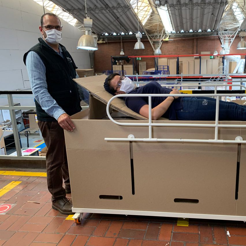
Emergency bed and coffin by ABC Displays

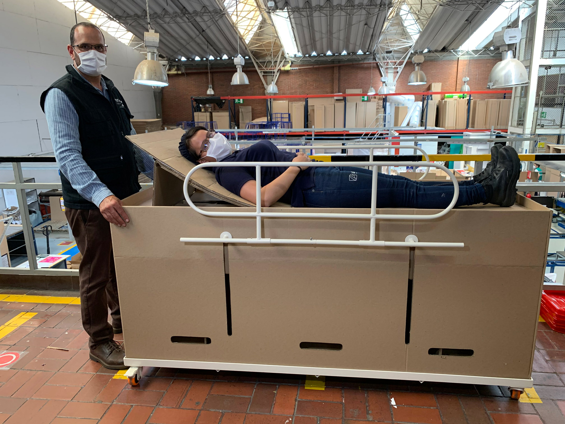
A Colombian company has created an emergency hospital bed from cardboard that can be quickly assembled and transformed into a coffin in response to the coronavirus crisis.

ABC Displays, a company in Bogotá that specialises in advertising materials, has started making and distributing the low-cost bed for coronavirus patients.

In the worst-case scenario, each bed can be rapidly reconfigured to become a cardboard coffin.

Emergency bed and coffin by ABC Displays
ABC Displays has created a hospital bed that can be converted into a coffin 

CEO of ABC Displays Rodolfo Gómez told Dezeen the idea came after seeing the dire situation in the neighbouring country of Ecuador. Mortuaries have been overwhelmed and the government had to distribute emergency cardboard coffins as bodies were left on the streets.

"It is a worthy solution so that people are not lying on the floor of hospitals and [they] are not throwing them in mass graves if they die," said Gómez.

"By converting this bed into a coffin, it also allows medical personnel to have biological isolation from the corpses without having to manipulate the corpse much, protecting the medical team," said Gómez.

"The entire procedure is done in the same bed, as in the worst case, the patient's death, it can be converted into a coffin in less than 18 seconds."

As a hospital bed, the cardboard design has slots in the sides for railings and space for brakes, so it can be mounted on wheels.

Emergency bed and coffin by ABC Displays
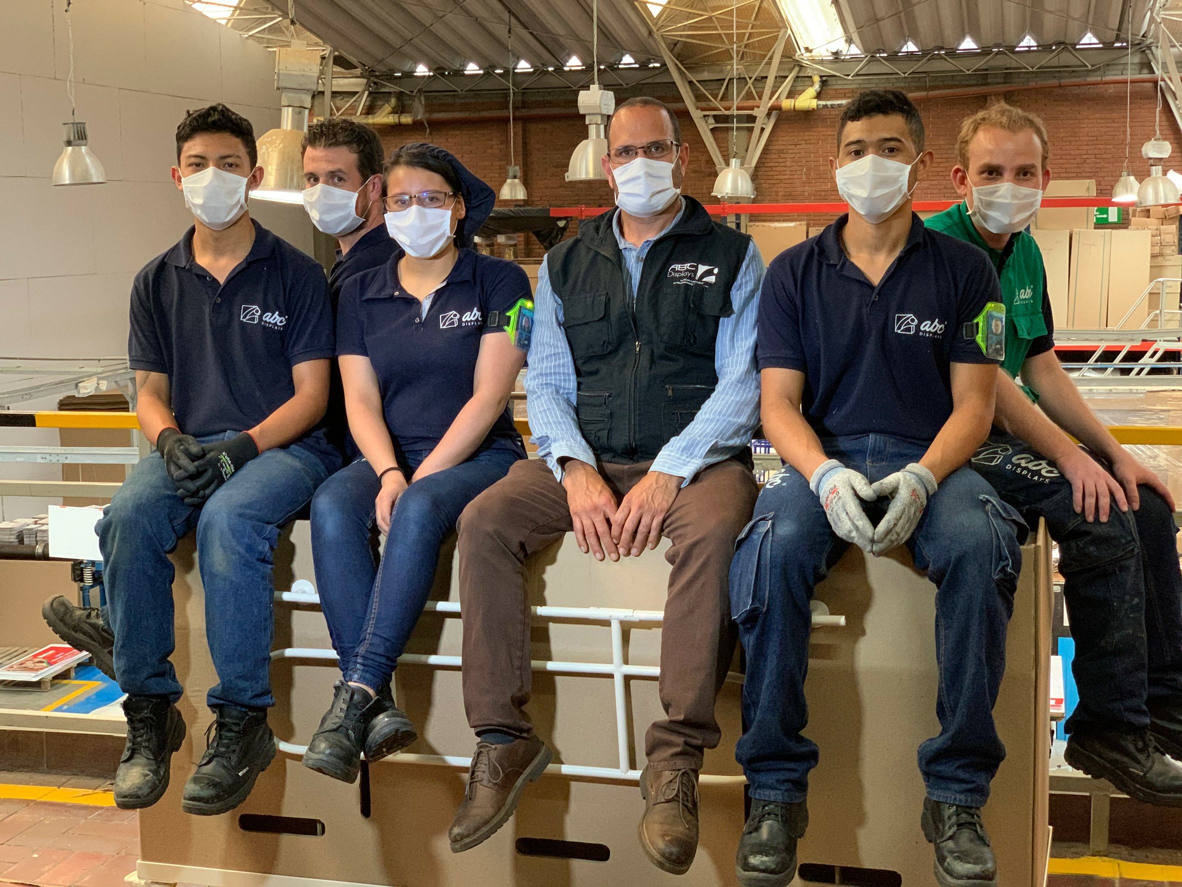
The team at ABC Displays designed the bed after observing the situation in Ecuador

ABC Displays said they consulted with doctors and hospital staff during prototyping to make sure the bed had the best dimensions for coronavirus patients. Sheets and blankets can be used to cover the cardboard surfaces, just like a normal bed.

Cardboard was chosen for several reasons. According to recent studies, coronavirus can only survive on cardboard surfaces for 24 hours, whereas it lives for two to three days on materials such as wood, metal and plastic.

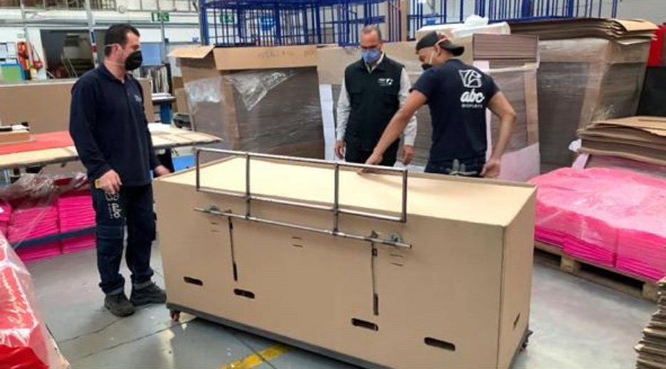
Each bed can be shipped flat packed, and the corrugated cardboard is light but strong enough to support 150 to 200 kilograms. An average adult weighs just 62 kilograms.

It also minimises the environmental impact, as it can be easily recycled after use – if not used as an emergency burial device.

Emergency bed and coffin by ABC Displays
Each bed is designed to be shipped flat packed

ABC Displays is sending a donation of cardboard beds to Leticia in the Amazon region on the border with Peru and Brazil. Leticia's biggest hospital has only five ventilators, reported the Bogota Post, and no intensive care unit beds. Colombia currently has over 25,300 coronavirus cases and has registered over 800 deaths.

The company will donate beds to the worst affected regions, and is offering to sell them to other local governments in places such as Peru that are looking for inexpensive solutions to bed shortages. ABC Displays estimates it can manufacture 3,000 beds a month if needed.

"The company has all the capacity to export these beds worldwide, considering that there are airlines with the availability to make and carry humanitarian aid," said Gómez.

At the start of the pandemic, Swedish startup Stykka made a cardboard desk that could be used as a cheap solution by people suddenly working from home.

Photography courtesy of ABC Displays.

The post Cardboard hospital beds that double as coffins developed in Colombia appeared first on Dezeen.


from Dezeen https://ift.tt/2TYgLP0

IOC designs Solari workstation in collaboration with Gensler

Dezeen Showroom: trestle legs and a customisable, J-shaped privacy screen distinguish the Solari desk system, developed by Italian office...