Friday, January 31, 2020

In-house teams: How Reuters Graphics visualises “catastrophic” world events

“Just because a story is big doesn’t mean that it’s visual, or that it merits a response from us,” Simon Scarr tells Design Week. “We try to work on stories that really need our work — where the visual aspects are essential to the understanding.”

Scarr is the deputy editor of the Reuters Graphics, the news agency’s in-house graphics team that creates and distributes graphics to its clients all over the world. Recent visuals have covered the outbreak of the Coronavirus in China, Hong Kong protests and the Iran-U.S missile crisis. In January, the team made a scroll-down page displaying hundreds of orange squares, aiming to convey the scale of Australia’s bushfires, which have so far razed 103,000 sq km of land (an area the size of South Korea).

We speak to Scarr about how the team tailors content to clients, keeps up with the news cycle and stays inventive.


What do they do?

The team publishes graphics to Reuters.com and distributes content to clients internationally. Reuters is a news agency, which media and corporate companies from all over the world subscribe to. This means that the focus must have “global or at least regional appeal”. “As much as a mayor’s race in Spokane may be of huge interest for that community, it won’t play on the global scale,” Scarr says.

It means they must always consider the “end user of the work”, which is not necessarily a reader. A client might be a newspaper, but it could also be a company with an online product. That means that the team must produce a file that is easy to edit, for individual client’s use. “We have to go one step beyond thinking how something will look in the window of a web browser,” Scarr explains. It has to be done “in a way that’s easy to understand if someone if picking these files apart and editing them”.

Illustrations for the Hong Kong protests. Courtesy of Reuters

Another consideration is language. Because of the agency’s international focus, not all clients use the English language, so the graphics and presentations have to be built in a way that is easy to translate. And although digital is a focus, many clients still have a printed product. A print client might want a static map or a series of static charts, Scarr says. “We would never send out a large interactive file and expect a print client to pick that apart,” he adds. “Everything has the customer in mind.”

Most importantly, it’s the “visual merit” of a story that matters. Scarr says a question that’s often asked among the team is: “Will the visuals add value, or can the reader understand this story just as well without them?”


How does the team work?

Scarr is based in Singapore, but the graphics team has desks in New York, London, and Bangalore. There are around 20 members in the entire team. Each desk tends to focus mostly on their region (divided by AMERS, EMEA, and APAC), but there is some collaboration on stories with “global elements” and pre-planned major events, like a recently published feature on Davos (with floating Bill Gates’ faces to show the number of years the Microsoft founder has attended the annual Swiss conference). The 2020 Tokyo Olympics coverage will be a joint effort between all bureaus.

“Cross-region collaboration can also be driven by pairing up particular skillsets, data-heads, cartographers, illustrates and codes to work together,” Scarr says. “We think of ourselves as one large team and have communication channels that make it easy for us to share work, discuss ideas and solicit feedback, regardless of where we are in the world.”

That also means working with the entire newsroom. Most of the team are reporters by trade, Scarr says — although he is an exception, having gained a diploma in Newspaper Design and Information Graphics. But having access to the Reuters newsroom — with reports on the ground and investigative journalism — means that the team can work with an enviable variety of datasets.

The visual showing the edited police procedures manual. Courtesy of Reuters

A recent visual for the Hong Kong protests showed changes the police made to their guidelines on the use of force in the run up to October’s violence. Discovered by a reporter at the Hong Kong bureau — “a story by itself”, Scarr says — the information then became part of a “bigger immersive project”. The team highlighted in yellow all the additions the police made (such as suggestions of pepper spray, tear gas and water cannons as law enforcement) and strike-throughs for removed phrases. For example, the framework of actions against police by assailants that were considered aggressive changed from, “Physical assault not intended to cause serious bodily injury” to “Physical assault to cause or likely to cause bodily injury to others”, significantly loosening police restrictions.

Illustration of the weapons used during the Hong Kong protests. Courtesy of Reuters

What’s the process like?

Scarr says while the team is “open to experimentation” in terms of new technology, there’s a regular suite of programmes it uses. Adobe Illustrator is prime among them, as well as QIS or ArcGIS for mapping and plotting map layers and Cinema 4D for 3-D work. D3.js is used for a lot of the data visualisation.

When it comes to coming up with ideas for the visuals, the process is less linear. “Truthfully, we often don’t know the best way to visualise something until we start trying to do it,” Scarr says. “For most of the pieces we do, there is a sad trail of trial and error.”

But just as great ideas can end up as mediocre visuals, often the simplest data makes the most impactful graphic. One particularly memorable motion graphic came from a simple fact: In 2019, almost 1 million plastic bottles were purchased every minute. It shows a human figure being ‘drowned’ in plastic bottles, with a timer that counts how many plastic bottles have been sold since the page was opened.

As you scroll down, more graphics show the quantity by hour (at which point Rio de Janeiro’s Christ the Redeemer would have been covered) and by day — when 1.3bn bottles would pile up to half the size of the Eiffel Tower. In ten years, 4 trillion bottles have been sold, enough to cover the city of Manhattan.

Visualisation showing the amount of plastic humans inadvertently consumer. Courtesy of Reuters

The team is aware that projects are likely to be shared on social media, and so should look good. Illustrations for the Hong Kong weapons piece were done in-house in Singapore by Marco Hernandez, lending a hand-drawn illustrative style that contrasts with the more-realistically rendered models of bullets and weapons.


What are the challenges?

A good news sense is crucial. The biggest story in the world might not be on the pages the day after, and Scarr says it would not be worth it to commit time to visualise these. It’s also possible to follow stories as they break. The recent coverage of Coronavirus — the respiratory illness that has spread from Wuhan, China — is a good example of this. First there was a global map charting the outbreak of cases, then a chart with pending cases against deaths and recoveries and another map of mainland China with localised cases. “As that story continues to grow,” Scarr says, “you spot more angles to look at and more interesting ideas.”

Visualising the scale of plastic bottle use. Courtesy of Reuters

It also requires being selective, sometimes disapprovingly so. “There are unlimited possibilities for visual story-telling and with unlimited resource we would probably try to do them all,” he says. “But the fact of the matter is, we are a moderately sized team trying to cover the entire world, so we can only really engage on a tiny fraction of the projects we would like to.”


What’s next?

Scarr is sure that things might change with the advent of virtual and augmented reality — “there’s a progression in how people are absorbing content,” he says. But the team has to think about how widespread that technology is. “We’re not aggressively working on projects using that technology right now, but we do discuss new ways of tackling projects, especially with sports.” Right now, it’s simplicity that’s key: People are used to scrolling down through stories, so the interactive graphics often work with this motion.

The Star Wars graphic, which shows how man lightsaber strikes characters made against each other during the films. Courtesy of Reuters

Sometimes the graphics team dabble outside of serious news into lighter stories. Like an infographic on Star Wars, published on the release of the 2019’s The Rise Of Skywalker, showing the number of lightsaber strikes made by each characters in the science fiction saga. The statistics were visualised in signature blue, red and greens of the weapons. (Mark Hamill, the actor who played Luke Skywalker liked the story on Twitter.) The team has also published graphics for the Oscars, using different shades of gold to represent nominations earned by films.

Scarr hints that there are more of these projects to come — including a recurring idea about the proliferation of mangoes — and not simply because they are popular online. “It’s a welcome change of pace after covering the negativity or catastrophic events that often drive the news agenda,” he says.

The post In-house teams: How Reuters Graphics visualises “catastrophic” world events appeared first on Design Week.


from Design Week https://ift.tt/2vyFpw5
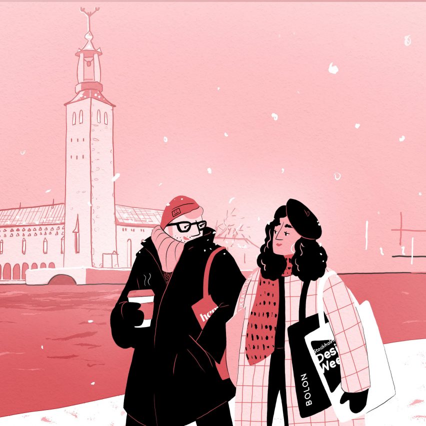
Architecture and design events in February 2020 from Dezeen Events Guide

Dezeen Events Guide February

Modernism Week in Palm Springs, Stockholm Design Week and the Collect crafts fair and Surface Design Show in London are among the architecture and design events taking place this month and listed on Dezeen Events Guide.

Other events taking place in February include Madrid Design Festival, Nomad St Moritz and Object Rotterdam.

Stockholm Design Week

Stockholm Design Week is Dezeen's first major excursion of the year, as we have several events taking place in the city. Check the Stockholm section of Dezeen Events Guide for details!

The week takes place from 3-9 February in the Swedish capital, with more than 200 events across the city, including the Stockholm Furniture & Light Fair, which is the biggest design fair in Scandinavia.

The Guest of Honour at this year's fair is Indian-British design duo Doshi Levien, who will present an exhibition explaining their working process in the entrance hall of Stockholmsmässan, where the fair takes place.

The fair's talks programme will include a lecture by Doshi Levien's Nipa Doshi and Jonathan Levien moderated by Dezeen founder and editor-in-chief Marcus Fairs. It takes place at 2pm in The Design Bar at the fair.

Modernism Week

Modernism Week takes place in Palm Springs, California this month. The 15th year of the festival will include walking, biking and bus tours of many of the mid-century houses in the area, as well as films and lectures.

Talks include an exploration of the female architects involved in designing Palm Springs, and TWA Hotel: Rebirth of a Modern Icon about the restoration of Eero Saarinen's 1962 TWA Flight Center at JFK airport.

Collect craft fair

The Collect: International Art Fair for Modern Craft and Design functions more like an art fair, with galleries taking stands to show exhibitions by specific designers and makers.

Collect moves to London's Somerset House this year, with over a quarter of participating galleries showing for the first time.

Galerie Scene Ouverte from Paris will show furniture and objects in small editions, in the manner of a New York apartment, and three South Korean galleries will show new work.

See more events in London on Dezeen Events Guide.

About Dezeen Events Guide

Dezeen Events Guide is a new guide to the leading architecture and design events taking place around the world each year.

With over 100 events in 30 countries already listed for 2020, including conferences, trade fairs, major exhibitions and design weeks, the guide is updated weekly.

Inclusion in the guide is free for basic listings, with events selected at Dezeen's discretion. Organisers can get enhanced or premium listings for their events, including images, additional text and links, by paying a modest fee.

In addition, events can ensure inclusion by partnering with Dezeen. For more details on inclusion in Dezeen Events Guide and media partnerships with Dezeen, email eventsguide@dezeen.com.

The illustration, featuring Ragnar Ă–stberg's 1923 Stockholm City Hall, is by Rima Sabina Aouf.

The post Architecture and design events in February 2020 from Dezeen Events Guide appeared first on Dezeen.


from Dezeen https://ift.tt/2GI3yCJ

130 Designs That Are So Bad That It’s Hard To Believe Someone Came Up With Them (New Pics)

Human beings don’t always build things to last. Sometimes, they make such obvious mistakes that casual observers can’t believe they didn’t notice their design flaws from the get-go. Alas, we’re all flawed (much like some designs!) and most of us have a blind spot when it comes to the things we’re involved in.

Nonetheless, bad designs are a lot of fun to look at and laugh at. And there’s no place who does it better than the ‘Crappy Design’ subreddit! We collected some of the best, newest, crappy designs from the Reddit community, so scroll down and enjoy. Remember to upvote your fave bad designs, and drop us a comment telling us why you loved hating them.

We at Bored Panda love great designs, but we also adore really bad ones, too. When you’re done looking through our awesome list, check out our posts about epic design fails, the very worst kitchen designs, epically bad bar and restaurant designs, and structural nightmares. We’re sure you’ll love ‘em.

#1 My Sister’s School Health Clinic May Need Some Emoji-Education

Image credits: reddit.com

#2 Ladies And Gentlemen, The Pinnacle Of Human Stupidity

Image credits: KoldunMaster

#3 Sounds Like An Invite To Your Own Murder

Image credits: sh*telyf

There are plenty of examples of bad design out there, but we can find some excellent designs here and there. And good design involves uniting the concept you have with the physical end-result of the product.

For instance, Ikea talks about how its design is “democratic” in that the company believes “good home furnishing is for everyone.”

#4 The Single Worst Clock I Have Ever Seen. I Actually Said Aloud "Whyyyy"

Image credits: patchestheshark

#5 The Implication That This Tooth Has Something Down There

Image credits: Dylflon

#6 Anti-Plastic Book Wrapped In Said Plastic

Image credits: Qudufy_Duck

Meanwhile, Apple values quality craftsmanship through and through. Company founder Steve Jobs said that “for you to sleep well at night, the aesthetic, the quality, has to be carried all the way through.”

#7 This Graph Comparing Average Women's Height Around The World Is...well...

Image credits: reddit.com

#8 It’s Supposed To Say Shoemaker

Image credits: Cataclysmxdd

#9 My School

Image credits: JIIPEEG

You’ve heard that “function over form” is an important aspect of design, but have you ever considered that they can be (and should) united into one seamless whole?

Postmodernist Frank Lloyd Wright, who dedicated his life to crafting organic designs, coined the phrase “form and function are one.” According to him, form and function ought to be in “a spiritual union” instead of vying for dominance over one another.  

#10 He's Calling Her To Ask Her For Her Number?

Image credits: PomPlosion

#11 Trying To Figure Out What This Sign Means For The Past 5 Years

Image credits: notgayyyyy

#12 I Hope The Electrician Knows The Sprinklers Schedule

Image credits: sause246

In a previous interview with Bored Panda, the moderators of the ‘Crappy Design’ subreddit said that the community changed over the years.

“The original motivation for the subreddit was to point out crappy designs. Nowadays, most subscribers probably come here for entertainment. However, it is common to have meaningful discussion here on why or why not something is crappy design,” they said.

#13 Washing Machine

Image credits: hacktvist

#14 This New Wall Art In My Office

Image credits: Bitemarkz

#15 That's How I Broke My Leg

Image credits: Dis-Man-8

#16 Found This Beauty At My Local College

Image credits: GelatinSkeleton3

#17 I Have Always Wanted To Be A Horse Back

Image credits: clodet_s

#18 Ladies And Gentlemen Take A Look At This Gem

Image credits: ReiReiKi

#19 Our Company Now Has 900 Of These Pens

Image credits: mtkeepsrolling

#20 There’s A Bomb On September 11 On This Super Mario Calendar

Image credits: Chubby_Bub

#21 This Tablecloth That Looks Like A Hair Carpet

Image credits: 7HZE6

#22 Finally A Realistic Mannequin In Women's Lingerie Store

Image credits: Bukkake_Monster

#23 Waiting To Engage In A Dining Experience At My Favorite Taco Establishment

Image credits: twitchPr0saic

#24 Straight Pride Flag Looks Totally Gay

Image credits: neoprenewedgie

#25 My Friend’s Apartment Has A 1/2 Bathroom On The Ground Floor. This Is The View From The Street.

Image credits: donnydealZ

#26 My Keyboard Lights Up, But You Can’t See Any Letters At Night

Image credits: Zvnkz

#27 Had This Suitcase For 2 Years And I Only Just Noticed It Says Sample Texts

Image credits: Spaz-Squad-Lads

#28 These Stairs In My In-Laws Summerhouse. We Have Parties Here So Going Down These Stairs Drunk Is A Challange

Image credits: holyhelp

#29 Washed My Measuring Cup And All The Lines And Numbers Come Off

Image credits: TranslucentTaco

#30 Those Are Some Interesting Arms You Got There...

Image credits: Thefeuerone

#31 If Only They Realized

Image credits: BrightSpright

#32 This Backroad Near My House

Image credits: esteban_agpa

#33 Fine Fart

Image credits: memester3000_

#34 This Unnecessarily Zig-Zag’d Sidewalk

Image credits: drnick1988

#35 Imagine Being Drunk

Image credits: M3strefi

#36 My Favorite Flavor...

Image credits: Clapz_06

#37 This Baby Jesus Looks Like It Came From Attack On Titan

Image credits: Jomaced

#38 My Pan’s Handle Is Too Heavy For It To Stay Flush With The Stove Top

Image credits: Luwaz

#39 If Only Louisiana Were Shaped Like A Letter In The Word Love, This Would Have Worked Much Better

Image credits: BeerandGuns

#40 The Lighting At This Bar

Image credits: pantsinsummer

#41 Someone Was Wearing These At The Mall And I Had To Double Take

Image credits: kan-neigh

#42 [oc] This Won The Design Competition

Image credits: chica420

#43 At The Local Gym

Image credits: herashoka

#44 I Cant Really Decide If Im Dumb For Walking On Pebbles Or If This Is Just Bad Design

Image credits: Submarine335

#45 These Cinema Cup Holders With No Bottoms So They Only Fit Their Super Large Drink Cups

Image credits: Shakes-Fear

#46 This Ad For Teeth Whitening

Image credits: punchy989

#47 So Xxxl Is Just A Stretched Xxl?

Image credits: BIGSlil

#48 1) That's Not A Marimba 2) That's Not How You Hold Mallets

Image credits: /booroms

#49 This Bath Bomb's Final Color

Image credits: GlassBank

#50 There’s No Option For Never/None In The Alcohol Use Category In This Doctor Form

Image credits: Kewlhunter

#51 My Wife Can’t Take Pills If They’re Too Big

Image credits: BlastBack1994

#52 Write & Elpoop

Image credits: LittleBigTube10

#53 These Two Pens At My Office... Nothing Can Possibly Go Wrong

Image credits: 1 year ago

#54 Ah, Can't Wait To Scan This

Image credits: animalcrossing101

#55 This High-End Rug That Appears To Have Been Pooped On

Image credits: 0xford_llama

#56 Let's Use Red To Indicate The Coldest Temperatures And Blue To Indicate The Warmest

Image credits: sensory_overlord

#57 This Elevator

Image credits: password1capitalp

#58 My School That Started An Eco-Friendly Project By Giving Out Apples To Stdents

Image credits: BunKuro

#59 This Plaque Near My House

Image credits: Jamez7484

#60 This Will Probably Work Out Just Fine For Bicycles

Image credits: TactfulRanger

#61 This Glow In The Dark Clock

Image credits: emmawiiwiiwii

#62 This Pennywise Halloween Costume

Image credits: Scoutingtn

#63 I Feel Like This Is Meant To Be Inclusive But

Image credits: Alendite

#64 To Stir Or Not To Stir. That Is The Question

Image credits: _everything_is_fine

#65 First One Of These I’ve Come Across Where The Soap Didn’t Come From The Bottom. (Yes, I’m Taking One For The Team Here)

Image credits: PicoDeBayou

#66 This Doormat Belonging To A Couple Living In My Building

Image credits: maxington26

#67 These 2020 Glasses

Image credits: Nunex97

#68 Christmas Gift From Sister In Law: Handmade Soap With Real Legos Embedded In It. They Slowly Start To Emerge The More You Use It. Can Wait ‘Till The First One Falls Out Mid-Shower

Image credits: tomaszmajewski

#69 Guys, It’s Still 2019!!

Image credits: ittiwi4ever

#70 They Built This School Like One Month Ago

Image credits: WifideRouter

#71 Cousins...

Image credits: thecreoleking

#72 This Jumpsuit I Bought From And Promptly Returned To Walmart.

Image credits: nastynagito

#73 Almost Did It, Too

Image credits: Adecker100

#74 Why Don't You Just Use All The Stairs?

Image credits: marytheuseless

#75 This Irritates Me More Than It Should

Image credits: Ev3-G

#76 This Nemo Plate

Image credits: ZexyDexter

#77 These Bathroom Stalls

Image credits: TheRealBearSloth

#78 Honestly, If I Am Booking For Boston, That’s Kind Of Where I Would Like To End Up.

Image credits: jlr9

#79 Should I Do It?

Image credits: lukeandsilver

#80 The Us Space Force Has Olive-Green Camouflage Uniforms ... For Outer Space.

Image credits: BartKing

#81 It's Not A Mirror, It's A Doorway

Image credits: daekaz

#82 Michael Jackson Wax Sculpture In Georgia

Image credits: Jolootje

#83 The New Apple Card Needs To Avoid Contact With Leather And Denim

Image credits: emmawiiwiiwii

#84 Wow!! The Crack Was So Big That It Went Off The Phone

Image credits: JayR07

#85 Great Idea: Let's Put A Gold Stripe On Our Uniforms...

Image credits: WiseOwl33

#86 Not At All Misleading

Image credits: LordLittlePants

#87 All Three Butterflies Are Exactly Alike

Image credits: GeneBeean

#88 Love A Good Poster

Image credits: V3nomous

#89 This Laptop Stand That Is Very Poorly Photoshopped In And Not Even Being Used

Image credits: Doeljan11

#90 Yes This Will Help My Child Learn About Proper Dental Care. Not Terrify Them

Image credits: mldutch

#91 You Know You Have A Problem When You Need To Explain

Image credits: rawhide17

#92 Oh Wow What A Great Table

Image credits: dankun-donuts

#93 My 7yo Son Was Excited To Show Off His Clay Pirate Boat

Image credits: TheDiscordium

#94 This New Hotel Carpet That Looks Like It’s Worn Out Beyond Threadbare

Image credits: PretzelsThirst

#95 Alphabet Ice Cube Tray That Shatters When You Try To Get The Ice Cubes Out

Image credits: johnfogogin

#96 This Alarm Which Looks And Feels Just Like The Light Switch Directly Next To It

Image credits: realChester

#97 That Gate Sure Is Necessary

Image credits: CptTrimBeard

#98 If This Is The Unknown, Then I Don’t Want To Go In It

#99 I’d Like To Eat Here. Unsure When Is Ok

Image credits: HEROnymous_Rex

#100 Glass On A Remote... Why??

Image credits: chiletrain

#101 So The Hospital Is Called Willis-Knighton. They Really Couldn't Come Up With A Better Name For This Water?

Image credits: Lewer001

#102 Look What I Found In A Bathroom

Image credits: fluffytoast12

#103 This Dog Harness Doesn't Look Very Comfy For Your Pet

#104 Seems Like You Could Have Chosen A Different Color

Image credits: damrider

#105 Behold The Largest Refrigerator Light In The Universe. All Bottles Move To The Left And The Right. This Space Is Reserved For -L A M P-

Image credits: unknown

#106 I Mean In Europe It's Not A Bad Design...

Image credits: lazyjew555

#107 This Horrible, Deformed Hobby Lobby Christmas Ornament.

Image credits: ForlornBread

#108 Graphic Design Is My Passion

Image credits: Squirrel_Scratch

#109 This Actually Isn't A Terrible Product... But The Image Isn't Inticing At All

Image credits: WandaPandaIsMyName

#110 Hmmmmmmmmmm.... Ah, Sorry, Forget It...

Image credits: luisgdh

#111 Someone Chose The Wrong Colors On My Boardroom Doors At Work

Image credits: patchy_22

#112 These Deadly Looking Stone Decorations

Image credits: Pomoc48

#113 I Was In Warsaw This Week And Saw That,,,

Image credits: kom4toznik

#114 Thanks For Sharing My IP With The World While Streaming

Image credits: gunzguy

#115 This Work Survey Will Go Well

Image credits: jkus

#116 This Skulpture Near My School Looks Like That Dude Is Boutta Yeet That Child Into Another Continent

Image credits: senqaiuwu

#117 Saw This. Thought It Belonged Here

Image credits: theodorhel

#118 The Door Stop At My Hotel. I Present The "Toe Buster 5000"

Image credits: CleetisMcgee

#119 I Booked The Train Two Hours Later, Because I Thought There Was No Way I Was Gonna Get From Platform 1 To Platform 12 In 3 Minutes With My Giant Suitcase... This Bloody Train Station Only Has Those Two Platforms!

Image credits: Baguettgott

#120 "Basketball" Court In Brno

Image credits: thenitramo99

#121 Its Thiccachu!

Image credits: maxsjakie

#122 Was Locked Out Of The Job Site Till I Figured Out The Combination Lines Up At The Top Instead Of The Middle Like Every Other Lock On The Planet.

Image credits: thetinyTMster

#123 Disability Is Seen As An Extreme Sport At This School

Image credits: Frezzi54

#124 The Girl In This Ad Looks Like A Stroke Victim

Image credits: fakeg1rl

#125 Now I'm No Expert But I Don't Think Penguins Have Teeth

Image credits: anthony_ugh

#126 The Design For My School’s New Uniform

Image credits: pulpfriction58

#127 So, Which States Are Affected?

Image credits: angela4design

#128 Brother And His Boyfriend, Maybe?

Image credits: memequeenbitch

#129 Is This Arctic Fox?

Image credits: anbeck06

#130 Pretty Sure Graphs Work A Bit Different

Image credits: owen_the_boi


from Bored Panda https://ift.tt/38UlXID

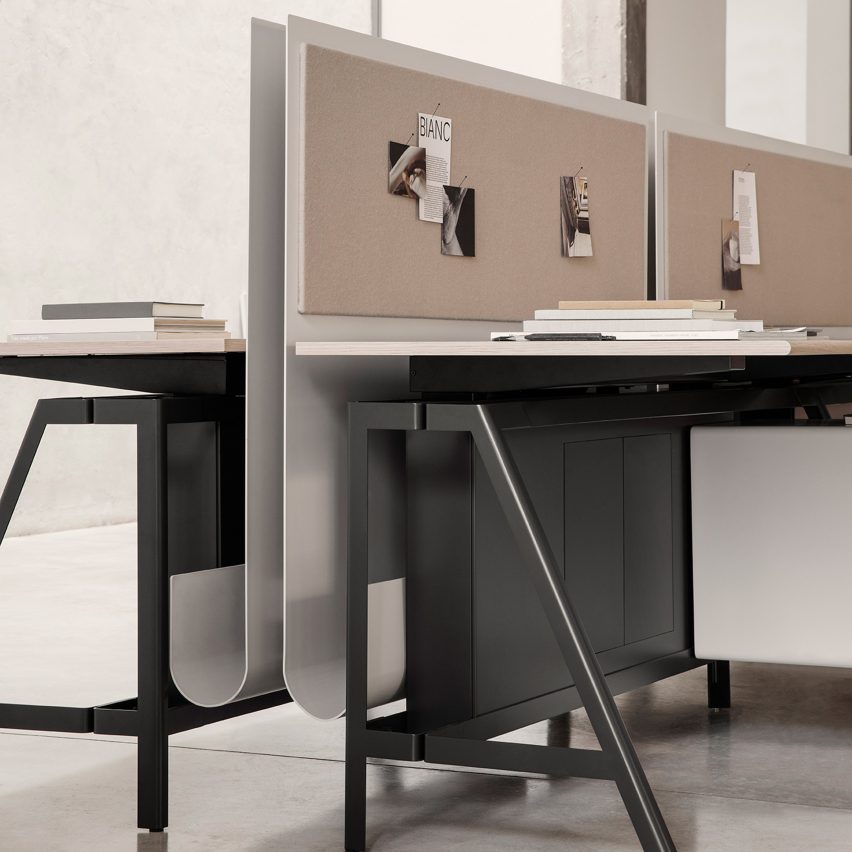
IOC designs Solari workstation in collaboration with Gensler

Dezeen Showroom: trestle legs and a customisable, J-shaped privacy screen distinguish the Solari desk system, developed by Italian office...