Thursday, April 30, 2020

Container Atlas editor picks top five shipping-container architecture projects

Container Atlas editor's picks

Container Atlas brings together examples of shipping-container architecture from around the world. Here, one of the book's editors picks his top five projects from the book's latest edition.

Han Slawik is the co-editor of Container Atlas – A Practical Guide to Container Architecture, along with Julia Bergmann, Matthias Buchmeier, Sonja Tinney, and by Lukas Feireiss and Robert Klanten for Gestalten.

A decade on since the first Container Atlas was published, the new and extended edition features 20 more handpicked examples of shipping-container architecture.

Along with floor plans, sketches and photos illustrate the whole range of buildings that have been created from shipping containers, from community centres to luxury homes, restaurants to retail spaces. The book also presents a comprehensive history of the origins and evolution of container architecture.

An engineer, architect and professor, Slawik has been an expert in shipping container architecture for decades.

Read on for Slawik's editor's picks:

Container Atlas editor's picks
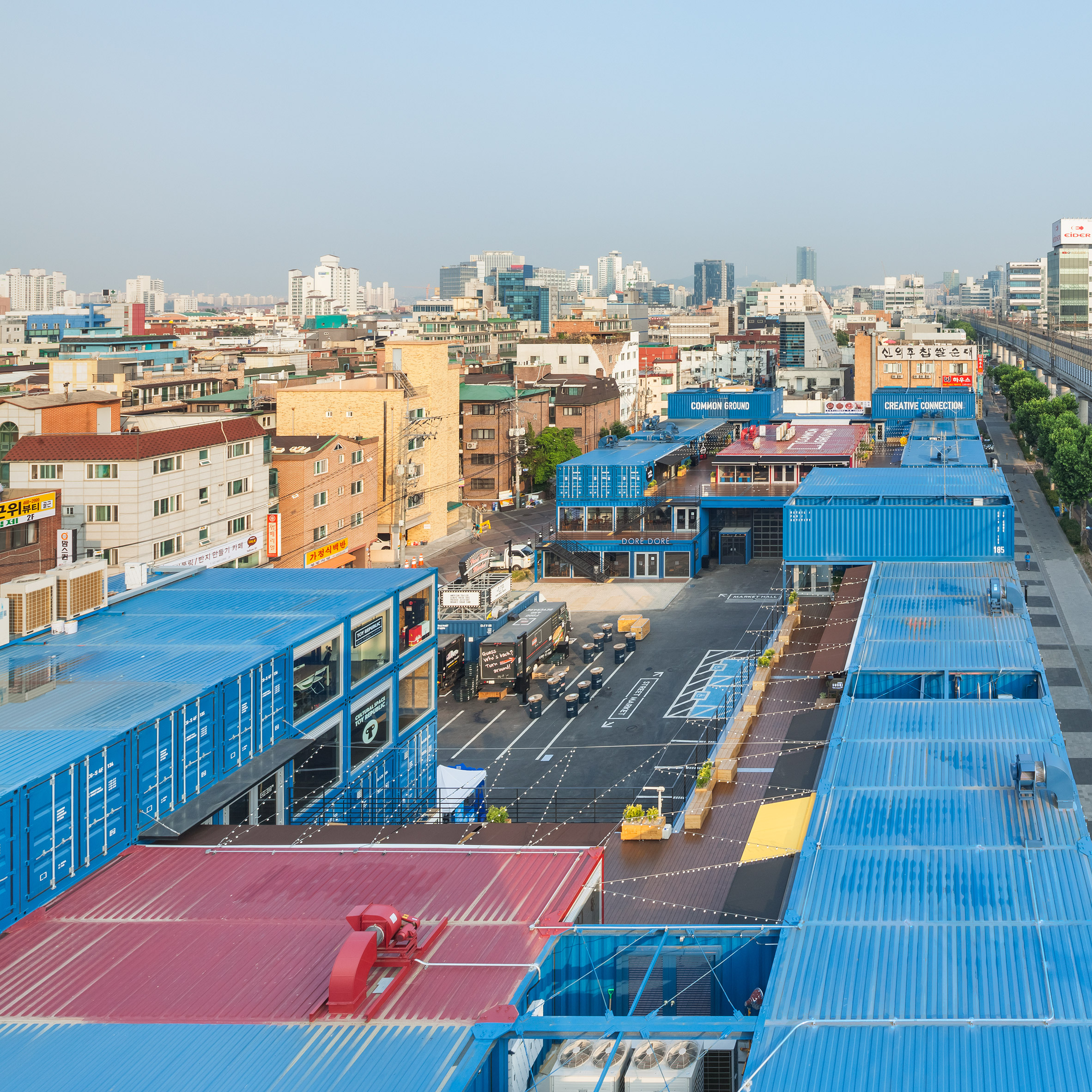
Photo by Kyungsub Shin, from page 166 of Container Atlas, Gestalten 2020

Common Ground, Seoul, by Urbantainer and Office 53427

"This modern indoor market hall with an open market street is situated in a central location but inside a heterogeneous urban environment.

"The cubic capacity made of fitted freight containers was created quite fast and in a cost effective way. If required it can easily be dismantled.

"To me, this unit can seem slightly rigid. However, functionally and spatially it is consistent in container architecture. The ensemble is extremely popular with visitors because the inside and outside can be enjoyed alike, and the building fosters communication.

"These buildings also reflect the image of freight containers: internationality, standardisation, multi-functionality, and the transport of goods."

Container Atlas editor's picks
Photo by Tinney Kleusberg, from page 69 of Container Atlas, Gestalten 2020

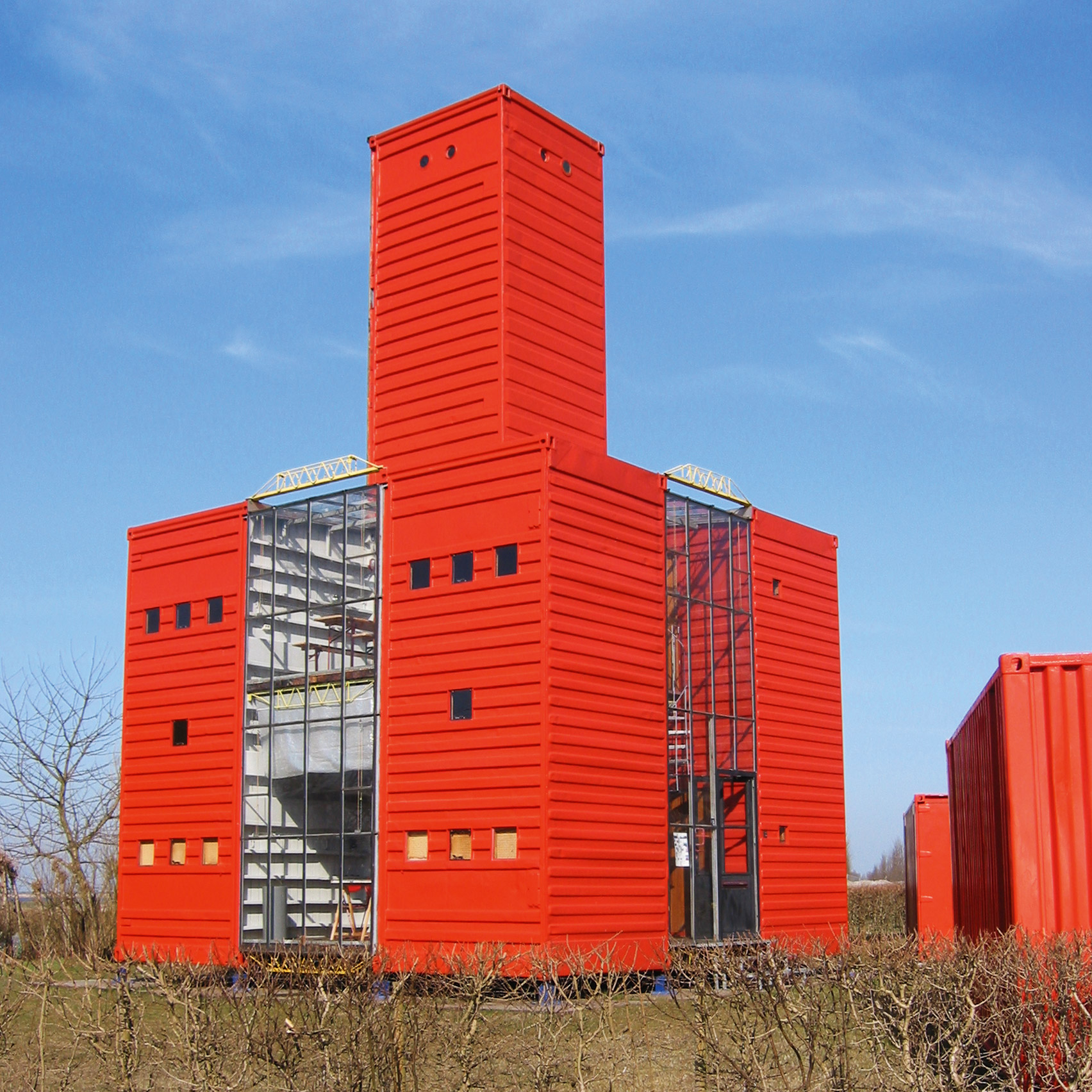
Campus, the Netherlands, by Han Slawik for Architech

"This is my favourite project from the new edition of the Container Atlas, because it is the first container building made of steel.

"For the international architecture competition on 'temporary living' in 1986, Architech realised the first steel container buildings that were made of ISO freight containers. These unified the three important adjectives of container architecture of being mountable, demountable and remountable.

"The pitch is seen as the pioneering project of container architecture in Europe. During the pitching phase, the architecture studio experimented with construction and space. These first container buildings made of steel also served as the laboratory during the planning and construction phases.

"At the time, my studio Architech was still a rather small creative studio that was acting in an experimental manner. "

Container Atlas editor's picks
Photo by Johannes Grimme, from page 242 of Container Atlas, Gestalten 2020

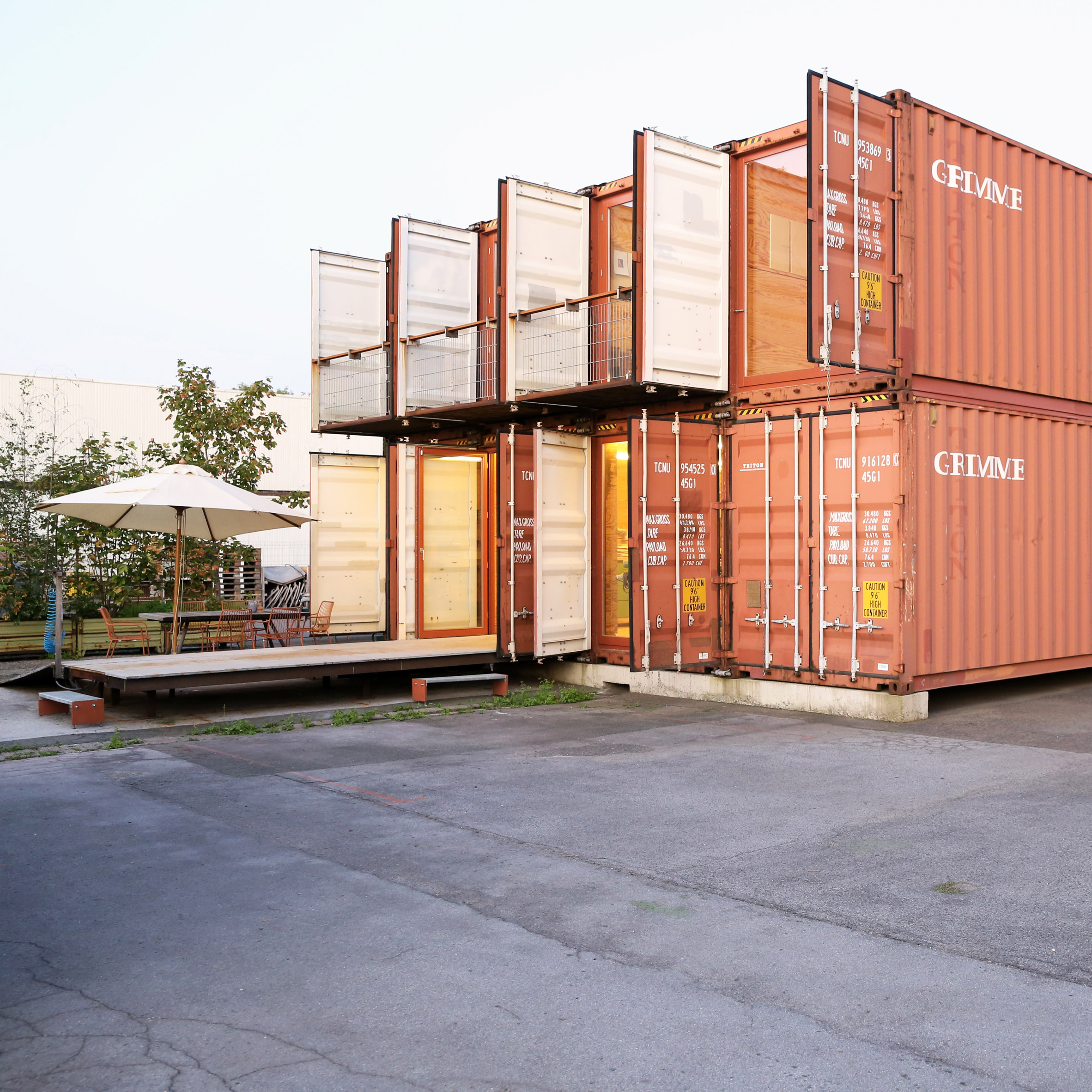
Containerwerkstatt, Germany, by Grimme Architektur & Möbelwerkstätten

"This project is made of reused 12-metre-long containers.

"For this office building that can also house workshops, a simple interior fitting system was employed stating a container specific aura – puristic, minimised, reduced and therefore very cost-effective.

"Bridge fittings in the corners of the containers allow for quick and easy changes of the container configuration."

Joshua Tree Residence by Whitaker Studio
Image courtesy of James Whitaker

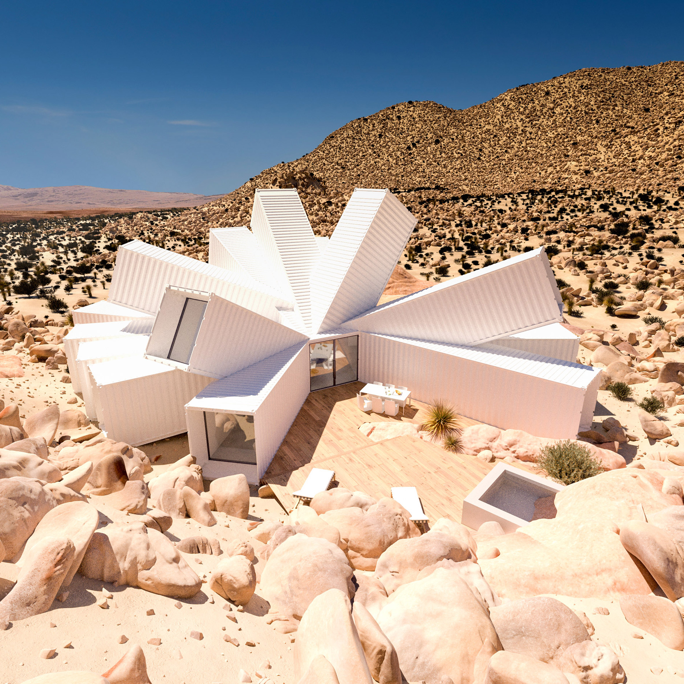
Joshua Tree Residence, unbuilt, by James Whitaker

"The Joshua Tree Residence  is one of the most exciting projects currently seen in container architecture in my point of view.

"The elaborate supporting structure is varying widely from the normal load of freight containers. The inside allows for different views in all directions and promises an extraordinary spatial experience – inside and outside. The contrast between nature and the building at this container project strengthens this effect.

"I hope that this project is going to be realised!"

Container Atlas editor's picks
Photo by Dave Southwood, from page 222 of Container Atlas, Gestalten 2020

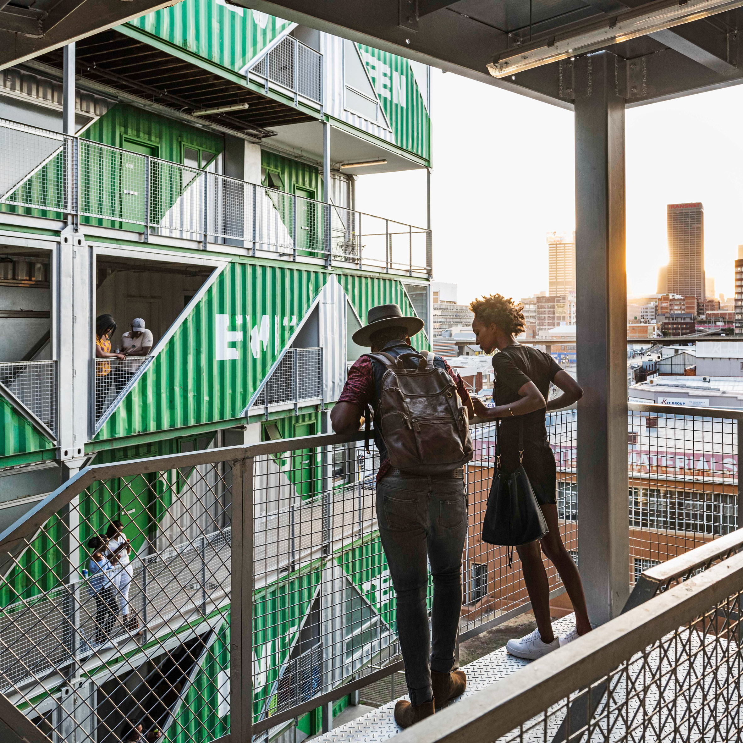
Drivelines, South Africa, by LOT-EK

"These two connected super blocks in the city centre consist of recycled freight containers. They house compact unconventional apartments and some shops.

"The space in-between those invites for meetings and further development opportunities. From some angles, the facade could seem to serve merely decorative purposes. However, the facade can be very clearly seen, also from a distance."

The post Container Atlas editor picks top five shipping-container architecture projects appeared first on Dezeen.


from Dezeen https://ift.tt/2VQZnwK

"Our brick has pride of place in our meeting room so we can show it off"

If you won a Dezeen Award this year, how would you display your brick-style trophy? We got back in touch with some of the 2019 winners to share their "shelfies".

The trophies for Dezeen Awards have been designed by Dutch design studio Atelier NL since its first year. They are made by hand from London clay – the material used to make the traditional yellow bricks that are a defining characteristic of buildings across the UK capital.

This year, 45 more trophies will go to winners across categories spanning architecture, interiors and design, as well as to the three projects of the year selected from the pool of existing winners.

Enter Dezeen Awards before 2 June and start thinking about where you'd put your trophy if you win!


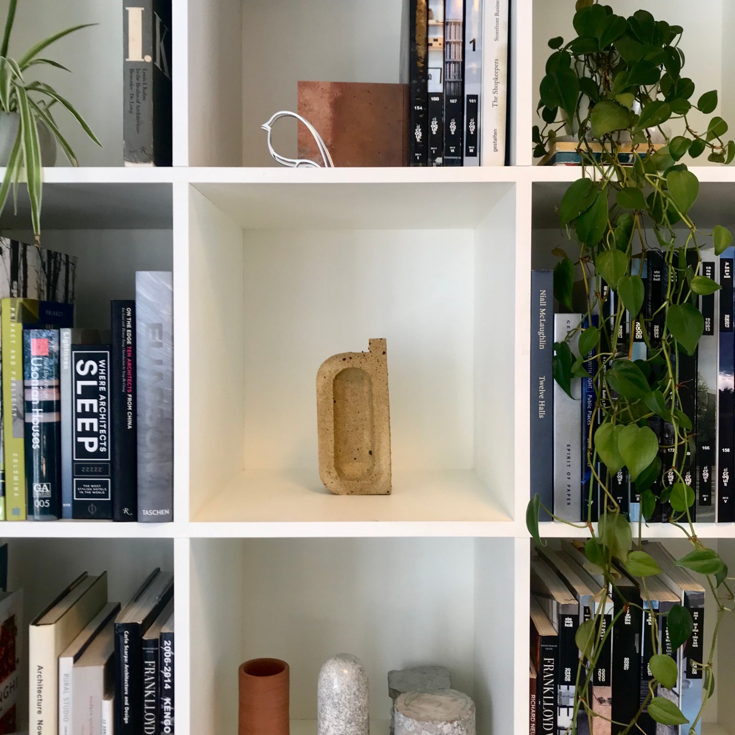
"Our brick has pride of place in our meeting room so we can show it off"

Shanghai, Hong Kong and Auckland-based architecture and interior design studio Linehouse, winner of emerging interior designer of the year, keeps its trophy in the meeting room, where guests can admire it.

"We have a few other awards on the shelves next to it but the brick stands out because the design and materials are so tactile and thoughtful", said co-founder Alex Mok, who is also a Dezeen Awards judge this year.


"It sometimes becomes a temporary one-minute-sculpture"

German studio J Mayer H, winners of the residential rebirth category with their project Casa Morgana, moves its trophy around the studio to remind everyone of Dezeen Awards.

"The trophy moves around the office, from here to there, and becomes a temporary one-minute-sculpture in combination with other objects", said Beate Quaschning.

"The composition is random and done by different people. The trophy travels to different departments and reminds the whole team of the Dezeen Awards."


"It reminds us of our dedication and commitment to design"

Vladimir Radutny Architects keep its trophy in the conference room, where it stands alongside other awards that the Chicago-based studio won in the past.

"The trophy sits on the shelves of our office conference room, as part of the display of work, process models and images of completed projects", explains founder Vladimir Radutny. "It's part of the collection of our achievements for the past 11 years."


"It is a position that will be noticed by visitors"

Japanese architect Katsutoshi Sasaki designed a 102-square-metre house for his family in Toyota, Aichi Prefecture, which won in the urban house category last year.

Sasaki and his family keep the trophy in the open loft space in their home, where it can be seen by visitors. He said that he felt "on top of the world" when he received the award.


"We keep it where everyone can enjoy it"

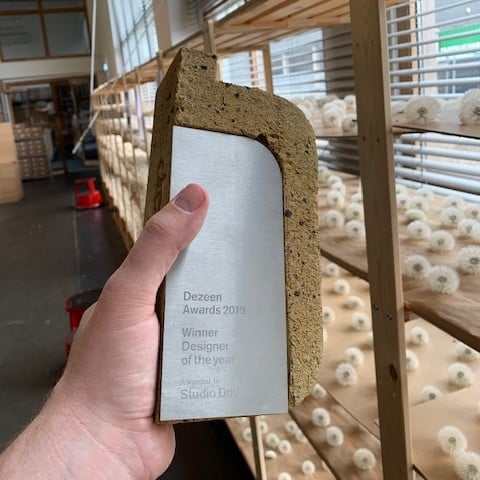
Amsterdam-based Studio Drift, which won designer of the year 2019 and lighting design of the year 2019, keeps its trophies in the studio's shared library space, where everyone can see and enjoy them.

"Our founders Ralph and Lonneke think that everyone won the awards, so they wanted to make sure that it is felt throughout the team", said Sarah Schulten of Studio Drift. "We also had the  certificates framed and they are hanging in Ralph's and Lonneke's Office."


"The trophy stands next to a Japanese lucky charm"

Japanese design studio Takt Project won emerging designer of the year at Dezeen Awards 2019. Founder Satoshi Yoshiizumi said that the trophy is kept in their Tokyo office.

"As you can see from the photo, the trophy is on the shelf together with our work and a rake, which is a Japanese lucky charm", said Yoshiizumi.

In Japan, decorated miniature rakes made of bamboo represent success, wealth and good luck.


"Located in the heart of our workplace"

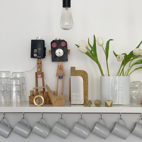
London-based architecture and interior design studio Sevil Peach was crowned interior designer of the year 2019.

"The trophy is on the kitchen shelf which is part of the Studio", explains co-founder Sevil Peach."It is in the heart of our workplace visible to all, along with few much loved objects".


"All our guests ask about it"

Brazilian firm Laurent Troost designed a two-storey house within a campinarana, a forest characterised by small trees, and won rural house of the year 2019.

"The trophy is displayed on the main living room shelf among some other trophies, decoration items and architectural and art related books", said Troost.

"It is on display on that shelf because we are so proud if this important achievement and because of its special design, all of our guest do ask about it."

Laurent Troost is also a Dezeen Awards judge this year and will be assessing entries in the architecture project categories.


"Located in a prominent part of our studio"

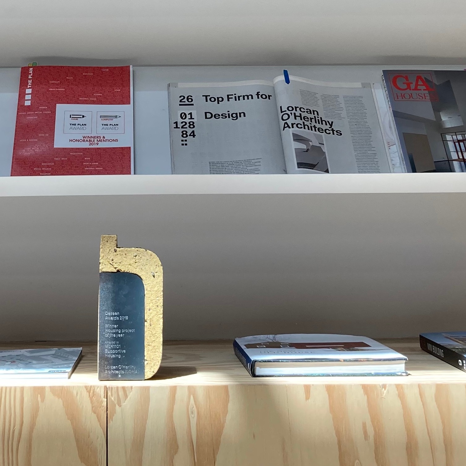
Lorcan O'Herlihy Architects (LOHA) won in the housing project of the year category with their social housing building MLK1101 in Los Angeles, USA.

They keep their trophy where new clients and guests are sure to notice it.

"The award is located in a prominent part of our studio where we host new clients and visitors", said member of the studio Sinead Finnerty-Pyne.

"The display area features a selection of our recent publications and awards. We like the way that the raw brick material of the Dezeen Award compliments the off-the-shelf aesthetic of our plywood cabinets."


"The trophy blends in with the environment"

China-based architecture studio Atelier Liu Yuyang won hospitality building of the year with its XY Yunlu Hotel.

"We keep the trophy in our principal architect Liu Yuyang's office, together with other trophies and certificates. All of them are placed on a table beside the window, with a view on big trees and flowers. This clay made brick trophy blends in with the environment", explains Qiushi Kong on behalf of the studio.

"Although we don't have big shelves or fancy tables to display these awards, it is still a corner of glory, which represents the world's recognition and affirmation of our design work."

Enter Dezeen Awards 2020

You can enter Dezeen Awards 2020 until Tuesday 2 June, so you still have plenty of time to complete your entry!

If you run into issues or have questions drop us a line at awards@dezeen.com or visit our how to enter page for more information.

The post "Our brick has pride of place in our meeting room so we can show it off" appeared first on Dezeen.


from Dezeen https://ift.tt/3f3MYxh

British Sea Turns Tropical After Lockdown Decreases Pollution

While the novel coronavirus is ravaging across the globe and people are locking themselves up at home to avoid getting infected, the world seems to do just fine without us. We have seen the news from all over the world about animals invading cities and claiming it for themselves as people empty the streets, witnessed water in Venice go crystal clear, and welcome some of the wildlife back to its canals and many more examples of nature thriving.

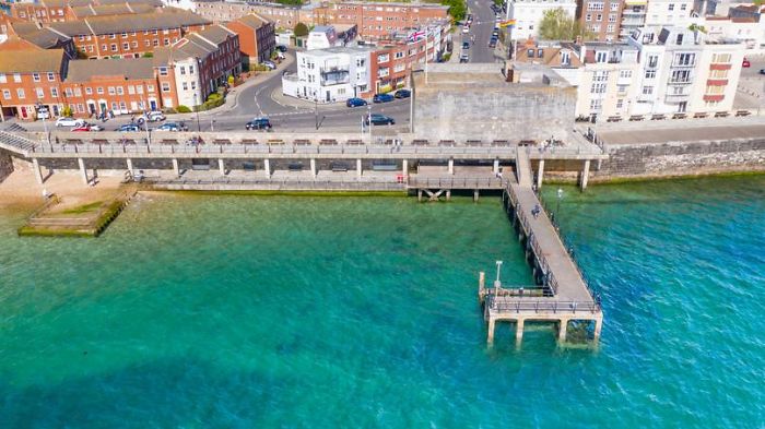
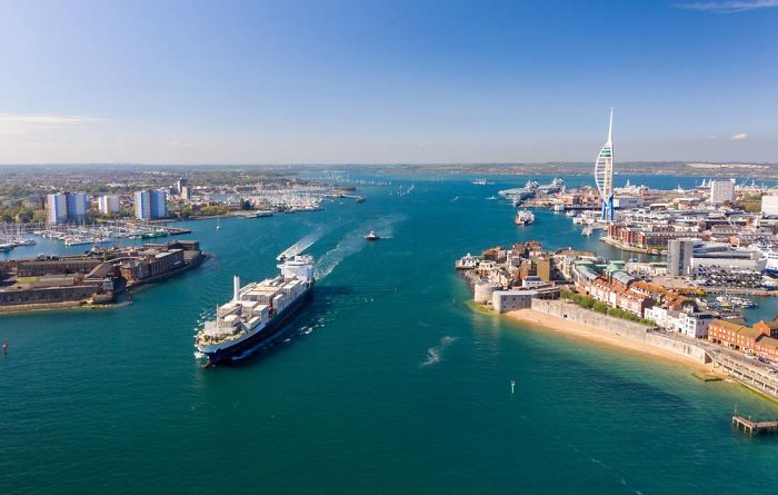
This time, it’s Brits throwing some good news at us. Even though they are usually not the ones to brag about sunny weather and tropical coastline, it seems the lockdown has done some good to their coastline near Portsmouth.

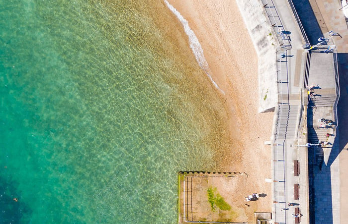
Incredible drone photos show tropical-looking British coastline

Image credits: Solent News/Solent Sky

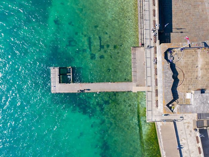
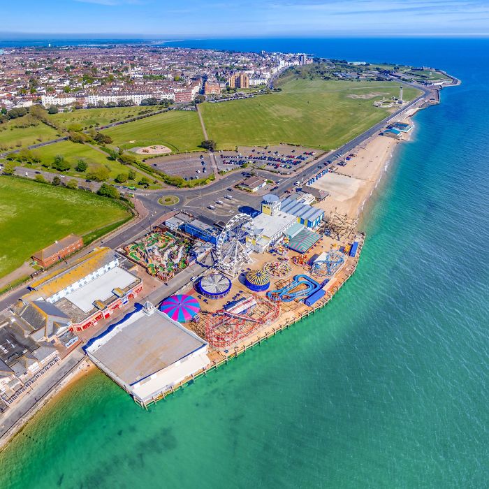
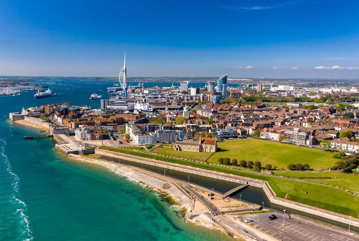
Even though most people never expect tropical-looking pictures of the seaside to be coming from the Brits, they did manage to surprise us this time. Mike Woods took these incredible looking pictures by flying a drone over Portsmouth. He was amazed to see usually murky waters azure blue and crystal clear.

The photos of azure blue waters were taking by flying a drown over Portsmouth

Image credits: Solent News/Solent Sky

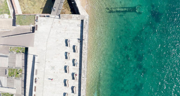
Some people believe the sea around Portsmouth has cleared out to decreased pollution levels during the coronavirus lockdown. It’s not necessarily the case but the locals are happy about this change despite the possibility of it being temporary.

Usually murky waters most likely cleared out because of a decrease in pollution

Image credits: Solent News/Solent Sky

It could be pretty accurate since the color of the sea depends largely on how many particles are in the water, so the more it is affected by car pollution, boat traffic and other human activity, the more particles get into the water and changes its hue, making it appear darker and murkier.

Pollution levels dropped significantly in the UK due to the coronavirus lockdown

Image credits: Solent News/Solent Sky

Mike Woods, who took these aerial shots of azure blue seas near Portsmouth said: “There has been a lot of talk about the color of the water in the area recently and I think the perception is, nature is thriving.”

“It’s phenomenal. We’ve never, ever seen the water look this clear before, it’s lovely,” said Mike Woods who took these photos

Image credits: Solent News/Solent Sky

“It’s beautiful to see it and it looks like you are in a different country down there, it really does. It’s phenomenal,” he added. We’ve never, ever seen the water look this clear before, it’s lovely.”

However, the water could just appear cleaner with fewer people and boat traffic to disturb its stillness

Image credits: Solent News/Solent Sky

Looking at the prospects of maintaining the British coastline as tropical as it looks now, it would seem people should just leave it alone for good, not only during the lockdown as scientists explain that murky waters are caused by the concentration of particles in them.

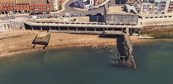
These Google Earth images showcase how the British coastline looked before the lockdown

Image credits: Google Earth

Despite the good news about the tropical-looking British coastline, waters of Venice clearing out, and even ozone layer fixing itself, assuming that all the environmental problems of the world will fix themselves in a couple of weeks of human inactivity and will stay fixed is a little bit over-optimistic. It doesn’t mean we shouldn’t enjoy it while we can though!

The murkiness was most likely caused by car pollution, water traffic and human activity

Image credits: Google Earth

That’s what people responded to the photos


from Bored Panda https://ift.tt/2WggIhG

After No One Could Spot A Difference In This Puzzle, The Newspaper Had To Issue An Apology

Everyone makes mistakes and there’s no shame in that—mistakes are what make us human. However, some blunders are way more hilarious than others and that’s why they deserve a whole separate post on Bored Panda.

Recently, people on Twitter found themselves laughing way too hard at one mistake that the newspaper The Baltimore Sun published by accident. While it’s hilarious now that the error has been cleared up and explained, imagine the number of people this Sunday close to the brink of tears or a half-breakdown because they couldn’t bring themselves to solve a simple puzzle⁠—spotting the differences in two seemingly similar images. “We must wonder how many were finally driven over the edge by this,” one Twitter user notes, and we can’t help but wonder too.

More info: Twitter

This Sunday, newspaper The Baltimore Sun printed a seemingly easy-to-solve puzzle

Image credits: VirginiaLByrne

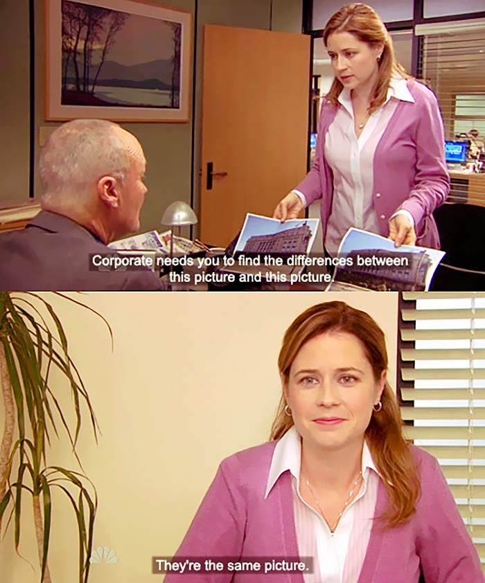
Probably the majority of us love such riddles that involve spotting the differences between two images. They’re fun, they’re easy, and they make you more attentive to details. However, the spot-the-difference puzzle that was printed in this Sunday’s The Baltimore Sun had two identical pictures instead of slightly alternated ones. Can you imagine the frustration of those trying to spot the differences?

But one of the writers for the newspaper took to Twitter to share the hilarious error they made

Image credits: NathanSRuiz

Turns out, the two printed images were identical

Image credits: NathanSRuiz

The text in the “Corrections” section in the newspaper read: “The images in the ‘Spot the difference’ feature in the Sunday, April 26, editions were mistakenly the same image and not in fact different. The Baltimore Sun regrets the error.” Do you, Baltimore Sun?

The correction published by the newspaper was shared by Nathan Ruiz—one of the writers working for The Baltimore Sun. His tweet soon went viral, with almost 10k people retweeting it and around 75k people liking it.

As it later turned out, the spot-the-difference puzzle was making some feel like they were going insane: “I typically never pay attention, but my 6-year-old was sitting next to me and I asked her,” one person shares on Twitter. “She looked and looked and said they’re the same. I had to verify but couldn’t believe it till I saw someone else tweet about it. Thought I was going nuts as a shut-in.”

Naturally, Twitter was having a field day

Image credits: BadGuyZero

Image credits: MustachedSID

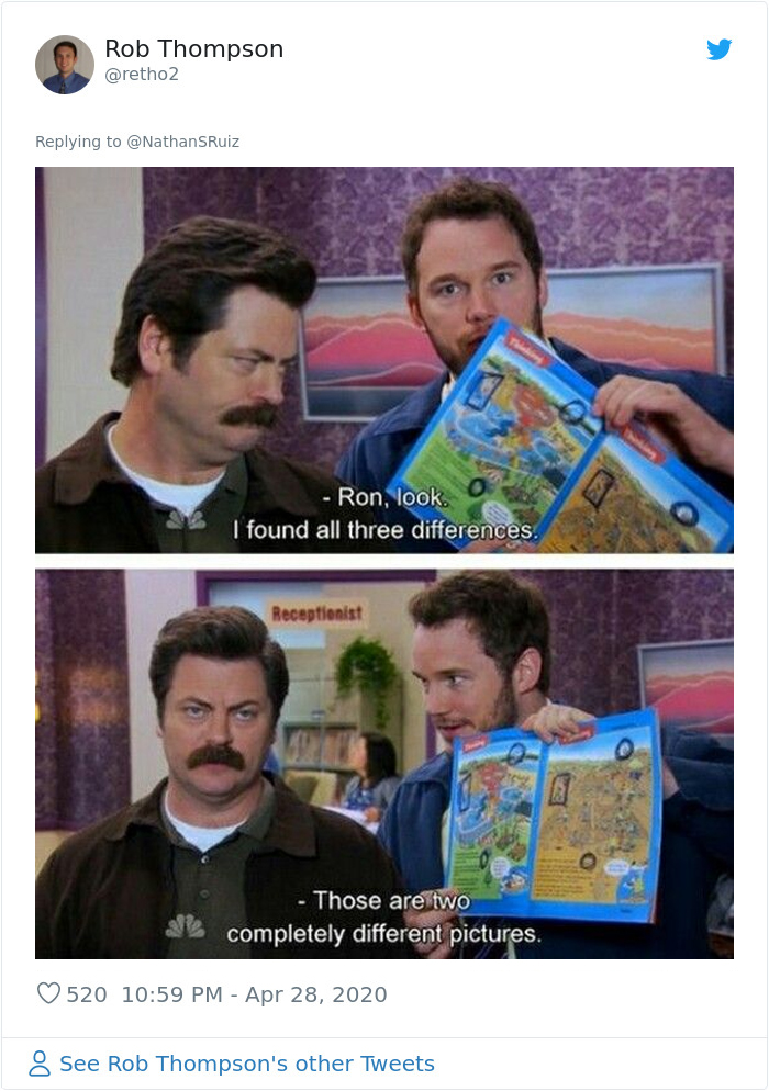
Image credits: retho2

Image credits: JackieChiles14

Image credits: Scott_Frenzel

There were people falling right into the trap, even though they knew that both pictures were the same

Image credits: izzmosis_jones

Some, like us, were worried about the poor souls on Sunday trying to solve the riddle

Image credits: jamiegp

Image credits: xtinatkacik

Image credits: AlainnFocail

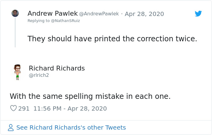
Image credits: rlrich2

Image credits: KeatsTabby

Image credits: paulhollifield

Image credits: SciFleur

Image credits: jackiebensen


from Bored Panda https://ift.tt/2SljjWp

New York design studio Superflower's wallpaper collection includes cannabis pattern

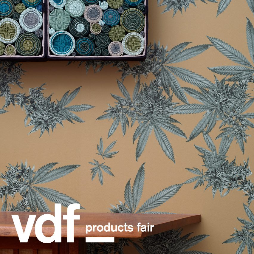
Indica pattern in Superflower's Florescence collection

A cannabis-themed wallpaper forms part of Superflower's Florescence collection, which has launched on the VDF products fair.

Florescence is the New York design studio's latest range, which includes nine patterns with "fantastical floral forms" in nine different colourways.

Four of the patterns are now live on the VDF products fair, which has been developed as an affordable way for designers and brands to launch new products as part of Dezeen's Virtual Design Festival.

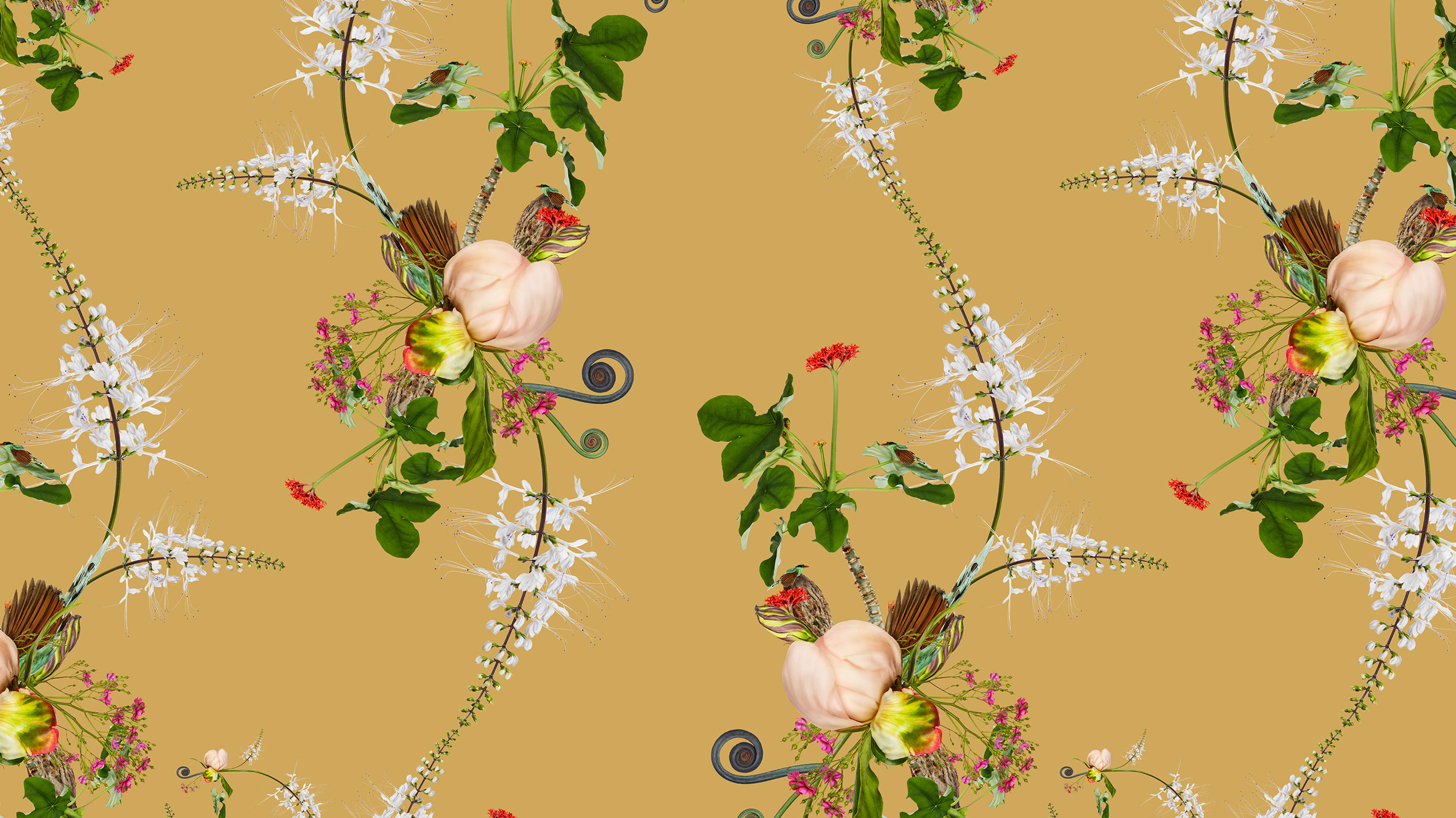
One of the styles is called Indica, which is modelled on the "visually stunning form" of the cannabis plant. Another pattern, Peony, takes its cues from traditional Japanese flower arrangements.

Peony by Florescence by Superflower
Superflower has launched its latest wallpaper collection including the Peony pattern (above) and Indica (top)

The two other Florescence patterns that feature at the VDF products fair are named Cannonball and Paradise. Each one was developed by the studio using photographs of live flowers.

"All of the pattern designs begin with photographs of live flowers, which are then composited into what we call Superflowers," explained Superflower founders Andrew Zuckerman and Nicole Bergen.

"These arrangements are explorations of fantastical floral forms presented in hyperreal clarity," they continued. "Layering and juxtaposing the papers creates surprising harmony that activates space as one moves through it. The unique chromatic range is drawn directly from primary natural sources."

Other brands that have unveiled new designs at the VDF products fair include Muuto, which has launched seven products including a new version of Julien De Smedt's classic Stacked Storage System.

UK company Modus has also revealed a range of its latest products, alongside Danish brand Fritz Hansen and Ukranian design studio Faina.

About VDF products fair: the VDF products fair offers an affordable launchpad for new products during Virtual Design Festival. For more details email vdf@dezeen.com.

The post New York design studio Superflower's wallpaper collection includes cannabis pattern appeared first on Dezeen.


from Dezeen https://ift.tt/3d2PC4A

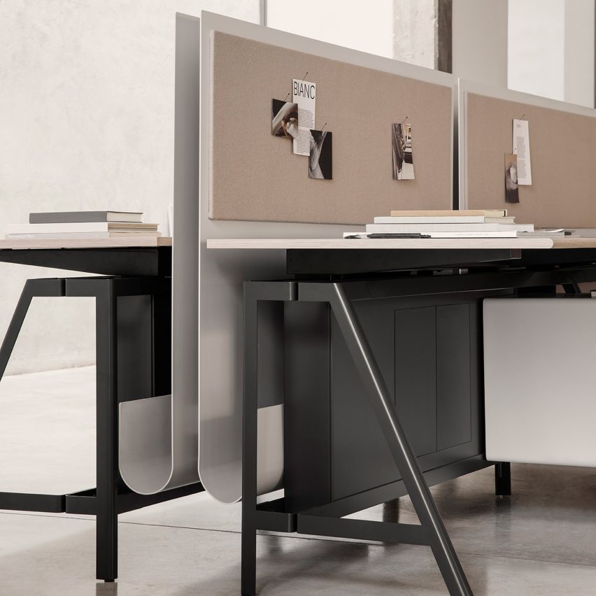
IOC designs Solari workstation in collaboration with Gensler

Dezeen Showroom: trestle legs and a customisable, J-shaped privacy screen distinguish the Solari desk system, developed by Italian office...