If it ain’t broke, don’t fix it. The original versions of movies are usually the best ones: they shouldn’t be meddled with just because our TVs keep getting bigger, wider, and fancier. That’s what some people think, especially when it comes to animated films made by Disney.
The sad reality is that some restorations and remakes of old animations completely ruin the atmosphere, details, and ‘spirit’ of the originals. Take for instance one of Disney’s classics—’Cinderella.’ Many fans agree that the original on tape is far superior to the modern Blu-ray edition.
Some Disney fans were disappointed that the restoration of ‘Cinderella’ for Blu-ray reduced the quality of the movie
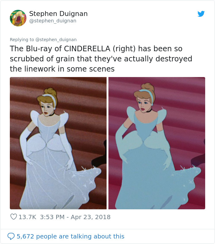
Image credits: stephen_duignan
Image credits: stephen_duignan
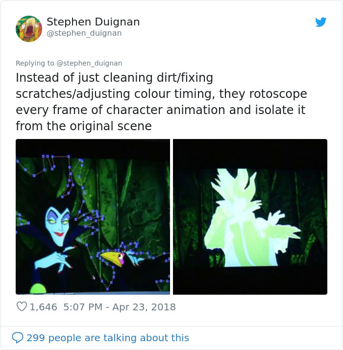
Image credits: stephen_duignan
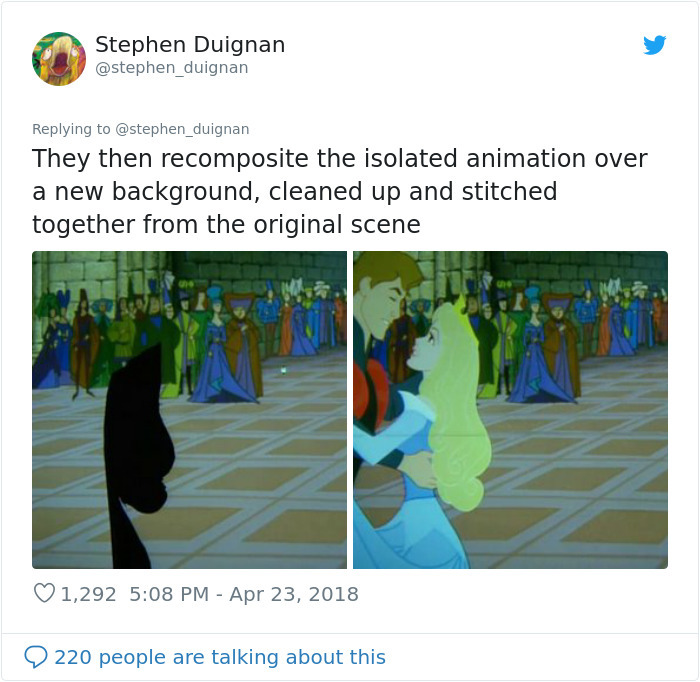
Image credits: stephen_duignan
Image credits: stephen_duignan

Image credits: stephen_duignan
Restoring movies is similar to restoring artwork. It takes patience and dedication to restore a masterpiece to its highest possible visual quality. You don’t start ‘painting’ whatever you want and messing with the colors.
Restoration should never, ever be about turning a classic into “a crayon sketch of a very hairy monkey Jesus in an ill-fitting tunic,” which is exactly what happened to the 19th-century fresco ‘Ecce Homo.’ While not as drastically bad, the Blu-ray edition of ‘Cinderella’ is, according to some, atrocious.
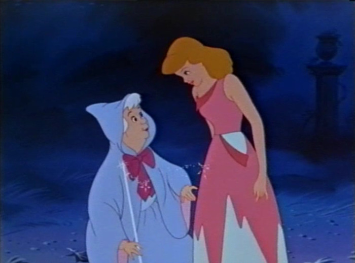
The Fairy’s light blue blouse is missing
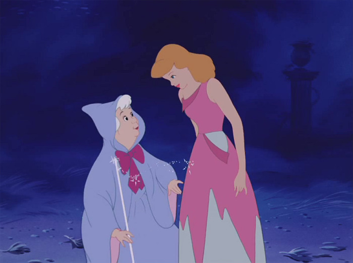
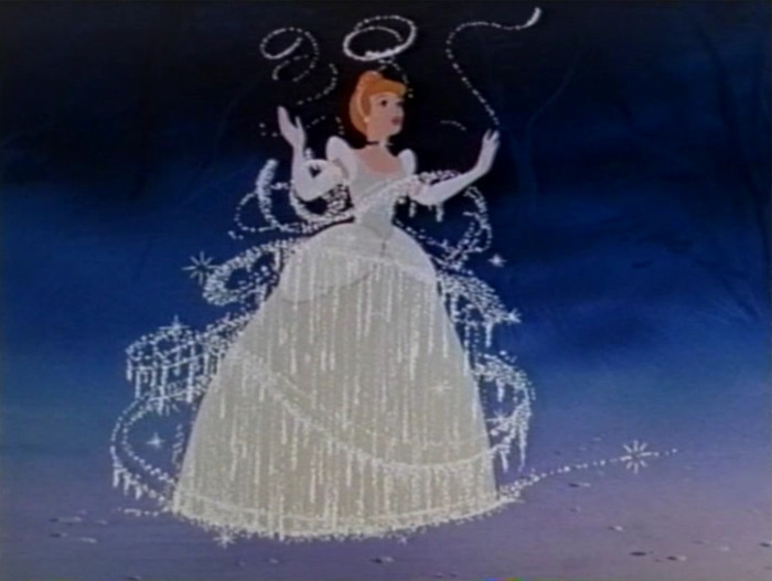
Big parts of the Fairy Dust in the sky are missing
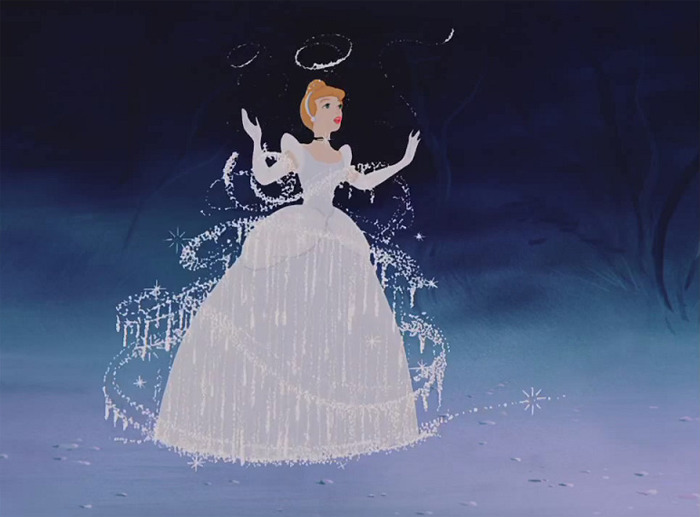
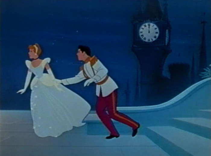
Where is his right hand touching her arm? Where is the red of his trousers?
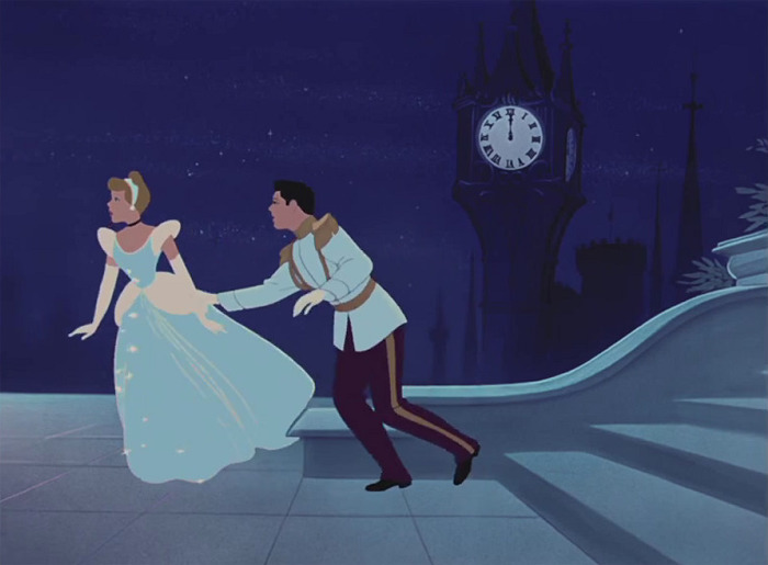
The lining on his shoulder parts is the same color but darker as the parts themselves
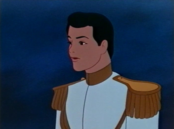
Here the lining on the shoulder parts is blue instead of the brownish color it should be
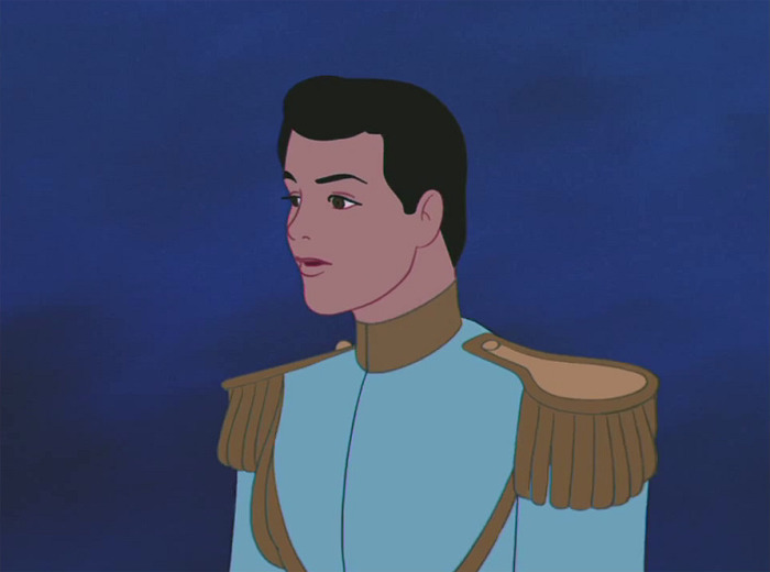
Some ‘Cinderella’ fans lament the loss of details, as well as the changes in color, hue, and lighting. While other Disney fans think that the changes are not that bad and people are getting angry without a sufficiently good reason.
While restorations, remasters, and remakes aren’t exact synonyms, they do have one thing in common—they fiddle around with what works and usually make it worse. For example, some Disney fans who grew up with ‘Beauty and the Beast’ were disappointed by the live-action remake starring Emma Watson. According to some fans, the remake was ‘soulless’ and ‘boring.’ Then again, others enjoyed it.
Here the sparkles are bright white and the lines in the red curtains are dark red as they should
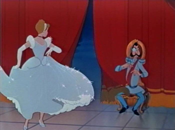
Where are all the creases in the fabric of her grown? Where are the lines in her left hand?
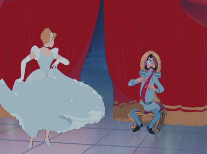
Here she has arms, her gown sparkles and shows detail and the stairs are royally red
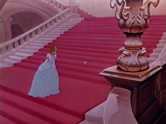
Left marble staircases yellow!? Blue spots around her head and yellow lines on the stairs?
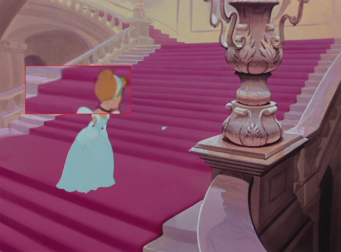
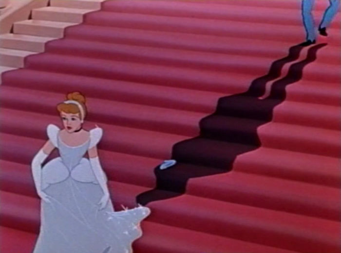
Where are her arms, where is the detail in her gown!? Even parts of sparkles are gone
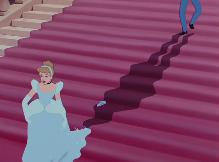
Bright sparkles and a detailed gown. Detail on street. Warm glow coming put of the palace
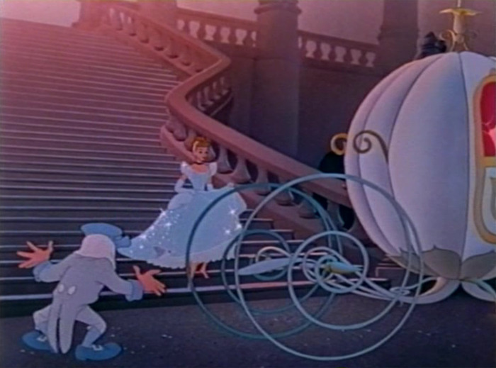
Everything cold greenish. Blue shadows on stair cases, green shadow on carriage top piece?
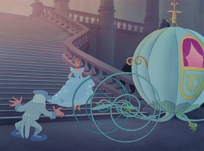
Pumpkin lines on the carriage and copper brasses on the horses’ harnesses
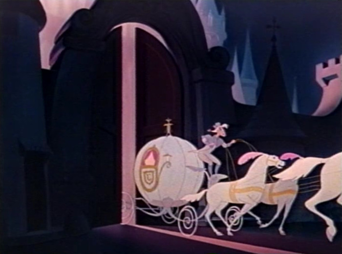
Blue and Green horses!? With no detail and Pink tales!? No driver’s jacket slip
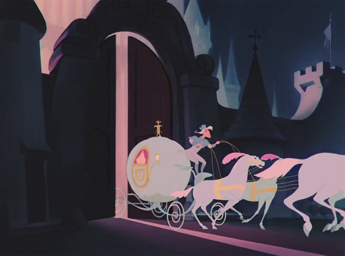
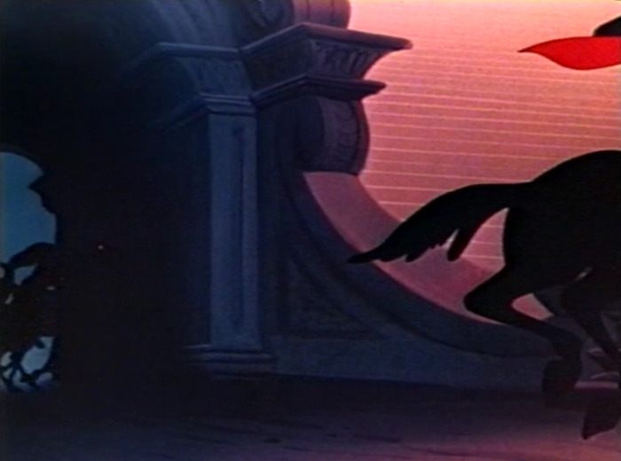
Where is the warm glowing light coming out of the palace?
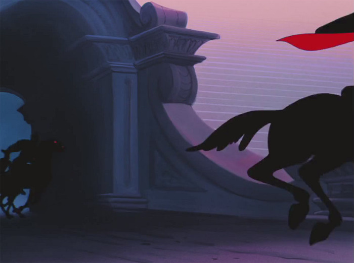
What do you think of restoring and remaking movies? What’s your favorite Disney animation? Do you think that we should try to improve films that are already beautiful and lauded as being classics? Do you think that the Disney live-action remake of ‘Mulan’ made a mistake by not including Mushu the dragon spirit in the trailer (“Dishonor on you, dishonor on your cow”)? Share your thoughts with us in the comments!
The story’s similar with other Disney classics
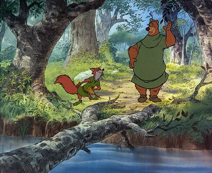
Image credits: Freddy2
Look at the loss of detail in the grass on the BD. Look at the fuzziness of every single line. Look at the loss of detail and shades on the trees
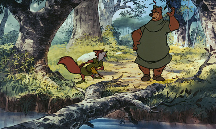
Image credits: Freddy2
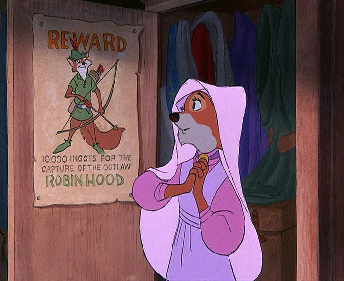
Image credits: Freddy2
The wanted poster looked like old paper with sharp printing on it. Now it looks flat and out of focus. Not to mention the DNR effect on the wood structure and the loss of contrast in the closet
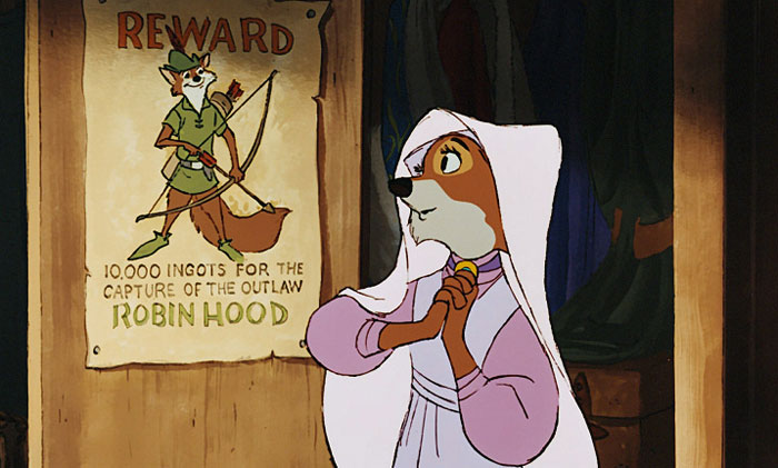
Image credits: Freddy2
Other Disney fans noticed the same drop in detail after animated movies were restored
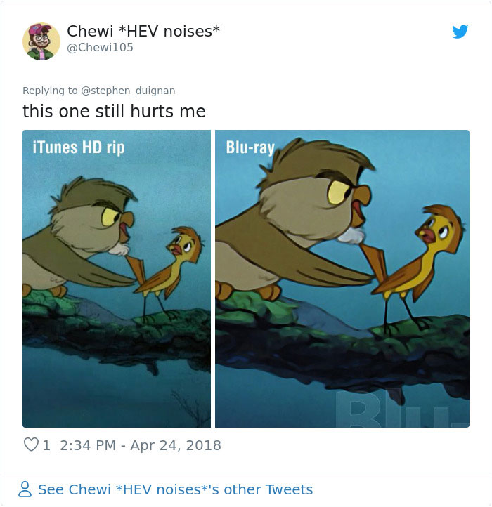
Image credits: Chewi105
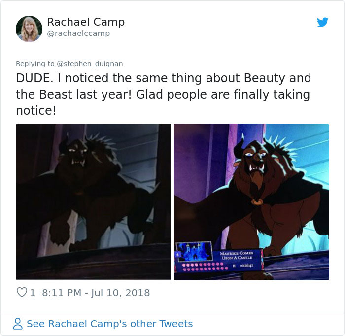
Image credits: rachaelccamp
from Bored Panda https://ift.tt/2qv0gy7

No comments:
Post a Comment