
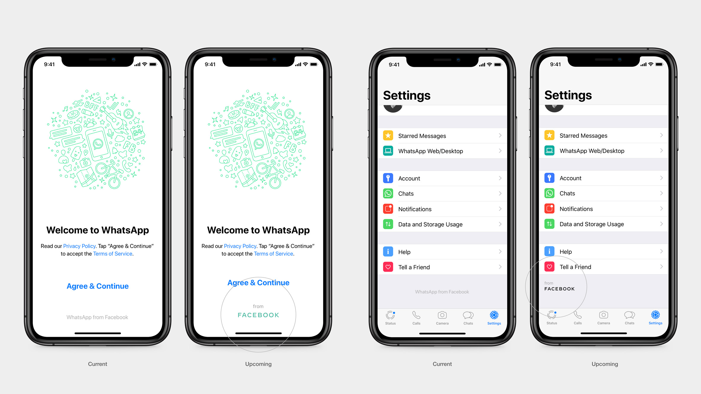
Facebook has launched a new branding for its subsidiary companies, which comprises an all-capital typeface that changes colour depending on the service offered.
Facebook will use the new branding on the services it owns – such as image-sharing app Instagram and messaging service WhatsApp. It will continue to use the lowercase, blue lettering for its social networking app, which was established 15 years ago.
"The new branding was designed for clarity, and uses custom typography and capitalisation to create visual distinction between the company and app," Facebook said.
"The brand system was born out of a commitment to be clear, empathetic and create space for people's stories to shine through."
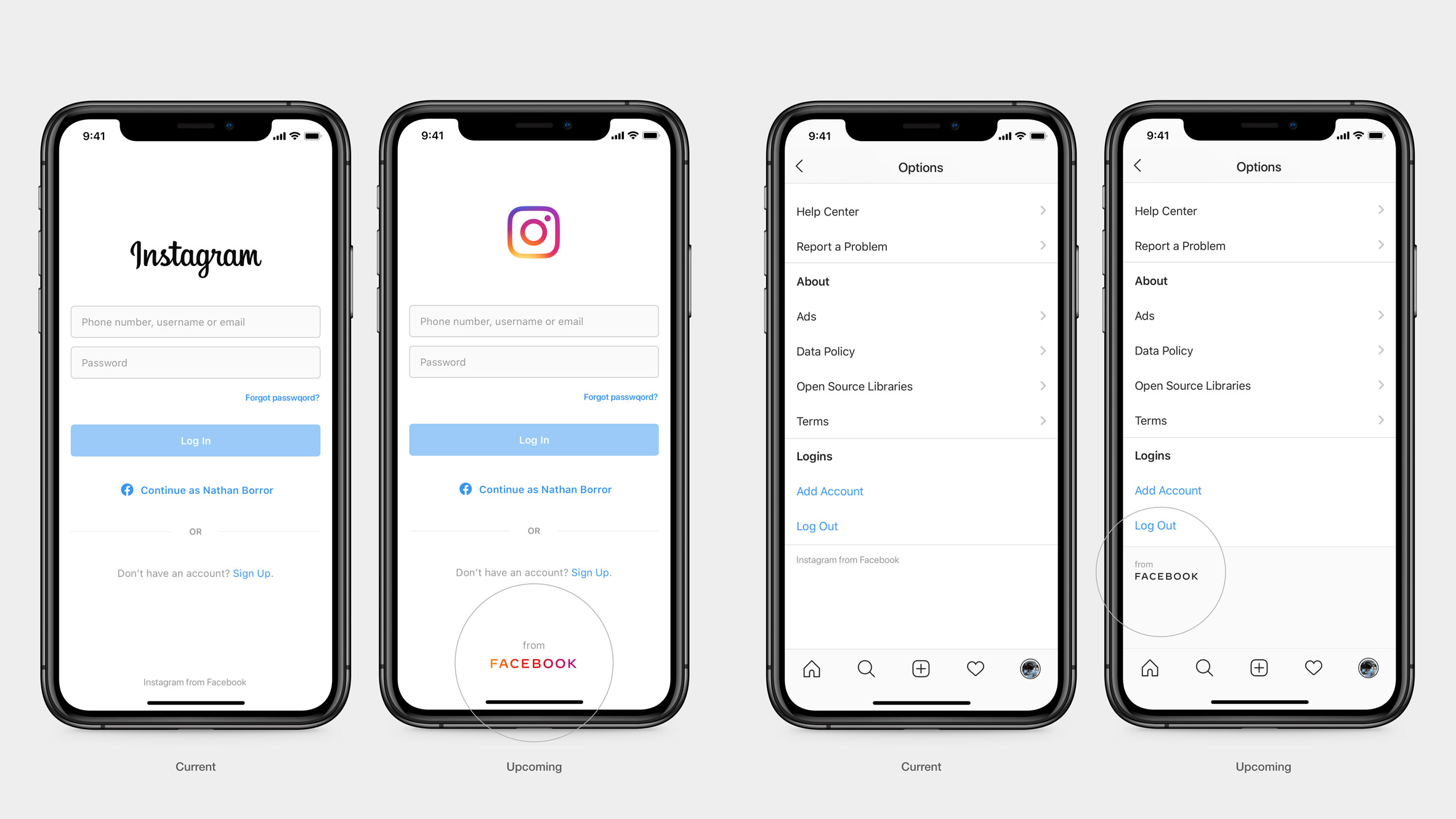
Facebook worked with branding agency Saffron and UK type design studio Dalton Maag, which also redesigned the typeface used on Airbnb's platforms, to develop the rebrand. It will replace the "from Facebook" endorsement added in grey text to the interface of Facebook's apps earlier this year.
In the redesign, Facebook will be written in a rounded capital typeface coloured to match the brand it appears on. For example, in WhatsApp Facebook will be coloured to match the messaging application's green brand, while in Instagram it will be in tones of yellow, pink and purple.
"Instead of the company owning a single colour, we designed the brand to be responsive to its context and environment" Facebook said. "This system allows the word mark to take on the colour of our individual brands."
Similar styling will be produced for the company's other subsidiaries, including tech-company Oculus, collaboration app Workplace, video calling service Portal and Calibra, which is set to launch next year to provides financial services.
Generous spacing between letters and consistent stroke widths clarify the brand's identity, while also allowing its updated font to be easily resized and condense into a "FB monogram" for smaller spaces.
Facebook recently relaunched its website with a "modern", all-white design that aims to put the privacy of its users first.
The redesign follows criticism over the social media company's protection of users' private data after it was revealed in 2018 that Cambridge Analytica had harvested millions of people's personal data from Facebook without their consent.
Following this, the company opened five pop-up cafes in the UK where users could have a check-up on their privacy settings, and a free cup of coffee.
The post Facebook rebrands to "create visual distinction" between company and social app appeared first on Dezeen.
from Dezeen https://ift.tt/33v1VCs


No comments:
Post a Comment