According to the pair, the branding was designed to create a sense of pride in the area, as well as reflect the individual voices of Lewisham’s community. It’s emphasised by the ‘I am/we are Lewisham’ tagline – which is more than a little reminiscent of Amsterdam’s I Amsterdam slogan.
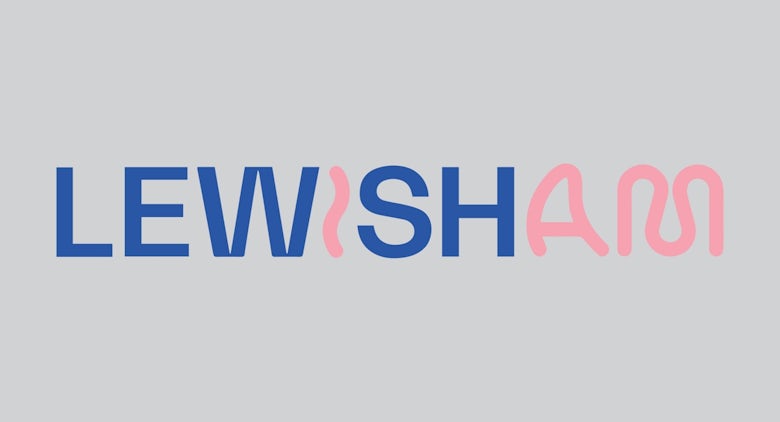
Designer Jamie Paton chose a pair of contrasting typefaces for the identity, mixing a relatively sober sans serif with a more expressive line-drawn style to pick out the ‘I’ and ‘am’ of Lewisham. According to him, the combination reflects the energy and spirit of the area. It’s also expressed in the colour palette, which features purposefully clashing shades of primary blue, red and yellow, alongside pink and grey.


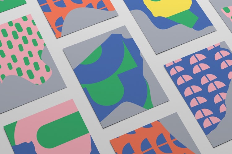
A collage of illustrated patterns and graphics create a sense of spontaneity, designed to make the brand feel as if it was created by the local community.
The identity appeared in posters and flyers across Lewisham in the run up to the bid presentation, to encourage locals to support the effort, as well as a booklet left behind for the selection panel. Studio Raw and Jamie Paton’s efforts clearly made an impact as well, with Lewisham just named London Borough of Culture for 2021 – which will see the area awarded over £1m in funding for cultural events for the local community.
The post ‘I am Lewisham’ says the borough’s bright new identity appeared first on Creative Review.
from Creative Review https://ift.tt/39EtEmI


No comments:
Post a Comment