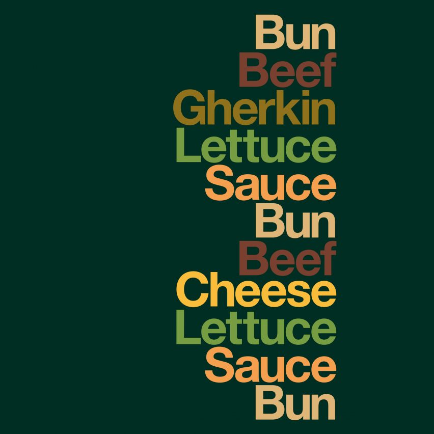
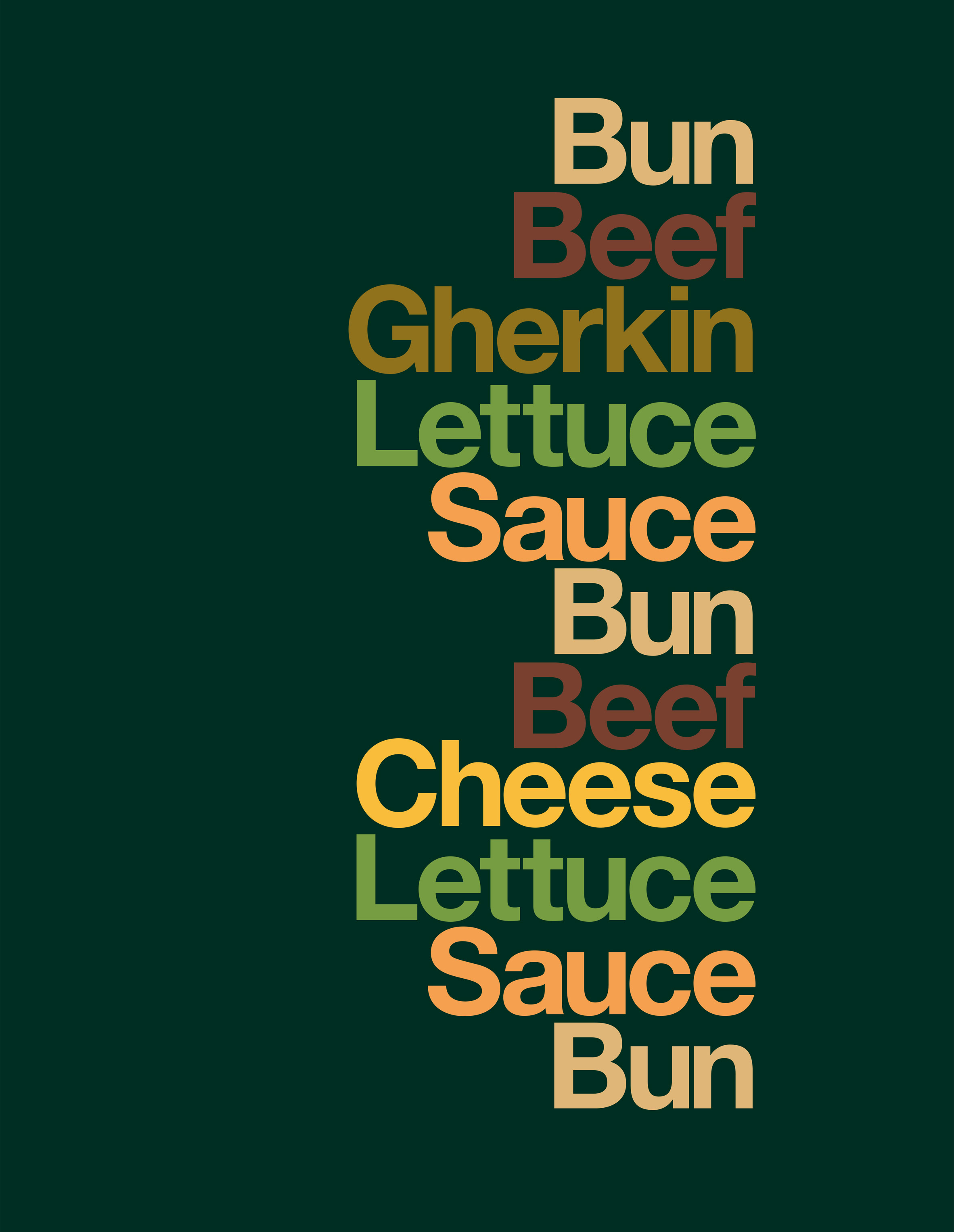
Advertising agency Leo Burnett has designed minimalist posters for McDonald's with just lists of ingredients in the Helvetica font and no mention of the fast food chain's name.
London-based agency Leo Burnett teamed up with Minneapolis-based designer David Schwen to create the Iconic Stacks campaign for outdoor billboards.
The "redacted" adverts have done away with both images of food and the McDonald's name itself, focusing wholly on the typography.
According to Pete Heyes, creative director at Leo Burnett, the visual approach to the campaign started with the creators asking themselves a simple question: "are our products so recognisable that you recognise them without telling you who it’s from?"
"McDonald's is a leader," said Heyes. "Only a handful of global brands can communicate like this."
"The redacted and graphic nature of this latest campaign exudes the confidence McDonald's and its iconic products deserve," he added.
"In execution, it needed to respect the iconic nature of the products, be visually playful and deliver some 'food values', which is tricky without a photo."
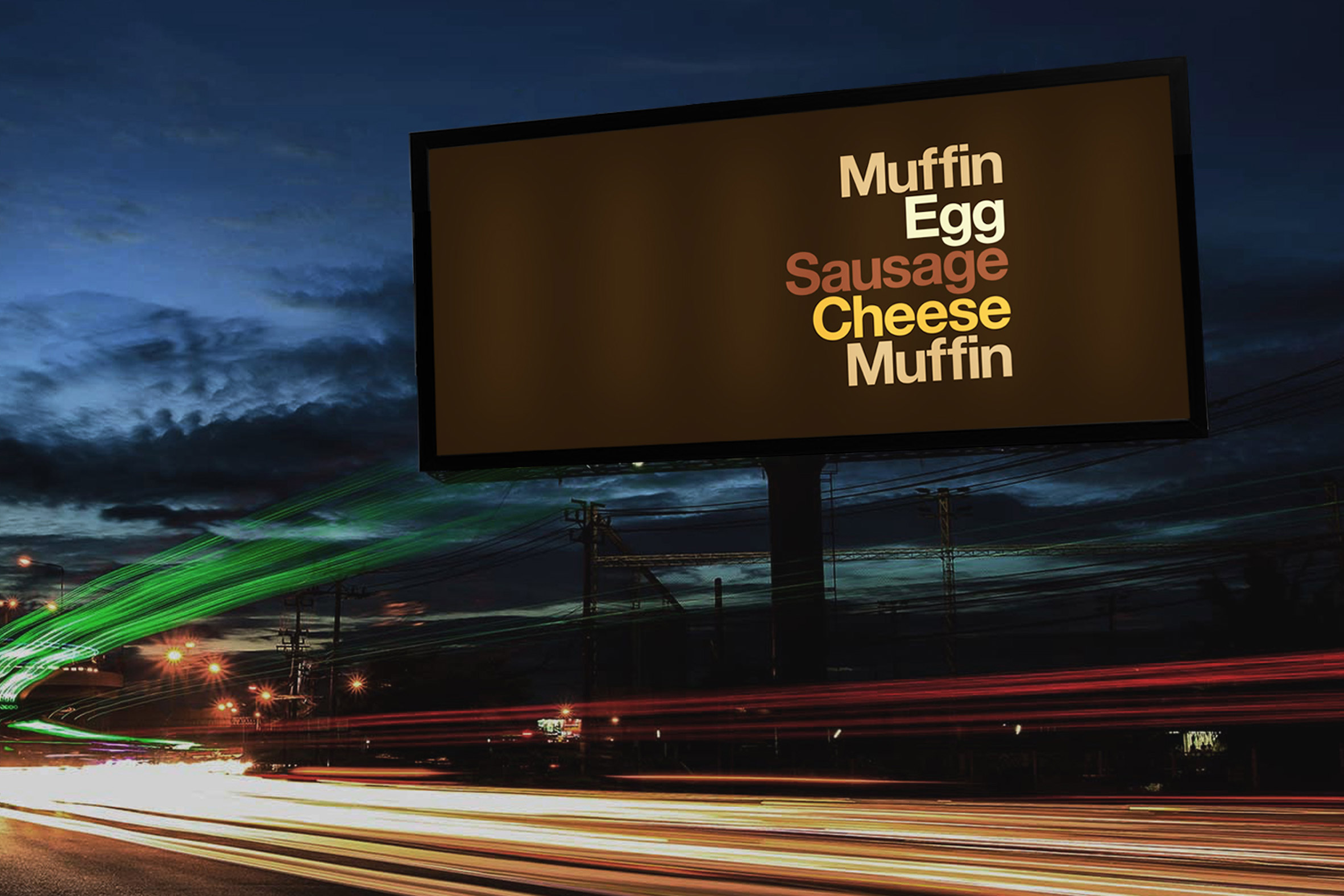
The duo chose some of the brand's most popular food items, such as the Big Mac, the Sausage & Egg McMuffin and the Filet-O-Fish, and broke them down into a list of their main components.
The Sausage & Egg McMuffin, for instance, becomes "Muffin, Egg, Sausage, Cheese, Muffin".
Each word – written in Helvetica typeface – is stacked on top of the other, mimicking the arrangement of the food itself, and is coloured in a shade reminiscent of the ingredient it references.
"The minimalist approach developed from the needs of the communication. Simplicity. Nothing should distract. Everything is a 'slave' to the idea. Everything provides and earth wire back to the brand," Heyes told Dezeen.
"Funnily enough, a designer accidentally put the logo on the initial artworks," he continued. "That moment when you put your thumb over the logo and remind yourself of how strong this work is... that's what we all get out of bed for."
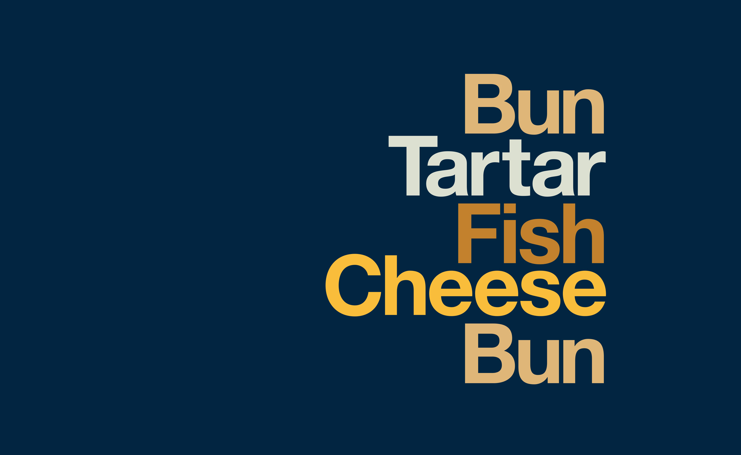
The new advertisements are a development on Schwem's 2011 project, Type Sandwiches, which saw the designer list the ingredients in different sandwiches in the same fashion.
"David Schwem's graphical style helps the viewer literally build the product in their mind," said Heyes. "The colour palette is gentle, not forced. It uses the visual truth of the products and the packaging. The type doesn’t shout. It's humble. It's confident."
The new campaign also draws on posters that Schwem made in 2015 for McDonald's restaurants in Dubai, where the designer broke down three of the fast food chain's most popular sandwiches into ingredient swatches that emulate Pantone colour charts.
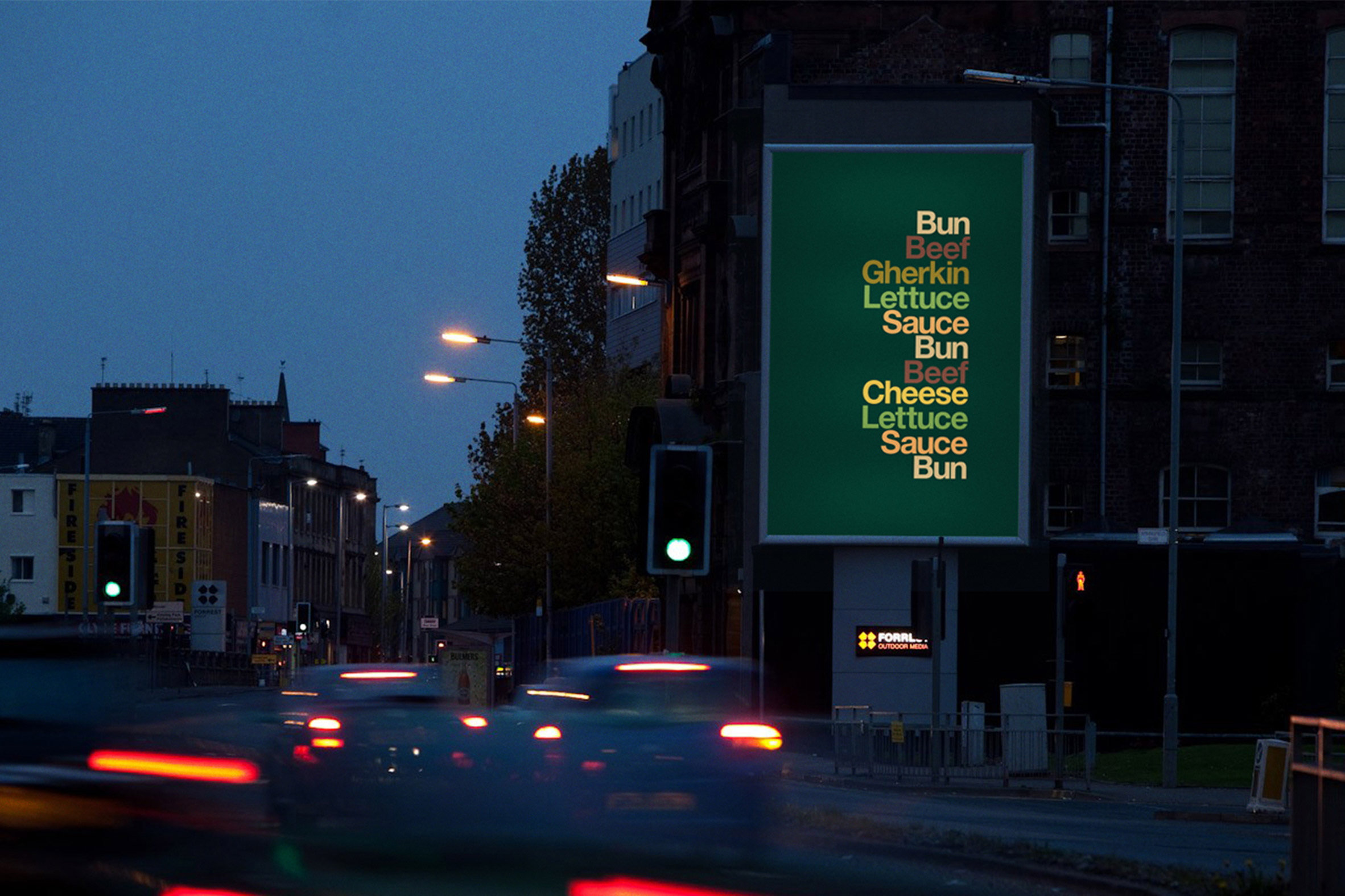
The Iconic Stacks posters were launched last week and will be rolled out across digital outdoor sites nationwide.
This is just one of a string of design-led campaigns for McDonald's. Advertising agency TBWA recently created a series of looping animations to celebrate the Egg McMuffin being available all day in the chain's restaurants in France.
Each of the 15 animations see the deconstructed elements of the breakfast item coming together in different ways as they move through a cartoonish production line.
The post Minimalist McDonald's adverts feature ingredients lists but no brand name appeared first on Dezeen.
from Dezeen https://ift.tt/2uDnWCH

No comments:
Post a Comment