The past few years have seen a major shift in the way we talk about periods. Menstruation is no longer discussed in hushed tones and euphemisms or via cheesy ads filled with montages of women living their best life – instead, brands like Thinx are tackling the subject with frank humour and wit while Libresse has challenged taboos with its decision to switch blue liquid for blood.
New startups and direct-to-consumer brands have also brought some much-needed product innovation to the femcare market, with their eco-conscious alternatives to tampons and liners (see Thinx’s period pants, Mooncup’s silicone cup, and Dame’s reusable tampon applicator), and a more contemporary approach to branding. With sleek packaging, playful names and colourful websites, companies like Thinx, TOTM and OHNE have offered a cooler and more considered alternative to the dated products found on supermarket shelves.


UK brand Callaly is another newcomer hoping to change our experience of period care. Founded by Alex Hooi, a gynaecologist, and Thang Vo-Ta, an entrepreneur, the brand launched in 2018 with a 2-in-1 tampon and liner known as the ‘tampliner’ (see what they did there?), and has since released a wider range of tampons, pads and liners. Products can be ordered individually or customers can create custom packs and have them delivered to their door.
Since launching its first product, Callaly has been working with London studio Design Bridge to develop its visual identity and create packaging for individual products and custom packs. The project was revealed last week – giving Callaly a fresh new look.


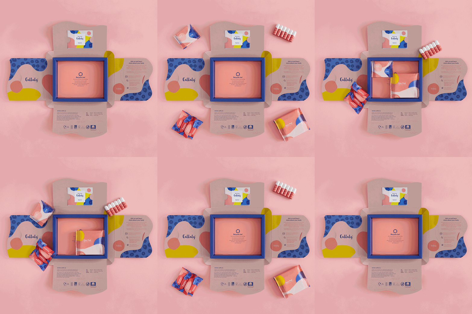
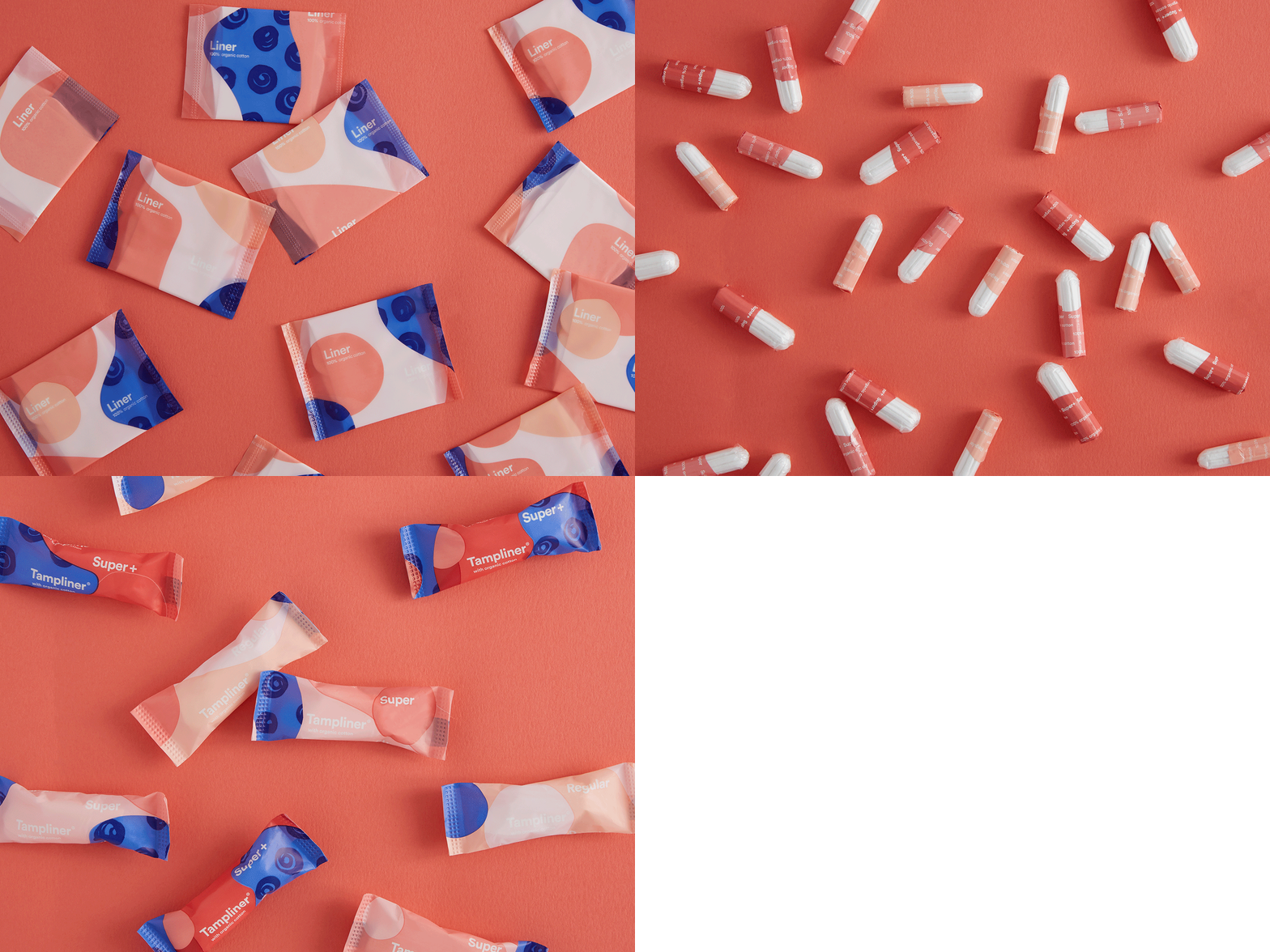
Boxes and wrappers feature colourful graphic patterns in bright yellow, blue and pastel pink. Wrappers are made from compostable and biodegradable materials, while boxes are made out of recyclable cardboard. Each box unfolds to reveal information about the company and its environmental credentials, along with a bookmark promoting Callaly’s online book club and a message urging consumers to recycle.
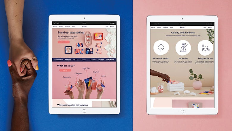
Along with designing the new packaging, graphic patterns and a custom typeface inspired by Callaly’s ‘conversational’ tone of voice, Design Bridge art directed photoshoots for the brand’s social media channels, and designed a suite of animated icons to help bring the brand to life online. The studio says the aim was to “challenge the norms of the femcare category” and create something that people would “genuinely enjoy receiving and opening”.
With its playful patterns and bold colours, Callaly’s packaging feels more in line with the look of Instagram-friendly beauty brands than the likes of Bodyform and Libresse. And its bold colours and playful patterns project a warm and friendly feel while carefully sidestepping the usual clichés associated with femcare.
It’s a welcome alternative to plastic wrappers in shades of bright pink and lime green – and one that will hopefully inspire larger brands to adopt a more eco-friendly approach to design.
The post Period care brand Callaly gets a fresh new look appeared first on Creative Review.
from Creative Review https://ift.tt/2Ow7Rpe

No comments:
Post a Comment