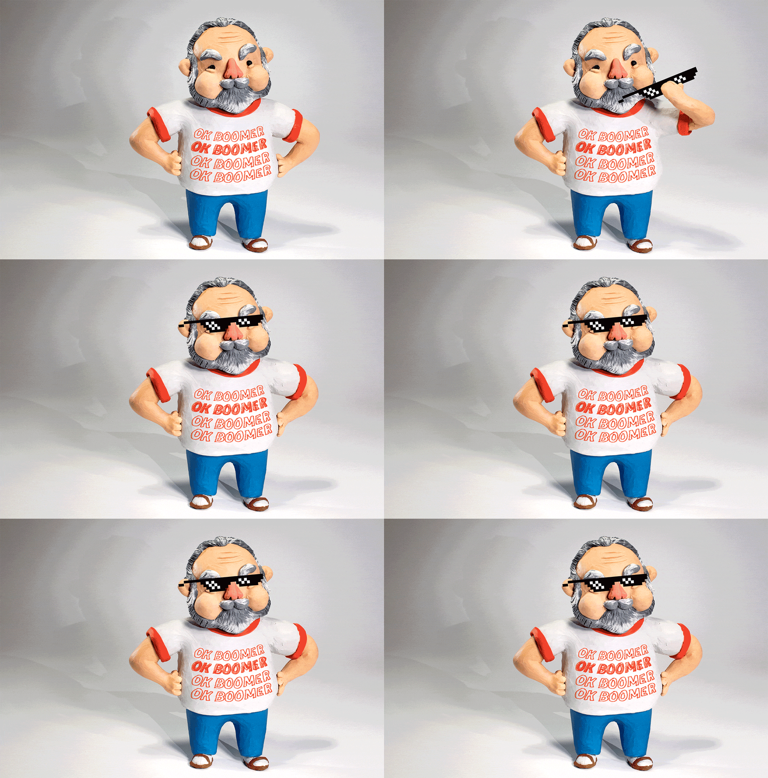
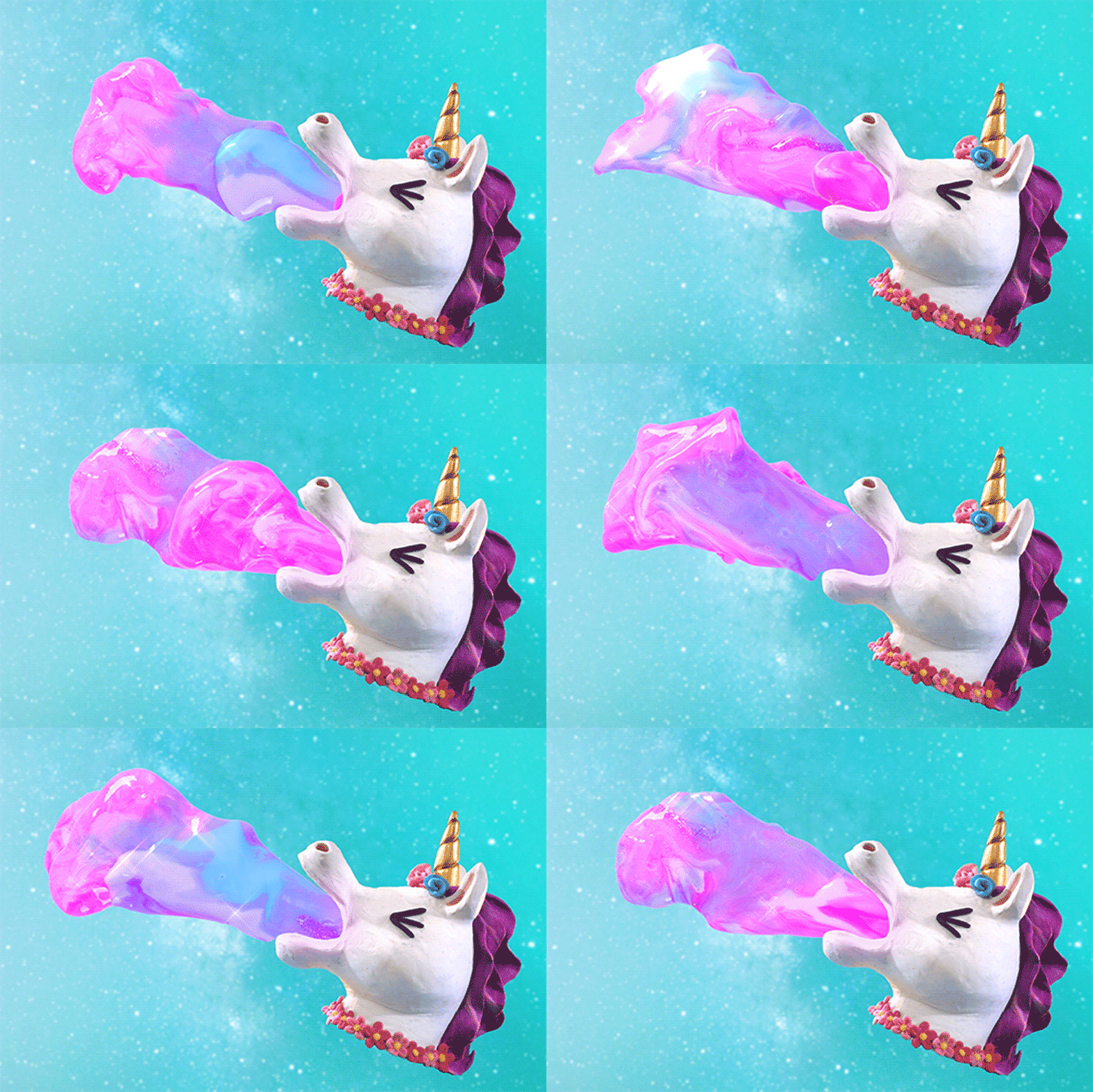
Annie Wong grew up as an only child, which she says gave her lots of solo time to spend on “drawing, crafting, playing pretend in my backyard and watching cartoons”. Being a quiet child, drawing was her go-to outlet and it’s something that stuck with her all the way through her teen years and higher education. Now it’s her job to create images for a living, although it’s rare you’ll find her just with a pencil and paper.
“After graduating with a fine arts degree I took a job at Children’s Fairyland in Oakland, CA, which is a storybook theme park,” explains Wong. “I learned the art of puppetry while there and as the ‘Director of Art and Restoration’, I managed and maintained much of the artwork inside the park, deepening my illustration experience.”
Her time in the puppet theatre ignited an interest in animation so Wong went back to school to study visual development, eventually pivoting to stop-motion animation, which allowed her to combine her love of mixed media. “I began sharing my animations through social media and have found that to be the most fun way to get my work out into the world.”

Wong’s aesthetic is bold, brash and full of funny moments. Her pool of references is broad but she’s narrowed it down to a few key influences: “A few things that pop out in my mind is the zaniness of Pee-Wee’s Playhouse, the elegance of Jiří Trnka’s stop motion films, the friendliness of Jim Henson’s muppets, the imaginative spirit of Yoko Ono, and the visual aesthetics of 90s MTV and the early 90s in general.”
Wong’s love of stop-motion means that her illustrations, gifs and short films are all “handcrafted with humour and heart” and it’s the messiness of her process that keeps her coming back to clay as one of her main mediums. “It’s easy to see evidence of the human hands … or, put simply, I like lumpy things,” she says.

It was when Wong was in graduate school that she found her groove making everything by hand. “I’m a very tactile, experience-based learner,” she explains. “I would have the hardest time visualising 3D space when taking perspective classes at school. I found I worked best just building the physical object or a room and moving things around and reshaping till I got the space right.”
As Wong is hand-building every element of her images there are a lot of steps involved. “I think traditional illustration and animation can be produced within one medium, like on paper or digitally in the computer,” Wong says. “But for me, I start with sketching, then building, then setting up the camera and lighting, then shooting, and finally editing it all together. It’s slower, but I like that it also feels like playtime when things are working well and I’m engaging all my senses. If I’ve done my job right, then hopefully it engages the viewer’s senses as well!”

For personal projects Wong enjoys the freedom to experiment but she also has a range of editorial and commercial commissions under her belt from clients including Washington Post Magazine, Vans, the New York Times and many more. Her clay-based editorial illustrations feel refreshing, offering a happy interruption to the black and white copy that accompanies them. Some highlights include a clay banana looking out a window wistfully, created for a New York Times piece about making a case for doing nothing; a series of ovary-based gifs that aim to break down the stigma around menstruation for charity OvaryActions.com; and a claymation gif of a knowing boomer for the Washington Post.
“I love the opportunity to create something fresh and visually unique for clients – what I do is not that common in animation or illustration, so I’m so grateful when a client allows me to add my oddball flavour to their existing brand,” Wong explains. “When working with clients, the process isn’t that much different except that I am supplied with a script or creative brief in the beginning and there are many check-in points for the client to approve before moving onto the final version.”

The perfect kind of brief for Wong is one that balances enough direction to give context for what the piece needs, but also enough freedom to allow the creative to insert some of her off-beat style. “This is going to sound simplistic, but what I enjoy most is just that I get to have fun with my work,” Wong says. “When I get to create puppets that make me laugh or make me feel warm and fuzzy inside, that’s when I’m happiest because then a new character has taken on a life of its own and gets to live in the world with me.”
Wong’s style is less conventional than traditional approaches and this pursuit for something a little different is based on a true passion for what she does, which Wong feels is key for success. “I think it helps to have a good sense of security, confidence and self-compassion. That is not always easy for creative people,” explains Wong. “You’re sharing things that you’ve made that you’ve put a lot of yourself into, and that can feel scary. But when you develop that self-confidence, it really frees you to take more creative and business risks and accept criticism with humility.”

The post Annie Wong’s claymation creations will put a smile on your face appeared first on Creative Review.
from Creative Review https://ift.tt/2QNekx5

No comments:
Post a Comment