The Ashmolean – the University of Oxford’s museum of art and archaeology – was founded by Alias Ashmole in 1683, when it became the world’s first public museum. If over three centuries of history isn’t enough, inside visitors will find 500,000 years’ worth of art, archaeology and other historic artefacts.
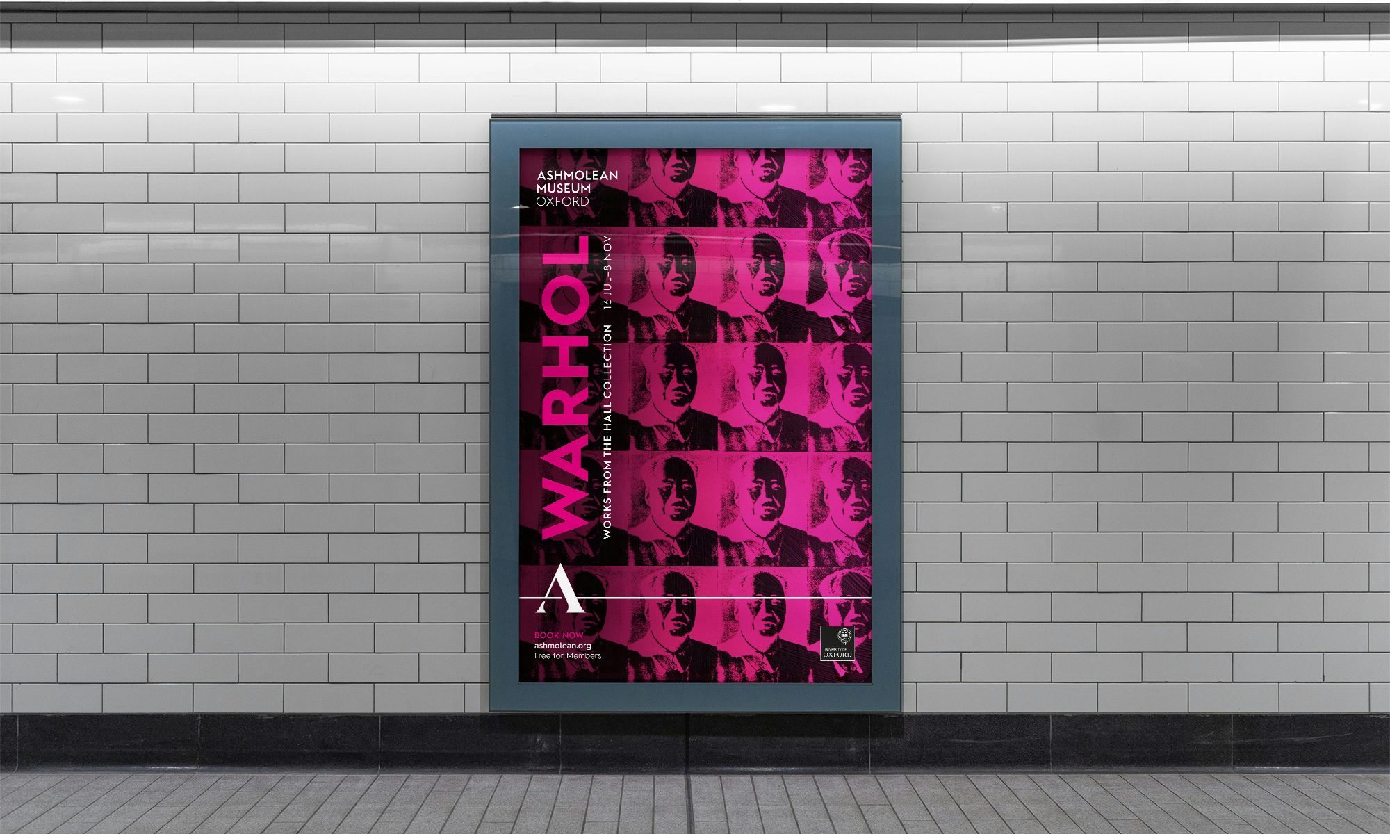
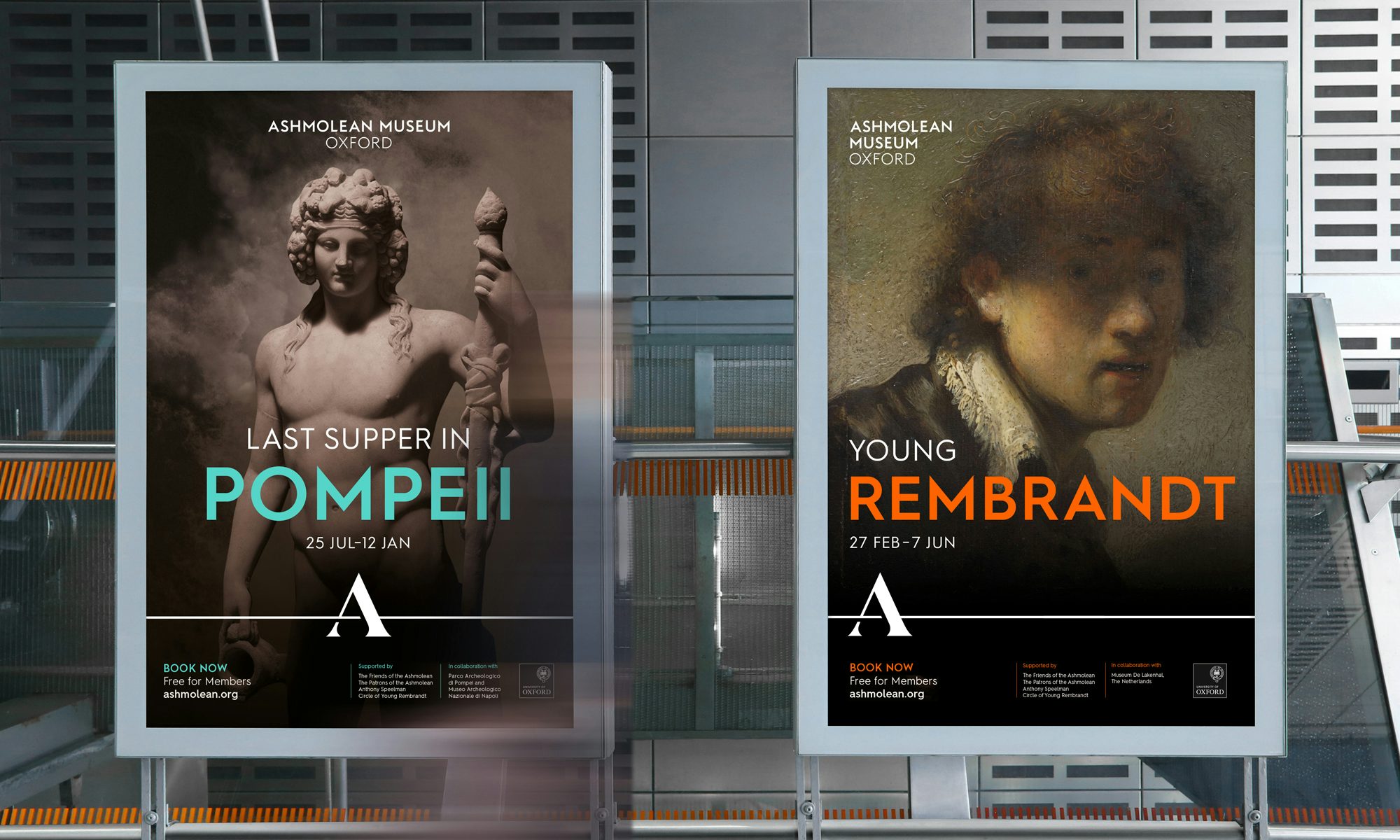
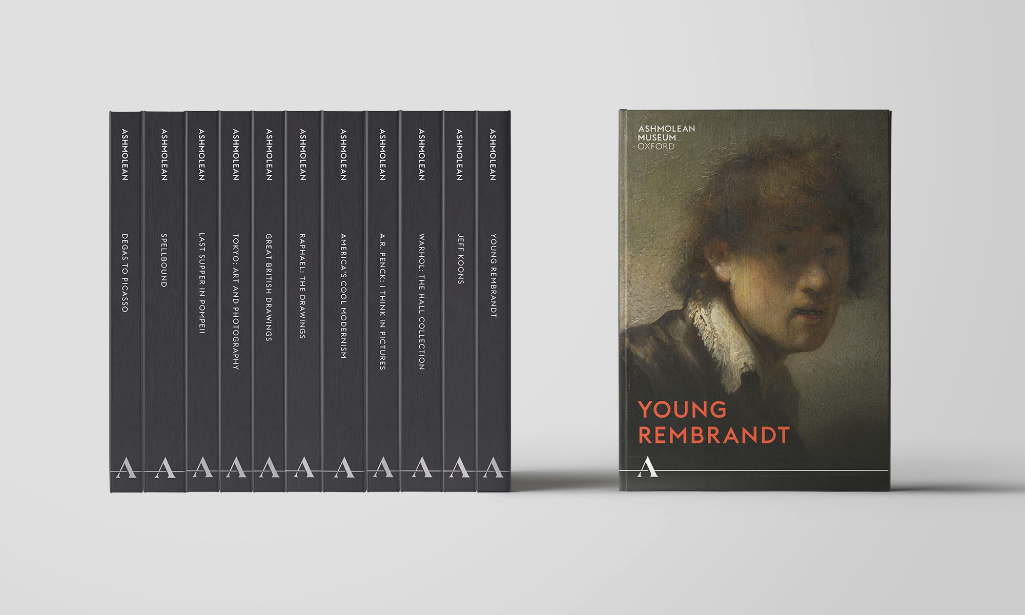
As part of a strategy overhaul, the museum enlisted design studio Blast to create a new identity that would help to improve brand awareness and ultimately expand the museum’s reach – in terms of both the size and diversity of its audience.
Yet the refresh was born out of a need to modernise, too. “From a practical point of view the previous logo and descriptor lock-up had legibility problems,” explains Paul Tunicliffe, director of Blast. “It wasn’t designed to work effectively across digital platforms and there were problems with creating appealing branded products and merchandise.”

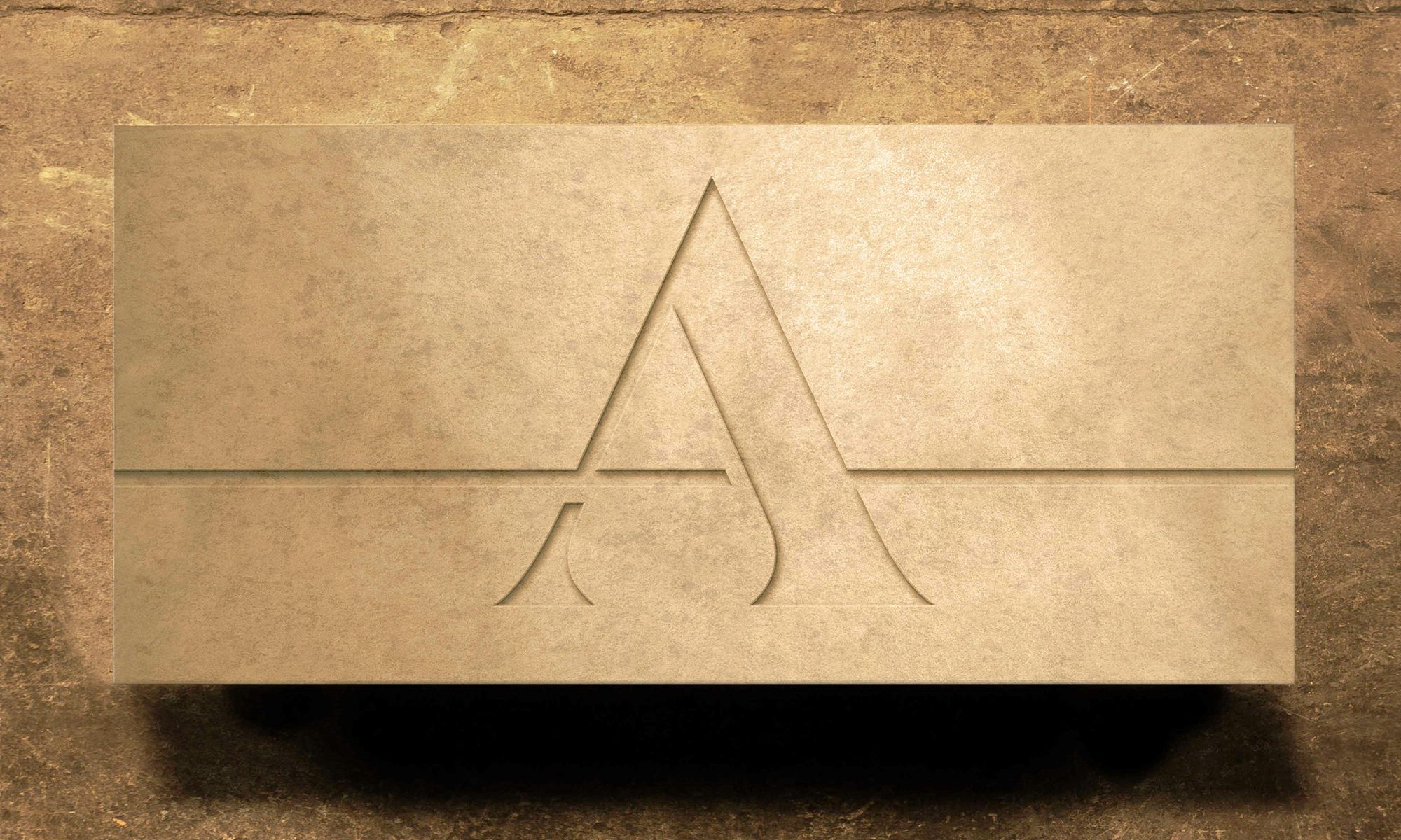
First and foremost was the logo redesign, which is now represented by a crisp, geometric serif A complete with an extended crossbar, “inspired by the concept of a timeline”. The new logo is designed to create a “bold, recognisable symbol for the Ashmolean, a distinctive shorthand mark, recognisable at small sizes and from distance,” Tunnicliffe says.
“The logo is designed to form the cornerstone for typographic layouts, signposting information, dates, events, art or artefacts,” he adds. The new logo was formed with flexibility in mind, giving freedom to adopt a range of layouts and, crucially, hitting the right notes across digital touchpoints – whether the Ashmolean’s online platforms or the information screens within the museum. Blast also developed a new tagline for the institution: ‘Inspiring minds, since 1683’.

Beyond the logo, the aspect of the overhaul that arguably jumps out most is the colour palette, which now welcomes flashes of colour akin to those seen in Pop Art. “We wanted a vibrant palette to keep communication fresh and engaging,” Tunnicliffe says. But it wasn’t a case of throwing away the history books altogether; hidden amongst the grabby colours are subtle allusions to the Ashmolean’s rich heritage. “The brand colour palette is inspired by the vibrant colours of the museum’s galleries, paired with the more subtle colours of the exterior stonework.”
Creating a digitally minded brand identity for any historic institution is difficult at the best of times, but particularly for one associated with both a city and a university both heavily steeped in history. The Blast team were cautious of this, highlighting the importance of “reflecting the beauty and history of the Ashmolean”. However, they saw how imperative it was to freshen things up in order to work across multiple formats and ultimately attract modern audiences. Even for the world’s oldest public museum, “creating a brand identity suitable for the digital age is key.”


The post Ashmolean’s new identity brings a historic museum into the modern world appeared first on Creative Review.
from Creative Review https://ift.tt/2UxQgQ0

No comments:
Post a Comment