Fondly known as ‘the home of cricket’, Lord’s cricket ground is steeped in sporting history. Named after its founder Thomas Lord, the ground’s current site in St John’s Wood has held a place in the cricketing community’s heart for over 200 years now, coinciding with cricket’s transition from a national pastime to a global sport.
But the historic sport has faced a number of challenges in recent years, with its disappearance from free-to-air TV channels and plummeting grassroots player numbers coming at a time when clubs and other sporting institutions are being forced to behave more like brands in order to stand out.


As the owner of Lord’s, Marylebone Cricket Club felt it was time for a fresh start, and brought in independent agency The Clearing to create a new visual identity for itself and its home.
Having previously worked with other historic sporting institutions such as Wimbledon and Ascot, the team at The Clearing decided the best approach to the rebrand would be to unify and simplify.

“Lord’s and MCC are two brands with a unique position in the game, but their close relationship is often overlooked – causing confusion and limiting their impact. And as new formats of the game like the IPL and The Hundred emerge, and cricket’s audience becomes increasingly global, it’s important for MCC to maintain its influence and relevance, and start to connect better with fans across the world through digital channels,” says the agency.
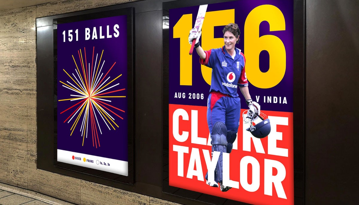
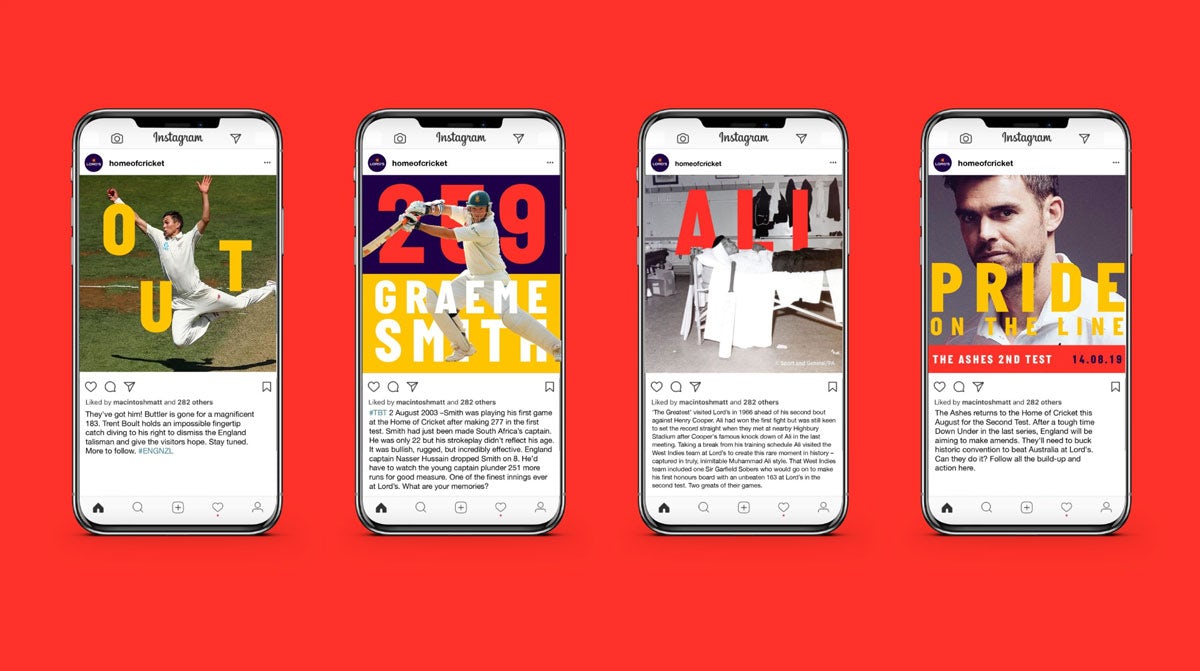
The interlocking MCC monogram and Lord’s logotype have both been updated to work better across digital channels and merchandise, while the club’s distinctive ‘egg and bacon’ colour palette of red and yellow is now threaded throughout both brands to help improve recognition.

“Ultimately our work is designed to help MCC continue to push boundaries in cricket in the digital age and create a seamless fan experience, whether they’re at Lord’s or engaged with the brand anywhere across the world. It’s about making the game more exciting and appealing than ever – opening cricket to new people and ensuring that MCC and Lord’s have a future as illustrious as their past,” says the agency.
The post Cricket gets a new face with Lord’s rebrand appeared first on Creative Review.
from Creative Review https://ift.tt/2whz60y

No comments:
Post a Comment