Going into business with family isn’t anything especially unusual in itself – everything from humble startups to transnational empires have familial foundations. However, with seven siblings as co-founders, Salford-based brewery Seven Brothers Brewing Co isn’t exactly run of the mill.
Inspired by their father, who brewed beer in the family cellar, the brothers first started producing their own beer seven years ago (and booze brands obviously run through the family’s veins, with the brothers’ four sisters also teaming up to run their own gin distillery, Sis4ers).
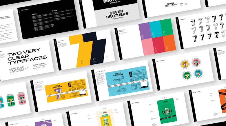
Today, Seven Brothers (stylised as Seven Bro7hers) has taken its unusual business formation and run with it in terms of the concept behind its zingy new branding. The refresh was led by Manchester-based creative branding agency Creative Spark, and centres around the idea of the lucky number seven.
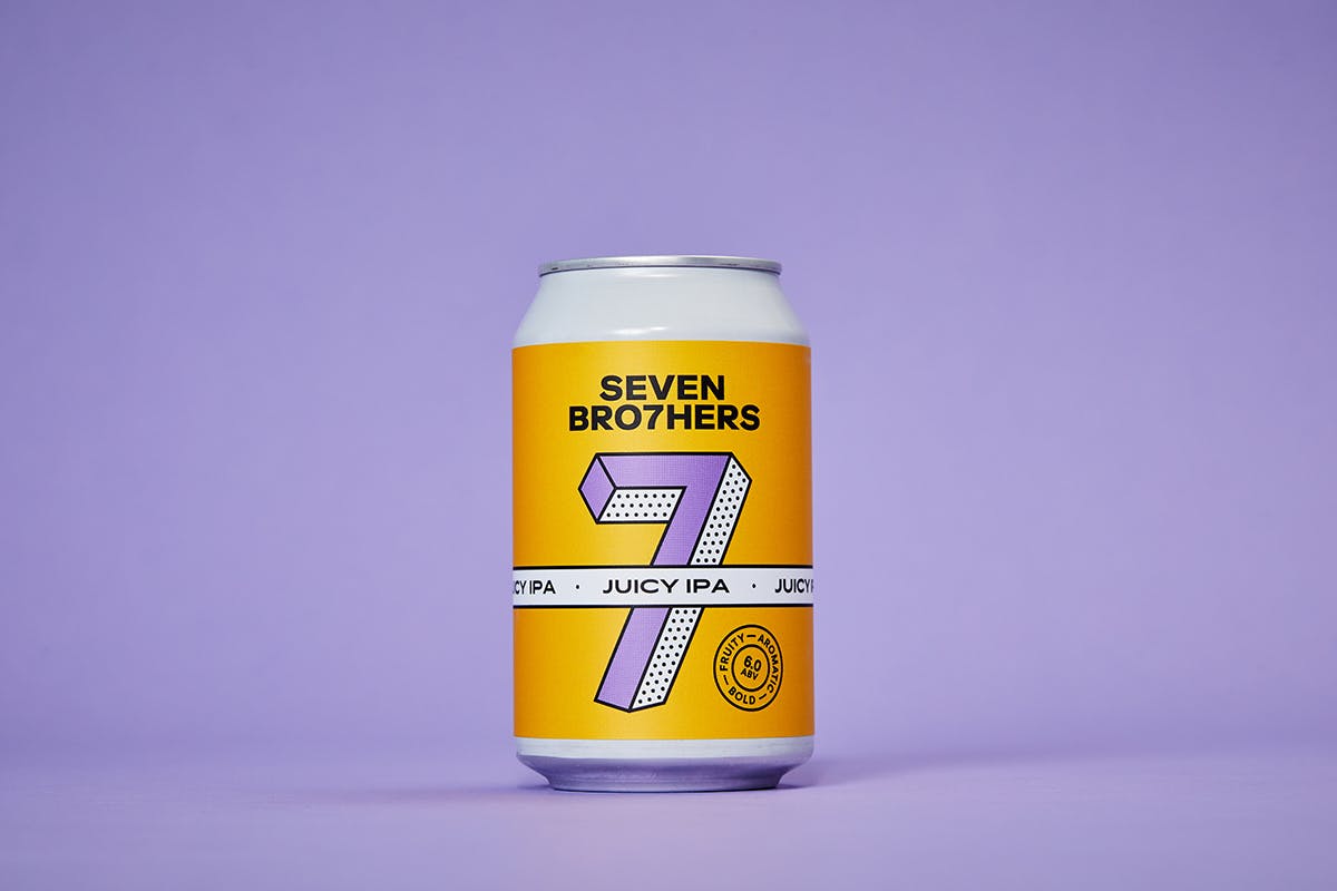


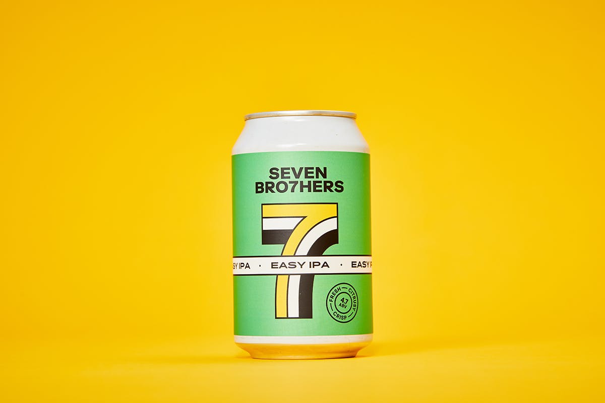
This isn’t the first time they’ve worked together; Creative Spark created the original name and branding in its early days. Yet with major retailers in Seven Brothers’ sights, and the ambition to push the beer house side of the business, it was time for a new look and voice “reflective of the business’ northern community spirit,” explains Creative Spark founder and director Neil Marra.
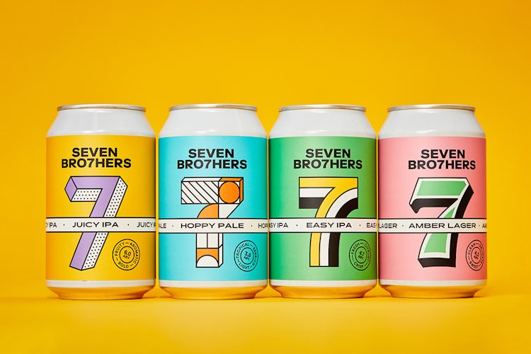
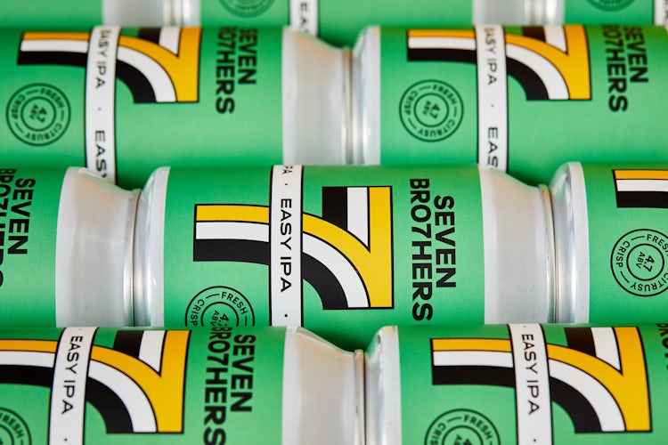
Creative Spark wanted to ensure that the cans stand out on the shelves, and key to this was a vibrant colour palette that helps to distinguish them from other brands. “We did some initial research with [insights agency] Humanise into what new and current customers wanted from the Seven Brothers brand,” Marra says.
The insights informed the brighter approach to the palette, though the brand still maintains its original core colours of black, white and yellow too. “Crucially the colour combos had to stand out on the shelf, and the colours also make the flavours recognisable to the customer while enabling us to have some fun with packaging.”
While many brands will revert to shades indicative of the taste or flavour profile inside, the agency steered clear of this and instead loosened up when it came to deciding on the palette. “We didn’t want to create colours that related to taste, such as pink and green melon etc. We wanted to be more random and fun,” Marra tells us.
Key to developing recognisability was the prominent use of the number seven, which is presented in different yet uniformly punchy 3D typefaces across the product variants. “The unique sevens we created allow each can to have its own look, but will still be recognisable as a Seven Brothers can,” says Marra.
It’s an unusual approach to alter what is essentially a logo across a product range, particularly for a nascent brand. However, it certainly feels as though the seven is locked down as a core emblem, giving the brand room to breathe in terms of the type choices.
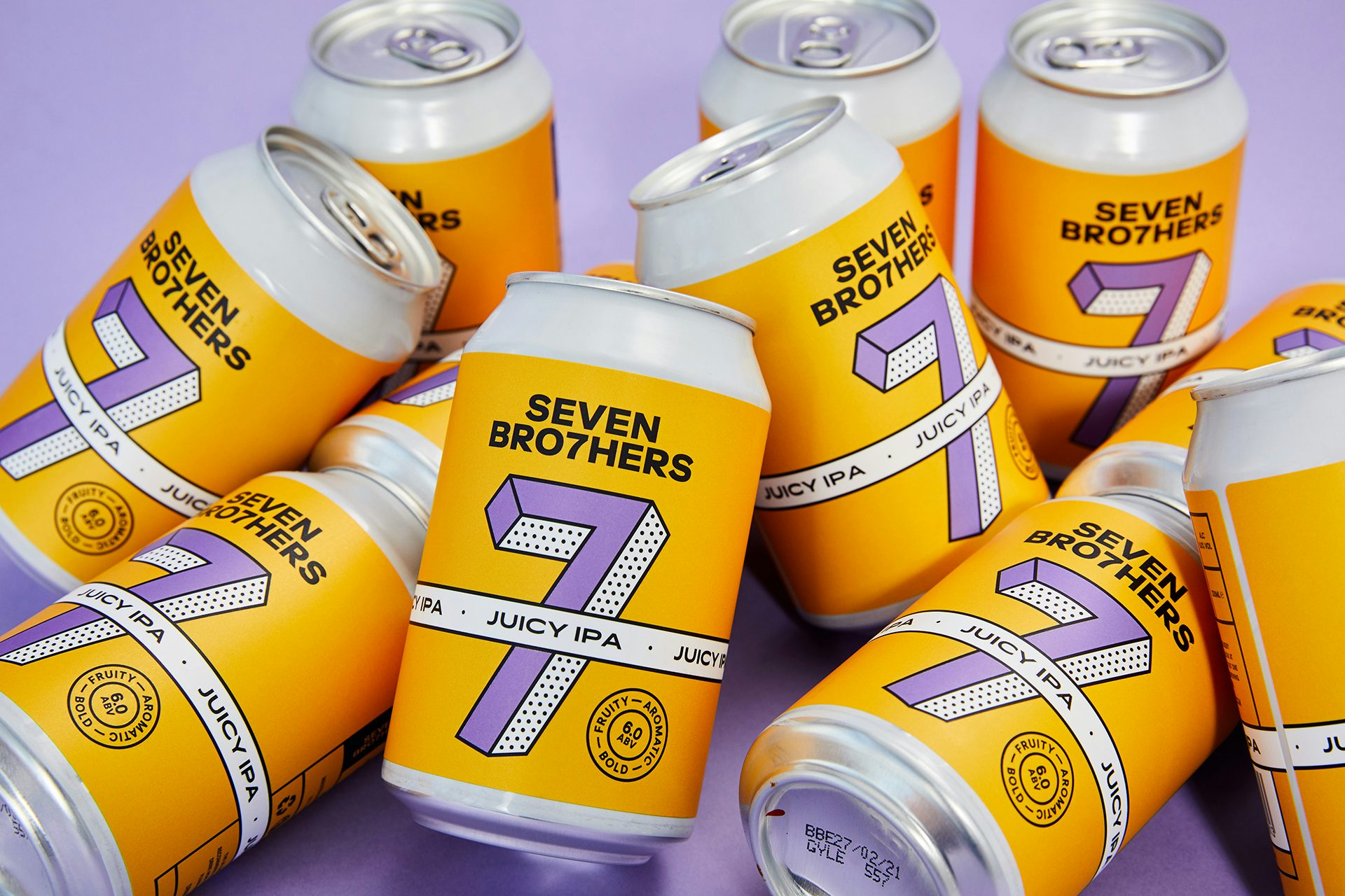
Despite the flexibility of the cans’ designs, Creative Spark aimed to ensure that Seven Brothers would be well equipped to continue developing the branding themselves in the future (a redesigned website is also on its way). “Special cans will be reproduced all year round, so we created a grid that allows the in-house team to create unique sevens to show off the flavour or a collaboration.
“The plan is to create sevens with local illustrators and artists as well as having Seven Brothers’ doodle books and creating apparel with bespoke sevens for the range,” says Marra. “This was all for the brand to own the number seven and be able to run with it for many years to come.”
creativespark.co.uk; sevenbro7hers.com
The post Seven Brothers brand refresh is all about lucky number seven appeared first on Creative Review.
from Creative Review https://ift.tt/2W50tWm
No comments:
Post a Comment