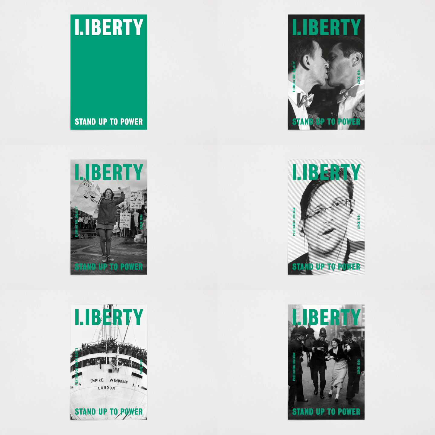
Founded in 1934 in response to police attempts to stop peaceful protests during the Hunger Marches, over the last eight decades Liberty has grown into the UK’s largest civil liberties organisation, and has been at the centre of high profile cases including that of whistleblower Edward Snowden and the Equal Pay Act.
While Liberty’s values have remained the same throughout its history, its branding had become dated over the years, and the organisation brought in design studio North to reimagine its visual identity for today’s landscape.

“[Liberty’s] fight to achieve positive and real impact on millions of ordinary lives was not communicated with their brand identity … and it was instead seen as old-fashioned, and associated with Westminster elitism and the legal bubble of the UK’s political power centre,” says North.
On a practical level, the new identity needed to work across everything from social to legal documents, but one of North’s other key considerations was how to reach a younger, more diverse and politically engaged audience.

The double L and I character in the new logotype is intended to be a “rallying cry” to its membership base, says North, adding: “Our civil rights are dependent on the effort of individuals, and so challenge us to be responsible. The special L and I character expresses the dichotomy between the organisation and the individual.”
Bureau Grot was chosen as the main font family for its “bold” appearance and “approachable quality”, says North, while the core colour palette eschews politically charged colours such as red and blue for green, and was inspired by the coloured hankerchiefs of the Argentinian women’s rights and pro-choice movement Pañuelazo.

The studio also worked on a brand campagin to go with the visual identity, which uses the logotype to highlight some of the key cases Liberty has worked on over the years, which have ranged from fighting fascism to exposing the dark side of mass surveillance.
The post Liberty brings its civil rights fight up to date with a new identity appeared first on Creative Review.
from Creative Review https://ift.tt/2Rkia0U

No comments:
Post a Comment