Raissa Pardini always knew what she wanted to be when she was little – but perhaps more importantly, she always knew what she didn’t want to be. “I wanted to produce art but I didn’t want to be an artist, and that’s when I realised that design could give me all the art I needed in my life without [becoming] an artist.”
The Italian-born, Glasgow-based visual designer has a clear penchant for vibrant colours, bold type and challenging forms, which she channels into gig, tour and event designs for a range of bands and labels, and commissions for brands such as Dr. Martens, Sony, Vevo and Vans.
These projects have become her playground for bending conventions and pushing the envelope as much as she can within the confines of the brief. “I like playing with rules. I love having to deal with letters, spacing, colours, messages, briefs. It’s challenging to me,” she says. While “an artist creates their own rules”, she feels she’s better at breaking pre-existing ones.

One of the greatest visual rule breakers is incidentally one of her key inspirations: Keith Haring. While still living in Italy, Pardini studied art history, a subject “taken very seriously there”. Florence was just an hour train journey from her hometown, and centuries of art history met her at every turn. “I’d have a wander in the Uffizi to see Botticelli, walk around the corner and admire the Giotto Chapel, a Donatello statue, a Michelangelo Sacristy. Lots of history, lots of rules.” For her, it was the likes of Keith Haring who broke those rules.
Pisa is home to one of Haring’s murals, Tuttomondo, which he was commissioned to paint on the back of the Sant’Antonio Abate church only a year before he died – one of his last public artworks. It holds special significance for Pardini, who was born just a couple of months before he completed the work, as it encapsulates what graphic design means to her: “the bridge between developing a strong message and shaping it into a visual content”.

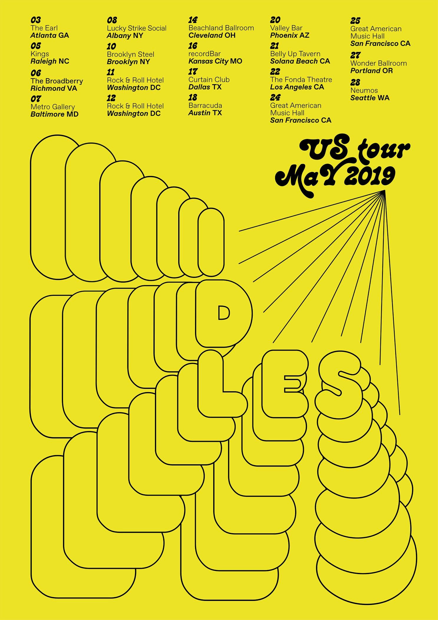
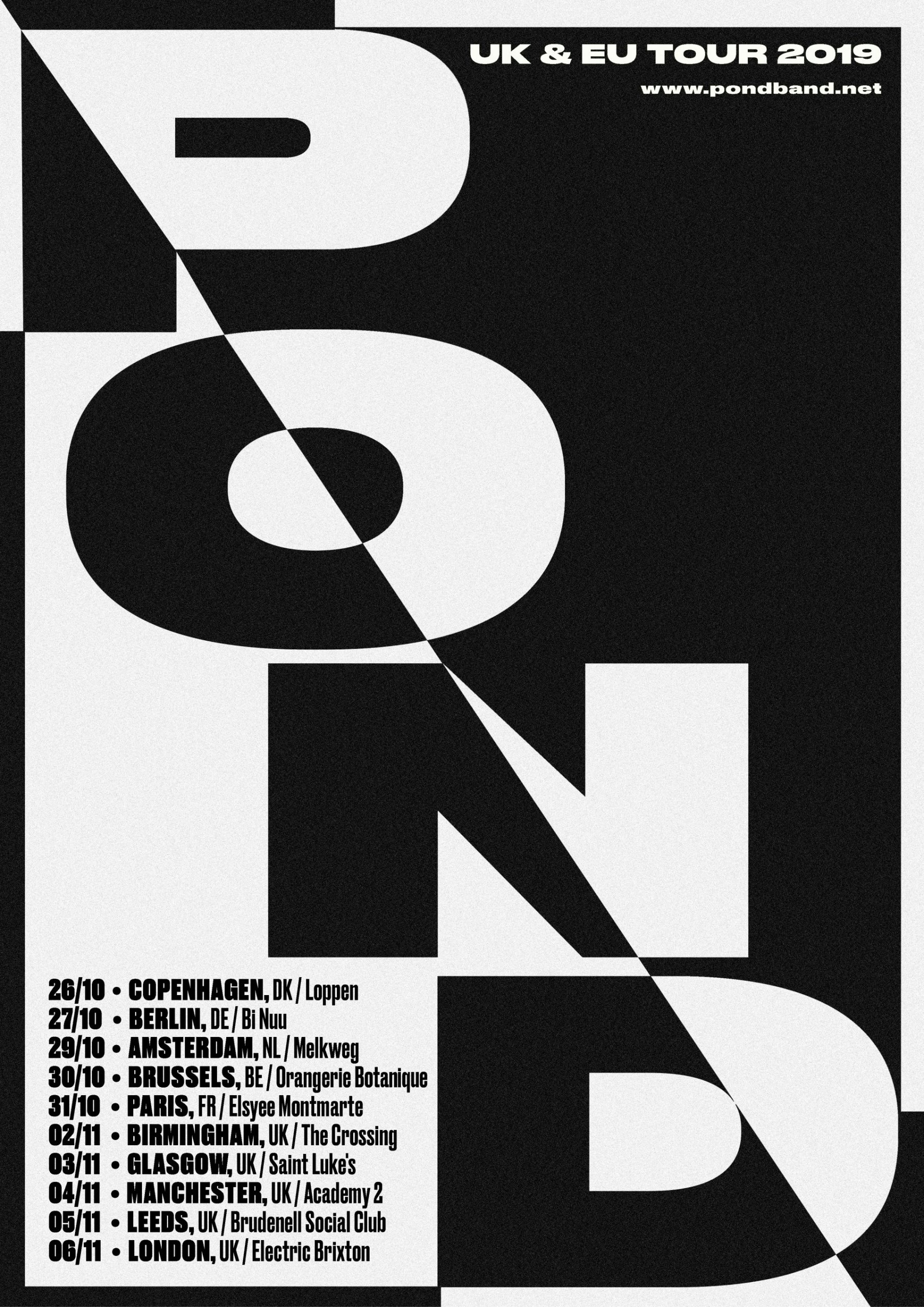
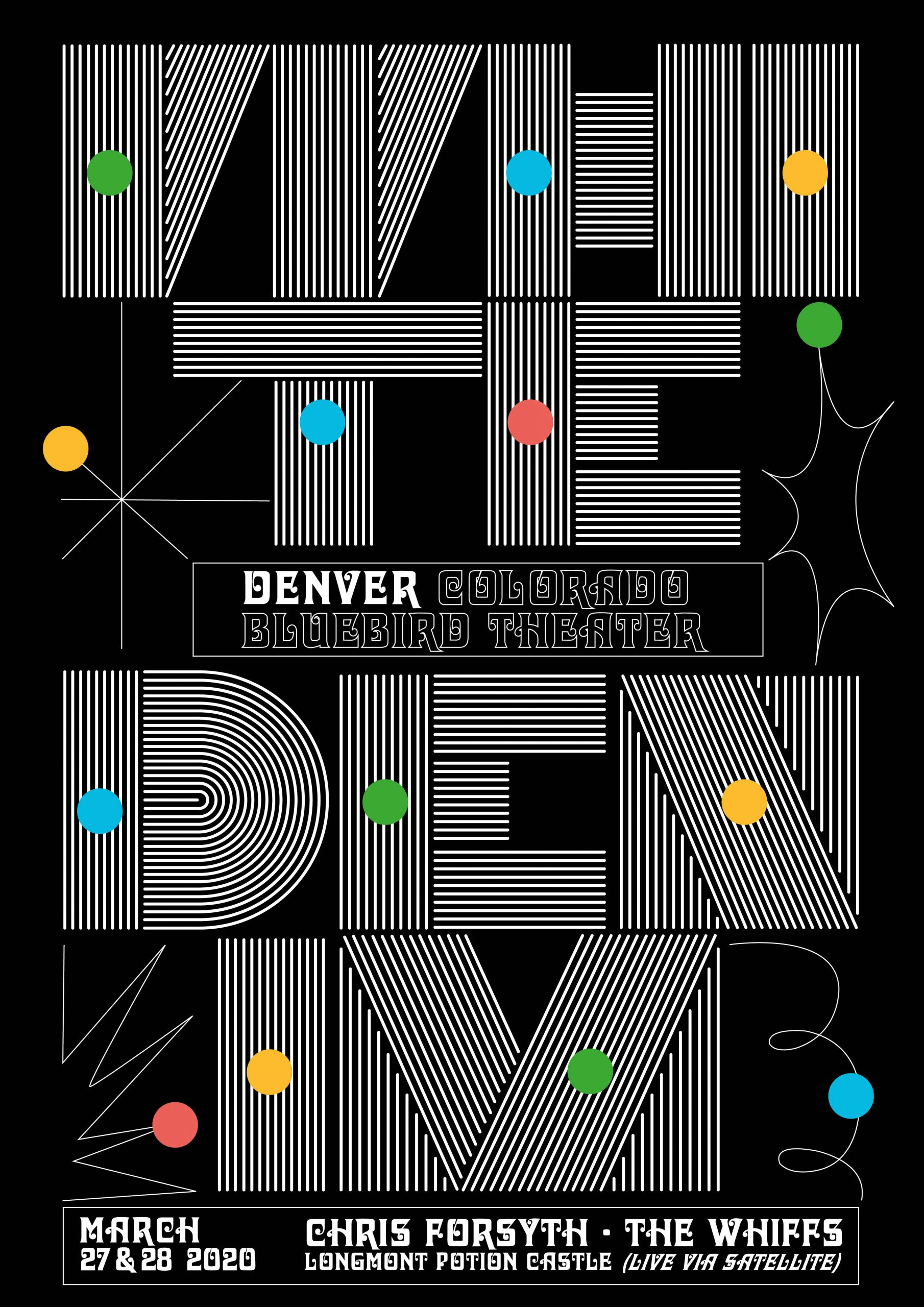
For Pardini’s own line of work, she enjoys playing with this dynamic. “Pushing my creativity to the limit of legibility but at the same time don’t over kill it as the message needs to be delivered – that’s my favourite challenge,” she says. Pardini has applied this approach to a range of designs for music gigs, tours and other events, working across posters and music videos for bands such as Snapped Ankles, Pond, Houseplants, Awesome Tapes from Africa, and hit band Idles. “Those are all graphical compositions made out of only letters and colours,” she says. “I want to push the typography until letters becoming the real artwork feature.”
Typography is such a clear focal point across many of Pardini’s designs, where letters are often obscured and toyed with. So where did this interest come from? “I love writing by hand. I’ve always learnt something I wrote by hand,” she says. “Seeing the letters all together in one place, it was always fascinating me. I spent days asking myself the importance of alphabets, in order to understand and speak to each other.”

Pardini sees how “creatives relate to their past somehow”, and her longstanding fascination with letters have had a strong influence on her preferred visual aesthetic – she has even earned a Masters in Arabian calligraphy.
“The more I studied letters, the more I became passionate about them until the point that I wanted to reconstruct them and use them as artworks rather than ‘letters’ only. I’m not an illustrator but I can make compositions with letters and that’s how I express myself.” For her, it would be something of a dream come true to think that she contributed to the evolution of how letters are used and perceived.

Working predominantly in tandem with the music industry can pose challenges. “The music industry can be tricky, and working with other artists (and their managers) can be really awkward at times. I feel lucky to be approached to work with someone because of my own style, and bands usually trust me to deliver the best piece of work I think would suit them. But it isn’t always like that and it can get frustrating,” she says.
“Deadlines are tight and the design is always the last thing to be called out; budgets can be tight too if there isn’t a visual understanding for the artwork. The music industry is like a very good looking cake and everyone wants a piece of that, but at the same time, it can be a great community of dedicated people that end up being your friends for life.”

Pardini has given a number of talks on the connection between the music industry and visual communication. “It is a topic that isn’t covered enough and I wanted to reach all young artists out there on my pages. Music will always need a ‘face’ for its sound. It always going to need something that makes that noise more tangible and live visually.”
She highlights that this applies far beyond print now, with “so many accounts, sites, profiles, platforms that need digital content right now”. This digital presence means they’re readily available to a great number of people, which Pardini believes makes it all the more important to get the messaging on point. “What if those messages we sent [out] are wrong? A design becomes powerful only when it delivers the right message. We developed that through a very close process with musicians and labels, making sure the design represents their music in the best possible way. And that comes with trust towards the designer too, giving the designer confidence in the work and the effort they will put into their work.”

raissapardini.com; @raissa_pardini
The post Raissa Pardini’s designs give a bold, typographic face to music appeared first on Creative Review.
from Creative Review https://ift.tt/2ROGGaz

No comments:
Post a Comment