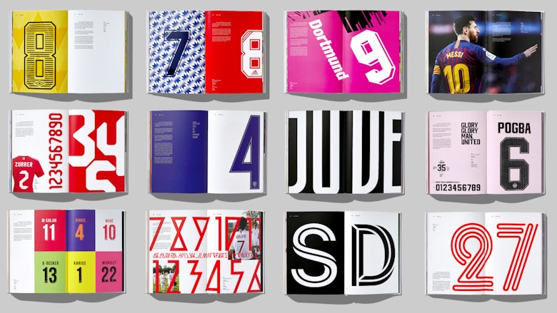
In 2013, designer Rick Banks released a limited-edition book exploring an often overlooked but fascinating aspect of graphic design. Football Type traced the history and development of typography in football, from the numbers sewn on to kits in the 1930s to custom fonts created for major clubs and sports brands.
The book was the result of two years’ research, which saw Banks and author Sheridan Bird contacting numerous designers and trawling various visual archives. Released in a run of 1,000, it quickly sold out, and with profits from sales donated to the Football Foundation, it helped raise over £20,000 for grassroots football club Horwich St Marys in Bolton.

Seven years on, Banks has released a sequel. Football Type 2 is described as a revised edition, with all of the content from football type “plus lots more”. Like its predecessor, the book contains a mix of bizarre and beautiful fonts along with interesting stories about squad numbers and the letters featured on players’ shirts.
“There is a lot more history in this book than the first one,” Banks tells CR. “I sourced a lot of 1960s shirts from the NASL (North American Soccer League) – this was a gold mine and inspired a lot of the British shirts in the 90s.”

The book also showcases some of the many designs that have been created since the first edition was released in 2013, such as lettering created for special World Cup kits around the world, and designs created for non-league clubs and five-a-side teams.
Banks decided to publish a sequel after being inundated with queries from football fans looking to get their hands on a copy of the first book. “I was getting constant emails from people asking if the original book was still available to buy. I only did 1,000 copies last time and they sold out in three weeks, and my personal file copies were selling for £350 each! So two years ago I decided to do a sequel.”

The book was created in collaboration with sports journalist Denis Hurley, who also runs football kit blog Museum of Jerseys. “[Hurley] wrote the whole book. His knowledge on football kits is phenomenal – he often out-trumped me! – and he picked errors and holes from the first edition…. It was fantastic working with him,” adds Banks.
As with the first book, it’s been a labour of love. “Getting permission from all the clubs and brands was the hardest part…. Thankfully, the vast majority of contributors were happy to help out,” says Banks.

With his first edition, Banks set out to raise awareness of football shirt lettering, and show how far it had come since the crude handmade lettering which appeared on kits in decades past. As he points out, “clubs and brands are starting to invest in good agencies and designers to create beautiful type” – resulting in some striking and innovative designs.
The latest book builds on this, while also reflecting the changing face of football itself. One of the examples featured inside is creative agency Nomad’s typography for the Women’s Super League – Europe’s only fully professional women’s league – which hints at the recent growth and success of the women’s game.
The book comes in two versions: the standard edition costs £40, while a limited edition, priced at £65, comes with a bespoke numbered dust jacket. Copies are available to order from Face37’s website and books will be shipped from next week.
The post Rick Banks’ new book explores the art of football lettering appeared first on Creative Review.
from Creative Review https://ift.tt/3aJ8bsY

No comments:
Post a Comment