It’s been a long time coming, but after years of being overshadowed by male-only leagues, women’s football has finally become a major sporting success in its own right.
The FIFA women’s World Cup reported its highest-ever viewing figures last year, with over 260 million people tuning in to watch the final between the Netherlands in the US. In the UK, the success of England’s Lionesses has prompted a massive rise in players at a grassroots level, inspiring 850,000 women to take up the sport, while brands from the BBC to Nike and Adidas have launched campaigns in support of the team.
It’s also a growing sport in Belgium: last year, the Belgian FA announced an ambitious five-year plan to grow women’s football and double player participation from 40,000 to 80,000. Along with investing an additional €3 million into the sport over the next two seasons, the FA plans to visit hundreds of schools to raise awareness of the game at a grassroots level.
Local football clubs have also been working to raise the profile of women’s football and attract new players to the sport. This week, Club Brugge’s women’s team revealed a new name and a slick visual identity created by Studio Dumbar (part of design agency Dept) and independent art director Ludovic Beun.
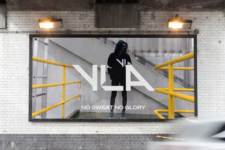
The rebrand sees the club renamed as Club YLA in honour of Yvonne Lahousse, a Brugge local and diehard fan. “[Lahousse] died in 2006 at the age of 91. She was the ‘mother of the Spionkop’ – the part of the stadium with the most loyal supporters. Her fanaticism was legendary; mere days before giving birth she could still be found behind the goal to cheer on the team,” says Studio Dumbar.
The design aims to reflect Lahousse’s “dynamic, passionate and energetic” spirit, and will be applied to merchandise as well as outdoor ads and digital communications. With its bold black-and-white colour palette, angular typeface and striking photography by Stig de Block, it’s a fresh and contemporary look – one that feels closer to campaigns from the likes of Nike and Adidas than it does to traditional football branding.
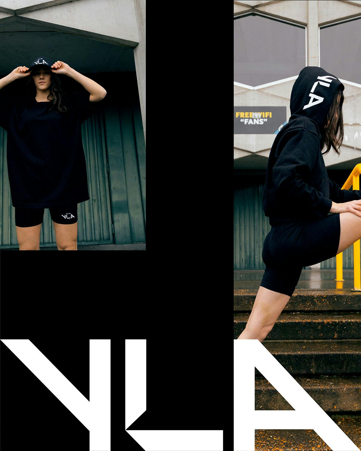
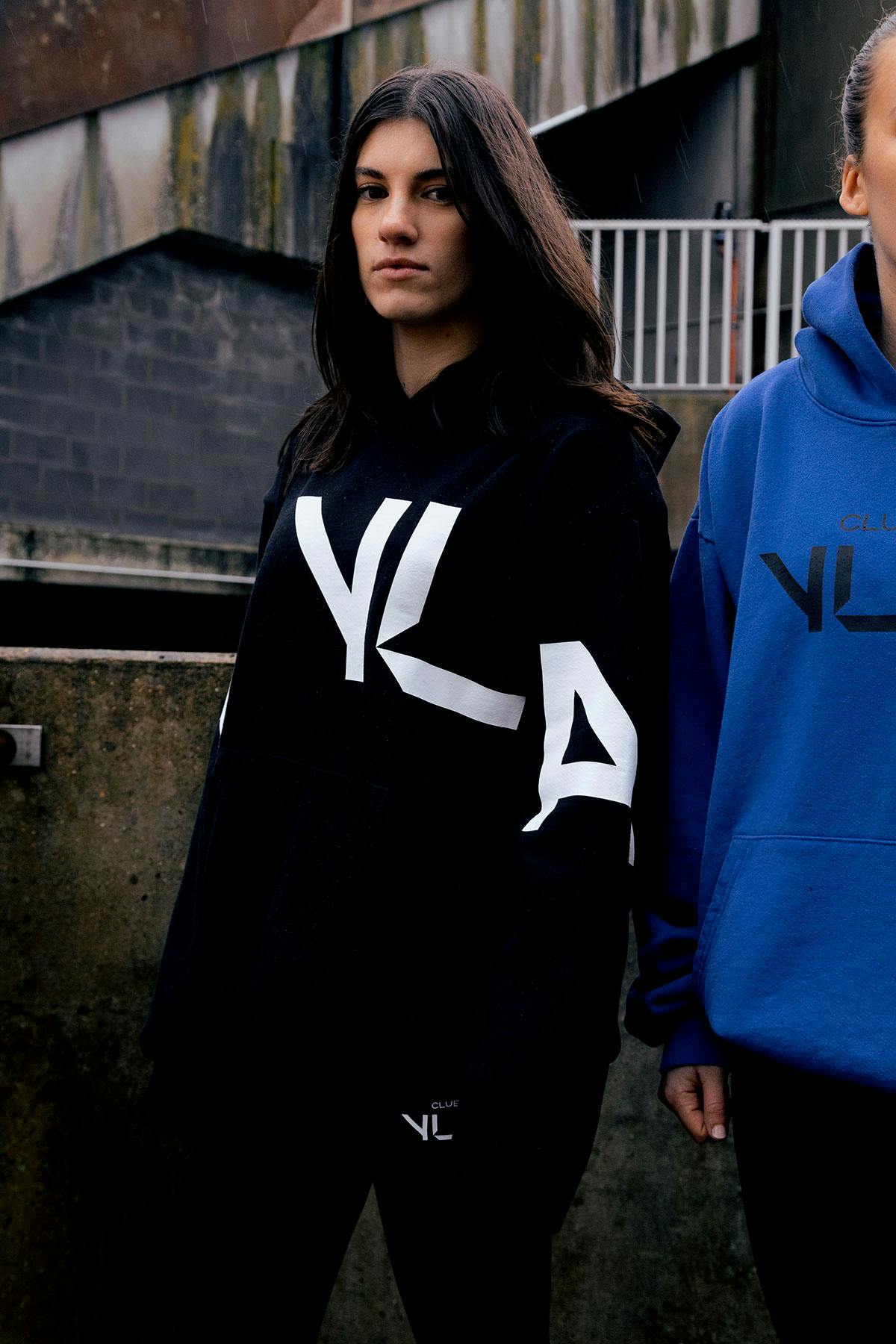
“[The club] definitely wanted to stand out,” explains Liza Enebeis, creative director at Studio Dumbar. “Club YLA is more than a football brand. It’s a contemporary brand that mixes sport, football and lifestyle. The brand had to reflect their attitude.”
The custom logotype aims to reflect the physical dynamic of football, with sharp angles referencing arrows and movement, and provides a nod to the slanted lines in Club Brugge’s emblem.

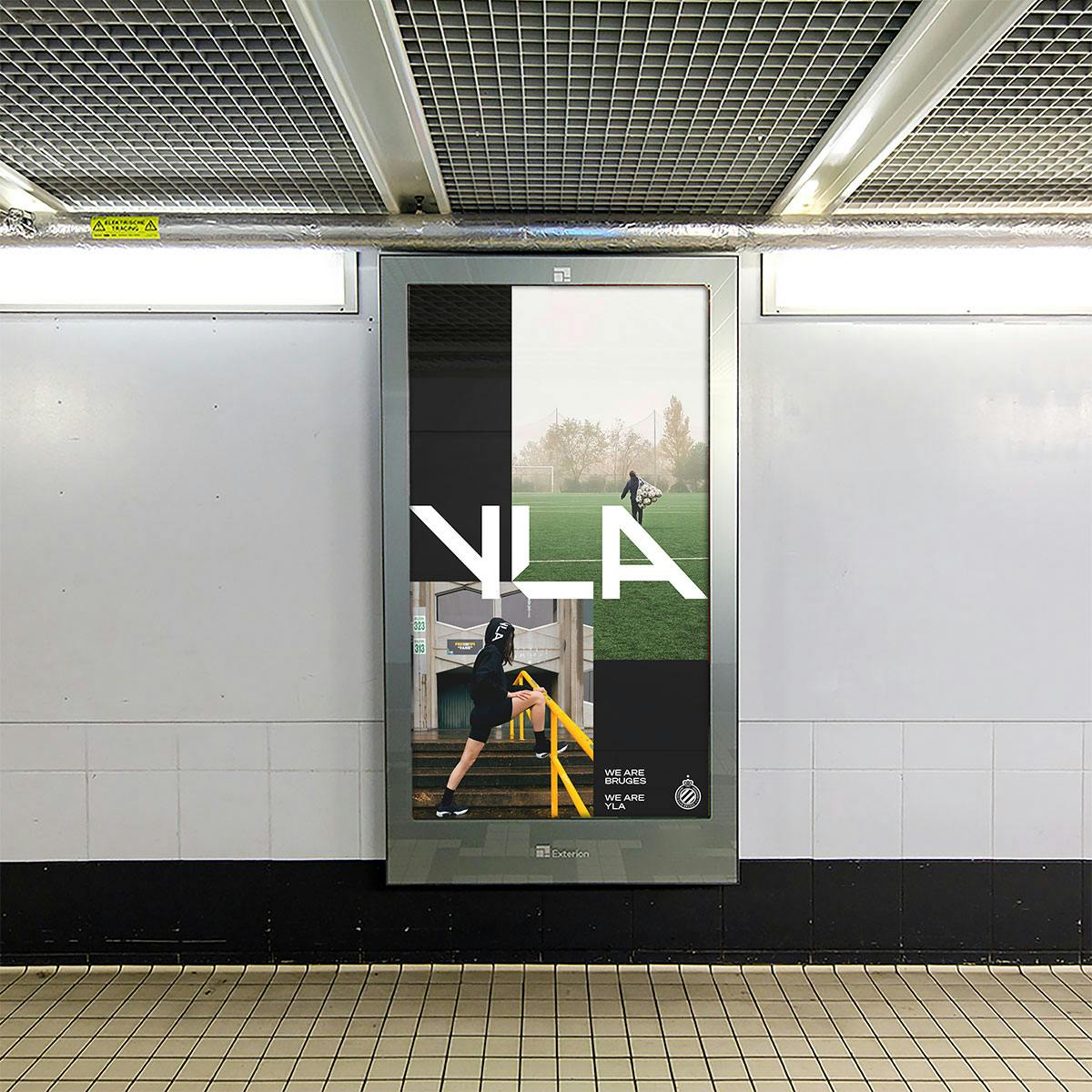
The logotype is used alongside Klim Type Foundry’s typeface, Söhne Breit, in communications: “We specifically choose Söhne to contrast the hard-edged logotype and layouts and create more tension. It’s contemporary and functional with clear letter forms,” adds Enebeis.
Photography, meanwhile, aims to reflect the club’s “down to earth attitude” and urban location, while the colour palette reflects the team’s core colours of black, white and blue.
Credits: Art direction and design: Studio Dumbar and Ludovic Beun. Styling: Kate Housh. Photography: @stigdeblock
The post Studio Dumbar rebrands Brugge’s women’s soccer team appeared first on Creative Review.
from Creative Review https://ift.tt/3aBo30p
No comments:
Post a Comment