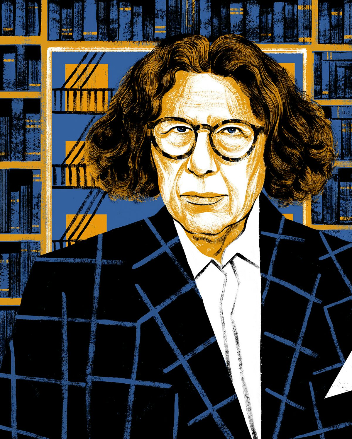
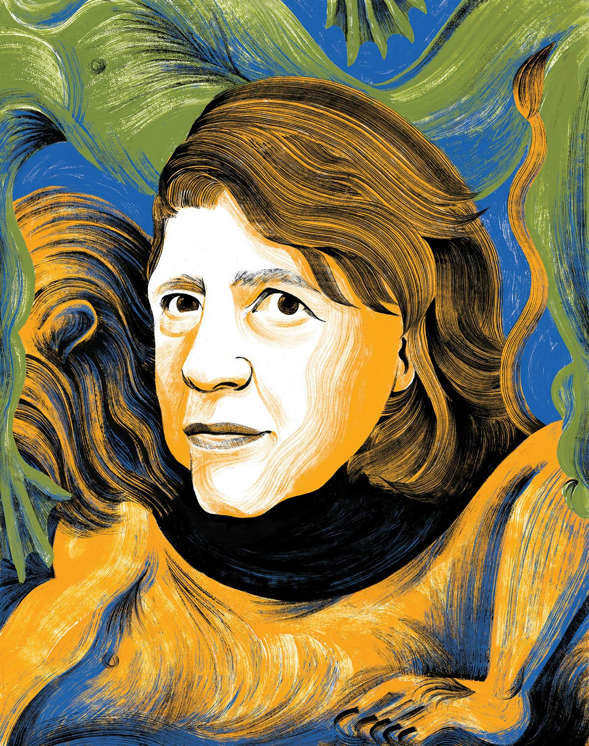
In just a few carefully applied brushstrokes and a modest palette, Chloe Cushman produces incredibly nuanced portraits that capture far more of a subject’s character than some of the most photorealistic artworks out there.
Whether depicting Angela Merkel’s sobering, reserved expression or the piercing stare of author Fran Lebowitz, Cushman’s knack for distilling the elements of a person’s character is clear. The Toronto-based illustrator’s instinct has already landed her commissions from leading stateside publications, including the New Yorker, the Washington Post and the New York Times.
Colourful yet considered, Cushman’s choice of tones and her deft application of texture come together to create endlessly intriguing illustrations that feel fleshed out without the fuss. Even in her more abstract creations, there is a sense of richness with minimal colours, as seen in her illustrations to accompany reviews of Margaret Atwood’s The Testaments and Ezra Klein’s Why We’re Polarized.
Below, she discusses her love/hate relationship with portraits, building a “visual vocabulary”, and the highlights of her career so far.


Creative Review: Were you always creative from a young age?
Chloe Cushman: The arts were a huge part of my childhood. Neither of my parents are visual artists, but their love of the arts more generally, specifically the theatre, encouraged my creativity from the start. Growing up, my drawings usually went hand-in-hand with writing. More often than not there was a story to go along with the pictures. I think, sadly, the idea of whether or not you’re artistically ‘talented’ gets ingrained really early on, especially in the case of drawing. I definitely picked up at a young age that I ‘could’ draw, (as if anyone ‘can’t’) – but there’s no substitute for discovering the joy of making things, and losing yourself in it.
CR: Can you tell us about your education?
CC: I studied English literature and contemporary philosophy at the University of King’s College in Halifax, Nova Scotia for my undergraduate degree. I never thought about going to art school – I was too in love with the idea of a traditional liberal arts education. After that, I studied Illustration at Sheridan College in Oakville, Ontario. Before that programme I had no real idea what a career in illustration was. Art school was essential for gaining some understanding of the job and the industry, but I still think of my first degree as the foundation of what I do now, especially for editorial and conceptual work. For me, illustration deals in ideas and references as much, if not more so, than rendering. You need to build your visual vocabulary out of something.
CR: Who or what do you think has influenced your illustration style the most?
CC: The influences that have had the greatest impact on my direction tend to straddle the line between design and illustration, like the work of Milton Glaser, Saul Bass, or Paula Scher. I’ve always looked to iconic poster art for inspiration. This is more about spirit than style, but Maira Kalman’s work and career is a real inspiration when I think about what illustration can be. And Christoph Niemann, of course, not just for his work, but for his insights into the creative process and struggle. Outside of the industry, Kathe Kollwitz is a longtime touchstone. My longest standing influence is probably Matisse, since he was my favorite artist as a child, and is still who I look to for colour inspiration.

CR: What has been your favourite project to work on so far in your career?
CC: Illustrating the cover of the New York Times Book Review for the first time was a personal highlight. I’ve always loved the Sunday Times, and especially the books section, so I was thrilled to be asked. The book was Namwali Serpell’s debut novel The Old Drift, which was an embarrassment of riches in terms of imagery, and the review was by Salman Rushdie (no pressure). But most importantly, art director Matt Dorfman is a joy and a privilege to work with.
CR: Do you think there’s been a specific commission or project that felt like your big break?
CC: The piece I illustrated for the New Yorker on tensions between Angela Merkel and Trump felt like a breakthrough for me. The assignment was a particularly tricky combination of portrait and concept illustration and there were many agonising roughs before the final. The simplicity of the image, and the balance of substance and style I think I achieved in the final illustration, are what I’m always striving for in my work.

CR: What draws you to portraits in particular?
CC: I have a real love/hate relationship with portrait illustrations. Capturing a likeness can be incredibly frustrating, but I love the puzzle of getting to the essence of a particular face, and how that semblance can reveal some element of the person’s character. The real challenge is capturing a likeness without crushing the life out of it. There’s a big difference between a portrait that is accurate or realistic, and a face that has life on the page. Also, I just can’t turn down a good face – if you look at my portfolio, you can probably tell I have a type.
CR: The colours are often really striking in your work. Can you tell us how you devise your palettes?
CC: I tend to stick to a limited palette in my illustrations. This wasn’t a conscious decision in the beginning, but over time I’ve found it helps me unite the intellectual and practical sides of my process. Colour is one of the most powerful tools you have as an illustrator to get across the concept and tone of a piece. A simplified palette forces you to be that much more intentional with your colour choices. I love the graphic appeal of bold colours, but in the context of an illustration I’m always trying to be purposeful with their impact.

CR: What is the creative scene like in Toronto?
CC: This is a hard question for right now. Also, I grew up in Toronto, so I never feel like I can have an unbiased view of the city. The arts scenes here are chronically underrated, but it’s still very hard to say it compares to London or New York, specifically for something as niche as illustration. Whenever I visit New York I definitely feel like the industry and community for what I do exists there in a way it just doesn’t anywhere else. More than once I’ve connected with other Toronto artists for the first time … while in New York. Everything is more diffuse here, so you need to make more of an effort to be part of that community – I know I do!
CR: What would be a dream story or brand to work on?
CC: Book covers and theatre posters will always be dream projects to me. I’m also a sucker for doing work in a series. I’d love to do cover illustrations for a series of Shakespeare editions. Really anything with great source material to dig into and an excuse to read a lot before starting a project. Illustrating the short fiction in the New Yorker would also be a dream assignment, especially if, say, Zadie Smith wrote it.


chloecushman.com; @chloecushman
The post Chloe Cushman’s striking illustrations are filled with nuance appeared first on Creative Review.
from Creative Review https://ift.tt/2za7e09

No comments:
Post a Comment