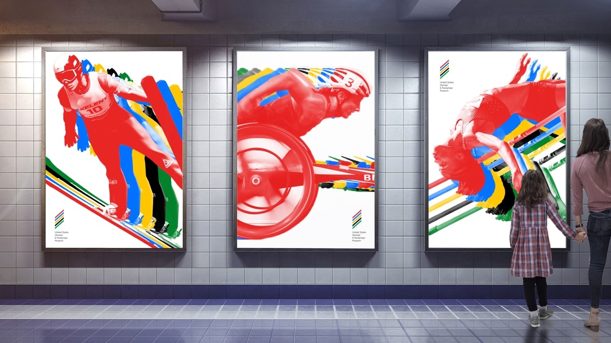
The 60,000 square foot museum, designed by Diller Scofidio + Renfro, will be home to various pieces of Olympic paraphernalia when it opens later this year.
This will include the scoreboard from the 1980 Winter Olympics, held at Lake Placid, and gymnast Shannn Miller’s sparkly scrunchie – which she wore at every major competition.

To create the museum’s logo, the studio brought together the colours of the Olympic rings in a series of stacked stripes. They form a diamond shape which references the 10,000 similarly shaped panels that cover the façade of the building – each of which is unique.
According to C&G&H, the logo is intended as an abstract version of the Olympic flame. It’s accompanied by a sans serif wordmark.


It certainly achieves out what the studio aimed for – something that’s reminiscent of the games, while still individual to the museum.
But given the rich history of Olympics’ graphics and design, there’s a sense that maybe C&G&H could have pushed this just a little further. Perhaps a touch of the mad energy of the London 2012 logo wouldn’t have gone amiss.
The post Colorado’s Olympic museum debuts its ‘abstract flame’ logo appeared first on Creative Review.
from Creative Review https://ift.tt/2WPVFnS

No comments:
Post a Comment