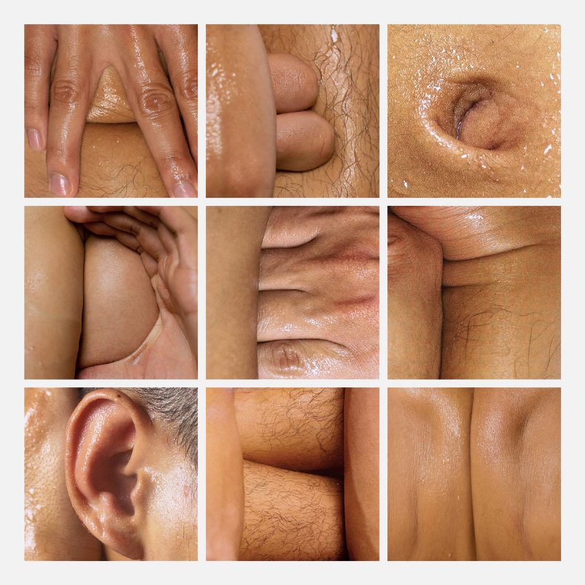
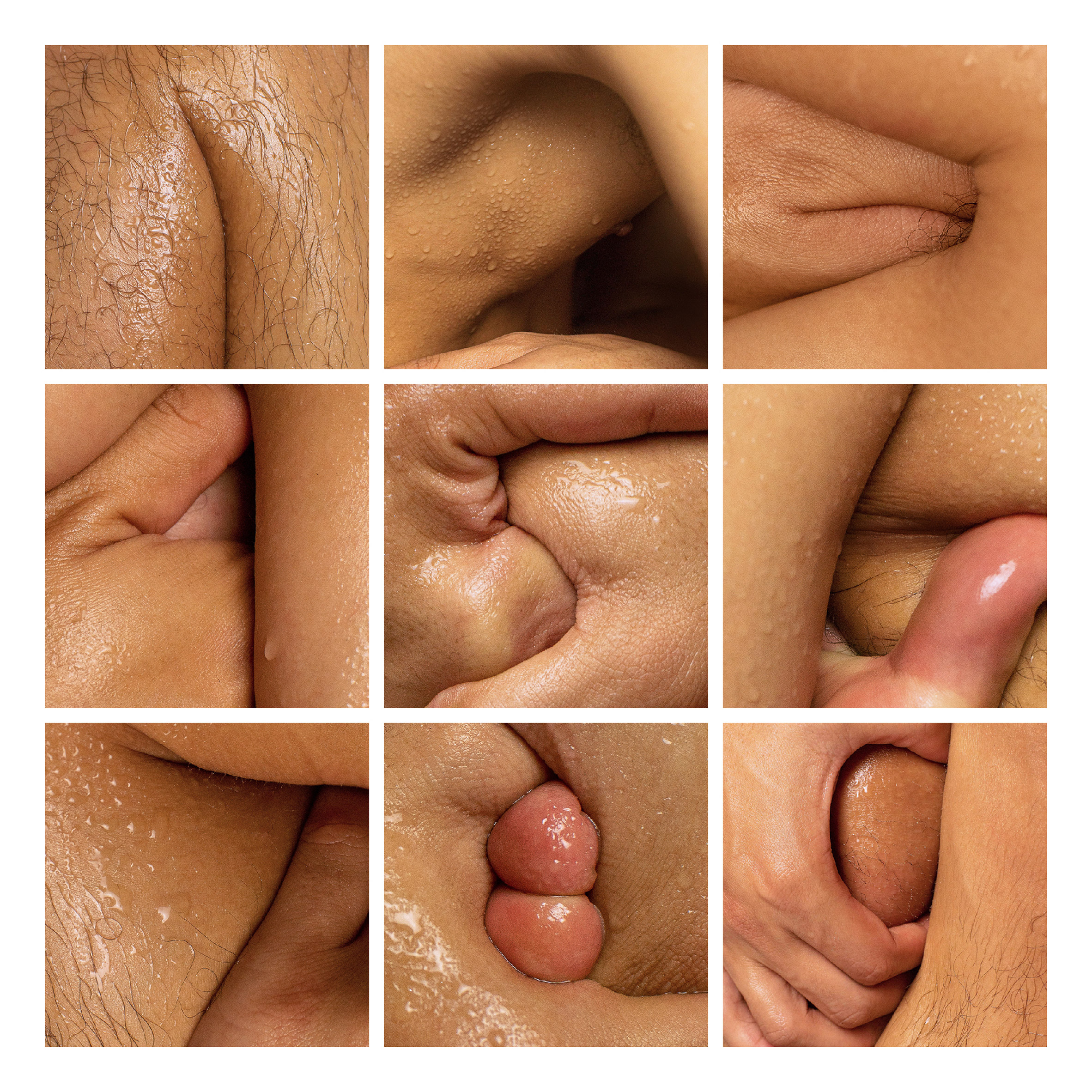
Filipino graphic designer Julius Raymund Advincula sat half-naked in front of a mirror looking for letters and numbers in the folds of his skin and limbs to make up this Body Type typeface.
Advincula, who works under the name Subhelic, created Body Type as an exploration of the various characters and figures that are hidden in the skin.
The letter C, for example, has been formed from the designer's belly button, while P has been made using his finger to fold down his ear, and a nipple takes the place of an O.
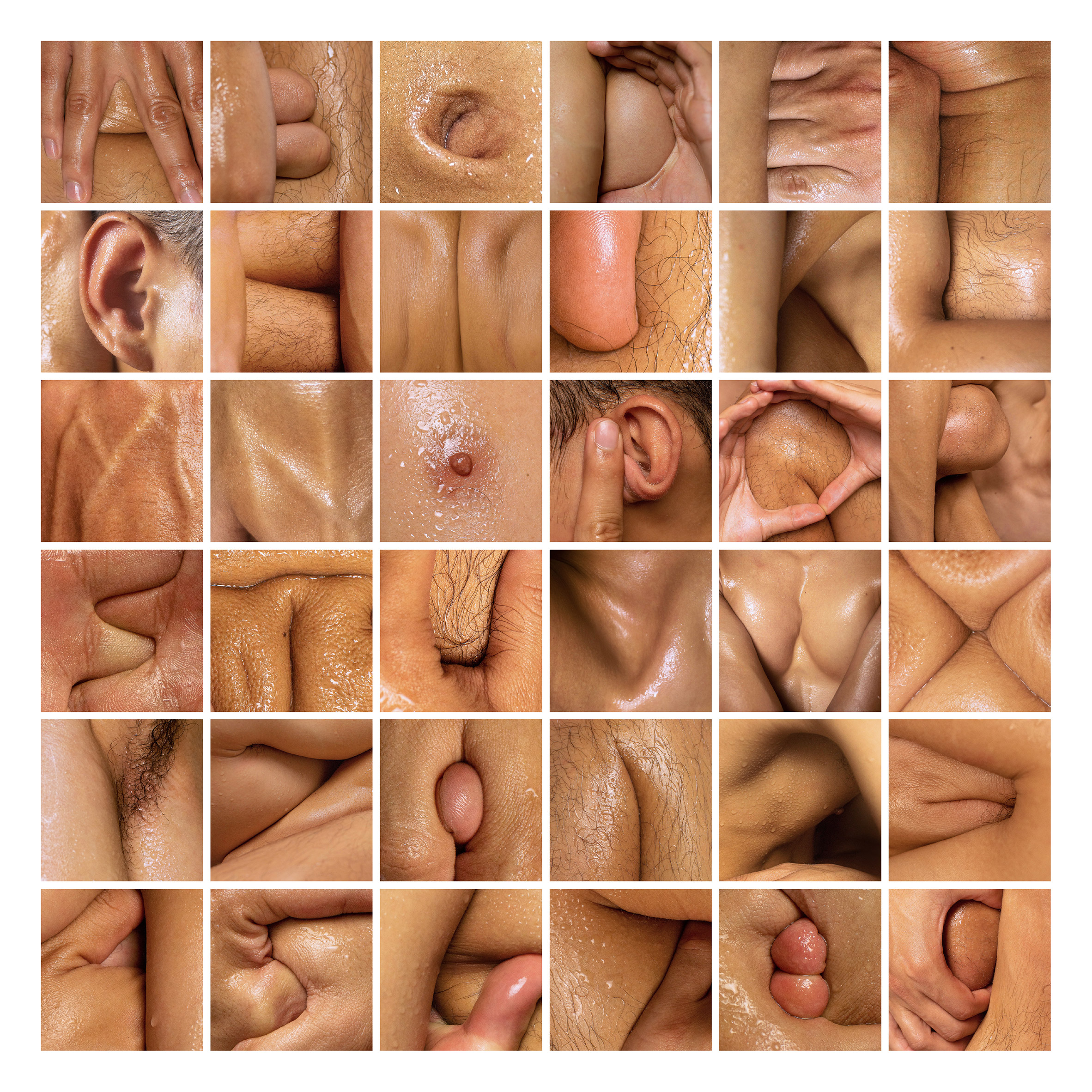
Body Type was designed in response to the 36 Days of Type challenge, which invites creatives to design a number or letter each day for 36 consecutive days.
After looking through the submissions, Advincula noticed that most of them were illustrated, either traditionally or digitally.
"I wanted to deviate from that and explore a process that involved finding rather than drawing," he told Dezeen. "Then the phrases 'body type' and 'body language' popped into my head."
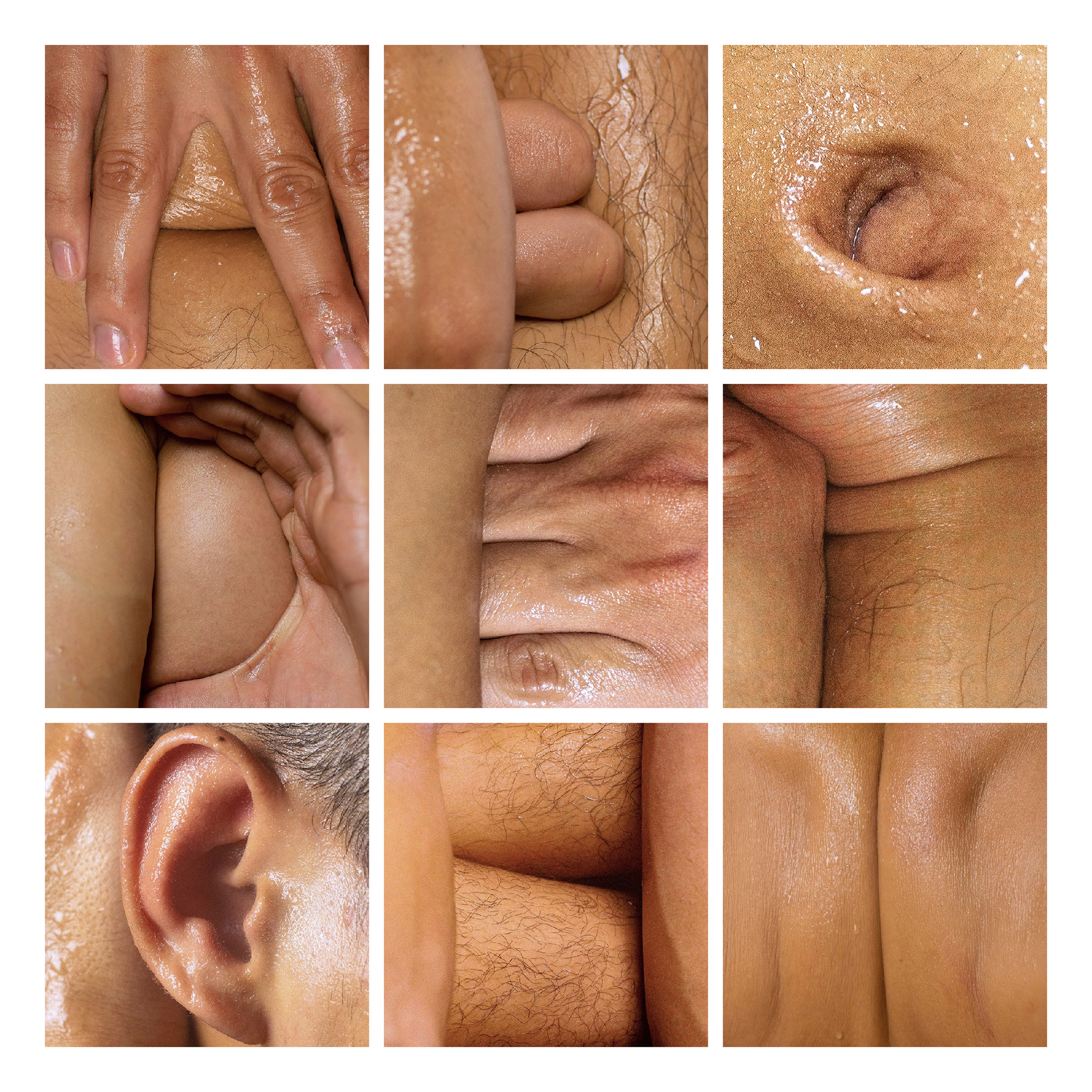
To create the typeface, Advincula sprayed his body with a mixture of olive oil and water before sitting half-naked in front of a mirror and searching for different numbers and letterforms in the folds of his skin and contortions of his body.
"I had one friend help me squeeze and stretch and hold my body still while another friend took the photos," he explained.
The oil and water mixture offered heightened highlights and textures that elevated the "sensuality and organic-ness" of the images, he said.
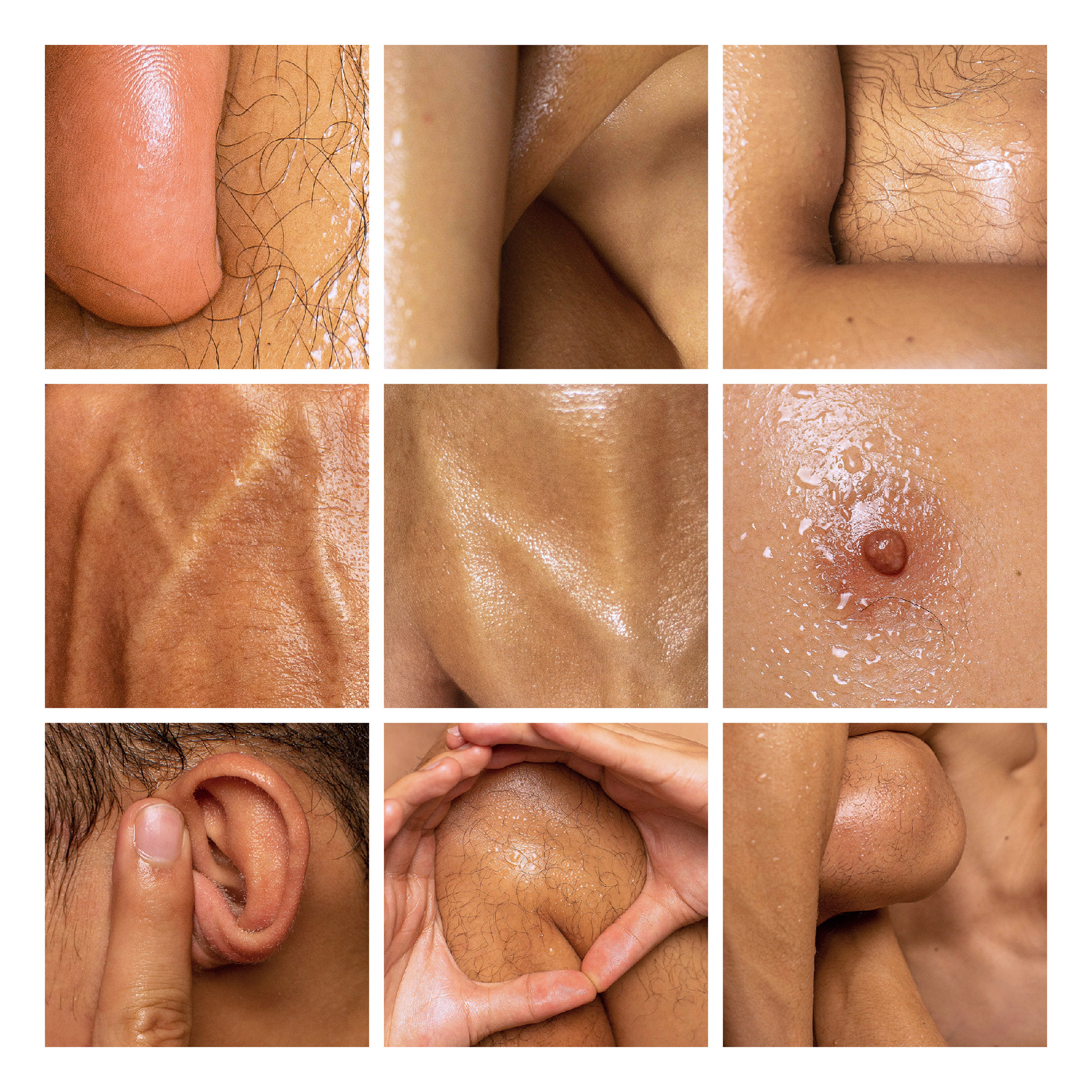
The designer explained that the project has, expectedly, received mixed reactions. "Some have said it's a brilliant idea, others can't look at it for more than two seconds, and some have called it utterly disgusting."
"I wanted it to be provocative; to confront the viewer and their opinions on skin and hair and body parts," he added. "I like to ask people if they would react differently to it if I were a woman."
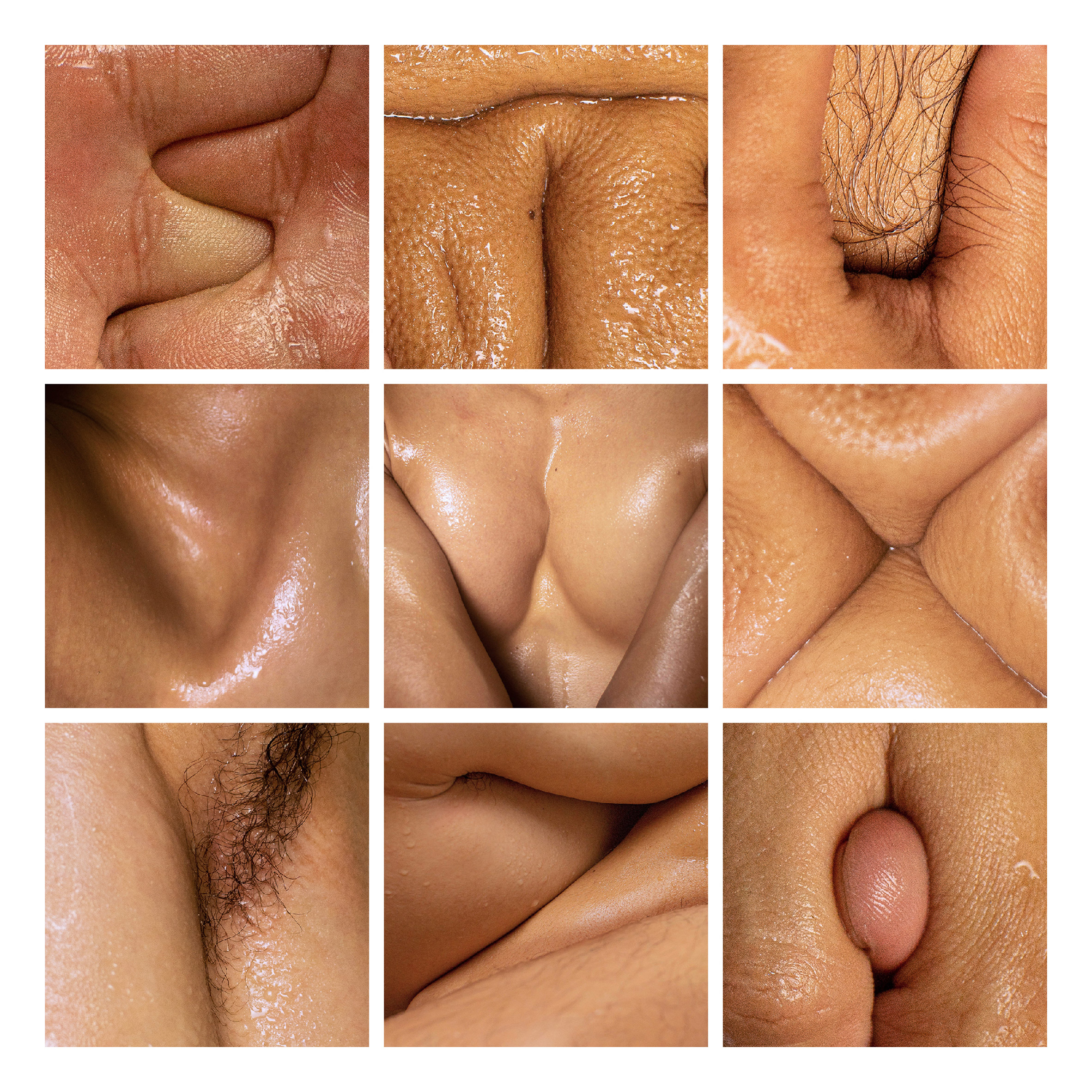
Exactly what body parts were used to make which letters or numbers remain undisclosed, as Advincula wishes to retain the mystery of the images.
"I can't reveal how the letters and numbers were formed because I think what really makes the images is the ambiguity; the responses of 'I wonder which body part this is', and the 'Wait... what?'," he added.
The letter Y is one of the designer's favourites, as it "does its job of provocation well", alongside M and N, which were "pleasant surprises" during the creation process.
This is not the first time graphic designers have looked to unusual materials to create typefaces. Swedish hardcore band Pissjar designed a typeface made from their own urine.
Jerusalem designer Ori Elisar, on the other hand, used a bacteria-based ink to grow a Hebrew alphabet in a lab.
The post Julius Raymund Advincula makes "provocative" typeface from cleverly positioned body parts appeared first on Dezeen.
from Dezeen https://ift.tt/2Wt9cS7
No comments:
Post a Comment