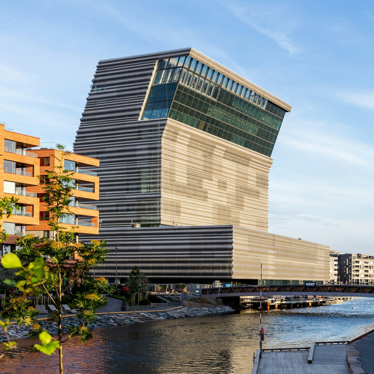
Estudio Herreros designed the new building, which is located in Oslo’s Bjørvika harbour area and designed as a replacement for the city’s Munchmuseet – which needed extra space for its collection of Munch artworks, as well as the visitors flooding in.
According to the museum, the architects were influenced by a photograph of the artist on the beach, leaning forward as he painted another semi-naked man.
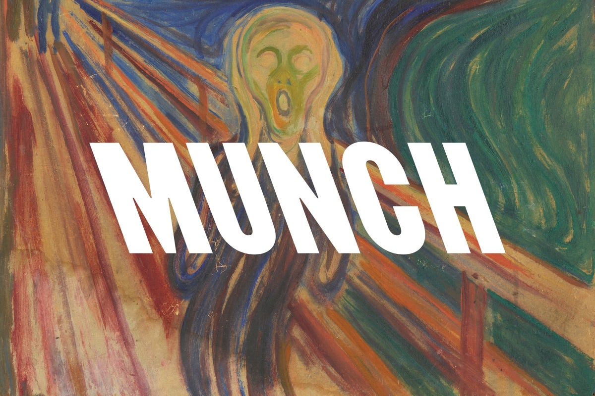
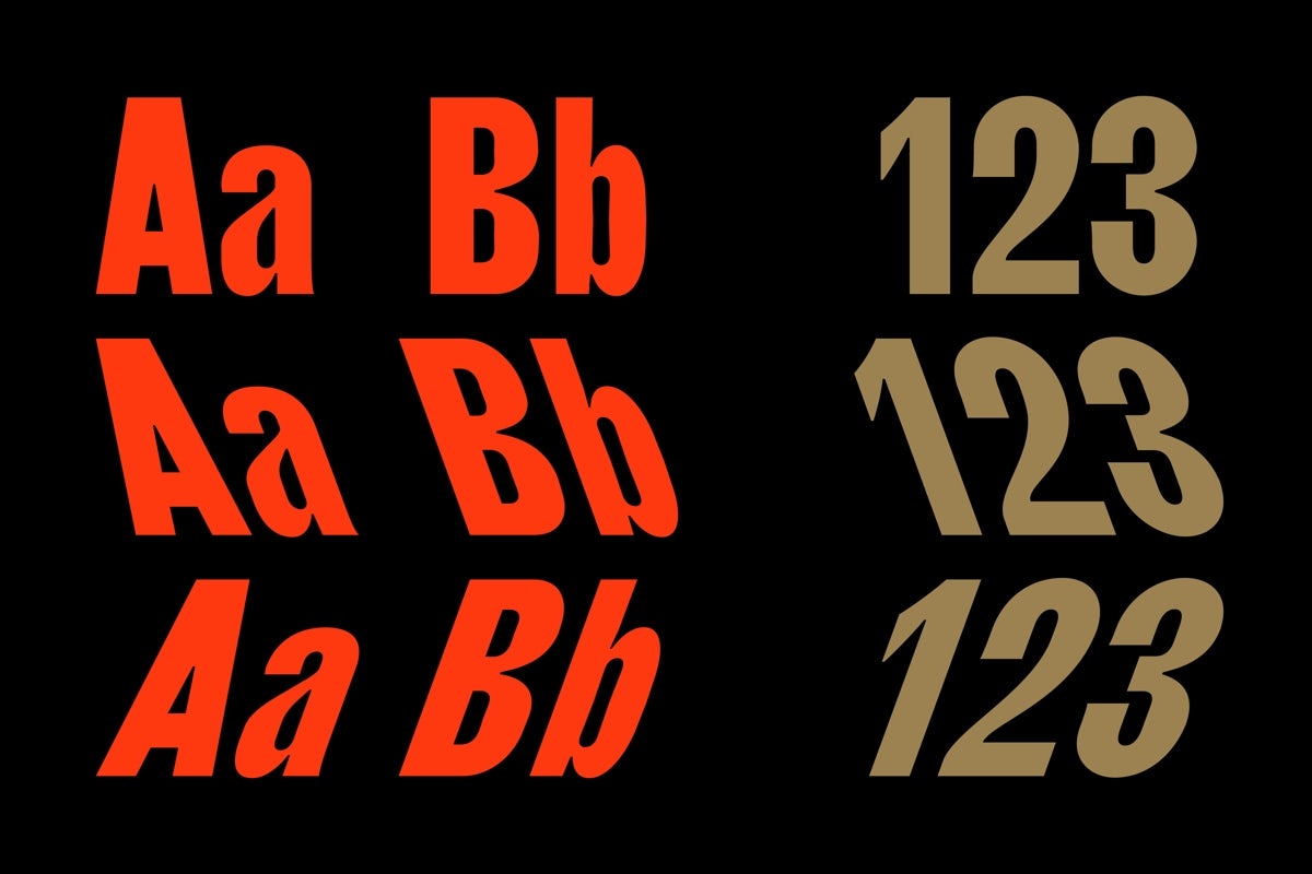
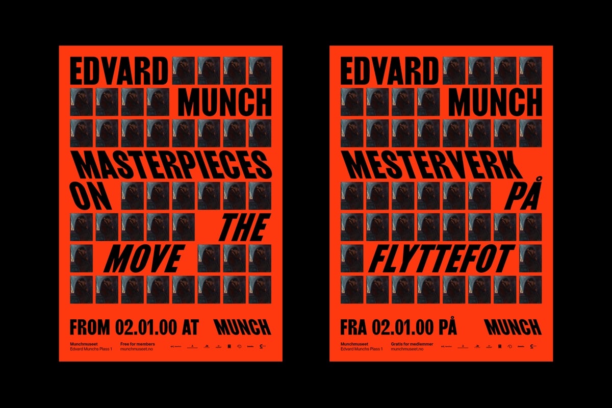
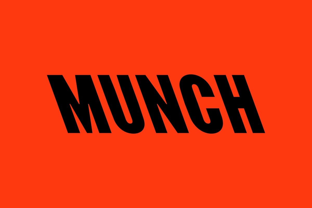
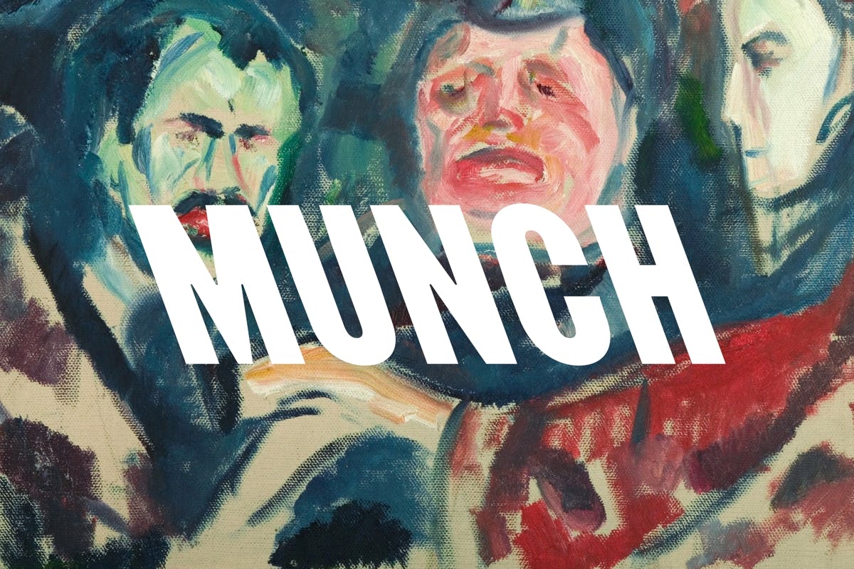
North worked together with designer Radim Peško to create a custom font for the new museum’s identity, taking the distinctive profile of the museum and referencing it in the backward slant of the letters. The studio says it’s not just about typographic expression, it’s also an effort to capture the Expressionist artist’s “unconventional spirit”.
As well as marking a fresh start for the Munch collection, North’s work hopes to appeal to a younger audience – and the identity certainly evokes a sense of energy.
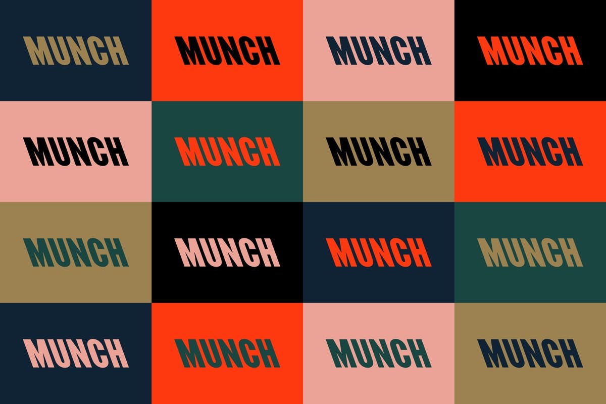
It’s supported by a colour palette derived from the artist’s work, which includes a punchy ‘Munch red’, pink, black, green, navy and gold. The identity especially comes to life in a series of animated pieces, which will appear across the museum’s 20 digital screens.




northdesign.co.uk; munchmuseet.no
The post Oslo’s Edvard Munch museum unveils its backwards-slanting identity appeared first on Creative Review.
from Creative Review https://ift.tt/3gpsKPe
No comments:
Post a Comment