Stuck inside our makeshift WFH offices and trying to escape the bleakness of daily death tolls, many of us have taken to windowside daydreaming over the last few months.
It was while daydreaming out the window and imagining what the future might hold that Pentagram’s Giorgia Lupi and Phillip Cox conceived the idea for their new lockdown project, Happy Data, which spotlights some of the more uplifting statistics linked to the pandemic.

“We’re searching far and wide for Happy Data: small but mighty numbers that, while insignificant to the more urgent statistics about the virus’ toll, help us to picture a new reality post-pandemic,” the duo tell CR. “Heartwarming, surprising, encouraging – we hope these numbers brighten people’s day and help us all cope with this unprecedented moment.”
Lupi, who joined Pentagram’s New York office as a partner in 2019, has a background in information design, but her work is a far cry from what you might first imagine that means. Speaking to CR recently about her designs, she said: “I feel that data, if it’s seen as an abstraction of reality, can reveal hidden patterns of our own human nature and society that we can then understand better, and understand through design experiences.”

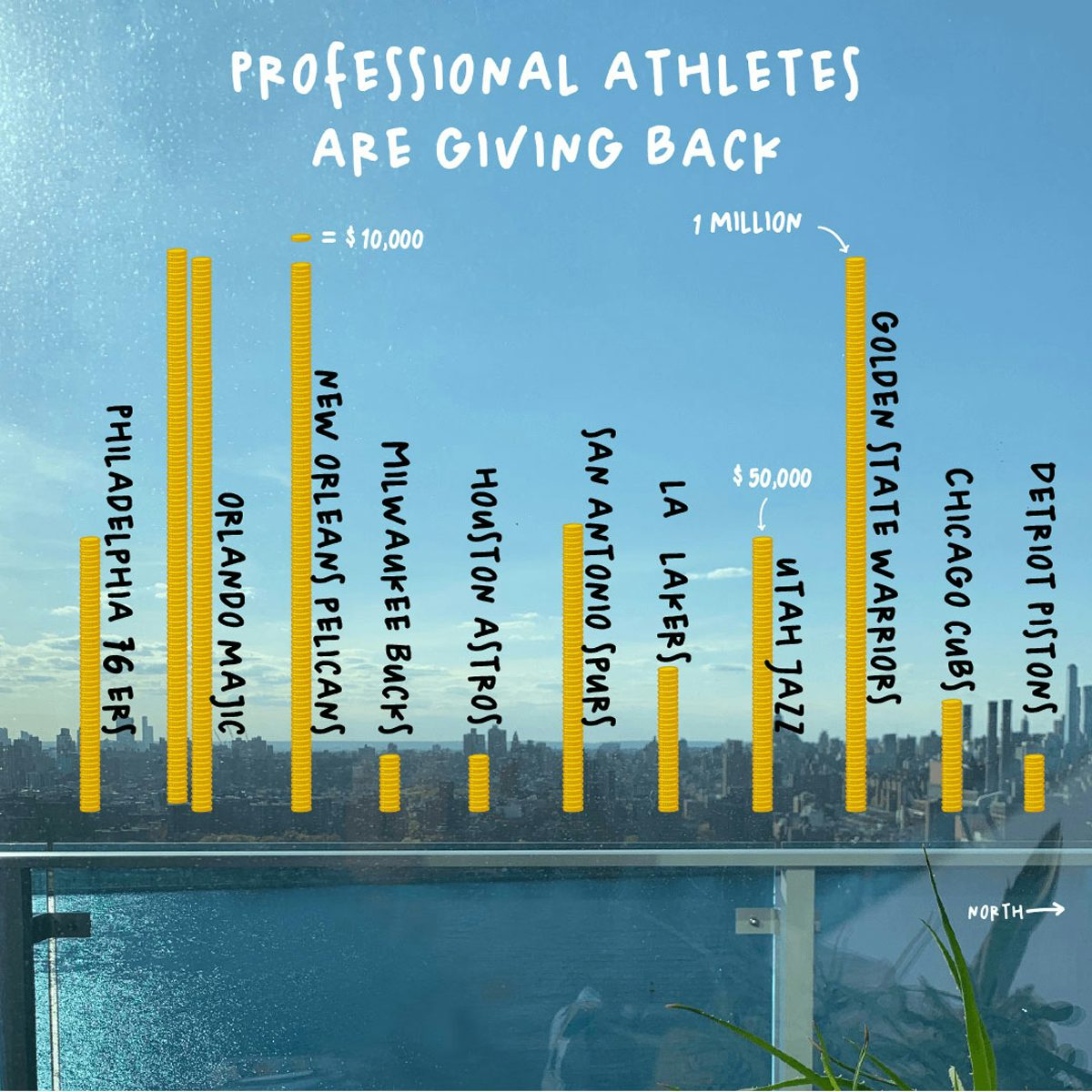
This approach is clearly present in Happy Data, which shows Lupi’s handdrawn graphs and charts overlaid onto real-life views from people’s windows. In one image, Lupi’s own view of the New York City skyline is accompanied by towering gold coin skyscrapers, which represent the donations professional athletes are making during these difficult times. In another, the blue sky over an apartment block in Milan is transformed into a graph which shows the huge decrease in air pollution since the pandemic began.
“We wanted to be as wide-ranging as possible in the types of data we visualised,” say Lupi and Cox. “The one uniting factor is that all the data is publicly available or, in a way, ‘hiding in plain sight’. While more depressing statistics about Covid-19 mortality and positive cases tend to dominate the headlines, we wanted to spotlight stories which are still happening out in the world and being reported on, even if we don’t always notice them.”

Over the coming weeks, the team behind Happy Data will be taking photo submissions for the project and experimenting with other publicly available resources such as the Google search data found on Google Trends, with a view to releasing more visualisations from around the world to help brighten up people’s days.
The practical and ethical challenges of data visualisation during coronavirus is a contentious topic at the moment, as CR explored recently when we spoke to data journalist Mona Chalabi and Information Is Beautiful founder David McCandless about what it’s been like creating infographics at the moment.

Lupi is all too aware of the delicacy of working with data during these uncertain times, and it’s something she has considered carefully with Happy Data. “As data practitioners of all kinds, we need to take into account the level of data literacy of our general public, and design specifically for audiences who are not necessarily used to looking at charts every day,” she says.
“How do we invite them in? How do we make sure they understand what’s in the data, where it comes from, how it is collected, what is left out, what is its context? How do we engage them to come back and stay informed? Then, visually, how do we make sure that what is in the numbers speaks to our human nature and to the stories and lives they represent? It’s only then that people will relate and feel moved by numbers. And at the same time, obviously maintaining rigour, accuracy and truth in the data.”

Read CR’s interview with Giorgia Lupi here; happy-data.co
The post Pentagram’s new project shows the human side of stats during coronavirus appeared first on Creative Review.
from Creative Review https://ift.tt/3cfIVLs

No comments:
Post a Comment