Founded in Livington, Scotland in 1981, shoe retailer Schuh has grown into a retail empire spanning 130 stores across the UK, Ireland and Germany, and selling brands ranging from Converse to adidas, along with its own-brand Schuh label.
In recent years, however, Schuh has struggled to stand out against other mainstream shoe retailers, with additional competition coming from newer, cooler brands aimed at the rapidly growing sneakerhead community.
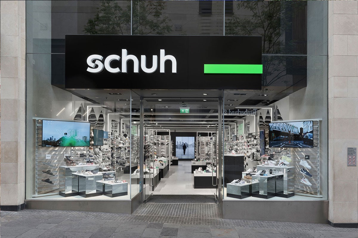
The retailer brought in Stockholm-based studio Snask to gives its visual identity a much-needed update, as well as creating a brand platform that would reflect the typical Schuh customer and what they want out of the shopping experience.
“After being in the business for so long Schuh’s customer has both aged but also changed from being the young and cool, to anyone who has one or a pair of feet,” says Snask’s founder and creative director, Fredrik Öst.
“Schuh’s customer service has won several awards, and in our research we found that what customers loved most about Schuh was the people greeting them in the store.
“There was some tension to go into other cooler stores and being afraid to talk to people on the shop floor, but at Schuh that feeling was gone, customers felt generally very welcome and it all felt down to earth.”
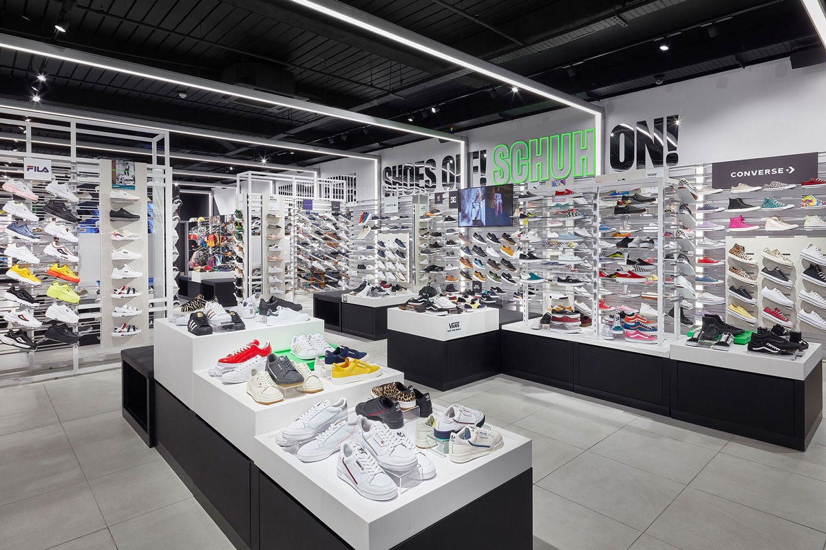
The new brand strategy and visual identity reflects the retailer’s shift of focus from just stocking cool brands to the service it provides both online and in-store, with Schuh’s staff and customers appearing at the heart of brand imagery and communications.
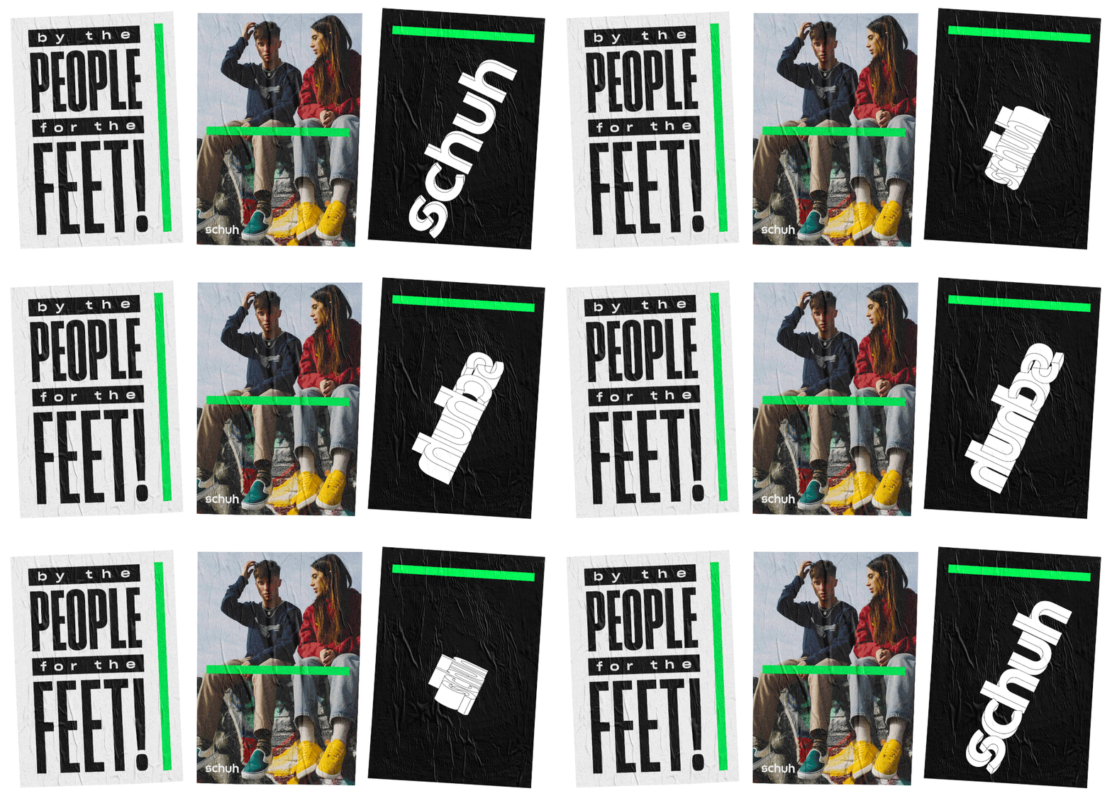
As well intensifying the existing bright green brand colour, Snask added a more versatile colour palette, an entirely new typeface, and created a more modern iteration of the Schuh logo.
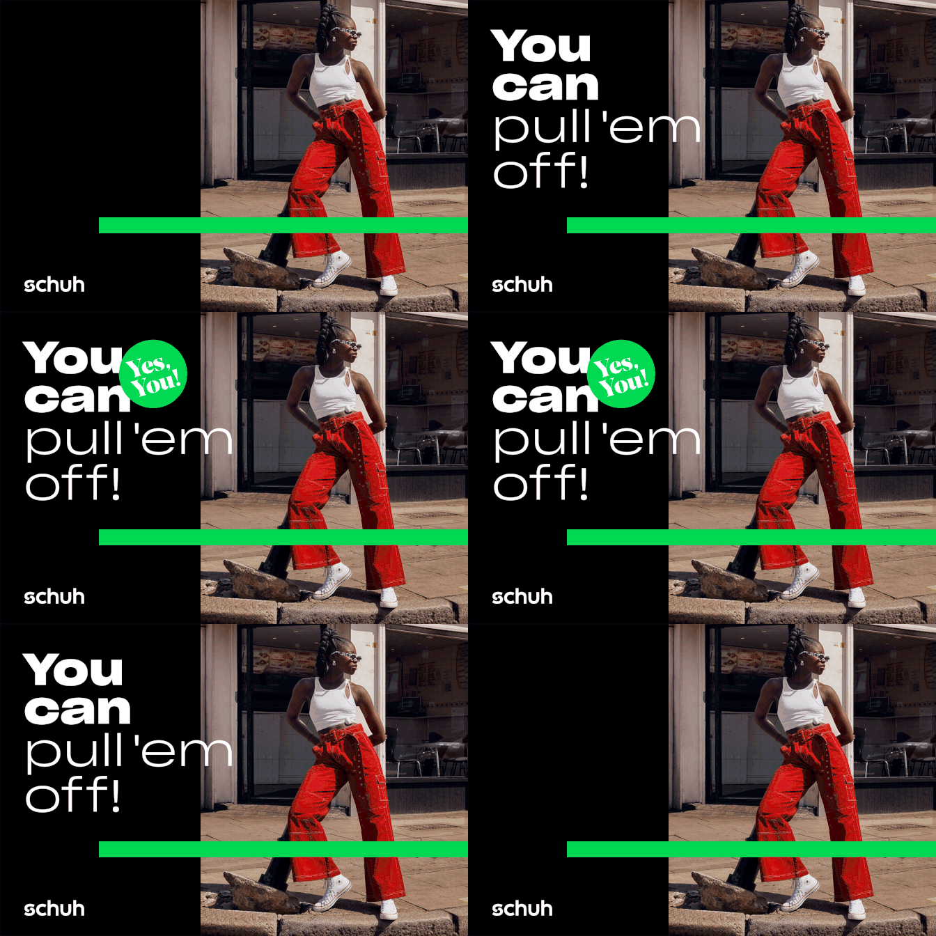
“We looked into the current identity assets and found that the logotype had been misused and mistreated for several years,” says Öst. “It went to such lengths that the original logo didn’t even exist, so we decided to refine it and make it geometrical and graphically correct. It’s not a redesign of the logo but a refinement of the existing one.”
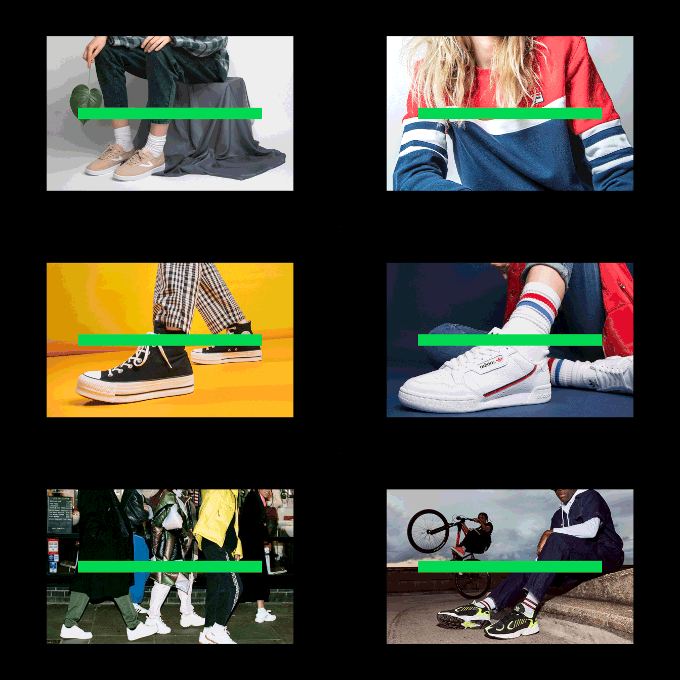
The brand’s new green stripe graphic appears both horizontally and vertically, and can be used as a device to place behind and in front of text, objects and other elements in its communications.

“We wanted to find a ‘red thread’ going through the whole identity that would put the Schuh brand feel on all assets but without necessarily having to put the logo everywhere or using the green to extremes, so we created the green strike to complement photos as well as any form of asset. It’s a brand carrier that is easily recognised yet very simple,” says Öst.
While Breve Display is used to highlight shorter words or prices, Sharp Grotesk was chosen as the main typeface. “Not only did it provide a good range from thin, light and book all the way up to medium, bold and black, it also gave quite a big difference in characteristics of the different weights. This gave the brand a cohesive yet dynamic new typeface,” Öst adds.
The post Snask gives shoe retailer Schuh a fresh new look appeared first on Creative Review.
from Creative Review https://ift.tt/2TKkeAF

No comments:
Post a Comment