With 3.5 million vegans and counting in the UK, the look and feel of brands in the plant-based space has changed dramatically over the last few years.
As more people have embraced the power of plants, branding and packaging designs have moved away from the hand-drawn fonts and earthy tones traditionally associated with health food brands, instead adopting more contemporary and colourful approaches.
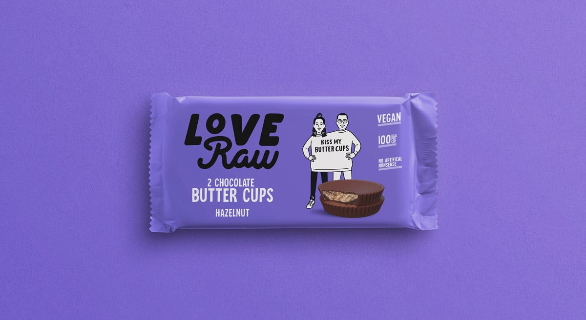
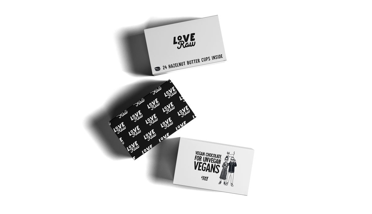
The plant-based phenomenon of recent years was a key influence in chocolate company LoveRaw’s decision to reimagine its brand strategy and visual identity.
The brand commissioned Leamington Spa-based studio Daughter to rethink its proposition based on the question: how do you rebrand a vegan chocolate bar so it appeals to non-vegans too?

Its new positioning is designed to appeal to flexitarians as much as hardcore vegans, focusing on its taste credentials as “vegan chocolate for unvegan vegans”.
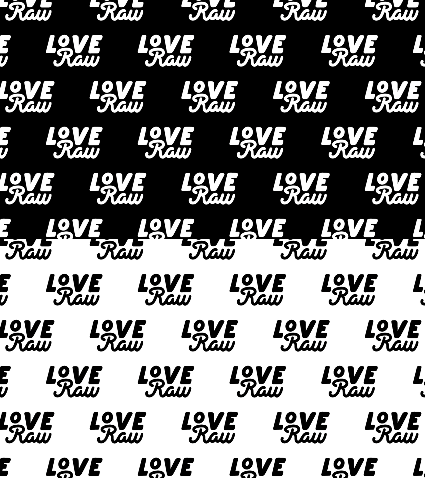
Japanese illustrator Nimura Daisuke’s monochrome illustrations are at the heart of the new identity, depicting a series of hipster-like characters accompanied by pet cacti and reusable coffee cups. Daughter also created a chunkier logo, more colourful packaging and a playful tone of voice.



It’s an approach that feels reminiscent of oatmilk brand Oatly, which has made a name for itself with its attention-grabbing packaging and poster campaigns, and will likely see LoveRaw find its place within the growing plant-based revolution.
The post Chocolate brand LoveRaw’s new identity puts a playful spin on plant-based appeared first on Creative Review.
from Creative Review https://ift.tt/2N0TdoQ

No comments:
Post a Comment