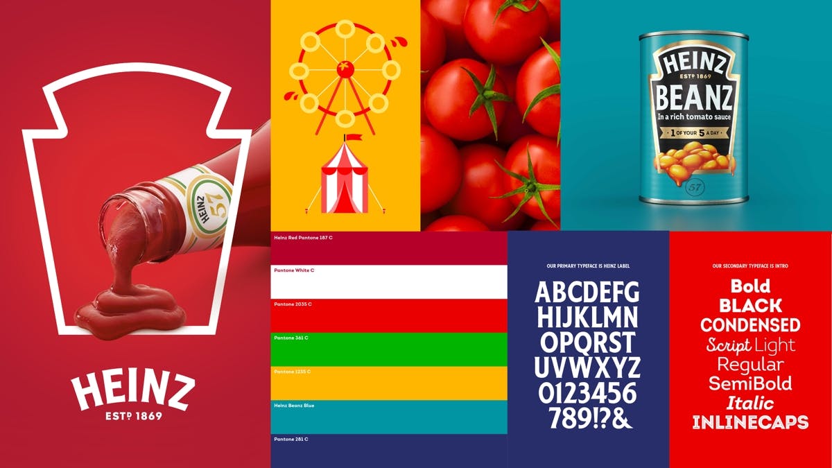
The identity covers all of Heinz’s products around the world, bringing them under the same visual umbrella. The redesign arrived on shelves earlier this year, and prominently features the brand’s ‘keystone’ symbol – so shaped for the Keystone State, Pennsylvania, where the company was founded.
JKR’s work makes good use of the mark, tapping into its familiarity, and using it as a playful framing device, with spaghetti hoops, saucy beans and plump tomatoes all interacting with it.
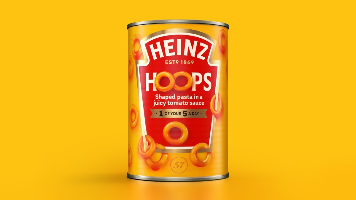
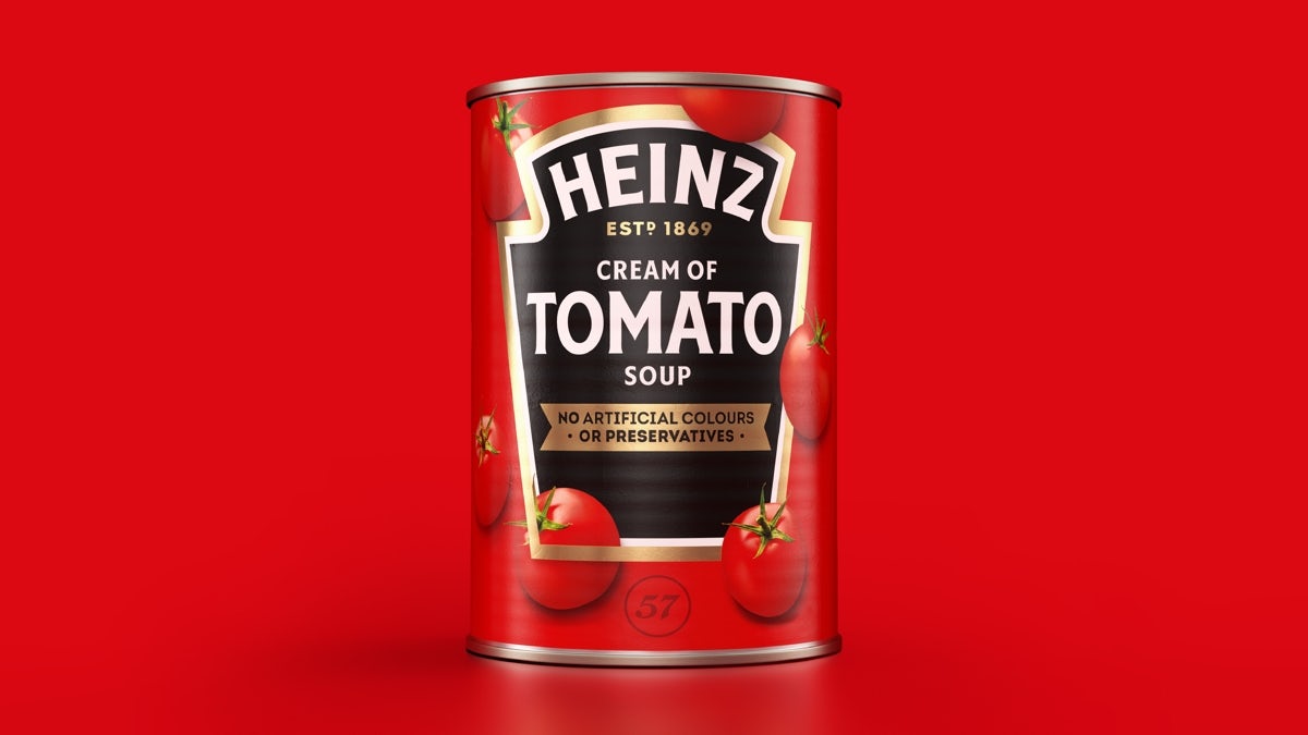

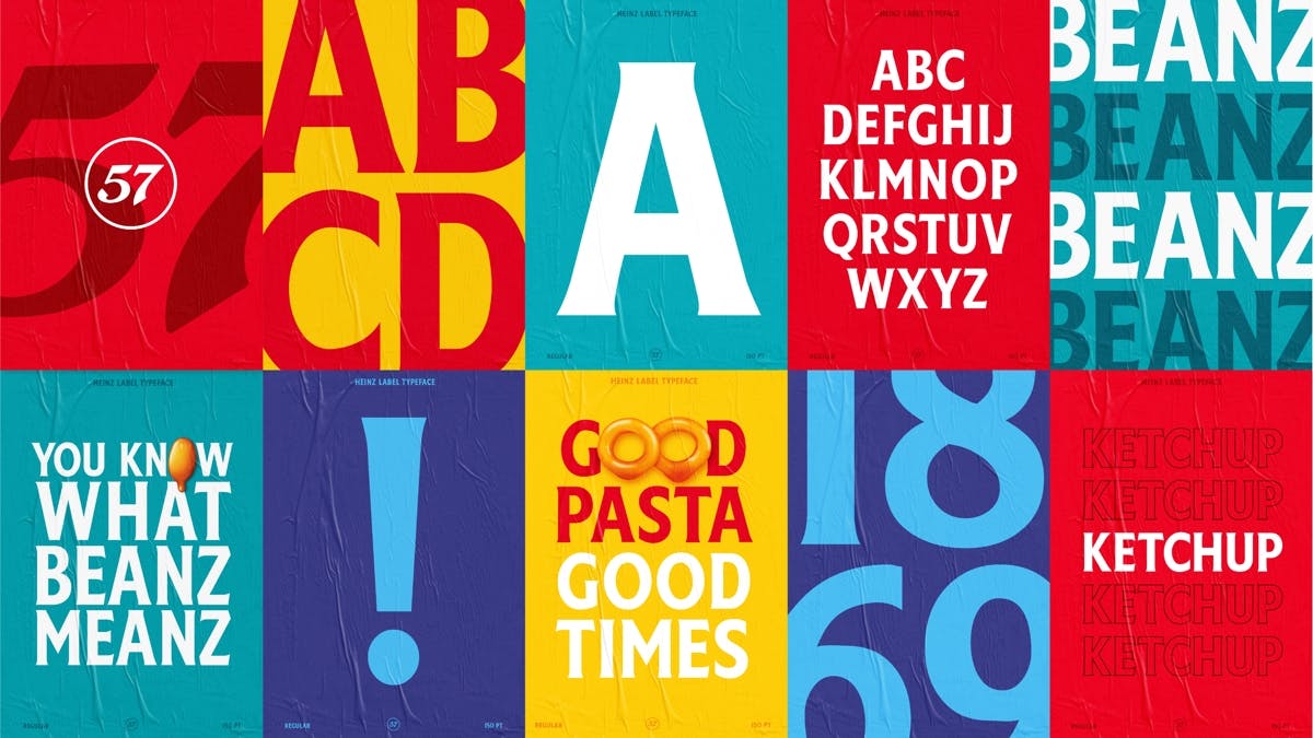
It’s accompanied by a pair of brand typefaces, Heinz Label – which has letterforms that mimic the Heinz logo – and Intro, which offers a range of styles including inline caps and script. A new colour palette includes the requisite Heinz Red, alongside green, yellow, blue and white.
The overhaul is intended to help align Heinz across all of its various markets. “We know that iconic, distinctive assets are key to enhancing the effectiveness of your brand through all channels – whether that be paid, earned or owned,” explains Victoria Sjardin, Vice President of Marketing for the International Zone at Kraft Heinz.

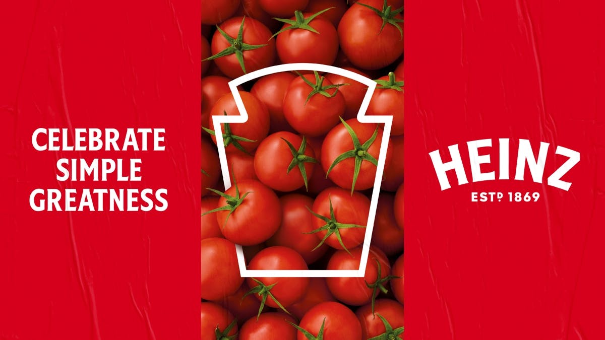
JKR Managing Director Jonny Spindler says the masterbrand celebrates Heinz’s “simple greatness”, and creates “brand unification” across the various parts of its business.
The post Heinz celebrates “simple greatness” with a new global masterbrand appeared first on Creative Review.
from Creative Review https://ift.tt/37qSaI3


No comments:
Post a Comment