Illustrator Julia Dufossé grew up in a creative household and from an early age she was making things and leafing through her parents’ collection of books about art, furniture and architecture. “When I was around seven, I became obsessed with the Pop Art movement. I was making these big abstract canvases and paintings with messages,” says Dufossé. “One of them I remember very well, mostly because I still have it and it makes me laugh up to this day, it’s just a simple red background with the word ‘art’ written in big capital letters in yellow. I crave that kind of carelessness and assurance in my work today.”
Born in France, but now based in Chicago, Dufossé stopped painting and drawing in high school, focusing more on academia, and it took a while to realise that the visual part of her life was missing. “I went to university with all the wrong ideas. Coming out of high school, and perhaps owing to what I absorbed from school, I was convinced that only a career in medicine or engineering would fulfil me,” she explains.
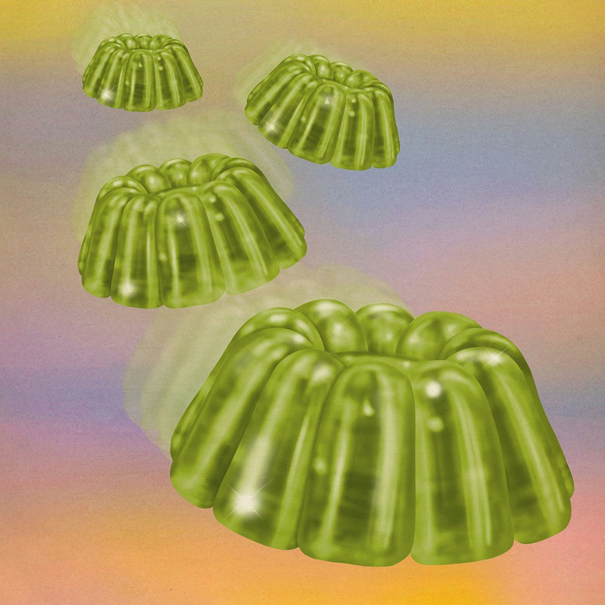
After deciding medicine wasn’t for her, she made a shift towards reading, writing and history at university, and even applied to a doctorate programme with the idea of becoming a historian or professor, but something was still missing. “When I quit my doctorate, I hadn’t picked up a pencil in years (to draw that is), I had no idea what an illustrator did, no idea how to use Photoshop or Illustrator, no idea what my style was,” remembers Dufossé. “I had to figure all of that out on my own after my formal education. My wife, Kate Dehler, who’s one of the most talented illustrators I know, really encouraged me and helped me to develop my voice.”
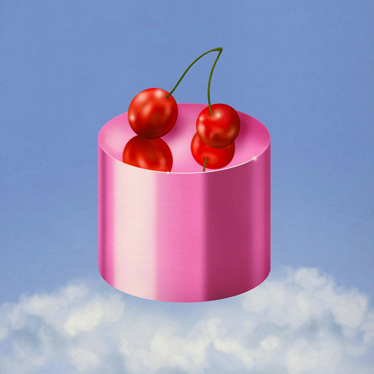
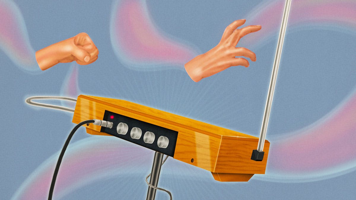
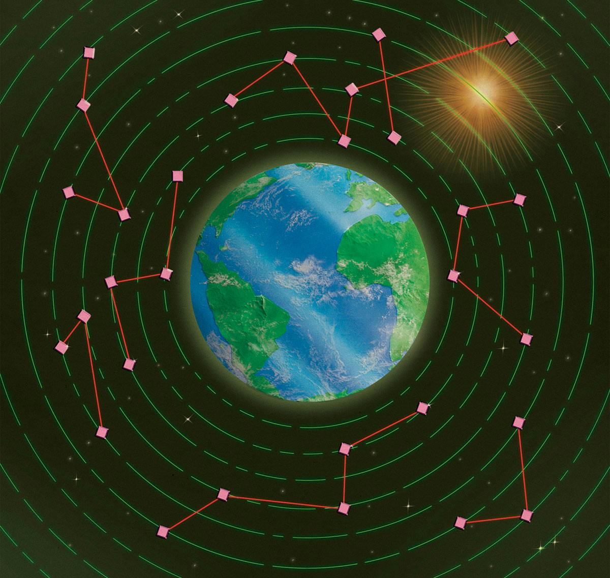
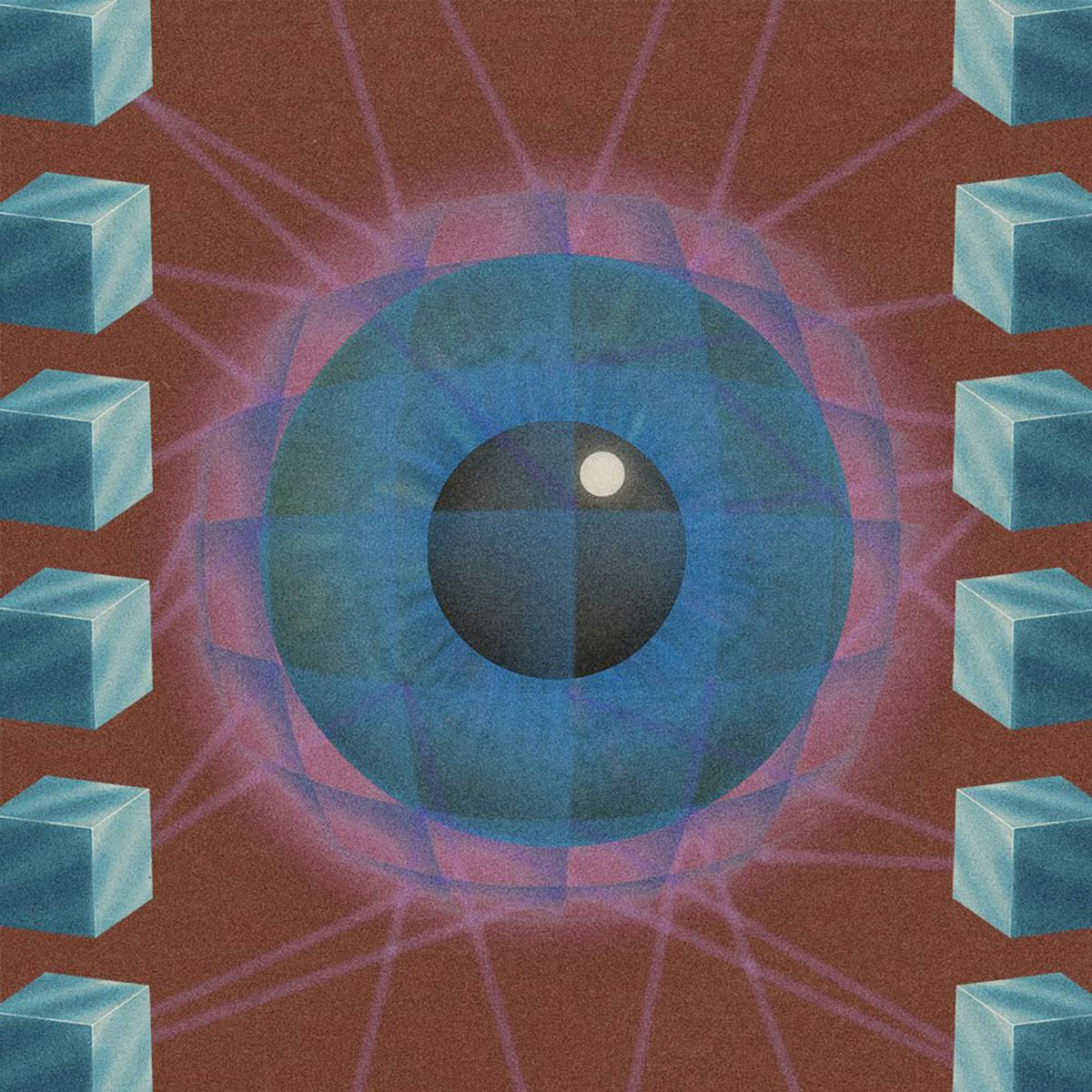
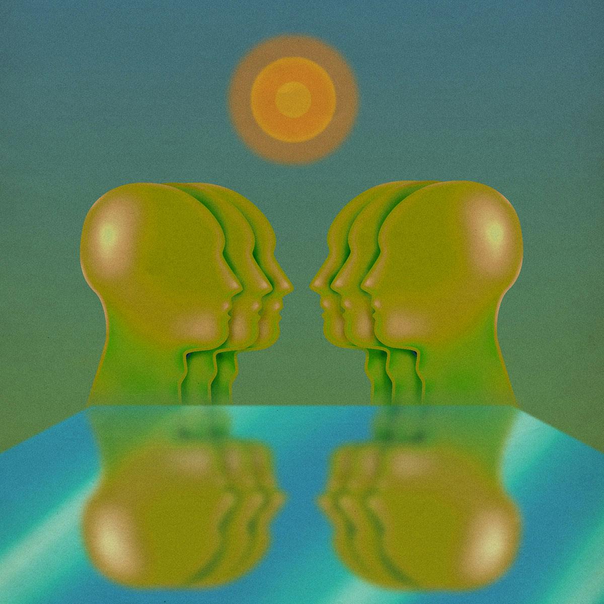
For the last few years, Dufossé has been working on building a portfolio full of warm, nostalgic and surreal illustrations. Though she works digitally, she takes inspiration from airbrush artists of the 70s and 80s. “I think airbrush art can be so exhilarating and fresh. It has this amazing quality of seeming almost a little too real or too shiny,” says Dufossé. “Everything seems to look like a sublimated version of reality. I hope my work can someday provide this surreal mood.”
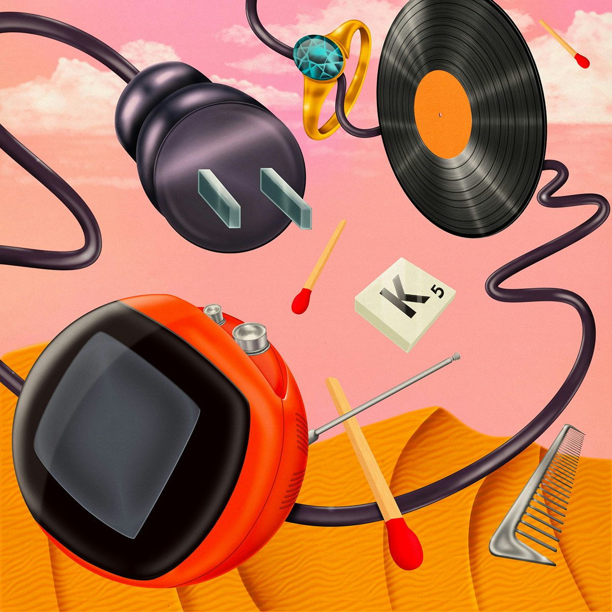

Right now, Dufossé is flexing her creative muscles in the world of editorial illustration and her client list includes MIT Technology Review, Bandcamp and Medium among others. “I love the intellectual challenge of coming up with new concepts and ideas quickly,” says the illustrator.
When starting a new piece, Dufossé throws herself into the reference material, often going beyond just the article she’s been given and doing additional research to make sure she understands the history and basics of a topic. “I tend to come up with ideas in writing, and then start thinking about how to visually represent them,” she explains. “I’m pretty ruthless with the ideas I do choose to explore further. I eliminate a lot of concepts until I have two or three that really excite me. After that I usually do sketches and then take the piece to the final stage.”

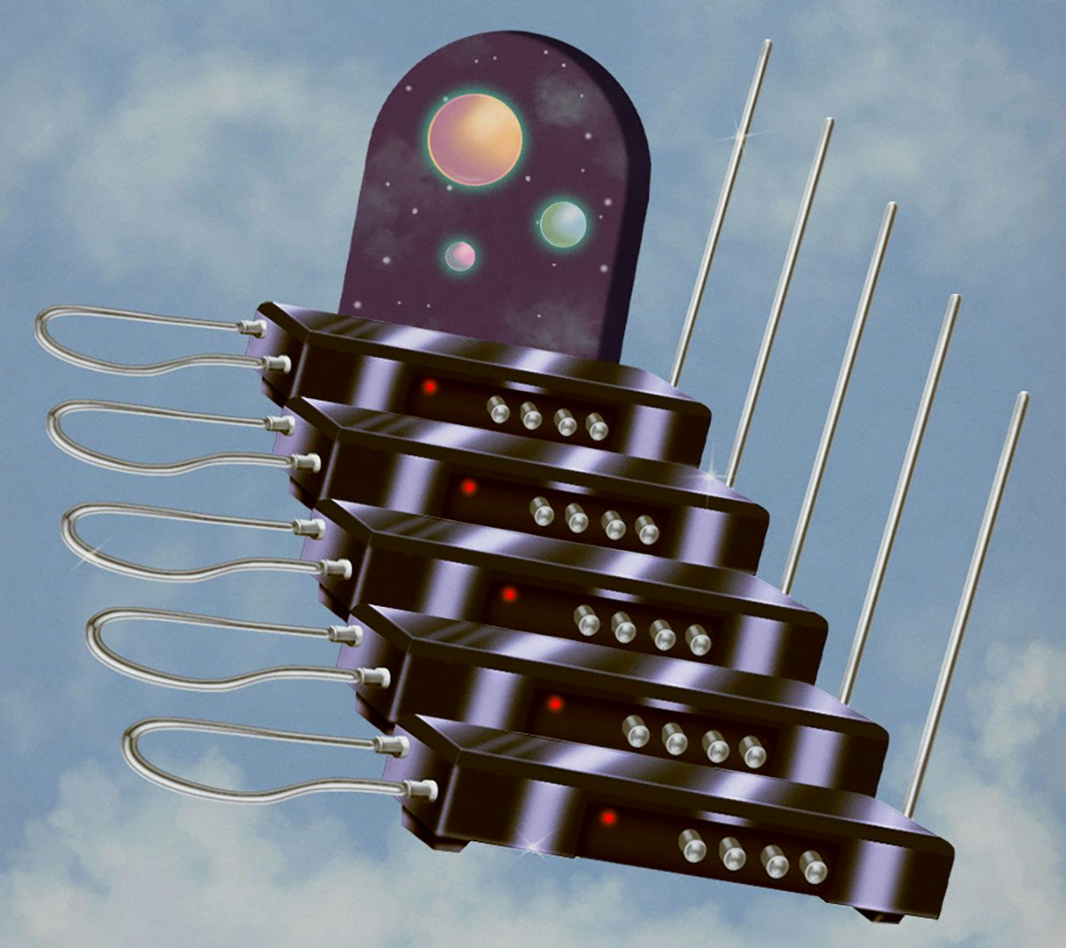
For these early sketches, Dufossé tends to work on her iPad Pro using Procreate as it allows her more room to experiment with composition. “I can try out different ideas without being too precious and it saves me a lot of time,” she says. After this stage, Dufossé takes her sketches into Photoshop where she does the majority of her work.
“My techniques mimic the traditional method of airbrushing where you mask out shapes and airbrush inside the masks, piece by piece,” she explains. “Of course, using digital tools saves me a lot of time and pain especially compared to traditional airbrushers. It’s a much more forgiving process. Depending on how detailed the piece is, it can get tedious and repetitive, but I really enjoy working on really small details.”
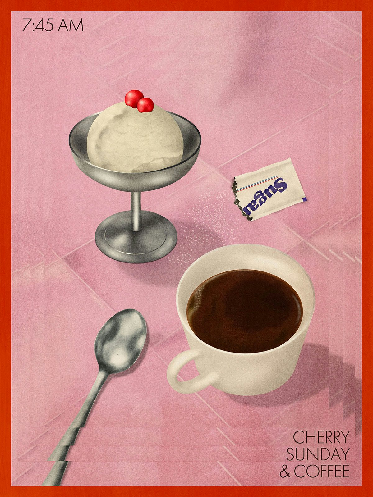
It’s this extra attention to detail that gives Dufossé’s illustrations such wonderful textures and an air of advertising posters from a bygone era. Her focus on honing process came from the advice of fellow illustrator Thibaud Herem, who was interviewed by Dufossé on the podcast she runs with Dehler.
“Thibaud really convinced me to focus on my craft and to really respect the process of image making. It’s hard to take a hard look at your practice and to seek to improve even the smallest technical details, to take every decision seriously,” explains Dufossé. “It demands you to be much more intentional and considered about your creative decisions. I don’t know that I’ve succeeded in attaining the level of craft that Thibaud displays in his work, but this idea has stuck with me. It has helped me make tremendous strides in my work and I try to recall it as often as possible.”
“More generally though, I think the best piece of advice I’ve ever gotten is to just put yourself out there and trust in yourself,” she says. “That’s the piece of advice I’d like every creative person to internalise.”



The post Julia Dufossé’s editorial illustrations inspired by retro airbrush techniques appeared first on Creative Review.
from Creative Review https://ift.tt/2CjS8Gw
No comments:
Post a Comment