Harry Pearce and his team at Pentagram have created a new visual identity for the London department store, including a new logotype that claims to be the “most authentic in Liberty’s history”.
The new logo puts the name of the store front and centre, dropping the reference to its London home and instead moving it to additional brand assets alongside a redesigned crest. The iconic deep purple hue remains intact across the packaging design, while the gold seen across the lettering has been “refined”.
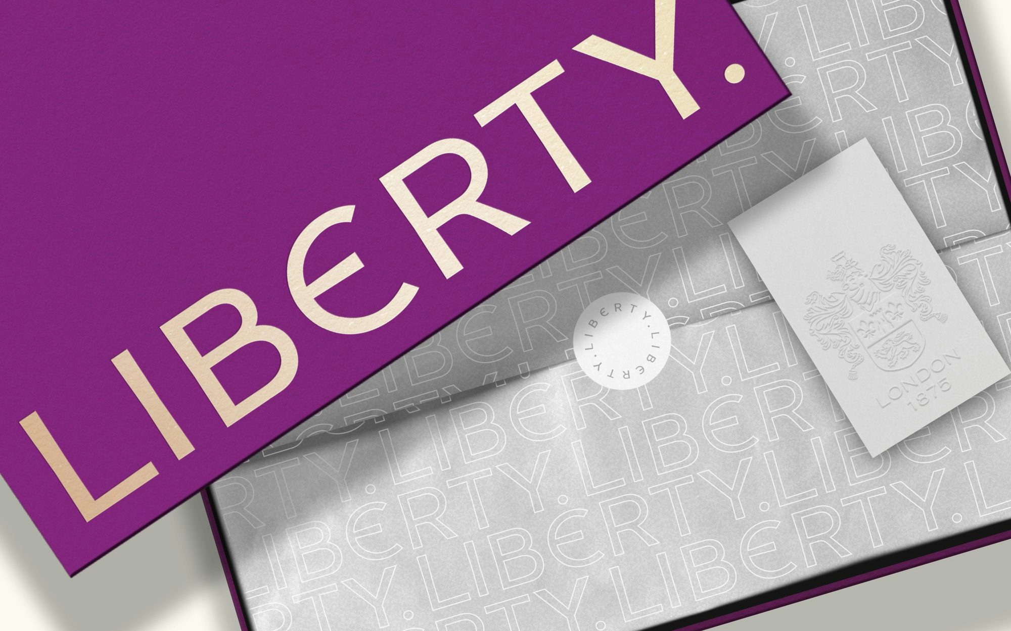
The new branding draws upon Liberty’s lengthy history, in particular the original sign used at its Great Malborough Street location, though the historic link may appear subtle to casual onlookers thanks to the identity’s decidedly sleeker look.
The connection to the past is established in smaller details like the full-stop, which has been reinstated on the wordmark as per the original sign. Meanwhile, the angular serifs have been dropped from the logotype in favour of a new sans-serif typeface similarly rooted in the original design.
“The process of rebranding Liberty has been one of craft, archaeology and refinement,” says Pearce. “The logotype itself hails from the lettering in the original sign above the Great Marlborough Street front door, carefully redrawn to make it the most authentic logotype in Liberty’s history.”

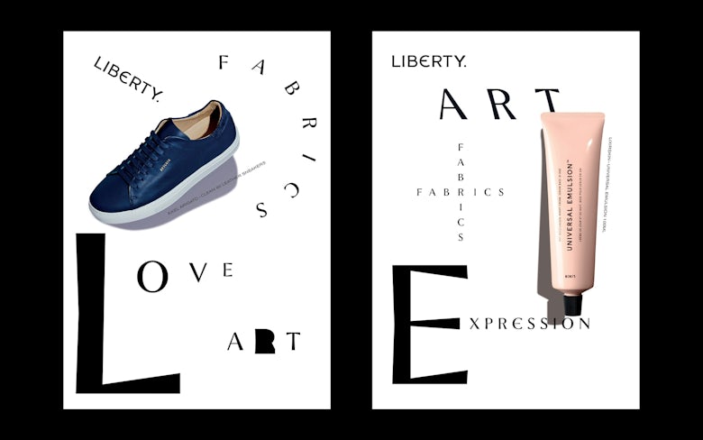
While the new logotype has a stripped-back look, presumably designed with digital in mind, Liberty’s character comes through in the slightly quirkier primary typeface, Lasenby Sans (named after founder Arthur Lasenby Liberty), complete with an E in the style of an epsilon.
The visual identity is littered with nods to the store’s heritage. Yet some Liberty disciples have already expressed on social media that they consider the previous logo to be historic in itself: an illustration of the challenges faced when bringing contemporary design to a beloved, classic brand.


The post Liberty’s new visual identity pays homage to its heritage appeared first on Creative Review.
from Creative Review https://ift.tt/2Ba3R9Z


No comments:
Post a Comment