Museum of Happiness is a social enterprise with a mission to help people understand the science behind happiness. Based on the concept that happiness is a skill which requires learning and practice, the London-based not-for-profit runs events and training courses which combine fun activities with practical advice for people looking to improve their sense of wellbeing.
The organisation was founded in 2016 by Shamash Alidina, a mindfulness teacher, and Vicky Johnson, a youth mentor, after the pair met at a charity event. Their initial idea was to create a physical museum exploring mindfulness, happiness and positive psychology – “but then we found out how much it costs to open a museum … and we decided to start with putting on events instead,” says Alidina.
After running small-scale events around London, the pair decided to host a winter happiness festival to coincide with Blue Monday (believed to be the unhappiest day of the year) in January 2016. With a giant adult ball pit, mindful art classes and a programme of uplifting talks and workshops, it provided some much-needed respite from the doom and gloom of January, and proved a massive hit with Londoners. The event listing went viral, with over 10,000 people singing up to attend, and the festival was featured on Sky and BBC News.
Since then, Museum of Happiness has run events ranging from laughter yoga to mindfulness sessions and group activities where participants perform acts of kindness – such as making care packages for London’s homeless. It spent a year working in a dedicated space at the UK’s largest homeless hostel, and another year running events at the Canvas Cafe in Shoreditch. It has also organised free workshops and experiential pop-ups for school children and older people at risk of depression and isolation, and regularly runs paid-for events for corporate clients to help fund its work in local communities.
Alongside these public events, Museum of Happiness delivers in-person and online training courses for people who want to help spread happiness within their own communities. Its happiness facilitator course is aimed at teachers, educators and community leaders, and covers topics from gratitude and kindness to mindfulness, self-compassion and finding meaning. As with all of the Museum’s programmes, it draws on scientific research, and aims to equip participants with tools and techniques that can be learned and passed on, while also providing general advice on training and coaching.
For our On Brief project, we commissioned director, animator and illustrator Hannah Jacobs to create a set of animations promoting the online course. In collaboration with CR, Facebook and the Museum of Happiness developed a brief and messaging for the campaign, which highlighted its focus on science-based techniques, and a call-to-action inviting people to sign up to the course. Jacobs then developed a series of animations to bring this messaging to life, using abstract shapes and playful characters to draw people in and capture the idea of nurturing and spreading happiness.
Jacobs was particularly keen to ensure that her animations would have a broad appeal – “Happiness is such a personal and abstract emotion, and I wanted to make sure that the whole thing felt inclusive, and didn’t feel like it was aimed at a specific demographic or a certain type of person. I wanted to ensure it felt accessible for everyone, which is kind of the whole ethos of the Museum of Happiness,” she says.
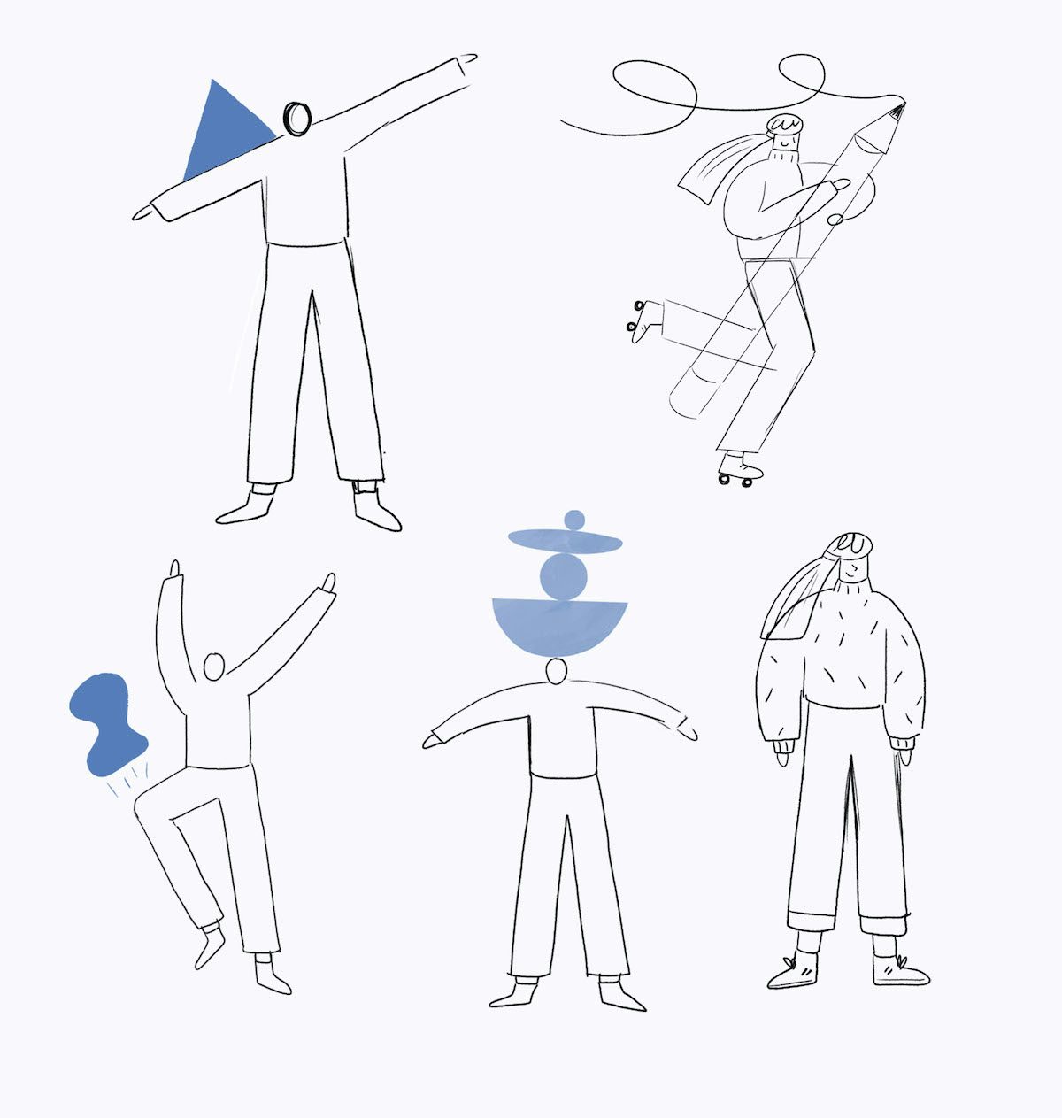
Inspired by the idea that happiness is something to be practiced and worked at over time, Jacobs decided to represent the subject through a series of shapes that morph and change. “I felt that was a good way of representing it something that is abstract and evolving and can take on many shapes for each person, so that was the core idea running through each of the animations, and from there I was thinking about different creative ways of expressing that with different characters. I knew I wanted to have characters in it to make it feel a bit more relatable, so I started scribbling loads of ideas for how the shape could interact with people and how I could have different themes for each one.”
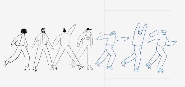
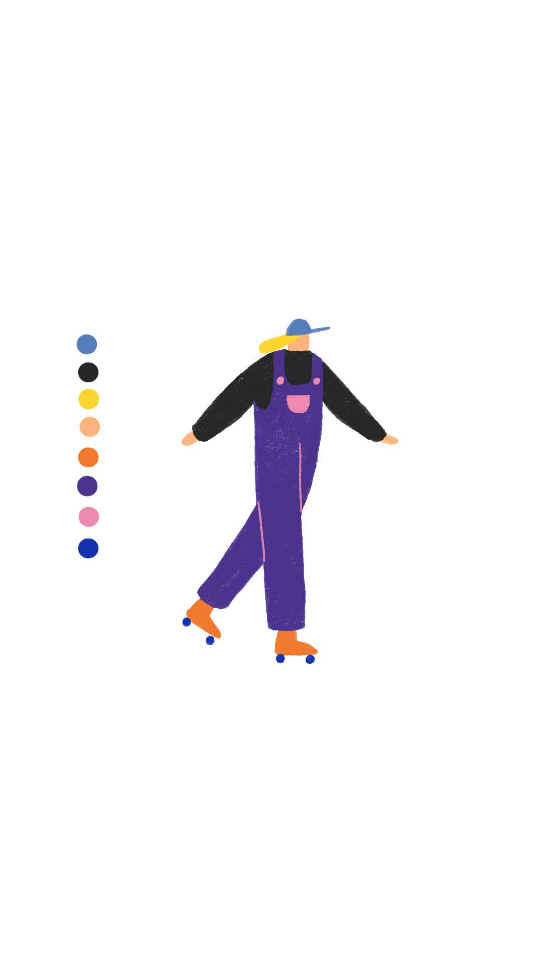
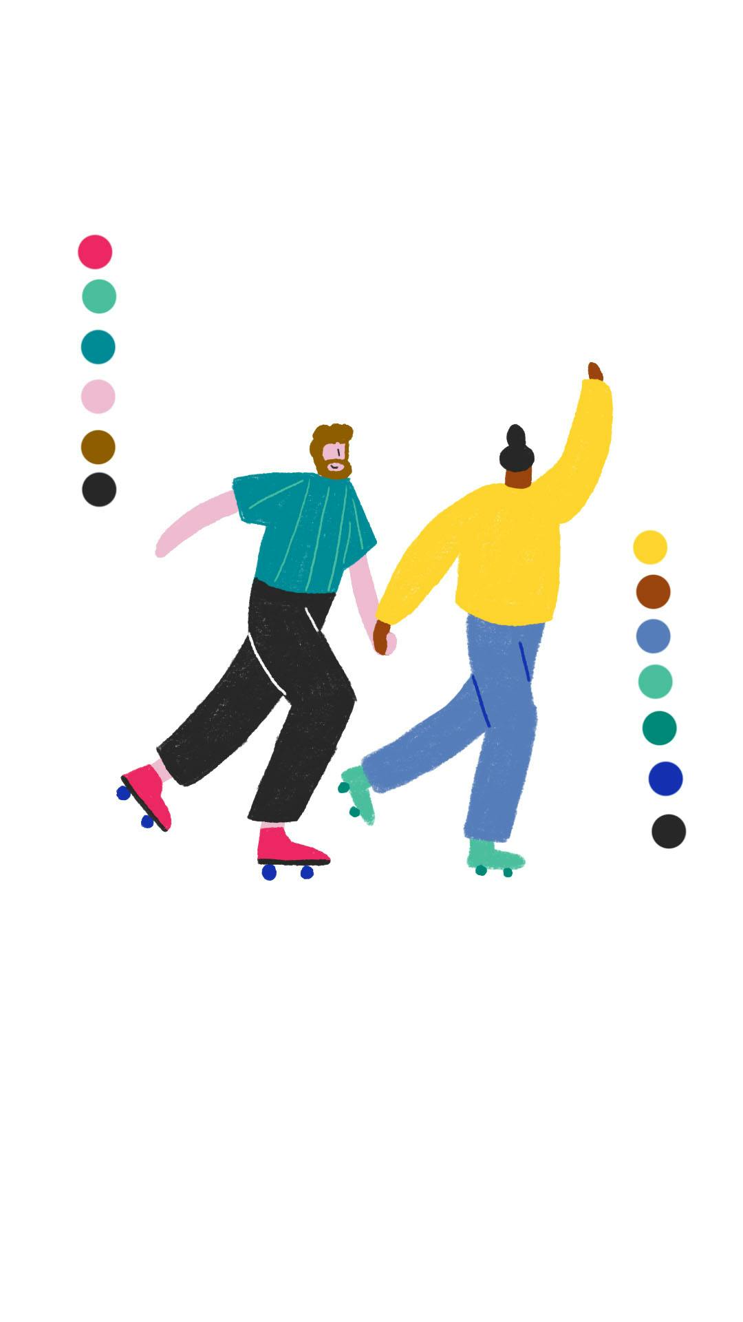
The process began with Jacobs sketching out ideas before creating a set of style frames to share with Facebook and the Museum of Happiness. These style frames provided an overview of the visual direction and the colour palette for animations, which was drawn from the Museum of Happiness’ core brand colours. “I brought in different tones around those core colours to create a nice palette, and that’s when I started figuring out the design and the characters. From there, I built the storyboard, so again I went back to paper and started sketching out thumbnails, then I took it back to Photoshop, drew them up neatly and created an animatic, which is basically the whole storyboard timed out on a timeline so I can figure out pacings and how everything is going to flow from one shot to the next,” she adds.
Once the animations were mapped out, Jacobs worked with animator Harriet Gillian to bring designs to life, before colouring each frame in Photoshop using a range of different brushes. Natasha Pollock, Bianaca Beneduci and Hayley Warnham provided colouring support, and animations were composited by Zach Ellams, with music provided by Kerry Leatham.
While Jacobs has worked on a wide range of commissions, this is the first time she has created animations specifically for Facebook and Instagram. The project required her to think carefully about timings, and how to balance creative storytelling with the need to instantly capture people’s attention and communicate a clear message in just a few seconds.
“I guess it’s taught me to be a bit more economical, and I’ve learned you can get across a lot in a small amount of time. You don’t need to have these big epic scenes to communicate with people – it’s actually quite a good lesson in stripping things back,” she adds.
Visually representing a subject as loaded as happiness is a challenging brief. But Jacobs has succeeded in creating animations that are fun, appealing and informative. Her 2D, frame by frame approach gives the creative a distinctive handmade feel – helping it stand out among the wealth of content that people are presented with on their Feeds.


As Alidina points out, happiness isn’t just about feeling cheerful. It’s also about learning to accept and deal with the whole range of emotions we experience, which is why Museum of Happiness aims to combine playful exercises with more serious self-reflection in its programmes.
“There’s two elements to happiness – one is a sense of pleasure, and the other is a sense of purpose. So the pleasure element is to do with fun and joy and laughter, and the other element is doing things like mindfulness activities and things which are more reflective,” explains Alidina. “Although there’s this fun and light-hearted element to the events we do, there’s also this deeper aspect, which is all about cultivating happiness from the inside, and cultivating the right attitude and mindset so we can be open and present and not just think about ourselves,” he adds.
This balance is reflected in Jacobs’ animations, with a rainbow of colours reflecting the full spectrum of human emotions. “We wanted it to be embody not just the fun side of our business, but the sense of it being something deeper,” adds Alidina. “The animations have that wide range, but at the same it’s got this joyful energy about it too.”
Kat Hahn, Northern Europe Lead at Facebook Creative Shop, worked closely with Jacobs and Museum of Happiness to provide advice on Facebook best practice – helping to ensure that ads would capture people’s attention. As Hahn explains, it was important to consider the context in which animations will be viewed – and how audiences tend to consume content on Facebook and Instagram – to give the campaign the best chance of success.
One interesting aspect of mobile behaviour is the speed at which people scroll. It’s insanely fast … so you have to put your best foot forward and show your brand and an enticing visual from the get go
“At Facebook’s Creative Shop we look at people’s behaviour first and that informs everything we do. One interesting aspect of mobile behaviour is the speed at which people scroll. It’s insanely fast [1.7 seconds, on average] … so you have to put your best foot forward and show your brand and an enticing visual from the get go,” she explains.
“For all creative assets going on to our platform we have some really great best practices: Keep it single-minded, put the brand first, keep it under ten seconds, and make it work in a sound-off environment. But most importantly, it’s all about having thumb-stopping visuals, which Hannah’s illustration style delivers in heaps,” adds Hahn.
Hahn also recommends previewing mobile creative on a mobile. While this might sound like common sense, it’s something that is often overlooked during the creative process – and it can make a huge difference to the success of a campaign. “You can upload your animatic or rough animation to Creative Hub and really easily create a mock-up of your ad,” she says. “Reviewing work on a big screen (as most of us do) can be very misleading. This way you can see if your ad is working on a smaller screen. Can you still read the copy? Is it as impactful as you want it to be?” adds Hahn.
For the Museum of Happiness, the project has presented a chance to experiment with original animation – a new format for the team. Alidina hopes the resulting campaign will help raise awareness of the Museum’s wider work, as well as encouraging people to sign up to its online course.

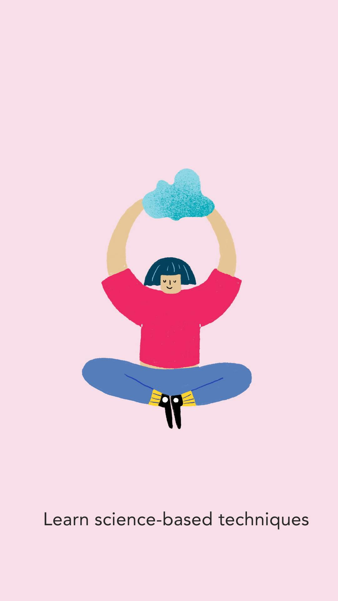

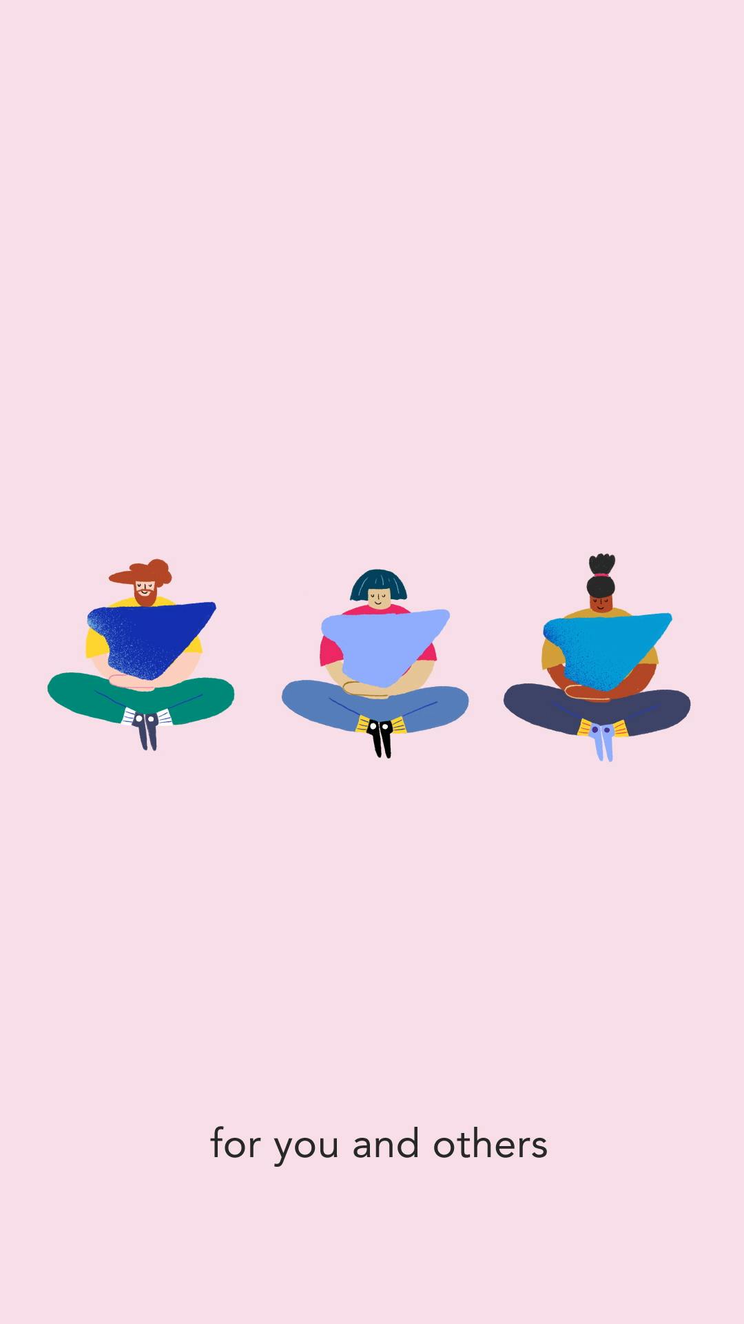
“This is the first time we’ve ever used custom animation. We’ve used photographs and videos from our events before, and we have custom branding … but in terms of creating ads, we tend to do it very quickly [in-house].”
“Because we’re a tiny organisation – less than a handful of staff – we don’t have huge budgets. So we also wanted to create something that could be repurposed in different ways. Assuming that it’s popular and it encourages people to engage with our programmes, then we’d love to use more animation. We’re hoping to stay in touch with Hannah, and we’d love to work with her again in the future.”
On Brief is part of Inspire, a partnership between Creative Review, Facebook and Instagram to showcase outstanding creative work on both platforms. Creatives are paid for their involvement in On Brief. For more content from Inspire, see creativereview.co.uk/inspire
museumofhappiness.org; hellohannahjacobs.com
The post On Brief: Museum of Happiness x Hannah Jacobs appeared first on Creative Review.
from Creative Review https://ift.tt/2XuF2hy

No comments:
Post a Comment