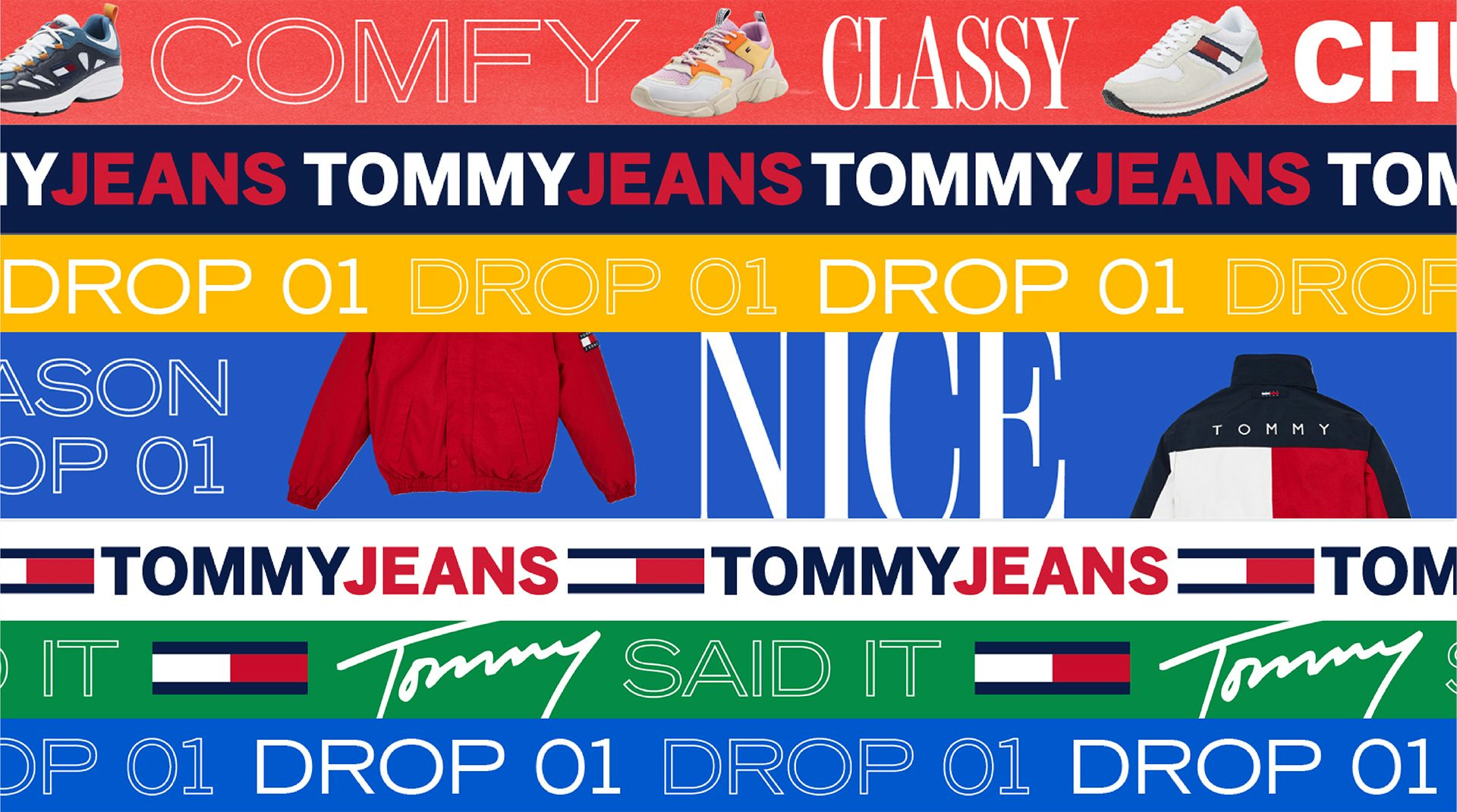
Tommy Jeans has been given a branding update by Design Studio that seeks to bring it into the modern marketplace. The new design toolkit is filled with elements that make a clear beeline for younger consumers, from the creation of dynamic, social media-friendly assets to a revised tone of voice that matches its peers in the Gen Z space.
At the core of the redesign was the ambition to capture “a fresh approach to ‘Americana’”. As part of this, Design Studio helped to develop a new take on art direction and photography, plus an updated colour scheme that expands its core tricolour palette to include wider flashes of colour.
“We’ve left high-school football fields behind, in favour of interesting urban locations around the world,” say Design Studio. “We also introduced motion, taking Tommy Jeans into the digital world for good.”
The new typographic style feels suitably irreverent for the collaged digital world of today, combining a chunky sans-serif, scrawled Tommy signatures and an elongated serif (that perhaps looks suspiciously similar to Gap’s wordmark).

The new Tommy Jeans look could easily be shrugged off as the latest brand attempting to tune into the Gen Z visual language. However, many of the elements are thoughtful, well-executed references to the brand’s own heritage. The new layout system for assets neatly draws on the Tommy flag logo, while the ticker tape graphic takes inspiration from the waist band on boxers.
Recent years have seen a revival of brands from decades past, with the likes of Fila enjoying a second wind among younger buyers. With a fresh look and genuine heritage stretching back to the 1990s, Tommy Jeans may well be set to join them.


The post Tommy Jeans brand refresh channels an “optimistic” Americana spirit appeared first on Creative Review.
from Creative Review https://ift.tt/2Vxv0ez

No comments:
Post a Comment