Founded in 1843, Yale began life as a New York-based manufacturer specialising in handmade bank locks. Today, it is one of the longest-running international businesses in the world, with million of Yale locks in use worldwide.
Along with its extensive range of traditional security products including padlocks and safes, in recent years the company has also built up its range of smart living products such as home alarms and home view wifi cameras.

With start-ups such as Nest making more of a name for themselves in the home security market, and other global brands moving into the connected home space, Yale decided its brand identity and strategy needed to better reflect its offering to consumers.
“[Parent company] ASSA ABLOY has a decentralised business model, so regions make decisions by themselves. For Yale, that meant the brand stood for different things in different countries, resulting in a lack of consistency and no global positioning,” says GW+Co client partner Esther Compostella. “Our brief was to create a consumer brand proposition for the digital age.”

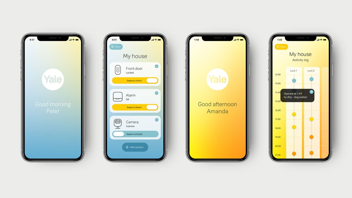
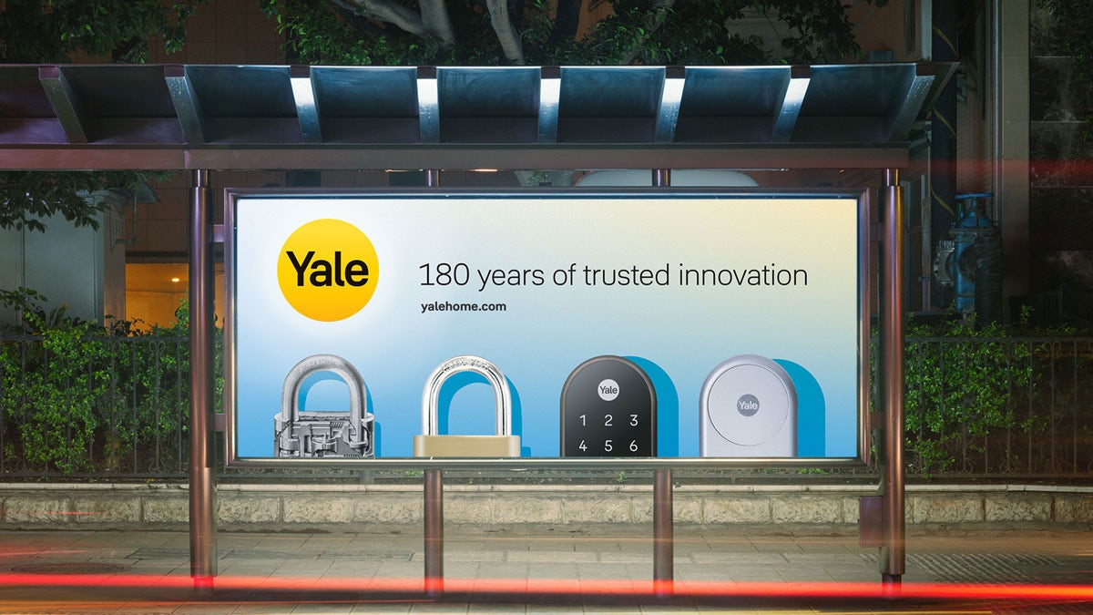
Yale’s refreshed visual identity includes a bespoke typeface by Jeremy Tankard and new UX, motion and sonic branding, all of which are centred around its distinctive sun-shaped logo. “We looked for something universal that would be understood around the globe. Yale already had a round yellow logo so that turned out to be a gift we could work from,” says GW+Co principal Gilmar Wendt.
“We landed on the sun as the core design idea because Yale is a warm and positive brand. You can rely on it always being there (even if you don’t see it) giving you peace of mind, and it is a big idea that is universally understood.”

The presence of the sun is carried through to the rest of the visual language too, including the brand’s use of photography and its colour palette of gradients inspired by sunlight.
“We have four key brand moods or backgrounds: morning, midday, afternoon and evening,” explains Wendt. “The logo sits in the brightest spot and casts a shadow onto every object that is being shown. The relationship between logo, backdrop and object determines the shadow colour and positioning.”

GW+Co also developed a new illustrated brand mascot called Linus, based on the original founder’s son Linus Yale Jr, who was responsible for making his father’s pin-tumbler lock design suitable for mass production in the early 1860s.
“We were looking for an element that could both make this point and add a touch of lightness,” says Wendt. “As the inventor of the cylinder lock, Linus Yale Jr. has played a key role in the history of home security. It’s also his 200th birthday coming up, so that worked well too. We based the avatar on a real picture of him, albeit modernised in style.”

The rebrand is currently rolling out internally, and will be seen externally later on in the year. For Wendt and the rest of the GW+Co team, the project has exemplified the challenges of rebranding a historic company like Yale for the digital era. “There is a need to create a future vision that builds on the past, rather than brushing it aside,” he says.
“You have to balance the heritage – in this case firmly mechanical – with a vision for the future – digital. But it’s not straightforward, because not all of Yale’s markets are digital yet. You have to find a platform for both, the mechanical history and the digital future, so that they can coexist.”

The post Yale unlocks the power of the sun in its new identity appeared first on Creative Review.
from Creative Review https://ift.tt/2YrwicV

No comments:
Post a Comment