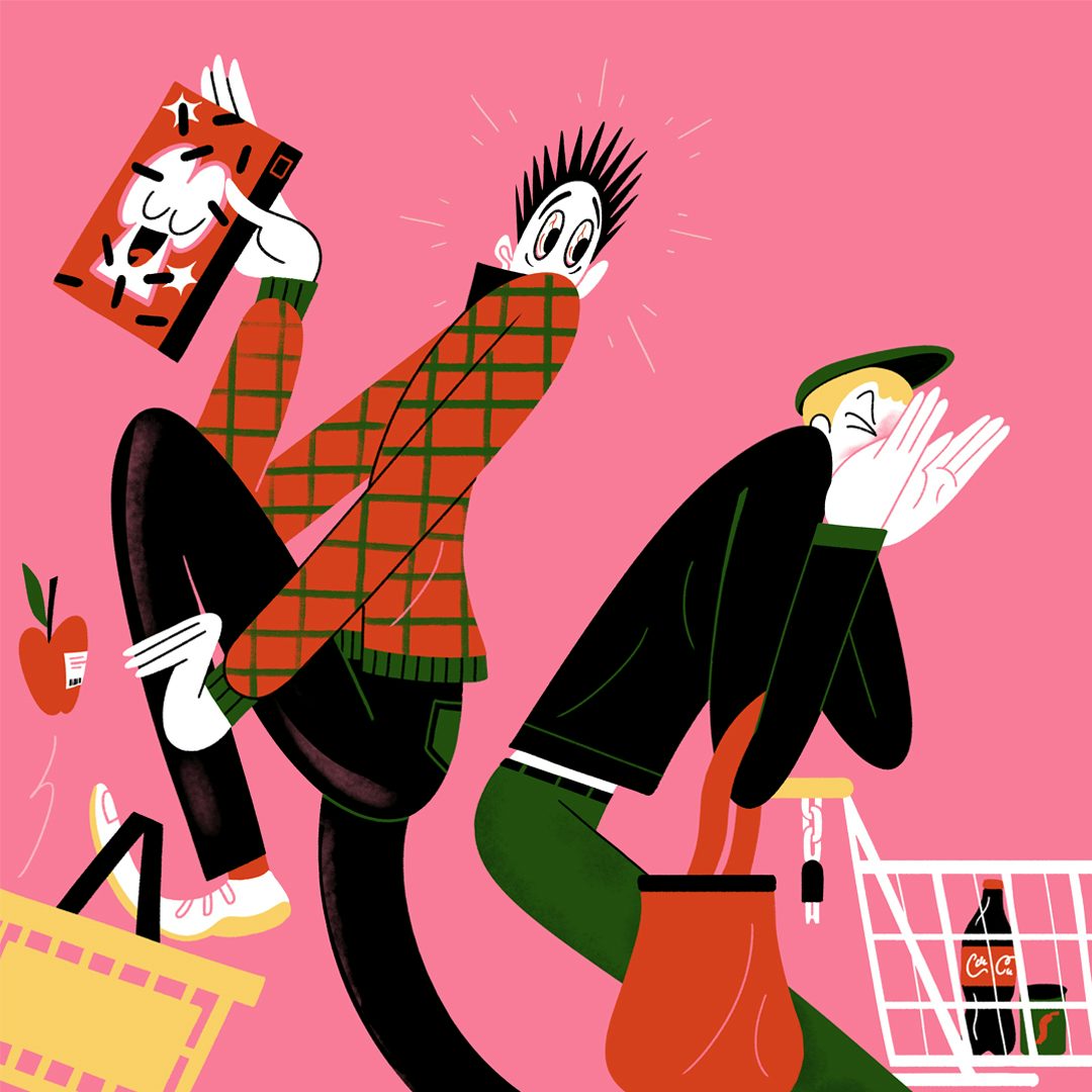
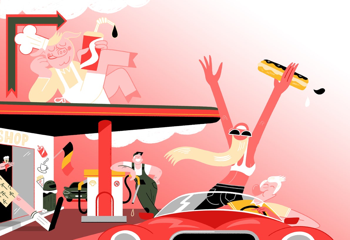
Joren Joshua’s bold graphic style combines his art school training as an illustrator with a love of graffiti and vintage posters. Since graduating from AKV St Joost in Breda in 2012, he has carved out a successful trajectory that crosses the divide between commercial illustration and graphic art. His drawings, children’s book illustrations and wall paintings are infused with both a playful quality and a complexity that encourages deeper examination. During the global lockdown caused by the Covid-19 pandemic, Joren continued to capture the zeitgeist with his musings on contemporary life.
Joren works from a studio in what he describes as the “Wild West of Rotterdam”. The enforced isolation during lockdown didn’t hinder his creative output, and his daily bike ride through a deserted city to his studio gave him a “zen feeling” that aided his creativity. Finding himself busy with editorial commissions related to the pandemic, he worked on the “corona editorials” for two newspapers who were pre-lockdown clients – de Volkskrant in the Netherlands and DeMorgen in Belgium.


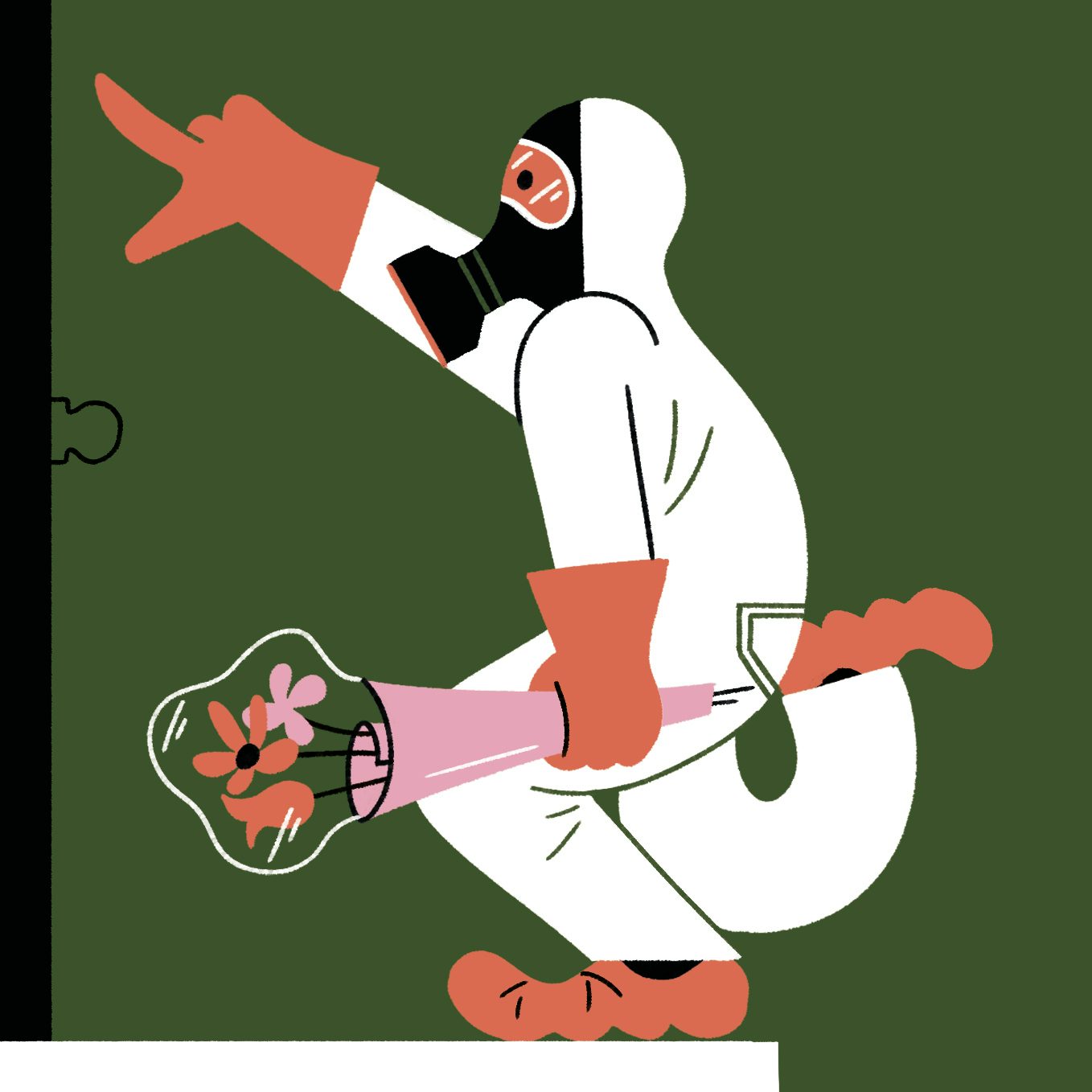
The resulting artwork is edgy and current, capturing in bold graphic illustrations some aspects of life under lockdown, including an image illustrating how to have hygienic lockdown sex, a woman singing from her balcony in the spirit of the Italian community during quarantine, and a man working from home with Covid-19 symptoms. Joren’s lockdown art is thoroughly contemporary, yet imbued with a hint of the bold graphic aesthetic of Russian Revolutionary posters of the 30s and 40s, mixed with the absurdism and spontaneity of the Dadaists in post-World War I Europe.
Born and raised in a village in the south Netherlands, Joren describes himself as an imaginative child who was into Lego and loved drawing so much that he even found himself talking to the paper. At secondary school he felt he lost the magic in drawing, returning to it later when the family moved to the city of Breda, where his discovery of graffiti reignited a love of drawing and a desire to maintain a playfulness in his art.
Although he only graduated eight years ago, Joren already boasts an impressive portfolio of work for clients including; Coca-Cola, Feyenoord, de Volkskrant, Trouw, DeMorgen, Mascotte, WWD Weekly, de Correspondent, Uitgeverij Leopold, Uitgeverij Noordhoff, Effenaar, TU/ Eindhoven and CBK Rotterdam.


His illustrations for the children’s book Zeb, on which he collaborated with the writer Gideon Samson, earned the duo a Golden Griffel award for best children’s book and a Silver Brush award for illustration in the annual children’s book awards in the Netherlands. The book consists of 11 short stories that all contain an absurdist element perfectly suited to Joren’s whimsical and often surreal style.
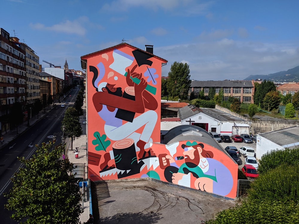
Of his influences, Joren cites graphic artists including Uderzo, Blexbolex, Joost Swarte, Aryz, Stefan Glerum, Jacob Lawrence and Hedof. These historical influences are mashed up with Joren’s love of street art and graffiti, combined with a hint of photorealism and a childhood crush on Van Gogh’s paintings and mythology, which the young Joren copied to hone his draughtsmanship. Joren’s vast murals in Spain and Breda also have a Dolce Vita vibe, evoking the iconic Italian classic car posters of the 50s and 60s.
Joren’s images are clearly created from careful observation of real life. “I find it interesting when you get inspiration from other things than images,” he says. “I observe people, often unconsciously. I constantly look at movements and postures. Someone who’s drunk, people in a conversation, a child falling, someone in a hurry. My work focuses very much on movement and postures. I hardly ever use image references but make the most of my memory.


“I always draw things with the idea that they should work big,” he continues. “This makes my work more graphic, and I leave out superfluous details. I do like eye-catchers, work that attracts your attention from a distance. I also use this vision for illustrations that are not really large, like a newspaper or, for example, the children’s book. But admittedly, because I now also make a lot of editorial illustrations, more details have returned. With murals, the goal is slightly different. Apart from the story you tell, you also make something in a public space and have to deal with the environment, the decorative purpose is often greater than with a newspaper, where the story or communication is often the most important thing.”
Joren is sanguine about separating commercial and personal work. At the outset of his career he felt that clients came to him for a “piece of soul”, but he realised that adapting his work or his style to suit the client wasn’t the answer, and that his most successful commissions were the ones he injected with his own authentic sense of self and personality.
His future plans include continuing with the regular editorials for newspapers, and the prospect of another children’s book to illustrate, as well as more large-scale painting. Whatever Joren turns his hand to next will undoubtedly have the power to intrigue and capture the imagination.
The post Joren Joshua’s illustrations depict everyday life with wit and humour appeared first on Creative Review.
from Creative Review https://ift.tt/2C8yg9A

No comments:
Post a Comment