If you’ve ever found yourself sipping a cocktail at The Standard, or tucking into tacos at London restaurant El Pastor, then there’s a good chance you’ll have encountered Playlister’s work. The London and Ibiza-based company curates music for restaurants, bars, fashion stores and boutique hotels – working with clients to craft distinctive playlists and audio identities.
Founded in 2008 by Dan Lywood – who has produced soundtracks for catwalk shows and luxury hotels – the company was set up with a focus on human curation. Through research and consultation, its team provides custom playlists that are tailored to specific spaces and brands.


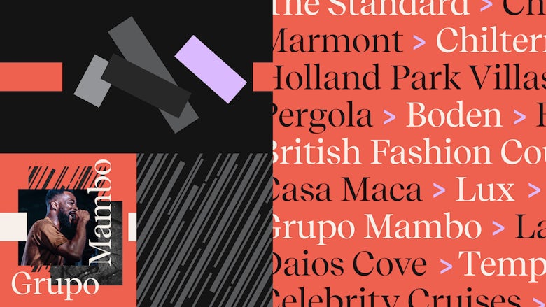
This human approach was the inspiration for Playlister’s new visual identity, which combines warm colours with graphic patterns, serif type, a lowercase word mark and a symbol representing a playbar.
Designed by creative studio Output (which has worked on identities for Mixcloud and post production house The Mill), the branding aims to reflect Playlister’s focus on expert curation and help the brand stand out from other services that rely on digital algorithms.


The triangular play bar device can be used to frame images or punctuate text – providing the brand with a recognisable, flexible icon that can be scaled up or down. Output also created a set of graphic patterns that can be placed over, under or alongside images, and selected an understated colour palette made up of neutral shades and brighter coral and lilac accents. The sans serif word mark is contrasted with Luzi Type’s serif typeface, Recife Display, which is modelled on traditional Dutch fonts.
Like Collins’ work for Spotify and Mother’s identity for BBC Sounds, Playlister’s branding is designed to work alongside a wide range of imagery, creating a system that can adapt to suit a range of music and applications – from the company’s website, to social media content and client proposals.


“The system is designed to be rolled out by the Playlister team, with a simple set of guidelines and templates providing a balance between consistency and flexibility,” says Output.
The studio also set out to create an elegant toolkit that would reflect Playlister’s focus on working with upmarket brands and venues. The result is an identity that feels both playful and grown up – and communicates a certain warmth and friendliness.

studio-output.com; playlister.fm
The post Output creates a “human” identity for music curation service Playlister appeared first on Creative Review.
from Creative Review https://ift.tt/2C2sQwV

No comments:
Post a Comment