The first ever TGI Fridays opened on the corner of New York’s 63rd and 1st in 1965. It was swiftly popularised not as the casual-dining family restaurant that it is today, but as a singles bar for cocktail-swilling young adults in Manhattan; one of the first of its kind and apparently the inspiration for Tom Cruise’s bartender character in the film Cocktail.
More recently, and much like the rest of the food scene on the high street, the restaurant chain has struggled to stand out against the raft of independent burger joints and street food venues that dominate our cities.

Working with the company’s new leadership team, SomeOne has been rethinking the TGI Fridays brand over the past six months, stripping it back down to a tagline that captures the essence of its New York origins: The Fridays Feeling.
“Our vision is to make Fridays famous again so we needed to breathe fresh life into the brand by relevantly leveraging the past,” says the chain’s CEO, Robert B Cook. “The Fridays Feeling is the inspiration for our new food and drink menus and a service plan designed to consistently deliver the best guest experiences and a generosity of spirit.”

SomeOne started by reducing the brand name down to just Fridays, based on the fact that the meaning of TGI had become lost and confused over time.
“Now shorter, sharper and more contemporary, the name becomes part of our language and can be flexed into a number of headlines – from Feel Good Fridays, to Fridays, I’m in love,” says the agency’s founder, Gary Holt.
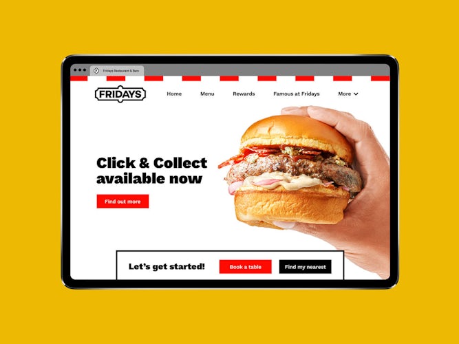
The new logo is inspired by the original Fridays signage from the 60s, and can also be reduced down to an ‘F’ icon to be used when closer to the brand, onsite or online.
Another design feature from the restaurant’s roots is the use of bold vertical red and white stripes, which nod to the original awnings of the 1965 bar, and also take inspiration from historic circus company Ringling Bros. and Barnum & Bailey.
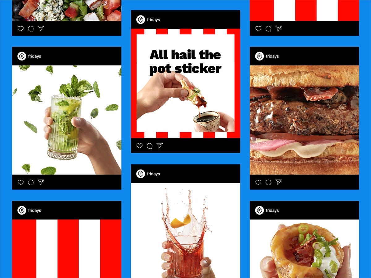
There is a greater focus on digital services such as click and collect and home delivery, along with a photography style that gives new weight to the restaurant’s food selection and, crucially, a more personal, irreverent tone of voice.
“While we focused on developing a watertight operating system, it was important that we didn’t lose sight of the character synonymous to Fridays,” says SomeOne design director, Cosmo Jameson.
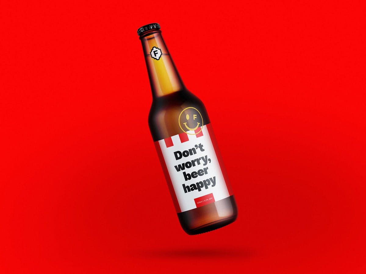
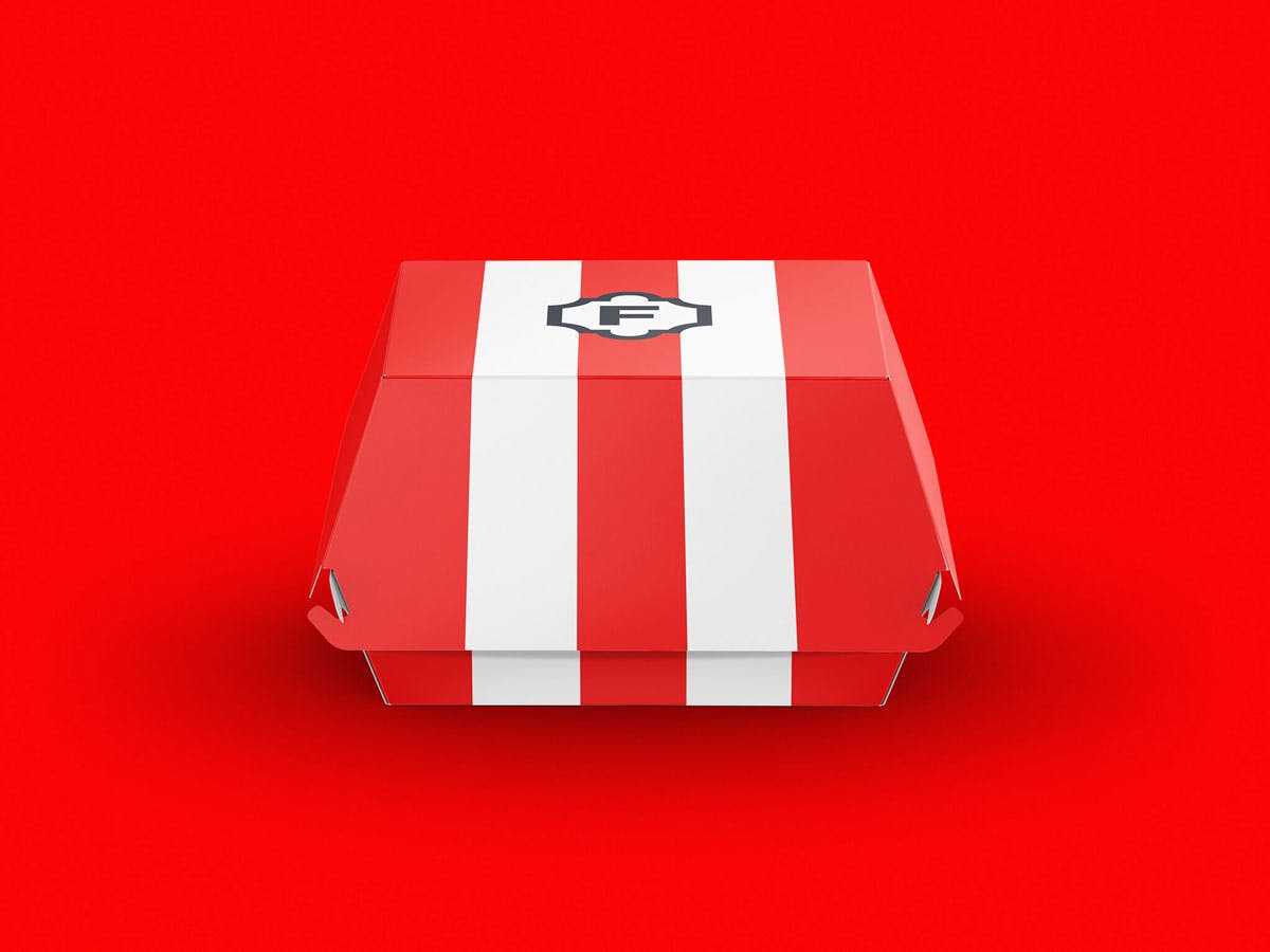
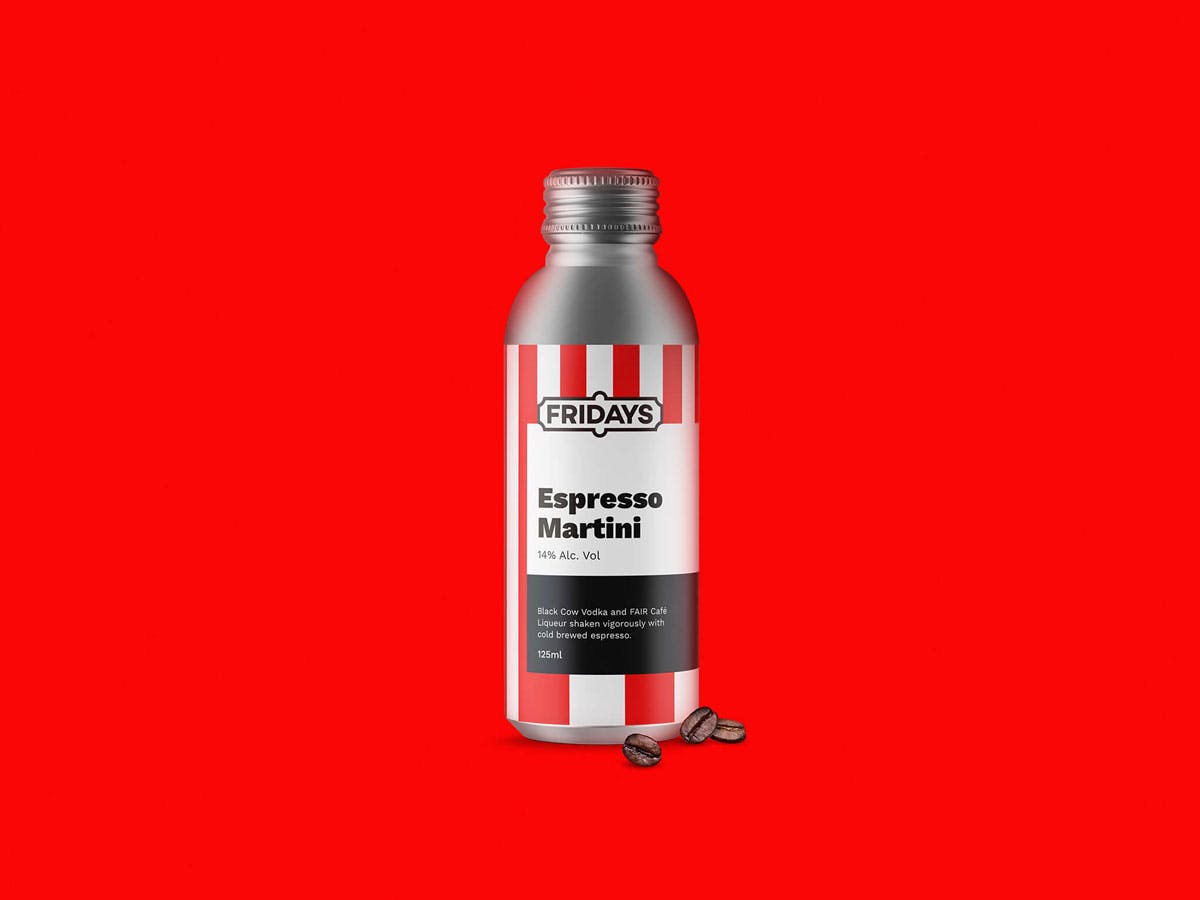
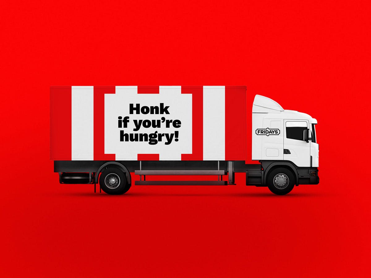
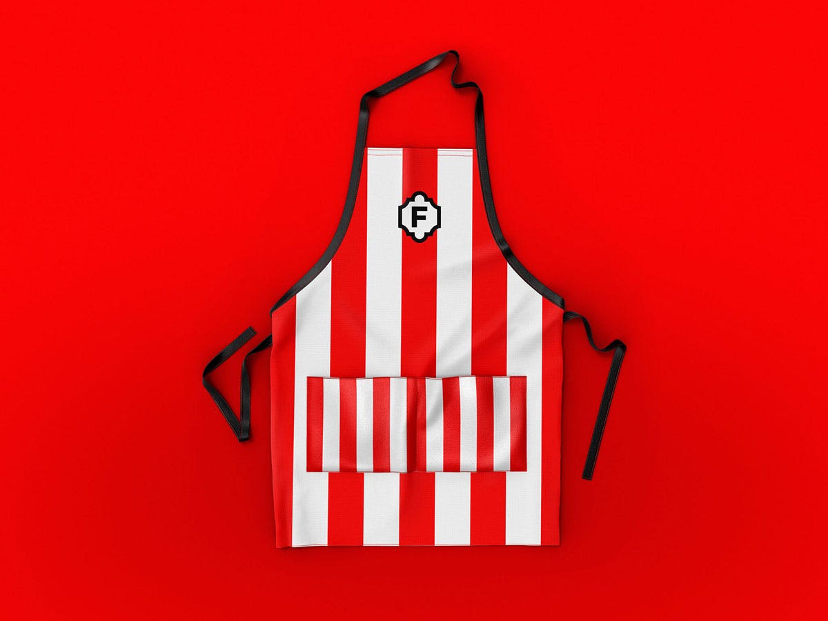
“So we have made sure to deliver a touch of frivolity on all design materials and instil that as part of the brand’s DNA. Whether it be playful copy, cheeky icons or illustration.”
The post TGI Fridays’ new identity is all about that Friday feeling appeared first on Creative Review.
from Creative Review https://ift.tt/2YSbNWK

No comments:
Post a Comment