Vasava has teamed up with Spanish publishing house Editorial Planeta to create a new collection of covers for well-known classic children’s novels. “Our challenge for this brief was to be able to produce something which could encourage young readers to put down their phones and games consoles, and pick up a good book,” explains the studio.
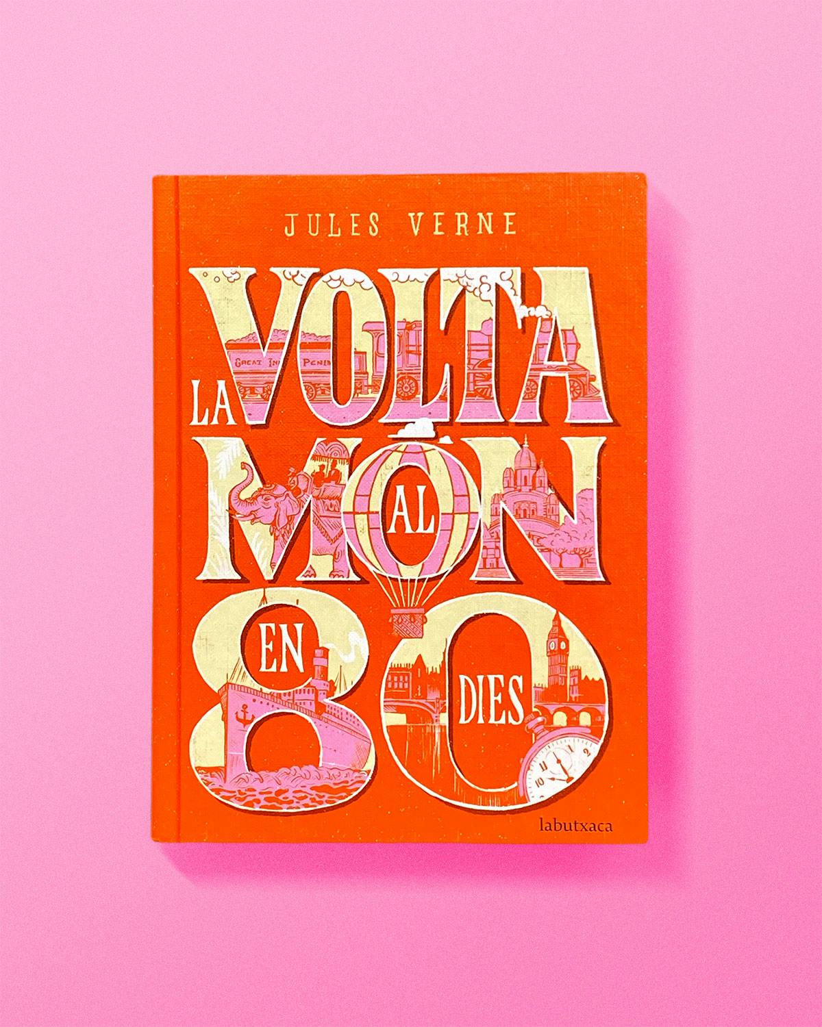
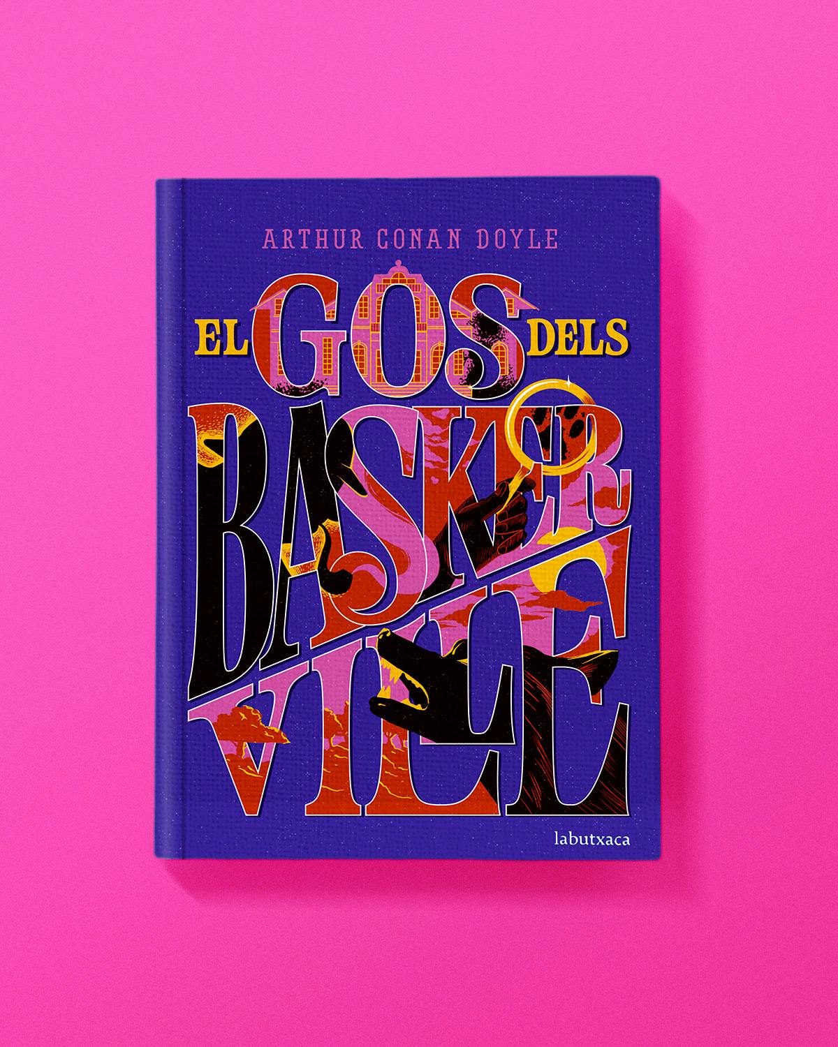
Some of the titles Vasava has renewed, such as Treasure Island and Around the World in 80 Days, are books less popular with kids today, so the agency adopted an eye-catching concept. “We incorporated illustrations into the lettering, creating vignettes, which would act as a visual synopsis for each novel,” says the studio. “The comic book style was paired with bright colour palettes to create a happy and inviting collection of books that any kid would proudly display on their bookshelf.”
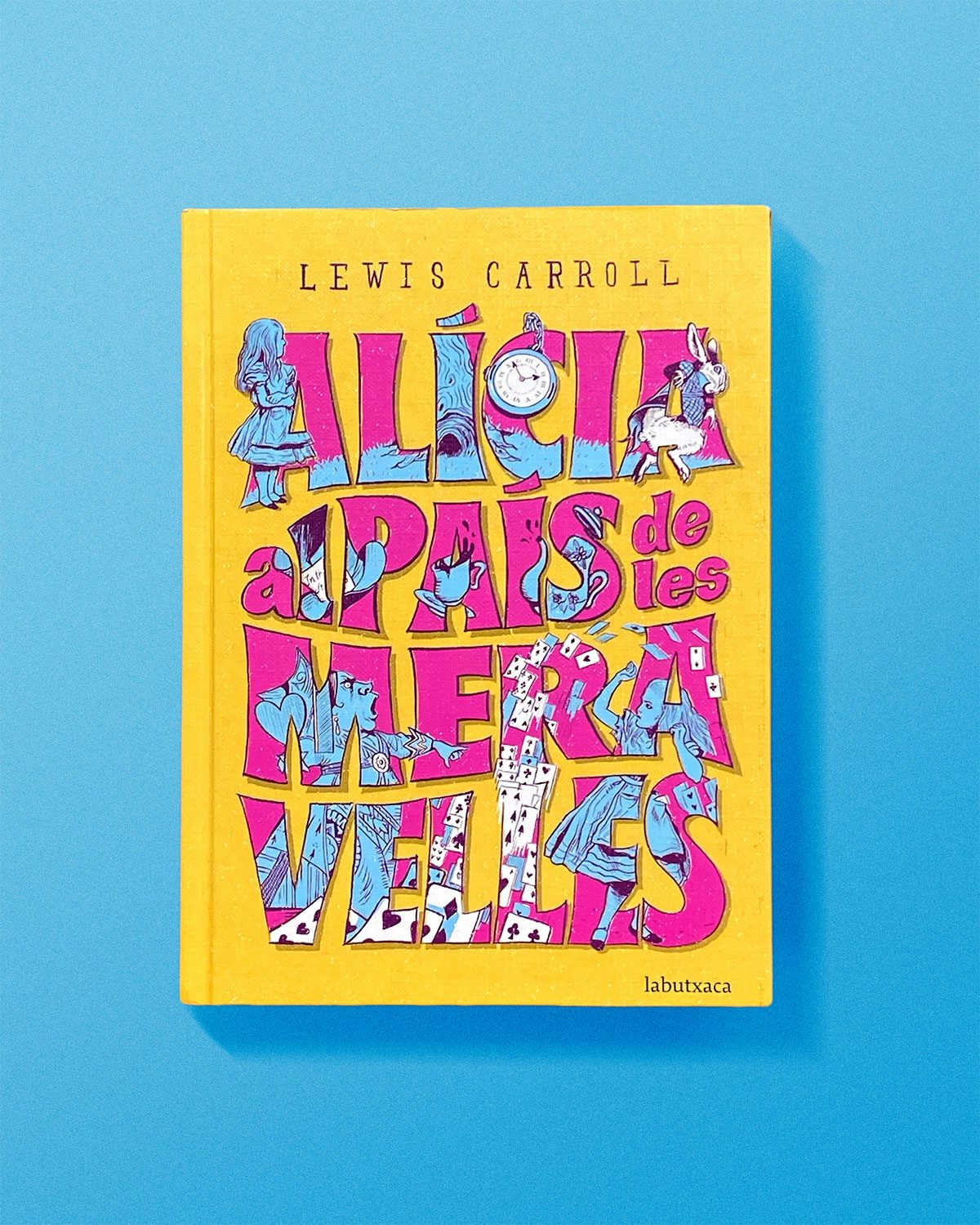
Part of the creative process for Vasava was deciding the aesthetic for the typeface which was to house the illustrations. “The lettering needed to be able to contain the illustrations while retaining its readability,” says the team. “It also had to tie in with the story itself and not feel out of place, so it was important for us to be able to hand-draw each of the titles in order to have complete control and be able to make any necessary tweaks along the way.”
Each title has its own lettering which hints towards the story within, such as Peter Pan’s flowing type that makes the reader think of pirate flags and Wendy’s old-fashioned nighty. To really bring the covers to life though, Vasava took a detailed approach when deciding what the illustrations should contain and they started by highlighting the key characters, locations and objects from each of the novels.
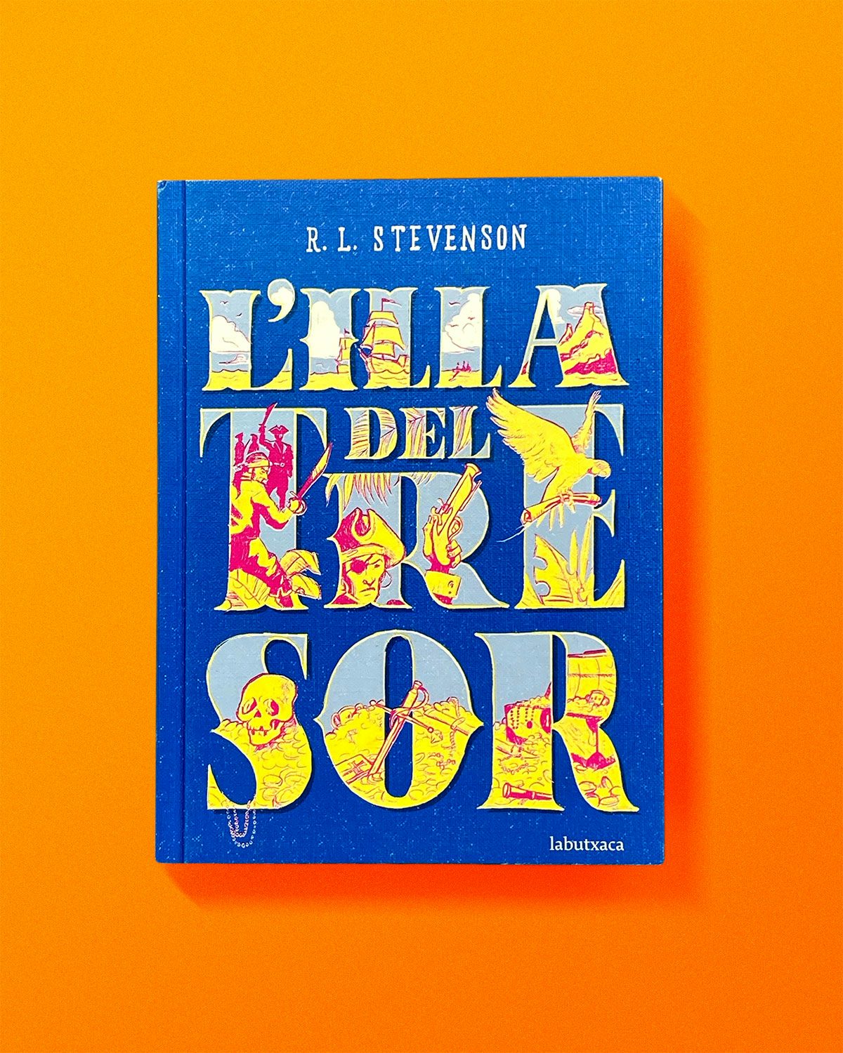
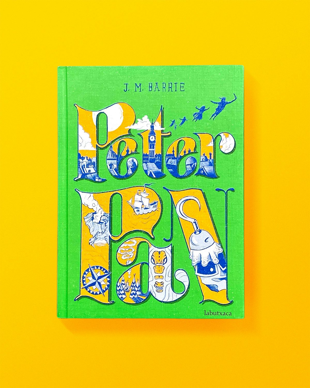
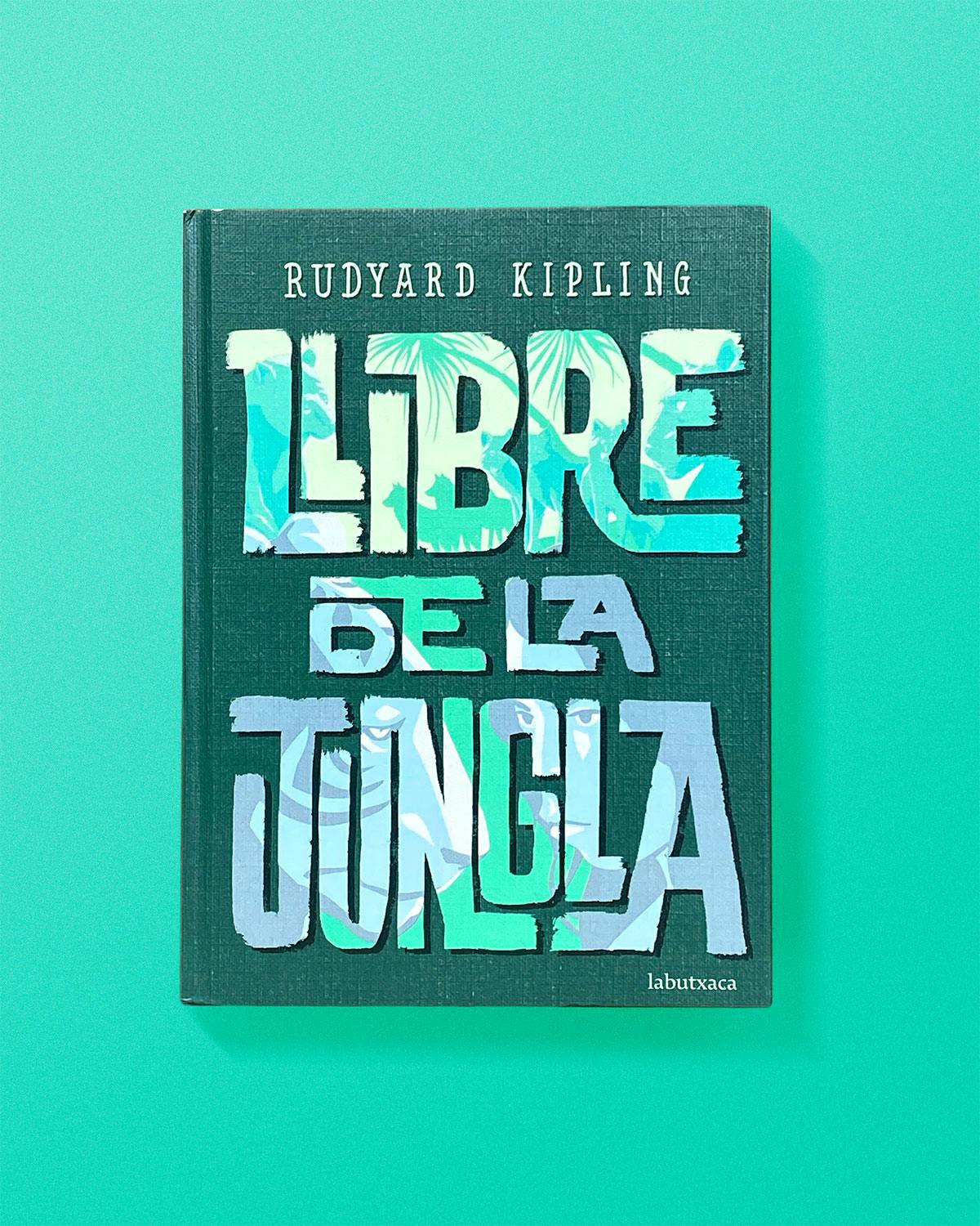
This process allowed the agency to decide what could be used to allude to the narrative but not give too much of the plot away. “Incorporating these elements in and around the lettering we were able to create covers which really captured the essence of each book,” says Vasava.
The collection of covers pop with vibrant, clashing colours and are crammed with intricate illustrations. What ties the whole series together is the vintage treatment of each title, reinforcing the idea of the books as literary classics.
“Many of us at Vasava had grown up reading these books so working on this project made us feel very nostalgic,” says the agency. “It was a great opportunity to be able to reimagine the covers for the kids of today.” So far, there are seven classics reimagined, but Vasava and Editorial Planeta are set to release more in the coming months.

The post Vasava uses hand-drawn type to reimagine children’s classics appeared first on Creative Review.
from Creative Review https://ift.tt/3eaAty0

No comments:
Post a Comment