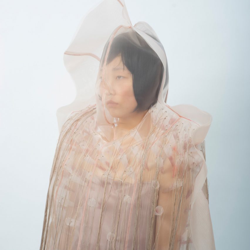
Rosy-hued shells of organza encase the wearer of these garments by Rhode Island School of Design (RISD) graduate Violet Zhou, which explore different states of mind experienced during personal struggles.
Inspired by her own personal experiences and "emotional turbulences", Zhou sought to translate certain feelings into tangible products.
Her fashion collection, titled Within, comprises six looks, each representing a different stage in the process of going through and overcoming various emotional and mental challenges.
These include angry, weighed-down, wounded, sinking, numb and emerging.
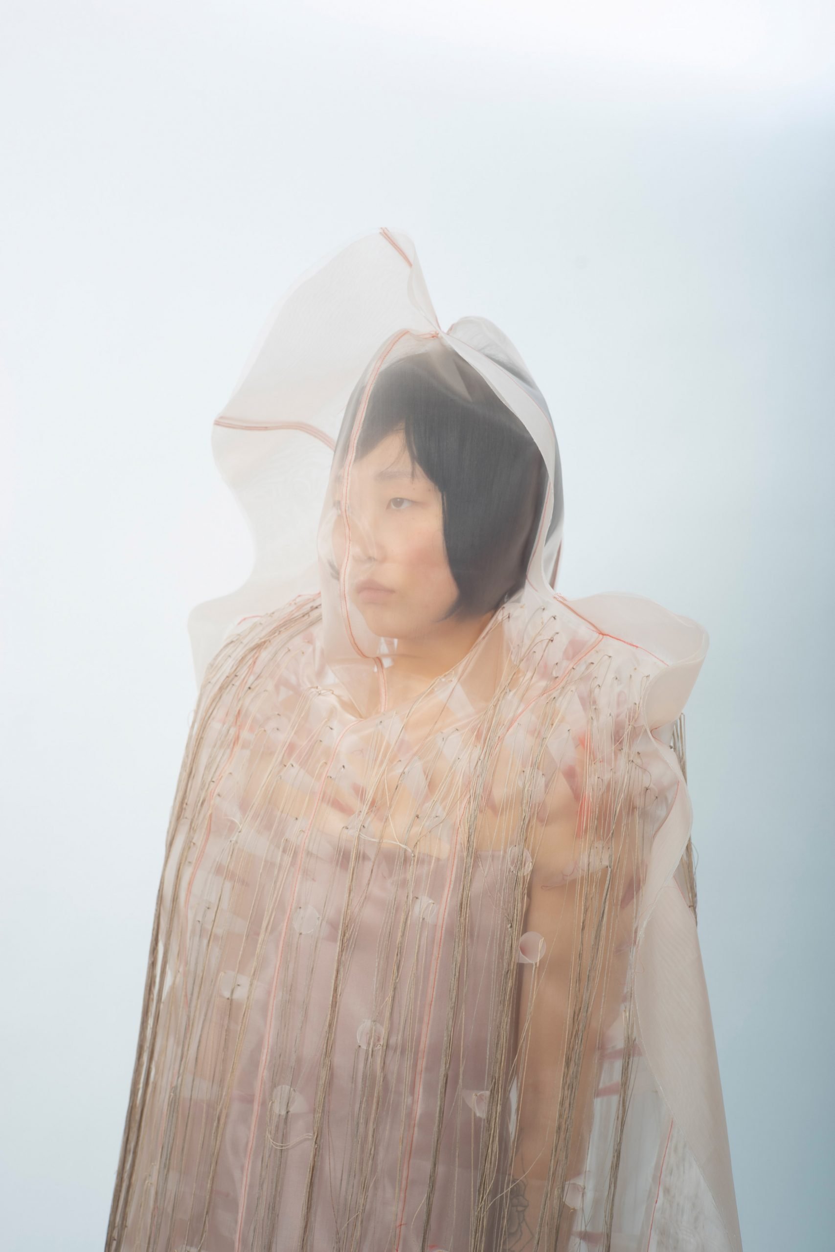
Designed to create a sense of "confinement", many of the pieces literally seal their wearer inside the garment with an outer layer of fabric.
Each look progresses onto the next, until finally "emerging" from the turmoil into a lighter state of mind, where the wearer physically breaks free from the material casing.
"I wanted it to look like the model is vacuum-sealed in between two plastic sheets, with her silhouette protruding from the flat sheets and the rims of the sheets extending beyond her body," Zhou explained. "I wanted a sense of helplessness and paralysis to seep through."
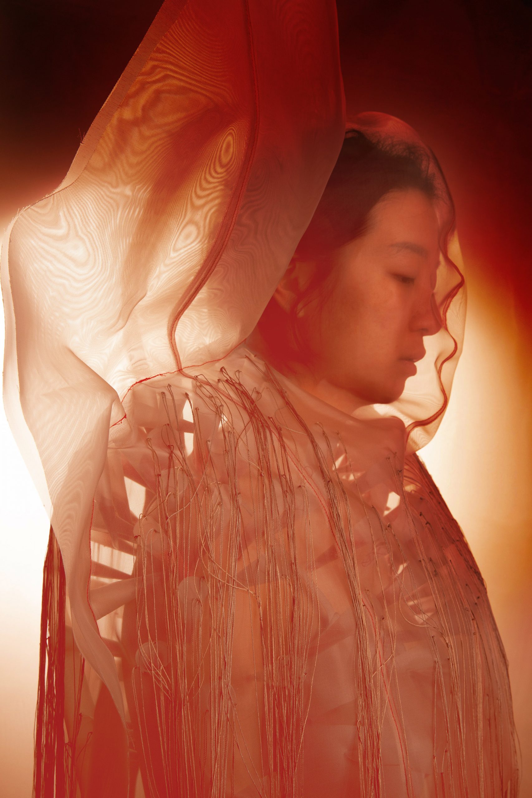
The RISD graduate opted for translucent fabrics like gauze, chiffon and organza as she felt they granted a "sensuality" to the garments.
"These materials also allow the collection to play with the tension between visibility and inaccessibility," she added.
In order for the designs to be able to stand up on their own, Zhou chose a material called stiff polyester organdy, as it is both see-through and stuff enough to be self-standing.
She combined this with a millinery material called sinamay – a loosely woven straw fabric that can be shaped with moisture and heat.
Categorised by the designer as "interactive sculptures" as opposed to functional garments, the designs don't take comfort or utility into consideration.
To make each look, Zhou enlisted the help of some friends to create a duct tape form of her entire body, before stuffing it with second-hand Poly-Fil. She then wrapped pieces of wetted sinamay around this life-size body cast and applied fabric stiffener.
After this, she cut the sinamay material along the back of the structure and pulled it away from its stuffing, leaving the outer human-shaped casing.
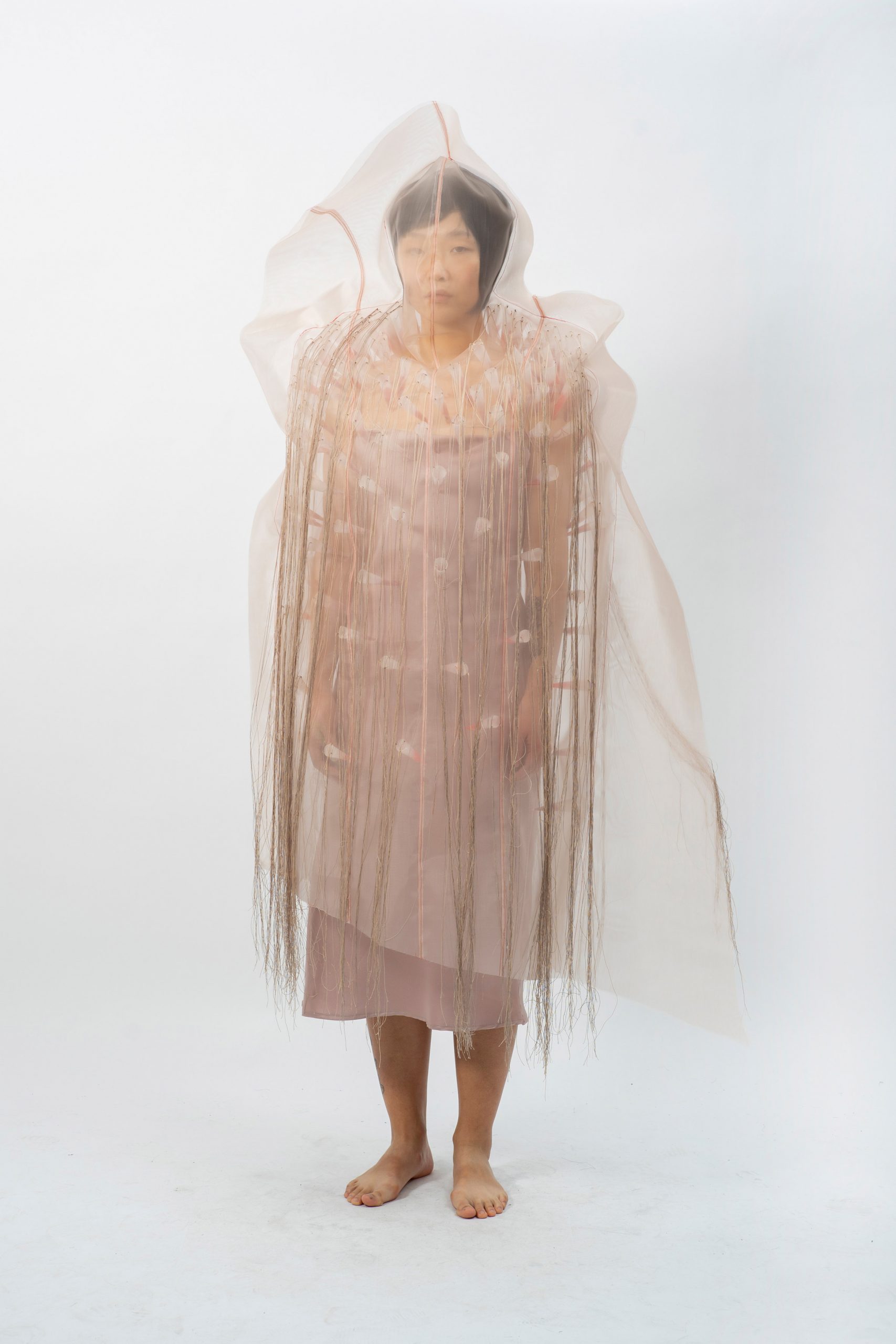
The first look, called Angry, features a series of spikes pointed inwards towards the wearer. These were made from semi-transparent, frosted polyurethane, which Zhou cut into circles and rolled into cones.
She used red organza and yarn to add various blood-coloured accents to these lightweight spikes, before hand-stitching them onto the misshapen shell made from pink-hued organdy.
"Anger is an edged emotion, and while it can be explosive, I wanted to depict the more oppressed version of it as if someone is trying to hold back the rage," Zhou told Dezeen.
"We may cause harm to others when we let anger take over, but the person who is hurt the most is ourselves, hence the many spikes pointing towards the wearer."
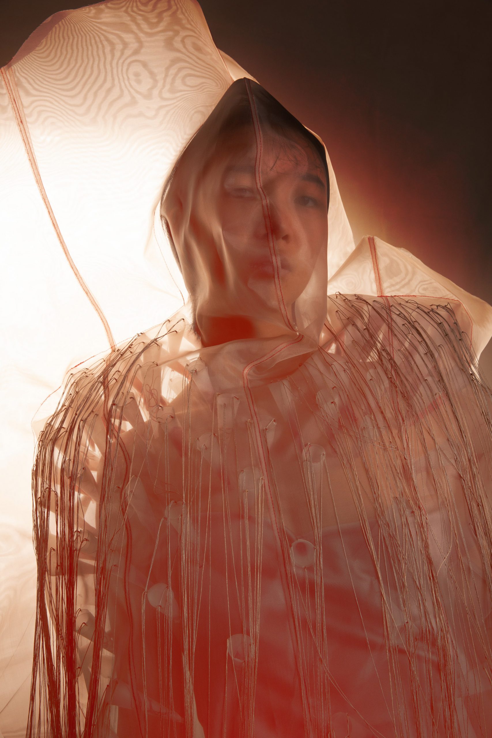
"Like all other looks in this collection, the wearer is sealed off from the external world by a translucent shell," she added. "My intention is that the translucency would make the viewers even more aware of the distance between the external world and the wearer."
"The audience can glance through the barriers to vaguely see all the spikes and their red tips, but they will never see what it actually is like on the inside, nor will they know how the wearer sees through this garment and how the spikes feel on her skin."
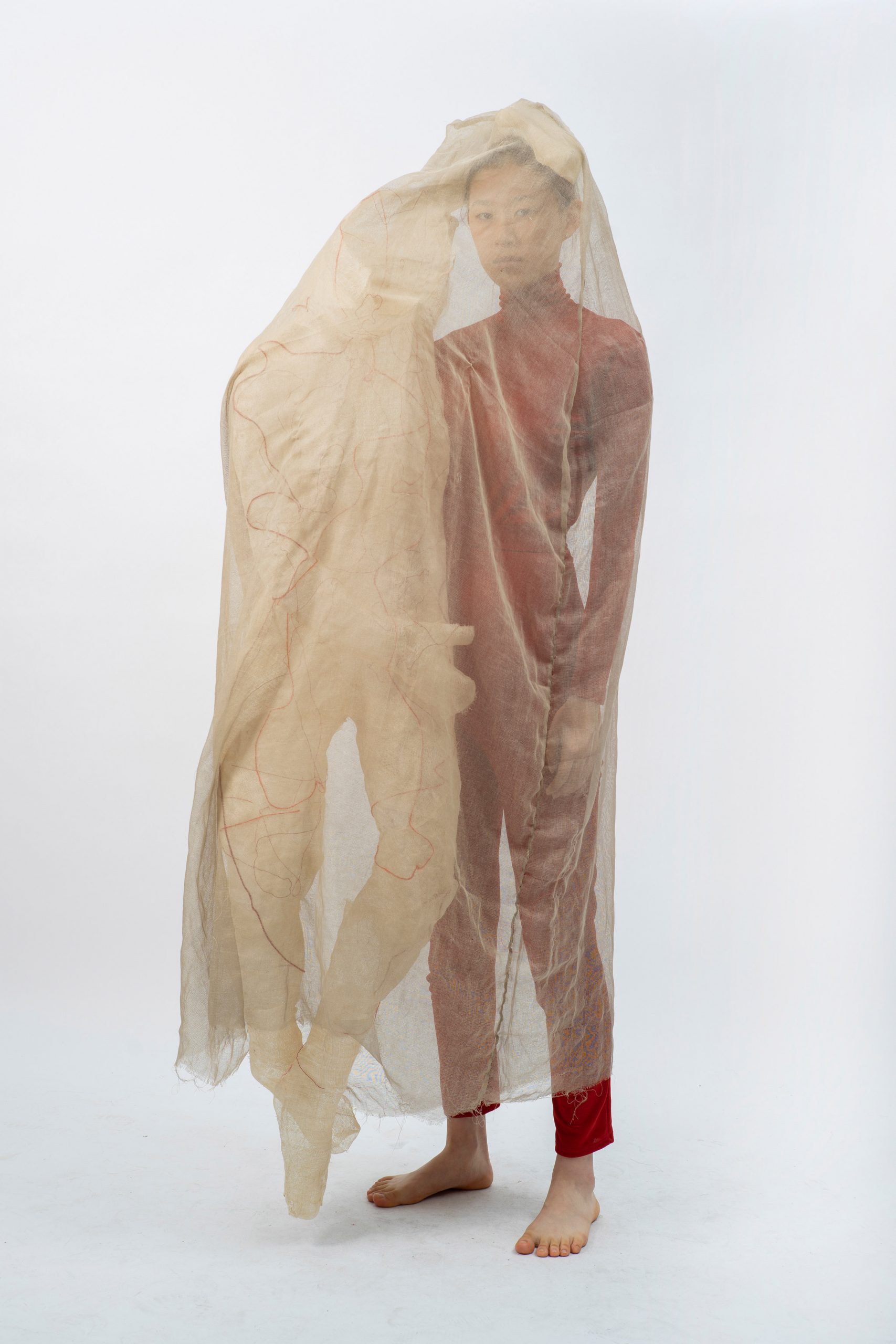
In the second Weighed-Down design, a "ghostly" human-like figure is attached to the wearer's bodysuit, hanging from one side of their body.
As Zhou explains, this fabric figure represents "the other self within" who is an invisible weight that drags the person down.
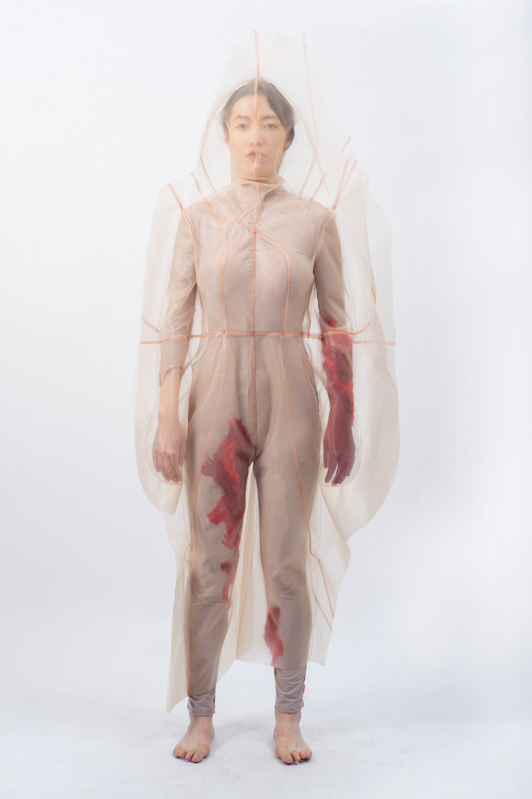
For the third look, Wounded, Zhou wanted to create a "physical manifestation of emotional wounds", which she embodied in a nude bodysuit worn under the organza shell featuring red organza appliqués.
As Zhou told Dezeen, the locations of these "wounds" on the garment were deliberately chosen according to her own experiences. There is also a "bleeding" element positioned under the crotch, which alludes to the pain – both physical and emotional – that is associated with bodies that menstruate.
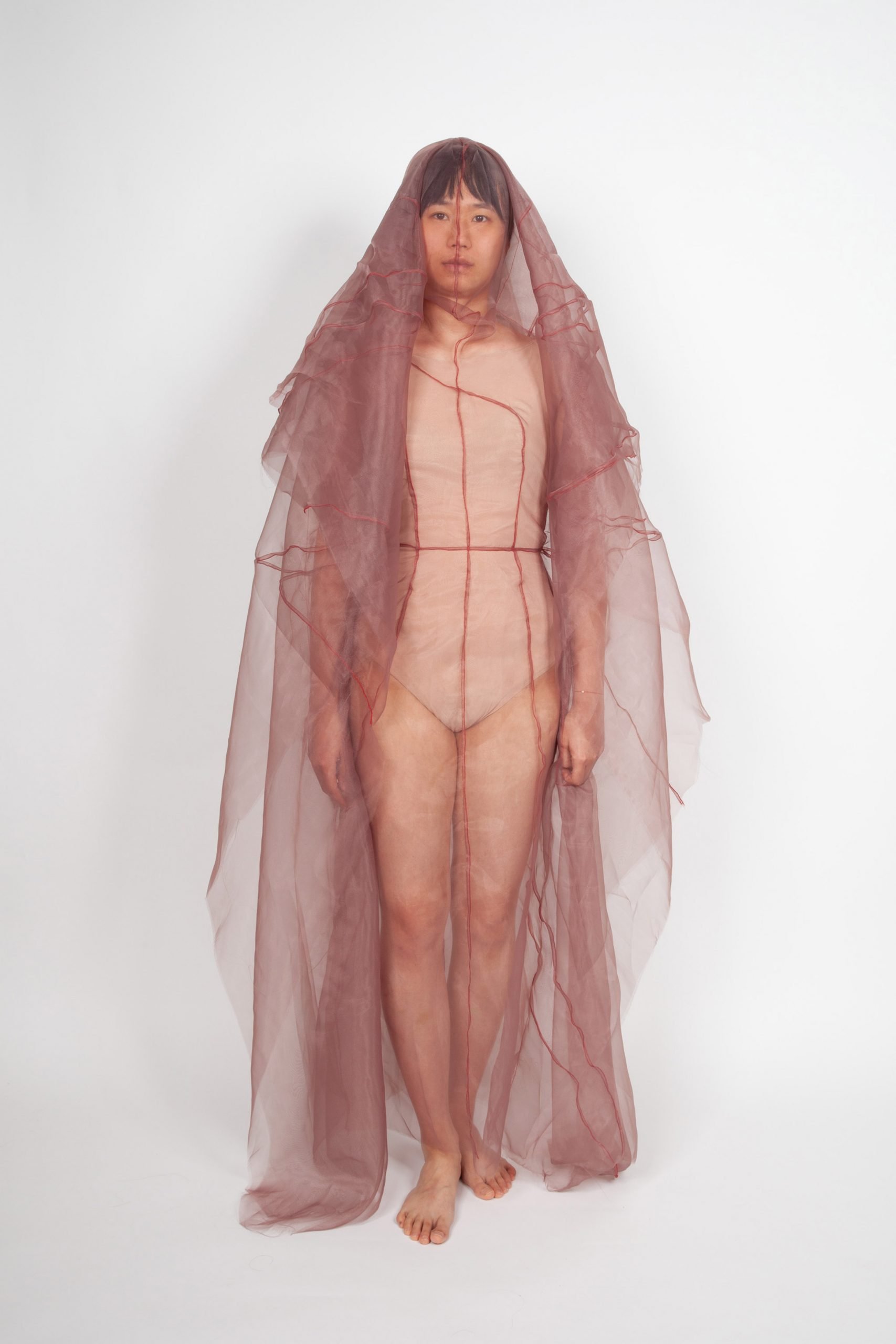
The fourth look represents a "sinking" feeling, which she represented using lightweight fabric to emulate the motion of slowly drifting downwards.
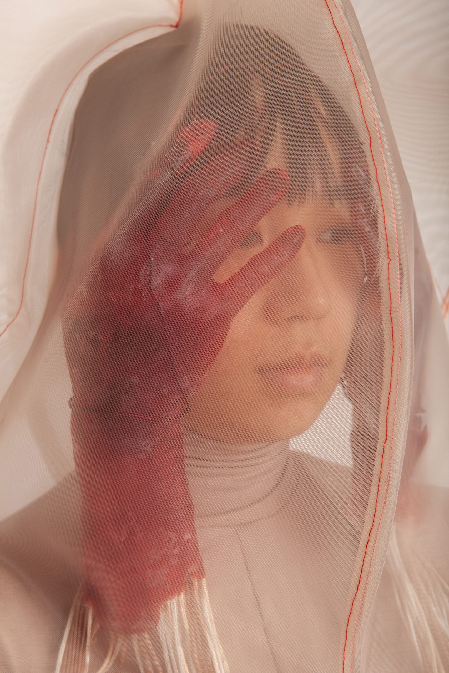
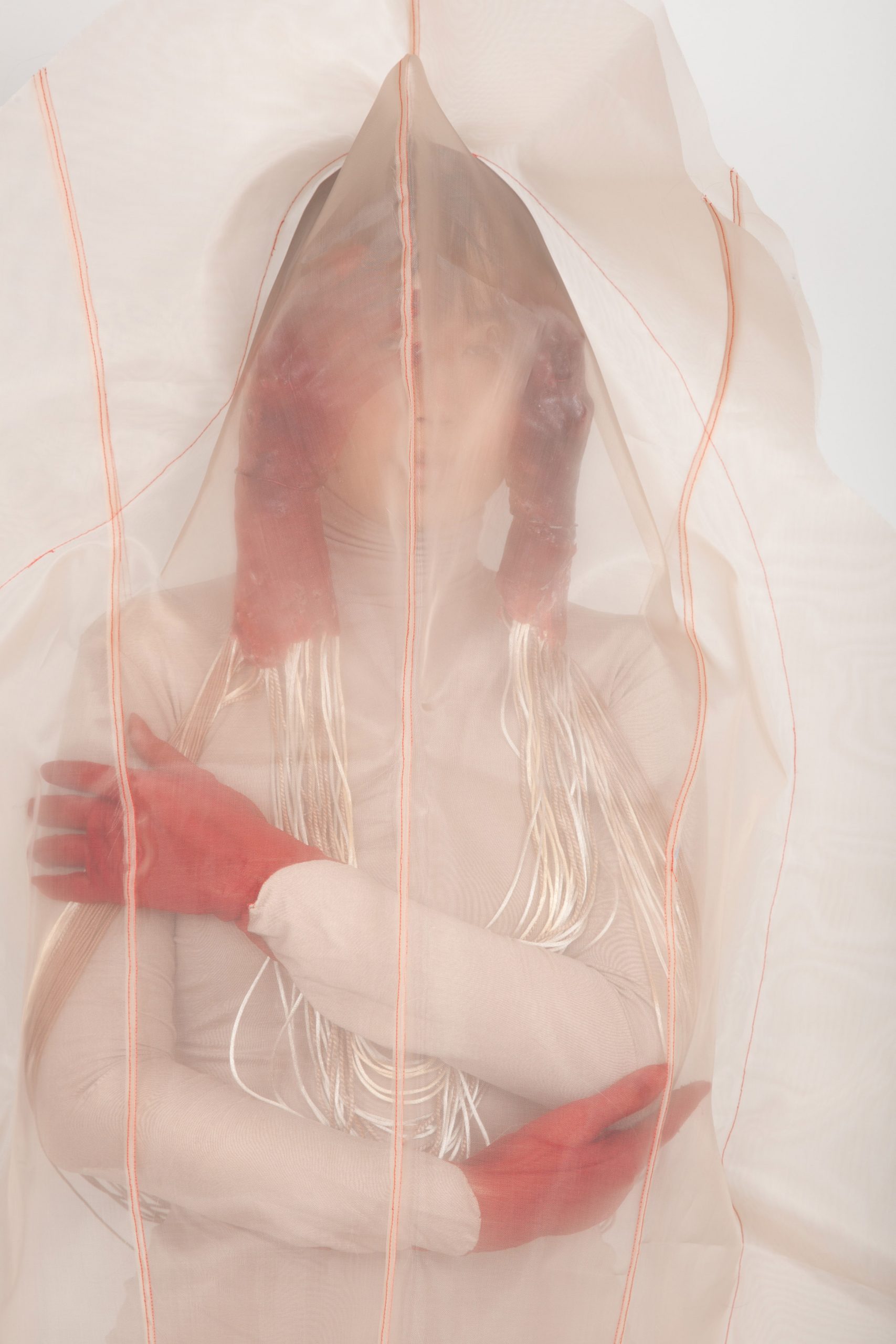
The fifth look, titled Numb, places a focus on hands and their ability to convey a sense of fear or stress, particularly when covering the face.
Zhou made two bright red, life-size resin casts of her own hands that incorporate shreds of organza fabric. She attached this to a wire structure that was used to secure them onto the model's head.
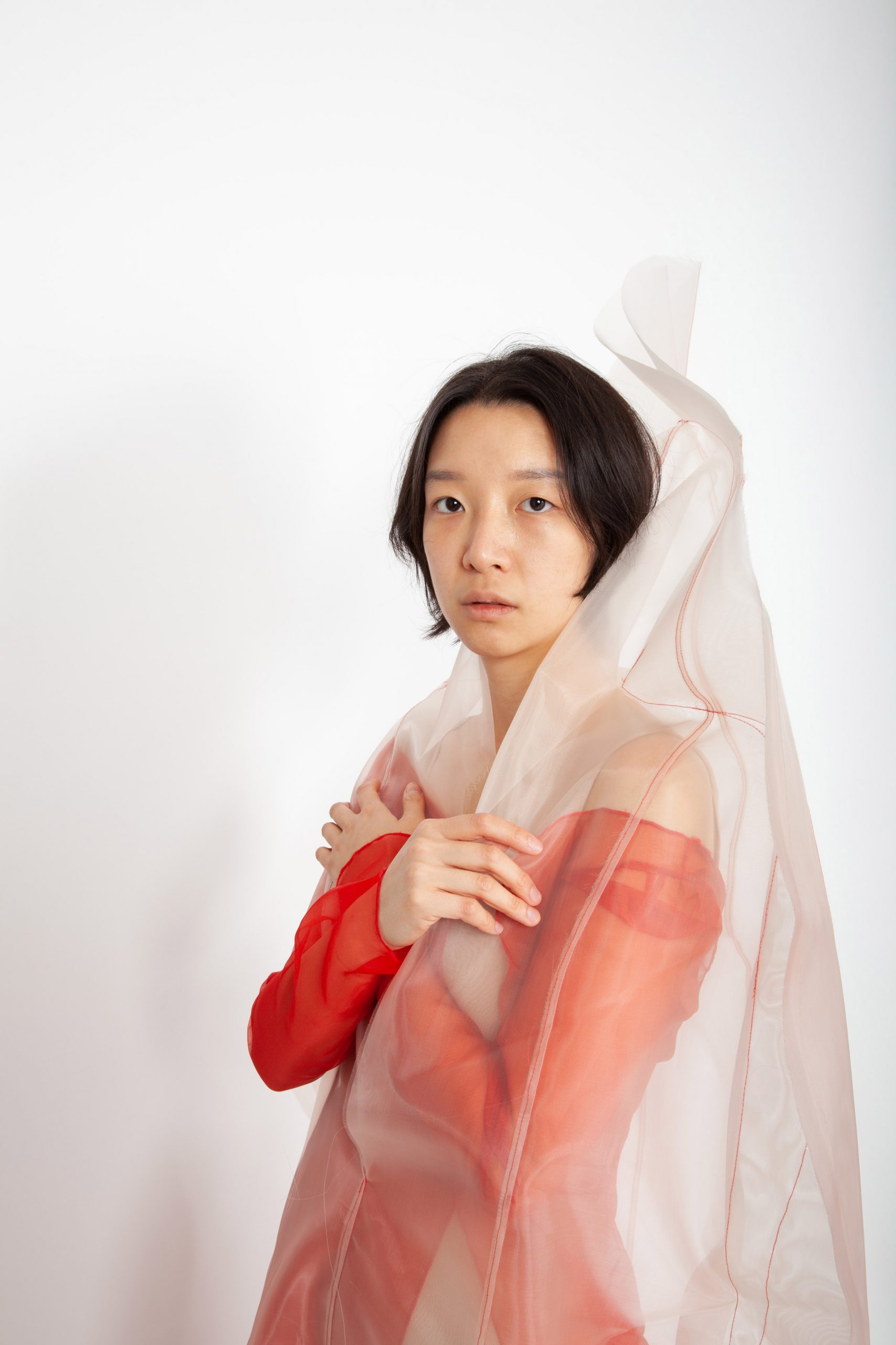
The sixth and final look, Emerging, depicts the wearer physically coming out of her fabric shell. It is the only look in the collection that shows parts of the wearer's skin other than the feet.
Zhou took inspiration from both Chinese photographer Ren Hang, who works almost exclusively with portraits and bodies, and French-based, Chinese-born fashion designer Yiqing Yin for the graduate collection.
Yin's Spring/Summer 2013 collection, called Sur le Fil, and Fall/Winter 2012 series, titled Spring of Nüva, particularly resonated with her – both address themes of the human body and its internal organs.
"I was so struck by the fluidity of the lines in the garments and the sensuality of the silhouettes – how they are crude and delicate, hard like bones but soft like hair at the same time," said the designer.
Central Saint Martins graduate Jessan Macatangay had a similar concept for his fashion collection, titled Finding Beauty and Power in Struggle, which he made using swathes of lycra jersey and silk satin and deconstructed chairs.
Comprised of five different looks, the collection aims to symbolise how people carry the weight of personal struggles. Each garment becomes progressively lighter and less bulky as they gradually include fewer furniture elements.
The post Violet Zhou translates mental states into ethereal fashion collection appeared first on Dezeen.
from Dezeen https://ift.tt/3hCNUJq
No comments:
Post a Comment