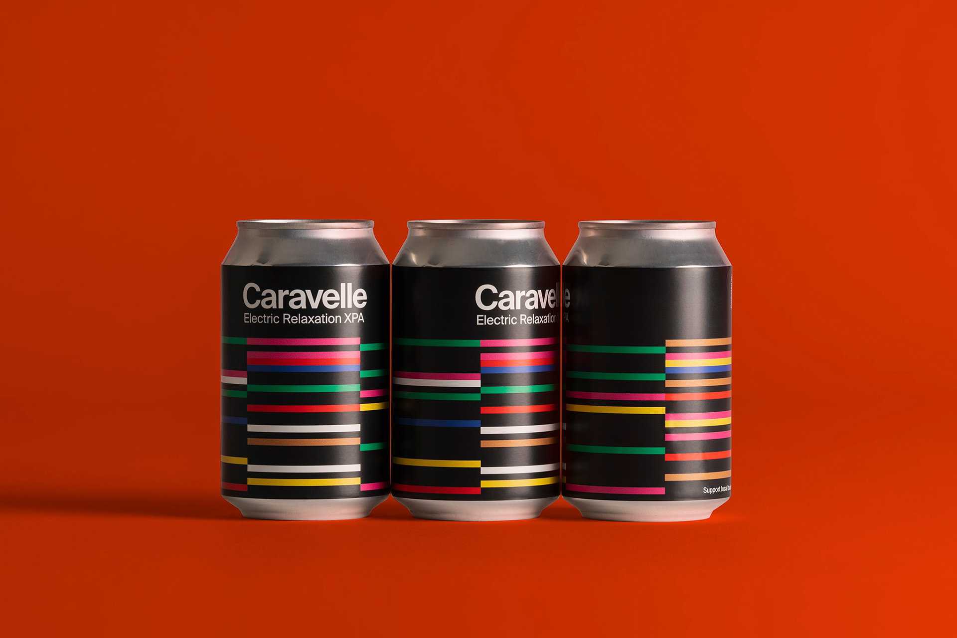
Design studio Hey has worked with restaurant and brewery Caravelle on creating colourful packaging for its new range of craft beers. The Barcelona-based studio previously teamed up with Caravelle back in 2017 on its initial beer range, and was enlisted once again to help it flesh out the existing design system as the brewery relocates to a larger location to keep up with demand.
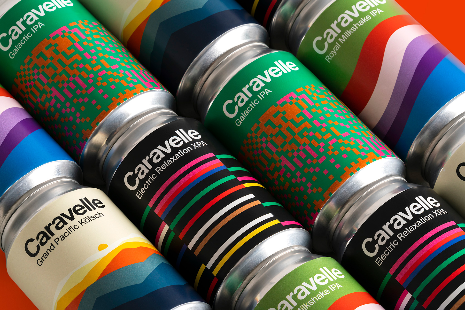
The designs tap into the names of each variety, from the sunset-inspired graphics used for Grand Pacific Kölsch to the fluid layers seen on the Royal Milkshake IPA.

The packaging takes a geometric turn across the rest of the range, with a pixelated bit graphic applied to Galactic IPA and a colourful striped design showcasing the Electric Relaxation XPA.
As appetites for craft beer continue to grow, packaging design has become an integral way to distinguish brands from the rest of the herd and help them pop on the shelf. With large international breweries also moving in on the craft market, graphic design will no doubt continue to play a central role in putting the ‘craft’ into craft beer.


The post Beer brand Caravelle gets a graphic facelift appeared first on Creative Review.
from Creative Review https://ift.tt/33q6LDt

No comments:
Post a Comment