The work of Albert Camus has taken on a new life in lockdown, with sales of The Plague – his story of the Algerian town of Oran experiencing an outbreak of bubonic plague – skyrocketing by 150%.
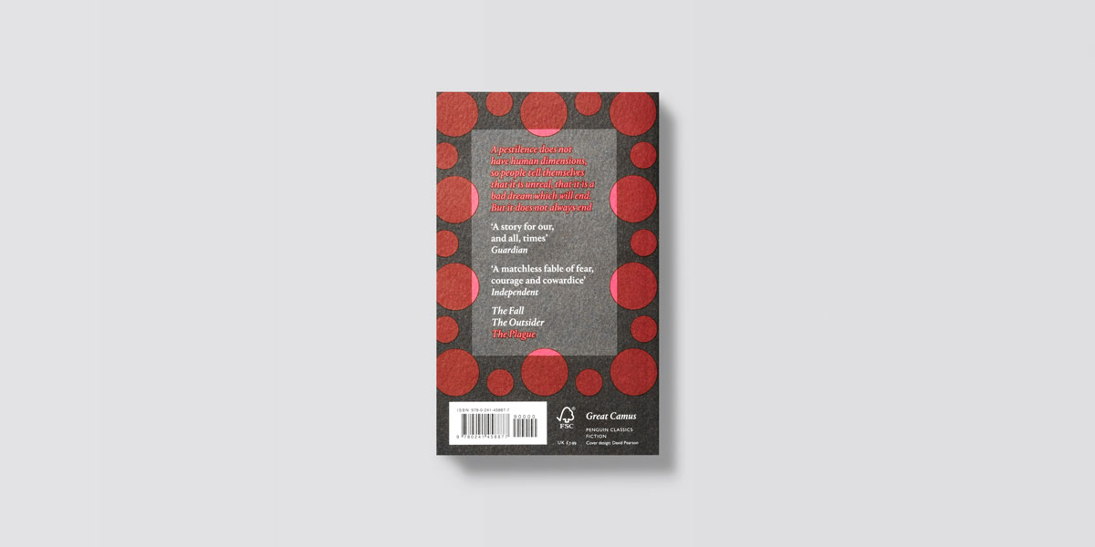
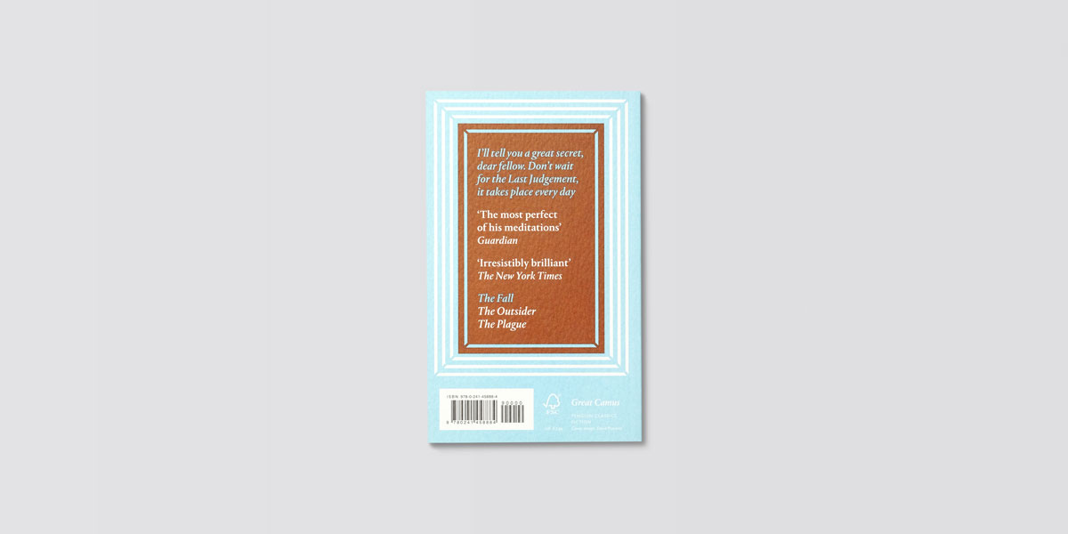
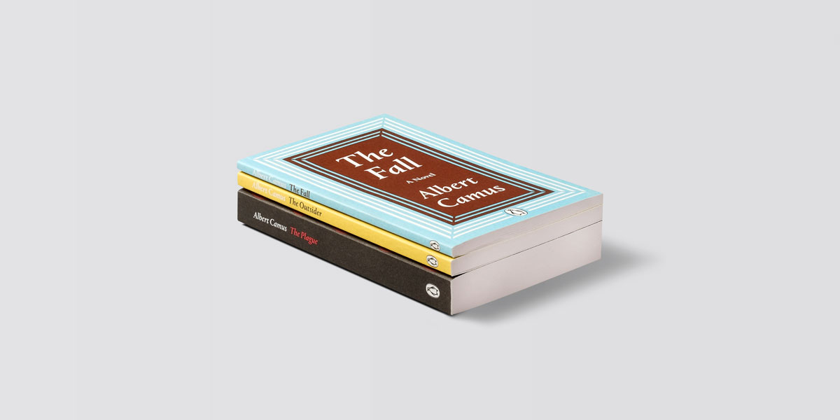
Although commissioned pre-pandemic, Penguin’s reissue of three Camus classics, including The Plague, The Outsider and The Fall, feels particualrly timely in light of our current situation.


Having cut his teeth as a cover designer at Penguin in the early noughties, and well known for his carefully considered book series including Great Ideas, David Pearson jumped at the chance to make his mark on Camus.
“I always feel additional excitement when designing for books I have read and loved. Book designers all have a check-list of authors they would like to have a crack at, and Albert Camus was certainly on mine,” says Pearson.


“Also, this job came to me with the Great Camus moniker, meaning it is a spin-off from the Great Ideas series and therefore subject to the same design-led approach, taking stylistic leads from the period that the books were written.”
While each of the reissues comes with its own distinct colour palette, such as The Plague’s red circle graphics alluding to the symptoms of the bubonic plague, when it came to creating an overall aesthetic for the series Pearson found himself drawn to abstraction.


“My initial attempts were gestural and rightly deemed to be too visceral-looking. A few well-placed words from Jim Stoddart, art director of Penguin Press, nudged me towards a more quietly suggestive approach,” says Pearson.
“The border surrounds were a useful device for creating order but the fun part came from disrupting them in subtle ways; using shifting, overprinted colours to build in small anomalies across the print run. I do enjoy this gentle sparring between the formal and informal; a kind of quiet rebellion going on within the details.”

For Pearson, the pleasure of designing for an author like Camus will always lie in the absurdism of his writing. “The absurdists are very appealing to book designers,” he says.
“They allow us to play with tensions, oppositions and abstractions; the sort of one-step-removed gameplay that makes a designer feel like they’re creating interesting pockets for interpretation.”
The Great Camus reissues are out now; typeasimage.com
The post David Pearson gives Camus a fresh look for Penguin appeared first on Creative Review.
from Creative Review https://ift.tt/3aftWCb

No comments:
Post a Comment