Arsenal, by Adidas

Arsenal’s 2020/21 kit has been inspired by the club’s Art Deco period, which took place almost a century ago. The club’s geometric crest, which was used between 1936-1949 has provided the aesthetic for both the home and away kits. Most notably, the ‘A’ inside the period crest is the starting-point for the chevron graphic on the home kit. This background pattern is also a nod to the marble halls of the East Stand, the home of Arsenal before its 2006 move to the Emirates Stadium.
Aston Villa, by Kappa

Keeping the club’s claret and blue colourway, Kappa’s new kits for the team feature a subtle pinstripe pattern in an attempt to add depth to the look.
Brighton and Hove Albion, by Nike

Pinstripes have also been used for the new Brighton and Hove Albion kit, which centres around thin white stripes and is a nod to the 1983/84 shirt.
Chelsea, by Nike

Chelsea’s new kits have been inspired by London’s tailoring history, Nike says. Specifically, Saville Row has influenced the herringbone pattern that covers the shirt and shorts in an attempt to create a “sophisticated” look. The indigo typeface also recalls the labels that are sewn into these bespoke suits, Nike adds.
Liverpool, by Nike

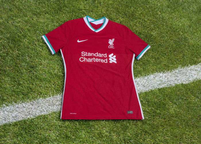
The first collaboration between Liverpool and Nike is also an attempt to become a more sustainable sports manufacturer. Liverpool’s kit is made from 100% recycled polyester fabric, which has been sourced from recycled plastic bottles. According to the apparel company, Nike has diverted over 7.5bn plastic bottles from landfills and waterways.
The traditional red is finished with a teal highlight on the collars and sleeves. The players’ numbers have been given a three-dimensional treatment on the shirts’ reverse. All apparel has been created with Nike’s 4D visualisation tools to foster “generative” design. Nike claims that the kits are 55% faster at sweat-wicking, 13% more breathable and have 10% more stretch than previous designs.

Manchester City, by Puma

Man City’s home kit is inspired by the creative hub of Manchester’s Northern Quarter, which is home to the city’s well-known mosaic displays. A mosaic graphic pattern is the background for the kit, which Puma says is an ode to Manchester’s “art, industry, football, music, fashion, noise and colour”.
The away kit strays from the team’s light blue tone and features a black pattern, inspired by Castlefield and the Bridgewater canal, which is “symbolic of Manchester’s past, present and future”.

Manchester United, by Adidas

Adidas used the club’s crest as the starting point for Man United’s kit, as threads from the crest have been extracted to create a “subtly patterned base fabric”. This textured look was made possible by a “space dye” technique from the Adidas product team, which “allows separate yarns to be dyed individually”, thereby giving more depth to the final appearance.
Using this same process, the club’s name has also been printed into the background pattern. A distinctive typeface, featuring slashes, has also been used for the kit.

Tottenham Hotspur, by Nike

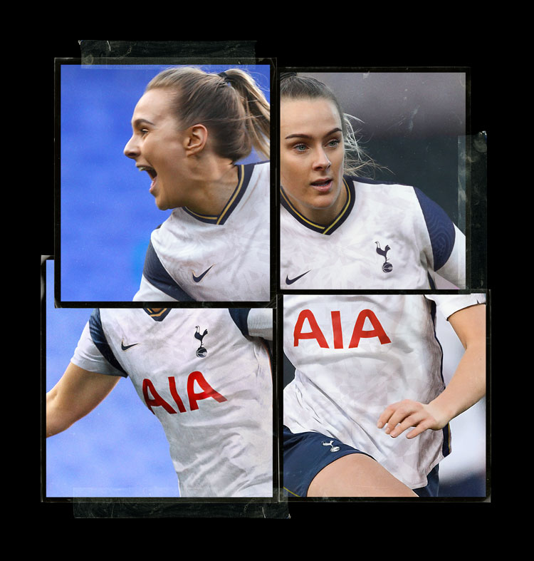
With blue and white colour blocking, Spurs’ new kit incorporates a “bespoke knit pattern” in an attempt to add a “futuristic quality” to the North London team’s look. Though the resulting effect is subtle, shades of white have been “enhanced” by being woven into the kits.
The pattern also incorporates some team nostalgia, as Nike has “reinterpreted graphics from old jerseys to create a new design”. For the away kit, neon tones and a green colour palette are an attempt to “enliven” the design.

West Bromwich Albion, by Puma

Puma has given West Brom a bold, barcode-inspired design which is a riff on the team’s 1992/93 kit. The away kit applies a vivid yellow and green colour combination to the same barcode print.

West Ham, by Umbro

Umbro’s kit for West Ham remains largely unchanged, using the blue and maroon colourway for the team’s 125th birthday. The away kits inverts the colour combination.
Wolverhampton, by Adidas

In a similar vein to its other designs, Adidas’ work on Wolverhampton’s kit features a geometric background graphic in an effort to add depth to the kit. The distinctive orange remains unchanged, while the geometric influence extends to the players’ number and names on the reverse of the shirts.

The post “Futuristic” graphics and sustainable materials: 2020/21 Premier League clubs’ kits revealed appeared first on Design Week.
from Design Week https://ift.tt/2Cfzaky

No comments:
Post a Comment