
Design studio House of van Schneider has created a visual identity for NASA's Mars 2020 mission, which condenses the red planet, the Earth and the rover into three simple, flat shapes.
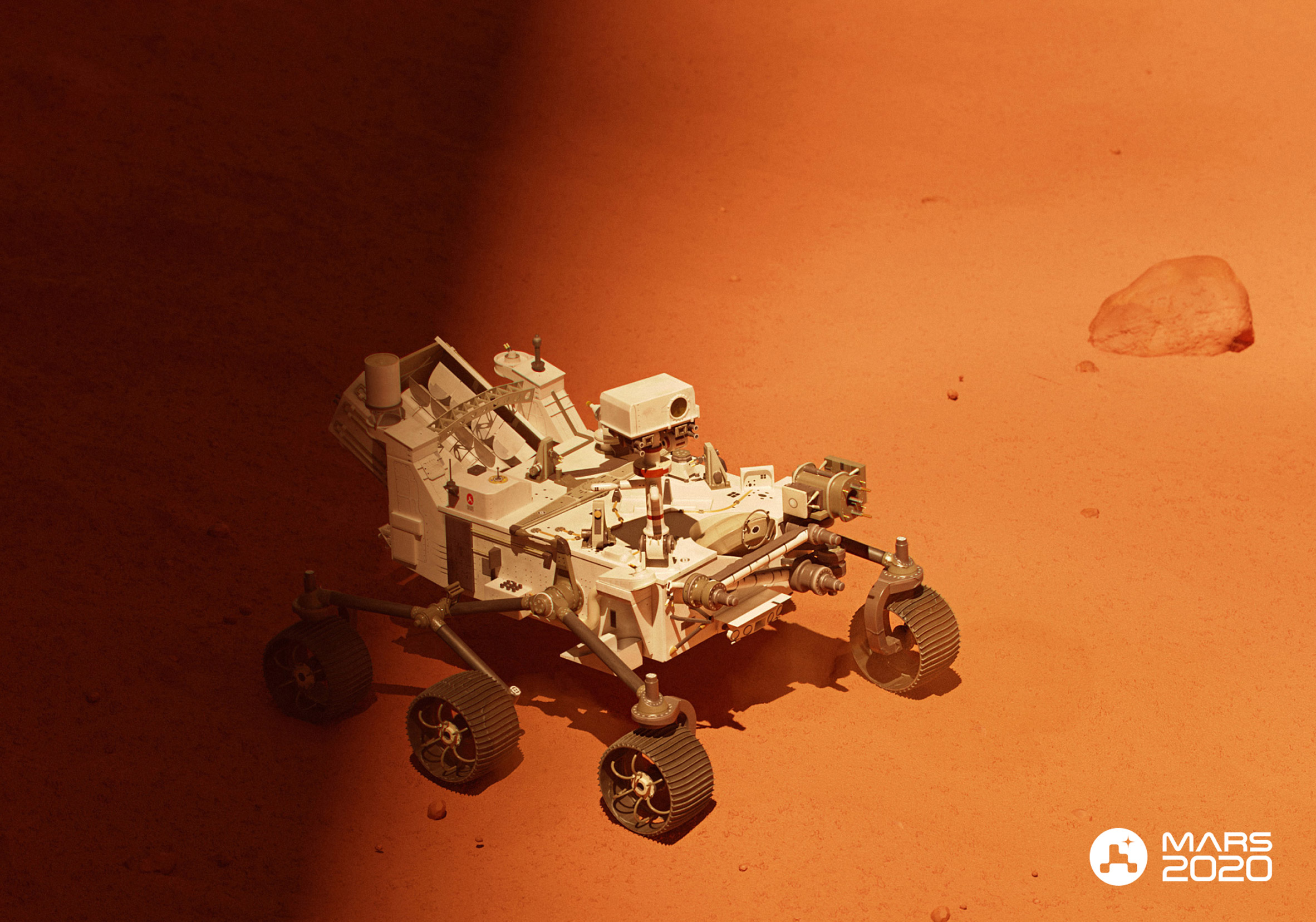
Designed to capture "the energy and legacy of space travel", the logo and branding was created to mark the launch of NASA's Perseverance robotic rover, which was sent to Mars on 30 July to find evidence of past life on the planet.
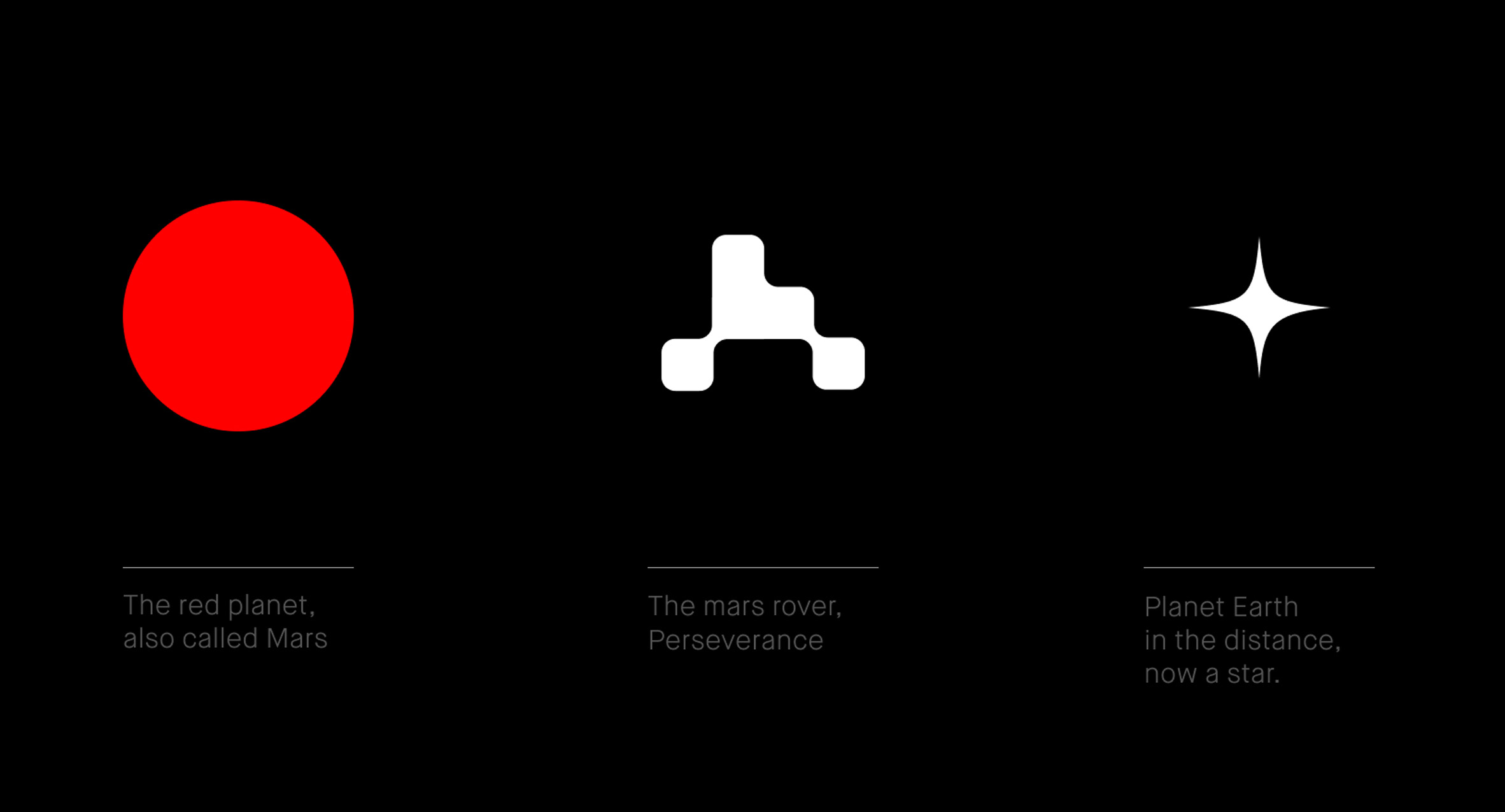
House of van Schneider's logomark is made up of three parts, including a red colour-block circle, which symbolises Mars, and a white geometric form made up of unevenly stacked blocks, designed to stand for the Mars rover.
The third element is a white star, meant to represent what the Earth would look like from the red planet.
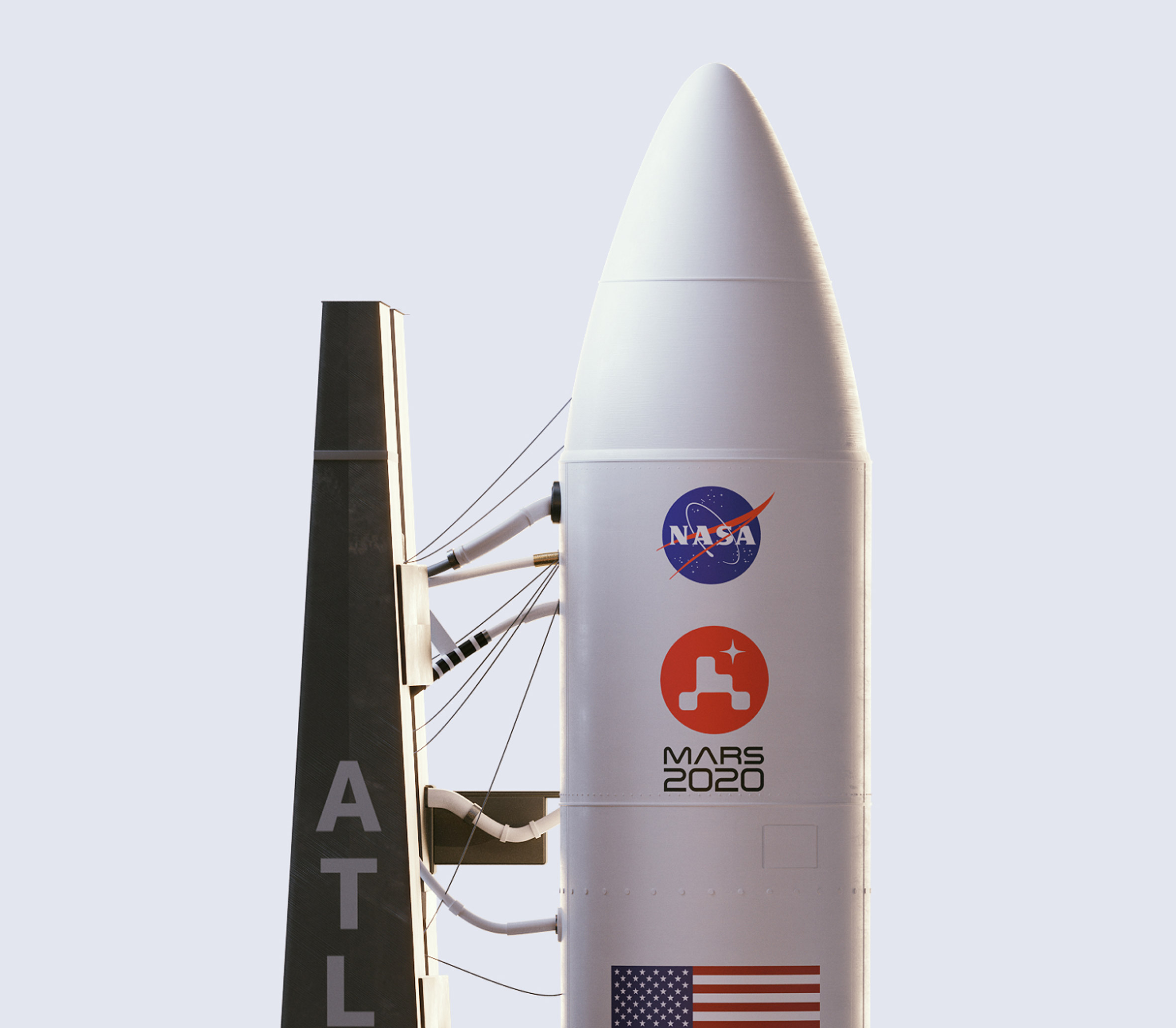
The Brooklyn-based studio wanted the emblem to be able to work just as well on the rover itself as it would on the 191-foot-tall (approximately 58-metres-tall) rocket ship.
The logo's simple, flat design ensures that it can be applied in all sizes across digital platforms as well as physical formats without compromising the clarity.
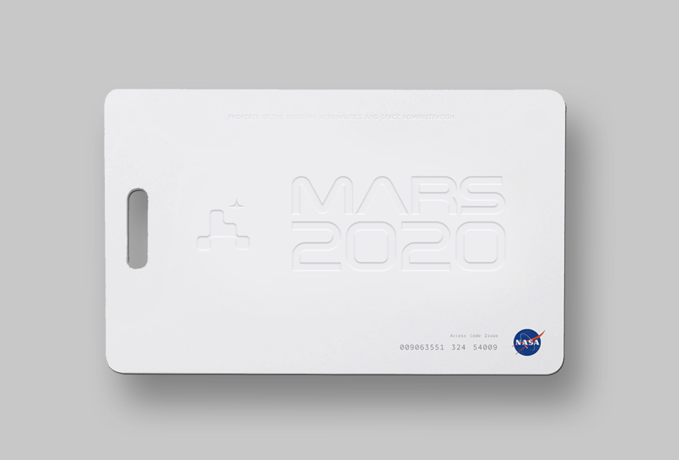
It is also featured on NASA products like badges and key cards, for instance, the latter of which are printed with a simplified, embossed version of the logo without its circular backdrop.
"Last year, a fairly well known space company reached out and asked us to design a logo for the Mars 2020 mission. Naturally, we complied," said founder Tobias van Schneider in an Instagram post.
"We never had our work on a rocket, or sent to space, let alone on Mars. This was a first for the entire House of van Schneider team," he continued. "It was a major bucket list project for us and we're beyond thankful for the opportunity."
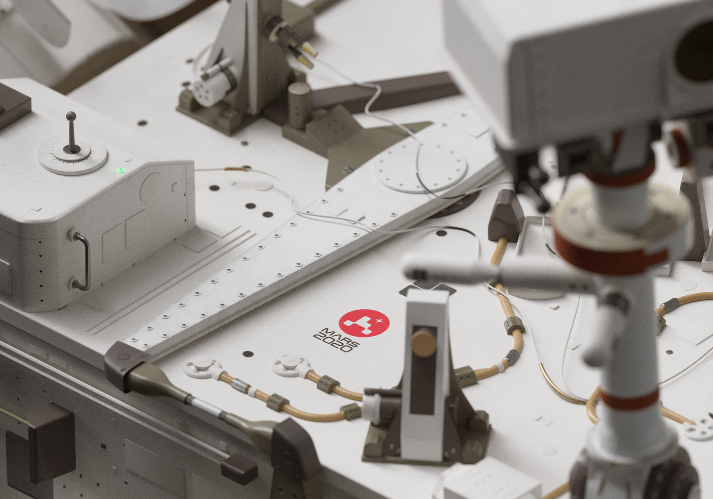
The Perseverance rover, which is being operated by NASA and the Jet Propulsion Laboratory (JPL), is due to land on Mars in February 2021.
NASA also recently revived its "worm" logo, designed by Danne & Blackburn, for the first time since 1992. The emblem was previously phased out in favour of the original 1950s "meatball" design.
The worm logo was brought back to "mark the return of human spaceflight on American rockets from American soil", as the Demo-2 flight to the International Space Station was launched.
House of van Schneider is one of many studios to adopt a flat design when creating logos. The style is particularly favoured among car brands, including Toyota, Nissan and BMW.
Other non-automotive companies to rebrand with flat logos include British condom manufacturer Durex, which tasked Creative agency Havas with creating a new brand identity that would challenge "repressive" sexual norms.
The post House of van Schneider designs minimal logo for NASA's Mars mission appeared first on Dezeen.
from Dezeen https://ift.tt/3ggJeYA

No comments:
Post a Comment