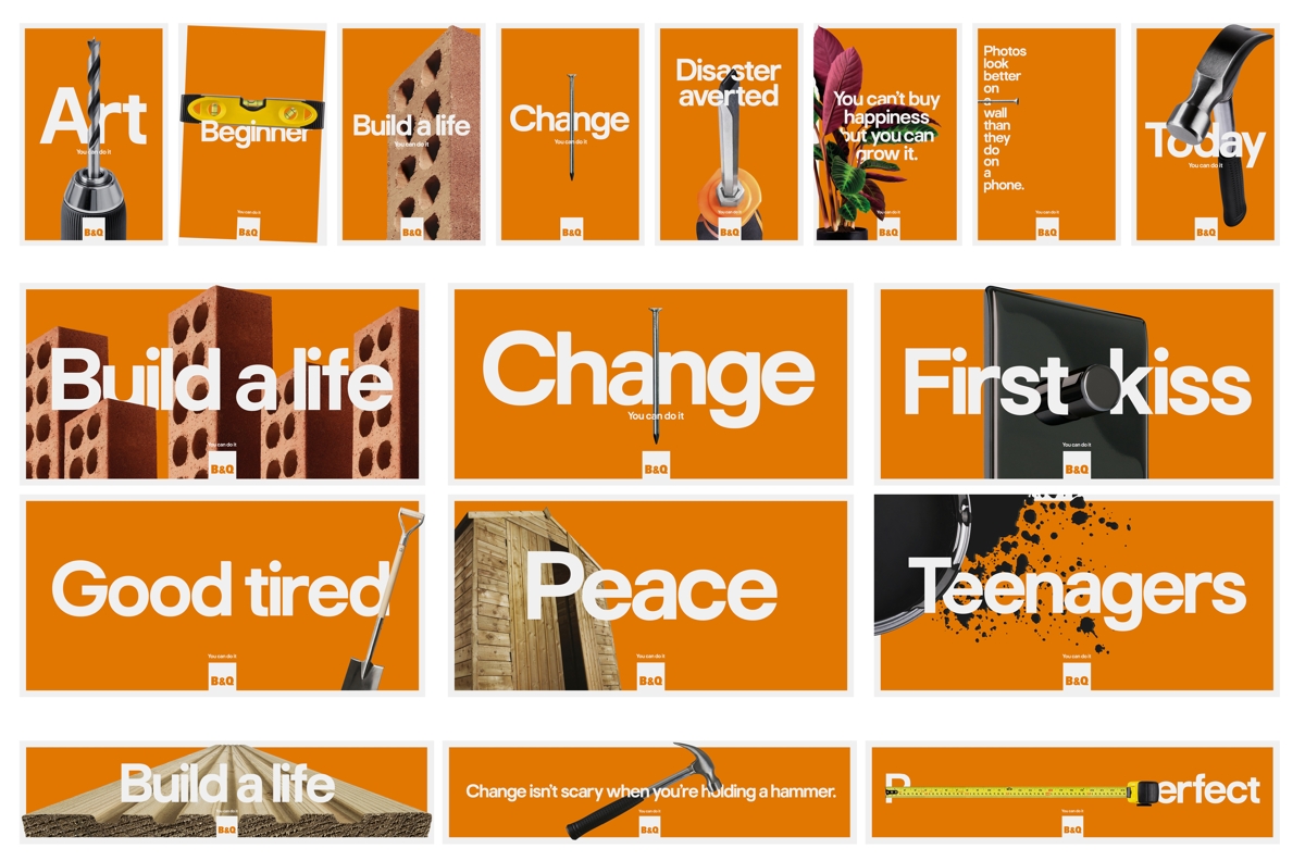
The campaign encompasses 17 different posters in total, all celebrating everyday tools such as nails, hammers and paint. They’re accompanied by short or single-word taglines, which speak to the domestic potential that a good bit of DIY can unlock.
“Even if you’re just putting a nail in the wall to put a picture up, you get a warm feeling – and that’s progress, that’s change,” Nils Leonard, founder of Uncommon, told CR. “It’s powerful, because in the world at the moment it’s hard to see us progressing. Our profiles are online. We buy things digitally. So physically changing your house is much more powerful than we give credit for.”


While doing research around the campaign, Leonard says he stumbled across the work of Richard Paul Lohse, who often used large, cut-out photography of objects – as can be seen in this Ausstellung Musikinstrumente Kunstgewerbemuseum Zürich poster.
It’s something Uncommon has referenced in the photography for the posters, which places relatively mundane objects front, centre, and close up.
“Lohse would do these insane annual reports, with a picture of a sink, or a spanner, and they’d be cropped and used really graphically in a powerful, gridded, Swiss, brutal way,” explains Leonard. “So it was about how we take implements like a nail or a spanner – the cornerstones of DIY – and speak to his spirit.”


Notably, the images sit on a vast expanse of B&Q orange – a colour Leonard says the brand often minimalises, but which Uncommon wanted to bring to the forefront. “It’s our orange tribute to Swiss Modernism,” he jokes.
The campaign follows hot on the heels of Uncommon’s Build a Life TV ad, both adopting the same emotionally-driven approach to DIY, and the ways it can help us to create a home.

The post B&Q continues its celebration of the sentimental side of DIY appeared first on Creative Review.
from Creative Review https://ift.tt/33NEOEq

No comments:
Post a Comment