Next year, the Bob Dylan Center is set to open in the Tulsa Arts District in Oklahoma, US. The institution will be one of the only public venues for the musician’s archive and is set to exhibit a collection of more than 100,000 items spanning Dylan’s career.
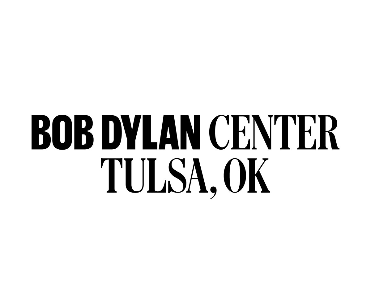
To help bring it to life, creative studio Base Design, which has hubs in New York, Brussels, Melbourne and Geneva, was brought on to create the logo and identity system set to be used across a range of applications and the website. “Given Bob Dylan’s iconicity, we were all excited and humbled when this project came in,” says the studio. “We also became aware of the revitalisation that Tulsa is undergoing, and that with the addition of the Bob Dylan Center, we had the opportunity to create a profound cultural impact on the city and beyond.”

The identity is centred around the spirit of music, and references bill and protest posters and woodblock type, in a mini celebration of 20th century American design. “We prioritised the prominence of the institution by creating an iconic identity that is quintessentially Dylan, but specific to this time and place – acknowledging our heritage in America and our site in Tulsa,” says Base Design. “Visually, it draws inspiration from Dylan’s America and applies it to a contemporary setting – adapting to the times, as Dylan continues to do.”
As part of the identity and logo, three custom typefaces have been used, all of which draw upon classic American typography such as “woodblock printing, newspaper-inspired headlines and quirky humanist text”. The studio’s goal was for these typefaces to act as a metaphor for Dylan’s creative journey and eclectic body of work.


“Our main display typefaces consist of a serif, Telegram, and sans-serif, Grandstand. The balance of these two throughout the identity is critical, as we are not only presenting Dylan as a musician, but as the prolific a writer that he is,” says the team. “We wanted to further the notion of Dylan as a literary genius through the use of a blue ink. Our primary inspiration was drawn from the many annotations found in his manuscripts – suggestions of an ever-changing creative process. In the palette, we also utilise a warm red and an off-white which bring in contrast and warmth.”
In terms of visuals, the Bob Dylan Center has never-before-seen imagery in its archive and the studio were given access to shots of the musician that were lesser known, allowing Base Design to hone in on “telling a story of creative work and a life in constant progress”.

To avoid the identity being simply a tribute to Bob Dylan and his work, Base Design have attempted to create something timeless and understated in order to let the exhibits, photography and music be the focus. “We also knew the Center should not solely be focused on Bob Dylan, and that Tulsa should hold prominence in this identity as well,” says the studio. “We constantly asked ourselves if we were striking the right balance between the two.”
“At the end of the day,” Base Design adds. “We wanted to create an identity that spans generations, celebrates Bob Dylan’s ongoing legacy, and welcomes new audiences to the growing city of Tulsa.”
The post Base Design creates identity for the forthcoming Bob Dylan Center appeared first on Creative Review.
from Creative Review https://ift.tt/2S1ng2a

No comments:
Post a Comment